Retail Merch Caps Logo Placement Guide for Buyers sounds straightforward until the cap is actually on a head, under store lighting, and viewed from three feet away. Then the logo that looked centered on a screen can feel low, crowded, or oddly small. That gap between mockup and merchandise is why placement deserves the same attention as price, fabric, and fit.
On caps, a few inches matter more than most buyers expect. Crown height, panel count, seam position, brim curve, and decoration method all change how the front mark reads. A logo that feels balanced on a structured snapback can look compressed on a low-profile dad hat, while a clean flat mockup can shift once the crown flexes in real use.
The commercial goal is practical: make the brand easy to read, keep the product sellable from a distance, and avoid revisions that add cost and delay. A cap can be well made and still miss the mark if the logo sits in the wrong place. For retail, that is not a design flaw alone; it is a merchandising problem.
What the placement guide covers on the shelf
The shelf view changes everything. A cap hanging on a peg is seen slightly from above. A cap in a stack exposes less crown and more brim. A worn cap adds another layer of distortion because the front panel curves and the logo no longer sits on a flat plane. Any placement decision that ignores those conditions is guessing.
Placement is not just about decoration, either. It is about how the product sells. Too low, and the brim swallows the mark. Too wide, and the design hits seam lines or eyelets. Too close to the center break, and the artwork can look forced, even if the template technically allows it.
The same artwork can behave differently across styles. A 2.75-inch-wide logo may sit neatly on a tall structured trucker, then feel cramped on a soft 5-panel. The cap shape changes the visual center, and the visual center determines where shoppers look first. That is why a single artwork file is rarely enough by itself.
For buyers, the right placement is the one that reads quickly and survives real display conditions. If a shopper has to lean in to understand the brand, the logo is working too hard. If the cap looks clean from a few feet away and still feels balanced when worn, the placement is probably right.
- Retail visibility: the logo should read in 2 to 3 seconds from a few feet away.
- Balanced placement: leave enough room from seams, eyelets, and the brim edge.
- Style fit: structured and unstructured caps need different rules.
- Wearability: the front panel should still look correct on a real head.
Consistency matters across colorways and styles. When one cap in a line feels centered and another feels ad hoc, the assortment loses discipline. Repeating a placement system across a program keeps the collection looking intentional instead of patched together by different teams.
How cap decoration process and turnaround affect placement
The decoration process decides how much room you have to adjust the art. A typical order moves from file review to digitizing or patch prep, then to placement mockup, sample production, approval, bulk production, inspection, and shipping. Skip a step, and the mistake usually turns up later, when a correction costs more.
Time matters because placement changes are not always trivial. Moving a logo up by a quarter inch, changing its width, or testing a second version can add another proof cycle. On a relaxed timeline, that is manageable. On a tight launch, the first proof needs to be very close to final.
Turnaround is shaped by stitch count, thread changes, extra placements, and whether a physical sample is needed. A simple front embroidery hit is easier to approve than a multi-color patch with edge stitching or 3D puff. That does not make the more complex version bad. It just means the buyer needs more time to verify that the decoration sits well on the actual cap body.
For simpler embroidery runs, 12 to 15 business days after proof approval is a common window. Patch-heavy or multi-step orders usually take longer. Rush service can reduce calendar time, but it leaves less room for correction and often raises unit cost. That tradeoff is normal in production; it is not a supplier issue by itself.
A mockup can be useful and still be misleading. The real test is how the logo sits on the actual cap structure, with the actual decoration method, before anyone signs off.
Ask how the supplier handles artwork revision, digitizing, and pre-production sample approval. Those steps say more about placement reliability than a polished quote ever will. If a vendor cannot explain why the logo should sit where it does, the final product may look fine in a sales sheet and weak in person.
If the order includes cartons, hang tags, or inserts, packaging quality and transit handling can affect the finished presentation. For shipping test standards, ISTA publishes widely used methods. If paper components matter, FSC certification is worth asking about. Neither one is glamorous, but both help prevent avoidable problems.
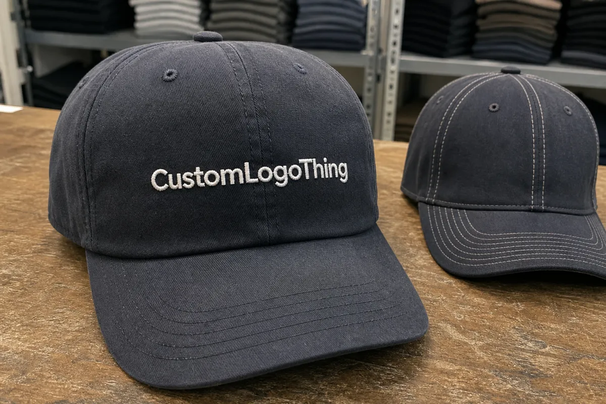
Front panel shape, crown height, and seam lines that change the logo zone
Cap construction changes the logo zone more than most artwork reviews admit. A structured cap has a stiffer front that supports embroidery and patch work better. An unstructured cap collapses more, so the logo needs extra breathing room. A 5-panel front gives you a single clean face, while a 6-panel cap introduces a center seam that can cut through the wrong part of a design.
Crown height affects perception fast. A tall crown creates more visual space above the brim, so the logo can sit a little higher without looking jammed. A shallow crown compresses the usable area and makes the same logo feel lower and tighter. One file can be fine across both styles only if the measurements are adjusted with intention.
Seams, eyelets, and panel tension are the small details that separate a clean sample from one that gets explained away. If a letter lands on the center seam, the stitch line can break the shape. If an icon sits too close to an eyelet, the mark can look pinched. With embroidery, thread is physical. It does not care how polished the artwork looked on screen.
Retail display changes the read again. A hanger exposes more of the top front panel. A folded stack pushes attention lower. A worn cap adds curve and angle. The logo should still feel centered from each of those views, which means the visual center needs to be checked more than once.
The safest approach is to place the logo on the actual cap spec, not a generic blank template. Use the correct panel count, brim curve, and crown height. Then compare the result on screen, on a real cap, and in a shelf-style display. If it holds up in all three, the placement is close to production-ready.
- Structured vs. unstructured: stiffer fronts usually hold detail better.
- 5-panel vs. 6-panel: seam position can change whether the logo can stay centered.
- Low profile vs. high profile: shallow crowns need tighter logo height.
- Brim curve: a more curved brim makes the front panel read smaller from the shelf.
The field check is simple: look at the cap from the front, slightly above, and at a small angle. If the logo only works in one perfect pose, it is too fragile for retail. A cap needs to hold together visually in a messy selling environment.
Cost, pricing, MOQ, and unit cost by decoration method
Placement affects price because decoration method affects the number of production steps. Flat embroidery is usually the most economical front hit for retail caps. 3D puff adds foam and tighter stitch control. Woven patches, leather patches, and printed patches each have setup requirements and quality limits. Direct print can work in some cases, but it is not the default solution for every cap style.
The usual cost drivers are consistent: digitizing, setup, patch tooling, extra thread colors, multiple placements, and sample revisions. A logo with thin lettering may need more digitizing work before production even starts. Add a side hit or a back mark, and both cost and approval time usually increase.
MOQ matters because setup cost gets spread across the order. Small runs carry a higher unit price. As quantity rises and the art is locked, pricing improves. A quote for 100 pieces can feel harsh while 1,000 pieces may look much more manageable. Same cap, same decoration, different math.
| Decoration method | Typical use | Approx. unit cost at 500 pcs | Placement risk | Buyer note |
|---|---|---|---|---|
| Flat embroidery | Clean retail logos, simple text, most front-panel marks | $0.70-$1.40 | Low to medium | Good mix of value and readability for many programs |
| 3D puff embroidery | Streetwear looks, bold initials, thick icon shapes | $0.95-$1.80 | Medium | Needs strong shapes; tiny details disappear quickly |
| Woven patch | Sharper detail, premium merch feel, small text | $1.10-$2.25 | Low to medium | Useful for detail, but patch size still needs restraint |
| Leather patch | Lifestyle brands, rustic or heritage positioning | $0.85-$1.90 | Low | Simple shapes work best; embossing often reads cleaner than tiny print |
| Printed patch | Color-rich art, gradients, complex illustration | $0.75-$1.60 | Medium | Useful when embroidery would flatten the design |
The lowest quote is not always the best buy. A cheaper run that produces weak placement creates sell-through problems later, and those costs are harder to see on the first invoice. Spending a little more for a cleaner front panel often saves more than it costs.
If the logo has to be reduced so much that it loses legibility, the method is probably wrong for the artwork. In those cases, a patch may outperform embroidery, or a simplified embroidered version may work better than print. The product should serve the art and the retail environment, not fight them.
Step-by-step placement checklist before you approve the art
Start with the exact cap style, not a similar one. A 5-panel, a low-profile dad hat, and a structured trucker all handle decoration differently. Placing art on the correct template saves time and reduces the chance of a proof that looks right in theory and wrong in production.
- Confirm the cap spec: structure, panel count, crown height, brim curve, and closure type.
- Set the safe zone: measure width, height, and distance from seam lines in inches.
- Test the visual center: compare the logo on screen, on head, and in a shelf-style display.
- Check thread or patch details: thread color, stitch direction, patch edge, and backing type.
- Review readability: make sure the logo still reads from a few feet away.
- Save the approved spec: keep measurements, artwork, and photos together for reorders.
Use inches, not rough language like “looks about right.” That phrase tends to show up right before a sample is remade. A practical front logo on a retail cap often lands around 2.25 to 3.5 inches wide, depending on the artwork and the crown height. That is a useful range, not a rule. Bold icons, simplified text, and tall marks can run wider; thin scripts and dense detail usually need to shrink.
Build a real-size mockup if the order matters. Print the art at scale, place it on the actual cap body, and look at it from a few feet away. Then tilt the cap slightly and check again. If the placement only works when viewed perfectly straight on, it is too delicate for retail.
Practical check: review the sample in the actual colorway that will be produced. Dark thread on a dark crown can vanish. Bright thread on a soft neutral cap can feel louder than expected. Color changes alter contrast, and contrast changes how buyers judge value.
Common logo placement mistakes that make caps hard to sell
The most common mistake is treating a cap like a T-shirt. Cap fronts are smaller, curved, and less forgiving. Oversized artwork often looks forced because the panel cannot carry the visual weight. The cap ends up looking decorated rather than branded.
Seam collisions are another frequent problem. If a letter or icon crosses a center seam, the stitch line can split the shape and make the logo appear broken. Eyelets create the same issue when the placement sits too high. A layout can be technically possible and still be visually wrong.
Another retail mistake is placing the logo for the wearer instead of the shopper. What looks fine in a mirror can disappear on a peg, under store lighting, or in a folded stack. Buyers care about sell-through. They care less about whether the cap looks good in a selfie.
Thin scripts and tiny copy also cause trouble. Embroidery thickens edges. Small counters close up. Patch printing can preserve more detail, but only to a point. If a design stops reading once it is scaled to cap size, simplify it before production.
The rule is straightforward: if the logo cannot be read at a glance from a few feet away, it is too small or too detailed for the format. Not every design needs to be loud, but every retail cap needs to be legible. That is the line between a product and a puzzle.
- Too large: the logo crowds seams and looks forced.
- Too low: the brim steals attention and the mark disappears.
- Too detailed: embroidery and patch methods flatten thin elements.
- Wrong for the buyer: art may suit streetwear, not shelf merchandising.
Expert rules for retail-ready cap assortments
Keep the front logo strong and simple. Side and back marks should support the main branding, not compete with it. A good assortment uses secondary decoration with restraint. The front panel should sell the cap quickly, not make the buyer search for the brand like it is hidden.
Build a style matrix by cap type, color, and decoration method. The document may look dry, but it prevents one colorway from turning out clean while another falls apart visually. Once a buyer can see which combinations stay readable, approvals get easier and reorder quality gets steadier. The matrix also shows why a low-profile 6-panel cap may need a different logo height than a structured trucker in the same line.
Lock repeatable measurements for bestsellers. If a style is likely to reorder, keep the placement notes, art file, thread callouts, and approved sample photo in one place. Different factories, or even different production teams, can interpret vague notes differently. A precise spec reduces guesswork and keeps the line consistent.
A quick field test helps more than a long meeting: tilt the cap, fold it once, and look at the logo again. If the mark still feels balanced, it is probably in good shape. If it looks crooked, cramped, or oddly small from multiple angles, it needs another pass.
That is where a focused retail merch Caps Logo Placement guide earns its keep. It gives buyers a way to compare cap styles without relying only on taste. The cap still has to look good, but it also has to be readable, repeatable, and practical to produce at scale. That combination is what makes a line work.
Next steps to lock the proof, sample, and reorder spec
Create one approved spec sheet and keep it tight. Include cap style, decoration method, exact placement measurements, thread colors, patch details if needed, and the tolerance you will accept on the production run. Do not bury that in email threads where it can disappear after a personnel change.
If the launch matters, order at least one physical sample. A proof is not enough for every program. Compare the sample against the retail shelf, the worn fit, and the shipping carton before bulk production starts. A cap can look fine in a photo and still feel wrong on display. That is how surprises happen.
Save the final art file, placement notes, and approved photo together. Reorders become easier when the buyer does not need to reconstruct the full decision tree. It also helps if the next run moves to a different supplier or production team. Clear records reduce drift.
For most retail programs, the best outcome is plain: the cap reads clearly, the price makes sense, and the factory can repeat the placement without drama. If the sample matches the spec and still looks sellable in real display, the order is ready. That is the point of the Retail Merch Caps logo placement guide, and it is where good planning saves the most money.
FAQ
How do I choose the best logo placement on retail caps?
Match placement to the cap structure first, because a safe zone on paper can still look low or crowded on a curved crown. Center-front usually works best for broad retail appeal, then you can shift slightly for premium or streetwear styles when the design calls for it. Always check the cap on a real head and in a shelf-style display before approval.
What logo size works best for embroidered retail caps?
Most front logos land in a compact range, often around 2.25 to 3.5 inches wide, depending on cap style and art complexity. The real rule is readability: if a shopper cannot read it from a few feet away, the artwork is either too small or too detailed. Tiny script and fine lines usually need simplification before digitizing.
Does logo placement change the price of retail caps?
Yes. Placement can change price if it adds stitch count, extra setup, additional thread colors, or a second decoration location. Patch styles, 3D puff, and multi-location branding usually cost more than simple front embroidery. More complex placement can also increase MOQ pressure because the supplier needs more setup time per style.
How long does production take after placement is approved?
Simple decorated caps usually move faster than patch-heavy or multi-step orders, but the sample phase still affects the schedule. Any revision cycle adds time, so a clear first proof is cheaper than a messy second round. Rush service can shorten the calendar, but it usually increases cost and reduces flexibility.
Can one placement work across different cap styles?
Sometimes, but not without adjustment, because dad hats, truckers, 5-panels, and structured caps all handle artwork differently. Keep the same visual balance, but tweak height, width, and distance from seams or brims by style. Lock separate measurements for each bestseller so reorder quality stays consistent.


