Retail Merch Caps Logo Placement Guide to Order Right
Use this Retail Merch Caps logo placement guide to choose imprint positions, decoration methods, pricing factors, and proof checks before ordering hats.
What Buyers Miss First
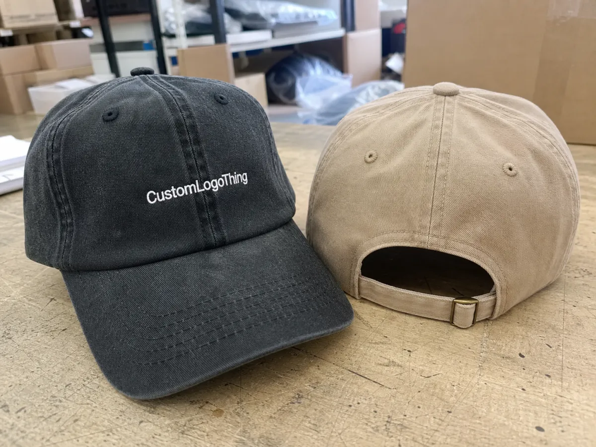
The logo position people notice first is not always the easiest place to decorate. A useful Retail Merch Caps logo placement guide has to account for seams, crown shape, buckram, sweatbands, closures, and the way hats move when worn.
Logo placement is more than front, side, or back. It covers size, orientation, decoration method, and how the mark behaves on an actual cap instead of a flat screen. A 2.75-inch embroidered wordmark on a structured 6-panel cap can look clean in a mockup and awkward on the finished hat if the seam cuts through the design. The file did not fail. The placement did.
Retail Merch Caps need to photograph well, read quickly on a shelf, feel comfortable, and survive repeated wear without puckering, curling, cracking, or disappearing into the fabric. The best placement is the one that survives production and still looks intentional after shipping, handling, and real use.
The common zones are front center, left or right front panel, side panel, back arch, closure strap, underbill, overbill, woven label, patch, and interior branding. Each zone has limits. Most problems start when the buyer approves artwork before checking those limits.
How Logo Placement Works on Real Cap Panels
A cap is not flat. The crown is built from shaped panels joined by seams, then pulled into form with curve, tension, and, in many styles, a stiff front support called buckram. That construction changes how embroidery, patches, heat transfers, and printing sit on the surface.
5-panel caps usually give a cleaner front panel because there is no center seam running through the main decoration zone. That helps bold wordmarks, rectangular patches, and simple centered graphics. 6-panel caps often have a front seam, which can split small type or make symmetrical marks look slightly off. It is subtle, but it matters when the cap is sold as retail merchandise.
Structured caps hold shape better and give embroidery or patches a firmer base. Unstructured caps flex more, which can make dense stitch coverage wrinkle the crown. Low-profile caps have less vertical room, so tall logos may need to be shortened or simplified. Trucker caps add foam and mesh, which changes where a patch can sit cleanly.
Front center is still the classic retail placement because it reads first in photos and on shelves. It works for brand marks, collection logos, mascots, and event merchandise. Side placements are quieter and better for secondary marks, short slogans, or small icons. Back placements usually sit above the arch or closure and need clearance so embroidery does not fight the hardware.
Special placements, including underbill prints, overbill edge graphics, woven labels, and interior taping, can add a premium feel. They also add more details for the factory to confirm. Clean orders specify the exact panel, logo height, decoration method, and finish before production starts.
Logo Size, Artwork Detail, and Decoration Method Fit
The decoration method drives much of the placement decision. Flat embroidery, 3D puff embroidery, woven patches, embroidered patches, leatherette patches, rubber patches, heat transfers, screen prints, and woven labels all behave differently. Match the artwork to the method, not just to the brand file.
Embroidery uses thread, so fine detail has limits. Tiny type, thin outlines, gradients, distressed textures, and small legal marks often need cleanup. Letters under about 0.20 inch tall can turn muddy depending on font, stitch direction, density, and fabric. Too much fill makes the cap stiff. Too little makes the mark look weak.
3D puff embroidery works best on bold shapes and block lettering. The foam needs enough width to rise cleanly. Skinny strokes, sharp corners, and delicate symbols tend to collapse or split. If the logo relies on elegant line work, puff is usually the wrong tool.
Patches are strong for retail caps because the patch can be made separately, checked for edge shape and detail, then sewn or heat-applied to the crown. They add texture and help smaller production runs stay consistent. The catch is fit: a wide flat patch can lift at the edges on a curved front, while a patch that is too large can crowd the seam.
Heat transfers and prints can hold more detail than embroidery, but only on compatible fabrics. Texture, stretch, coating, and abrasion all matter. Performance caps can be a good fit, but the decoration still needs to pass a heat test and a wear test.
Rule of thumb: front logos need enough height to read from a few feet away, side logos should stay compact, and back logos must clear the closure and hardware. Always judge artwork at actual cap scale.
| Decoration Method | Best Placement Fit | Typical Strength | Watchouts |
|---|---|---|---|
| Flat embroidery | Front, side, back arch | Durable, classic, strong retail recognition | Small type and gradients often need cleanup |
| 3D puff embroidery | Front center on structured caps | Bold raised look for initials and block logos | Fine detail, sharp corners, and low-profile crowns can fail |
| Woven or embroidered patch | Front panel, side panel, back label | Controlled shape, tactile finish, strong shelf appeal | Patch size must suit crown curve and sewing path |
| Heat transfer or print | Performance caps, panels, underbill | Good detail and color range on compatible materials | Fabric texture, heat limits, and abrasion matter |
Process and Timeline from Artwork to Finished Caps
A clean cap order follows a predictable sequence: choose the cap style, confirm placement zones, prepare artwork, convert the file for the chosen method, review a digital proof, approve a sample if needed, then release bulk production. Skipping a step usually moves the problem into production, where fixes are slower and more expensive.
Digitizing for embroidery is not just uploading a file. The artwork is translated into stitch type, stitch angle, density, underlay, trim points, and thread color calls. A vector file helps, but the digitizer still decides how thread should travel across a curved panel. Patches follow a different path: shape, border, backing, material, and attachment method are set before the patch reaches the cap body.
Lead time depends on cap availability, blank stock, custom dyeing, number of placements, sample requirements, and revision cycles. A front-only embroidery on a stocked blank can sometimes move through production in about 7 to 12 business days after proof approval. Add a custom patch, second logo location, underbill print, or private-label finishing, and the window often stretches by another 5 to 15 business days. If fabric or trim must be sourced, longer is normal.
Proof approval is not a formality. It is the point where placement height, logo scale, thread color, patch edge, seam conflict, and closure clearance should be checked before the order becomes expensive to correct.
Rush orders can work on simple placements with stocked blanks, but shortening the proof stage too much raises the risk of a bad run. A good process speeds up decisions without turning them into guesses.
Cost, Pricing, MOQ, and Unit Cost Considerations
Logo placement affects unit cost because each location can add setup, machine time, handling, and inspection. A small side logo is not always a small price increase. The cap still has to be positioned again, and every extra pass creates another chance for error.
The biggest pricing drivers are cap blank style, material, decoration method, stitch count, patch type, number of logo locations, thread or print colors, order quantity, packaging needs, and delivery timing. Embroidery is often priced partly by stitch count, so a dense filled emblem can cost more than a simple wordmark even when both occupy the same front area.
For rough planning, standard cap embroidery often adds about $1.50 to $4.50 per cap, depending on stitch count and quantity. Custom patches may add about $2.00 to $6.00 per cap, with higher costs for leatherette, rubber, specialty borders, or low-volume runs. Multiple placements increase those numbers. At 100 units, setup and proofing weigh heavily on unit price. At 1,000 units, the same setup spreads out.
MOQ depends on the order. Standard blanks and simple decoration can allow lower quantities. Fully custom caps, custom fabric colors, woven labels, specialty patches, and multi-location decoration usually require higher minimums. Ask what is included in setup, what counts as a revision, and whether a sample is included or billed separately.
Packaging also affects cost. Retail caps may need individual polybags, size stickers, hangtags, belly bands, or cartons with tighter pack-outs. If the product will sit in a warehouse, get repacked, or move through distribution, the pack-out needs to protect crown shape and decoration.
Common Logo Placement Mistakes That Hurt Retail Appeal
The most common mistake is putting detailed artwork directly over the center seam on a 6-panel cap without adjusting the design. Small letters can split. Symmetry can drift. Thin outlines can wobble because the needle is crossing a ridge instead of a smooth panel. The mockup may still look fine, which is why this mistake keeps happening.
Oversizing the front logo creates a different issue. A large mark can look bold on screen, then feel stiff, crowded, or heavy once stitched onto a curved crown. The reverse happens on side and back placements: tiny logos with thin letters or low-contrast thread can disappear from a few feet away, especially in product photos.
Cap structure matters. Unstructured caps may wrinkle under dense embroidery. Low-profile caps may not have enough vertical room for a tall logo. Trucker caps bring mesh and foam into play. Performance caps may have coatings or stretch fabrics that limit heat application. The same logo does not behave the same way on every blank.
Color contrast needs a real check. Navy thread on black caps, white patches on cream caps, or tonal branding can look refined in hand but nearly invisible online. Quiet branding can be strong if the product is meant to feel premium. The mistake is choosing low contrast by accident.
A flat digital proof does not show thread texture, patch thickness, puckering, or how the logo sits once the crown curves. Too many branded locations can also turn a retail cap into a giveaway cap, while raising cost and inspection time.
Placement Tips That Hold Up in Retail
Start with the cap silhouette before the logo. Dad caps, trucker caps, snapbacks, rope caps, performance caps, and camper caps all carry branding differently. A rope cap can make a small front patch feel intentional. A low-profile dad cap usually works better with a shorter wordmark. A structured snapback can handle bolder front embroidery.
Treat the front mark as the hero. Use side, back, or interior placements only when they add information or retail character. A small side icon, a woven label near the closure, or tonal embroidery can make a cap feel designed instead of stamped. More marks do not automatically mean more value.
Ask for the decoration-safe area for the exact cap style. Panel height, seam position, crown stiffness, and sweatband construction vary even among caps that look similar online. Thread, patch, and transfer colors should be checked against the actual fabric, not only against brand guidelines, because cotton twill, polyester, nylon, and washed canvas shift differently under light.
Use simplified artwork when needed. The full logo may belong on the hangtag, packaging, or belly band, while a compact icon or wordmark belongs on the cap. That is retail thinking, not a downgrade.
Review a sample from several angles: straight-on, three-quarter view, side view, back view, and worn position. Retail caps are rarely seen perfectly flat. If the sample looks good only while lying on a table, the placement needs more work.
Final Checks Before You Approve the Order
Before you sign off, confirm the cap style, crown height, panel count, fabric, decoration method, logo size, logo position, thread or patch colors, proof dimensions, and any secondary placement. A 10-minute check can stop a carton from arriving with a logo that sits half an inch too high or a back mark that collides with the closure.
- Send the right files: vector art when possible, plus brand color references, cap color choices, quantity, deadline, and a reference for the finish you want.
- Ask for risk flags: seam interference, tiny type, high stitch count, low contrast, patch edge issues, closure limits, and sweatband restrictions.
- Check actual size: compare the proof against a real cap or print the artwork at scale on paper before approving.
- Prioritize the budget: decide whether the cap blank, front decoration, secondary placement, custom patch, packaging, or turnaround matters most.
That is where the order gets either clean or expensive. Use the proof stage to settle specifications before production starts.
FAQs
What is the best logo placement for retail merch caps?
Front center is usually the strongest retail placement because it is easy to see in photos, on shelves, and when worn. Side and back placements work better for secondary branding, short text, icons, location marks, or co-branded details. The best choice depends on cap structure, logo shape, decoration method, and whether the cap should feel bold, premium, subtle, or collectible.
How large should a logo be on a custom retail cap?
The logo should fit the actual decoration-safe area of the cap, not just the space on a flat mockup. Front logos can usually be larger than side or back logos, but they still need to clear seams, crown curves, and low-profile limits. Small text, thin outlines, and detailed symbols may need to be simplified or enlarged so they stay readable after embroidery, printing, or patch application.
Does logo placement affect cap pricing and MOQ?
Yes. Each placement can add setup, labor, machine time, proofing, and inspection, which can raise unit cost. A simple front embroidery on an in-stock cap prices very differently from a cap with a front patch, side embroidery, underbill print, and private-label details. MOQ often rises when the order uses custom caps, specialty patches, multiple decoration locations, or nonstandard materials.
Should I use embroidery, a patch, or a print for cap logos?
Embroidery is durable and classic, but very fine detail and gradients may not translate well into thread. Patches are strong for retail merch because they add texture and can hold a defined shape, border, and premium finish. Printing or heat transfer can suit detailed artwork on compatible materials, but fabric texture, heat sensitivity, and wear expectations should be checked first.
How do I review a retail merch cap logo placement proof?
Check the exact logo size, placement height, color callouts, cap style, panel count, and decoration method before approving. Look for seam conflicts, closure interference, low contrast, small type, and artwork that sits too high, too low, or too wide on the crown. If possible, review a physical sample, stitch-out, patch sample, or actual-size printout so the proof matches the cap in hand.


