The Ribbed Winter Hats logo placement guide sounds straightforward until the hat is actually on a head. Then the cuff shifts, the knit stretches, the seam becomes visible, and a logo that looked centered on screen can sit a little too high, a little too low, or just slightly to one side. That small offset is enough to make the whole piece feel less considered.
Ribbed knit is not a flat decoration surface. It moves in use, especially around the cuff where most logos live. The ribs open under tension, the body narrows and widens, and the visual center changes depending on how the wearer folds the hat. Anyone buying branded beanies learns quickly that placement is not just a layout decision. It is a material decision.
The best results usually come from a simple rule: design for the hat as worn, not the hat as photographed. That means checking seam position, cuff height, artwork scale, and decoration method together. If one of those is off, the logo can still technically be “centered” and still look wrong.
Ribbed Winter Hats Logo Placement Guide: Why Centered Is Not Simple
Centered placement is popular because it is easy to understand. It photographs cleanly, reads quickly, and works across most styles. The catch is that ribbed knit changes the way that center is perceived once the hat is stretched. The front point on a flat mockup is not always the same point people see after the beanie is worn for an hour.
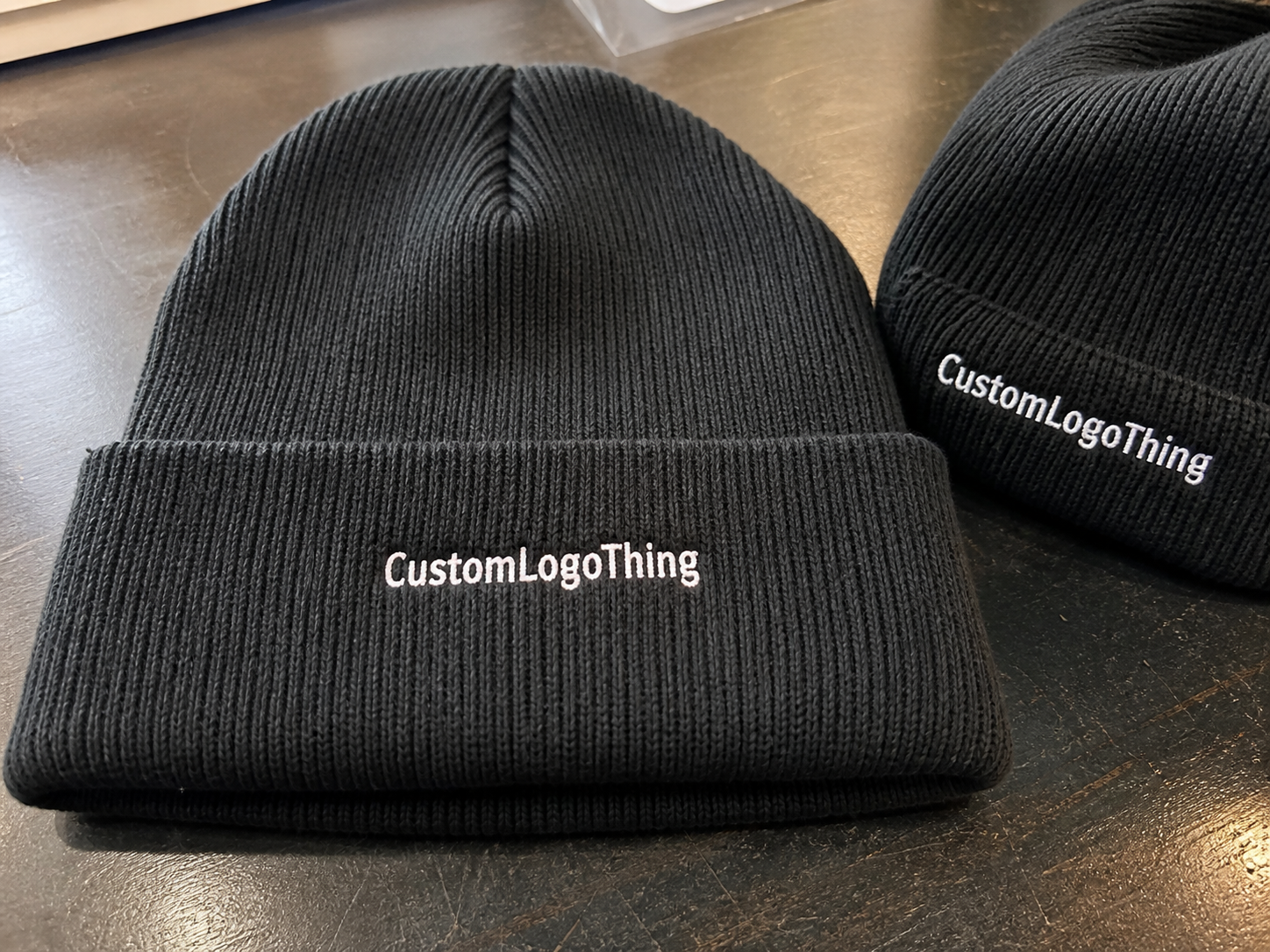
Three placement zones matter most: the cuff, the body, and the side. The cuff is usually the strongest option because it offers the cleanest visual field and gives the logo a natural focal point. The body works when the logo is large enough to survive the rib texture, but the decoration has to fight more visual movement. The side is better for small marks, icons, or secondary branding when the front already has a seam, patch, or fold pattern that would interfere with center placement.
For most orders, the cuff gives the best balance of visibility and control. It also gives production teams a consistent measurement point. On a ribbed hat, that consistency matters more than people expect. A quarter inch can change the appearance enough to trigger a remake discussion later, and no one wants that after dozens or hundreds of units are already in motion.
The tradeoff is simple. Small logos stay cleaner on ribbed knit, but oversized artwork can buckle across the ribs and look blunt or cheap. A 3-inch mark may sound reasonable in a spreadsheet. On a hat with strong stretch, the same mark can flatten the texture and pull the eye toward every small distortion in the stitching or patch edge.
If the logo only works in the mockup, the placement still needs work.
That is why a good ribbed winter Hats Logo Placement guide is really a guide to visual stability. The goal is not simply “front and center.” The goal is a placement that still looks deliberate when the beanie is folded, worn, photographed, and stretched beyond its flat sample state.
How Ribbed Knit Changes Logo Size, Stretch, and Visibility
Rib channels break up artwork. Thin letters can disappear between ridges, small icons can pick up texture noise, and delicate linework can look harsher than expected. Fonts with narrow counters or serifs are the first to suffer. Even a logo that seems modest on a vector file can turn noisy once it is stitched onto a textured surface.
Because of that, logo size should be judged by the widest legible area at full stretch, not just the flat measurement. A logo that looks good at 2.25 inches wide on a table may need to move to 2.5 or 2.75 inches on the real hat if the cuff stretches in wear. Push the artwork too wide, though, and the knit can look compressed. That is the awkward middle zone buyers usually underestimate.
Decoration method changes the answer too. A clean logo at one size in embroidery may need a different treatment in patch form. Here is the practical breakdown.
| Method | Best For | Typical MOQ | Typical Added Cost per Unit | Buyer Takeaway |
|---|---|---|---|---|
| Embroidery | Simple logos, bold text, lower-cost runs | 48-100 pieces | $0.85-$2.25 | Reliable and common, but fine details can close up on ribbed knit. |
| Woven patch | Small logos with tighter detail | 100-300 pieces | $1.10-$2.80 | Better detail retention than direct stitch on a textured surface. |
| PVC patch | Bold branding, outdoor styles, heavier visual presence | 100-300 pieces | $1.40-$3.50 | Highly visible, but it changes the feel and tone of the hat quickly. |
| Sewn label | Minimal marks, soft hand-feel, understated branding | 50-200 pieces | $0.35-$1.00 | Good for restraint, not for tiny text or intricate detail. |
Embroidery is usually the most economical option for simple graphics, but it is not a cure-all. Thread density can fill in fine text, and stitch direction can exaggerate the rib texture underneath. Woven patches preserve detail better when the artwork is compact. PVC gives the strongest contrast and often the strongest perceived value, but it also shifts the beanie toward a more technical or utility-driven look.
If the logo includes more than three thread colors, narrow lettering, or exact linework, the safest move is to ask for a sample on the actual hat spec before bulk approval. A polished mockup can hide problems that show up immediately in production. The sample cannot.
Cost, Pricing, and MOQ Factors That Change Your Unit Cost
The price of ribbed beanie orders usually comes down to five variables: decoration method, stitch count, patch type, thread colors, and digitizing. That is where the quote moves. Outer packaging, freight, and special folding instructions can matter too, but the core number is usually driven by decoration complexity and order quantity.
Embroidery often includes a one-time digitizing fee, commonly around $25-$75 for a simple logo, with higher costs if the artwork needs cleanup or rework. A small front logo with modest stitch density stays efficient. Add more density, tiny text, gradients translated into layered stitch effects, or extra color changes, and the machine time rises. The price follows. That is not a mark-up mystery. It is production time.
Quantity changes the math fast. A 50-piece order absorbs setup costs poorly, so the unit price feels high. A 500-piece order spreads those same setup expenses across more hats and usually looks much better on paper. If the order is for retail or a staged event rollout, ask for pricing at two or three volume tiers. The difference between tiers can tell you more than the headline price ever will.
MOQ also shifts with the decoration method and the color requirements. Stock hat colors are easier because they already exist in the supply chain. Custom-dyed yarn, special patch materials, or unusual thread colors can raise the minimum or stretch the timeline. If speed matters, ask what is already available before locking the art. The exact shade you want might be workable; it may also be the reason the schedule slips.
A line-item quote is the cleanest way to compare vendors. Separate the sample cost, setup or digitizing, per-piece decoration, and freight. Two quotes can appear close until one hides setup in the unit price and the other exposes it upfront. That is where buyers get misled.
- Sample cost: Usually $15-$60 for a physical placement proof.
- Setup or digitizing: Commonly $25-$75 for embroidery, more for complex patch tooling.
- Per-piece decoration: Often $0.35-$3.50 depending on method and art complexity.
- Freight: Can move from a few dollars per carton to much more on rushed orders.
If the order includes retail-ready packaging, it helps to ask how the cartons are packed and whether the outer shipping plan follows basic transit-test thinking such as ISTA guidance. If recycled paper claims matter, FSC certification may be worth requesting for hang tags or inserts. Neither one fixes a bad placement decision, but both help reduce avoidable problems elsewhere in the order.
Process and Turnaround: From Artwork File to Approved Sample
The cleanest production flow is usually the least glamorous. First, confirm the hat spec: rib count, cuff height, yarn weight, and color. Then send vector artwork, not a screenshot or a low-resolution mockup exported from a sales deck. After that comes a placement proof, then sample approval, then bulk production.
The biggest mistake is using a smooth-beanie mockup for a ribbed hat order. That shortcut can make the logo look centered, but it does not show the seam, rib texture, or the way the cuff actually folds. A good proof should reflect the real knit structure. Otherwise, the final product can feel slightly compressed or off-balance even when the artwork itself is fine.
Typical timelines are fairly predictable. Artwork cleanup may take one to two business days. A placement proof often takes two to five business days. A physical sample, if required, can add another three to seven business days. Bulk production usually runs about 10-15 business days after approval, with shipping added on top. Claims of much faster turnaround deserve scrutiny unless the supplier already has the exact hat style, color, and decoration method in stock.
Packaging can affect timing too. Retail inserts, folded presentation styles, or carton labeling instructions add handling steps. That is normal. What is not normal is discovering those requirements after sample approval, when the order is already queued for production. Ask early. It saves rework.
One useful quality check is to request exact proof dimensions in inches or centimeters and make sure the image shows seam position and cuff fold clearly. If those markers are vague, the proof is not a production instruction yet. It is just a concept.
Step-by-Step Placement Checklist for a Cleaner First Proof
Before approving placement, work through the hat as a finished product rather than a flat shape. The usable area is smaller than the full panel looks on a table, and the logo has to sit inside that smaller zone without fighting the knit.
- Measure the usable front area on the actual hat, not the full flat body.
- Mark the seam, fold line, and center point before deciding the logo position.
- Test the logo at two or three widths so readability can be compared at full stretch.
- Review the artwork from three feet away, since that is closer to real retail viewing distance.
- Confirm whether the cuff will be worn folded or relaxed; the visual center changes with the fold.
- Ask for dimensions and placement notes in writing before the proof is approved.
That last step matters more than it sounds. A nice-looking image is not enough. Production teams need instructions that can be repeated on the factory floor. If the dimensions are missing, the approval is too loose and the risk moves downstream to the bulk run.
The best placement is the one that still looks correct after normal wear, not the one that only looks balanced flat on a table.
For many ribbed hats, center-front on the cuff is the cleanest choice. Side placement can work when the front seam or rib pattern makes center position feel crowded. Body placement is reasonable for larger logos, but only if the artwork still reads clearly once the knit stretches. A strong ribbed Winter Hats Logo Placement guide treats the beanie as a moving object, not a static panel.
Common Mistakes That Make Ribbed Beanies Look Off
Tiny text is the most common failure. Rib texture can swallow it. Fonts with thin strokes, condensed spacing, or intricate punctuation are especially vulnerable once stitched. Even a clean vector logo can turn muddy if the stitch density is too high or the logo is too small for the knit.
Another frequent problem is a “centered” logo that only looks centered before wear. Once the beanie is stretched over a head, the visual center can shift slightly. That subtle drift is enough to make an otherwise solid product feel unbalanced. Placement on ribbed knit needs to allow for motion.
Dark-on-dark branding creates a different issue. A black logo on charcoal rib knit may be tasteful, but it will also disappear at a distance. That may be acceptable for quiet branding. If the goal is clear visibility in retail or event photos, contrast matters more than subtlety.
Oversized artwork causes trouble of its own. Big logos can flatten the knit, pull at the surface, and make the beanie feel heavier. Buyers often ask for more width because they want more visibility. What they usually get is more distortion. The hat starts doing the wrong kind of work.
There are also small production details that get ignored until the shipment arrives: cuff flips, seam drift, and wear variation from hair volume. A bulky ponytail, thick hair, or a deep cuff fold can change where the front reads on the head. No placement can account for every hairstyle, but a forgiving one can still look right in normal use.
Expert Tips and Next Steps for a Better Production Brief
The easiest way to improve a first proof is to decide the decoration method before arguing about logo size. People often try to solve all three variables at once. That is how the revision loop starts, and it usually ends with a sample that looks like a compromise instead of a decision.
Send three things together: vector artwork, brand colors, and a photo or spec sheet of the exact hat style. That gives the factory enough context to build a sensible placement proof. If you already know the target quantity, include that too. MOQ affects which decoration methods are realistic, and the numbers matter before artwork is finalized.
Ask for a production mockup with exact dimensions and a clear sign-off point before anything is stitched, molded, or sewn. Basic? Yes. But basic process control is what keeps the order from drifting. Most placement problems are not design disasters. They are communication problems that were never corrected early.
For buyers comparing options, the decision usually falls into a few practical lanes:
- Simple logo: Embroidery usually wins on speed and budget.
- Detailed small logo: Woven patch usually holds detail better than direct stitch.
- Bold outdoor look: PVC patch fits, provided the brand wants a firmer, heavier feel.
- Soft hand-feel: Sewn label keeps the branding subtle and wearable.
There is a practical endpoint for every order: pick the hat spec, choose the placement zone, approve a measured proof, and confirm the timeline before production starts. Do that and most of the usual problems stay out of the shipment. That is the real value of a focused ribbed winter hats logo placement guide. It keeps the logo legible, the placement repeatable, and the finished hat from looking like an afterthought.
Where should a logo go on ribbed winter hats?
Center-front on the cuff is usually the safest choice because it reads quickly and stays visible on most wearers. Side placement can work when the seam or rib pattern makes the center area feel crowded. Always measure the fold line and seam on the actual hat before approving the final position.
What logo size works best for ribbed winter hats logo placement?
Start smaller than you would on a smooth knit because the rib texture reduces clarity fast. Judge the logo by the widest readable width at full stretch, not by the maximum printable area. Keep tiny text and very fine details to a minimum if readability matters.
Is embroidery or a patch better for ribbed winter hats?
Embroidery is usually the better budget option for simple logos and larger text. Patches handle texture more easily and often preserve detail better when the artwork is small or complex. The right choice depends on the logo, quantity, and the hand-feel you want.
How much does ribbed winter hat logo placement usually cost?
Cost depends on decoration method, stitch count, patch type, and quantity. Setup fees, sampling, and freight can matter as much as the per-piece decoration charge at low volumes. Ask for a line-item quote so you can compare the true landed cost.
How long does production take for ribbed winter hats with logos?
Simple embroidery usually moves faster than custom patch development. Proofing and sample approval often set the pace, especially if the first placement needs revision. Build in time for artwork cleanup, proofing, production, and shipping before confirming a delivery date.