On heavyweight Winter Hats Logo Placement, the first thing that surprises new buyers is how much the hat changes once it is on a head. A proof can look centered and balanced on screen, then drift half an inch when the cuff folds, the knit relaxes, and the beanie sits at a real angle. That small shift can change visibility, comfort, and whether the mark reads as deliberate or crowded.
Heavier yarn gives the logo more to compete with. The fabric has more loft, more texture, and more visual weight than a lightweight acrylic cap, so placement has to earn its space. On dense knit headwear, the logo is not just decoration. It is a production decision that affects stitchability, reorder consistency, shelf presentation, and how the hat photographs in a catalog or ecommerce grid.
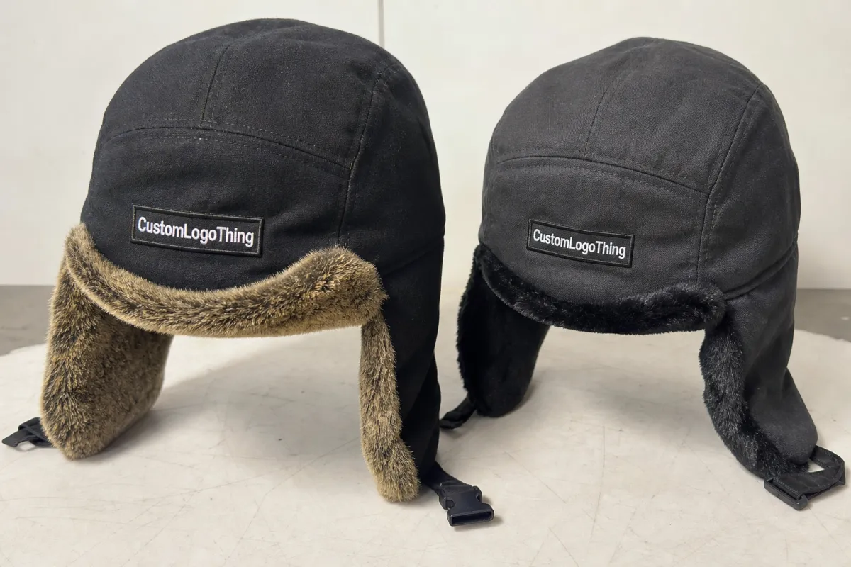
Material also matters. A thick 7- or 9-gauge acrylic beanie behaves differently from a wool blend or fleece-lined style. Acrylic tends to hold shape predictably and is common in promotional programs because it is affordable and easy to repeat. Wool blends bring a warmer hand-feel but can tighten more around seams and folds. Fleece lining changes how the cuff lies against the head, which affects where the logo actually lands in use. A spec that ignores those differences is usually too vague to quote well.
What Heavyweight Winter Hats Logo Placement Actually Changes
On a thick knit, the logo sits on a moving surface. The cuff can fold differently from piece to piece, the crown can stretch after wear, and dense stitch fields can pull the fabric tighter than the surrounding knit. That is why heavyweight winter Hats Logo Placement should never be approved from a flat digital mockup alone.
The placement zone also changes the message. A centered front cuff mark feels direct and familiar. An offset logo reads more fashion-led and can soften the look of a bulky beanie. A side-panel mark is quieter, useful when the body yarn already has a lot of texture or when the brand wants the hat to feel more retail than promotional. Crown placement stands out, but it is less forgiving because shaping lines can distort small artwork.
- Front cuff center: the clearest choice for visibility and reorder consistency.
- Offset cuff: useful for a modern look or asymmetrical graphics.
- Side panel: works well for secondary branding or smaller marks.
- Crown: visually interesting, but harder to keep clean on thick knits.
In practice, the strongest choice depends on how the wearer uses the hat. A cuffed beanie pulled low on the forehead needs more clearance than one worn loosely. A promotional hat handed out in bulk needs different treatment than a premium retail piece that will be photographed from multiple angles. If the hat will be packed flat, folded into a mailer, and reordered in the same colors later, consistency matters as much as style.
The safest habit is to measure placement on the actual hat style, not on a generic silhouette. A two-inch cuff on one beanie is not the same as a two-inch cuff on another; knit density, crown height, and stretch all alter the visible zone. Buyers who skip that step often discover the logo has been placed exactly where the fold edge lives.
A flat proof is a starting point, not a verdict. On heavy knit headwear, the real test is how the decoration sits once the cuff folds and the fabric settles.
How Decoration Methods Behave on Thick Beanies
Embroidery, woven patches, faux leather patches, and appliques all behave differently on dense knit fabric. On a heavyweight cuffed beanie, embroidery usually gives the most integrated look, but it also demands the most respect for stitch count, thread tension, and stabilizer support. Dense fills can flatten the knit, and tiny lettering can close in if the artwork is too fine.
That last point matters more than most buyers expect. A logo that looks crisp in vector form can still fail once it is reduced to a 2.5-inch-wide embroidery field. Small counters inside letters, hairline outlines, and fine internal details are the first things to disappear. On thick beanies, the decoration needs to survive distance, texture, and movement. If it only looks good in a close-up render, it is not ready yet.
Patches are often easier to read on textured yarn because they create a clean visual island above the knit surface. A woven patch can hold detail well and keep small type legible. Faux leather creates stronger contrast and a more premium hand-feel, though it changes the tone of the product immediately. Appliques and felt-style treatments can work too, but they need enough edge space to stay neat and should be tested against the actual cuff height before approving a full order.
Seams and fold lines deserve attention. A decoration sitting too close to a seam can lift unevenly or feel awkward against the forehead. A mark that crosses a thick transition area can twist once the cuff is folded. On heavyweight beanies, the safest approach is to map the exact wear zone on the exact style, then set the decoration area around that zone rather than forcing the logo to fit a generic placement.
There is also a practical limit to detail. For embroidery, text below roughly 4 to 5 mm in cap-height becomes risky on bulky knit because the thread has nowhere to land cleanly. Patch decoration tolerates finer detail, but it introduces another question: will the edge finish hold up after repeated wear and packing? On a retail program, that answer matters as much as how the hat looks on day one.
Thicker materials need more discipline at the machine. A dense acrylic or wool-blend body often requires firmer backing, careful hooping, and a slower sew-out to keep the logo from distorting. If the run is large, the sample should be checked for puckering, edge lift, and any thread sink that hides the design into the yarn.
Placement Factors That Change Cost, Pricing, and Quote Accuracy
Heavyweight Winter Hats logo placement affects price more than many buyers expect. Not because placement is mysterious, but because placement determines logo size, stitch count, the number of decoration locations, and whether the factory needs extra handling to keep the mark centered. The tighter the spec, the easier it is to quote accurately.
For bulk orders, decoration often adds somewhere around $0.35-$1.80 per unit depending on method, coverage, and run size. A simple front embroidery sits near the low end. A patch with extra application steps, or a two-location design that needs more alignment, moves upward quickly. Digitizing is usually a one-time charge, commonly around $35-$85 for a straightforward logo, though complex art with multiple color changes or tiny details can cost more.
| Decoration option | Typical added cost at 5,000 pcs | Best fit | Main caution |
|---|---|---|---|
| Simple embroidery | $0.35-$0.75 | Bold logos with limited detail | Too much detail can fill in on thick knit |
| Woven patch | $0.45-$0.95 | Sharp edges and small type | Needs extra application labor |
| Faux leather patch | $0.55-$1.20 | Retail-style branding and strong contrast | Surface texture changes the final look |
| Two-location decoration | $0.90-$1.80 | Retail programs or premium merch | Higher setup and more alignment risk |
MOQ matters too. A run of 300 pieces carries a much heavier setup burden per unit than a run of 5,000. That is one reason clear placement dimensions matter. If one quote assumes a 3-inch-wide logo and another assumes 4.5 inches, those numbers are not truly comparable. They are different products.
Quote accuracy improves when the order includes the details production actually needs:
- Logo width in inches or millimeters
- Exact cuff zone or side-panel position
- Decoration method and thread or patch colors
- Whether the logo is single-color or multicolor
- Any extra locations, labels, or inserts
That kind of information reduces revision risk and helps the decoration team estimate machine time, labor, and material use. It also shortens the proofing loop because there is less guesswork in the first mockup.
Material specification belongs in the quote, too. A 100% acrylic beanie, a wool-acrylic blend, and a fleece-lined style do not absorb decoration in the same way. The same logo width can feel perfect on one and crowded on another. If the hat body is exceptionally chunky, the logo may need to be a little wider to stay readable at a distance, but not so wide that it crosses into the fold edge.
Seasonal timing affects cost as well. Once the calendar moves into cold-weather retail deadlines, production windows tighten and blank inventory can become uneven. Prices may hold steady on paper, but lead times stretch. Buyers who need hats for a launch date should build a buffer before sampling begins.
Production Steps and Lead Time for a Clean Hat Program
A clean hat program usually moves through the same basic stages: artwork intake, file review, digitizing, proofing, sample approval, decoration, finishing, inspection, and shipment. The sequence sounds simple, but the delays usually appear in the handoff between steps, not in the sewing itself. A buyer who confirms logo width and placement early can often save several days.
Heavyweight winter Hats Logo Placement deserves a real-fabric sample whenever the order size or brand risk is high. A digital mockup can show proportion, but it will not show how the knit texture compresses under stitching or how a patch sits on a thick cuff. Even a single pre-production sample can prevent a full-carton problem later.
Lead time is shaped by more than the factory calendar. Artwork approval, thread color decisions, and placement changes can add friction fast. On many bulk programs, a straightforward decorated beanie run moves in about 12-18 business days after proof approval, while blank-stock decoration with simple embroidery can sometimes be faster. If a sample is required, adding 3-5 business days is a realistic expectation. Holiday demand, yarn availability, and carton quantity can extend that further.
The best sample review is not a quick glance at the front of the hat. Check the logo from multiple angles, then fold the cuff the way it will actually be worn. Look at the piece under bright light and again under warehouse or office light. Thread tension, patch edge lift, and spacing around the seam can look very different once the hat is handled.
There is also a packaging angle. If the hats will ship in retail-ready cartons or e-commerce mailers, many teams refer to established transit checks such as ISTA test methods for drop and vibration performance. That does not dictate logo placement, but it does influence how the hats are folded, packed, and protected so the decoration arrives in good condition.
For programs that include hang tags, belly bands, or paper inserts, sustainable stock choices can be part of the spec as well. If the project needs printed packaging, a paper source with FSC certification can help keep the material side of the order cleaner from a procurement standpoint.
Before production starts, the cleaner the proof set, the fewer surprises later. The proof should show the decoration on the actual hat color, the exact placement from the fold line, and any color substitutions if thread or patch stock changes. A note buried in email is easy to miss. A note on the approved proof is harder to ignore.
Common Placement Mistakes That Make Heavy Beanies Look Off
The most common mistake is placing the logo too close to the cuff edge. On paper, it may look centered. On the head, the brim folds down and the mark disappears or lands awkwardly near the wear line. That one issue alone can spoil an otherwise well-made beanie.
Another problem is artwork that is too fine for the fabric. Thin lettering, tiny outlines, and busy details can blur once they meet the density of heavyweight knit construction. A mark that looks crisp at 300 dpi on a monitor may not survive after thread takes over the shape. If the logo cannot be simplified, moving it into a woven patch or faux leather patch is often the smarter move.
Seam placement matters just as much. Thick hats flex differently at the crown than at the cuff, and a logo sitting over a shaping seam can tilt or ripple. That does not always ruin the piece, but it can make the hat feel less polished. On premium programs, that small unevenness is exactly the kind of detail buyers notice in the sample and ignore in the mockup.
Color contrast gets overlooked more than it should. Dark charcoal on black can disappear from several feet away. Navy thread on deep heather can do the same. On bulky yarn, the eye needs more contrast than it would on a smooth jersey surface, so the placement should be judged from a normal viewing distance rather than from a close-up desk check.
Scale is another trap. A logo that is technically within the decoration zone can still look undersized if the cuff is tall and the body knit is heavy. The opposite can happen on a shorter cuff, where a logo that was approved at 4 inches suddenly crowds the visible area. The same artwork needs different treatment on different hat bodies.
If the placement only looks good in a close-up render, it probably is not ready for bulk production.
Flat mockups are useful, but they can be misleading. Heavier hats often have more loft, more stretch, and a different cuff height than the proof suggests. Some wool blends settle after finishing. Some acrylics relax after handling. That is why the sample or detailed placement guide should always win over a generic artwork file.
Expert Tips for a Cleaner, More Durable Finish
Simple logos usually perform best. Bold lettering, clean icons, and well-spaced shapes hold their line on thick knit fabric far better than delicate artwork. A heavyweight beanie rewards restraint. The decoration should look like it belongs to the hat, not like it was squeezed in at the last second.
One practical habit is to measure from the fold line, not just from the raw crown. That keeps reorders consistent, because the visible cuff zone is what the customer actually sees. If the cuff height changes from style to style, the placement should change with it. The same logo height can look excellent on one hat and wrong on another.
Another useful move is to approve the exact beanie style before repeating the design across colorways. If the black, gray, and red versions all carry the same width and placement, the brand stays clean across the range. If the body colors shift, the thread or patch color may need adjustment so the logo does not sink into the surface.
For buyers comparing decoration methods, a simple rule helps:
- Choose embroidery for bold, integrated branding.
- Choose a woven patch for sharper small details.
- Choose a faux leather patch for a stronger retail look.
- Simplify the logo if none of the above can handle the detail cleanly.
There are a few quality-control checks worth adding to every spec. Confirm that the logo is centered relative to the visible cuff, not just the raw garment. Check that the stitch density does not distort the knit. Inspect the back of the decoration for excessive backing, glue seep-through, or hard edges that could irritate the wearer. If the hat will be worn in cold weather for long periods, comfort matters almost as much as appearance.
Keeping one approved spec sheet for every reorder is still one of the best ways to prevent drift between production runs. That sheet should include placement distance, logo width, decoration method, thread colors, and approved sample notes. Reorders usually go wrong when the original proof is buried in someone’s inbox and the next order is built from memory.
For teams that want to keep the process tighter, a good spec sheet also records the acceptable tolerance. A placement that can vary by 1/8 inch may be fine on a soft promotional beanie but too loose for a retail program where the brand mark needs to sit exactly above the cuff seam. That tolerance should be stated before production starts, not after the first carton is packed.
Packaging teams do this all the time with carton specs, and the same discipline helps with headwear. Once the measurements, method, and sample notes are locked, the next run becomes a repeatable product instead of a fresh negotiation.
Next Steps for a Placement-Ready Spec Sheet
Start with the hat itself. Define whether the style is cuffed, slouchy, fleece-lined, or double-layer, because the wear position changes the usable decoration zone. Then decide where the logo should live: front center, offset, or side panel. Do not leave that choice buried in email notes; put it on the proof.
Next, lock the method and the dimensions. If the logo needs to stay under 3 inches wide to keep the stitch count reasonable, say so. If a woven patch is the better fit because the art includes fine detail, make that decision early. Heavyweight winter hats logo placement becomes easier to price, sample, and repeat once the decoration method is fixed.
A good quote request should include:
- Hat style and cuff height
- Placement zone and logo width
- Decoration method, colors, and quantity
- Sample requirement and approval steps
- Expected carton or polybag packout
Then confirm MOQ, turnaround, and any setup charges before approving the order. A run that needs a sample, a second proof, or a placement revision will not move on the same timeline as a straightforward reorder. That is normal. The goal is not to force a fast schedule; the goal is to make the schedule honest.
Save the approved spec sheet, too. Reorders are where brands lose consistency if the placement is only living in a thread or an inbox. The cleaner the record, the better the next production run will match the first one.
One last practical check: ask whether the production partner is measuring from the same reference point every time. Some teams measure from the top of the cuff, others from the fold edge, and a few from the seam intersection. If that reference point changes, the logo can drift even when the artwork itself never changes. It is a small detail, but it is the sort of thing that separates a clean program from a messy one.
Frequently Asked Questions
How high should heavyweight winter hats logo placement sit on a cuffed beanie?
Keep the logo inside the visible cuff area with enough clearance above the fold edge that it still reads cleanly when worn. The exact height depends on the cuff depth of the specific style, and even a small fold difference can move the logo closer to the edge than expected. If the hat is usually worn slouchy, move the mark slightly higher so it stays visible in real use.
Is embroidery or a patch better for heavyweight winter hats logo placement?
Embroidery is usually the better fit for simple, bold logos that need a soft, integrated look on the knit. Patches are often stronger for small details, sharp edges, or artwork that would not stitch cleanly into thick yarn. The right choice depends on visibility, hand-feel, and how much texture you want the logo to have against the beanie surface.
Does logo placement change the cost on heavyweight winter hats?
Yes. Larger logos, multiple decoration locations, and more complex positions add setup time and machine labor. A patch may reduce stitch count, but it can add material and application cost, so the total unit price can still move upward. Clear placement instructions help keep the quote stable and reduce the chance of a revised price after proofing.
What files should I send for winter hat logo placement proofing?
Send vector art whenever possible so the decoration team can scale the logo cleanly and simplify small details if needed. Include the preferred logo width, thread or patch color targets, and a note showing exactly where the logo should sit on the beanie. If you have one, share a reference photo or sketch with the fold line and placement mark so the proof matches your intent.
What should I approve before production starts on heavyweight winter hats?
Approve the placement dimensions, decoration method, logo colors, and hat color before the order moves into production. Confirm MOQ, sample needs, and turnaround so the schedule matches the order size and any revision time. If possible, review a sample or detailed proof on the actual hat style to catch placement issues before the full run begins.
If you treat heavyweight winter hats logo placement as both a design choice and a production spec, the order gets easier to quote, easier to decorate, and easier to reorder. The practical payoff is simple: a hat that looks right on the cuff, survives bulk production, and stays consistent when the next run comes back around.


