Skincare packaging lives and dies on small details, which is why a practical skincare brands recycled poly Mailers Print Proof Checklist is not just an internal approval form. A proof can look clean on a screen and still print dull, stretched, too warm, or muddy on recycled film. That gap is where launch delays, color complaints, and expensive reorders usually begin.
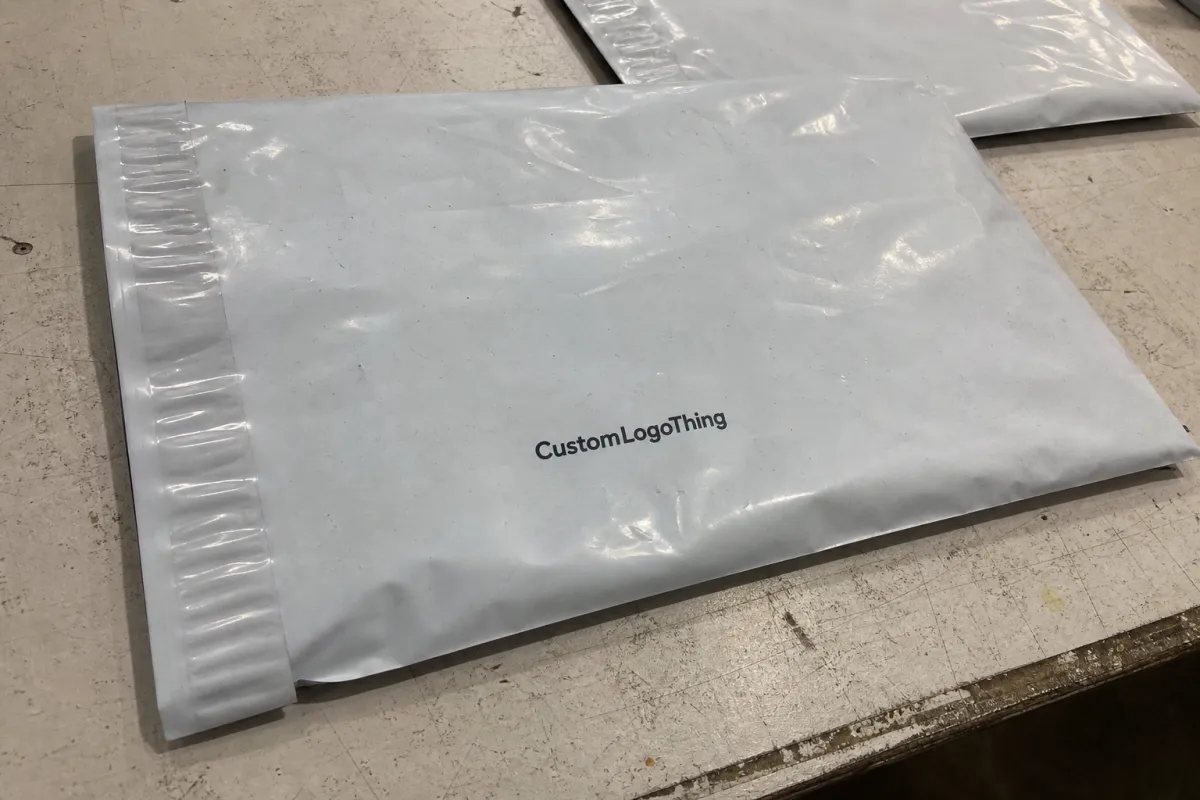
Skincare brands tend to put more pressure on a mailer than the mailer quietly wants to carry. The palette is often soft, the typography is compact, the logo may rely on thin strokes, and the overall effect depends on restraint rather than heavy graphics. That kind of design can work beautifully on a carton or label, then lose its balance on flexible plastic if the proof review is treated as a quick glance instead of a production check.
The goal is not to make the proofing process dramatic. It is to make it specific. A good proof review confirms what the file says, what the material can realistically hold, where the print can shift, and which details need to be corrected before the order moves into production.
Why Recycled Poly Proofs Fail on Skincare Mailers
Recycled Poly Mailers are less forgiving than many buyers expect. The film can vary from run to run, and recycled content may affect opacity, gloss level, surface smoothness, and ink behavior. Those differences matter most on the colors skincare brands tend to love: muted sage, pale pink, warm beige, clay, cream, lavender, gray-green, and other tones that show a small shift quickly.
On a calibrated design screen, your brand color might look balanced and polished. On recycled film, the same art can read flatter because the substrate reflects light differently and may not give the ink the same bright base that a white paper stock would. If the design also uses a fine logo stroke, a small ingredient-style line, or a low-contrast tagline, the proof may reveal that the artwork was designed for a mockup rather than a moving, flexible bag.
The checklist protects more than aesthetics. It protects the calendar. A proof correction is inconvenient; a finished run of mailers with unreadable back-panel text or a logo that feels off-brand is a far more expensive problem.
Two traits make skincare mailers especially sensitive:
- Soft color palettes expose changes in CMYK builds, spot-color matching, and white underbase strength.
- Small typography becomes risky on glossy or semi-gloss flexible stock, especially near folds and seals.
Experienced buyers rarely approve with a simple “looks good.” They check placement, copy accuracy, seal clearance, fold behavior, barcode position, and whether the proof gives a believable sense of how the recycled film will behave. If those questions are skipped, the first physical production run becomes the proof, and that is a poor place to discover that a delicate border crawls into the heat-seal area or that a barcode sits too close to a seam.
It also helps to separate brand preference from production reality. A mailer can be recyclable or made with recycled content and still have practical limits around print opacity, heavy ink coverage, and fine detail. Those limits do not make the material wrong; they simply need to be reflected in the proof review before the order is approved.
If you are still narrowing packaging options, compare finishes and formats in the broader range of Custom Packaging Products and the mailer-specific options in Custom Poly Mailers. Seeing the available structures first makes the proof conversation less abstract and helps prevent artwork from being designed for a format you are not actually buying.
How Print Proofs Translate to Real Mailer Output
Not every proof carries the same weight. A digital proof usually confirms layout, spelling, barcode placement, dieline alignment, and general color intent on a screen or PDF. A contract proof is held to a tighter approval standard and may be tied more directly to the final production specification. A production-style sample goes further by showing the printed result on material that is much closer to, or the same as, the final mailer film.
Those proof types answer different questions. A digital proof asks, “Was the artwork built correctly?” A physical or production-style sample asks, “Does this design actually work on this substrate?” Both questions matter, but they should not be confused.
A strong skincare Brands Recycled Poly Mailers print proof checklist should divide those checks cleanly. Use the digital proof to verify the file and the sample, if ordered, to evaluate the print result. The core digital proof review should include:
- Exact copy, spelling, punctuation, claims, and legal lines
- Logo placement, orientation, margins, and panel balance
- Barcode position and readable size
- Seal clearance, adhesive-strip space, and heat-seal margins
- Wraparound alignment for designs that cross the front, back, or side folds
- Bleed beyond trim and safe areas inside trim
- Any edge graphics, borders, or pattern work near folds or cut lines
Just as important, the proof should state what it cannot guarantee. A PDF cannot perfectly simulate recycled-film texture. A screen proof cannot predict how a cream tone will look under warehouse lighting, in a customer’s bathroom, or beside a glossy product carton. It also cannot fully account for handling after converting, folding, packing, shipping, and storage.
That limitation is not a flaw in the proof; it is a reason to choose the right proof for the risk. A reorder with locked artwork and a stable production history may not need a new physical sample every time. A first launch, seasonal kit, influencer send-out, or retail-facing mailer with a color-critical identity deserves more scrutiny.
There is also a tolerance conversation that buyers sometimes avoid because it feels too technical. Flexible packaging printing has allowable movement. Ink can sit slightly differently from batch to batch. Film can stretch. A supplier should be able to explain realistic tolerances for placement and color before the job is approved. If the design cannot survive normal production movement, the design needs adjustment, not wishful thinking.
For reference standards, packaging expectations are not invented from scratch on each order. Organizations such as ISTA publish transport-testing guidance, and the EPA provides broader material and environmental information that can help frame packaging decisions. A poly mailer proof is still a commercial print approval, but material and shipping context should inform how strict the review needs to be.
Material, Ink, and Artwork Factors That Change the Result
Three things do most of the damage: the recycled resin mix, the ink system, and the artwork itself. If one is poorly matched to the other two, a proof may look acceptable while the finished mailer lands a little muddy, too flat, or visually crowded.
Film thickness matters more than buyers often expect. A lighter bag can feel thin in the hand and may show more distortion near the seal or during converting. A thicker bag usually feels more substantial and may print more consistently, but it increases material use and can move the quote upward. Many skincare mailer programs sit around 2.5 mil to 3.5 mil, though some orders go higher when puncture resistance, opacity, or a more premium feel is required.
The recycled-content percentage should be discussed early. A higher recycled-content target may support a brand’s packaging goals, but it can narrow material availability and alter the appearance of the film. Buyers should ask whether the film is post-consumer recycled, post-industrial recycled, or a blend, and whether that content affects opacity, color consistency, or lead time. Those answers belong in the quoting and proofing stage, not after the art has been approved.
Ink choice matters as well. Digital printing is often practical for short runs, versioned artwork, and faster revision cycles. Flexographic printing can be more efficient at scale, particularly for stable artwork and repeat orders. Offset printing is not the typical route for flexible poly mailers, although buyers sometimes ask about it because they compare print methods across cartons, inserts, and labels. For poly film, the relevant questions are usually white ink coverage, CMYK control, ink adhesion, cure, and scuff resistance.
White ink deserves special attention. On clear, tinted, or less opaque recycled film, a white underbase can help colors hold their brightness. A full underbase may make the design look cleaner, but it can also affect cost and print feel. A selective underbase may be enough for logos and key art while leaving some areas lighter or more transparent. The proof should make clear which approach is being used.
Artwork is where brands get surprised. Thin lines can break up. Tiny serif type can fill in or blur. Low-contrast logos can disappear into the film. Pastel gradients can band, especially when they rely on very subtle tonal steps. If the design depends on quiet luxury, the checklist should force a sober look at whether the art is friendly to plastic printing or only attractive in a rendered mockup.
Pay close attention to folds, gussets, seals, and adhesive-strip zones. Anything placed too near those areas risks distortion, partial loss, or an awkward visual break. That includes decorative borders, return instructions, QR codes, recycling marks, subscription messaging, and compliance lines. A barcode that scans perfectly in a PDF can become unreliable if it prints with weak black density or sits where the bag curves or seams.
| Feature | Lower Risk | Higher Risk |
|---|---|---|
| Color style | Bold logos, strong contrast, limited palette | Pastels, gradients, low-contrast line art |
| Type size | Clean sans-serif type at readable sizes | Ultra-fine type, condensed legal copy, tiny serif details |
| Print method | Digital printing for smaller runs and versioned art | Complex multi-color jobs with frequent late revisions |
| Ink behavior | Solid color blocks with clear edges | Heavy CMYK blends over variable recycled film |
| Panel layout | Key information kept away from seams and seals | Borders, codes, or copy tight to folds and adhesive zones |
Finish changes can alter the result too. Matte finishes often feel calmer and more refined, which suits many skincare brands, but they can reduce perceived brightness. Gloss can make color feel deeper and more polished, though it may show scuffs and reflections more clearly. A finish should not be switched late without rechecking contrast and legibility on the actual material.
Production Process, Timeline, and Proof Turnaround
A clean proof cycle begins before the proof file arrives. First, the printer reviews the files. Then the dieline, bleed, safe area, color callouts, barcode, and technical notes are checked. After that, the proof is generated, reviewed, revised if necessary, and approved. Only after approval should the order move into printing, converting, packing, and shipment.
That sequence is simple. It still gets rushed.
For planning, a realistic schedule often looks like this:
- File review: 1-2 business days if artwork is complete and the dieline is correct
- Digital proof: 1-3 business days after file review
- Physical or production-style proof: 5-10 business days, sometimes longer when material or ink setup is limited
- Production: often 12-15 business days after approval, depending on volume, print method, and current capacity
- Transit: variable, and worth quoting as part of the approval schedule rather than treating as an afterthought
The delays are usually predictable. Missing dielines slow the first review. Low-resolution logos need replacement. Vague color instructions such as “match our Instagram” or “make it warmer” create extra back-and-forth. Late copy edits are another common culprit because they may require a new proof even if the change looks small.
The proof checklist helps most when it is tied to a launch calendar. If the mailers support a product drop, replenishment, subscription send, press kit, or retail shipment, build the schedule backward from the ship date and leave room for one real correction cycle. Approving under pressure is how brands end up accepting a mailer that is technically printable but not quite right.
A faster proof is possible when the files are clean. Send layered or editable artwork when requested, outlined fonts when appropriate, high-resolution logos, a locked dieline, clear Pantone or CMYK targets, and a barcode file that has already been generated at the correct size. That is not special treatment; it is simply a complete job moving through production without unnecessary detective work.
One caveat: a rushed physical proof is not always a reliable physical proof. If the final production film is unavailable, or if the sample is produced through a different setup than the full run, the sample can still be useful but should be labeled for what it is. Buyers should ask whether the sample uses final material, final print method, final ink sequence, and final finish.
Cost, Pricing, and MOQ Drivers for Accurate Quotes
Price is where buyers can be misled by a clean-looking number. The lowest quote may omit details that eventually matter: proof fees, setup, revision fees, freight, special ink charges, white underbase, color changes, recycled-content requirements, or a higher minimum order quantity than the brand can comfortably use.
The main cost drivers are straightforward. Bag size, film thickness, print coverage, number of colors, white ink usage, and finish all affect pricing. Recycled-content requirements can also raise the quote because they limit material options and may require more careful sourcing. If two quotes are far apart, ask whether both assume the same print method, film gauge, recycled-content level, artwork coverage, proof type, and delivered freight terms.
Lower MOQ orders usually cost more per unit. Setup has to be spread across fewer pieces, so the unit price rises. For a small skincare launch, that may still be the right decision if the design is untested or the campaign is short. For a repeat mailer used every month, increasing quantity can reduce unit cost enough to matter, provided storage, cash flow, and forecast accuracy support it.
Actual price ranges vary too much by size, quantity, film, print method, and freight to rely on a single per-bag estimate. A small digitally printed run may feel expensive per unit but save money by avoiding plates and excess inventory. A larger flexographic run may reduce the unit cost substantially, but only if the artwork is stable and the brand is confident the inventory will be used before any design or compliance change.
A practical buying frame:
- Short run, several versions: digital printing is often easier to manage and revise.
- Stable artwork, larger volume: flexographic printing may be more efficient after setup.
- Color-critical launch: budget for a physical or production-style proof before full production.
- Strict recycled-content target: confirm material availability and print expectations before artwork is finalized.
| Quote Item | What It Usually Affects | Buyer Tip |
|---|---|---|
| Proof fee | Initial setup, proof generation, and sometimes sample production | Ask whether it is credited back on the production order |
| Revision count | Artwork changes after the first review | Lock copy and claims before requesting the proof |
| White ink | Opacity and color brightness on recycled film | Confirm whether it is full underbase, selective underbase, or white-only art |
| Film thickness | Feel, durability, opacity, and material cost | Compare the same mil thickness across quotes |
| Freight | Total landed cost and delivery timing | Compare delivered cost, not just the production price |
| MOQ | Unit cost and setup efficiency | Check whether a higher MOQ lowers the unit price enough to justify extra inventory |
The cheapest front-end price is rarely the most useful number by itself. The better comparison is total landed cost with proofing, revisions, material specs, packaging, and transit made visible. That is where the checklist earns its keep: it turns a quote from a tempting thumbnail into something close to a real order.
Common Proof Mistakes That Blow Up a Skincare Launch
The first mistake is approving a proof only on a bright screen. That may be acceptable for a simple file check, but it is weak for a recycled poly mailer with soft branding and tight tolerances. Screens vary by brightness, calibration, color profile, and room lighting. A glowing display is not a packaging standard.
Another familiar mistake is ignoring bleed and seal zones. If a border sits too close to the edge, it may shift or trim unevenly. If copy lands in a fold area, it can warp. If the artwork touches the adhesive or heat-seal margin, production may need to move it inward, which can throw off the panel balance more than expected.
Color is the next trap. A brand can provide a Pantone target, but if the file is built in generic CMYK with no tolerance discussion, the proof may look “close” while the finished mailer misses the brand feeling. Skincare palettes are especially vulnerable because calm, clean tones often define the product’s position. A mint that turns a little gray or a beige that prints too yellow can change the impression of the entire pack.
Compliance details cause quieter problems. Recycling marks, country-of-origin notes, suffocation warnings where applicable, returns copy, QR codes, and barcode placement all need room. Crowding them near the edge is risky. Shrinking type until it barely survives the proof is worse. A mailer should not require the customer, fulfillment team, or carrier to guess what the print says.
Another issue is approving a flat proof without thinking about the bag as a formed object. Mailers are folded, sealed, handled, packed, and opened. A centered logo on a flat dieline may not feel centered once the flap is closed. A back-panel message may land awkwardly under the adhesive strip. A wraparound pattern may look charming in layout view and sloppy after conversion if repeat alignment was not considered.
A proof is useful only if it tells you what could go wrong before the press runs. If it only confirms that the PDF opens, the job has not really been checked.
The costliest mistake is rushed approval. It usually produces a mailer that technically matches the proof but does not support the brand well. The run arrives, the team sees the color under real light, and everyone realizes the warning signs were visible earlier. A disciplined review cannot remove every production variable, but it can catch the preventable ones.
What to Send Before You Approve the Proof
Before signing off, send the printer the cleanest version of the job you can assemble. The checklist should begin with the final dieline, editable artwork, logo files, approved copy, color targets, barcode specification, quantity, mailer size, film thickness, recycled-content requirement, finish preference, and required ship date. If you have a reference mailer, label, carton, or printed swatch that should be matched, include that as a physical or clearly photographed reference with realistic expectations.
Make the review side by side. Check the front panel, back panel, flap, seal area, folds, bleed, safe zones, and wraparound graphics in the same pass. If the material spec changed, ask what changed and whether it affects opacity, feel, print brightness, or lead time. A vague approval note does not help much later. A useful approval states what was checked and what remains subject to normal production tolerances.
Confirm these items before approval:
- Timeline: proof approval date, production start, expected completion, and ship window
- Revision limits: how many rounds are included before extra fees or delays apply
- Sign-off owner: who has authority to approve artwork, color, and schedule for the brand
- Material specification: film gauge, recycled-content type or target, finish, and opacity expectation
- Proof status: whether the proof is digital only, contract-level, or produced on final material
For a final pass, review the proof at actual size. Print the PDF at 100% for scale if the supplier provides a file suitable for that purpose, even though home or office color will not be accurate. Use that printout to catch type size, spacing, barcode size, and copy hierarchy. Then use the approved digital or physical proof for the production decision.
If your team uses recycled packaging across several formats, compare mailer proof requirements with the requirements for other Custom Packaging Products. A label, carton, pouch, and mailer all carry different print constraints, but the habit is the same: approve the packaging you will actually receive, not the idealized version shown in the first mockup.
Use the proof as the final approval gate, not a courtesy step. A focused skincare brands recycled Poly Mailers Print Proof Checklist keeps launch dates more honest, catches material-specific mistakes early, and gives the finished mailer a better chance of looking like the brand you paid to build.
How do skincare brands review recycled poly mailer proofs properly?
Review the proof at actual size and check color, small type, barcode placement, logo position, folds, and seal zones together. Ask which parts are simulated and which parts depend on final film, ink, and production tolerances.
What should be checked on a recycled poly mailer proof before approval?
Confirm artwork placement, trim, bleed, safe areas, wraparound elements, compliance copy, and barcode readability. Also check whether key graphics sit too close to seams, folds, adhesive strips, or heat-seal areas.
How long does recycled poly mailer proof turnaround usually take?
A digital proof often takes 1-3 business days after file review when artwork is complete. Physical or production-style proofs commonly take 5-10 business days, sometimes longer when material, ink setup, or revisions are involved.
What affects recycled poly mailer pricing the most for skincare orders?
Bag size, film thickness, recycled-content requirement, print coverage, number of colors, white ink, finish, MOQ, proofing, and freight are the main drivers. Compare total delivered cost rather than only the unit price.
What files should skincare brands send with a print proof request?
Send the final dieline, editable artwork, high-resolution logos, color targets, approved copy, barcode files, quantity, target ship date, material requirements, and any reference packaging that should guide color or finish expectations.


