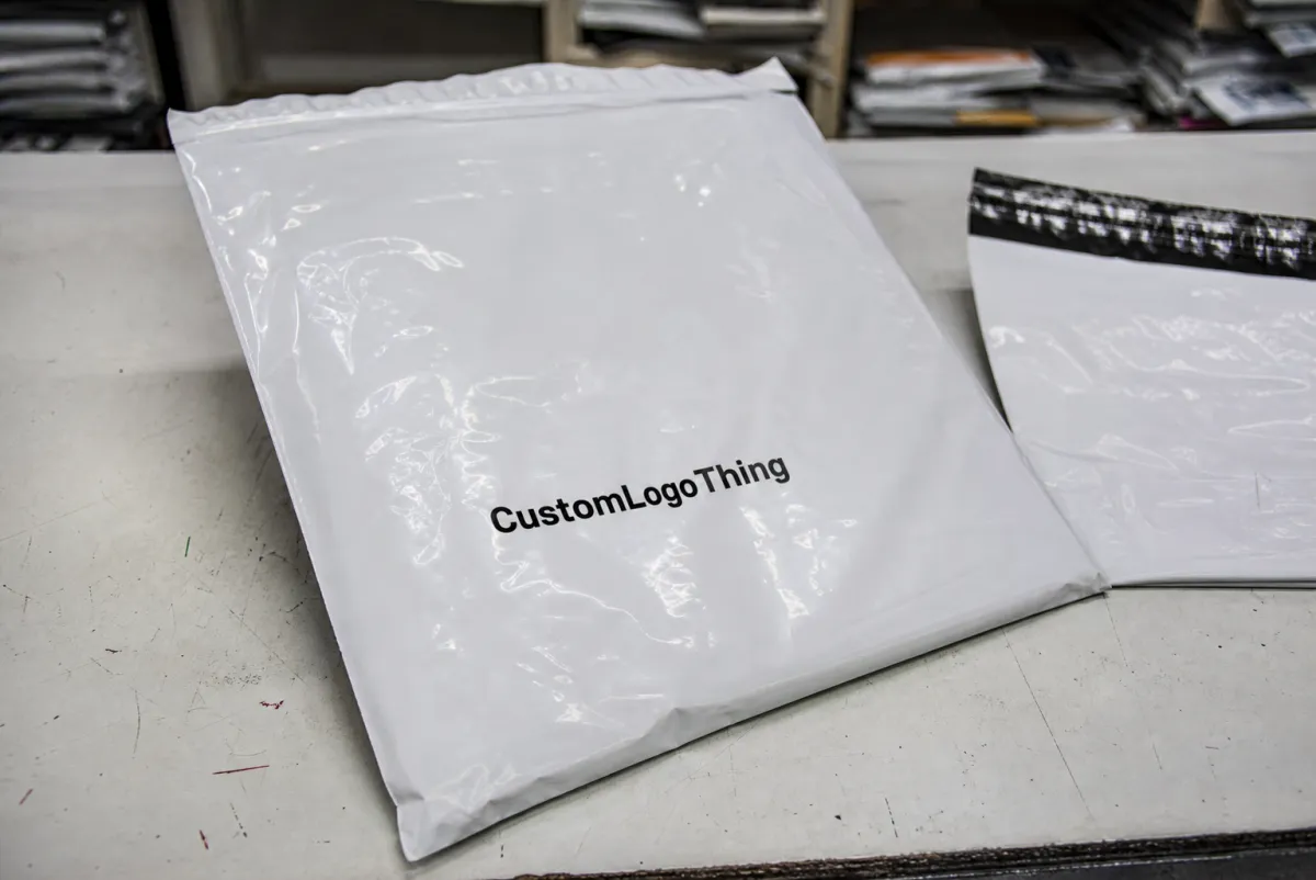
A flat proof can look clean on a screen and still miss the mark on the finished mailer. That is exactly why the stationery Printed Poly Mailers artwork proof checklist matters before anyone signs off. Once a design wraps around a poly bag, the layout stops behaving like a simple rectangle. Seams, seal zones, flap areas, and trim allowances start eating into the space you thought you had.
From a buyer’s standpoint, the proof is not decoration. It is the first real quality gate for size, copy, color notes, and print placement. It is also the best place to catch problems before they become expensive. Miss a seam line now, and you may be approving a run that looks fine in PDF form but wrong in production.
Most proof issues fall into a few buckets: artwork that sits too close to a no-print area, text that is too small to survive film sheen, and copy that was copied forward from an older file. None of that is glamorous. All of it costs money if it slips through.
Why a Flat Proof Can Save a Run
On a monitor, the center of the canvas looks like the center of the product. It is not. Poly mailers have folds, seams, flap seals, and production tolerances that change the visible area once the bag is made. A logo that looks perfectly centered in a PDF can shift a few millimeters in the finished piece. That is enough to make a return address feel crooked or put a barcode too close to the edge for comfortable scanning.
The proof matters because it shows where the artwork actually lives on the mailer template. That is the part buyers need to study, not just the pretty version. A good proof review catches three types of risk:
- Technical risk: bleed, safe area, resolution, and font handling.
- Production risk: artwork landing in a seal zone, seam, or fold.
- Approval risk: stale copy, old contact details, or the wrong version number.
The simplest way to think about it: the proof is a map, not a mood board. If the template marks the front panel, back panel, gusset, or seal path, those lines are telling you what can print and what cannot. Simple artwork still fails if it is placed badly. Clean layout is nice. Clean layout that survives production is better.
For buyers managing repeat programs, the proof also keeps teams aligned. Marketing may care most about color and logo balance. Operations may care about labels, barcodes, and ship-to instructions. Procurement may care about cost and lead time. The proof forces those concerns into one documented decision instead of three separate arguments.
How Printed Poly Mailer Proofs Are Reviewed
There are usually three proof types, and they do different jobs. A digital proof is quick and good for confirming text, rough placement, and overall composition. A soft proof adds more prepress detail, such as panel mapping, safe areas, or print notes. A hard proof or sample gives you a physical reference, which matters when color, sheen, or barcode performance needs to be judged on actual material.
Printers normally place the artwork onto the mailer template so you can verify orientation and imprint location. That is where subtle issues show up. A logo can look centered on a flat file and still drift once the design wraps across the usable print field. The best review checks the artwork on each panel, not just the center rectangle on the proof.
| Proof Type | Best For | What It Confirms | What It Cannot Confirm |
|---|---|---|---|
| Digital proof | Layout, copy, placement | Text, orientation, rough balance | Exact color, film sheen, real print feel |
| Soft proof | Prepress detail | Panel mapping, bleed, safe area, print notes | True material behavior on the finished bag |
| Hard proof | Color-sensitive or detail-heavy jobs | Physical size, handling, readability, finish | Exact consistency across a full production run |
Color is where expectations most often get fuzzy. A proof image is an approximation, not a promise. Film stock, ink laydown, and print method all affect the final look. A deep blue on glossy poly may dry darker or flatter than the screen version. A pale tint can disappear more than people expect. If the art uses gradients, fine type, or a dark brand color, ask how the printer wants you to judge the proof. Some shops can match tightly; others need a practical range, not a perfect clone.
This is also the time to request a revised proof if anything looks crowded. Tiny type, hairline rules, barcodes, QR codes, and edge-to-edge coverage deserve extra attention. If those elements feel cramped, muddy, or too close to trim, ask for another round before approval. Prepress would rather adjust once than explain a reprint later.
If the proof looks perfect but the spec sheet disagrees, the spec sheet wins.
For sustainability claims or sourcing language, buyers sometimes ask whether the material spec includes FSC-certified paper components or another documented standard. That is worth confirming, but only if the claim appears on the bag or in the brand copy. The proof review should verify the exact wording, not a vague intention. For certification basics, the FSC site is useful. If the package needs transit testing or rough handling verification, the ISTA site is a good reference point.
Cost, Pricing, and Quote Variables to Verify
Quoted price is rarely just unit price. It is a mix of material choice, print setup, labor, and freight. On poly mailers, the biggest cost drivers are size, film thickness, number of print colors, number of printed sides, and total quantity. A 2.5 mil bag with one-color print on one panel belongs in a different cost band than a 4 mil mailer with full coverage or multiple print areas.
Buyers often fixate on the per-piece number and miss the setup charges sitting behind it. Plate fees, file cleanup, proof revisions, and shipping can shift the total more than the artwork itself. On a small run, those fixed costs get spread across fewer pieces, which makes the unit price climb fast. On larger orders, the same setup may become invisible in the total.
Here is the part that helps most teams make cleaner decisions: ask exactly what the quote includes. A fair estimate should say whether it covers prepress correction, one or more proof rounds, plate setup, and shipping to one destination or several. If a supplier leaves those items vague, the final number can drift far enough to blow the budget.
| Quote Variable | Typical Effect on Cost | What to Confirm |
|---|---|---|
| Bag size | Changes film usage and print area | Exact finished dimensions and flap style |
| Film thickness | Heavier film usually costs more | Whether the job needs more puncture resistance |
| Print colors | More colors can raise setup and production cost | Spot color count and whether black is separate |
| Quantity | Higher volume lowers unit cost | Minimum order quantity and breakpoints |
| Proof changes | Extra rounds may add fees or time | How many revisions are included before approval |
As a rough buying pattern, low-quantity custom mailers can end up costing well over a dollar each once setup is spread across the order. Larger one-color production runs can fall much lower. Exact numbers swing hard based on print method, film gauge, and freight, so the useful question is not “what is the cheapest quote?” It is “what is the real landed cost at the quantity I actually need?”
The stationery Printed Poly Mailers artwork proof checklist belongs next to the quote review because proof changes can move the budget. A design tweak that seems minor may require a new plate, a new press setup, or a second prepress pass. That is where people get surprised. The artwork did not look expensive. The change log did.
Production Steps and Lead Time: From Proof to Press
Once the file lands, the job usually moves through a familiar chain: file intake, prepress review, proof creation, buyer corrections, final approval, production, curing, and packing. The steps sound neat. The timing rarely is. Missing fonts, low-resolution logos, unclear notes, or late copy edits can push the proof back into the queue.
Lead time usually starts after written approval, not when the file is first sent. That detail matters more than buyers expect. A team may think the order is moving while the printer is still waiting on sign-off, corrected legal text, or confirmation that the color reference is final. If the change affects layout or tooling, the schedule can reset.
- File intake: The printer checks whether the artwork is complete and usable.
- Prepress review: Text, image resolution, and layout are checked against the template.
- Proof creation: The artwork is placed on the mailer spec for buyer review.
- Correction round: The buyer marks changes directly on the proof.
- Final approval: The written sign-off locks the job.
- Production and curing: Printing happens, then ink or coating dries as required.
- Packing and dispatch: Finished mailers are packed and prepared for shipment.
A practical lead-time rule: ask what has already been done before the proof reaches you. Some suppliers pre-check the template, ink coverage, and basic file fit early. Others do more of that work after approval. That difference can move a job from roughly 7-10 business days into the 12-15 business day range, sometimes longer if the order is large or the artwork is messy. Nothing destroys a timeline faster than a surprise second proof.
Higher-volume jobs deserve even more care. A few lost hours in prepress can turn into a full day in production if the press must be retooled or a form of curing needs extra time. Buyers who plan reorder windows around realistic lead times avoid most of the drama.
Stationery Printed Poly Mailers Artwork Proof Checklist
Here is the section that actually gets used. The stationery Printed Poly Mailers Artwork Proof checklist should be read line by line, not skimmed for a green light. A proof can look fine and still hide a production problem that shows up only after the bag is printed, sealed, and handled by warehouse staff.
- Finished size: Confirm the exact mailer dimensions, including flap, gusset, and seal allowance.
- Bleed: Make sure all art that touches the edge extends far enough past trim.
- Safe area: Keep critical text and logos away from the edge, seam, and seal zone.
- Orientation: Verify front, back, top, bottom, and opening direction.
- Imprint location: Confirm the exact panel or side where the artwork will print.
- Typography: Outline or embed fonts, check font sizes, and review line breaks.
- Spelling and copy: Verify addresses, URLs, product claims, legal copy, and phone numbers.
- Color callouts: Match Pantone references if needed and confirm CMYK expectations.
- Contrast: Check that text remains readable on the selected film color or finish.
- Barcodes and QR codes: Test size, quiet zone, and scan legibility on the proof.
- Production notes: Confirm finish, seal zones, gussets, and no-print areas.
- Revision history: Make sure the proof reflects the latest approved file, not an older version.
One detail buyers miss constantly is the relationship between artwork and the seal zone. If a design runs too close to a heat-sealed edge or side seam, print can distort or disappear once the bag is formed. Another common miss is assuming a layout built for one size will transfer cleanly to another. A 10 x 13 poly mailer and a 14.5 x 19 bag do not share the same visual footprint, even if the logo file is identical.
Typography deserves its own check. Small disclaimers, return instructions, and compliance language can vanish if the font is too light or too tiny. Anything that needs to be read quickly by warehouse staff should be bold enough and large enough to survive film sheen, motion, and imperfect lighting. If the proof includes a barcode, ask for scanner verification if the code matters to operations.
The checklist also protects against internal version drift. Reprints often start with a simple mismatch: marketing updated the logo, operations had an old contact line, and the wrong proof was approved because the visible change was subtle. The review step is where that gets caught. Not after the press starts.
Common Proof Mistakes That Cause Reprints
Screen color is the first trap. A monitor can make a navy logo look rich and dense, while the printed version lands lighter because the film is glossy, the ink sits differently, or the press operator is matching to a different reference. That does not automatically mean the printer missed the job. It often means the proof was never a color promise in the first place.
Placement is the second trap. Artwork that sits too close to a fold, seam, or seal zone can look acceptable in proof form and then lose readability after conversion. That is why the artwork proof checklist should always be paired with the actual template, not just the PDF preview. If the bag is heat-sealed at one edge, the visual center of the artwork may no longer be the visual center of the finished mailer.
Stale content causes plenty of reprints too. Old phone numbers, outdated URLs, expired promotions, and previous department names slip through more often than people admit. A buyer may inspect the proof for color and layout and still miss a tiny footer line that changed two versions ago. That mistake is painful because the whole run is wrong, not just one panel.
Internal approval can be just as risky as a production error. If one department signs off before another one reviews the proof, the printer may be forced into another correction round after the job has already moved. That creates extra fees, extra lead time, and a lot of unnecessary back-and-forth. One clean internal sign-off is worth more than three rushed opinions.
Another issue is asking for vague edits. Notes like “make it pop” do not help anyone. Specific comments do. “Move the logo 8 mm upward” or “increase the QR code by 15 percent” gives prepress something concrete to execute. The clearer the markup, the fewer mistakes on the next proof.
Expert Review Tips and Final Approval Steps
Compare the proof against the specification sheet line by line. Not by vibe. Check finished dimensions, print side, artwork size, and no-print notes one at a time. If the proof and the spec sheet disagree, stop and ask for clarification before approval. That pause is cheaper than a reprint.
Read the proof like a production document, not a creative file. Ask whether a warehouse worker, shipper, or receiving clerk can understand the message in two seconds. If the mailer carries a barcode, return label, or customer-facing message, make sure every item has enough contrast and clearance to survive handling. Fancy is irrelevant if the code will not scan.
A proof is approved by a person, but the bags are judged by production.
Before final approval, save the approved version, the quote, and all proof notes in the same folder. That habit sounds basic. It saves time on reorders and keeps future revisions from wandering off. It also gives you a clean record if you later compare Custom Poly Mailers across sizes or print styles.
A practical final sequence looks like this:
- Verify the proof against the spec sheet.
- Confirm color notes, size, and print position.
- Check the quote for setup, revision, and freight terms.
- Get written internal approval from every stakeholder who can stop the job later.
- Approve only the latest version, then archive it with the purchase record.
If you want the cleanest result, treat the stationery Printed Poly Mailers Artwork Proof checklist as the last gate before production, not a checkbox exercise. That habit catches the small issues that become big headaches, and it keeps the order aligned with what was quoted, what was approved, and what the press can actually produce.
Frequently Asked Questions
What should be on a printed poly mailer artwork proof checklist?
Check size, bleed, safe area, orientation, and seal-zone placement first. Then confirm typography, spelling, logos, barcode readability, and any legal copy that must stay visible. It also helps to verify color notes, print side, and revision history so the final approval matches the intended version.
Do I need a hard proof or is a digital proof enough for poly mailers?
A digital proof is usually enough to verify layout, text, and placement. Ask for a hard proof or sample when color accuracy, barcode performance, or fine detail is critical. The right proof type depends on the risk level of the order, not just the lowest-cost option.
How does artwork approval affect printed mailer lead time?
Lead time usually moves only after the proof is approved in writing, not when the file is first sent. Each correction round can add time if the change needs new prepress work or a revised proof. Late approval delays production, packing, and shipment, especially on higher-volume orders.
What changes usually increase stationery mailer pricing the most?
More print colors, larger coverage, and special file cleanup often increase setup and production cost. Small quantity orders can carry a higher unit price because fixed setup fees are spread across fewer pieces. Changes after proof approval can also add revision fees or push the job into a new production cycle.
What file format is best for artwork proof review on poly mailers?
A vector-based PDF is usually the cleanest starting point for proofing and press review. Keep linked images high resolution and make sure fonts are outlined or embedded before sending files. If the file includes gradients, transparency, or fine text, ask prepress to confirm how it will reproduce on film.


