A pencil pouch can look polished on screen and still fail on the packing table. The logo may sit 3 mm too close to the zipper track, a blush-colored line drawing may nearly disappear on frosted film, or a barcode that scanned cleanly in a PDF may struggle once it lands on textured plastic. That is why a stationery Brands Zipper Pouch Bags artwork proof checklist is not a design formality. It is the last practical check before plates, film, or digital files move into production.
Why a Tiny Proof Error Can Spoil a Great Stationery Pouch
An artwork proof is the production-ready preview that shows what will actually be made. It confirms pouch size, print placement, color references, seam allowances, zipper position, hang hole location, barcode readability, white ink layers, varnish areas, and any special finishing notes. In other words, the proof becomes the instruction sheet for the print and converting team.
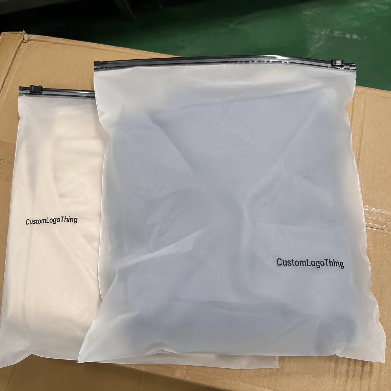
Zipper Pouch Bags for stationery are not simple flat poly bags. They usually have to protect the product, show the brand, support retail display, and remain useful after purchase. A clear pouch for sticker sheets needs visibility. A reusable pencil pouch needs structure, a reliable zipper, and artwork that still reads after it is filled with markers, clips, or tabs.
Stationery brands are exposed to proofing issues because the artwork tends to be delicate. Small serif fonts, planner icons, pale backgrounds, metallic details, washi tape illustrations, and SKU-heavy collections demand tighter review than a bold one-color logo on a shipping mailer.
The common mistake is reviewing the proof like a mockup. The safer habit is to read it like a manufacturing document. That shift catches the 2 mm problems that become expensive 5,000-piece problems later.
Factory-floor rule of thumb: if a detail is hard to read at actual size on the proof, it will not become easier to read after sealing, filling, carton packing, and retail handling.
How Artwork Proofs Work for Custom Zipper Pouch Bags
The proofing flow is straightforward, but every missing detail creates room for assumptions. The buyer sends artwork, logo files, pouch dimensions, material preference, quantity, zipper color if known, and the intended use. The packaging supplier places the design onto a dieline and returns a digital proof for review.
The dieline is the technical map of the pouch. It shows the front panel, back panel, bottom gusset if used, side seals, zipper track, tear notch if applicable, hang hole, rounded corners, and safe print areas. On a flexible package, the safe area matters because artwork near a seal can distort, disappear into the seam, or look crooked once the pouch is filled.
A proof is not the same thing as a finished sample. The proof confirms layout and production intent. A physical or pre-production sample confirms tactile details such as thickness, zipper feel, film opacity, gloss level, and whether the pouch stands, hangs, or ships flat the way you expect.
Common file requirements include vector logos, outlined fonts, embedded images, CMYK or Pantone references, and high-resolution raster artwork, generally 300 dpi at final print size for photographic or illustrated elements. Special layers should be clearly labeled: white ink, spot gloss, matte varnish, metallic effect, emboss target, or any no-print area. If a designer sends one flattened PNG and calls it final, the supplier has very little room to correct trapping, type, or spot color issues.
Read proof annotations carefully. Notes about “color approximate,” “print tolerance ±2 mm,” “keep artwork 5 mm from zipper,” or “barcode must be verified by buyer” are not filler text. They are risk markers. The brand, designer, and packaging supplier should confirm the same assumptions before approval because changes after approval can require revised setup, new plates, or a lost production slot.
Material, Size, and Print Factors That Change the Proof
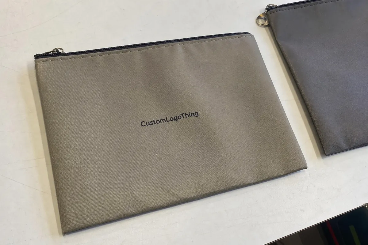
Material changes the appearance of artwork as much as the design file does. Clear PE, frosted PE, glossy laminated film, matte laminated film, biodegradable blends, and metallized structures all reflect light differently. A navy logo on white film may look crisp. The same navy logo on clear film, over a stack of pastel sticker sheets, may lose contrast unless a white ink backing is specified.
Transparency is a major choice for stationery products. A clear window helps shoppers see pens, sticker sheets, journaling cards, or washi tape rolls, but it also complicates print planning. White ink may be needed under logos, barcodes, QR codes, light typography, and pastel illustrations. Without it, colors can look weak because the product behind the pouch becomes part of the visual background.
Thickness and structure should follow the actual product, not just the brand style. Flat sticker packs may work in a lighter pouch, often around 60–90 microns depending on film type and load. Reusable pouches for pencils, markers, planner tabs, clips, and bundled kits may need a heavier feel, commonly 100–180 microns or a laminated structure. Bulky items may require a bottom gusset of 25–50 mm so the pouch does not strain at the zipper.
Size needs a real product check. Pens need clearance below the zipper so the closure is not fighting the product. Sticker sheets need enough flat panel space that the sheet does not cover care notes, barcode, or collection naming. Washi tape, binder clips, and erasers create depth, so a flat dieline can be misleading if nobody checks how the filled pouch behaves.
Print method also affects proof decisions. Digital printing can suit lower quantities, seasonal sets, and multiple SKUs because setup is lighter. Flexographic printing often fits larger runs and simple repeatable graphics. Gravure-style production may be used for high-volume laminated structures with strong repeatability and heavier ink coverage. The right choice depends on quantity, film, color control, and budget.
| Option | Typical Use | Artwork Watchout | Cost Effect |
|---|---|---|---|
| Clear PE pouch | Sticker sheets, pens, visible sets | Needs white ink behind light colors and barcodes | Usually economical, but white ink adds setup |
| Frosted PE pouch | Soft retail look, premium stationery | Fine type can lose contrast on hazy film | Moderate cost; opacity testing helps |
| Matte laminated pouch | Reusable kits, higher-end bundles | Dark colors may look softer than on gloss | Higher film and converting cost |
| Digital print | Many SKUs, lower runs, seasonal drops | Confirm color consistency across versions | Lower setup, higher unit cost at scale |
| Plate-based print | Larger quantities, repeat programs | Plate changes cost money after approval | Higher setup, stronger cost at volume |
Fine detail risk is real in stationery branding. Thin serif fonts, pale blush backgrounds, hairline illustrations, microcopy, QR codes, barcodes, and intricate patterns can soften or fill in. If the artwork relies on a 0.2 mm line, ask whether the print method and film can hold it consistently. Sometimes the answer is yes. Sometimes it is not, and that depends on substrate, ink, plate, press control, and coverage.
Stationery Brands Zipper Pouch Bags Artwork Proof Checklist
A strong checklist breaks review into groups. Do not scan the PDF casually from top left to bottom right and hope your eye catches everything. Review copy first, then color, then dieline, then scannable codes, then legal and retail requirements.
Copy checks
- Brand name spelling, including capitalization and spacing.
- Product name, collection name, planner size, pen color, or sticker theme.
- SKU, UPC, quantity count, sheet count, or set count.
- Website, social handle, care notes, and customer service details.
- Country-of-origin statements, safety warnings, or retail copy if used.
Color and finish checks
- CMYK builds and Pantone references, especially for brand colors.
- White ink layers under light colors, barcodes, and QR codes.
- Matte, gloss, spot varnish, metallic, or soft-touch callouts.
- Proof notes that say whether color is approximate or controlled.
Screen color is a poor final judge. A backlit monitor can make pastels look cleaner and brighter than they print on film. For brand-critical shades, ask for a drawdown, printed swatch, or physical sample. For color language and measurement, many packaging teams rely on controlled references such as Pantone callouts and internal brand standards; for broader packaging education, the Packaging Industry Association is a useful industry resource.
Dieline and construction checks
- Finished size, not just flat artwork size.
- Zipper placement and clearance from the product.
- Bottom gusset, side gusset, seal width, and corner radius.
- Hang hole position and whether it works for the intended retail peg.
- Safe zone compliance around seals, zipper, fold areas, and tear notch.
Logo, barcode, and QR checks
- Logo is vector where possible and not stretched or redrawn poorly.
- Barcode has adequate quiet zone, contrast, size, and orientation.
- QR code is tested from a printed sample when possible.
- Important marks are not blocked by pens, tabs, cards, or sticker sheets after filling.
For barcodes, a real scan test is better than a guess, especially when the package material is clear, frosted, metallized, or heavily patterned. A barcode that scans from a laser printer proof on white office paper tells you something, but not everything.
Process and Timeline from Artwork Upload to Approval
The typical process runs in a clear chain: specification gathering, artwork file review, dieline setup, first proof, buyer comments, revised proof, final approval, production scheduling, printing, converting, quality checks, and shipping preparation. A clean digital proof may come back quickly, but the full approval cycle depends on how complete the incoming information is.
The fastest approvals happen when the buyer sends final pouch dimensions, product measurements, quantity, material preference, zipper color, print colors, finish, delivery target, and barcode files before the supplier builds the proof. If the packaging team has to guess whether the pouch hangs vertically, sits in a retail bin, or ships flat inside an ecommerce box, layout decisions get shaky.
Timelines stretch for predictable reasons: missing vector logos, RGB artwork, unclear Pantone expectations, last-minute SKU changes, barcode corrections, legal copy updates, and debate over pouch orientation. Digital proofing may take a couple of business days for a simple layout, while revisions add more time. Physical samples take longer because film, print, zipper, cutting, and sealing all need coordination.
A practical timing expectation for a custom run might look like this: 1–3 business days for file review and first digital proof after complete files arrive, another 1–3 business days for revisions depending on complexity, and often 7–15 business days for a physical sample path if printing and converting are involved. Full production after final approval can vary widely, but many flexible packaging projects land somewhere around 12–25 business days depending on quantity, material availability, and print method.
Approval responsibility is shared, but not equal in every area. The manufacturer should check manufacturability, safe zones, print limits, and construction feasibility. The brand should verify spelling, SKU data, color intent, barcode information, regulatory copy, product fit, and final commercial presentation. That division matters.
A simple internal route works best: designer checks files and color, operations checks dimensions and SKU data, sales or retail checks shelf presentation, and leadership approves the final commercial risk. Use one marked-up proof. Scattered email comments from four people can create confusion, especially across ten seasonal SKUs.
Cost, Pricing, and MOQ Details That Artwork Can Affect
Artwork choices can change zipper pouch bag pricing. Size, film structure, color count, white backing, special finishes, order quantity, and SKU count all influence the quote. A pouch that looks only slightly larger on screen may use noticeably more film, require a larger carton, and reduce the number of units packed per case.
For rough planning, a simple custom printed zipper pouch at 5,000 pieces might fall around $0.18–$0.45 per unit depending on size, material, color count, and origin of production. A heavier reusable laminated pouch with more print coverage, specialty finish, or lower quantity can move higher. These are planning ranges, not a promise, because resin pricing, print method, freight, and structure can shift the real number.
Full-coverage designs usually cost more than a small one-color logo. Heavy ink laydown, spot white backing, metallic effects, matte coatings, or multiple passes can add setup time and production control. If a design uses a pale logo on clear film, the white ink layer may be the detail that makes the package readable, but it still needs to be priced.
MOQ depends on the process. Digital production may allow lower runs and more SKU variety, sometimes useful for seasonal stationery drops or market tests. Specialty films, custom zipper colors, complex laminates, and plate-based printing usually need higher quantities to make sense. One 20,000-piece run is easier to manage than ten 2,000-piece runs with separate art, separate proofing, and separate inspection records.
SKU count is the hidden cost many stationery brands underestimate. Ten pouch designs may require ten proofs, ten barcode checks, ten file names, ten approval records, and tighter version control. Even if the pouch size is identical, the handling effort is not identical.
Paying for a physical sample is usually worthwhile for a first retail launch, premium stationery kit, new pouch size, new material structure, tight brand-color match, or any design with barcode risk. A sample fee may feel annoying early on, but it is cheaper than discovering after production that the zipper presses into the top row of pens or the barcode sits over a curved gusset.
Ask for quotes with options: good-better-best materials, two or three quantity breaks, single SKU versus multiple SKUs, and with or without a sample stage. Clear options make tradeoffs visible. Guessing rarely saves money.
Common Proofing Mistakes Stationery Brands Should Avoid
The most common mistake is approving the proof as if it were only a visual mockup. It is not. The proof is a production instruction sheet that the factory will follow, and a disciplined checklist keeps that mindset front and center.
Layout mistakes show up often. Logos land too close to the zipper. Patterns run into seal areas. Gusset distortion is ignored. Artwork is centered on the flat dieline but looks off-center once filled. Back-panel text is carefully designed, then hidden by the actual sticker sheet or journaling card inside the pouch.
Color mistakes are just as common. Brands judge color only from a backlit screen, send RGB artwork, expect pastel shades to print cleanly on clear film without white ink, or forget to say whether a Pantone match is required. Plastic films and paper labels behave differently, so a color that works on a 350gsm C1S header card may need adjustment on frosted PE.
File mistakes create preventable delays: missing fonts, low-resolution illustrations, unoutlined type, unembedded links, flattened files with no editable layers, and unclear naming for front and back artwork. A file named “final_FINAL_use-this-one-2.pdf” is a warning sign, not a version-control system.
Copy mistakes are painful because they are easy to miss. Wrong sheet count. Old SKU. Mismatched collection name. Incorrect pen color description. Missing barcode. Inconsistent capitalization across a product family. These are not print defects; they are approval defects.
For larger SKU groups, use a simple tracker with file name, revision date, SKU, barcode number, proof status, approver, and approval date. It does not need to be fancy. It needs to be unambiguous.
A final printed review is especially useful for small type, QR codes, barcodes, pale colors, and fine line art. These elements often look acceptable on screen and weak in hand. If retail distribution is involved, also check transport performance and carton packing assumptions; organizations such as ISTA publish testing resources that help teams think beyond the pouch itself and into the shipping environment.
Next Steps Before You Approve Your Pouch Artwork
Before approving, print the proof at actual size. Then place the real product over the dieline. Check whether the logo, product name, zipper, hang hole, barcode, and back-panel information still make sense when the pouch is filled. This five-minute exercise catches a surprising number of problems.
Use a short internal review route. The designer checks artwork files, line weights, color callouts, and special layers. Operations checks size, SKU data, product fit, and carton needs. Sales or the retail contact checks shelf presentation, peg orientation, and barcode placement. Leadership gives the final commercial approval after the technical comments are resolved.
Mark comments directly on the proof whenever possible. A circled zipper clearance issue on the PDF is clearer than an email saying, “Can we move the top part down a little?” Production teams need one clean set of revisions tied to the correct file version.
Before signing off, confirm the final specification block: material, thickness, finished size, zipper type or color, print method, number of colors, finish, quantity, carton packing preference, and ship-to details. If sustainability claims are involved, be careful and specific; claims around recyclability, compostability, or responsible sourcing should match the actual material and certification path. For paper-based components or mixed packaging programs, FSC provides recognized sourcing standards.
Ask the supplier three direct questions:
- Are all design elements inside the recommended safe print areas?
- Is any text, barcode, or QR code below recommended production size?
- Will the selected material change color, opacity, or readability compared with the screen proof?
Keep an approved-proof archive for repeat orders. Save the final PDF, dieline, color references, revision date, sample photos, barcode files, and supplier notes. Reorders and seasonal variations move faster when everyone starts from a controlled baseline instead of rebuilding the pouch from memory.
That is the real value of a stationery Brands Zipper Pouch bags artwork proof checklist: fewer assumptions, fewer costly revisions, and a cleaner handoff from design to production.
FAQ
What should be included in the artwork proof checklist for stationery brands zipper pouch bags?
Include finished size, dieline orientation, zipper position, seal areas, hang hole, logo placement, copy, SKU, barcode, QR code, color references, white ink layers, finish, material, thickness, and final quantity. For stationery products, also check sheet counts, pen colors, collection names, planner sizes, and whether the filled product blocks any important artwork.
Do stationery brands need a physical proof for zipper pouch bags?
A digital proof is often enough for repeat orders or simple one-color layouts, but a physical proof is smart for first launches, premium retail packaging, clear or frosted films, small type, barcodes, and tight color expectations. Physical proofs help confirm hand feel, opacity, zipper function, product fit, and how the artwork looks under real lighting.
How can artwork proof errors increase zipper pouch bag pricing?
Errors can trigger revised proofs, new setup work, plate changes, delayed production slots, additional sampling, or reprinting if the issue is caught too late. Artwork choices such as full ink coverage, extra colors, white backing, specialty finishes, and many SKU versions can also raise the unit cost.
What file format is best for custom zipper pouch bag artwork?
Vector files such as AI, EPS, or production-ready PDF are usually preferred for logos, text, and line art because they scale cleanly. Raster images should be high resolution, fonts should be outlined or supplied, links should be embedded, and special layers such as white ink or spot varnish should be clearly labeled.
How long does the artwork proof process take for stationery zipper pouches?
Timing depends on file completeness, pouch complexity, revision rounds, and whether a physical sample is needed. The process moves faster when the brand provides final dimensions, artwork, material choice, print colors, quantity, zipper requirements, and barcode information before the first proof is prepared. A clear checklist keeps comments organized so approval does not drift across disconnected emails.