Approving a vitamin woven label Beanies Digital Proof Checklist is not really about admiring artwork on a screen. It is about deciding whether a logo can survive a translation from pixels to thread, from flat file to ribbed cuff, from a tidy vector drawing to a knit surface that stretches, twists, and behaves differently once it is worn.
That gap between digital and physical is where most mistakes live. Beanies compress artwork in ways a monitor cannot show: the cuff may fold higher than expected, the seam may shift the label off center, and a design that looked elegant at full zoom can turn cramped at 35 mm wide. Buyers who inspect scale, placement, color contrast, and construction details before approval usually avoid the expensive cycle of revision, remaking, and delayed shipment.
Vitamin Woven Label Beanies Digital Proof Checklist: What to Review First
Begin with legibility at final size. A woven label that looks sharp on a PDF can become crowded once the design is reduced and converted into thread. Tiny type, hairline borders, and intricate icons are the first items to fail. If the label needs a magnifier to read on a screen, it is probably too ambitious for a beanie badge.
The second check is placement in context. A cuffed beanie and a slouch beanie do not offer the same visual field. A placement that looks centered on paper can end up too close to a seam, partly hidden by the fold, or visually heavy on one side of the cuff. On chunky rib knits, even a few millimeters of drift are noticeable because the surface itself adds texture and irregularity.
A practical review usually catches three issues before production starts:
- Scale - the logo or text is too small to stay readable once woven.
- Contrast - thread colors blend into the hat instead of separating cleanly from it.
- Placement - the label is technically correct but looks awkward on the cuff, seam, or fold.
From a buyer's perspective, the proof is not a decorative preview. It is the control point that prevents a bad fit between artwork and garment. Once a weaving run begins, changes can affect stitch count, fold direction, and thread selection. Those are not cosmetic edits; they alter the build. The safest habit is to compare the proof against the actual beanie style, not against memory or a previous style sheet.
“If the logo only works on a bright monitor and not on the hat itself, the proof still needs work.”
If your trim program includes more than one component, keep the proof, artwork notes, and garment reference together with your Custom Labels & Tags specs. That reduces the chance of approving one detail against an outdated placement note or an old color file. In trim production, mixed references are a common source of avoidable mistakes.
How the Digital Proof Maps to the Finished Woven Label
A digital proof usually shows the label size, border style, thread color layout, fold direction, backing choice, and planned placement. That is enough to verify the structure of the label, but not enough to predict every tactile detail. You still cannot fully judge edge firmness, yarn sheen, or how the label will feel once it is stitched into a knit fabric that stretches and relaxes with wear.
That limitation matters because woven labels are physical objects first and graphics second. The file may use clean vector art and carefully chosen brand colors, yet the woven version will still obey the limits of thread count and weave resolution. Fine detail can close up slightly. Solid color fields can look a little more textured than a print proof suggests. A buyer who understands that difference gives more useful feedback because the notes focus on the details that actually control the result.
For beanies, the most useful mental model is simple: the proof is a map, not the terrain. It tells you where the design should go, how it should fold, and what colors should appear, but the finished piece still depends on the construction method. Many suppliers will warn that very fine lines or tiny text become unreliable below about 4-5 pt equivalent at label size, though the exact threshold depends on color contrast, label dimensions, and weave density. Dark-on-dark combinations are usually the hardest to keep crisp.
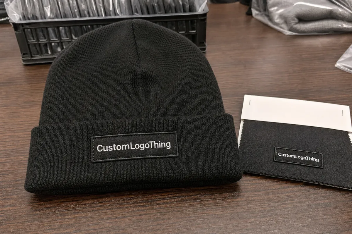
Another detail buyers sometimes miss is that the same label can read differently depending on the garment color. A white logo on a black beanie is straightforward. A muted gray logo on heather charcoal is not. The proof may be accurate in isolation and still be weak in context. That is why approval should always include the actual hat color, not just the artwork panel.
If you need a broader reference point for quality and consistency, general packaging and shipping standards such as Packaging Institute resources and ISTA testing standards reinforce a useful habit: approve against measurable criteria, not only visual instinct. The standards are not made for beanie labels specifically, but the discipline translates well.
The key question is not whether the proof looks polished. It is whether the label will still feel like the same brand once it is sewn onto the garment and handled in the real world. If that answer is uncertain, revision is cheaper than regret.
Specs That Matter Most on a Beanie Label
Artwork scale is the first spec to scrutinize. Beanie labels often land around 30 x 50 mm or 35 x 60 mm, and that is not much room for detail. Stacked copy, web addresses, or secondary taglines may look balanced in a design file but become cramped once the artwork is woven into thread. If the label includes more than a logo and one line of text, the risk of crowding rises fast.
Thread color is the second major decision. Woven labels do not have the full tonal range of print; they rely on a limited set of yarns, often three to six colors in a simple label and more for complex designs. That limitation is not a flaw, but it does mean the palette has to do more work. Dark charcoal, navy, and black hats demand stronger contrast than many brand guides expect. On pale knits, soft colors can wash out unless the proof is adjusted for the actual substrate rather than the logo file alone.
Construction details matter just as much as the artwork. Merrowed edges give a stitched border with a softer visual finish and slightly more bulk. Heat-cut or laser-cut labels can look cleaner and sit flatter, which helps when the beanie has a narrow cuff or the placement area is tight. Backing changes performance too. A sew-on label behaves differently from an iron-on or adhesive-backed option, and each choice has its own tradeoff between flexibility, speed of application, and long-term hold.
Placement deserves its own review because it affects how the brand is read from a distance. Centered on the front cuff, offset near a seam, or tucked into a side edge each creates a different impression. The same label can feel premium in one spot and awkward in another. Beanies with tall folds, heavy ribs, or pronounced seams leave less forgiving space than flat apparel trims, so the proof should show placement marks clearly and, if possible, in relation to the actual hat shape.
There is also a difference between visual neatness and production reality. A proof can look perfectly aligned on screen, but if the requested fold direction conflicts with the garment construction, the finished piece may sit crooked after sewing. That is the kind of issue that rarely shows up in an initial review and is easy to miss when a buyer is focused only on artwork approval.
For teams comparing decoration routes, it helps to review the broader Manufacturing Capabilities page so the label spec is chosen alongside other trim options, not in isolation. Beanie programs often work better when woven labels, patches, and packaging are considered as one system instead of three disconnected decisions.
| Option | Typical Use | Approx. Unit Price at 5,000 pcs | What Usually Changes the Cost |
|---|---|---|---|
| Simple woven label | Clean logo, limited text, standard fold | $0.10-$0.18 | Few colors, standard size, basic sew-on finish |
| Detailed woven label | Fine type, small icon work, stronger contrast control | $0.18-$0.28 | More weave colors, tighter stitch count, extra proof revision |
| Special finish label | Custom fold, premium edge, specialty backing | $0.25-$0.40 | Heat-cut edges, extra finishing steps, rush handling |
The table is a comparison tool, not a quote. Two vendors can send similar numbers while pricing very different constructions. A 25 x 50 mm standard label and a 35 x 70 mm detailed build are not interchangeable, even if the first glance price looks attractive. That is why unit cost should always be read with the spec sheet beside it.
Buyers should also ask about compliance and documentation early if the project needs it. Recycled content claims, packaging requirements, and retailer paperwork can all affect how the order is set up. Those items rarely change the woven label itself, but they can slow the order if they are discovered after approval.
Process, Timeline, and Production Steps
The production sequence is usually predictable: artwork submission, digital proof, revision notes, final approval, weaving, finishing, packing, and shipment. What surprises many teams is how much time disappears in the revision stage. A clean file can move quickly. A proof that needs spelling cleanup, a size change, or a color adjustment can add several business days before the loom starts.
For a typical custom woven label order, one to three revision cycles is common. Simple logos move faster because there is less to interpret. Complex artwork slows down because the supplier has to translate visual intent into thread structure, and every small correction needs to be checked again at actual size. That is normal workflow, not a warning sign by itself.
Lead time is also shaped by how many moving parts are in the order. Multiple beanie colorways, several label sizes, and custom folding instructions all create extra checkpoints. If the run has a hard ship date, those checkpoints need more discipline, not less. A rushed proof review often creates the delay it was trying to avoid.
A practical timeline should include three separate dates: proof approval deadline, manufacturing window, and transit time. Buyers often focus only on the factory completion date and forget freight, customs, or internal receiving time. A label order can finish on schedule and still miss the launch if the shipping window was too optimistic.
Here is the sequence I would use for a vitamin woven label beanies Digital Proof Checklist that supports production instead of slowing it down:
- Confirm the beanie style, size, and placement zone before reading the proof.
- Check thread colors against the hat color, not only against the monitor.
- Verify fold direction, edge finish, and backing choice at the intended label size.
- Read spelling, punctuation, spacing, and quantity while the file is still open.
- Approve only after quote, lead time, and spec sheet still match the same version.
That last point matters more than it sounds. A surprising number of problems come from version drift, where the artwork was updated but the quote was not, or the label size changed but the notes did not. In trim work, the paperwork and the physical spec have to move together.
Cost, Pricing, and MOQ: What Pushes the Quote Up or Down
Pricing usually rises with detail. More weave colors, tighter artwork, larger label sizes, and specialty finishing steps all add cost because they require more setup or more machine time. A simple two-color label can stay economical. Once the design asks for tiny text, layered color fields, or a premium border, the quote begins to move upward for reasons that are easy to see in production.
MOQ affects unit price in a direct way. Lower minimums spread the setup work across fewer labels, so the per-piece cost climbs. Larger quantities usually lower the unit price, especially when the same size and finish are repeated across the run. That is why a 1,000-piece order and a 10,000-piece order can look similar in concept but behave very differently on the invoice.
There are also cost items that do not show up in the first round of discussion. Rush scheduling, extra proof rounds, specialty backings, custom folds, and expedited freight can all change the total. Some of those add-ons are worth paying for because they protect a launch date or simplify application. Others only make sense if the brand actually needs the feature, not because it sounds premium.
To compare quotes honestly, ask suppliers to price the same spec sheet. Label size, border type, thread count, backing style, and packaging method should match before the numbers are judged side by side. If one vendor is quoting a simpler construction and another is quoting the exact visual result you want, the cheaper number is not really cheaper.
Used properly, the vitamin Woven Label Beanies Digital Proof checklist becomes a pricing tool as much as a quality tool. It shows which details drive cost and which details are simply cosmetic. That distinction helps buyers decide where to spend and where to simplify without accidentally weakening the final product.
For retail-facing projects, the final decision often comes down to whether the label, the packaging, and the beanie itself feel like they belong to the same price tier. If the trim looks too basic, the garment feels underbuilt. If the trim gets too ornate, the economics can get out of sync with the rest of the line. Price only makes sense in context.
Common Mistakes Buyers Make When Approving Beanie Proofs
The most common mistake is approving color from a monitor alone. Screens vary, and thread does not behave like RGB artwork. A navy logo may look strong on the proof but lose contrast on a charcoal beanie. A light gray mark can nearly vanish on heather knit. The right question is not “does the proof look right?” but “does the thread still read clearly on this hat color?”
Placement mistakes are close behind. A proof can look balanced until the beanie is folded and sewn. If the fold direction is wrong, the label can face the wrong way. If the placement mark sits too close to a seam, the finished label may pull to one side once the cuff is turned and the knit relaxes. Those errors are small on paper and obvious in hand.
Small text is another trap. Taglines, URLs, and stacked copy often survive the design stage but do not survive weaving at compact size. Buyers sometimes push for too much information in too little space, then blame the supplier when the result is dense. In reality, the spec was asking the loom to do more than the format could support. Simpler copy usually performs better and looks more intentional.
The administrative checks matter too. Spelling, punctuation, quantity, and label size are the fields that generate expensive avoidable errors. A proof can look polished and still contain a typo or the wrong count. Visual review and line-item review need to happen together, not as separate steps.
One more habit improves accuracy: compare the proof with a real beanie sample if one is available. Even a blank cap gives better scale reference than a document ever will. Paper can say “35 mm.” A cuff in the hand makes that number feel real.
Next Steps Before You Approve the Run
Before approval, place the proof beside the actual beanie style and ask whether the label size feels deliberate. That check often reveals whether the artwork is too dense, too small, or too close to the edge. A logo that looks balanced on a screen may need a few millimeters of adjustment once it meets a knit structure.
If possible, print the label at true scale or tape a mockup onto the cuff. It does not need to be polished. The point is to judge readability at arm's length and to see whether the placement lands where the eye expects it to land. Zooming in on a screen can hide the very problem you are trying to catch.
Ask for one final annotated file with the notes in one place: thread references, fold direction, placement preference, and any must-keep details. Scattered comments across email threads are where mistakes start. A single approval file gives production less room to improvise and fewer excuses to interpret the design loosely.
Most of all, make sure the proof, the quote, and the timeline agree before the run starts. If the spec changed but the pricing did not, or if the requested delivery date is tighter than the current production window, stop and reconcile the files first. That is the real purpose of a checklist like this: aligning artwork, cost, and lead time before the loom runs.
For beanie programs specifically, the best results usually come from treating proof approval as a manufacturing decision, not a formality. A careful read of the actual garment, a realistic view of what thread can and cannot do, and a clean record of the approved spec are what keep the finished label looking deliberate instead of improvised.
Frequently Asked Questions
What should a vitamin woven label beanies digital proof checklist include?
It should cover label size, fold direction, placement, thread colors, and any backing or edge finish. It should also confirm spelling, logo spacing, and whether the artwork still reads clearly at the final woven scale.
How do I check color accuracy on a woven beanie proof?
Compare the proof to thread or PMS references instead of relying on a monitor alone. Ask whether the final yarn colors have enough contrast against the beanie fabric and whether any substitutions were made.
What affects lead time for custom woven label beanies?
Artwork revisions, label complexity, and production queue position usually matter most. Rush requests, special finishing, and shipping distance can add time even after the proof is approved.
How does MOQ change the price for woven label beanies?
A lower MOQ usually means a higher unit cost because setup is spread across fewer pieces. Larger quantities often reduce the per-label price, especially when the artwork and dimensions stay consistent.
What files should I send for a faster beanie proof?
Send vector artwork when possible, plus any brand color references, label dimensions, and placement notes. A quick mockup photo or annotated reference file can help the proof team avoid extra revision rounds.


