If you are approving caps for a booth crew, a digital proof is where most expensive mistakes can still be stopped. The trade show embroidered baseball caps Digital Proof Checklist is less about catching typos and more about catching production problems before they turn into dozens or hundreds of identical caps with the wrong scale, placement, or stitch behavior. On screen, a logo can look clean and centered. On a curved crown, the same mark can feel crowded, distorted, or simply too small to read from the aisle.
That is why the proof matters so much. It is not a decorative preview. It is the first real translation of flat artwork into a stitched product, and that translation changes the math. Embroidery has thickness, direction, density, and backing. A design that looks polished in vector form may need simplification to survive needlework on a six-panel cap, especially if the front seam cuts through the artwork.
For trade show buyers, the stakes are practical. Booth uniforms need to look consistent under harsh lighting, in photos, and from a few feet away. Giveaway caps have to survive short production windows and repeated handling. A rushed approval can cost more than the cap itself if it triggers a rework or a delayed shipment.
Trade Show Embroidered Baseball Caps Digital Proof Checklist: What to Inspect First
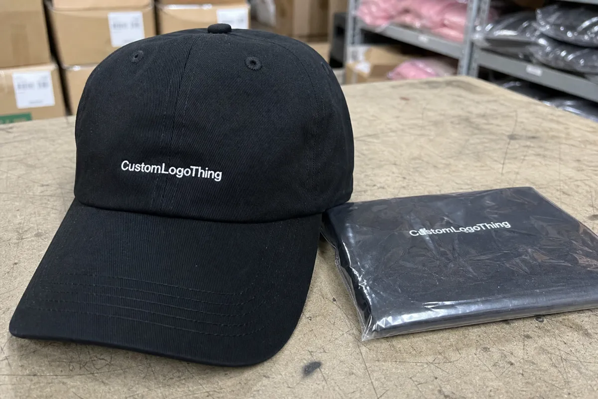
Begin with the cap, not the logo. A baseball cap is not a flat print surface, and the front panel geometry determines how much detail will survive embroidery. Structured caps hold their shape and usually support cleaner stitching. Unstructured caps feel softer, but they can let dense designs sink or warp. Low-profile caps look modern and understated, yet they offer less vertical room for stacked text or tall iconography.
Check logo width first. Then check where the design lands relative to the center seam, the brim, and the lower edge of the crown. Even a shift of 1/4 inch can make a design feel either balanced or awkward. That is not subjective once the cap is worn. It is visible from across a trade show floor, which is exactly where the cap has to work.
Typography deserves its own review. Small text often survives the proof in theory but fails in thread. Thin fonts, condensed letters, and delicate serifs are the usual problems. If a URL, slogan, or year stamp is included, ask whether it is still readable at booth distance. A mark that looks sharp at 100 percent zoom may become fuzzy once stitch density is applied.
Use the proof as a risk filter. Ask whether the design can still read correctly after the digitizing process, thread direction, and cap curvature are applied. If the answer is uncertain, pause. The cheapest correction is the one made before production starts.
- Logo size: confirm the decorated width fits the cap style and does not crowd the crown.
- Placement: verify centerline, height from the brim, and distance from seams.
- Text legibility: review small copy, stacked lines, and any fine rules or outlines.
- Cap type: make sure the crown profile and closure style fit the event use case.
For teams comparing decoration options and production constraints, a supplier should be able to explain what can actually be stitched cleanly and what needs adjustment. The most useful proof is the one that reflects the real cap, not an idealized mockup that ignores seam placement or stitch limitations.
If a detail is hard to see on the proof, do not assume it will magically become clearer in embroidery. Thread rewards clarity and punishes ambiguity.
How the Digital Proof Process Works for Cap Orders
The usual workflow is straightforward: artwork comes in, the design is digitized, a digital proof is built, internal checks happen, the buyer approves, and production starts. The word that matters most in that list is digitized. That is where artwork becomes stitch instructions. The file is no longer just a logo; it becomes a map for needle movement, underlay, fill direction, and sequencing.
A good proof shows more than the logo floating in the center of a cap outline. It should show approximate scale, thread colors, placement, and any adjustments made for structure. It also reveals whether fine details were simplified. That simplification is not always a bad thing. In embroidery, clarity usually beats literal accuracy. A small line dropped from a logo can make the difference between a sharp mark and a muddy one.
What the proof does not show perfectly is texture. Screens are flat and evenly lit. Thread catches light differently from one angle to another, especially on a polished crown or a dense satin stitch. That is why a proof should be treated as a production guide, not a final-photo preview. The shape is locked in by approval, but the finish still depends on the cap, thread, and stitch method used.
Revisions are normal, and they are not automatically a sign of poor service. A supplier may enlarge a thin letter, remove a tiny interior detail, or move the logo to clear a seam. Those changes usually improve the finished cap. The important question is whether the revision protects the brand or just smooths over a weak design decision. Those are not the same thing.
After approval, the proof becomes the job reference. At that point, size and thread callouts matter as much as artwork. If the proof lists a 3.25-inch logo width, that becomes the specification. If black thread is approved, the team running the machines should be following that callout exactly. The approval is the last place to question the spec before the production line starts spending time and material.
Buyers who manage repeated events should also ask how proofing connects to reorder control. A good process keeps notes on cap style, thread names, logo size, and any exceptions. Without that record, the next order can become a fresh round of guesswork, even if the artwork is the same.
Key Specs That Change Stitch Quality and Brand Readability
Cap construction changes how embroidery behaves. A structured cap gives the front panel support, which usually makes the final stitching look cleaner. An unstructured cap has more softness and drape, but that softness can work against crisp lettering. A low-profile cap offers a modern look, yet it reduces the available vertical space. A mid-profile cap gives a little more room to breathe. That extra room can matter more than buyers expect, especially when the logo has two lines or a tall icon.
Panel count also matters. A 5-panel cap often works well for centered decoration because there is no front seam splitting the design. A 6-panel cap is more common, but the seam can interfere with fine text or a narrow symbol. If a logo crosses the seam, the proof should show exactly how that interruption is handled. Sometimes a simplified lockup is the best answer. Sometimes a patch is cleaner than direct embroidery. Sometimes the logo just needs a few millimeters of breathing room.
Thread count and stitch density influence both appearance and comfort. Dense fills create strong color and good coverage, but too much density can make the front panel stiff. Extremely light fills can look elegant, but they may not hold up visually under bright show lighting. There is a narrow middle ground where the design looks full without becoming heavy. Good digitizing aims for that middle ground, but the artwork has to cooperate.
Font choice is another production constraint disguised as a design decision. Thin serif fonts and hairline rules can lose detail fast. Text under roughly 3/16 inch in height often becomes risky, depending on font style and stitch structure. That does not mean every small element must be removed. It means the proof should be treated like a reality check. If the message depends on tiny type, a different placement or a simplified treatment is usually the better trade.
Thread color and fabric color should be checked together, not separately. A dark thread on a dark crown can disappear at distance. White thread on a heathered or textured cap can look less crisp than expected. Glossy thread reads differently than matte thread, and a heavy fill can catch light in a way that makes the logo appear larger than it really is. For a trade show piece, those visual shifts are not minor. They determine whether a passerby notices the brand or just sees a dark shape.
Closure style, brim shape, and contrast stitching also affect the impression. A flat brim reads differently from a softly curved one. Snapback, hook-and-loop, fabric strap, and metal buckle each signal a different tone. If the caps are for a technical product launch, the styling should feel precise. If the caps are for a lifestyle brand, the finish can be looser. The cap itself should support the brand message instead of fighting it.
For buyers with sustainability requirements, packaging deserves a quick review too. Cartons, inserts, and packing slips are often overlooked, even though they affect presentation and waste. If paper components are included, FSC-certified stock is a reasonable ask. For larger shipments or mixed merch kits, shipment protection becomes more than a nice-to-have. Third-party transit testing standards such as ISTA can be useful when freight damage would be expensive to sort out on arrival.
Turnaround, Timeline, and Production Steps After Proof Approval
Once the proof is approved, the job moves into a different kind of queue. Final digitizing checks are locked, production is scheduled, embroidery begins, inspection happens, and packing follows. For a clean order with simple artwork, this can move fast. For a complicated mark with multiple revisions, the timeline stretches. Rush service can compress the front end, but it cannot erase bad artwork or eliminate the time needed to stitch, trim, inspect, and pack.
Typical proofing for a straightforward cap order often takes 3 to 7 business days. Production can take another 7 to 15 business days after approval, depending on quantity, season, and factory load. Larger runs, dense stitching, or a busy trade show calendar can push that longer. Those ranges are not a guarantee; they are a practical planning window. If the event date is fixed, ask for milestone dates in writing: proof sent, revision due, approval received, production start, and ship date.
Small delays tend to come from predictable causes. Missing Pantone references. A quantity change after the proof is built. A request to add extra text that did not exist in the original brief. A last-minute decision to move the logo lower or wider after the artwork has already been digitized. Each of those changes adds friction, and friction matters because headwear jobs are often scheduled tightly around other event work.
It is also worth remembering that production time does not behave like software time. A late edit does not simply update one file. It can force a new stitch plan, another approval, and a new place in the queue. That is why the approval stage should be treated like a spec lock, not an informal review. The faster the decision is made, the more likely the caps arrive on time. The more ambiguous the proof, the more expensive the ambiguity becomes.
- Artwork upload: send vector files when possible and include brand color references.
- Digitizing: the logo is converted into stitch paths and checked for structural integrity.
- Digital proof: layout, scale, colors, and cap placement are presented for review.
- Approval: the proof becomes the production reference after signoff.
- Production: embroidery, trim work, inspection, and packing happen in sequence.
- Shipment: cartons are prepared for parcel or freight delivery based on deadline and quantity.
Cost, Pricing, MOQ, and Quote Variables Buyers Should Compare
Cap pricing is shaped by a few variables that are easy to compare once you know what matters. Quantity is the biggest one. Stitch count is another. Cap style, thread count, rush timing, and packaging all push the final number up or down. A run of 48 caps is priced very differently from a run of 500 because setup cost is spread across fewer pieces. That is basic manufacturing math, not a trick.
Buyers often compare unit prices without looking at the landed cost. That creates false savings. A low decoration price can be offset by digitizing, setup fees, proof revisions, freight, and rush charges. A quote that looks slightly higher on paper may actually be the cleaner buy once everything is included. Ask for the full picture before comparing vendors.
| Order Type | Typical Unit Range | Best For | Watch-Out |
|---|---|---|---|
| Low MOQ embroidered cap | $8.50-$14.00 each | Small teams, pilot runs, urgent event needs | Setup, sample, and shipping costs can lift the landed price fast |
| Mid-volume trade show order | $5.75-$9.25 each | Booth staff, promotional handouts, regional events | Extra colors or detailed stitching can move pricing more than expected |
| Higher-volume repeat order | $3.90-$6.25 each | National shows, seasonal programs, reorders | Any artwork change after approval can erase the volume advantage |
| Patch-style alternative | $6.50-$11.50 each | Fine-detail logos that do not embroider cleanly | Patch material, edge finish, and application method change the result |
MOQ affects price in a very direct way. Lower quantities carry more overhead per unit, especially when the design needs digitizing or a sample run. Buyers sometimes expect a 50-piece order to price like a 500-piece order if the decoration appears simple. In practice, the setup cost is the same whether the run is tiny or not. The only thing that changes is how much of that cost each cap absorbs.
Ask for a quote that shows whether proof revisions are included, whether sample approvals are extra, and whether cap color changes affect the schedule or price. If the supplier only provides a decoration number, the quote is not yet complete enough to compare responsibly. The best quote is the one that explains the cost structure, not just the headline price.
Common Proofing Mistakes That Cause Rework or Delays
The most common mistake is approving the proof on a bright screen without checking contrast against the actual cap color. A navy logo can disappear on a black crown. White thread can look crisp on a monitor and slightly softer on textured fabric. Embroidery is less forgiving than print in this respect because the material itself changes how light behaves.
Another frequent miss is assuming everything in the email thread is part of the proof. It is not. Packaging, insert cards, accessories, split shipments, and size assortments often live in separate notes or separate line items. If those pieces are not called out clearly, approval can become ambiguous. Ambiguity is expensive because production teams have to stop and confirm details that should have been settled earlier.
Tiny text remains the classic problem. Buyers want the logo, the tagline, the web address, and the launch date on one cap. On paper, it fits. In thread, the same design can turn into visual clutter. The smarter fix is often to move secondary information to the back, the side, or a different product entirely. Embroidery is a good medium for strong marks and a poor medium for crowded messages.
Late-stage changes are the easiest way to create avoidable delays. A color adjustment may require new thread matching. A placement shift can send the job back to layout. A new logo version can require fresh digitizing. Once the production slot is reserved, every change has a ripple effect. Even small edits carry weight because the machinery, labor, and packing plan all depend on the final proof.
Approval should answer one question: does this proof protect the brand on the show floor? If the answer is unclear, stop and correct it before the run starts.
For Orders That Ship with other event materials, the packing method deserves a look too. Carton labels, divider inserts, polybags, and transit protection all influence how the caps arrive. A clean embroidery job can still feel messy if the packing is loose or the cartons are damaged in transit. The delivery experience matters because trade show teams usually have no time to rework inventory once it reaches the venue.
Next Steps Before You Approve and Place the Order
Before you approve, compare the proof against the original brief line by line. Check the logo version. Check cap style. Check quantity. Check thread colors. Check placement on the cap template. If the proof notes a seam adjustment, make sure you understand why it was needed and whether it changes the visual balance of the design.
- Match the proof to the brief: logo, size, placement, and cap style should all align.
- Confirm color references: verify thread names, Pantone targets, or approved swatches.
- Lock the quantity: avoid changes after the order enters production.
- Capture written signoff: keep brand, events, and budget approval in the same record.
- Archive everything: save the proof, quote, and spec notes together for the next reorder.
That archive matters more than it sounds. The next trade show can arrive faster than expected, and old approvals are easy to lose in email threads. A clean record turns a reorder into a simple reference job instead of a detective exercise. The cap itself may be inexpensive, but the coordination around it is not.
For repeat programs, the best habit is boring and effective: keep one folder with the final proof, order details, and any exceptions that were approved. That record protects against version drift, keeps branding consistent, and reduces back-and-forth the next time the team needs caps on a deadline.
If you need a final sanity check, run the trade show embroidered baseball Caps Digital Proof Checklist one more time before you sign off: size, placement, thread, cap style, seam clearance, quantity, and ship date. That last pass is often the one that saves the order.
What should I check on an embroidered trade show cap digital proof?
Check logo placement, size, and orientation on the actual cap panel, not just on the artwork file. Review thread colors, small text legibility, seam clearance, and any notes about revisions or exclusions. Verify quantity and cap style too, because those details affect both appearance and production.
How long does the proof and production timeline usually take?
Simple proofs often move quickly, but revisions add time. Production usually takes longer than approval because digitizing, stitching, inspection, and packing are separate steps. Ask for milestone dates in writing so the caps arrive before booth setup.
What changes the unit cost of custom embroidered baseball caps?
The biggest drivers are order quantity, stitch count, cap construction, and number of thread colors. Rush service and shipping can change the landed price more than buyers expect. Lower minimums usually raise the per-piece cost because setup is spread across fewer caps.
Why does the digital proof look different from the final cap?
Screens show flat color and layout, while embroidery follows a curved surface with thread texture and shine. Density, underlay, and fabric grain all affect the finished look. A proof is a production guide, not a photo of the final cap.
Should I approve the proof if the colors are close but not exact?
Only approve if the supplier has documented the intended thread or Pantone match. If color accuracy is critical, ask for a sample or a clearer thread comparison before release. Do not rely on monitor color alone for branded event merchandise.