Buyer Fit Snapshot
| Best fit | Unboxing Experience with Logo projects where brand print, material claims, artwork control, MOQ, and repeat-order consistency need to be specified before quoting. |
|---|---|
| Quote inputs | Share finished size, material target, print colors, finish, packing count, annual reorder estimate, ship-to region, and any compliance wording. |
| Proofing check | Approve dieline scale, logo placement, barcode or warning zones, color tolerance, closure strength, and carton packing before bulk production. |
| Main risk | Vague material claims, crowded artwork, missing packing details, or unclear freight terms can make a low unit price expensive after revisions. |
Fast answer: Unboxing Experience with Logo: Branding That Feels Premium should be specified like a repeatable production item. The safest quote records material, print method, finish, artwork proof, packing count, and reorder notes in one written spec.
Production checks before approval
Compare the actual filled-product size with the drawing, then confirm tolerance on folds, seals, hang holes, label areas, and retail display edges. Reserve space for logos, QR codes, warning copy, and material claims before decorative graphics fill the panel.
Quote comparison points
Review material grade, print process, finish, sampling route, tooling charges, carton quantity, and freight assumptions side by side. A quote is only useful when the supplier can repeat the same color, closure quality, and packing count on the next order.
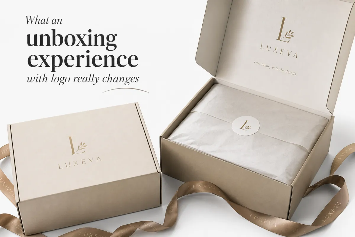
Unboxing Experience with Logo: Branding That Feels Premium
The first thing many customers touch is not the product at all, but the package around it, and that is why an unboxing experience with logo can shape the mood of a purchase before the item is even in view. A plain carton says “shipment”; a thoughtful unboxing experience with logo says “brand,” and that difference shows up quickly in customer perception, confidence in the price, and the likelihood of a repeat order.
From a packaging buyer’s point of view, the logo is not just a mark sitting on the surface. It signals that the business cared about brand consistency, made deliberate material choices, and treated the opening moment as part of the product experience. Done well, an unboxing experience with logo supports brand identity without shouting, which is usually what makes it feel premium instead of promotional.
For brands selling direct to consumers, the goal is not to cover every square inch. The goal is to use print, structure, and finish in a way that reinforces the right message at the right moment. The strongest packaging often feels calm, intentional, and slightly restrained, because that restraint gives the logo room to matter. I’ve seen packages go from forgettable to memorable with just one cleaner print decision and a better fold sequence, so yeah, the details do matter.
What an unboxing experience with logo really changes
An unboxing experience with logo changes the order of perception. Before the customer touches the product, they are already judging the brand through the carton, tape, label, and reveal sequence. That first judgment sticks. If the outside looks clean and the inside looks considered, people infer quality even when the product itself is ordinary. If the box feels random, expectations start dropping before the item is ever inspected.
That effect is especially strong for gifts, subscription orders, premium accessories, beauty products, boutique apparel, and small-batch goods. In those categories, the package is part of the value proposition. A buyer may not say, “I paid extra for the box,” but they absolutely notice the gap between a generic shipper and an unboxing experience with logo that feels planned from the start. The logo becomes a proof point that the brand is real, stable, and willing to stand behind the purchase.
There is a practical trust element too. A clear logo on the outside improves recognition during delivery, and a consistent logo treatment inside the package helps the buyer connect the shipping experience to the website, the social channels, and the product insert. That is where brand recognition grows. Not from one dramatic gesture, but from repeated signals that all feel like they came from the same company.
“A logo on packaging is not decoration first. It is a promise that the rest of the details were probably handled with the same level of care.”
A lot of brands overcomplicate this part. They assume premium means more layers, more foil, more ink coverage, more everything. In practice, premium often comes from the opposite: a measured unboxing experience with logo that uses one strong visual cue, clean structure, and a finish that feels right in the hand. That can be a crisp one-color mark on a kraft mailer, a soft-touch rigid box with a single debossed logo, or a folding carton with a controlled reveal. The point is not excess. The point is confidence.
The other change is emotional. A buyer who enjoys opening a package is more likely to remember it, talk about it, photograph it, and feel better about the money they spent. That matters because visual branding is not only about recognition on a shelf or screen; it is about memory after the sale. A good unboxing experience with logo helps the customer carry the brand into their own space, where the package becomes part of the story instead of waste to be discarded.
And there is one more thing. When the opening experience feels considered, customers are a little more forgiving if the product is not perfect on the first try. That does not excuse quality problems, of course, but it does buy a bit of goodwill. Packaging cannot fix a bad product, but it can make the first impression feel less brittle.
How the unboxing experience with logo works from box to reveal
A useful way to think about an unboxing experience with logo is as a sequence. The customer starts with the outer shipper, then moves to the branded carton or mailer, then to the internal wrap, and finally to the product itself. Each layer has a job. If every layer tries to be the star, the reveal gets noisy. If every layer knows its role, the process feels calm and deliberate.
The outer carton is about arrival and protection. It needs to survive handling, stacking, abrasion, and the reality of parcel networks. That means board strength, tape placement, and print durability matter more than people sometimes expect. A beautiful outer print that scuffs during transit can weaken the whole unboxing experience with logo. The outside should announce the brand clearly, and it also needs to survive the trip.
Inside the box, the job changes. Tissue, a belly band, a label seal, a custom insert, or a thank-you card can create the reveal moment without making the package feel overworked. This is where layered packaging earns its keep. A simple branded mailer may be enough for lightweight products, but for premium goods, the interior often carries the strongest emotional impact. A logo printed on the lid, a colored inside panel, or a neat insert that frames the product can make the unboxing experience with logo feel purposeful from the first fold to the last reveal.
Materials also influence the feel of the opening. A matte-coated folding carton opens differently from a high-gloss mailer. Soft-touch lamination has a quieter, more velvety hand feel, while uncoated kraft board reads more natural and earthy. Embossing, debossing, foil stamping, and spot UV all affect how light and fingers interact with the package. These details can make a logo feel refined, but only if they fit the brand and do not fight the structure.
The best unboxing experience with logo is usually built from restraint and repetition rather than from surprises stacked on surprises. The customer should recognize the brand at a glance, then understand it again when they open the lid, and again when they lift the product out. Each step should confirm the same tone: this brand is consistent, and it knows how to present itself.
One more practical point: social sharing. A package with clean logo placement and a visible reveal zone photographs well. If the first opening moment looks intentional, customers are more likely to post it without heavy editing. That can turn a well-designed unboxing experience with logo into organic word of mouth, which is still one of the most credible forms of promotion a brand can earn.
Key factors that shape an unboxing experience with logo
Several design choices shape whether an unboxing experience with logo feels polished or forgettable. The best results usually come from aligning structure, print, finish, and shipping reality before artwork is finalized. A package cannot be judged only by how it looks on a screen, because the customer is going to hold it, open it, and maybe ship it across the country.
Structure comes first
Structural packaging choices set the tone. Folding cartons work well for retail-style presentation, light to medium-weight products, and applications where a clean printed surface matters. Corrugated mailers are practical for e-commerce because they protect better and ship efficiently. Rigid boxes, especially set-up style boxes with separate lids, are the go-to for gifts and high-value items when the brand wants the opening moment to feel more substantial. Custom inserts, whether paperboard, corrugated, pulp, or foam, keep products centered and reduce damage during transit.
If the structure is wrong, the logo cannot save it. A beautiful print on a box that crushes in shipping will not produce a premium unboxing experience with logo. A huge box around a small item creates empty space, rattling, and wasted freight. Right-sizing is not glamorous, but it is one of the strongest design decisions a brand can make.
Print and placement need discipline
Print decisions should follow the hierarchy of the package. A one-color logo on kraft board can feel honest and tactile. A full-color print may fit lifestyle brands, but only if the artwork supports the product and the budget. Interior printing is powerful when used sparingly, because it turns the inside lid or base into a reveal surface without making the whole package visually busy.
Logo placement matters more than many teams expect. A centered mark on the lid gives a different impression than a small corner stamp or a repeating pattern. If the goal is a premium unboxing experience with logo, the logo should usually have room to breathe. Too many badges, claims, and social handles can make the package feel like a flyer. Good visual branding is often about editing, not adding.
Finishes and materials change the feel
Material choice is not just a cost line. It changes how people read the package in their hands. Coated SBS or C1S board gives a crisp, smooth print surface. Kraft board can communicate natural, recycled, or minimal aesthetics. Soft-touch lamination creates a matte, almost suede-like finish that often feels more premium than high gloss. Foil stamping catches light and signals specialness, but it can also look loud if used without restraint. Embossing and debossing add physical depth and can be especially effective for a logo because the customer feels the identity, not just sees it.
If the product is fragile, heavy, or moisture-sensitive, the package should also be designed for the realities of shipping. That is where standards and test thinking matter. Many teams use ISTA-style testing concepts, and the practical reason is simple: drop, vibration, and compression failures are expensive. You can read more about transport testing practices through the ISTA and package sustainability guidance through the EPA. If a box cannot survive the journey, the logo on it will not matter much.
Sustainability should look intentional
Customers notice waste. They also notice when a brand overcorrects and uses flimsy materials that feel cheap. Better packaging usually comes from right-sizing, choosing recycled-content board where possible, reducing filler, and designing inserts that do more with less material. FSC-certified paperboard is worth considering when sourcing priorities include responsible forestry and traceability. The FSC system is a useful reference point when brand teams need to explain sourcing choices to buyers or internal stakeholders.
In a strong unboxing experience with logo, sustainability should not feel like an afterthought. It should show up in the way the box fits, closes, and opens. A package that uses less material but still opens cleanly often feels more premium than a larger package that looks wasteful and unstable. That is one of the quieter truths of packaging: the best environmental decision is often also the best brand decision.
Brand personality belongs here too. A clean luxury skin-care brand, a rugged outdoor brand, and a playful gifting brand should not use the same visual language. The logo is doing different work in each case. The right unboxing experience with logo should feel native to the rest of the customer journey, from website typography to thank-you message to product photography.
In sample reviews, I usually look for one question before anything else: does the package feel like the price point it is asking for? That sounds simple, but it catches a lot of problems early. If the answer is no, the design may need a quieter finish, a better insert, or a tighter structure. Kind of boring advice, maybe, but it saves money.
Cost and pricing for an unboxing experience with logo
Pricing for an unboxing experience with logo usually comes down to five variables: material grade, box style, print complexity, finishing, and order quantity. Once those are set, a supplier can usually give a much more honest number than a vague “custom quote.” The tricky part is that the cheapest-looking option is not always the cheapest total cost, especially after freight, warehousing, and damage risk are included.
Small runs tend to feel expensive because setup and tooling are spread across fewer units. Larger orders usually reduce unit cost, especially on simple folded cartons or printed mailers. Specialty finishes, custom inserts, foil, embossing, and rigid construction add steps, and each step adds labor, equipment time, or both. If a brand is still testing the offer, it often makes sense to keep the first version of the unboxing experience with logo simple, then invest in premium touches once sell-through is proven.
| Packaging option | Typical use | Approx. unit price at 5,000 pcs | What it usually delivers |
|---|---|---|---|
| Printed corrugated mailer | E-commerce, light apparel, accessories | $0.35-$0.95 | Good protection, efficient shipping, clean branded exterior |
| Folding carton with insert | Beauty, small electronics, gifts | $0.95-$2.75 | Sharper presentation, better shelf feel, stronger reveal moment |
| Rigid setup box | Premium kits, high-value gifts, presentation sets | $3.50-$9.00+ | Heavier feel, premium perception, room for special finishes |
Those ranges are not fixed quotes, and they can move depending on board stock, color count, insert style, shipping zone, and whether the box is printed on one side or both. They are still useful for budget planning because they show how fast a logo package can move from practical to premium. A simple unboxing experience with logo does not have to be expensive; it just has to be designed around the right priorities.
It also helps to think in terms of total landed cost, not just box cost. Proofing, freight, pallets, storage space, and assembly time can all change the real number. If a rigid box ships flat, but assembly takes a minute per unit and requires staff time, that matters. If a custom insert lowers damage claims by a few percentage points, that can save more money than a flashier finish would spend. That is the kind of math packaging buyers should keep in view.
If the budget is tight, I usually recommend spending in this order: structural fit first, then print clarity, then one high-value finish. That might mean choosing a better board grade, improving the logo placement, and adding an embossed mark rather than trying to use every finish option at once. The best unboxing experience with logo often comes from one or two well-placed details instead of a crowded spec sheet.
One honest caution: pricing changes fast with paper markets, lead times, and shipping conditions. A quote from six months ago might not hold. So if you are planning a launch, get fresh numbers before locking the artwork. That part is not glamorous, but it keeps everyone out of trouble.
Step-by-step process and timeline for logo packaging
A good unboxing experience with logo rarely happens by accident. It usually comes from a sequence that starts with business goals and ends with physical samples that have been handled, folded, opened, and tested by real people. The more disciplined the process, the fewer surprises at production time.
- Define the goal. Decide whether the packaging is meant to protect, gift, retail, ship, or do all four. Clarify the audience, average order value, shipping channel, and budget ceiling.
- Choose the structure. Match the box style to the product weight, fragility, and opening experience. A 2 oz cosmetic item does not need the same construction as a 3 lb gift set.
- Prepare artwork. Build the logo files, bleeds, dieline, and finish callouts. Check type size, line weight, and the exact placement of every mark.
- Review proofs. Confirm color, panel orientation, fold behavior, and interior details. The proof stage is where many problems get caught, especially in a unboxing experience with logo that uses inside printing or specialty finishes.
- Sample and test. Handle the package in real life. Check closure, squeeze points, product fit, and the sequence of the reveal. Test it with someone who has not seen the design before.
- Move to production. After approval, the factory runs the job, then finishes, packs, and ships it. Freight planning matters here because packaging moves in volume, not by the piece.
Lead times depend on complexity. A simple printed mailer with ready artwork might move from approval to production in roughly 10 to 15 business days, not counting freight. A folding carton with a custom insert may take 2 to 4 weeks, especially if there are multiple proof rounds. Rigid boxes, specialty lamination, foil, embossing, or unusual die cuts can push the schedule longer. If the order needs to land ahead of a launch, it is smart to build extra margin into the calendar rather than hope the printer has unused time.
Seasonality can also stretch timelines. Gift-heavy periods, promotional pushes, and holiday production windows fill up fast, and the unboxing experience with logo is often one of the first places where rushed decisions show up. Files that need fixes, missing dielines, or late changes to the copy can cost days. Good packaging work is usually less about speed and more about keeping decisions clear early enough that production can run without friction.
From a buyer’s perspective, the strongest workflow is simple: pick the package purpose, approve the structure, lock the artwork, sample the reveal, then move to full production. That order protects both quality and schedule. It also gives the brand room to make sure the unboxing experience with logo looks and feels right in the hand, not just in a PDF.
If you want the short version, this is the part to remember: structure before decoration, sampling before approval, and shipping reality before print fantasy. That sequence has saved more projects than any flashy finish ever could.
Common mistakes that weaken an unboxing experience with logo
The fastest way to weaken an unboxing experience with logo is to treat branding as an overlay instead of a system. A logo can help, but it cannot fix poor fit, weak structure, or confusing sequencing. The most expensive packaging mistake is often not a fancy finish; it is a package that looks good in review and disappoints the second a customer opens it.
- Overbranding: Too many marks, too many messages, and too much copy crowd the surface. The result feels busy instead of premium.
- Poor fit: Excess headspace, loose product movement, or crushed corners make a package feel careless, even if the print is excellent.
- Weak contrast: A logo that disappears in dim light or blends into the substrate will not carry the branding moment very far.
- Ignoring the inside: The exterior may get the first glance, but the inside often creates the strongest memory in the unboxing experience with logo.
- Skipping handling tests: What looks stable on a computer can fail under actual pressure, drop, or vibration.
- Forgetting shipping reality: A package that opens beautifully on a desk but scuffs, tears, or bends in transit does not support the brand for long.
Another mistake is adding premium finishes where they will not be noticed. A foil logo on a mailer that gets heavily tape-sealed and handled by parcel carriers may never feel worth the cost. A better spend might be a stronger insert, a more precise die cut, or a printed interior panel. The smartest unboxing experience with logo usually puts money where the customer actually experiences it: the first hand feel, the first open, the first lift-out.
Brands also underestimate how lighting affects packaging. A low-contrast logo can look elegant in a studio render, then vanish in a kitchen, office, or doorstep at night. That is one reason physical samples matter so much. A package needs to survive real-world viewing conditions. The better the test process, the better the final unboxing experience with logo will perform in ordinary homes, not just in presentations.
Another common trap is designing for approval instead of use. Teams sometimes approve a package because it looks expensive, then discover the closure is awkward, the insert is too tight, or the product arrives off-center after transit. Testing catches those issues early. Good packaging is a working object, not a render.
And if a package only looks good from one angle, that is usually a red flag. Customers rotate boxes, open flaps, pull tabs, and inspect seams. The branding has to survive all those moments, not just the front-facing shot.
Expert tips to improve your unboxing experience with logo
If the goal is a better unboxing experience with logo, the smartest improvements are usually specific rather than dramatic. One strong tactile decision, one cleaner visual hierarchy, and one more thoughtful opening sequence can do more than a pile of extra decoration. That is the practical side of packaging design that buyers learn after a few production cycles.
Design for the camera and the customer at the same time. If the package has a clear front panel, a strong opening line, and a reveal that creates contrast between outside and inside, customers are more likely to photograph it. The packaging does not need to beg for attention. It just needs a moment that reads clearly in a picture. That helps the unboxing experience with logo work in both private and public settings.
Pick one memorable tactile element and let it carry the premium signal. That might be embossing on the logo, a ribbon pull, a colored interior, a soft-touch finish, or a well-cut thumb notch. I would rather see one useful detail done well than five details fighting each other. The most effective unboxing experience with logo often has a single point of delight that people remember.
Keep the visual hierarchy simple. The logo should read quickly, but it should not compete with every message on the box. If the package is trying to explain the entire business model, the reveal gets cluttered. Brand identity is stronger when the main mark has room to breathe, and the rest of the information supports the opening rather than stealing the spotlight.
Include a short insert or card that actually helps the customer. A care note, usage tip, reorder path, or thank-you message can add value without feeling pushy. The key is to keep it useful. Customers can tell when a card exists only to fill space. A useful insert is better for trust, better for retention, and better for the overall unboxing experience with logo.
Test the package with people who have not seen the design before. Hand them the sample, stay quiet, and watch what they do. Where do they hesitate? Where do they pull first? What do they notice? Those small reactions are gold, because they reveal friction that design reviews miss. If the opening path feels awkward, adjust it before production locks in. That habit alone can improve a unboxing experience with logo more than another round of visual polish.
Think in systems. The packaging should match the website, the order confirmation, the product insert, and the delivery expectation. A clean package with a different tone from the rest of the brand journey can feel disconnected. A coherent package strengthens brand consistency and supports repeat sales because the customer knows what to expect before the next order even arrives.
Here is a simple way to pressure-test the design before committing:
- Open the box in a low-light room and see whether the logo still reads.
- Shake the packed unit gently and check for movement.
- Close and reopen the package several times to see whether the mechanics hold up.
- Ask whether the package feels aligned with the price point.
- Compare the sample to the website branding and product photography.
That kind of hands-on check tells the truth quickly. If the package passes those tests, the unboxing experience with logo is usually moving in the right direction. If it does not, the fix is often simpler than expected: better fit, cleaner print, or one less design element competing for attention.
One last practical tip: keep a physical sample on the desk during final review, not just a PDF on screen. Paper, board, finish, and assembly all reveal themselves differently in the hand. It sounds basic, but it prevents a lot of expensive surprises.
Frequently Asked Questions
How do I make an unboxing experience with logo feel premium without overspending?
Start with fit, structure, and clean print quality before you add premium finishes. A well-sized box with crisp artwork and one thoughtful detail, such as an embossed logo or a branded interior panel, often feels more upscale than a package overloaded with foil and extra decoration. In many cases, the strongest unboxing experience with logo comes from editing the spec down to the pieces customers can actually feel and remember.
What packaging types work best for an unboxing experience with logo?
Printed mailers work well for light e-commerce shipments and everyday fulfillment. Folding cartons are a strong fit for beauty, small electronics, and giftable products. Rigid boxes are better for presentation-heavy launches, high-value sets, and occasions where the box itself is part of the purchase value. The best choice depends on weight, protection needs, and how much of the unboxing experience with logo you want to build into the package structure.
How long does it take to produce custom logo packaging?
Simple projects can move quickly if the artwork is ready and the structure is standard. Custom shapes, specialty finishes, insert work, and proof revisions add time, and that is especially true for a detailed unboxing experience with logo that uses multiple layers or a premium opening sequence. As a planning rule, give yourself extra room for sampling, approvals, and freight rather than trying to squeeze production into the last possible week.
What affects the price of an unboxing experience with logo the most?
Order quantity is usually the biggest cost driver because setup and tooling spread out differently at scale. Material choice, print coverage, finish selection, and insert complexity also make a big difference. Freight, warehousing, and assembly time can matter just as much as the box itself. If you are comparing options, ask for complete pricing so the unboxing experience with logo is evaluated as a system, not as a single line item.
How can I tell if my logo packaging is actually working?
Check whether the package protects the product, opens the way you intended, and matches the brand level the customer expected. Watch for concrete signals like fewer damage claims, more positive feedback, better repeat purchase behavior, and more social sharing. If new customers say the packaging feels more expensive than the product price would suggest, that is often a sign the unboxing experience with logo is doing its job.
A strong unboxing experience with logo does not need to be loud to feel premium. It needs to be thoughtful, well-fitted, and honest about what the brand stands for. When the structure protects the product, the logo supports recognition, and the finish choices match the audience, the package becomes part of the value rather than a container around it. That is the kind of unboxing experience with logo that builds trust, supports repeat sales, and makes the brand feel finished from the outside in.
If you are deciding where to start, begin with the box structure and the first reveal moment, then choose one logo treatment that fits the material instead of fighting it. That approach keeps the packaging clear, cost-aware, and believable, which is usually where the best results come from.
Related packaging resources
Use these related guides to compare specs, costs, quality checks, and buyer decisions before making the final call.


