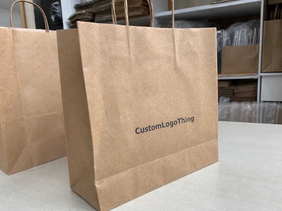
A vitamin brand Kraft Paper Bags print proof checklist is the easiest place to prevent the kind of mistakes that turn a clean packaging plan into a reprint. Kraft is not a blank white surface. Its brown tone, visible fiber, and ink absorption can shift brand colors warmer, duller, or flatter than they appeared on a monitor. That matters for vitamin packaging because the bag has to carry trust: ingredient copy, regulatory statements, barcodes, and brand cues all need to remain readable while the piece still feels premium.
On paper, a bag proof can look straightforward. In production, it is a working document that shows where folds land, how the handle area interrupts the art, and whether the print method can carry the design without losing contrast. Buyers who treat the proof like a production check, not a presentation, usually avoid the most expensive surprises. The difference shows up in the final bag: cleaner edges, fewer misaligned panels, and fewer compromises made under deadline pressure.
There is also a practical reason this checklist matters now. Many vitamin brands want a natural look that signals restraint, wellness, and material honesty. That aesthetic can fail quickly if the logo sinks into the kraft, the barcode lands too close to a crease, or the legal copy shrinks below readable size. A focused proof review keeps the design from being only attractive on screen.
What the vitamin brand kraft paper bags print proof checklist catches
The checklist exists to catch the issues that do not announce themselves in a digital mockup. A centered logo on a flat artboard can drift once a bag gets folds, gussets, or handles. A text block that feels roomy on a layout can crowd a seam after the structure is added. A barcode can sit inside the artwork but still fail on the final bag because the quiet zone is too tight or the placement is too close to a fold line. Those are small errors on paper and expensive ones on press.
Kraft paper changes the reading of color more than most brands expect. Natural kraft tends to warm everything up. Bleached kraft offers more contrast, but it still has texture that affects ink laydown. Recycled kraft often brings extra fiber variation, which is useful for certain sustainability stories and less useful for tiny type. The proof should force everyone to look at the piece as a shopper would: from a short distance, under imperfect light, with competing packages nearby.
For vitamin brands, legibility is not optional. The front panel may need to hold a brand mark, a product descriptor, a quantity statement, and one or two claims. The back or side panels often carry ingredient lists, warnings, lot-code space, and barcode placement. A strong vitamin brand kraft paper bags print proof checklist asks whether all of that survives the structure, not just whether the layout is attractive in software.
A proof should answer three questions before approval: will the art fit the structure, will the copy stay readable, and will the print method support the brand message.
- Panel fit: Confirms logos, copy, and codes stay inside live print areas.
- Copy accuracy: Checks ingredient text, claims, SKUs, and required legal language.
- Visual contrast: Verifies how the palette behaves against kraft paper.
- Assembly risk: Catches fold-line collisions, handle interference, and gusset creep.
If the packaging story includes FSC-certified paper, recycled content, or biodegradable packaging language, the proof should reflect that wording exactly. Claims are not decorative copy. They need to be supported by the right stock, the right supplier paperwork, and the right final phrasing. If the material story changes midstream, the proof should be updated before production starts, not after.
How the proofing process works from dieline to sign-off
The cleanest proofing process starts with a dieline. That file shows the bag’s exact panel structure, fold lines, glue zones, handle area, and live print space. Artwork gets placed on the dieline so the designer can see what will happen after assembly, not only before it. A good first proof then shows the packaging as a production object, not a flat illustration pretending to be one.
A PDF proof is the fastest way to verify layout, spelling, hierarchy, and panel placement. It is especially useful for checking whether a logo drifts toward a fold or whether the barcode has enough quiet space around it. A physical sample does something different. It shows the real paper tone, ink density, texture, and the way the bag behaves in three dimensions. If the design uses fine typography, metallic accents, or a white underprint on dark kraft, the sample is usually worth the extra cost. Screen color is not a substitute for printed color on textured stock.
| Proof type | What it confirms | Typical cost | Best use |
|---|---|---|---|
| PDF proof | Layout, copy, panel placement, barcode position | Often included or low cost | First-pass approval and fast revisions |
| Physical sample | Color contrast, paper texture, fold behavior, finish feel | Usually $75-$250 | Artwork with tight color tolerance or structure concerns |
| Press proof | Closest view of final print behavior and ink density | Often $250-$600+ | Higher-risk jobs, specialty inks, or launch-critical packaging |
Version control is where many teams stumble. Proof files should be numbered, dated, and tracked so no one approves an old correction by accident. The approval note should name the exact version, list the changes already accepted, and state what still needs to happen before print release. That is especially useful on jobs that move through digital printing for short runs or offset printing for larger quantities, because setup changes can happen quickly once the final file is released.
Lead comments also need one home. A single thread or single document is far easier to manage than four different email chains. If a buyer, marketer, and compliance reviewer all send separate notes, the risk is not disagreement alone. It is the chance that a printer receives three partial instructions and has to guess which one is final.
For brands trying to judge how structure, finish, and artwork work together, past packaging examples can help. A few of our packaging case studies show how simple artwork can still behave differently depending on print method, material, and bag construction.
Key print and material factors that change the final look
The stock itself changes the design more than a lot of buyers expect. Natural kraft has a warmer base tone and a more visible fiber pattern. Bleached kraft reads cleaner and gives color more room to stand out. Recycled kraft can support a sustainability story well, but its surface variation is usually more noticeable. The same ink formula can look richer on one stock and flatter on another, so the proof should be judged against the actual paper, not a generic mockup.
Paper weight matters too. Retail-style kraft bags often sit in the 120-180 gsm range, while heavier bags may use higher weights for better stiffness, opacity, or load-bearing comfort. Heavier stock can improve print stability, but it can also raise cost and make folding behavior more pronounced. Thin stock may print more economically, though fine type and solid coverage can suffer if the surface is too absorbent. There is no universal best choice; there is only the stock that supports the artwork with the fewest compromises.
White ink or a white underprint often decides whether a design reads as crisp or faded. On dark kraft, a small logo without an underbase can lose edge definition. On textured paper, thin serif type can break apart if the ink deposit is light or uneven. A useful vitamin brand kraft Paper Bags Print proof checklist should not only ask whether white ink is present. It should ask where it is needed, whether it covers enough area, and whether the fine details still hold up at arm’s length.
Structure is another source of surprises. Gussets change what is visible on a flat file versus a filled bag. Handles interrupt top-panel artwork. Glue zones are not decorative space. The live print area rarely matches the full artboard, and artwork that ignores that difference often ends up with a brand mark hiding behind a seam or text slipping toward a fold line. A flat proof may look clean while the assembled bag tells a different story.
Finish choices can help or hurt clarity. Matte varnish softens shine and makes copy easier to read. Spot gloss can pull attention to a logo or key visual. Foil accents add contrast and perceived value, but they also introduce registration risk and can magnify any edge mistake. The finish should match the claim set. A bag that talks about natural ingredients but looks overly glossy and dense can feel off, even if the print quality itself is good.
- Natural kraft: Warmer tone, more visible fiber, higher risk of muted color.
- Bleached kraft: Cleaner base, stronger contrast, more predictable typography.
- Recycled kraft: Supports recycled content messaging, but variation is normal.
- White underprint: Helps logos and fine text stay readable on darker surfaces.
- Spot finish: Can improve emphasis, but needs careful registration review.
One often overlooked issue is transit wear. Finished bags are usually packed into cartons and moved through normal shipping and warehouse handling. If the print finish scuffs easily, that damage can show up before the bags ever reach a shelf. The proof cannot simulate every shipping hazard, but it can prompt the right questions about coating, carton packout, and whether a finish needs extra protection during transport.
Turnaround and lead time for proof revisions and approval
Proof timelines usually follow the same sequence: initial proof, internal review, revision round, final approval, then production setup. The slowest part is often not the press step but the review step, because feedback arrives in fragments. One person looks at the barcode, another checks claims language, another focuses on the color. That spreads the revision cycle out, sometimes by days.
A basic PDF proof can often turn around in one to three business days if the artwork is already organized and the dieline is confirmed. A physical sample usually takes longer because it has to be prepared, shipped, reviewed, and sometimes corrected. A press proof can add another layer of scheduling if specialty inks, foil, or a specific stock must be loaded and checked. For launch-critical packaging, that timing needs to be accounted for early, not after the calendar has already tightened.
Rush orders are possible, but they nearly always compress the review window. That can be acceptable if the artwork is simple and the team knows exactly what cannot move: spelling, barcode quality, fold-line spacing, and compliance copy. A rushed schedule is less risky when the proof checklist is disciplined enough to stop cosmetic feedback from crowding out the essential checks.
The best planning rule is simple. The closer the proof review happens to the actual release date, the less room there is for correction. That matters even more if the vitamin bag is only one piece of a larger launch that also includes labels, cartons, or inserts. A tiny mismatch in claims wording can trigger a chain of edits across all packaging components.
For teams trying to estimate what a realistic lead time looks like, the useful question is not only “How fast can the printer move?” It is “How many review cycles will this artwork need before it is safe to release?” That answer changes more than the calendar. It changes the final cost of the job.
Cost, pricing, and MOQ details that shape the quote
Pricing usually comes down to a few repeatable drivers: artwork complexity, print colors, finish, sample type, and the amount of setup work required. A one-color logo on natural kraft is generally easier to quote than a multi-color design with foil, spot gloss, and white underprint. The proof stage matters because it exposes those choices before anyone assumes the quote is fixed.
MOQ affects unit cost in a direct way. Lower quantities spread setup expense across fewer bags, which raises the per-unit price even if the artwork is simple. That does not make a smaller order wrong. It just means the buyer should expect the proof, plate setup, and shipping to have a larger share of the total. In many short-run situations, digital printing is the practical choice because it avoids the economics that make tiny offset runs expensive. For larger orders, offset printing often becomes more favorable, but only if the proof is stable and the file is truly ready.
Printed packaging quotes are easier to compare when they are broken into parts. Ask whether the PDF proof is included, whether a physical sample is extra, whether plates are separate, and whether freight is built in or billed later. A low headline price is not necessarily a better price if it hides revision fees, finish setup, or expedited handling. A good estimate should show what changes the number instead of making the buyer guess.
Material documentation belongs in the quote discussion too. If the brand needs FSC-certified paper or wants to support a recycled content claim, that language should be tied to the correct paperwork. If the packaging is being positioned as part of a broader recycled materials or post-consumer waste story, the proof and the estimate should reflect that from the start. A supplier who works regularly with these claims will usually ask for confirmation before production, which is the right behavior.
- Artwork complexity: More colors and more coverage usually mean more setup.
- Finish choice: Matte, gloss, foil, or soft-touch details can change cost and proof time.
- Sample type: A physical sample costs more than a PDF, but it can prevent a reprint.
- MOQ: Smaller orders usually carry higher per-bag pricing.
- Shipping: Freight, carton count, and packout method should be visible in the estimate.
If the quote does not break those pieces out, ask for a line-item version. It makes the comparison much clearer. More important, it shows whether the price moved because of stock, print method, finish, or a revision that was not visible in the first estimate.
Common mistakes, expert tips, and the final approval steps
The most common proof mistake is approving too early. Phone screens make barcode size, fine copy, and fold-line proximity hard to judge. Another common miss is treating kraft like white board and expecting the same color result. A third is reviewing the proof as if it were a marketing board instead of a production document. That is how reprints happen.
Useful review habits are not complicated, but they do need discipline. Look at the proof under neutral lighting rather than warm office light that can distort color. Compare the proof against a master copy of the artwork so copy changes do not slip through. Check every panel, fold, handle area, and gusset. If the design uses a white underprint or a spot finish, confirm those layers land exactly where the printer expects them to land.
The safest approval names the exact proof version, lists the corrections already made, and assigns one person to own final sign-off.
That single-owner rule matters. When three people send three different approval notes, the vendor has to decide which instruction is final. That invites errors. One owner keeps the process clear, especially once the file moves from proof to production-ready artwork. The final approval message should confirm the version number, request the corrected production file, and ask for a final spec sheet if anything changed in size, finish, or print method.
Here is a practical closing sequence that works well on most custom bag jobs:
- Redline the proof in one place.
- Confirm the corrected version number.
- Check every legal line, barcode, and panel note.
- Request the final production file and spec sheet.
- Archive the approved proof for reorders and color reference.
- Run the vitamin brand kraft paper bags print proof checklist one last time before sign-off.
That final pass protects margin. A careful proof review costs time, but it costs far less than reworking plates, discarding the wrong sample, or discovering too late that a claim, fold, or barcode was off. For a vitamin brand, the bag is part of the trust signal. If the packaging looks uncertain, the product often does too.
Handled well, the proof stage removes guesswork from the order. The buyer gets fewer surprises, the printer gets clearer instructions, and the finished bag has a better chance of looking intentional instead of merely printed. That is the real value of a disciplined proof process.
FAQ
What should I check first on a vitamin brand kraft paper bag proof?
Start with spelling, panel placement, and safe margins so the brand name and product information do not land too close to a fold or seam. After that, confirm the barcode, claims text, and any required regulatory copy before moving to decorative details. If the kraft shade is warm or heavily fibrous, check contrast early because it can change how the final bag reads on shelf.
Do PDF proofs show the same color as the finished kraft bag?
No. A PDF proof is strong for layout and copy, but screen color does not behave like printed ink on textured kraft paper. If color contrast, white ink, or subtle brand tones matter, ask for a printed proof or physical sample. Review it under neutral lighting so the bag color and print contrast are easier to judge.
When is a physical sample worth the extra cost?
A physical sample is worth it when the artwork uses light ink on dark kraft, metallic accents, or fine text that needs real-world contrast testing. It is also useful when the bag structure, handle position, or gusset artwork must be checked in three dimensions. In many cases, the sample cost is cheaper than discovering a layout or color issue after production starts.
How does MOQ affect the proof and the final quote?
A lower MOQ usually raises the per-bag cost because setup and proofing are spread across fewer units. The proof itself may not change much, but specialty finishes, sample handling, and rush scheduling can move the quote. Ask whether the MOQ is tied to the print method, material choice, or finish so you can compare options accurately.
What is the safest approval message to send?
Reference the exact proof version and date so there is no question about which file was approved. State that approval is for production only after the listed corrections are made, then ask the vendor to confirm the final spec sheet. Keep the approval in writing and store it with the artwork files for future reorders or color matching.


