Custom coffee paper bags Print Method Comparison decisions usually begin with a small shock: the substrate changes the artwork more than the artwork changes the substrate, especially on brown kraft. A logo that looks sharp on a monitor can soften, darken, or lose contrast once ink meets uncoated paper. The first real question is not which press is “best,” but which paper will carry the design honestly.
For buyers, this is more than a color preference. You are balancing image quality, setup cost, minimum order quantity, lead time, and whether the finished bag can survive retail handling without scuffing or fading at the edges. Coffee packaging sits between product packaging and branded packaging, so the print choice has to support both shelf appeal and distribution. If you also buy Custom Packaging Products in other formats, the same rule usually applies: choose the material first, then the decoration.
A nicer file does not rescue the wrong substrate. In practice, paper choice often decides the final look before the press operator even starts tuning ink.
What a custom coffee paper bags print method comparison really shows
A useful custom coffee Paper Bags Print method comparison is less about naming a winner and more about matching four variables that have to work together: paper surface, artwork complexity, order size, and timeline. Coffee bags are judged in seconds on shelf, but they also have to hold up in packing lines, transit cartons, store backrooms, and on a countertop where fingerprints and abrasion are normal.
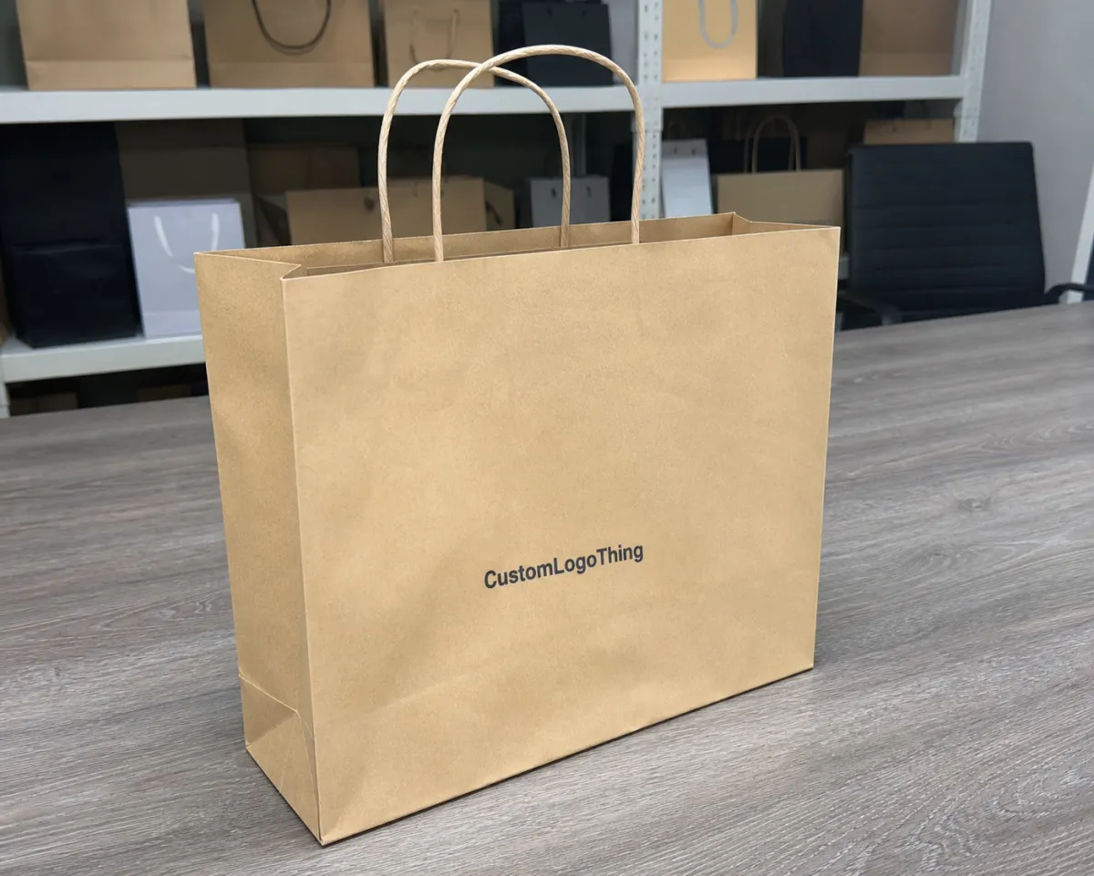
That makes coffee different from many other packaged goods. The bag is not only a container. It is a freshness signal, a tiny billboard, and part of the product story. A clean high-contrast print on white kraft can make a brand feel precise and controlled. The same artwork on brown kraft can feel warmer, more rustic, and more grounded. Neither is universally better. They simply tell different stories.
In practice, buyers are usually comparing four options:
- Flexographic printing for larger repeat runs and simpler designs.
- Digital printing for shorter runs, quick artwork changes, and seasonal launches.
- Offset printing for sharper graphics, smoother gradients, and photo-heavy branding.
- Specialty finishing such as foil, spot coating, embossing, or soft-touch lamination when the bag needs a more premium retail packaging feel.
The right answer can shift from one coffee line to another. A single-origin reserve bag, a supermarket retail pack, and a private-label club-store bag do not have the same visual or cost demands, even if the volume looks similar on paper.
How flexographic, digital, and offset printing actually transfer ink
Flexographic printing uses relief plates and fast-drying inks. It tends to work well when the design is repeatable, the artwork uses a manageable number of colors, and the order size is large enough to spread setup cost across many bags. On porous kraft, flexo can look clean because the ink pulls into the fibers quickly. That same absorbency can also soften fine detail or make pale colors look weaker than expected.
Digital printing skips plates entirely. That is the main reason it feels easier for buyers who are testing a new roast, a short holiday design, or a recipe update that may change again in a few months. In a real custom coffee paper Bags Print Method Comparison, digital usually wins on agility because copy, batch numbers, and design elements can be adjusted without paying for new tooling. The tradeoff is straightforward: the per-unit price often stays higher than flexo once volume rises.
Offset printing is the precision option. It lays down controlled color and can reproduce small type, fine lines, and photographic detail better than many buyers expect, especially on coated stock or on structures that are printed first and converted later. If the goal is rich imagery or tightly managed brand color, offset can be the stronger path. It usually asks for more prep, tighter color management, and sometimes a different bag construction or lamination step.
Registration is where the differences become visible. Flexo can be perfectly acceptable for bold logos and broad blocks of color, but tight outlines, small legal copy, and edge-to-edge graphics make any drift easier to spot. Digital usually handles short-run complexity well. Offset often wins on edge definition and tonal consistency. The issue is not which method is universally superior; it is which one makes the packaging look deliberate instead of compromised.
Cost, MOQ, and quote drivers that change your unit price
The cleanest comparison breaks cost into layers instead of looking only at the headline unit price. Setup, plates, proofs, ink coverage, number of colors, and finishing all matter. A one-color mark on kraft is a very different job from a full-bleed image with white ink underlay, metallic accents, and a matte soft-touch finish.
| Print method | Best fit | Typical setup cost | Typical MOQ | Rough unit cost range |
|---|---|---|---|---|
| Digital printing | Short runs, artwork changes, seasonal blends | Low to moderate | 300 to 3,000 bags | $0.22-$0.55 per bag |
| Flexographic printing | Simple repeat designs, larger replenishment orders | Moderate, plate-dependent | 5,000 bags and up | $0.08-$0.25 per bag |
| Offset printing | Fine detail, color-rich retail packaging, premium graphics | Moderate to higher | 3,000 to 10,000 bags | $0.15-$0.40 per bag |
| Offset plus finishing | Foil, soft-touch, embossing, high-end shelf presentation | Higher | Usually mid to larger runs | $0.20-$0.60 per bag |
Those ranges move with bag size, paper grade, inner liners, and barrier features. A 250g coffee bag on white kraft will quote differently from a larger 1kg retail pack, even when the artwork is the same. White ink on brown kraft can add meaningful cost because opacity may require extra passes or tighter press control. Heavy coverage also uses more ink and can slow production slightly.
MOQ is where buyers sometimes misread the offer. Digital printing often keeps minimums low, but the unit price can stay higher because the press time is spread across fewer bags. Flexo usually looks less attractive at the quote stage until the run gets bigger, then the economics swing quickly. If repeat orders are likely, the first run may cost more than the second because the setup has already been paid for.
The hidden math matters too: waste allowance, freight, proofing, packing, and reprint risk. A quote that looks $0.04 cheaper can become more expensive once you add 5% waste, a second proof, and a rush shipment. That is where many packaging buyers lose money. Landed cost matters more than the press estimate.
For paper sourcing and chain-of-custody questions, verify whether the paper aligns with FSC requirements and whether the supplier can document the source clearly. Buyers increasingly want the finish, print quality, and paper story to match. If you need distribution-focused context as well, the ISTA resources are useful for thinking about how packages behave in transit, not just how they look in a mockup.
Process, timeline, and lead time from art file to shipment
Most print delays happen before the press runs. A practical workflow starts with the brief, then file review, proofing, color approval, tooling or setup, printing, converting, packing, and shipping. Skip one step or rush the proof stage, and the whole job can slip by days.
For a first-time order, digital is usually the fastest path because there are no plates to make and fewer setup steps. If the art is ready and the proof is approved quickly, a simple job can move through production in roughly 5-10 business days, with transit added on top. Flexo and offset often need more lead time, especially when plates, coatings, or special finishes are involved. A realistic production window is often 10-18 business days after approval, though that depends on the plant schedule and the bag structure.
The file issues that slow things down are usually the same: low-resolution art, missing dielines, copy that has not been checked by compliance, and last-minute changes to SKU names or ingredient statements. Coffee brands run into this often because blends evolve, roast levels change, and retail claims get refined just before launch. That is normal, but it is also why a solid prepress check saves money.
It helps to separate artwork prep time from press time and shipping time. A buyer can approve a proof quickly and still miss a launch date if freight is slow or if the bags need to pass an internal quality review before receiving. A clear 3-5 day proof cycle and a 7-12 day production window is more useful than a vague promise of “fast turnaround” that never explains where the time actually goes.
Match the method to bag material, barrier needs, and shelf impact
Paper choice changes the print result more than most buyers expect. Brown kraft gives a natural, earthy look, but it mutes pale colors and lowers contrast. White kraft makes color reproduction more predictable, especially for logos, small text, and photography. Coated papers improve image sharpness and make offset printing more reliable, while laminated structures protect the print and add a more polished retail finish.
That is where the comparison becomes a packaging design decision, not just a print decision. If the brand wants rugged, organic, and farmer-market honest, brown kraft can support that story well. If the brand wants crisp, modern, and export-ready, white or coated stock usually gives more control. If the coffee sits in a distribution chain where bags get handled often, a tougher surface or protective finish may matter more than a slightly lower print cost.
Barrier needs complicate the choice. A simple dry-goods paper bag can often run through a straightforward print-and-convert path, but a bag with an inner liner, moisture protection, grease resistance, or a high-barrier layer may require different construction steps. Those steps can affect where the print happens, whether the surface accepts ink cleanly, and how much folding or sealing can happen without cracking the graphic.
Artwork complexity matters too. Gradients, photographic imagery, and metallic accents usually ask for more controlled methods, which is why offset printing and digital printing often show better results than a basic flexo setup. Small legal text is another reality check: if your claim panel includes tiny origin copy, recycling symbols, or compliance language, test it on the actual substrate before you approve the full run.
If you are comparing coffee bags against other retail packaging formats, the same rule still applies: substrate first, print method second, finish third. The smartest Custom Packaging Products buying decisions usually come from matching the material to the brand story and the distribution route, not from choosing the prettiest proof on a screen.
Step-by-step way to choose the right print method
If I were narrowing a custom coffee paper bags Print Method Comparison for a buyer, I would use a sequence instead of starting with technology.
- Define the order size and reorder rhythm. A one-time launch, a seasonal campaign, and a standing SKU each point to different economics.
- Confirm the bag material. Brown kraft, white kraft, coated paper, and laminated structures behave differently under ink and pressure.
- List the must-have visual elements. Decide whether photography, gradients, metallic accents, or tiny type are essential or optional.
- Ask for a proof on the actual substrate. A flat PDF is useful, but it is not the same as seeing the art on the real paper color.
- Compare landed cost, not just unit price. Include freight, waste, packing, and any extra testing or reprint exposure.
- Check the timeline against the launch date. A cheaper method is not useful if it misses the shelf window.
A good sample request should include one comparable print on similar paper, one color-managed proof, and one clear note about acceptable variation. That last part matters. If a supplier cannot explain the tolerance they are working to, the quote is not complete enough yet. Suppliers who speak plainly about color variation, registration limits, and what happens when a design needs a second pass are usually easier to work with than those who only sell optimism.
For national distribution, think about handling as well as appearance. If the bags are going through carton stacking, pallet wrap, and multiple unloads, ask whether the print finish can survive scuffing and pressure. Distribution-test thinking, including references from EPA materials and waste guidance, keeps packaging decisions grounded in reality instead of only in design intent.
Common mistakes that cause color shifts and costly reprints
The first mistake is assuming a screen mockup will look the same on kraft paper. It will not. Uncoated stock absorbs ink differently, and lighter colors can lose strength fast. Brown kraft can make bright pastels feel dusty, and black can look less dense than expected if the press does not lay down enough coverage.
The second mistake is sending files that are not truly print-ready. Tiny text, ultra-thin strokes, RGB-only artwork, or colors that depend on an exact monitor match create trouble. Coffee buyers often discover this late because the bag design was built for a website or a social post first, then adapted for product packaging without a proper prepress review.
The third mistake is skipping a real substrate proof. That is expensive because the reprint happens after the entire run is already in motion, not before. Even a careful Custom Coffee Paper Bags print method comparison can go wrong if no one checks the art on the actual paper color, with the actual finish, under the actual light the bags will see on shelf.
The fourth mistake is choosing the cheapest quote without checking what is included. Does it cover plates? Does it cover packing? Is there a waste allowance? What color tolerance is acceptable? Are there charges for white ink, extra passes, or metallic finishes? A quote that ignores those questions may be cheap only on paper.
There is also a common assumption that “more premium” always means “better.” Not always. A very high-gloss finish can feel wrong on a small-batch, direct-trade coffee line that is trying to feel grounded and honest. Good package branding is not about using the most expensive method. It is about using the method that makes the story believable.
Expert tips and next steps for a cleaner coffee bag order
Buyers usually get better results when they start with a short checklist and keep it tight. Confirm the bag material, print method, color count, finish, MOQ, and target ship date before asking for final numbers. That simple discipline removes a lot of quote drift and avoids the back-and-forth that burns time.
Ask for one comparable sample on similar paper, one proof with color management, and one explanation of what counts as acceptable press variation. If a supplier is confident, they can explain whether they are matching to Pantone intent, visual expectation, or a process-specific tolerance. That conversation is often more useful than talking about perfect color, because perfect color is not a real production promise on every substrate.
If the bag will become a steady SKU, think about reorder planning early. A locked-in spec saves time, and repeat orders often benefit from fixed plates, known ink recipes, and a pre-approved construction. That is where a careful custom coffee paper bags print method comparison turns into a supply-chain tool instead of a one-time design exercise.
One last buyer habit helps more than people expect: compare this order against the rest of your branded packaging line. If your coffee bags, Custom Packaging Products, and other retail packaging all need to feel like one family, the print method has to support that consistency from first shipment to reorder. The comparison should always come back to the same three questions: does it fit the volume, does it fit the budget, and does it fit the shelf story? If the answer is yes to all three, the choice is probably sound.
Which print method is usually best for custom coffee paper bags with small order quantities?
Digital printing is often the easiest fit for smaller runs because it avoids plate costs and handles short quantities efficiently. It is especially useful when you are testing a new blend, a seasonal design, or a limited retail launch. If the artwork is simple and the bag count is low, digital can reduce setup friction even if the unit price is a little higher.
How does kraft paper color affect custom coffee paper bags print method comparison results?
Brown kraft can mute light colors, reduce contrast, and make white or pale artwork look softer than it does on a screen. White kraft usually gives more predictable color reproduction, especially for photography, fine type, and bright branding. Always proof on the actual paper color you plan to use, because the substrate matters as much as the print method.
What is the most cost-effective print method for larger coffee bag orders?
Flexographic printing often becomes more economical as volume rises because the setup cost spreads across more bags. The best value usually depends on how many colors you need, how much coverage the design uses, and whether you expect repeat orders. A low unit price is only useful if the method also meets your timeline and quality requirements.
How long should I expect a printed coffee paper bag order to take?
Lead time depends on file readiness, proof approval, print method, and whether plates or special finishing are required. Simple digital jobs can move faster, while flexo or offset workflows may need more setup and color confirmation time. Ask for a timeline that separates artwork approval, production, and shipping so you can plan inventory more accurately.
Can I use full-bleed artwork on custom coffee paper bags without losing detail?
Yes, but the result depends on the print method, the paper surface, and how fine the details are in the artwork. Dense coverage, gradients, and photo-heavy designs usually need closer color control and a better proofing process. If the design includes small text or thin lines, ask for a substrate sample before approving the full run.

