A design can look sharp on a monitor and still lose clarity once it is woven into a small beanie label. That gap is exactly why the beer Woven Label Beanies Digital Proof checklist matters: it is the final checkpoint before thread count, placement, and color contrast become fixed in production.
Buyers often think of the proof as a preview image. That is too soft a definition. It is closer to a production document with pictures attached. The proof tells you what the factory understood, what it can build, and where the artwork may need to be simplified so it survives a small woven format.
The best reviews are usually the least dramatic. Clean files, direct notes, and one person collecting internal feedback tend to move faster than a long thread of half-conflicting comments. Winter accessories are unforgiving that way. A label that reads well at arm’s length usually wins; a design that depends on tiny detail usually loses.
Beer Woven Label Beanies Digital Proof Checklist Essentials
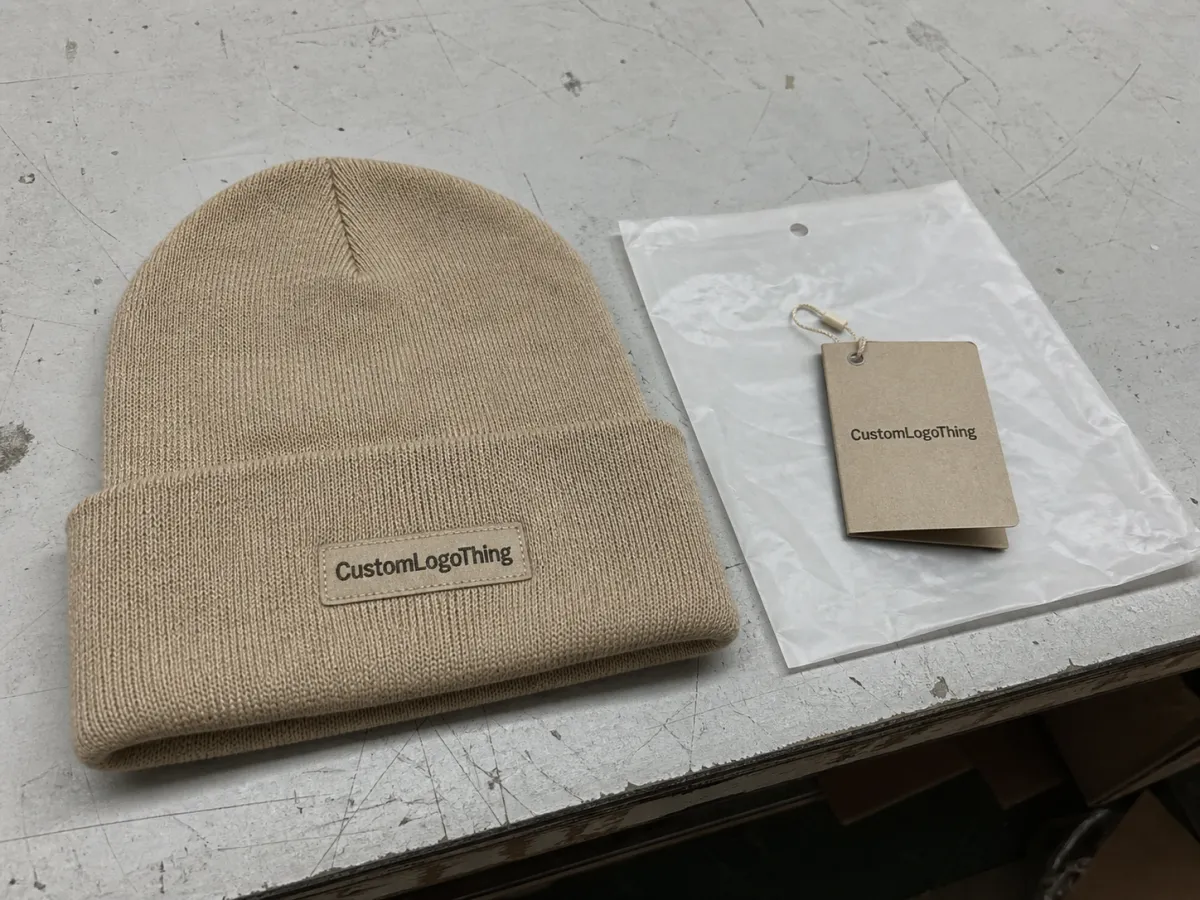
The practical surprise is this: a label that looks balanced on screen can behave very differently once it is woven into a cuff or side panel. Knit texture, seam placement, and the scale of the garment all affect how the eye reads the mark. A strong beer woven label Beanies Digital Proof Checklist exists to catch that mismatch before any yarn is cut.
The proof should be treated as the buyer’s last visual checkpoint, not as a sample that guarantees texture or hand feel. It can confirm layout, type size, border style, folding direction, and rough placement. It cannot fully show thread sheen, stretch, or how the label will sit against rib knit, fleece, or acrylic yarn in the real world.
What a proof can confirm: spelling, logo proportions, color separations, edge treatment, fold direction, and sew-on area. What it cannot fully confirm: softness, exact thread sheen, stretch behavior, and how much the surrounding fabric may distort the label once it is attached.
"A proof is a map, not the destination. If the map is wrong, production pays for it later."
That is why the checklist has to go beyond aesthetics. It should verify production readiness. Buyers who read the proof like a manufacturing document, rather than a marketing mockup, are more likely to catch the problems that matter: tiny text that will blur, lines that are too thin for the weave, or a placement choice that disappears once the cuff is folded.
- Confirm the artwork size against the actual sew-on area.
- Check contrast between background thread and logo thread.
- Review fold or cut style so the label reads correctly once attached.
- Look for seam conflicts and tight corners that may distort the weave.
- Approve production-ready copy, not placeholder text or draft wording.
For teams comparing trim options across apparel lines, a woven label proof should sit alongside the rest of the spec pack, not in isolation. The label may be small, but it still has to match the garment’s construction, the brand’s color logic, and the intended retail position. That is where most expensive mistakes start.
How Artwork Becomes a True-to-Weave Proof
A woven label starts as vector artwork, then gets translated into thread structure. That translation changes what the eye sees. Thread count, weave direction, and stitch resolution all influence whether the final piece looks crisp or slightly softened. The proof has to reflect those limits, not pretend they do not exist.
Digital proofs usually flatten the texture on purpose. They are not trying to imitate every thread. Their job is to show the parts that matter most for approval: proportions, alignment, type size, logo balance, and color blocking. If those elements are correct, the label is usually on solid ground.
In beanie programs, scale is the trap. A detail that feels readable at full monitor size can vanish once the label shrinks to a couple of inches wide. Small text is the usual casualty. Thin borders are close behind. If a design depends on delicate line work, it should be tested at the exact size printed in the proof notes, not judged by a zoomed-in screen view.
Proof notes deserve the same attention as the artwork itself. They often tell you what is fixed, what can still be adjusted, and where the factory is making a judgment call. If a thread color is marked as a near match rather than an exact reference, that is not a cosmetic footnote. It is a signal to slow down and decide whether the difference is acceptable.
Good buyers read the proof like a spec sheet. They compare the image, the dimensions, the notes, and the legend together instead of assuming the mockup tells the whole story. That habit avoids one of the most common woven-label problems: approving a nice-looking proof that was never matched to the actual build.
If your team works across categories, common packaging language can help keep the conversation precise. Terms such as finished size, backing type, and trim construction should mean the same thing to everyone involved. That is especially useful when the buyer, designer, and production contact are not looking at the same screen at the same time.
Threaded trims also have a quiet limitation that is easy to overlook: they read by contrast first, detail second. A simple logo with good negative space often performs better than a crowded emblem with three outlines and a slogan. The proof should reveal that hierarchy clearly.
Size, Color, and Placement Factors That Change the Final Look
Size changes everything. A label that looks balanced at 2.5 inches wide may feel crowded at 1.5 inches, especially if the beanie has a tight cuff or a limited sew-on zone. On small winter accessories, even a slight reduction can compress the type and make the logo feel heavier than intended.
Color is the second major variable. Thread availability affects the final match, and contrast matters more than many buyers expect. Dark navy on black, charcoal on charcoal, or a thin outline sitting against a busy knit can disappear quickly. If the design depends on separation, the proof should show enough value contrast that the label remains readable at a glance.
Placement decides how the label performs in the real world. A front-fold label may look strong on the proof, but a side-seam location can improve comfort and keep the brand mark cleaner. A cuff-edge position can work well for visibility, while a hem tag location may create a quieter, more premium feel. Each choice changes appearance and wear behavior.
Backing and edge finish matter too. Heat-seal backing can reduce sewing time on some programs, while sew-on backing is usually the safer choice for long-term durability on knit goods. Satin edges, merrow-style borders, and clean-cut finishes all feel different against skin. The right option depends on whether the beanie is intended for retail, promotion, or outerwear use.
| Label Option | Typical Price at 5,000 Units | Best For | Buyer Note |
|---|---|---|---|
| Simple two-color woven label | $0.12-$0.20 each | Bold logos, short text, clean contrast | Lowest complexity, usually easiest to approve |
| Mid-detail multicolor label | $0.18-$0.30 each | Most branded beanie programs | Good balance of detail and cost |
| Fine-detail label with specialty backing | $0.28-$0.45 each | Small logos, tighter type, premium finish | More thread setup and more review time |
The price spread is not random. It usually comes from thread count, color count, edge finish, and whether the artwork needs a tighter weave to hold finer detail. Higher density is useful, but it is not free. More weave detail means more setup time, more checking, and more room for a buyer to request revisions.
Material choice matters as well. Most Woven Labels for Beanies rely on polyester thread because it holds color well and behaves predictably in production. Cotton can feel softer in some applications, but it is less common when crisp detail and strong color separation are the priority. For winter accessories, visual clarity usually matters more than tactile complexity.
If the order also includes paper inserts, swing tags, or retail cartons, it is worth asking about paper grade and certification early. Those add-ons rarely affect the woven label proof directly, but they can affect the broader launch schedule. Packaging is often where slow approvals hide.
Process and Turnaround: From File Upload to Approval
The cleanest proofing path is direct. A buyer sends artwork, confirms size and placement, receives the digital proof, reviews it internally, sends consolidated edits, and then approves the final version so production can start. That sequence sounds simple because it is. The complication comes from unclear ownership.
Here is the rhythm that tends to keep things moving:
- Upload clean vector artwork, ideally AI, EPS, or PDF with outlined fonts.
- Confirm size, placement, backing, and fold direction up front.
- Review the proof at actual dimensions whenever possible.
- Collect internal comments before sending one response.
- Approve the final version only after every note is resolved.
Turnaround depends on more than the factory calendar. Response speed matters. Revision count matters. Holiday volume matters. If the proof needs color matching, layout cleanup, or a thread substitution, expect more back-and-forth than a simple reorder. In many programs, a proof can move fast, but production after approval often lands around 12-15 business days, depending on order size and shop load.
What shortens the clock? Clean files, exact color references, and one contact person who can approve without waiting on a chain of emails. Buyers who send the placement note with the first file upload often save a day or two because the proof does not need to be reinterpreted later.
One overlooked step is building the placement note into the original file package. A side-panel mark, for example, needs different assumptions than a centered cuff label. If the proof team has to infer placement from a flat logo file, you are already wasting time. Clear instructions beat long revision threads every time.
If the finished goods will travel with cartons or other packed components, transport quality is part of the conversation too. Compression, vibration, and carton movement can affect how accessories arrive at the retailer or warehouse. That does not change the label proof, but it does affect how carefully the full order should be packed and checked before dispatch.
Cost, MOQ, and Quote Drivers Buyers Should Compare
Price is rarely just price. For woven beanie labels, the quote usually reflects size, weave complexity, number of colors, backing choice, and whether the artwork needs a high thread count to preserve detail. Once the order becomes intricate, unit cost rises because setup time and production care both rise with it.
MOQ changes the picture too. Smaller runs usually carry a higher per-piece cost because the setup work is spread over fewer labels. A 1,000-piece order can look very different from a 5,000-piece order even if the artwork is identical. That is normal. Buyers often get better value by comparing total landed cost instead of only the per-unit number.
It also helps to ask what the quote includes. Some suppliers build revisions, proofs, and basic freight assumptions into the number. Others keep the headline price low and add charges later. A line-item quote makes those differences easier to see, especially if you are comparing a simple private-label reorder with a more detailed retail program.
| Quote Driver | Why It Changes Cost | Buyer Question to Ask |
|---|---|---|
| Label size | Larger labels use more material and more sew time | Is the size fixed by the garment, or can it be trimmed? |
| Color count | Each color adds weave complexity and setup work | Can any colors be simplified without weakening the brand mark? |
| Backing choice | Heat seal, sew-on, and specialty backings each require different processes | Which backing best matches the end use? |
| Revision rounds | Extra proof cycles slow the order and may add admin time | Who will consolidate comments before the supplier sees them? |
| Rush timing | Compressed schedules can affect factory planning and freight | Is the launch date fixed, or is there a buffer? |
If you are comparing suppliers, read the quote beside the proof, not separately. The cheapest line can become expensive if it excludes a needed revision, a specific backing, or the kind of construction your product actually needs. A strong beer woven label beanies Digital Proof Checklist helps you compare like for like before time and money start moving.
One more detail often hidden in the margins: some quotes assume standard thread availability, while others accommodate custom color matching from the start. That can change both cost and turnaround. The buyer who asks that question early usually avoids the awkward discovery that a color match needs a different lead time than the rest of the order.
Common Proofing Mistakes That Delay Beanie Orders
The most common mistake is approving tiny text because it looks readable on a bright laptop screen. Small type that appears fine at 150 percent zoom can turn muddy once it is woven at actual size, especially if the label has a tight thread count or the beanie fabric adds visual noise around it.
Another frequent miss is vague color feedback. "It feels off" does not give the production team much to work with. A better response is specific: the red looks too warm, the blue reads too dark, the background and logo are too close in value, or the thread choice does not match the approved reference closely enough.
Placement errors are just as costly. A label can look correct on a flat mockup and still land awkwardly beside a seam or fold line on the real beanie. If the label is meant for the cuff, confirm the fold orientation. If it is meant for the side panel, confirm the available space after stitching. That one check can save a frustrating rework cycle.
Missed notes create their own problems. A supplier may call out a border adjustment, a color substitution, or a backing limitation in the proof notes, and the buyer may scan straight past it. One overlooked note can delay the whole order because the proof was not fully reviewed before sign-off. That is why the checklist matters on repeat orders as much as first-time runs.
There is also a subtle error that shows up in teams with strong design instincts: approving the proof because the composition feels right, while ignoring the build details. Good design does not override poor production math. If the type is too fine, the label is too wide, or the fold direction conflicts with the garment, the finished piece will still underperform.
- Do not approve a proof before checking spelling and spacing at final size.
- Do not rely on screen color alone without a reference standard or approved sample.
- Do not ignore seam lines, fold lines, or attachment direction.
- Do not assume a clean mockup means the weave detail is production-ready.
Expert Review Tips and Next Steps Before You Approve
The best review routine is methodical and short. Check spelling first. Then check dimensions. Then check color names, placement, border style, and backing notes. After that, compare the proof against the original brand artwork, not memory or a previous season’s version.
A second set of eyes is worth the minute it takes. Merchandising sees the brand story. Production sees the build. Marketing sees the visual balance. One person can approve a proof, but a quick internal review often catches the sort of detail that would otherwise come back as a correction after production has already started.
Keep the approved proof with the spec sheet and revision notes in one folder. That seems basic, but it matters for reorder consistency. When the next seasonal run comes around, you want the same thread colors, the same placement note, and the same label construction available without digging through old emails.
Before sign-off, run through this short sequence:
- Confirm the artwork matches the intended product line.
- Check that the woven label size fits the beanie placement.
- Verify that the colors are acceptable in thread form, not just on screen.
- Make sure the attachment method matches the garment construction.
- Save the approved proof where your team can find it fast.
That kind of discipline keeps rework low and launches on schedule. If the label will be part of a wider apparel release, align the proof with the rest of the trim package, from hang tags to carton marks. The beer woven label Beanies Digital Proof Checklist works best when it is treated as a production tool, not a formality.
There is one final buyer habit that pays off more than it looks like it should: compare the proof against the physical beanie blank, not just the artwork file. A flat image can hide how much space the cuff actually gives you. Real fabric tells the truth faster than any screen.
In plain terms, the fastest approvals come from good files, clear notes, and a buyer who knows what the proof can and cannot show. If you do those things well, the checklist becomes less of a delay and more of a safeguard for the finished beanie.
FAQs
What should a beer woven label beanies digital proof show?
It should show layout, text, color blocking, label dimensions, and placement so you can judge production readiness. It should also include notes about backing, edge finish, and any weave limits that affect the final look.
How many revisions are normal on a digital proof for woven beanies?
One to two revision rounds is common when the artwork is already clean and the specs are clear. More rounds usually happen when the buyer is refining colors, resizing text, or changing placement after the first review.
What files should I send for a woven label proof?
A vector file is best, usually AI, EPS, or PDF with outlined fonts so the art can be scaled accurately. If you have brand color standards, include Pantone references or approved samples to reduce color guesswork.
How do MOQ and quantity affect beanie label pricing?
Higher quantities usually lower the unit cost because setup is spread across more labels. Small runs can cost more per piece, especially when the design has many colors or a complex weave.
How long does proof approval and production usually take?
Proof review is often the quickest step if your feedback is consolidated and your artwork is ready. Production timing depends on order size, revision speed, and current shop load, so fast approvals help protect turnaround.


