Waterproof Apparel Mailers Logo Placement Guide for Buyers
A proof can look correct on screen and still fail once the bag is filled, sealed, and stacked. That is why a Waterproof Apparel Mailers logo placement guide matters: the logo is not just a graphic, but a printed element on a flexible package with seams, closures, and handling wear.
Once garments go inside, the front panel stretches visually, the top edge compresses, and the mailer reads more like a three-dimensional product than a flat file. Buyers who plan for that early usually get fewer artwork changes, cleaner quotes, and a finished bag that feels deliberate instead of improvised.
What Buyers Miss Before They Approve Artwork
The most common mistake is treating a mailer like a flat brochure. A filled bag behaves differently: the front face bows, the closure edge pulls attention upward, and the placement that looked centered on the dieline can feel high or cramped after packing. On a flexible package, the visual center is not always the geometric center.
For buyers, Waterproof Apparel Mailers usually means polyethylene or co-extruded film made to resist moisture, dust, and parcel handling. That protection is useful, but it does not make the bag indestructible. Punctures, weak seals, and misaligned closures still cause failures, so the supplier should be able to explain the film, seal method, and handling limits without overpromising.
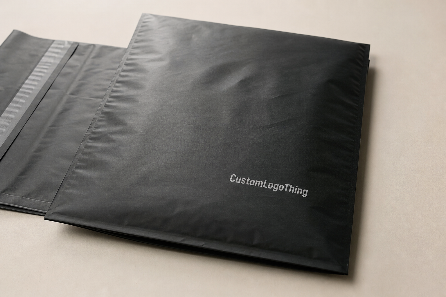
Brand visibility is the other half of the decision. The front panel during delivery matters most, followed by any side that may show in fulfillment bins or product photos. The opening edge is usually the least forgiving place for artwork because adhesive flaps, tear notches, and seam construction all compete for space. A strong layout respects those constraints instead of trying to overpower them.
That is why logo placement is really a production issue, not just a design issue. A mark that looks balanced on a flat mockup can still miss the mark once the bag is stuffed or stacked. Buyers who catch that before approval usually save time, reduce revision cycles, and avoid rework on the press side.
How Logo Placement Works on Film, Seals, and Fold Lines
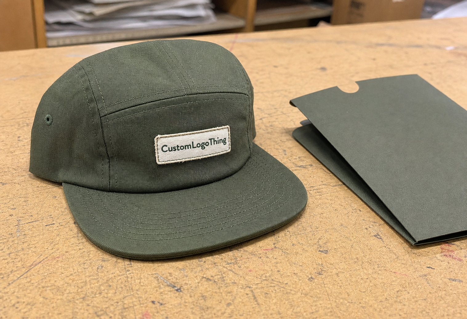
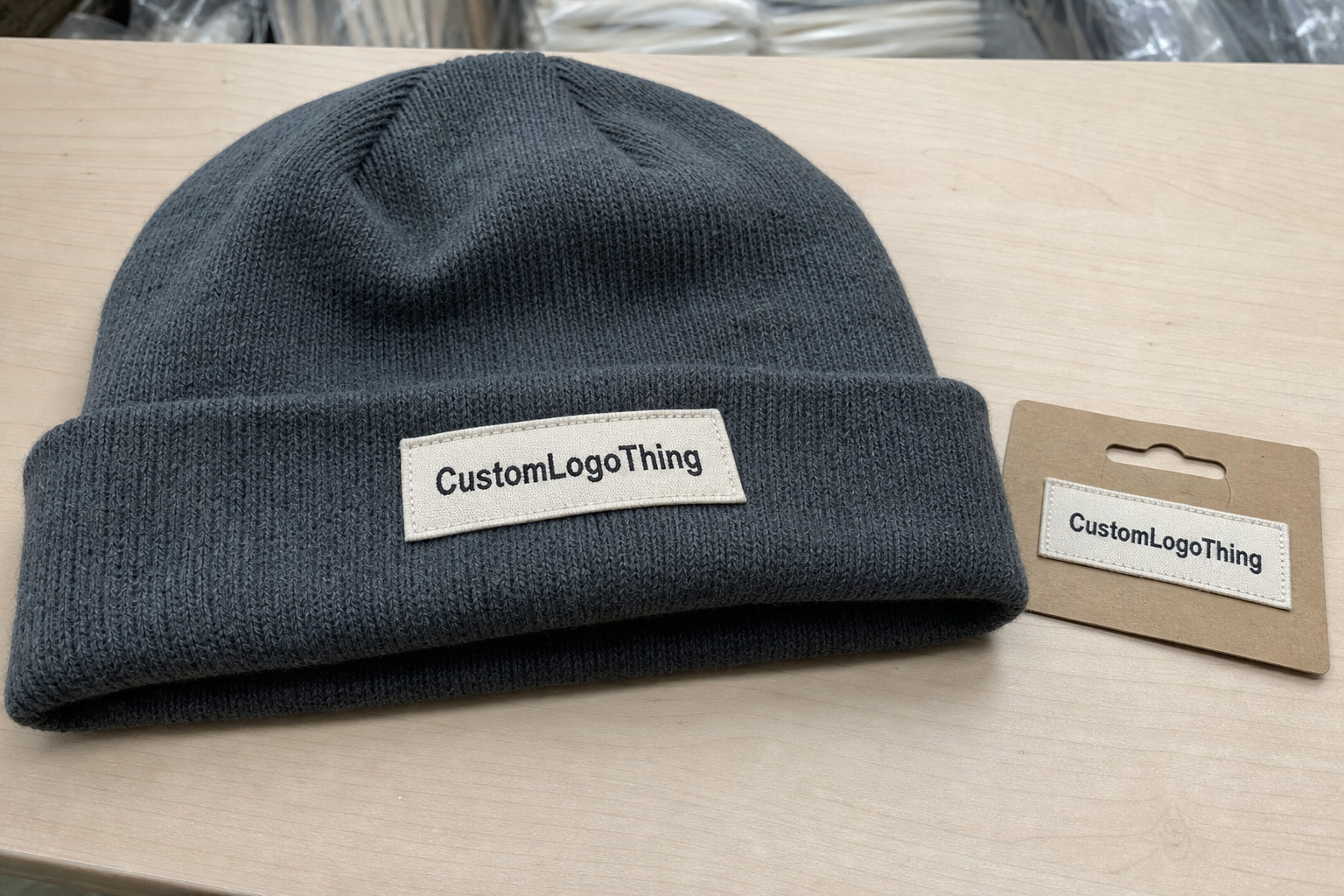
A flat dieline is only the starting point. The safest home for a primary logo is usually the front panel because it offers the most uninterrupted space and the clearest return on print spend. If the brand mark is the hero, it should sit where the bag has breathing room, not where leftover space happens to be.
Print-safe area, trim line, seal zone, and fold line are separate things. The print-safe area is the portion of the film that can accept artwork without cutoff or distortion. Trim lines define the finished edge. Seal zones are where heat, adhesive, or folding can compress the film. Fold lines deserve special attention because they can bend thin type, weaken hairline strokes, and make a centered mark appear off balance even when the layout is technically correct.
Most printers prefer keeping critical art at least 1/8 inch to 1/4 inch away from active edges unless the dieline says otherwise. If the bag is transparent or tinted, a white underprint may be needed so the logo does not wash out. On opaque white film, the same art often prints with better contrast and fewer adjustments. Flexographic printing tends to favor larger, repeatable runs; digital printing is usually better for shorter quantities and faster artwork changes. The right method depends on quantity, color count, and the level of detail in the logo.
Placement also has to survive motion. A logo can look fine on a proof and still disappear when a handler’s hand crosses the panel or when the bag is photographed under warehouse lighting. The mark should remain readable from a few feet away, not just on a designer's monitor.
Material, Finish, and Structure Factors That Change the Layout
Material changes placement more than most buyers expect. A 2.5 to 3.5 mil co-extruded polyethylene mailer behaves differently from a thinner film, especially once folded apparel is inside. Thicker film feels more substantial and often lies flatter in the hand, but it still flexes enough that the logo should stay away from the most active crease zones.
Finish changes the read. Glossy film reflects light and can make fine detail disappear at a glance, while matte film softens glare and often improves readability under warehouse lighting and in product photography. White film usually gives the cleanest field for brand color accuracy. Clear and tinted films often require either stronger contrast or a simpler mark, because subtle details get lost faster than many art teams expect.
Structure matters too. Seams, gussets, tear strips, zipper-style closures, and tamper-evident adhesive flaps can interrupt the visual field or pull the viewer's eye away from the logo. A wordmark that looks elegant on a smooth layout may feel unbalanced once a seam cuts through nearby negative space. That does not mean the design is weak; it means the packaging needs a different kind of restraint.
In most cases, simpler logos print better. Solid line weight, sensible letter spacing, and generous negative space usually beat layered illustrations with small details. Thin serif type, hairline borders, and fine gradients may need to be simplified for slick film. The goal is not to dilute the brand, but to make it read clearly on the finished package.
Operational marks matter as well. Size labels, handling icons, recycled-content claims, and shipping marks may need to share the surface without fighting the logo for attention. If you are comparing mailer structures, reviewing Custom Poly Mailers alongside the apparel spec can make the print field easier to judge. For teams managing multiple packaging formats, Custom Packaging Products can help keep brand treatment consistent across mailers, cartons, and inserts.
Quality checks also deserve a place in the conversation. If the bag needs to survive parcel handling, ask whether the supplier uses any shipping simulation references such as ISTA methods. That does not guarantee success on its own, but it gives you a more disciplined way to compare samples and spot weak points before mass production.
Cost, MOQ, and Quote Drivers for Custom Mailers
Pricing starts with structure. Bag size, film gauge, print coverage, number of colors, and whether the artwork stays on one panel or wraps across multiple panels all affect the quote. A small mailer with a single-color logo is a different job from a larger retail-style bag with full-bleed graphics and white underprint. The more print zones and color layers involved, the more setup time, registration control, and proofing the run will need.
MOQ matters because setup costs get spread across the order. Lower quantities usually carry a higher unit cost, while larger orders can bring the printed bag price down once the press is dialed in. Buyers should compare total landed cost, not just unit price: setup, proofing, freight, and any special handling all affect the final number. A quote that looks attractive at first can become expensive if the artwork needs multiple corrections or a fresh layout file.
| Option | Typical Use | Rough Unit Range at 5,000 pcs | What Moves the Price |
|---|---|---|---|
| Single-color front-panel print | Simple logo, strong contrast | $0.18-$0.28 | Lowest setup, least ink coverage |
| Two-color print with white underprint | Dark film or colored substrate | $0.24-$0.38 | Extra print pass, color matching, opacity needs |
| Full-bleed or multi-panel print | Retail-heavy branding | $0.30-$0.55 | Coverage area, registration control, more proofing |
Hidden drivers show up quickly if the buyer does not ask early. Plate or cylinder setup, color matching, proof rounds, and dieline edits can all add time and cost. The cleanest way to keep spend under control is to reduce color count, keep the mark inside one print zone, and avoid design elements that force the press to work harder than necessary.
For many brands, the sweet spot is a clean one- or two-color mark on a standard-size mailer. It reads clearly, prints reliably, and keeps the quote easier to defend. If sustainability claims are part of the brief, make sure the claim matches the actual build. Do not borrow recycled-content language from a paper product and assume it applies to a polyethylene mailer.
Process and Timeline: From Artwork to Production
The cleanest launches start with a proper dieline review. Before anyone starts adjusting artwork, the buyer should confirm the exact bag size, closure style, print method, and logo placement window. That single step avoids a lot of back-and-forth because the printer can see the real working area instead of a decorative mockup.
Prepress is where many delays are created or avoided. Bleed must extend beyond trim, text should stay inside safe margins, and fonts need to be outlined so nothing substitutes on export. Vector files are still the safest option for logos because they hold crisp edges and scale cleanly. If the artwork uses photography or textured effects, resolution matters, but most mailer branding is stronger with solid fills and vector shapes anyway.
If the logo prints over dark film, the file must account for white ink, backing layers, or knockout behavior early. That detail sounds small until a proof comes back too muted or too busy. Fixing it after the fact usually costs more than building it correctly from the start.
Proofing usually happens in two stages: a digital proof for layout approval and, when the artwork is critical, a physical sample on the actual substrate. The second step is worth the time if the logo is large, the color match matters, or the closure area sits close to the artwork. A flat screen cannot show how glossy film reflects once the bag is folded, packed, and stacked.
"A good proof confirms more than color; it confirms how the logo behaves once the bag is stuffed, sealed, and stacked."
Lead time depends on setup, plate making, ink matching, curing, inspection, and freight. For straightforward runs, buyers often see 10 to 15 business days after final approval. Complex artwork, specialty films, or extra sample rounds can push that longer. If a pre-production sample is required, add shipping and review time on top. The fastest way to lose a week is to approve a file before every detail is locked.
Common Mistakes That Undermine Mailer Branding
The easiest mistake to avoid is still the most common: placing the logo too close to a seam, fold, or edge. That can cause cutoff artwork, a cramped look after filling, or a slight visual shift that makes the package feel cheaper than it is. On a flexible mailer, breathing room is part of the design.
Low contrast creates the next layer of problems. Thin type, light ink on a pale film, or overly detailed graphics can vanish once the package is moving through a warehouse or photographed under harsh lights. Experienced buyers often simplify the logo for mailer use even when the master brand uses a more elaborate mark elsewhere.
Skipping a real sample is another expensive error. A mockup can hide tension points, warp around the closure, or show a logo perfectly centered where a filled sweatshirt will pull it slightly off axis. Testing with actual garments matters because a folded tee, a hoodie, and leggings all change the visual weight of the bag in different ways.
Operations can expose weak artwork faster than design reviews do. A bag that cannot accept carrier labels, scan marks, or handling icons without clutter is still a problem. Leave room for the work that happens after print. From a fulfillment standpoint, the logo should support the packing flow, not compete with it.
Practical Tips for a Cleaner Launch
Start with a buyer checklist before asking for pricing. Exact bag size, closure style, print method, logo file format, color targets, quantity, and ship date should all be in the first request. If those details are missing, the estimate may look fine and still miss the mark once the dieline reaches the art desk.
Ask for a digital proof and, where the artwork is important, a physical sample. That matters most if the logo sits near a seam, uses fine type, or prints on darker film with white underprint. A sample shows whether the mark reads cleanly when the bag is filled and stacked, which is the condition that actually matters to the end user and the fulfillment team.
Test the design with real garments on the packing line. A logo that feels balanced in an empty bag can look too high or too low once a folded sweatshirt goes in. That live test catches problems that screen-based approvals miss and costs far less than fixing a bad run later.
My practical advice is simple: keep the branding bold, keep the margins honest, and keep the operating space clean. If you do those three things, the mailer usually looks better, the quote is easier to manage, and the final proof is much closer to the finished product.
Frequently Asked Questions
Where should the logo go on waterproof apparel mailers for the cleanest read?
Put the primary logo on the front panel whenever possible, centered inside the safe print zone and kept away from seals, folds, and closure hardware. Leave enough margin so the artwork still feels balanced after the mailer is filled, stacked, and handled during shipping.
Can I print a logo near the flap or seam on apparel mailers?
Only if the manufacturer confirms the safe zone on the dieline and the artwork will not distort in production. Critical details, thin lines, and small text are better kept away from seams and fold lines because those areas are most likely to shift visually.
What logo file is best for mailer placement?
Vector artwork is the safest choice because it scales cleanly and gives the printer sharper edges for text, icons, and solid brand shapes. If the design uses fine detail or color builds, send outlined fonts, proper bleed, and a proof-ready file so placement can be checked accurately.
How does MOQ change pricing for custom waterproof mailers?
Higher MOQ usually lowers the unit price because setup costs are spread across more mailers, especially when the print layout stays consistent. Smaller runs often cost more per piece, so compare total order cost, not just the quoted price per mailer.
How long does production usually take after artwork approval?
Timeline depends on setup, proofing, color matching, and the print method, but lead time usually starts only after final approval. If plates, cylinders, or samples are needed, those steps add time, so confirm the schedule before you commit to a ship date.