If you are sourcing woven labels for ecommerce brands, the hat usually decides the right spec before the artwork does. A cap has less usable interior space than a shirt hem or a folded tee, and the label has to fit around seams, sweatbands, and closures without creating a scratchy edge or crowding the crown.
That small piece of trim carries more weight than people expect. Customers handle hats directly, flip them over, and notice whether the inside feels finished or improvised. A clean woven label helps the product read as deliberate from the first touch, which matters for repeat purchases as much as it does for the first sale.
For ecommerce, the label also has to survive a lot of ordinary wear. Caps get packed, squeezed, worn in heat, and tossed into bags. A good spec keeps the brand mark readable after shipping, handling, and use, which is the real test for any trim that lives inside a hat.
Woven Labels for Ecommerce Brands: How to Order Better
From a packaging buyer’s point of view, a hat label has two jobs. It should reinforce the brand the moment someone opens the order, and it should fit the garment without creating comfort issues or production friction. That balance is why woven labels for ecommerce brands work so well on headwear: they can carry identity, sizing, and compliance details in a small, durable piece of construction.
That matters more in ecommerce than on a retail rack. A cap can arrive in a mailer looking perfectly fine on the outside, but if the interior branding is crooked, scratchy, or hard to read, the product feels less complete. Buyers do notice that. So do customers who compare one brand against another before they reorder.
The label type also affects how easy the item is to fulfill. Some brands want only a brand mark, while others need a woven size label or care information inside the hat. If all of that is forced into one tiny tag, the result can turn crowded fast. The cleaner approach is usually to decide what the label must do, then cut everything else.
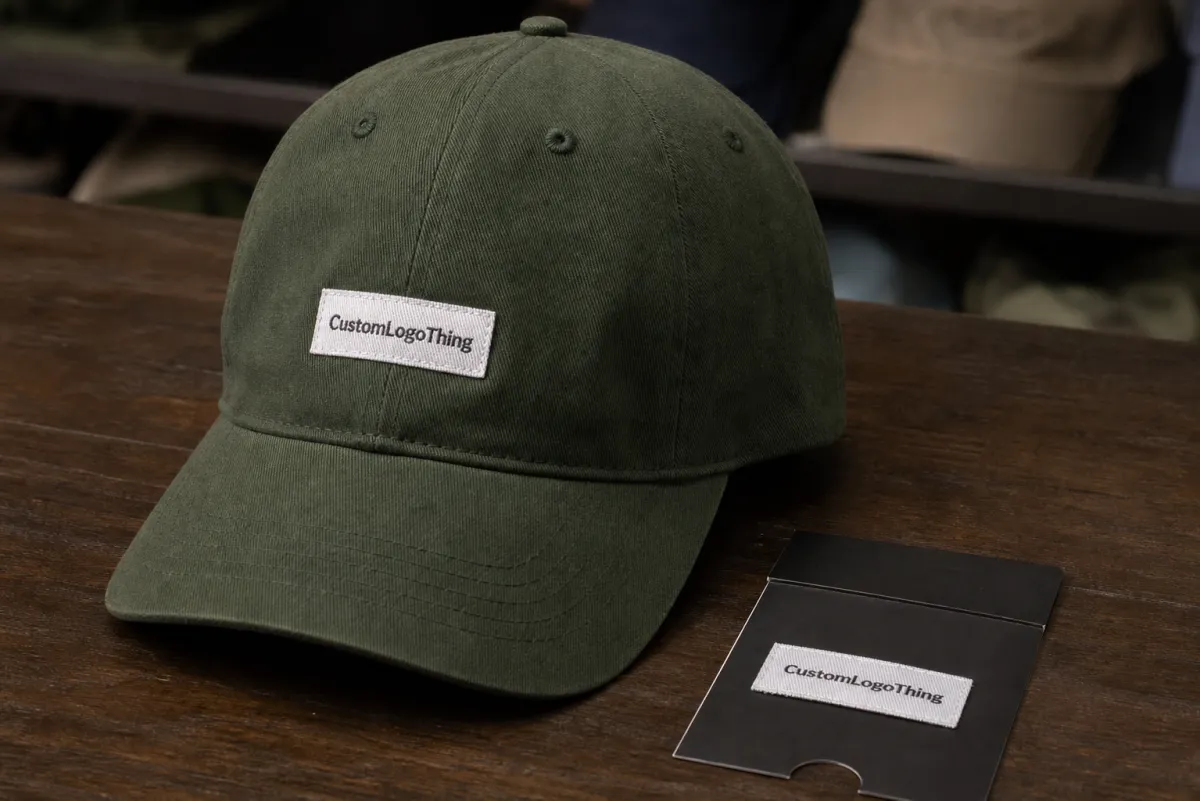
A good hat label should feel built into the product, not stitched in as a last-minute add-on.
- Brand-only labels work best when the inside of the hat needs a polished identity mark and nothing more.
- Functional labels make sense when the label has to carry size, fiber content, or care details.
- Hybrid labels are useful when one tag has to do both jobs, but only if the layout stays readable.
One practical point often missed: headwear is not flat. A label that looks perfect in a proof can behave differently once it curves over a seam or sits against a sweatband. That is why fit and placement deserve as much attention as the art itself. A label on the wrong seam can feel bulky even when the design is correct.
Another buyer observation: the best labels are usually the ones that disappear into the product experience. They do not announce themselves loudly, but they still make the hat feel finished. That quiet role is exactly what makes woven construction so useful for ecommerce brands that want a consistent unboxing and a durable interior finish.
How headwear woven labels are made and attached
Woven labels start as thread, not ink. The artwork is translated into a textile structure, usually with polyester yarn because it holds color well and stands up to abrasion better than many printed options. For buyers, the important thing is not just the material name but the weave density, because that determines how much detail survives the conversion from logo to fabric.
Most label makers use a damask-style weave for finer detail. It is the workhorse choice when a logo needs crisp edges, tight lettering, or a small symbol that still has to read clearly at cap size. Satin weave can give a smoother surface and a softer sheen, but it often gives up some precision. Cotton can look more natural, yet polyester tends to stay more stable in color and wear.
Edge finishing matters as much as the body of the label. Heat-cut edges seal the fibers and help prevent fraying, but they can feel firmer inside a hat if they sit near the forehead. Folded labels hide the cut edge and usually feel cleaner against skin. That difference sounds small on paper and becomes obvious the first time a customer wears the hat for a full day.
The most common attachment styles are straightforward:
- Sew-in labels are stitched into a seam or lining edge and usually hold up best.
- Center-fold labels wrap over an edge and create a finished face on both sides.
- End-fold labels are sewn at the ends for a low-profile look on flat areas.
- Loop labels can wrap, hang, or identify a product in a small footprint.
- Seam-in placements keep the label secure and reduce the chance of scratching.
On caps and dad hats, placement matters more than most buyers expect. A label can look perfect on a spec sheet and still feel wrong if it lands where the forehead presses or where a thick seam already creates bulk. On low-profile crowns, the best spot is often slightly offset from the highest-contact zone so the label stays visible without becoming a comfort issue.
For hats with unstructured panels, soft sweatbands, or thin cotton twill, sewing method matters too. Adhesive or iron-on backing can be useful in some textile categories, but on headwear they are usually less dependable than direct stitching. Sweat, friction, and repeated wear make sewn attachment the safer choice for most ecommerce programs.
Sizing, weave, and artwork choices that keep details readable
Label size should be chosen around the actual hat panel and seam allowance, not guessed from a mockup. A woven label that looks balanced on screen can disappear once it is cut down to fit the crown. On many caps, practical sizes often land around 15 x 40 mm, 20 x 50 mm, or 20 x 60 mm, but the right number depends on the style of the hat and the amount of room inside it.
The more detailed the art, the more forgiving the size has to be. Thin strokes, tiny serif type, and elaborate icon outlines are the first things to blur in weave-based construction. Strong shapes and clear contrast usually reproduce better. Short wordmarks are easier to keep crisp than long taglines, and a stacked layout often works better than a wide lockup when the label is narrow.
That is the main tradeoff buyers run into: finer detail requires more room and a tighter weave, while simpler graphics can stay legible at smaller sizes. If the logo includes a thin line or more than one small text line, it may need to be redrawn before production. A cleaner redraw is usually less expensive than trying to force too much into a label that is simply too small.
For interior hat labels, comfort is part of the artwork decision. A soft backing, folded edge, or seam placement can matter as much as the design itself. A heat-cut edge may be acceptable on a flat insert, but inside a cap it can feel sharper if it sits where the skin rubs. Buyers who test only the mockup often miss that until the first sample arrives.
Good artwork checks before approval:
- Keep the logo in vector format so line weight stays consistent.
- Confirm the exact label dimensions in millimeters, not just pixels.
- Check the smallest text at final size, not at screen scale.
- Match thread colors to the hat body so contrast stays clear.
- Ask for a redraw if the logo depends on hairline strokes or tiny reversed text.
Thread count and color count also affect the final result. A label with two or three colors is usually easier to keep sharp than one with six or more. Extra color changes can make the weave busier, add setup time, and create more opportunities for registration drift. If the design can be simplified without losing recognition, that usually pays off in both readability and cost.
One more practical caveat: the proof does not always show the exact feel of the finished piece. Thread sheen, weave tightness, and edge finishing can shift how dark or bright the label appears against a black, navy, or olive hat. It is worth checking the label against the actual fabric color before approving a full run.
Process, timeline, and turnaround from proof to shipment
The production flow is more methodical than many buyers expect. Artwork comes in first, then the vendor prepares a digital proof showing size, fold, colors, and placement. After approval, the labels are woven, finished, inspected, and packed. If a sample or strike-off is requested, that step happens before the full run and usually adds a few business days, but it can save a much larger delay later.
Clean artwork moves faster. A vector file, clear dimensions, and a decided fold style make proofing simple. When the buyer is still deciding between two label sizes or changing thread colors after the proof, the timeline stretches. Most delays come from revisions, not from the weaving itself.
For straightforward orders, lead time often falls somewhere around 12 to 15 business days after proof approval, though complexity and quantity can push that longer. Small test runs may finish faster, while larger orders, custom finishing, or multi-color designs usually need more time. If the order needs a sample first, add that window in as well. Rush schedules can work, but only if the spec is settled early and the vendor is not asked to solve design questions mid-run.
A useful planning habit is to work backward from the packing date, not the order date. Give yourself time for proof approval, one round of corrections if needed, inbound freight, and any rework that may come from a sizing change. If hats and labels must land together for a launch, that cushion keeps a small delay from becoming a missed ship date.
Inspection matters at several points. A label batch should be checked for thread consistency, cut accuracy, fold symmetry, and spelling before it leaves production. Good vendors also confirm count accuracy and carton labeling so the right quantity arrives ready for line work. On a headwear program, a mistake in count or placement can slow an entire packing schedule, not just one style.
A practical timeline for a clean run:
- Day 1 to 2: artwork review and digital proof.
- Day 3 to 5: sample or strike-off, if requested.
- Day 6 to 15: weaving, finishing, and inspection.
- Final step: packing, labeling, and freight booking.
Shipping should be planned with the same care as the labels themselves. Cartons need to keep the labels flat and sorted so they do not arrive curled or mixed by size. For larger ecommerce programs, a buyer should also ask how the labels will be packed for production use, not just how they will be shipped. A tidy carton saves time on the receiving dock and reduces mistakes when the trim is handed to sewing or fulfillment.
Cost, pricing, MOQ, and quote drivers to compare
Price is shaped by the spec sheet, not just the logo. Label size, weave density, number of colors, fold style, backing, and order quantity all influence cost. A small two-color label with a standard fold usually costs less than a larger piece with tighter detail, multiple color changes, and a special finish. The material may be small, but the setup work is not.
MOQ, or Minimum Order Quantity, is easier to understand when you think about production setup. Thread changes, machine setup, proofing, and finishing labor have to be spread across the order. That is why very small runs carry a higher unit price. You are paying for repeatability and consistency, not just thread.
For comparison shopping, the most useful quote is the one that matches the same exact spec. If one vendor prices a center-fold label and another prices an end-fold label, those numbers are not directly comparable. Freight can also distort the picture. One quote may include delivery, while another assumes pickup. A buyer can only compare cleanly when every line item is aligned.
| Order profile | Typical unit price | Best fit | Watch-outs |
|---|---|---|---|
| 1,000 to 2,499 labels | $0.30 to $0.60 | Test runs, small launches, placement trials | Higher setup share and fewer options for complex detailing |
| 5,000 to 10,000 labels | $0.12 to $0.28 | Core SKUs, steady ecommerce replenishment | Proof accuracy matters because rework is more expensive at scale |
| 25,000+ labels | $0.06 to $0.16 | Seasonal programs, repeat styles, larger fulfillment runs | Lead time, carton planning, and storage space become important |
| Sample or strike-off | $15 to $60 total | Artwork approval and fabric matching | Useful for comfort, contrast, and edge-finish checks before full production |
Those ranges only help if the specs are truly identical. A supplier using a tighter weave and a more detailed proof will usually quote differently from one using a simpler construction. Ask for the same size, same fold, same thread count, same backing, and the same freight method before you judge price. Otherwise the lowest quote can be the most misleading one.
It helps to think in landed cost rather than unit cost. A cheaper label that arrives late, or one that fails a comfort check and has to be resewn, costs more in the end than a slightly higher quote that gets the job right the first time. For ecommerce brands, the real value is a label that lands on the hat, passes inspection, and does not slow fulfillment.
Typical MOQ for woven labels is often a few hundred pieces at minimum, though many suppliers are more comfortable quoting at 1,000 pieces or above because setup costs have room to spread out. Smaller orders can still make sense for launches, but they are rarely the most efficient route for a continuing hat program.
Common mistakes that create weak labels or production delays
The easiest mistake is overcrowding the design. Long taglines, tiny legal text, multiple icons, and thin borders can blur once the label is woven down to cap size. If the art needs zooming just to read on screen, it is probably too busy for textile production. Clean shapes survive better than clever detail.
Color choice creates its own set of problems. Dark-on-dark combinations can disappear on black, navy, charcoal, or heather caps, especially when the label sits inside a shaded crown. Buyers sometimes approve a proof on a white background and only notice the contrast problem when the full run arrives. A label should always be checked against the actual hat fabric, not just a digital canvas.
Placement mistakes show up after the order lands. A label can be technically correct and still be uncomfortable if it sits where the forehead bends or where a seam adds bulk. It can also land in a spot that feels accidental, such as too close to the closure or too visible against the sweatband. Good placement should look intentional from both inside and outside the hat.
Proof approval is another common trap. People glance at the mockup, confirm that the logo shape is recognizable, and move on. That is not enough. Spelling, orientation, fold style, edge finish, and thread color order all need a careful review. Once the run starts, small errors are difficult to recover from without delay.
One more issue that slows programs down: changing specs after production has already been scheduled. A new size may require a different weave density, and a new colorway may need a separate thread match. Those changes do not just affect the label; they can change the whole production sequence. The cheapest time to make those decisions is before the proof is approved.
Four mistakes worth avoiding:
- Trying to fit too much copy into a narrow label.
- Using contrast that disappears on dark hat colors.
- Picking a fold or placement that rubs the skin.
- Approving a proof before checking every production detail.
Expert tips and next steps for your next order
The best way to order woven labels for ecommerce brands is to treat the first run like a learning run, even if the order is going straight into stock. Start with one primary placement and, if the style allows it, one backup placement so you can compare comfort, visibility, and brand impact on the actual hat body. A label that looks right in one cap style may sit very differently in another.
Ask for a sample or strike-off against the exact fabric you plan to use. Woven labels can look crisp on artboard and still read differently on brushed cotton, twill, or heavier canvas. That physical check tells you more than a screen mockup ever will, especially if your catalog uses more than one cap body or colorway.
Keep the artwork in vector form, save the approved spec sheet, and note the fold, size, thread colors, and placement in a reorder file. If you can, record a simple placement sketch with seam references. That documentation makes repeat production much easier because the next buyer or production partner does not have to rediscover the same details from scratch.
It also helps to record practical production notes that rarely make it into a marketing brief. For example: whether the label was comfortable near the forehead, whether the thread contrast held up on dark colors, whether the edge finish felt firm or soft, and whether the label looked balanced once the hat was packed. Those details matter more on reorder than on first approval.
For brands that run seasonal launches, hand the spec sheet to operations before the next reorder window opens. A clean internal handoff saves quoting time and prevents accidental changes when a new style is being built under pressure. It also keeps the trim program consistent across SKUs, which is where many ecommerce brands start to drift.
Good labels do not need to be flashy. They need to fit the hat, survive handling, read clearly, and support the product without adding friction in production. If the spec does those things, the label has done its job. That is usually the standard worth repeating.
Are woven labels for ecommerce hats better than printed labels?
Woven labels usually feel more premium and hold up well to friction, handling, and repeated wear inside Caps and Hats. Printed labels can work for softer detail or lower-cost applications, but woven labels are often the better choice when brand texture and durability matter. For ecommerce headwear, they are especially useful when you want the product to feel retail-ready the moment it is unpacked.
What size works best for woven labels on caps and hats?
Small labels often work best, but the right size depends on the panel, sweatband, and seam space available on the actual hat style. Short brand names and simple icons are easier to read than long taglines when the label is narrow. A physical placement test on the real cap style is the safest way to avoid a label that looks fine in art but disappears in production.
How long does production usually take for woven labels for ecommerce brands?
Timing depends on proof approval, quantity, weave complexity, and whether you need a sample before full production. Simple orders move faster when artwork is clean and all specs are confirmed early. Build extra time into your launch plan if the labels need to arrive before hat inventory is packed and shipped.
What drives the price of woven labels for ecommerce brands?
Price is shaped by label size, thread detail, number of colors, fold style, backing, and order quantity. Smaller orders usually cost more per label because setup and finishing are spread over fewer pieces. The most useful quote compares the same exact specs, not just the headline unit price.
Can woven labels be sewn into different hat styles?
Yes, but placement should change based on the style, such as structured caps, Unstructured Dad Hats, snapbacks, or other headwear formats. Interior seams, sweatbands, and closures all affect where a label fits best and how comfortable it feels. The best result comes from matching the label fold and size to the construction of the hat, not forcing one standard placement everywhere.

