Woven Labels Material Guide for Book Merch Brands
A reader may not say it out loud, but a scratchy neck label can do more damage than a bad mockup. That is the quiet premise behind this Woven Labels Material guide for Book Merch Brands: a label smaller than a matchbook can shift how a hoodie, tote, or scarf feels the moment it touches skin.
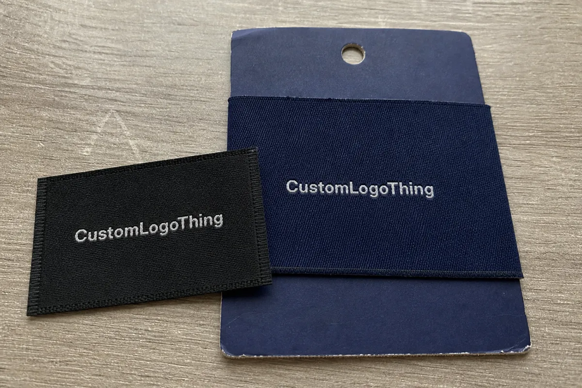
Woven labels are not printed graphics sitting on top of cloth. They are built thread by thread, which gives them a different kind of durability and a more finished retail look. For author merchandise, book club apparel, and limited-run reader gifts, that matters. A woven label can make a shirt feel edited, not assembled.
Book merch teams use them in more places than first-time buyers usually expect. Neck labels on tees and sweatshirts, hem tabs on hoodies, side-seam tags on tote bags, folded loop labels on scarves, and small marks on blankets, robes, and subscription kits all sit in the same family. On a canvas tote, the label can work like a book spine on a shelf: small, visible, and strangely memorable.
The main material choices are simple once you see the tradeoffs. Damask is the detail specialist. Satin is softer and more polished. Taffeta is firmer and more economical. Cotton-look yarns bring a matte, natural feel. Recycled polyester can work well for sustainability-focused collections, but only if the supplier can confirm yarn availability, color limits, and documentation before the merch is promised on a product page.
This is a buying guide, not a theory exercise. The right label depends on artwork detail, placement, comfort, quantity, and schedule. A soft label for a sleep shirt serves a different purpose than a crisp exterior tab on a tote packed into kraft paper for fulfillment.
How Woven Label Materials Actually Work
Woven labels are built from yarn paths, not ink dots. That distinction matters because literary branding often includes tiny serifs, ornate borders, line-art moons, books, flowers, and author initials. A design that looks clean at screen size can collapse when it has to be translated into thread at 35 mm wide.
The loom uses warp and weft threads to form the image. In practice, every line, border, and letter must be converted into a weaving pattern. That is why woven labels handle bold marks so well and why they struggle with gradients, photography, shadows, and elaborate illustration detail. The machine is excellent at structure. It is not interested in acting like a printer.
Density changes both the appearance and the hand feel. A tighter weave holds smaller details and smoother type. A looser weave may feel a little more textured but will simplify fine line work. For a series emblem with tiny stars or a compact author monogram, high-density damask is usually the safer choice. For a plain two-color side tab, taffeta can be enough.
Damask is the premium workhorse for literary merchandise because it uses finer yarn and supports cleaner edges. It is still not magic. Long quotes, tiny copyright lines, and thin decorative type can disappear if the label is too small. If the text only works at 6-point or smaller in a mockup, it is probably too crowded for weaving.
Satin has a smooth face and a softer visual finish. It fits elegant or gift-driven pieces, like sleepwear, scarves, and boutique apparel. The shine can be useful on a special-edition item, but it may feel wrong on a vintage-inspired or minimalist book brand. Surface finish changes the whole read of the product.
Taffeta is more structured and usually more budget-friendly. It is a practical option for simple logos, size labels, tote tabs, and other marks where the art is clean and the priority is keeping unit cost down. It will not carry tiny lines as gracefully as damask, so the artwork needs to stay disciplined.
Thread color comes from available yarn libraries, not from unlimited digital color mixing. A supplier can often get close to a Pantone target, but exact matches depend on stocked yarns, dye lots, and material type. For a brand built around a precise visual system, ask for thread references or physical strike-offs rather than trusting a monitor.
Material Choices for Reader Comfort and Merch Style
Comfort is a material decision, not a finishing detail. Readers wear merch at signings, conventions, bookstores, airports, and on long travel days. If a neck label scratches or curls against a soft tee, the garment feels cheaper than the print suggests.
Damask polyester is the strongest all-around option for most book merch apparel. It is durable, smooth, and capable of holding small lettering and clean symbols. For hoodies, tees, and repeat-wash garments, damask usually gives the best balance of clarity and comfort. It is often the default for a reason.
Satin woven labels are softer and more polished. They work well for sleep shirts, robes, scarves, and pieces that are meant to feel gentle against skin. The tradeoff is shine. On a romantic special edition accessory, that can feel intentional. On a distressed or archival-looking crewneck, it may feel too neat.
Taffeta is firmer and usually better away from sensitive skin. It suits hem tags, tote tabs, blanket labels, and straightforward logo marks on structured items. When the label sits on the outside of the product, that firmer body can look crisp and intentional without adding much cost.
Cotton-look and matte yarns are useful when the brand should feel less synthetic. They fit indie bookstore, archival, cottagecore, and academic aesthetics especially well. Paired with uncoated hangtags or kraft packaging, they can reinforce a quieter visual language. If the packaging program also uses recycled board or FSC-related claims, keep those claims specific and verifiable. The Forest Stewardship Council is a useful reference for understanding FSC language.
Recycled polyester can support a sustainability-led collection, but buyers should check fiber content, certification support, minimums, and color availability before building claims into copy. Recycled yarn libraries do not always match the standard polyester range, and not every supplier can provide the same paperwork.
| Material | Best Use | Feel | Detail Level | Buyer Note |
|---|---|---|---|---|
| Damask polyester | Neck labels, premium apparel, author marks | Smooth, refined | High | Best default for small lettering and repeated washing |
| Satin woven | Scarves, sleepwear, soft neck labels | Soft, lightly glossy | Medium to high | Use when shine fits the brand rather than fights it |
| Taffeta | Hem tags, tote tabs, size labels | Firmer, structured | Low to medium | Good for simpler art and tighter budgets |
| Cotton-look yarn | Indie, archival, handmade-style collections | Matte, warmer | Medium | Useful when gloss would feel off-brand |
| Recycled polyester | Sustainability-minded merch | Varies by yarn | Medium to high | Confirm claims, certificates, and color availability |
Placement should guide the final call. Soft labels belong on skin-contact areas. Crisp labels fit exterior branding. Thicker constructions work better on bags and structured goods. A label that looks right on a spec sheet can still feel wrong on a brushed fleece or a lightweight cotton tee.
Artwork, Size, Fold, and Backing Specs That Change the Result
Material only works if the spec supports the design. A good damask label can still fail when the type is too small, the fold allowance is ignored, or the backing does not suit the garment. Most label mistakes happen before the loom ever runs.
Common book merch sizes vary by placement. A small side tab might finish around 0.6 x 1.2 inches. A standard neck label is often around 1.5 x 2 inches before folding. Patch-style tote or blanket labels may run 2 x 2 inches, 2 x 3 inches, or larger. Loop labels for scarves and accessories need enough room for the fold plus the visible face.
Fold type changes both the look and the sewing method. Straight cut works for flat patches. End fold tucks the short edges under for a clean sewn finish. Center fold is common for neck and hem labels. Manhattan fold gives premium neck labels a cleaner top edge and side tucks. Book fold creates space for care or size information when a single flat face would be too tight.
Backing matters too. Sew-on labels are the durable standard for apparel. Iron-on backing can work for some patches or craft-style items, but wash performance depends on the fabric, adhesive, heat settings, and laundering. Temporary adhesive is mainly for placement during sewing or assembly. Soft backing improves comfort on neck labels, though it can change thickness and cost.
Practical rule: approve woven label artwork at actual size, with fold allowance marked, before signing off on production. A 2-inch label shown at 500 percent on screen can hide problems that show up the moment it is sewn into a shirt.
Design limits are real. Tiny paragraphs, thin serif strokes, low-contrast yarn combinations, and dense illustrations all become harder to read once they are woven. A short phrase, emblem, initials, or collection mark often feels more premium than a miniature book cover forced into a small rectangle.
Vector artwork is the best starting point. Include finished size, fold type, thread colors, background color, placement, quantity, and whether the label touches skin. If you want to see how labels sit inside a broader merch system, the Custom Labels & Tags page is a useful comparison point before requesting a quote.
Pricing, MOQ, and Unit Cost Drivers for Woven Labels
Woven label pricing is shaped by setup, material, size, thread count, color count, fold style, backing, finishing, packaging, and order quantity. The lowest quote is not always the best fit for merch carrying an author name or imprint identity.
Small runs carry a higher unit cost because artwork conversion, loom setup, proofing, and finishing are spread across fewer labels. Under roughly 500 pieces, the setup cost can matter more than the yarn itself. Once the quantity moves into the low thousands, the unit price usually becomes more efficient, especially if one evergreen label can serve multiple SKUs.
Damask usually costs more than basic taffeta because it uses finer yarns and supports more detail. Specialty finishes, recycled yarns, heat-cut edges, soft backing, and more complex folds can also push cost upward. Shipping and rush charges are easy to overlook, especially when the labels are needed before sewing, packing, or convention fulfillment.
| Order Scenario | Likely Cost Driver | Planning Signal | Cost Control Move |
|---|---|---|---|
| 500 simple taffeta tabs | Setup spread across a small run | Higher unit cost | Use one size and two thread colors |
| 2,500 damask neck labels | Material density and fold style | More efficient than a micro-run | Keep the mark evergreen across apparel SKUs |
| 5,000 exterior tote labels | Size, edge finish, and sewing needs | Lower unit cost as volume rises | Choose a simple tab or end-fold label |
| Premium recycled yarn run | Material availability and documentation | May require a higher MOQ | Confirm certification language before design approval |
Ask about digitizing, physical sample fees, shipping, rush charges, color changes, separate size label runs, and multiple fold types in one order. Those line items are not tricks. They are real production steps, and they should be visible before a purchase order is approved.
There are straightforward ways to control cost without cheapening the product. Reduce thread colors. Choose one versatile label size. Simplify the artwork. Combine drops. Reserve premium materials for skin-contact labels or hero items. A Woven Labels Material guide for book merch brands should help teams spend where readers can actually feel the difference.
Clear specs make quotes cleaner. Instead of asking for “a nice woven label,” send finished dimensions, fold type, material preference, thread count or color count, quantity, delivery date, and whether the label touches skin. Vague requests create pricing buffers because the manufacturer has to guess the production path.
Process and Timeline From Artwork to Finished Labels
The production flow is usually predictable: artwork review, spec confirmation, weave file setup, digital proof, optional physical sample, approval, loom production, cutting or folding, backing application if needed, quality check, packing, and shipping. Each step exists for a reason.
Lead time depends on label complexity, the production queue, proof approval speed, sampling, quantity, finishing steps, and shipping method. A simple repeat order may move quickly. A new damask label with fine lettering, recycled yarn requests, specialty backing, and a physical sample will take longer. Usually not by a huge amount, but enough to affect a launch calendar.
Build approval time into the schedule if labels are needed before apparel sewing, fulfillment kit assembly, preorder shipments, or convention deadlines. A label that arrives three days late can hold up finished garments even if the shirts are already printed and boxed.
Check the proof slowly. Spelling matters: author name, imprint name, series title, size markings, care symbols, and website text all need a careful read. Thread colors, border alignment, fold direction, and simplified details deserve the same attention. A good proof is a production map, not just a pretty preview.
A physical sample is worth requesting for premium apparel, sensitive neck labels, new material choices, complex artwork, first-time supplier orders, and launches that cannot absorb a mistake. Loose samples help, but the most useful review happens against the actual garment or item. Place the label on the hoodie fleece, tote canvas, scarf weave, or blanket fabric before approving.
Rush orders can narrow the options. They may limit sampling or finishing choices, and they rarely improve the quality of unclear artwork. Better practice is to finalize label direction early while the garments, packaging, and fulfillment details are still being coordinated. The label should feel like part of the same system, not a late attachment.
One planning rule saves time and money: approve artwork only after garment placement is known. Label size and fold style often change once the sewing location is fixed.
Common Material Mistakes Book Merch Teams Can Avoid
The most common mistake is treating a woven label like a miniature book jacket. A full illustration, tagline, author name, series mark, care copy, and website cannot all fit cleanly in a space built for a few details.
Small serif lettering, script fonts, thin stars, delicate borders, and low-contrast yarn combinations can disappear when converted into weave structure. Black on charcoal may look sophisticated on a mood board, then become nearly unreadable in the finished label. Contrast is not just a style choice. It is a legibility tool.
Another mistake is choosing a stiff label for neck placement. Reader comfort matters more than many teams expect, especially on soft tees and sweatshirts sold as premium merch. If the garment is brushed, lightweight, or washed often, a rough label stands out in the wrong way.
Fold allowance gets missed often. Text can land inside the seam, borders can appear off-center after sewing, and the visible face can shrink more than expected. Always review the finished visible area, not just the flat label dimensions.
Inconsistent branding can also make a collection feel pieced together. One label material on hoodies, another unrelated finish on totes, and a third style on scarves can break the visual system. The answer does not need to be identical labels everywhere. Shared color, material tone, fold language, or a repeated mark can be enough to hold the range together.
Wash durability deserves attention. Apparel labels need thread, edge finishing, and sewing methods that survive repeated laundering. Textile test methods and shipping stress references from groups like ISTA can help teams think more clearly about performance, even when the label is only one component in the finished merch stack.
Finally, avoid locking in labels that are too campaign-specific unless the inventory is certain to move. Evergreen author, imprint, or collection labels are more flexible and less likely to sit unused after a launch passes.
Next Steps for Choosing and Ordering the Right Label
Start with the product, not the label. Choose the garment or item first, decide whether the label touches skin, simplify the artwork to the essential mark, pick a material family, choose size and fold, confirm thread colors, and request a quote with those details. That order keeps the label tied to how readers will actually use the merch.
- Confirm the item: T-shirt, hoodie, tote, scarf, blanket, robe, or reader gift.
- Mark the placement: neck, hem, side seam, tote edge, scarf loop, or patch area.
- Decide on comfort level: skin-contact labels need softer material and finishing.
- Simplify the art: one logo, short phrase, initials, emblem, or series mark.
- Specify production details: finished size, fold type, material, colors, quantity, deadline, and sample needs.
Sometimes two label versions solve the problem better than one universal label: a soft neck label for apparel comfort and a sturdier exterior tab for visible branding on totes, blankets, or accessories. That approach costs more, but it can protect both comfort and presentation.
Create a simple spec sheet before asking for pricing. Include finished dimensions, fold type, material preference, color references, artwork file, placement photo or sketch, quantity, desired delivery date, and whether a sample is required. If the team is also comparing broader presentation choices, the Case Studies page can help frame how small branded components support a larger product experience.
Review labels in context. A loose sample on a desk tells you texture and color, but not the full story. Place it against the actual shirt, hoodie, tote, or scarf fabric. Bend it. Feel the edge. Check it under normal indoor light and phone-camera light, because product photos and customer posts often reveal contrast issues quickly.
The best decision balances detail, comfort, durability, and budget. The most expensive material is not automatically right, and the cheapest one can become costly if it makes a premium garment feel irritating or unfinished.
Use this Woven Labels Material guide for book merch brands as a pre-quote checklist, then send clear specs early enough that proofing, sampling, sewing, and launch fulfillment can move without last-minute compromises. A good woven label is small, but on reader merch, small details carry a lot of brand weight.
FAQ
What is the best woven label material for book merch brands?
Damask is usually the strongest all-around choice for book merch because it handles small logos, clean lettering, and compact symbols better than basic weaves. Satin can work better for soft, elegant neck labels, while taffeta is often enough for simple exterior tabs or tighter budgets. The right material depends on placement, artwork detail, garment weight, comfort expectations, and whether the label is decorative or functional.
Can woven labels include quotes from a book or author?
Short quotes can work if the label is large enough and the lettering is simplified, but long quotes usually become too small to weave cleanly. A short phrase, initials, series mark, or emblem often looks more premium than a dense block of text. Always check proof legibility at actual size before approving production.
How much do custom woven labels cost for book merch?
Cost depends on quantity, size, material, thread colors, fold style, backing, finishing, sampling, and shipping. Smaller runs usually carry a higher unit cost because setup is spread across fewer labels. To get a useful quote, provide artwork, finished size, material preference, fold type, quantity, and delivery deadline.
How long is the production timeline for woven labels?
The timeline includes artwork review, proofing, optional sampling, weaving, cutting, folding, quality check, and shipping. Sampling, specialty materials, rush timing, complex artwork, and delayed approvals can extend the schedule. Book merch teams should start label planning before apparel sewing or fulfillment assembly begins.
Are woven labels better than printed labels for book merchandise?
Woven labels are usually better for durability, texture, and a retail-quality finish, especially on apparel, totes, scarves, and premium reader gifts. Printed labels can be better for gradients, photographs, care copy, or artwork that cannot be simplified for weaving. Many brands use woven labels for visible branding and printed labels or hangtags for longer information.


