Woven Labels Material Guide for Vitamin Brands That Sell
A label smaller than a business card can change how a vitamin product feels in the hand. That is the quiet truth behind this Woven Labels Material guide for vitamin brands: even a well-designed supplement pouch, wellness kit, sample bag, or insert can feel underbuilt if the branding touchpoint curls, frays, or loses definition after a few rounds of handling.
Vitamin and supplement packaging gets more abuse than most teams expect. A pouch sits in a warm warehouse, rides through corrugated shipping, gets tossed into a gym bag, lands on a humid bathroom shelf, and gets touched every morning for a month. If the woven label is part of a reusable kit or soft package, it has to survive that routine without looking tired.
Material choice drives that outcome. Thread type, weave density, fold style, edge finish, and attachment method all affect how the label reads, feels, and holds up. Damask behaves differently from taffeta. A center-fold label sewn into a seam does not face the same strain as a flat label on an insert sleeve. These are not cosmetic details; they decide whether the finished package feels considered or improvised.
For supplement brands, the label often carries more weight than decoration. It supports perceived quality on subscription packaging, travel kits, starter bundles, influencer mailers, and refill programs. If the rest of the packaging leans on kraft paper wraps, FSC-certified cartons, or recycled board, the woven label should fit the same standard instead of fighting it.
This Woven Labels Material guide for vitamin brands focuses on the choices buyers actually have to make: construction, durability, cost, lead time, and the mistakes that tend to show up only after the first order arrives. Catching them on a proof table is a lot cheaper than discovering them during fulfillment.
Packaging floor rule: judge the label by the finished package in hand, not by the artwork floating on a screen.
How Woven Label Construction Actually Works
A woven label is built by interlacing colored threads on a loom so the design becomes part of the fabric itself. It is not ink on top of a surface. That distinction matters because woven labels are expected to handle rubbing, bending, and repeated contact better than many printed alternatives.
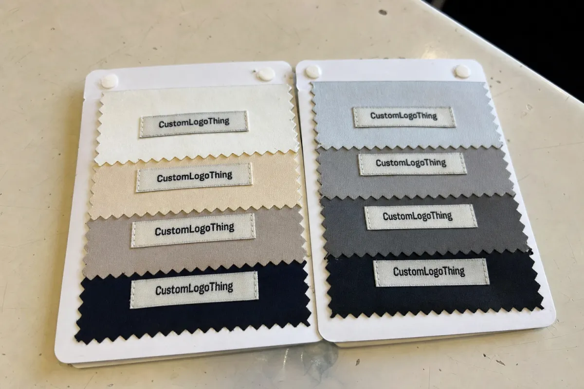
The most common premium construction is damask. It uses finer threads and a tighter weave, which makes it the better choice for small logos, thin lettering, and clean linework. If a vitamin brand wants the label to sit visibly on the front of a pouch or kit, damask usually gives the safest read.
Taffeta is a simpler, more economical weave with a slightly more textured feel. It can work for basic marks, short brand names, and side tabs that are not expected to carry much visual weight. The tradeoff is detail. Tiny type, narrow strokes, and close-set curves can lose clarity faster than they would on a damask label.
Satin-faced woven labels have a smoother surface and a softer sheen. They can feel polished on wellness products that lean toward beauty, spa, or giftable presentation. The downside is glare. Under some retail or bathroom lighting, a shiny surface can make low-contrast text harder to read.
Thread choice and weave density influence hand feel as much as appearance. A tighter weave usually improves definition, but it can also make the label stiffer. Softer yarns feel better on apparel giveaways or fabric pouches, though they may sacrifice a bit of edge sharpness. Heat-cut edges reduce fraying. Folded edges hide cut ends and give the label a more finished look when sewn into a seam.
For vitamin brands, the useful applications are straightforward: branded pouches, sample bags, travel kits, sleeve inserts, apparel promos, and soft packaging that extends the brand beyond the bottle. If the label is meant to carry trust, not just a logo, the construction needs to match the job.
Material Factors That Decide Durability and Readability
Durability starts with the physical build, but readability is the deciding factor people miss most often. A woven label can be technically well made and still fail if the customer cannot read it at arm’s length. I would rather see a simpler label that reads clearly than a dense design that turns muddy after weaving.
The main variables are practical:
- Softness: important for drawstring pouches, reusable kits, and anything that touches skin or fabric.
- Sheen: satin-like surfaces can look premium, but very shiny threads may hurt legibility on small type.
- Color accuracy: woven thread colors are selected from available yarns, so they rarely match Pantone values exactly.
- Edge fray resistance: heat-cut edges are common, while folded constructions hide raw edges more cleanly.
- Abrasion resistance: high-contact items need a tighter weave and secure attachment.
- Small-type clarity: letters under roughly 5 mm tall become risky depending on font weight and weave density.
Vitamin packaging faces rougher conditions than a brand deck suggests. Think humid bathrooms, gym bags, fulfillment lines, and repeated handling. A label on a reusable pouch may be squeezed hundreds of times. A label sewn into a wellness kit may rub against bottles, sachets, scoops, or insert cards during transit. That is why a label that looks fine in a mockup can still disappoint in production.
Finishing choices also change how the label behaves. A flat sew-in label sits broadly on a pouch panel and gives the most room for branding. A center-fold label is sewn into a seam and can show branding on both sides or create a small tab. End-fold labels tuck raw edges behind the face for a cleaner rectangle. Side-fold labels help when the stitch line runs vertically. Each format reduces usable space in a different way, which is why artwork needs to be sized against the finished fold, not just the open label.
Contrast deserves special attention. Cream thread on pale kraft fabric may fit a mood board, but it can disappear in use. Dark green on black can feel natural for a supplement brand and still read poorly at small scale. A good test is simple: the label should pass the quick-glance check from 18 to 24 inches away.
That is one reason the Woven Labels Material guide for vitamin brands starts with legibility rather than decoration. A crisp, readable label builds confidence faster than a complicated one.
A Step-by-Step Way to Choose the Right Label Build
Choosing a woven label gets easier once it is treated like a small engineered packaging component instead of a loose accessory. Every decision should answer one question: where will the label live, and what will happen to it there?
- Define the application. Is it sewn to a reusable pouch, attached to a sample bag, wrapped around a fabric sleeve, or used as a branded insert?
- Choose the weave style. Damask for fine detail, taffeta for simple economical branding, satin-faced for a smoother premium surface.
- Set the dimensions. Common small labels may run around 0.75 x 1.5 inches, 1 x 2 inches, or 1.25 x 2.5 inches, depending on logo shape and seam allowance.
- Select thread colors. Keep to 2 to 4 colors if possible for cost control and cleaner production.
- Pick the fold. Flat, end fold, center fold, side fold, or miter fold depending on attachment.
- Review the proof against the real package. Place the digital proof on the pouch, insert, or kit panel at actual size.
Measure before requesting quotes. You need panel size, seam allowance, visible label area, safe space around the logo, and whether the label will be viewed flat or folded. If a seam takes 3 to 5 mm from each side, that area cannot carry critical text. For center-fold labels, remember that the finished visible size is only half the unfolded length.
The choice between premium and cost-conscious comes down to role. If the label carries a fine icon, a small wordmark, or a front-facing premium cue, damask usually earns its cost. If the label is just a side tab on a sample pouch, a simpler weave may be enough. The same artwork can look expensive or awkward depending on how much space the build actually gives it.
Request a sample or strike-off when the label will be visible on a customer-facing package. A strike-off is a physical pre-production sample made with the intended weave and colors. It adds time, often several business days, but it can prevent a full run with weak contrast, wrong fold behavior, or type that looks clean on screen and fuzzy in thread.
For broader packaging planning, it helps to compare the label against the rest of the system. A woven label should work with the pouch fabric, the carton finish, and the order of assembly, not just the logo file.
Woven Label Cost, Pricing, and MOQ Basics
Cost is driven by a handful of variables: label size, weave density, thread count, number of colors, fold style, cutting method, backing, order quantity, and artwork prep. Larger labels use more material and loom time. More colors increase complexity. Higher density improves detail but usually raises the price.
MOQ conversations can be frustrating for first-time buyers, but the logic is simple. Setup time has to be spread across the order. A 250-piece run may require proofing, loom setup, yarn selection, cutting, folding, and packing almost like a 2,500-piece run, so the unit price climbs at low volume. Standard shapes and common constructions usually price better than unusual sizes, specialty folds, or highly customized finishes.
| Label Build | Best Use | Typical MOQ Range | Rough Unit Cost Range | Buyer Watchout |
|---|---|---|---|---|
| Simple taffeta, 2 colors, flat cut | Side tabs, sampler bags, basic soft packaging | 500-1,000 pieces | $0.10-$0.22 | Limited detail; avoid small copy |
| Damask, 3-4 colors, end fold | Premium pouches, wellness kits, visible front labels | 500-1,000 pieces | $0.18-$0.38 | Confirm thread color and fold allowance |
| Satin-faced woven, folded finish | Beauty-adjacent supplements, gift sets, upscale inserts | 1,000+ pieces | $0.24-$0.48 | Test glare and readability |
| High-density damask with backing | Reusable kits and heavier handling | 1,000+ pieces | $0.30-$0.60+ | Backing may add stiffness |
These ranges are broad because freight, quantity, size, and finishing can move price quickly. Sampling, rush handling, artwork cleanup, and rework after approval are common extra line items. If artwork changes after the digital proof or strike-off has been approved, expect added cost and schedule movement.
From a vitamin brand’s point of view, the smarter question is not “what is the cheapest label?” It is “what label cost supports the package experience we need?” A $0.28 damask label on a reusable pouch may be a better spend than saving $0.08 and making the kit feel generic. For subscription unboxing, premium shelf presence, or refillable packaging programs, the label can carry more perceived value than its unit cost suggests.
Production Process, Timeline, and Lead Time
A typical woven label order follows a predictable path. First comes the quote and artwork review. Then the supplier checks weave feasibility, confirms size and fold style, prepares a digital proof, and, if requested, produces a strike-off. Once approved, the job moves into weaving, cutting, folding, inspection, packing, and shipment.
For new custom constructions, a realistic timeline is often 10 to 20 business days after artwork approval, depending on complexity, quantity, and shipping method. A clean reorder using approved specs can move faster, sometimes around 7 to 12 business days before transit, because the artwork decisions and weave details are already settled. Rush service may be possible, but it narrows the room for careful review.
The slowdowns are rarely mysterious. Unclear artwork causes delays. Tiny type that cannot be woven cleanly needs adjustment. Late color changes restart proofing. Missing fold instructions create confusion. Approval delays can push a label order past the packaging assembly date, and that is painful when pouches, cartons, inserts, and fulfillment labor are already scheduled.
Build buffer into the calendar. If your launch kit assembly starts on the 15th, do not plan for labels to arrive on the 14th. Aim to have them in hand several business days before assembly so the team can inspect color, count, fold accuracy, and attachment behavior. For vitamin brands shipping in corrugated cardboard cartons, it is also smart to test the labeled pouch or kit inside the actual shipper to check scuffing and compression.
Packaging tests do not have to be elaborate for every project, but standards-minded thinking helps. The International Safe Transit Association publishes widely used transport testing protocols, and even a simplified internal rub, drop, and compression check can reveal label problems before a subscription batch goes out.
That production discipline is one of the reasons buyers search for a Woven Labels Material guide for vitamin brands. The label is small, but a late or flawed label can stall an entire packaging line.
Common Mistakes Vitamin Brands Make With Woven Labels
The most common mistake is trying to weave too much detail into too little space. A logo that looks sharp at 4 inches wide may collapse at 1 inch wide, especially if it includes fine botanical art, thin serif lettering, small certification-style text, or multiple nested shapes. Woven labels have physical thread limits. They are not miniature printed brochures.
Low contrast is another frequent problem. Pale green on cream, charcoal on navy, beige on kraft-colored fabric, or metallic-looking thread next to satin sheen can all weaken readability. The brand may look calm and natural on a mood board, but the customer still needs to identify it quickly.
Oversized copy creates the opposite issue. If the label tries to carry a tagline, product benefit, website, dosage cue, and logo all at once, the layout gets crowded. Use the woven label for the brand mark or a short identity cue. Let the carton, insert card, bottle label, or pouch print handle longer copy and regulatory content.
Fold style gets overlooked more often than it should. A flat label quoted at 1 x 2 inches is not the same as an end-fold label with 3 mm tucked under each side. A center-fold tab with a 2-inch unfolded length may show only 1 inch when sewn into the seam. If the artwork does not account for that, the logo can land too close to the stitch line.
Attachment method matters too. A label that looks good loose on a desk can pucker when sewn to thin pouch fabric. A stiff backed label can fight a soft substrate. A heat-applied backing may not suit every textile or reusable package material. Test the real assembly, not just the loose label.
Underordering is the quiet cost mistake. If the first run is 1,000 labels and the package build needs 950, there is little room for rejects, setup samples, assembly errors, or promotional extras. Reordering 300 more later may cost more per unit, take longer than expected, and risk slight shade variation because thread lots can shift.
Regulated products also need careful separation between branding and required information. The woven label should not become a place for claims that need more context. Keep compliance-heavy copy on approved printed components where revisions are easier to manage.
Expert Tips and Next Steps for a Better Order
Start with simple logo architecture. Bold marks, clean wordforms, and adequate spacing almost always weave better than delicate illustrations and micro text. Preserve empty space around the logo. On a small label, even 2 to 3 mm of breathing room can be the difference between polished and cramped.
Match the material finish to the package tone. A matte damask label may suit a science-forward supplement pouch better than a shiny satin face. A softer satin-style finish may work well for beauty supplements, sleep support kits, or wellness gift sets. Decoration for its own sake usually creates noise. The finish should support the product position.
Test against the exact package or textile. Put the strike-off on the actual pouch fabric, sleeve, insert, or kit material. Fold it. Sew it if sewing is part of the build. Rub it lightly against the inside of the shipper. Place it under the lighting where customers are likely to see it. A label can look perfect in proof and behave differently once attached to real material.
If sustainability is part of the packaging story, keep the broader system honest. A woven label may sit alongside kraft paper, recycled materials, post-consumer waste paperboard, or FSC-certified cartons. For paper-based components, the Forest Stewardship Council is a recognized reference point for responsible sourcing claims. Avoid implying that every component is recyclable or biodegradable unless the actual material and local recovery stream support that claim.
Here is the ordering sequence that tends to reduce mistakes:
- Gather finished package dimensions and label placement photos or drawings.
- Choose two or three material directions, such as damask matte, taffeta economy, and satin-faced premium.
- Confirm order quantity, assembly date, and launch deadline.
- Send clean vector artwork, preferably AI, EPS, or editable PDF.
- Request a digital proof at actual size.
- Approve a strike-off for visible customer-facing uses.
- Review the sample with the finished package in hand before full production.
Most vitamin brands do not need the fanciest woven label available. They need the right one: readable, durable, correctly folded, properly attached, and aligned with the package’s price point. Use this Woven Labels Material guide for vitamin brands as a decision path, not a menu of decorations, and the label will feel like part of the product instead of an afterthought.
FAQ
What woven label material works best for vitamin brands that need a premium look?
Damask-style woven construction is usually the strongest choice when the logo needs fine detail and a refined feel. Smoother finishes can add an upscale touch, especially on premium pouches or wellness kits, but readability should stay ahead of decoration. Test the label against the real package so the premium look holds up in hand, not just on screen.
Are woven labels durable enough for vitamin brand pouches and reusable kits?
Yes, woven labels are well suited to repeated handling and the wear that comes with reusable soft goods. Durability depends on thread choice, weave density, fold style, and how securely the label is attached. For high-use items, prioritize clear construction, strong contrast, and secure finishing over very tiny decorative detail.
How do woven labels for vitamin brands affect cost and MOQ?
Price is driven by size, color count, weave complexity, finishing, and total quantity. Lower quantities usually raise unit cost because setup work is spread across fewer pieces. Standardized sizes and simpler constructions often help keep both MOQ pressure and pricing under control.
How long does a woven label order usually take for a vitamin brand launch?
Lead time depends on artwork readiness, sample approval, production complexity, and shipping method. New custom builds usually take longer than repeat orders with approved specs already on file. Build schedule buffer into the launch calendar so labeling does not become the last item holding up fulfillment.
What artwork files are best for woven labels on vitamin packaging?
Send clean vector artwork whenever possible so the logo scales properly for the weave process. Keep small text, thin lines, and complex gradients under control because woven construction has physical limits. A strong proof review is the best time to catch readability issues before production starts.


