Apparel Flat Bill Snapbacks Logo Placement Buying Guide
Apparel Flat Bill Snapbacks logo placement looks like a simple art decision until a production sample shows up a little off-center, a little too low, or just too large for the panel. On paper, the difference may be a quarter inch. On the hat, that shift changes the first impression. The logo can feel sharp and intentional, or crowded and awkward, without a single change to the artwork file.
That happens because a flat bill snapback is not a neutral canvas. The front is structured, the crown is taller than many casual caps, and the bill creates a hard visual line that pulls the eye downward. A logo has to work with those shapes, not fight them. Buyers who treat placement as a purely aesthetic choice usually end up revising proofs, redoing samples, or paying for a run that only looks right in a mockup.
The comparison that helps most is packaging. A label can be technically accurate and still fail if it lands in the wrong visual zone. Hats behave the same way. The mark has to clear seams, balance the crown height, and read at a glance from a few feet away. If it does not, the cap looks less like a finished product and more like a decoration that missed its target.
Apparel flat bill snapbacks logo placement: what changes on the front panel
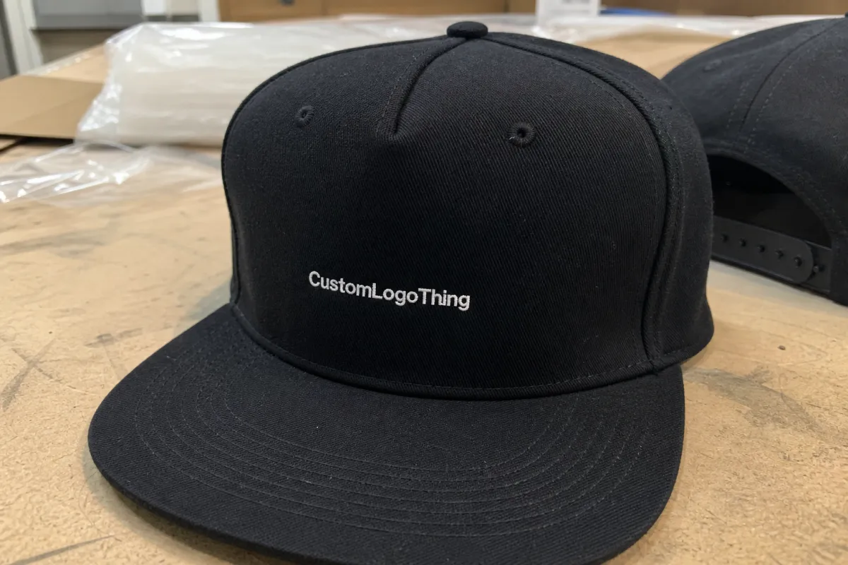
On a structured snapback, the front panel behaves like a fixed frame. Center-front placement is the default because the human eye expects symmetry there, but symmetry only works when the logo shape fits the panel shape. A wide wordmark can sit comfortably across the face of the crown. A vertical icon can climb too high and start to feel cramped. A circular badge can be elegant, or it can look pinched if it lands too close to the seam.
Flat bills add another wrinkle. A curved brim softens the transition from panel to bill; a flat bill does not. That hard line changes where the eye lands first. If the logo sits too low, the bill steals attention. If it sits too high, the mark can look as if it is floating above the hat instead of belonging to it. That is why placement decisions that look small in a layout file become obvious after the cap is stitched, pressed, or packaged.
Five-panel and six-panel caps do not behave the same way. Five-panel snapbacks often give a cleaner front field because there is no center seam slicing through the art. Six-panel caps are more traditional, but the seam can disrupt fine text, small icons, or perfectly round logos. A design that looks balanced on a flat digital mockup can suddenly feel compressed once the crown starts shaping around a head.
For that reason, the question is not simply “Where does the logo go?” The real question is, “Where does this logo read best on this hat, with this decoration method, at this size?” That is a production question, not a style preference.
How placement works on a structured front panel
Three placement zones show up again and again: center front, slightly offset to the left or right, and a raised position above the bill line. Center front is the safest for readability. A slight offset can feel more fashion-forward, especially in streetwear, but it demands tighter control because the eye measures it against the seam and the crown edge. A raised placement helps when the bill is visually heavy or the crown is dark, because it gives the logo more breathing room.
On structured caps, the usable area is smaller than it looks. Stitch pull, patch thickness, panel curvature, and seam allowance all eat into the available field. A logo that is 5 inches wide on a flat screen may behave like a larger object once it meets a curved front panel. The material itself changes the apparent size.
For embroidered wordmarks, a practical width often lands around 4.25 to 5.25 inches. That is not a rule carved in stone; it is a working range that keeps the mark legible without forcing the threads too close to the seam. Patch programs can go wider if the artwork has a border and the crown offers enough real estate. Once the design gets too close to the edges, the border starts to feel clipped and the cap loses visual balance.
Direct embroidery tends to work best when the logo is simple, bold, and sized for stitch performance. Fine lines and tiny text are vulnerable to fill-in. Woven patches hold detail better and can make small lettering easier to read, but they need enough border space and clean shape control. PVC patches add dimension and a more retail-driven finish, though their thickness can make placement feel heavier if they are pushed too low on the panel. Heat transfer handles detail well and can keep the front lighter, but it does not always have the same premium feel as embroidery or a well-made patch.
That is why placement should be decided together with decoration method. A location that works for embroidery may not work for a patch. A patch that looks crisp in the middle of a crown may feel oversized once it sits on a shorter front panel. Production teams that separate those choices usually create avoidable revisions.
One practical habit helps more than most people expect: compare the logo edge to the seam line. If the mark touches the seam in the proof, it is usually too large or too low. If it clears the seam with enough negative space to read cleanly, you are closer to a reliable production spec. The empty space matters. It is not wasted area; it is what makes the logo look deliberate.
Key factors that affect snapback logo visibility and fit
Logo shape comes first. Wide marks need lateral room. Tall marks need height control. Badge-style logos need enough square space that the border does not collapse into the crown. A round logo can look polished on a patch and awkward in thread if the seam cuts into the shape. The same art can succeed or fail depending on the decoration method and the panel geometry.
Audience changes the decision too. Retail buyers usually want cleaner margins and more restraint. Promo buyers often care more about fast recognition from a distance. A trade show giveaway can handle a larger front hit if the goal is visibility across a booth. A fashion line may want smaller, more precise placement that feels premium rather than loud. Neither approach is wrong. They just ask the cap to do different jobs.
Color contrast deserves more attention than it usually gets. Dark thread on a dark crown can disappear at arm's length, even if the logo size is technically correct. High-contrast thread, backing, or patch color improves legibility immediately. The bill color matters as well. A black bill under a black crown creates a heavy visual block. A contrasting bill can separate the lower edge and give the logo more lift.
Stitch density affects how the logo reads, especially on smaller placements. Dense embroidery gives sharper edges but can make a design feel heavier. A lighter stitch count can preserve flexibility, though thin strokes may break apart if the digitizing is sloppy. That tradeoff is one of the reasons experienced buyers ask for a placement spec sheet instead of relying on a clean-looking render.
Fit matters more than most first-time buyers expect. A logo can look centered on a flat table and still drift visually once the hat is worn. The crown curves. The bill casts a shadow. The front panel flexes with the wearer’s head. That is why a cap should be judged from a few feet away, not only in a perfect front-on mockup.
A logo can be mathematically centered and still look wrong if it fights the bill line.
For teams that also manage packaging or shipping, international test standards such as ISTA are useful for thinking about how decorated products survive transit. And if the order includes packaging with certified paper claims, FSC is the reference point worth checking early. Those standards do not decide logo placement, but they do reinforce a practical truth: presentation and durability need to hold up together.
Process and timeline for proofs, samples, and production steps
The cleanest order flow is usually the least dramatic: artwork intake, placement review, digital proof, sample approval if required, production, final inspection, and shipment. The common failure point is skipping the middle. Buyers send artwork, get a mockup, and assume the production team will infer the rest. That is how schedules slip and how placement surprises reach the sample stage.
Proofing is where most problems should be caught. A useful proof shows the logo size, distance from the bill, distance from the seam, decoration method, and any patch border or embroidery limits. If those numbers are absent, expect more back-and-forth. Two revision rounds is manageable. Three or more starts to strain the timeline, especially if the hats are tied to a launch, event, or retail delivery window.
Lead time depends on both decoration method and blank availability. A straightforward embroidery run on stocked blanks often takes about 10 to 15 business days after proof approval. Patch programs usually take a bit longer because they may include die cutting, heat pressing, edge finishing, or extra inspection. A physical pre-production sample can add 5 to 7 business days, sometimes more if the artwork is detailed or the materials are not already in stock.
Seasonality matters. Cap programs get slower before major retail drops, summer event schedules, and holiday orders. If a buyer waits until the last minute to settle placement, the production queue is usually less forgiving. Even a one-day delay in approval can become several days once the line is full.
Good buyers shorten the process in practical ways. Send vector artwork. Confirm the target logo width before the first proof arrives. Decide whether the mark should sit dead center or slightly offset before the sampling conversation starts. If a proof is already inside the acceptable range, approve it quickly. The schedule does not improve by sitting in a folder.
Sample review should never happen only on a screen. Hold the cap in natural light. Look at it from arm's length. Tilt it slightly. That is where placement issues usually show up. A logo can look balanced in a PDF and still sit too low once the brim shadow and crown curve enter the picture.
Cost, pricing, MOQ, and unit cost drivers for snapbacks
Pricing is shaped by five things more than buyers often expect: blank hat quality, decoration method, stitch count, patch material, and the number of color changes. A basic cotton twill or foam-front snapback is one price. A more premium structured cap with a better sweatband, cleaner profile, or stronger shape retention is another. The decoration cost sits on top of that.
For stocked blanks, blank cap pricing commonly falls somewhere around $4.50 to $9.50 per unit, depending on style and order size. Direct embroidery on a 100 to 500 piece run often adds roughly $1.75 to $3.75 per hat. Woven patches may land around $2.50 to $4.50. PVC patches often sit closer to $3.00 to $5.50 because of tooling and finishing. Heat transfer can be lower, roughly $1.25 to $2.75, though that method is not always the best fit for a premium retail program.
MOQ tends to move with complexity. A simple embroidered front logo may be available at 24 to 50 pieces through some suppliers. Patch programs often ask for 50 to 100 pieces, especially if tooling or custom finishing is involved. The more setup work a decoration method requires, the more likely the minimum rises. Smaller runs nearly always cost more per unit because the fixed work gets spread across fewer hats.
There are also charges buyers forget until the invoice is in front of them. Digitizing for embroidery is one. Depending on complexity, it often runs about $35 to $85 as a one-time setup fee. Samples may land around $40 to $125. Rush fees appear quickly when a delivery date moves. Special packaging, woven labels, hang tags, or retail inserts can add more to the order. If the packaging includes certified paper claims, verify that language before production so no one has to redo inserts later.
| Decoration option | Typical add-on cost | Best use case | Main watch-out |
|---|---|---|---|
| Direct embroidery | $1.75-$3.75 | Simple logos, durable wear, clean front panel branding | Fine details can fill in or lose definition |
| Woven patch | $2.50-$4.50 | Small text, sharper edges, retail-ready finish | Needs border space and careful scaling |
| PVC patch | $3.00-$5.50 | Dimensional branding, strong visual punch, outdoor use | Thickness can make the placement feel heavier |
| Heat transfer | $1.25-$2.75 | Detailed art, lighter feel, simpler setup on some runs | Not always the best choice for premium retail caps |
If you are comparing quotes, make sure every line uses the same inputs: blank style, decoration method, logo size, stitch count or patch size, digitizing fees, sample timing, and any packaging add-ons. A quote can look cheaper simply because it leaves out the details that matter.
Common mistakes that make flat bill snapback logos look off
The most common mistake is pushing the logo too close to a seam. It sounds minor on paper. On the hat, it can distort the art and make the cap look slightly crooked in photos. A logo that kisses the center seam often looks pinched once the crown flexes during wear.
Oversizing is the next problem. Buyers assume a larger logo means stronger branding, but a front panel with no breathing room can look cramped and less premium than a smaller, better-proportioned mark. Flat Bill Snapbacks already have enough structure. If the artwork fills every inch, the eye has nowhere to rest.
Skipping a physical sample is risky when the final result depends on thread direction, patch thickness, or a specific type of backing. Digital proofs cannot fully show how embroidery catches light or how a patch sits off the crown. A sample is not an extra luxury. It is the cheapest place to catch a problem before a run gets expensive.
File quality causes trouble more often than buyers admit. Low-resolution artwork, web graphics with stray pixels, or logos that were never cleaned up for production can produce fuzzy edges and broken small text. Vector art is still the cleanest starting point. If the logo was built for a website, assume it needs production cleanup before it hits a cap.
The wearer angle is the last mistake, and it is easy to miss. A logo that looks centered on a table may shift visually once the hat is on a head. The crown curves, the bill creates shadow, and the front panel no longer sits flat. The product has motion, and placement has to survive that motion.
Practical approval tips and final checks
Ask for a placement spec sheet before approving anything. A promise that the logo will be “centered” is not enough. You want exact measurements: width, height, distance from the bill, distance from the seam, and whether the artwork sits above, across, or near the front panel seam. Those numbers make the decision repeatable.
Choose one primary goal before the proof is built. Do you want maximum visibility, a fashion-forward offset, or a more premium and restrained front? Trying to get all three usually creates a compromise that satisfies nobody. A promo cap can run louder. A retail cap can run quieter. The right answer depends on the job, not the preference in a vacuum.
Match the proof to real viewing conditions. Check one digital proof, one physical sample if the order warrants it, and one final view under natural light at arm's length. That simple routine catches more issues than long email threads ever do. If the logo reads cleanly from that distance, clears the bill line, and feels balanced against the crown height, the placement is probably right.
Before release, the final checklist should be blunt and specific:
- Confirm the final logo width and height in inches.
- Lock the decoration method: embroidery, patch, PVC, or transfer.
- Approve the placement relative to the bill line and seams.
- Check whether digitizing, setup, or sample fees are included.
- Verify proof timing and the number of revision rounds allowed.
- Note any packaging, labeling, or retail insert requirements.
Handled this way, apparel Flat Bill Snapbacks logo placement stops being a guess and becomes a production decision with measurable limits. That shift matters. It is the difference between a cap that simply carries a logo and a cap that looks like it was built around the logo from the start.
Where should apparel flat bill snapbacks logo placement usually sit for the best visibility?
Center-front placement is usually the safest choice when readability matters most. A slightly raised position can help the logo clear the bill line and stay visible in photos. Pushing the mark too low often lets the brim hide part of the artwork from normal viewing angles.
How big should a logo be on a structured flat bill snapback?
The best size matches the front panel shape, not just the artwork file. Wide wordmarks usually need more horizontal room, while taller icons need controlled height so they do not crowd the seams. A useful proof shows the logo reading clearly from a short distance without swallowing the crown.
Does embroidery or a patch change snapback logo placement?
Yes. Thicker decoration methods usually need more space and can shift the visual center a little. Patches often look better with more border room than direct embroidery, and very detailed art may need a different placement choice if the decoration method cannot hold fine edges cleanly.
What affects MOQ and unit cost for logoed flat bill snapbacks?
The main drivers are decoration complexity, blank style, and the number of color changes or setup steps. Lower quantities usually raise the unit cost because setup is spread across fewer hats. Rush timelines and sampling can add cost even when the blank cap itself is inexpensive.
How do I get approval right the first time?
Send vector artwork, confirm the logo size early, and ask for exact placement measurements before the first proof is finalized. If the mockup, the sample, and the spec sheet all agree, the order is usually in good shape.