If you are reviewing a bakery brands zipper pouch Bags Artwork Proof Checklist, the stakes are usually higher than they look on screen. A pouch can appear polished in a PDF and still fail in print if the bleed is short, the zipper line cuts into copy, or a fine legal line disappears into a seal area once the bag is formed.
Bakery packaging carries a particular kind of pressure. The pouch has to make the product look fresh and appetizing, keep ingredients and allergens readable, and still hold barcodes, lot coding space, and retail claims inside a relatively small print surface. That is why a focused bakery Brands Zipper Pouch Bags artwork proof checklist is not paperwork for its own sake. It is the last practical checkpoint before a supplier commits to plates, cylinders, film, and production scheduling.
Why artwork proofing matters more than most bakery brands expect
From a packaging buyer’s point of view, the proof is where the real bag starts to exist. On screen, you are looking at a clean layout, but the actual pouch has seal zones, gussets, zipper hardware, and sometimes a hang hole, all of which reduce visible design space. That is why the Bakery Brands Zipper Pouch Bags artwork proof checklist should begin with structure, not with color preference.
Food packaging also carries a different level of scrutiny than a typical consumer label. If a bakery item is sold through retail, e-commerce, or club channels, the pouch often has to support ingredient clarity, allergen visibility, barcode performance, and brand trust in one glance. In practice, the design has to do four jobs at once: sell the product, explain the product, protect the product, and survive converting.
An artwork proof is the supplier’s prepress review or digital mockup showing how the final zipper pouch is intended to print and assemble. That proof is not just a courtesy. It is the point where you can still correct logo scaling, barcode placement, color setup, nutrition panel spacing, and copy legibility before print files are locked and production begins.
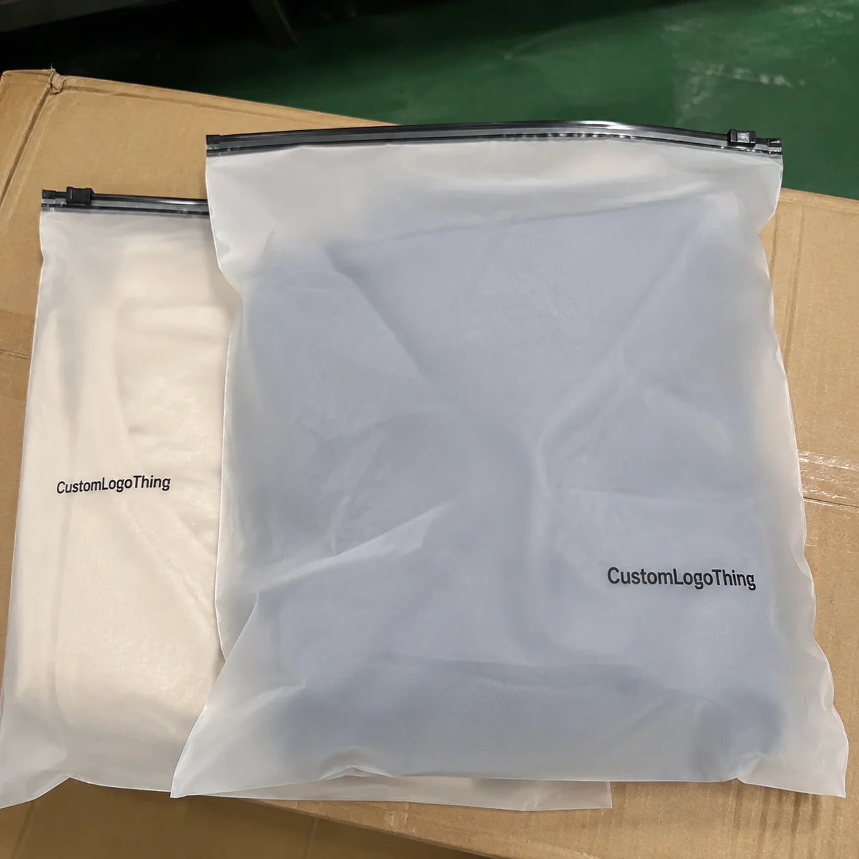
Here is the part many brands underestimate: zipper pouch bags usually have tighter design constraints than flat bags. The closure line, side seals, bottom gusset, and tear notch all affect what remains visible on shelf. A flour-toned bakery image may look beautiful on a monitor, but if the key product shot sits too close to a seal, it can feel chopped off or cramped once the pouch is converted.
“A proof that looks close enough often costs more later than a proof that gets another careful pass now.”
That is the real value of a detailed checklist. It lowers the odds of reprints, launch delays, and packaging errors that confuse retail buyers or make consumers wonder whether the product changed midstream.
How the proofing process works from file upload to approval
The normal flow is fairly consistent across most print suppliers, even when the terminology changes a bit. First, artwork gets submitted. Then prepress reviews the file for dimensions, resolution, color setup, font handling, and dieline fit. After that, the supplier sends a digital proof or dieline proof for review. Internal revisions happen next, followed by final sign-off and production release. A Bakery Brands Zipper Pouch Bags artwork proof checklist keeps each of those steps tied to the actual packaging spec.
There is an important difference between a visual proof and a production-ready proof. A visual proof is mainly for showing layout and general placement. A production-ready proof should reflect the final dieline, safe zones, print dimensions, and technical notes that the factory will use for press setup and pouch conversion. Even then, digital color on a monitor will not match press output exactly, because ink, film, lamination, and viewing light all shift how the package reads.
The dieline is your map. It shows the pouch shape, trim line, seal zones, zipper position, gusset folds, and any non-print areas. When a buyer skips over the dieline, that is usually where the problem starts. Good artwork can still fail if the logo sits too near a fold, the barcode straddles a seam, or a claim lands in a hidden area once the bag is filled and formed.
Most suppliers allow one or more proof rounds. Some include one revision cycle as standard, while others will keep sending updated proofs until the buyer is satisfied. Just remember that each round adds time if the changes are substantial. A small typo correction is easy. A full rework of the nutrition panel or a brand-color adjustment across multiple panels is a different story.
After approval, production usually moves into plate making for flexographic print, cylinder setup for gravure or other press systems, film printing, lamination, slitting, pouch converting, and packing for shipment. The approved proof becomes the reference point for all of it.
| Proof type | What it shows | Best use | Typical buyer risk if ignored |
|---|---|---|---|
| Visual PDF proof | Artwork layout, colors, and copy placement | Early review and internal comments | Missing dieline or seal-zone issues |
| Dieline proof | Pouch shape, trim, folds, zipper, and safe areas | Checking fit and structural constraints | Text or barcode landing in hidden areas |
| Production proof | Final prepress setup for press release | Final sign-off before production | Late-stage changes, delays, and rework |
Artwork and file specs that protect your design
Good artwork starts before the proof. If the source files are weak, the proof usually exposes that weakness quickly. For logo marks, icons, and type, editable vector files are ideal because they stay sharp at the actual pouch size. Raster images can work well for photography, but they need the right resolution, or the final pouch can look soft, muddy, or pixelated once printed on film.
For print work, CMYK is usually the safer starting point, not RGB. Screens emit light, while inks sit on film or laminate, and that difference matters. If a brand color is critical, a Pantone reference or a controlled color target may be needed, but even then the final result can shift depending on whether the substrate is gloss, matte, metallic, or clear. A warm brown that looks rich on coated artboard may look flatter on a translucent film.
There are a few layout rules that protect the design more than almost anything else:
- Bleed should extend past the trim so slight cutting movement does not leave a white edge.
- Safe zones should keep text and logos away from seals, folds, and zippers.
- Embedded fonts or outlined text prevent substitution problems during prepress.
- Overprint settings should be checked so black and spot elements behave as intended.
- Correct dieline dimensions should match the actual pouch specification, not a similar old file.
Bakery packaging also needs room for regulated and retail-driven content. Depending on the product, that may include nutrition facts, ingredient statements, allergen disclosure, barcode, lot code area, recycling marks, or product claims such as “made with real butter” or “gluten-free.” Those claims are not just marketing copy; they often need internal or legal review before approval.
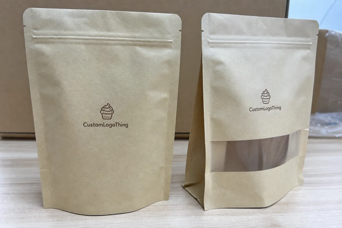
The surface matters, too. A glossy film makes color read stronger and can improve shelf pop, while matte can feel more premium but sometimes softens contrast. Clear windows can help show the product, but they can also compete with text placement if the layout is not planned carefully. The best artwork files are built with the material in mind from the start, not adjusted after the fact.
For reference-level packaging information, I often point teams to the Association for Packaging and Processing Technologies and, for recycling and material context, the EPA. Those resources will not replace your supplier’s spec sheet, but they are useful for broader packaging thinking.
Cost, pricing, and quote variables that affect bakery pouch orders
Pricing for custom zipper pouches usually comes down to a few hard variables: size, film structure, zipper style, finish, print coverage, quantity, and whether the design includes extras like windows, matte varnish, metallic accents, or upgraded barrier layers. If you are comparing quotes, the first question should be whether each supplier is pricing the same structural spec. A lower quote on a lighter film or simpler zipper is not the same thing as a direct apples-to-apples comparison.
Artwork changes can also create hidden cost. One extra prepress round is manageable. Three rounds because the file was not built cleanly can slow production and extend internal review labor. The expensive part is not always the obvious file correction; it is the schedule slip that pushes the launch behind packaging, freight, and sales deadlines.
Shorter runs usually carry a higher unit cost because setup is spread over fewer pieces. Larger runs lower the per-unit price, but they require more storage and more confidence in the artwork because any error multiplies quickly. MOQ matters here. A run of 5,000 pouches might land in a very different range than 25,000, even if the bag is visually identical.
For bakery brands, the quote should clarify whether it includes proofing, color review, final packing specs, shipping cartons, and any special notes for bagging or palletization. A unit price without those details can look attractive and still leave you paying for extras later.
Typical pricing can vary widely, but a custom printed zipper pouch in moderate quantities might land around $0.18-$0.28 per unit at 5,000 pieces, depending on size and print coverage. Add special finishes, heavier barrier films, or more complex closures, and that number can move up. That is why the bakery brands zipper pouch bags artwork proof checklist should be treated as a cost-control tool, not just a design review.
| Order factor | Lower-cost choice | Higher-cost choice | What to confirm on proof |
|---|---|---|---|
| Quantity | Smaller run | Larger run | Correct version and final count |
| Finish | Standard gloss | Matte, soft-touch, or specialty finish | Readability and color shift |
| Structure | Basic zipper pouch | Window, high barrier, or specialty closure | Seal zones and visible design area |
| Artwork complexity | Simple blocks of color | Heavy coverage, fine type, foil accents | Registration, legibility, and bleed |
Process timeline, lead time, and production steps to plan around
Lead time is usually a chain of smaller timings, not one single number. First comes file review and proofing. Then there may be revisions, approval, plate or cylinder setup, printing, curing or drying, lamination, slitting, pouch converting, inspection, and freight. If any one stage slows down, the whole schedule shifts.
Many bakery launches feel rushed because merchandising, promotions, and seasonal demand all hit at once. That is exactly why the proof stage should be treated as a critical path item. If the art is not print-ready, the supplier cannot move cleanly into production, even if the sales launch date is already fixed on someone’s calendar.
How fast things move depends heavily on the buyer. A clean file with clear comments might move through proofing quickly. A file with missing nutrition data, mismatched dieline dimensions, or unresolved claims can stall. If structural samples or custom tooling are needed, add extra time. That is not a penalty; it is the reality of converting flexible packaging.
Changes after approval are where schedules really get hurt. If a revision touches color separations, panel layout, or compliance text, parts of the process may need to restart. That means the buyer should get internal sign-off from sales, marketing, operations, and quality before final approval goes out. Otherwise one department’s late correction can undo a week of progress.
Seasonal bakery programs deserve a buffer, especially if the order is tied to holiday flavors, limited-edition packaging, or retail promotional windows. Printers and converters often have heavier queues during peak periods, and the safest way to protect the launch is to approve the artwork before the calendar becomes crowded.
For quality-minded teams, packaging and testing standards such as ISTA can also be worth reviewing when shipping and distribution protection matter. If you want to see how packaging projects are handled in real buyer scenarios, our Case Studies page is a helpful place to compare approaches.
Step-by-step artwork proof checklist for bakery brands
Here is the practical bakery brands zipper pouch bags artwork proof checklist most teams need during review. Keep the comments specific. Vague feedback slows everyone down.
- Verify pouch dimensions and filled size. Make sure the artwork matches the real bag structure, not an old template. A 150g pouch and a 250g pouch can look similar in a PDF but behave very differently on shelf.
- Check every line of copy. Spelling, grammar, ingredient order, allergens, product claims, and disclaimers should all be reviewed before visual styling gets your attention. A pretty error is still an error.
- Confirm logo placement and barcoding. The barcode needs a proper quiet zone, correct size, and enough contrast to scan reliably. Nutrition panels should be readable and not squeezed near a fold.
- Review brand colors against material choice. If your brand depends on a specific red, brown, cream, or black, say so directly. Finish and film can change the appearance more than many buyers expect.
- Inspect the dieline carefully. Look for bleed, trim, fold, seal, zipper, tear notch, and gusset areas. Nothing important should sit where it can be hidden, distorted, or cut off.
- Reserve space for coding and operations. Lot code, date code, or traceability marks need room. If a pouch is too tight, the production team may need to stamp code over artwork, which rarely looks elegant.
- Consolidate comments into one review. One clean markup sheet is better than five scattered emails. Production teams work faster when the revision list is unambiguous.
A small extra step helps a lot: print the proof at actual size if your team can do it. A monitor can hide how small 5 pt type really is, and bakery packaging often has more text than people realize. At actual size, you can judge hierarchy, scanability, and whether the design still feels balanced when viewed from arm’s length.
It also helps to review the proof in the context of the final sales channel. Retail shelves need strong front-panel clarity. E-commerce orders may need sturdier transit performance and clearer product identification. Subscription or DTC packs often need a slightly different communication hierarchy because the customer handles the package more closely.
Common proofing mistakes that create delays or reprints
The most common mistake is approving the proof because it “looks fine” while ignoring the technical details. A dieline that is even slightly off scale can create trouble later, especially if the pouch has a zipper or gusset that affects the visible area. The second common mistake is treating the proof like a design presentation instead of a production document.
Color is another trap. RGB files often look vibrant on a laptop, then flatten in print. That is not the printer being difficult; it is simply the difference between emitted light and printed ink. If a brand wants a specific finish or rich tone, hard-copy references and a clear color expectation are far better than screen assumptions.
Bakery pouches also get crowded fast. There is only so much room once seal zones, folds, and edge curvature start stealing space. When the layout gets too busy, the pouch can feel cramped, and the most important things—product name, flavor, key claim, and barcode—stop breathing.
Last-minute copy changes are another classic delay source. Ingredient updates, allergen language, or marketing claims can trigger compliance review, especially if the product is sold in multiple channels. A small wording tweak can be harmless, but it can also mean the proof has to cycle through internal approval again.
Barcode issues deserve their own warning. Poor contrast, incorrect sizing, and placement too close to seams can make a package technically printed and practically unusable. That kind of problem tends to show up right when a launch is already under pressure.
And then there are the tiny errors that survive a rushed review: an old address, a misplaced email, a stale product weight, or a forgotten distributor line. None of those are dramatic by themselves. Together, they can turn a good packaging run into a frustrating one.
Expert tips and next steps before you approve
A two-person review system catches more mistakes than a single reviewer ever will. One person should look at brand, merchandising, and marketing accuracy. The other should look at technical details, legal text, dieline fit, and print-production concerns. That split works because people naturally miss different kinds of errors.
If possible, print the proof at actual size and review it under decent lighting. It sounds old-school, but it helps with legibility, hierarchy, and barcode clearance. You can tell very quickly whether a panel is too dense or whether a key message gets lost once the design leaves the glowing rectangle of a screen.
Before you approve, compare the proof against the final sales channel. A package destined for a supermarket shelf may need stronger front-panel contrast than one going direct to consumers. If the pouch will ship through distribution, the outer package and freight handling matter too. If you are uncertain about transit durability, packaging test protocols like ISTA can provide useful context.
Keep a master file of approved artwork, revision notes, and sign-off dates. That habit saves a lot of future trouble when you reorder, refresh a season, or update a claim. Too many teams lose time hunting for the “final final” version, which is usually a sign that file control was weaker than it should have been.
The next step is straightforward: gather the final files, confirm the supplier’s specs, mark up the proof once with clear comments, and resolve open questions before approval goes out. Use the bakery brands zipper pouch bags artwork proof checklist one last time so final sign-off feels confident, tidy, and production-ready.
What should bakery brands check first on a zipper pouch artwork proof?
Start with pouch size, dieline, and safe zones so the design fits the actual bag structure. Then verify spelling, legal copy, barcode placement, and any required nutrition or allergen information.
How many proof rounds are normal for custom bakery zipper pouch bags?
One to two rounds is common when the file is close to print-ready. More rounds may be needed if the layout, claims, or color expectations need major correction.
Why does the printed color look different from the proof on screen?
Screens use light, while printed film uses inks on a specific substrate, finish, and lamination. Gloss, matte, metallic, and clear materials can all change how brand colors appear.
What file format is best for bakery zipper pouch artwork?
Vector files are best for logos and type because they stay sharp at print size. High-resolution images should be used for photos, and all fonts should be outlined or embedded as required by the printer.
How can brands avoid delays during artwork approval?
Review all content internally before sending files, including claims, ingredients, and barcodes. Use one consolidated markup sheet so corrections are clear and the proof can move to production faster.