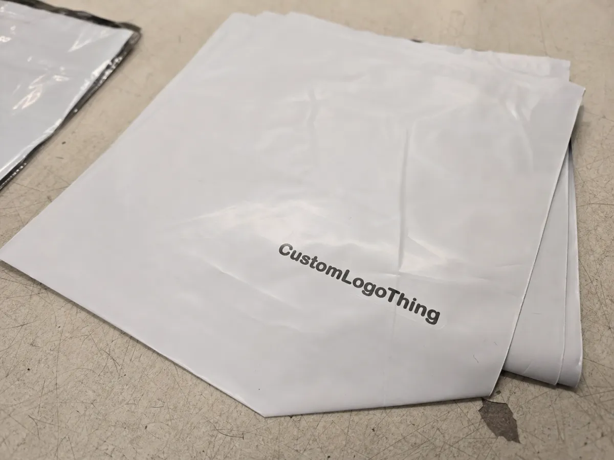
The ceramic Printed Poly Mailers Artwork Proof checklist is not a design exercise. It is the last line between a clean launch and a reprint you did not budget for. A mockup can look polished on screen and still fail once it meets actual film, real ink, folding, sealing, and the lovely indifference of production equipment.
That is the part buyers learn the hard way. A proof can look balanced, on-brand, and perfectly centered, while the real mailer ends up cutting off a logo, softening a color, or swallowing a barcode into a seal zone. The artwork may be correct in theory. It is still wrong in practice.
A good proof checklist protects more than aesthetics. It protects lead time, quantity planning, and margin. If you are ordering custom packaging for a launch, a subscription program, or a fulfillment shift, the proof is where you catch the expensive problems before anyone commits ink to film.
Why a Proof Can Look Fine and Still Fail in Print
A digital proof usually answers one question well: does the artwork appear where the file says it should? That is useful. It is not enough. Print adds variables a screen never shows. The mailer has seams, folds, trim tolerance, and a sealing area that can steal usable space. A glossy film reflects light differently than matte stock. Dark artwork can feel heavier on black or tinted film. A thin font can disappear once the press converts it from pixels into ink.
The safest way to read a proof is as a production map, not a style vote. If the template is accurate, it tells you where the artwork can live. If it is not, the file may still look fine and print badly. That gap is wider on poly mailers than on flat labels because the substrate is flexible and the print area is usually less forgiving.
Suppliers can usually confirm layout, dimensions, bleed, and basic file integrity. They cannot guarantee how every color will behave on every surface unless you ask for a physical sample or an approved reference drawdown. For orders where handling matters, testing against packaging standards such as ISTA handling guidelines makes more sense than trusting a laptop preview. The same goes for fragile product kits and subscription packs that get tossed, stacked, and shipped hard.
"A proof can be accurate and still be wrong for production. The job is to catch the mismatch before the order is locked."
If the kit includes inserts, labels, or paper components, check the specs for those pieces too. The mailer may be plastic, but the rest of the package can carry different material claims, finish requirements, and compliance language. Those details are boring until they are printed incorrectly. Then they are the whole problem.
Artwork Proof Process: From File Upload to Sign-Off
The process usually starts with a file upload and a preflight review. Someone checks whether the artwork is vector or a low-resolution raster file, whether fonts are embedded or outlined, and whether the layout respects the required safe zones. If the file is messy, the proof stage slows down immediately. That is normal. It is also avoidable.
Then comes the proof itself. Most buyers will see one or more of these: a digital layout proof, a dieline proof, a color reference, or a physical sample. Each does a different job. A dieline proof confirms placement against the actual template. A digital proof checks copy and composition. A color reference gives you a target, but not a promise that the final film will match the screen exactly.
Clean markups matter. "Move logo left 6 mm" helps. "Make it pop" does not. The cleaner the notes, the faster the revision cycle. That matters because proof delays usually do not come from major design changes. They come from unclear ownership. One person changes the address, another changes the logo size, and a third approves an older file because the version names are a mess.
For custom mailers, the proof has to respect the bag structure. Seams, folds, gussets, and heat-seal areas all affect the printable region. If your supplier shows a centered design floating on a blank rectangle but does not show the seal and trim zones, ask for a better layout. A mailer proof that hides the edges is not helping you.
One practical approval chain keeps everyone sane:
- Upload the final artwork files.
- Check preflight notes for missing links, fonts, or low-res elements.
- Review the layout against the dieline.
- Confirm size, quantity, material, and finish.
- Approve in writing from one named owner.
That last part is less glamorous than debating shades of blue, but it saves money. Multi-person verbal approval is how people end up printing the wrong revision.
File Specs That Decide Whether the Mailer Prints Cleanly
Most proof issues begin before the proof is opened. A weak file exposes itself fast. Resolution, vector quality, bleed, safe zones, and font handling do most of the damage. For raster artwork, 300 dpi at final size is still the basic target. For logos, icons, and type, vector artwork is safer because it stays crisp when resized or adjusted for press.
Some elements look acceptable on a monitor and turn ugly in print. Thin strokes can break apart. Reversed-out text can fill in. QR codes can lose scan reliability if the quiet zone is too tight. Transparency effects can flatten awkwardly. Busy backgrounds can bury the logo at arm’s length. If a reader has to zoom in hard to see whether the message is legible, the press will probably make it worse, not better.
Substrate and print method also change the outcome. A glossy polyethylene mailer throws back more light than a matte one. Dark films reduce contrast. Light films give more room for detail. If the artwork relies on delicate gradients or fine type, ask how the chosen print process handles those features before you approve anything. A file that looks elegant on a design monitor can look muddy once it lands on film.
Material thickness matters too. Many retail-ready poly mailers fall around the 2.5 to 3 mil range, while heavier shipping bags can run thicker. Thicker film can feel sturdier, but it can also change how the surface lays during print and how the finished piece reads in hand. That does not make the file bad. It just means the file has to be reviewed against the real bag, not a generic template.
A short buyer rule saves time: if the proof needs a long explanation, the artwork probably needs another pass. Not every file needs a rebuild. Every file does need a ruthless read.
- Resolution: keep raster artwork at 300 dpi or better at final size.
- Text: outline fonts before sending, especially if files move between teams.
- Bleed: extend art past the trim so edges do not feel cramped.
- Safe zone: keep key copy away from seams, folds, and heat seals.
- Color: specify brand values clearly, and use Pantone references where the match matters.
If the shipping program includes boxes, inserts, or labels, keep the whole package system aligned through Custom Packaging Products. Separate files can drift in style fast. Then the mailer and the insert look like they came from different companies, which is not the vibe anyone wants.
Pricing, MOQ, and the Proof Changes That Move the Quote
Pricing for printed poly mailers usually moves with a small set of variables: number of colors, artwork complexity, total ink coverage, size, revision count, and whether the order needs custom dimensions or special finishes. Small changes matter more than buyers expect. Expanding the print area by a few inches can affect material use and setup enough to move the quote.
MOQ has a real effect too. Lower quantities usually cost more per unit because setup, prepress, and production overhead get spread across fewer mailers. A 1,000-piece order can easily cost 20-40% more per unit than a 5,000-piece run, depending on size and print method. That is not a trick. It is the arithmetic of short runs.
Proof changes can also change the price. If the buyer adds artwork after prepress review, expands the print coverage into a full flood design, switches from one color to several, or asks for a new finish, the quote may need to move. Ask for the cost impact before approving the revision. After approval is too late to act surprised.
| Proof Option | What It Confirms | Typical Use | Common Cost Impact |
|---|---|---|---|
| Digital proof | Layout, copy, placement, and general composition | Most standard orders | Usually included |
| Dieline proof | Artwork fit against the mailer template | Custom sizing or edge-sensitive art | Often included; extra revisions can add cost |
| Color reference proof | Brand color target and ink direction | Strict brand matching | May add setup or sample expense |
| Physical sample | Material feel, print tone, and finish behavior | Launches and color-critical orders | Sample fee plus shipping |
On many programs, a basic digital proof is included in the order. Physical samples cost more. Depending on supplier setup and freight, that fee can be modest or annoying, and the shipping can matter almost as much as the sample itself. For a color-sensitive launch, though, the sample usually pays for itself. A wrong batch costs a lot more than a sample ever will.
Ask for line items before sign-off: revision fees, plate or tooling charges, sampling costs, shipping, and any setup tied to artwork changes. That keeps the quote readable, which is more than can be said for a lot of packaging emails.
Common Proof Mistakes That Trigger Reprints
The biggest mistake is approving color from a monitor and assuming the printed mailer will match exactly. Screens are lit. Printed film is not. That difference creates a lot of false confidence. If exact color matters, use a physical sample, a printed reference, or a clearly defined Pantone target, and ask how the substrate affects it.
Placement errors are just as common. Logos too close to the edge can clip. Text near the seal area can become hard to read. A barcode sitting on a busy background can fail to scan. None of those problems look dramatic in the proof. They turn dramatic on press.
Copy mistakes are worse because they hide in plain sight. A wrong website, an outdated phone number, the old legal line, or a missing QR destination can slip through if the review is rushed. I have also seen teams approve the right artwork with the wrong quantity. The proof looked fine. The inventory plan did not.
Pantone references help, but they are not magic. The substrate, ink system, and print method still control the result. Dark film compresses contrast. Matte finish softens the look. Gloss can make colors appear richer and sometimes harsher. If a supplier says a brand color is "close enough" without discussing the material, ask for a better answer.
Common errors worth checking twice:
- Wrong proof version approved by accident.
- Logo not aligned to the stated center line.
- Small text pushed into a no-print area.
- Barcode or QR code too small to scan reliably.
- Artwork built in RGB instead of the correct print color space.
Most reprints do not come from one giant mistake. They come from five small misses that nobody bothered to confirm.
Timeline and Turnaround: How Long Each Approval Stage Takes
A realistic timeline starts with file submission. If the artwork is clean, the first proof often comes back in 1 to 3 business days. If the file is incomplete, missing brand specs, or built poorly, the review takes longer. Then the buyer checks the proof, marks changes, and sends it back. One revision round is common. Two rounds happen when the layout or color direction is still not settled.
After final approval, production begins. For many printed mailer orders, production often takes about 12 to 15 business days after sign-off, though quantity, print complexity, and factory load all matter. Shipping adds its own clock. If a launch date depends on the order, build a cushion. The fastest-case timeline is a fantasy when artwork is still moving.
The schedule killers are predictable: incomplete files, vague markups, color matching requests that need extra back-and-forth, and approvals waiting on several stakeholders. If three people need to sign off, the clock does not care. It keeps moving anyway.
For seasonal campaigns and launch kits, send artwork earlier than you think you need to. The proof stage is where late decisions become expensive. That is especially true for the ceramic Printed Poly Mailers Artwork Proof checklist, because one overlooked detail can push the whole job back by days.
A practical planning window looks like this:
- Day 1-3: file review and first proof.
- Day 3-7: buyer markup and revision.
- Day 7-10: final sign-off and prepress lock.
- Day 12-15+: production, then packing and shipping.
That is a baseline, not a promise. Fast quotes that ignore artwork complexity usually age badly.
What to Do Before You Approve the Final Proof
Before you approve anything, do one last line-by-line check. Spell out the details. Literally. Spelling, logo position, quantity, barcode or QR scan, contact info, color notes, and material choice all deserve a final read. A proof can look polished and still carry one wrong digit that wrecks a campaign.
Compare the final proof against the dieline, not memory. Make sure every requested change is actually present. People love to assume a correction "must be in there somewhere." That is not a review method. That is hope pretending to be process.
Then lock the approval chain. Name one owner. Save the final file. Keep the proof notes with the purchase order. If you need a reorder later, archived proof records make the next round faster and keep the next buyer from repeating the same mistakes.
Here is the short version of the ceramic printed Poly Mailers Artwork Proof Checklist before sign-off:
- Confirm the final file version.
- Check size, bleed, safe zones, and trim.
- Verify logo, copy, barcode, and QR code placement.
- Review color notes and print method.
- Approve only after one named owner signs off.
If the ceramic Printed Poly Mailers Artwork Proof checklist stays tight, you lower reprint risk, protect the launch date, and avoid the awkward moment where the package is technically correct and still wrong for the brand. Run the checklist one more time, then approve with your eyes open.
FAQ
What belongs on a ceramic printed poly mailers artwork proof checklist?
Check artwork size, safe zones, bleed, and logo placement against the dieline. Review copy, QR codes, barcodes, contact details, color notes, and print method line by line. If the bag has a seal zone or gusset, confirm those areas are clear too.
How many proof rounds are normal for ceramic printed poly mailers?
One round is common for clean files with clear instructions. Two or more rounds happen when colors, layout, or copy need correction. Extra rounds can affect both schedule and cost, so it helps to settle the artwork early.
Will a digital proof show the final color exactly?
Usually no. Screens and printed film behave differently, and the substrate changes the result. If color matters, ask for a physical sample or a printed reference and use that as the real target.
What file type is best for ceramic printed poly mailers proofs?
Vector files are best for logos, icons, and sharp type. High-resolution PDF, AI, or EPS files usually give the cleanest prepress review. Outline fonts and flatten effects before sending so the file does not break in production.
How can I lower the quote without weakening print quality?
Reduce unnecessary color changes, revision loops, and last-minute artwork edits. Keep the design simple where possible and avoid tiny details that need extra cleanup. Lock the final file early so you do not pay for reproofs, rush charges, or avoidable setup changes.


