For fitness studios, a hat is rarely just a hat. The right Printed Bucket Hats logo placement for fitness studio brands can turn a simple accessory into a moving signboard, a retail item people keep wearing, and a piece of staff gear that looks sharp from the front desk to the sidewalk. The challenge is simple to describe and harder to execute: the logo has to stay readable, the hat has to stay comfortable, and the print has to suit a curved, flexible surface instead of a flat mockup.
That balance matters more than many buyers expect. A bucket hat sits differently from a cap. The crown is softer, the brim changes the viewing angle, and the fabric moves with the wearer rather than holding a rigid shape. In a studio setting, those details show up in class photos, mirror selfies, outdoor events, and quick interactions at the desk. A logo can look perfect on screen and still feel awkward once it is sewn, printed, packed, and worn.
Studios tend to buy these hats for three reasons: staff uniforms, retail sales, and event giveaways. Each use case has a different tolerance for size, visibility, and cost. Staff gear can be bolder. Retail merch usually needs a cleaner, more style-driven placement. Event pieces sit somewhere in the middle, where the logo must be legible fast but still feel worth keeping after the event ends.
Why Bucket Hats Change the Visibility Game for Studio Brands
Bucket hats behave like a moving canvas. The brim throws shadows, the crown slopes instead of standing upright, and the hat often sits lower on the head than a structured cap. That means printed Bucket Hats Logo Placement for fitness studio brands has to work in motion, not just in a digital proof. A centered logo can shift slightly once the fabric relaxes, especially on softer cotton twill or brushed canvas.
For a studio buyer, the value comes from repeated exposure. Instructors wear the hat on the way in, front-desk teams wear it near the entrance, and event staff can wear it outdoors where sunlight makes the logo pop in photos. That kind of visibility often beats a traditional cap because the bucket shape reads as more relaxed and more current for wellness and athleisure branding.
The basic goal is straightforward: the mark should be readable from a few steps away, comfortable enough for all-day wear, and scaled so the hat still feels like merch rather than a billboard. If the artwork takes over the crown, the hat stops looking wearable. If it is too small, it disappears the moment someone turns their head.
In practice, the best placements do three things at once:
- Hold up in daylight and indoor lighting.
- Leave enough breathing room so the hat keeps its shape.
- Make the brand recognizable in photos, videos, and quick interactions at the desk.
Printed Bucket Hats Logo Placement for Fitness Studio Brands
There are a few placement zones that work consistently well, and each one changes the personality of the finished hat. With printed bucket Hats Logo Placement for fitness studio brands, the choice is not only about where the logo sits. It is also about how the design interacts with seams, crown depth, panel joins, and the sweep of the brim. A flat mockup does not show all of that.
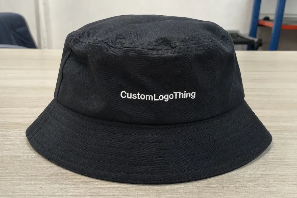
Centered Front Panel
This is the safest and most familiar option. It gives the strongest front-facing visibility, reads well in photos, and suits staff gear or launch giveaways. If the logo is compact and clean, centered placement usually feels confident without looking loud.
Centered placement also makes approval easier. Most buyers can judge scale quickly because the logo behaves the way people expect a branded mark to behave. That does not mean every design should go dead center, but it does mean this choice is a practical baseline when the studio wants a dependable result.
Slightly Off-Center Front
An off-center mark can feel more retail-friendly and less promotional. It works well for studios that want the hat to read like lifestyle merch instead of uniform issue. The key is making the offset intentional. If the mark drifts too close to a seam or panel join, the design looks like it was placed in a hurry.
This option tends to suit brands with a more editorial or fashion-aware tone. The logo still gets noticed, but the hat keeps more of its identity as an accessory. That matters if the studio sells apparel to members who care as much about style as they do about branding.
Side Placement
Side placement is quieter and often better for members who want a subtler branded item. It is also useful if the front of the hat needs to stay clean for style reasons. The tradeoff is visibility; people walking past from the front may miss it completely.
Side logos work best when the studio already has strong recognition elsewhere, such as on the front desk, apparel, towels, or signage. If the bucket hat is the first branded item a customer sees, side placement may underperform. If the brand is already familiar, it can feel understated and premium.
Wrap-Style Artwork
Wrap-style placement creates a bolder, event-ready look, especially for pop-ups or branded activations. It can be effective, but it asks more from the print method and often costs more because the artwork covers more surface area and needs tighter alignment.
That extra coverage also brings more risk. Artwork that crosses multiple panels can shift at the seams, and highly detailed graphics can lose clarity where the hat bends. Wrap-style decoration is best reserved for strong, simplified graphics rather than logos packed with small text.
| Placement option | Best use | Brand feel | Practical note |
|---|---|---|---|
| Centered front | Staff, instructor teams, event visibility | Clear, direct, familiar | Best for quick recognition from across a room |
| Slightly off-center front | Retail merch, premium giveaways | More styled, less uniform-like | Needs careful alignment so it feels intentional |
| Side placement | Subtle brand wear | Quiet, modern, understated | Lower visibility in front-facing photos |
| Wrap-style artwork | Campaigns, events, launch drops | Bold and expressive | More risk of crowding seams and curvature |
For many studios, the smartest starting point is a centered front mark with enough open space around it to preserve the hat’s shape. That usually gives the cleanest result for instructors, retail customers, and social media images alike. If the brand later wants a more fashion-driven version, the same artwork can often be reworked into a smaller off-center placement for a second run.
Artwork Size, Fabric, and Print Method Basics
Fabric choice has a bigger effect on the final look than many buyers expect. Cotton twill usually gives the softest retail feel and takes print cleanly. Canvas holds structure better. Synthetic blends can be easier to clean for staff who wear the hat during active sessions. A 100% cotton twill bucket hat in the 250-280 gsm range often lands in a good middle ground for comfort and shape retention, while heavier canvas can feel more structured and slightly more premium.
Print method matters just as much. Bold shapes and one- to two-color artwork often work well with screen printing because the ink sits sharply and stays readable. Heat-applied transfers can help when a design needs more color flexibility or when the order is too small to justify screen setup. Some suppliers may suggest another method if the artwork has tiny type or fine outlines, but the best result still starts with simple, high-contrast art.
The hard truth is that fine detail disappears fast on a bucket hat. Tiny text, thin lines, and delicate gradients may look crisp in a PDF and still fail on fabric because the crown flexes, the hat folds in shipping, and the wearer changes the viewing angle throughout the day. If the logo cannot survive those conditions, it is too detailed for the product.
There is also the question of color. Dark fabric can make light ink look smaller than expected, and bright colors can shift once they are applied to textured cotton. On a proof, the logo may feel balanced. On the actual hat, the same artwork can appear heavier, softer, or slightly less sharp. A sample is the only reliable way to check that before production.
If your studio uses hang tags or insert cards, that is a good place to reinforce the brand without crowding the hat itself. For paper components, many buyers now ask for FSC-certified stock from FSC, which is a straightforward way to keep the packaging story cleaner without adding visual noise to the product.
One more practical point: keep the artwork size in proportion to the hat. A logo that is too small looks accidental; one that is too large overwhelms the crown. Most bucket hat decoration looks strongest when the viewer can read it quickly but still sees the fabric as part of the design.
Production Process and Turnaround Timeline
The usual production path is familiar, but each step has a place where delays can creep in. First comes artwork review, then a digital mockup or proof, then approval, decoration, finishing, packing, and shipment. For a buyer placing printed bucket hats logo placement for fitness studio brands orders, the timeline often depends less on the factory itself and more on how ready the files are at the start.
A clean process often looks like this:
- Submit vector artwork, preferred placement, and quantity.
- Review the proof with the logo size adjusted to the actual crown shape.
- Confirm colors, including Pantone references if the brand needs exact matches.
- Approve the sample or production proof.
- Move into printing, curing, trimming, and packing.
The decisions that usually affect lead time most are artwork readiness, color approval speed, print complexity, stock availability, and whether special packaging is needed. If you want custom tissue, swing tags, or folded retail presentation, that adds handling time. If the order is going straight into bulk cartons, the schedule is simpler.
Sample approval deserves more attention than it usually gets. A good sample reveals whether the placement is sitting too low, whether the logo needs more breathing room, and whether the ink or transfer feels stiff against the fabric. It can also show whether the print sits cleanly through the wash and whether the crown shape changes after the hat is folded and packed. Skipping that step is how minor design issues turn into returns.
For shipping-minded buyers, it helps to think about carton strength and transit stress in a practical way. Orders that will be distributed to multiple studios or mailed to members should be packed with enough protection to handle drops, compression, and stacking. The transport testing guidance published by ISTA is a useful reference point for anyone who wants to understand how packaged goods behave in transit, even if the final order is not formally certified.
A flat mockup is only the starting point. On a bucket hat, crown depth and seam placement change how the logo reads once somebody wears it, tilts their head, or steps into bright light.
Rush requests are possible in some cases, but they usually tighten decoration options and raise cost. If the artwork is clean and approvals move quickly, the path from quote to shipment becomes much shorter. In real production, speed comes from preparation more than promises. The best schedules are built on files that are ready to print, not on last-minute revision rounds.
Cost, MOQ, and Quote Factors
Pricing for bucket hats is shaped by a handful of predictable factors: quantity break, number of decoration locations, print colors, setup requirements, blank quality, and whether the hats are stocked blanks or sourced as a special order. A simple one-location print on a standard cotton twill blank will usually cost less than a multi-location design on a premium fabric with private-label finishing.
MOQ matters because setup cost has to be spread across the run. At 50 pieces, a supplier still has to prep artwork, screens or transfer output, and run the press, so the unit price is naturally higher. At 250 or 500 pieces, that setup is spread out and the per-hat cost usually drops in a way that makes staff wear, retail sales, and event giveaways easier to budget together.
| Order size | Typical unit economics | Best fit | Buyer takeaway |
|---|---|---|---|
| 50-99 pieces | Highest unit cost | Trial runs, small launches | Good for testing placement before scaling |
| 100-249 pieces | Moderate unit cost | Studio staff plus small merch drops | Often the most balanced starting point |
| 250-499 pieces | Better pricing tiers | Multi-location studios, retail restocks | Useful if you want room for events and inventory |
| 500+ pieces | Lowest unit cost | Chains, campaign launches, seasonal programs | Usually best for stable branding and steady sell-through |
As a rough buying reference, many standard printed bucket hat orders land somewhere around $4.50-$8.50 per piece at modest quantities, with premium blanks, extra print locations, or more complex finishing pushing higher. That range depends heavily on the fabric, decoration method, and order size, so it is better to share the full brief than to guess from a catalog image.
Some hidden costs are easy to miss. A split size run, Custom Woven Labels, hang tags, retail folding, or second-location printing can change the quote more than buyers expect. Sampling may also add a small fee, though that fee often saves money by catching placement issues before a full run is printed. The cheapest initial quote is not always the lowest total cost once rework and replacements are included.
The cleanest quote request includes five things: target quantity, preferred placement, approximate logo size, deadline, and intended use. Staff uniforms, retail sales, and event giveaways do not always need the same decoration approach. If you provide those details up front, the supplier can choose the right production route and avoid a round of revisions later.
For buyers comparing vendors, the most helpful question is not “What is the cheapest hat?” It is “What price gets me the placement, print durability, and look that fits the brand without making the hat hard to wear?” That framing usually leads to a better order.
Common Placement Mistakes That Hurt Wearability
The most common mistake is putting the logo too low near the brim. On a bucket hat, that area can disappear when the wearer tilts their head, and the artwork can distort where the fabric curves downward. A placement that seems bold on paper may end up half-hidden in real use.
Another frequent problem is going too big. Oversized artwork can crowd the crown and make the hat feel top-heavy, which is the opposite of what most fitness studio teams want. On the other side of the spectrum, tiny detail work may look elegant in a mockup but vanish once printed on textured fabric. Both extremes hurt the result.
Color contrast gets overlooked as well. Low-contrast combinations may look refined on a screen, but they often lose definition once the hat is worn in daylight or photographed from a distance. If the studio relies on the hat for brand recognition, the logo needs enough contrast to survive movement, glare, and imperfect lighting.
The best sanity check is to test the design on an actual hat shape, not just on a flat artboard. Seams, panel joins, and crown depth all change how the design sits. In a real sample, you can see whether the logo feels balanced from the front, whether it is sitting too close to a seam, and whether the scale matches the hat’s overall proportions.
It also helps to remember that bucket hats get folded, packed, and worn differently than caps. A print that is too delicate can lose clarity after handling, so if a design relies on hairline strokes or low-contrast colors, it may not be the right choice for this product at all. Brands often discover that the cleaner version is stronger, not weaker.
If the logo only looks good in a perfect digital mockup, it is not ready for production.
That sounds blunt, but it saves money. The best printed hats still look good after shipping, unpacking, and several wears in and out of the studio.
Expert Tips for Studio-Ready Placement and Merch Appeal
For most studios, the strongest strategy is to keep the primary mark clean, legible, and immediately recognizable. A bucket hat needs to work as both branded apparel and a saleable item, so the design should feel intentional even if someone has never seen the studio before. That is especially true for printed bucket hats logo placement for fitness studio brands, where the hat may be used by instructors, sold at the front desk, and photographed on members all in the same week.
Here are the choices that usually improve both wearability and merch appeal:
- Use a centered front mark for staff visibility and quick recognition.
- Use a slightly smaller off-center mark for retail drops or member gifts.
- Keep contrast high enough that the logo reads in bright light and low light.
- Limit text so the hat does not become crowded or visually noisy.
- Match the hat art with tees, towels, water bottles, and other branded pieces so the line feels connected.
That last point matters more than many buyers realize. A bucket hat rarely stands alone. If it shares the same logo treatment, color family, and tone as the rest of the merchandise, it feels like part of a larger brand system instead of a one-off add-on. That consistency helps sales because people recognize the line immediately and are more likely to buy pieces together.
Quality control should include more than a glance at the print. Check the placement against the seam map, confirm that the ink or transfer is fully cured, and make sure the hat still feels comfortable at the front edge of the brim. If the brand is planning a retail release, examine the hat under both indoor and outdoor light. Small color shifts become obvious fast once a customer sees the product outside the studio.
For a useful reality check, review custom merch case studies that show how placement and scale affect the final look. It is easier to judge a hat once you see how the same logo behaves across different products. You can also use studio branding examples as a guide when deciding whether the placement should feel premium, sporty, or event-driven.
If the goal is a stronger retail margin, keep the hat relatively quiet and let the logo do the talking. A well-placed small-to-medium print often sells better than a crowded graphic because it gives customers room to imagine wearing it beyond the gym. That flexibility matters. People tend to keep apparel longer when it works with their everyday clothes, not just their workout gear.
Next Steps Before You Request a Quote
Before you send an inquiry, gather the exact logo file, preferred color references, quantity target, deadline, and intended use. Those details let a supplier quote the right print method and production route the first time. If the logo exists in multiple versions, send the cleanest vector file and note which version should be used on the hat.
Then decide whether the hats are for staff uniforms, retail sales, or a launch event. That single choice changes the ideal placement, the acceptable budget, and sometimes even the pack-out. Staff hats can lean more visible, while retail hats often do better with a lighter, more refined placement.
If you want the strongest possible result, ask for a real mockup before production approval. A mockup should show the logo scaled to the actual crown, not just dropped into a stock image. For printed bucket hats logo placement for fitness studio brands, that proof step is where small adjustments make the biggest difference. A few millimeters can be the difference between balanced and awkward.
Final buying advice: do not let the lowest price dictate the layout. A hat that wears well, prints cleanly, and fits the brand will usually outperform a cheaper option that looks clumsy on head or in photos. Keep the placement simple, the artwork readable, and the order details clear. That combination gives the studio a product that earns its place in the merch mix and still looks right after repeated use.
For a fitness studio, the best bucket hat is the one people actually wear. That means the logo needs enough presence to signal the brand, but not so much that the hat stops feeling like something a member would choose on purpose.
Where should a fitness studio place a logo on printed bucket hats?
Front-center is the safest choice if you want easy recognition from across the room or in photos. A slightly smaller off-center mark can feel more premium for retail merch or member giveaways, especially if the studio wants the hat to read as lifestyle apparel instead of uniform gear.
What size logo works best for bucket hat branding in gyms and studios?
Use a size that stays readable without taking over the crown. Bucket hats usually look best with restrained artwork, because too much coverage can crowd the shape and make the hat feel heavy. Avoid tiny detail and extra text, since curved fabric and movement can make fine lines hard to see.
Which print method is best for printed bucket hats in active fitness settings?
Simple, bold art usually performs best with the most durable flexible decoration method available for the chosen fabric. If the logo has multiple colors or soft edges, ask for a method that can hold detail without adding a stiff, bulky feel to the hat.
How does MOQ affect printed bucket hats logo placement for fitness studio brands?
Lower quantities usually raise the unit cost because setup is spread across fewer pieces. Higher quantities often unlock better pricing tiers and can make staff, retail, and event orders easier to budget together, especially if the studio wants extras for restock or promotions.
How long does custom bucket hat production usually take?
Turnaround depends on artwork approval, stock availability, decoration method, and whether you need special finishing or packaging. Fast approvals and clean files usually shorten the timeline more than anything else, because they reduce back-and-forth before production starts.


