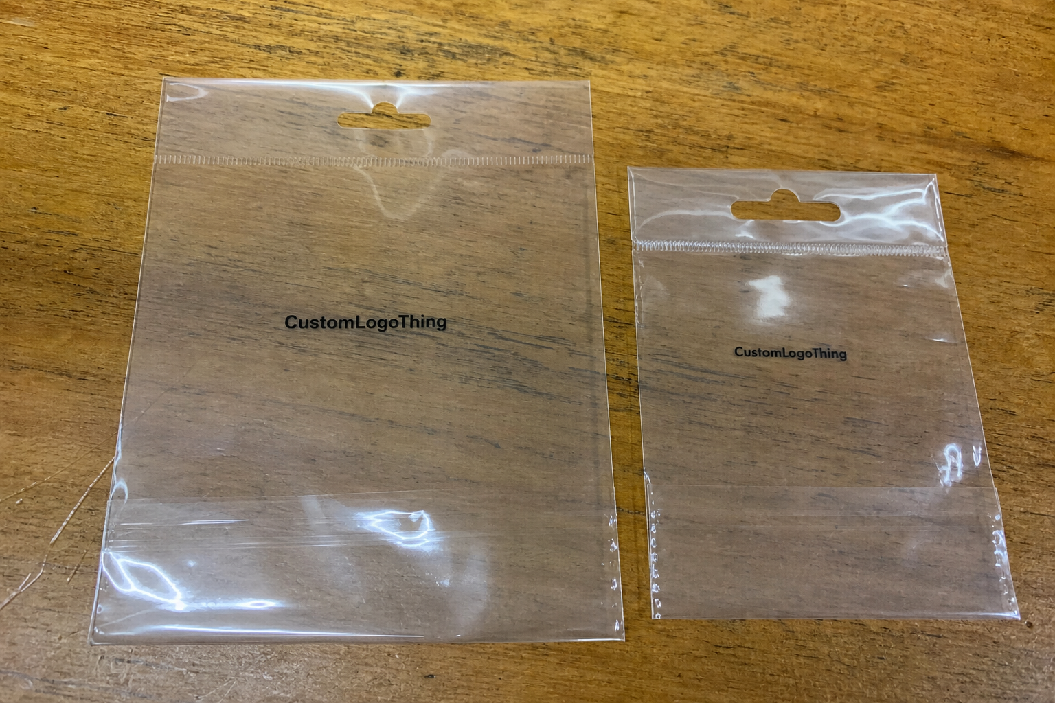
The Clear Poly Retail Bags logo placement guide starts with a detail that is easy to miss until the first proof comes back: a logo that looks perfectly centered on an empty bag can look too high, too low, or oddly compressed once the bag is filled and placed in front of real merchandise. Clear film does not hide much. It reveals seams, folds, closure lines, product contours, and even small alignment errors that would disappear on an opaque package.
That changes the job of logo placement. The goal is not to force symmetry for its own sake. It is to place the mark where shoppers will see it first, where the bag structure will not compete with it, and where the finished package still looks clean hanging on a peg, stacked in a tray, or tucked into a retail display. A good placement decision makes the package feel intentional before a customer ever touches it.
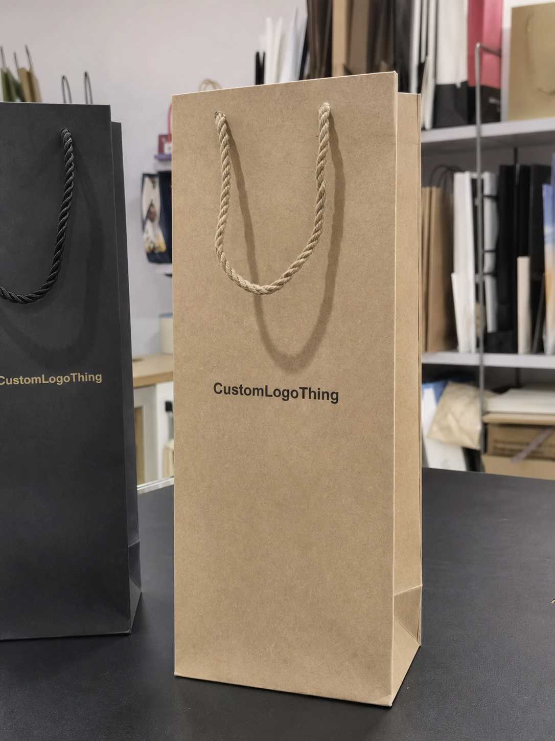
Clear Poly Retail Bags Logo Placement Guide: Why Centered Is Not Always Best
On clear poly, the eye does not read the package the same way it reads a printed carton or a solid-color pouch. Transparency turns the product itself into part of the design. That means a mathematically centered logo can still feel visually off once the merchandise goes in, especially if the item is tall, folded unevenly, or heavier on one side.
A better approach is to think about the filled bag first and the dieline second. If the package hangs from a header, the upper third usually carries more visual weight because that is where the shopper’s eye lands first. If it sits in a tray or nests in a counter display, the product mass may push the visual center lower, which can make a dead-center logo feel too high. The best position depends on display behavior, not just on the flat artwork file.
Clear film also changes how white space and edge distance feel. A logo that is slightly off-center on paper can look balanced on clear poly if the product behind it fills space in a useful way. The opposite happens too. A design that seems generous in a proof can feel crowded once the seal area, folds, and contents all enter the frame.
That is why a practical clear poly retail Bags Logo Placement guide always asks the same question: how will the bag look in the store, not just on the artboard? Centered is sometimes right. Often it is only the starting point.
Practical rule: review the logo against the filled bag and its retail position, not only against the empty dieline.
If the same brand has to appear across several package types, the placement logic should stay consistent even if the materials change. A clear bag may need to coordinate with other Custom Packaging Products, and the logo may also have to translate cleanly to a transit format like Custom Poly Mailers.
How Clear Film, Seams, and Product Fill Change What Shoppers See
Clear poly is honest material. It shows the bag structure instead of hiding it, which is useful for merchandise visibility but demanding for branding. Seams, gussets, zipper tracks, fold lines, reinforced tops, and side welds all become part of the visual field. If the logo sits too close to any of those features, it can look squeezed or interrupted even when the file is technically correct.
Product fill matters just as much. A light item may settle low and leave a lot of empty film around the mark. A bulkier item can push upward and create the impression that the logo was placed too close to the header. Buyers often approve artwork before they have seen a filled sample, and that is where surprises start. The empty bag and the retail-ready bag are not the same object.
Front and back visibility deserve separate attention. In a hanging display, a shopper may see the bag at a slight angle before a straight-on view. In a tray, the back panel can become more visible than the team expected. If the bag is double-sided, both faces should be checked for balance, not just one. Mirrored print also needs careful proofing because the reading direction can flip from what looks natural on screen.
Contrast is another place where clear film changes the rules. Dark artwork over a pale product usually reads well. Pale artwork over a patterned, dark, or busy product can disappear unless the ink density, underbase, or white flood is planned with care. That is one of the core lessons in the Clear Poly Retail Bags logo placement guide: placement and color are inseparable.
Small shifts in product fill can also expose weaknesses in the artwork hierarchy. A fine tagline that looks neat on a screen may become unreadable once it competes with glare, reflections, and the visual noise of the item inside the bag. The stronger the structural detail of the package, the simpler the brand mark usually needs to be.
Artwork Size, Safe Zones, and Line Weight for Cleaner Readability
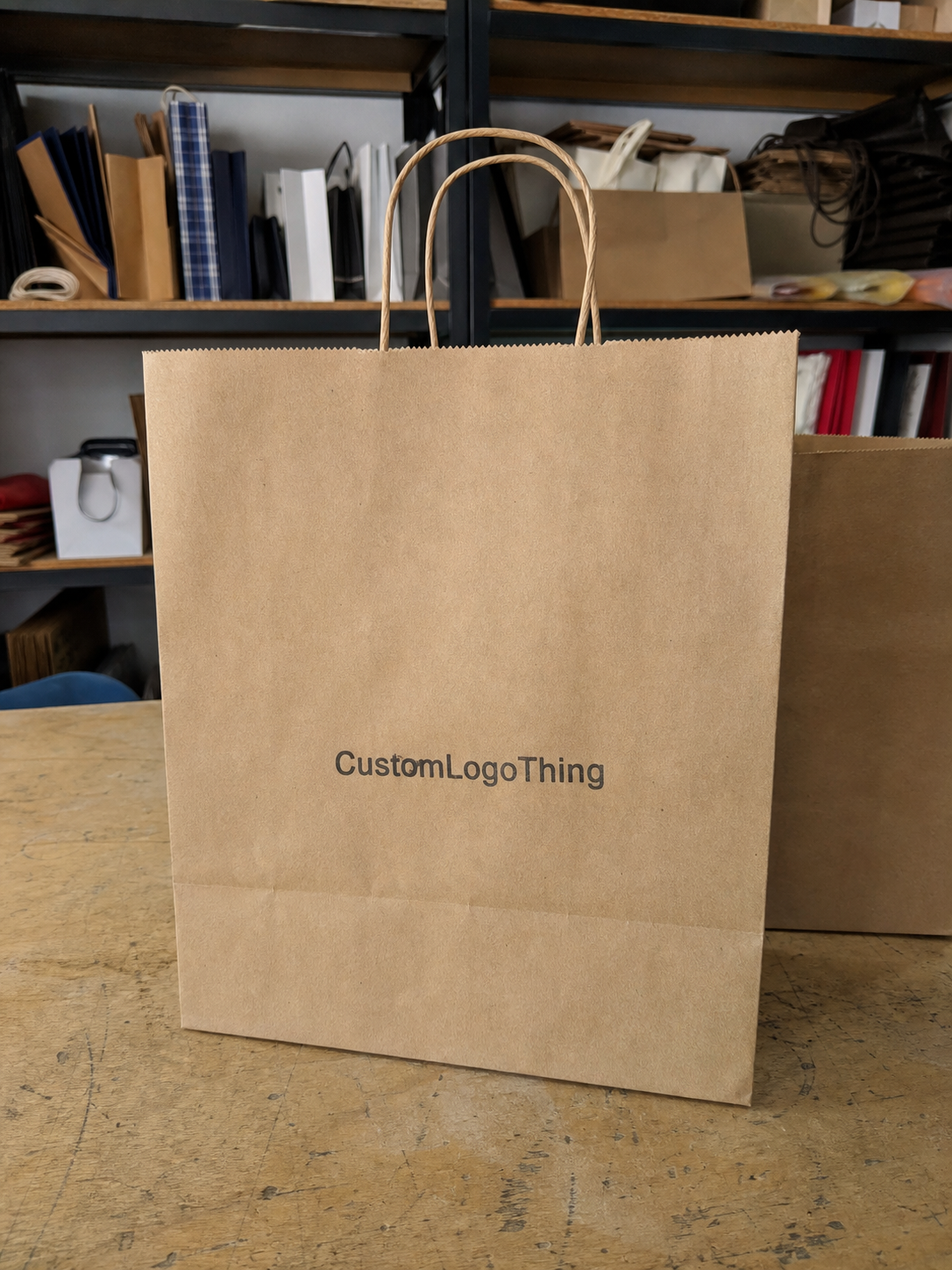
Logo placement is only part of the job. The artwork still has to survive production, handling, and retail viewing distance. Size, safe zones, and line weight all affect whether the mark feels crisp or fragile once it is printed on glossy clear film. A logo that looks elegant on a computer monitor can print muddy if the lines are too thin or the type is too small.
The most useful starting point is the actual print panel, not the brand kit. If the usable area is 7 inches wide and the safe margin from seams or closures is 0.25 to 0.5 inch, the real design field is much tighter than a standard digital layout. That difference changes everything. A good production file respects the bag geometry before it tries to defend the logo shape.
Hairline text, delicate outlines, and soft gradients are common trouble spots. Clear film can magnify glare, and the bag flexes as it is filled and handled. Thin elements that seem refined in a mockup can drop out visually on the shelf. In those cases, a stronger wordmark, thicker stroke weight, or simplified icon usually prints better and reads faster.
A clean test is simple: if the logo cannot be understood within a second or two from a few feet away, it needs more contrast, larger scale, or a less intricate layout. That is not a design flaw. It is a material adjustment.
- Keep a safe zone around the logo so seals, zippers, and folds do not compress the mark.
- Use bolder line weights if the bag will bend, flex, or be handled often.
- Reduce detail if the brand mark includes fine outlines, small copy, or subtle gradients.
- Scale for the filled bag rather than for the empty dieline.
There is also a practical production reason to keep things a little stronger than the screen suggests. Print registration, ink spread, and film movement all introduce tiny shifts. A design with more breathing room usually tolerates those realities better than one that is packed tight against structural edges.
For broader packaging education, the Packaging Industry Association remains a useful reference, and ISTA offers transport-test guidance that becomes relevant when retail packaging also has to survive distribution. If a paper insert or header card is part of the package, FSC standards can matter for that paper component even when the bag itself is plastic.
Process and Lead Time From Dieline Review to Final Print Approval
A clean production cycle usually follows the same sequence: confirm the bag style, review the dieline, place the logo, check the safe area, and approve the proof before press setup begins. The process sounds straightforward, but delays usually come from missing information. A vague note to “center it” is rarely enough. A logo sent without dimensions or color intent can slow down the proof stage more than the buyer expects.
The fastest projects are decision-ready. Vector artwork helps. So does a clear note about which side of the bag matters most in retail. If the package hangs on a peg, the top-to-center relationship is critical. If it sits in a tray, front-panel balance may matter more. A useful Clear Poly Retail Bags logo placement guide keeps those choices visible before anyone signs off on the proof.
Lead time depends on several real production variables: bag size, film gauge, number of print colors, print method, and whether the order needs special finishing. A simple single-color logo on a standard clear bag is easier to move through production than a two-sided layout with precise alignment or a custom closure. More touchpoints usually mean more setup and more time.
Late changes are expensive in time, not just in money. If the artwork has to move after proof approval, the schedule may slip by several business days while the file is rechecked and production is reset. That is why a mockup is not the same thing as a true proof. A real proof should show logo position, bag structure, and filled-bag orientation together.
- Confirm the bag dimensions and style.
- Mark the usable print area and safe zones.
- Place the logo in the retail orientation.
- Check contrast, color targets, and line weight.
- Approve only after the logo reads well with product inside.
For multi-format programs, the same approval discipline should apply everywhere. The bag proof, mailer proof, and any inserts should answer the same practical questions: where does the brand read first, what is the safe area, and how does the package look once it is filled?
Pricing, MOQ, and Unit Cost by Logo Placement Style
Placement choices affect cost more than many buyers expect. A single front logo is usually simpler than front-and-back print, oversized coverage, or artwork that must clear seals and gussets with tight precision. Every extra location adds setup work, and that work has to be spread across the run.
MOQ can rise along with complexity. If the press needs tighter registration, extra calibration for reflective film, or more handling around closures, the order often has to be large enough to justify the setup time. Smaller runs are still possible in many cases, but the economics change. That is normal for printed packaging, especially on a material as revealing as clear poly.
The ranges below are practical planning numbers for a run around 5,000 pieces. They are not universal. Film thickness, bag size, ink coverage, and print method all influence final pricing, but the table gives a realistic view of how placement style changes the unit cost.
| Placement style | Typical setup complexity | Common use | Typical add-on cost per unit | Watch-outs |
|---|---|---|---|---|
| Single front logo | Low | Simple retail branding | $0.04-$0.12 | Still has to clear seams and folds |
| Front and back logo | Moderate | Hanging displays and open trays | $0.08-$0.20 | Alignment must stay consistent on both sides |
| Oversized or wrap-style art | Higher | Premium shelf presence | $0.12-$0.28 | Higher risk of registration and edge issues |
| Detailed art with fine type | Moderate to high | Brand-heavy presentations | $0.10-$0.24 | Small text can disappear on glossy clear film |
The value of a table like this is not just comparison. It shows that a smarter layout can sometimes lower cost while improving shelf impact. A cleaner logo placed in the right part of the bag often performs better than a larger mark that crowds the seal or loses contrast over the merchandise. It is worth asking for two or three quote scenarios so visibility, MOQ, and unit cost can be weighed together.
That is one of the most practical savings opportunities in the entire project. A better placement usually trims setup work, reduces proof revisions, and cuts the risk of a run that looks technically correct but sells poorly because the branding is hard to read.
Common Placement Mistakes That Make Clear Bags Look Off
The most common mistake is also the easiest to understand: the logo looks centered on the flat bag, so the buyer assumes it will look centered in the store. Once the product is inserted, that assumption falls apart. The fill changes the visual center, and the artwork may drift too high or sink too low relative to the seal and closure.
The second mistake is crowding the print near seams, welds, or fold lines. Even a strong logo looks cramped if it sits too close to structure. On clear film, that crowding is obvious because there is no background color to soften the boundary. The eye sees every edge, and it sees them quickly.
Overcomplicated artwork causes another set of problems. Fine gradients, tiny disclaimers, and narrow outlines can survive a presentation deck, then vanish once the bag flexes or light reflects off the film. Clear packaging usually rewards simpler shapes, stronger contrast, and cleaner spacing. That does not mean the branding has to feel plain. It means the package has to carry the mark with enough force to be seen in motion.
Proof orientation is the final trap. A design that looks fine on a front-facing digital mockup may not work on a hanging peg or in a stack. A bag is not a flat rectangle once it reaches the shelf. It behaves like a retail object, and the logo has to be placed for that behavior.
Ask for proof in real orientation. Review the bag the way it will actually sit, hang, or stack before approving artwork.
That step sounds basic, but it catches a surprising number of issues before production starts. It also keeps the final package from looking improvised, which is one of the fastest ways to weaken a brand on clear packaging.
Expert Tips for Better Contrast, Registration, and Shelf Impact
Start with viewing distance. If the shopper will see the bag from three to six feet away, test the logo at that distance, not only at full zoom on a monitor. Clear film reflects light in a way screens do not, and a design that feels refined in the file can look faint once the product is inside.
Contrast is often the quickest improvement. Stronger ink density, a simpler icon, or fewer fragile details can make a major difference in how fast the brand is recognized. On clear poly, the item behind the print is part of the design field, so the logo needs enough strength to stand apart from whatever is inside the bag.
Registration matters more than buyers sometimes expect. Even a minor shift can be visible on glossy film because there is less visual clutter to hide the misalignment. If the design uses multiple colors, the file should be built with the understanding that the bag can move slightly during printing and handling. Small tolerances matter.
Before committing to a full run, ask for a placement mark-up or proof visualization. That single step often catches proportion issues early, while there is still time to resize the mark, widen the safe zone, or simplify the layout. If the packaging is part of a larger brand refresh, the proof review should follow the same standards used for inserts, mailers, and other Custom Packaging Products.
Here is the short version of the clear poly retail Bags Logo Placement guide: keep the logo bold enough to read, far enough from structural edges to stay clean, and positioned for the way the filled bag will actually behave in retail.
That usually means making a few tradeoffs up front. A slightly smaller mark in the right location often beats a large mark that competes with the seal or drifts into the fold line. The bag should support the brand, not fight it.
Next Steps Before You Request a Quote or Approve Proofs
Before asking for pricing, measure the bag and identify the usable print panel. Then decide how the product will sit inside the package, because that one detail changes the rest of the layout. A long garment, a folded soft good, and a boxed accessory all shift the final visual center in different ways.
Next, send the artwork in the right format and include a few practical notes: preferred placement, color target, and any areas that must stay clear of the logo. If there is a header seal, zipper, gusset fold, or reinforced top, call it out. That kind of information reduces unnecessary revisions and helps the proofing team work from the correct assumptions.
If you are still comparing placement options, ask for quotes on more than one layout. Sometimes a smaller logo in a cleaner area gives better shelf impact than a larger logo placed in a risky zone. Sometimes front-only is the right answer because it keeps the package tidier and the print setup simpler. The right choice is the one that balances display, cost, and readability.
Use the proof as a retail test, not just a production document. Step back, imagine the bag filled, and ask whether the logo reads first, whether the layout feels balanced, and whether the package looks deliberate. That is the standard that keeps clear poly bags from looking rushed.
For brands that want the package to feel polished from the first glance, the clear poly retail bags logo placement guide is really a decision tool. It helps you choose the print area, control cost, and approve proofs with fewer surprises before production begins.
Where should a logo go on clear poly retail bags for best shelf visibility?
Place the logo where shoppers will see it after the bag is filled, not just where it appears centered on the empty dieline. Keep it clear of seals, folds, and gussets so the mark stays readable in the real retail orientation. If the bag hangs on a peg, check the placement from eye level and from a short distance because that changes what reads first.
How much empty space should stay around the logo on a clear poly bag?
Leave enough breathing room so the logo does not touch seams, closures, or the edges of the print panel. Use a larger safe zone if the bag will hold bulky product, because contents can visually crowd the artwork. A proof that shows the logo against the actual bag dimensions is far more useful than a standalone graphic.
Does bag size or gusset depth change logo placement?
Yes. Both can shift how the logo appears once the bag is filled and standing or hanging in display. A deeper gusset can pull attention away from the front panel if the art sits too close to a fold or side seam. The safest approach is to match placement to the finished shape of the loaded bag.
How do pricing and MOQ change with different logo placements?
More print locations, larger coverage, or tighter alignment can raise setup effort and increase unit cost. MOQ may be higher when the print run needs more setup time or more careful registration control. It is smart to request quotes for a few placement options so you can compare visibility and cost side by side.
What should I send before asking for a clear poly retail bags logo placement quote?
Send the bag style, dimensions, target quantity, artwork file, and any preferred placement notes. Include how the bag will be displayed and whether the logo needs to read from the front, back, or both sides. If you can share a sample of the product that will go inside the bag, the placement can be judged more accurately.