The custom clothing store Paper Bags Logo Placement guide starts with a simple retail reality: a logo that looks neat in a mockup can still feel awkward once the bag is folded, carried, photographed, and loaded with folded garments. Placement is not a decorative afterthought. It affects how premium the store feels, how quickly customers recognize the brand, and how reliably the artwork survives production.
For apparel buyers, the best layout usually sits where visibility, brand tone, and print practicality overlap. Put the logo too high and it clashes with the handles. Put it too low and it can disappear behind a hand or a coat sleeve. Oversize it and the design starts fighting the bag structure instead of working with it. If you are comparing options for Custom Packaging Products, this is one of the few decisions that can save money before a single box ships.
Clothing stores also need to think about how the bag will be seen in motion. A shopper holding it by the handle sees one composition. Someone standing across a fitting room or walking behind them sees another. In photos, the logo may sit directly under bright lighting or partly hidden by the arm. That is why placement should be judged on the finished bag, not on artwork alone.
Custom clothing store paper bags logo placement basics
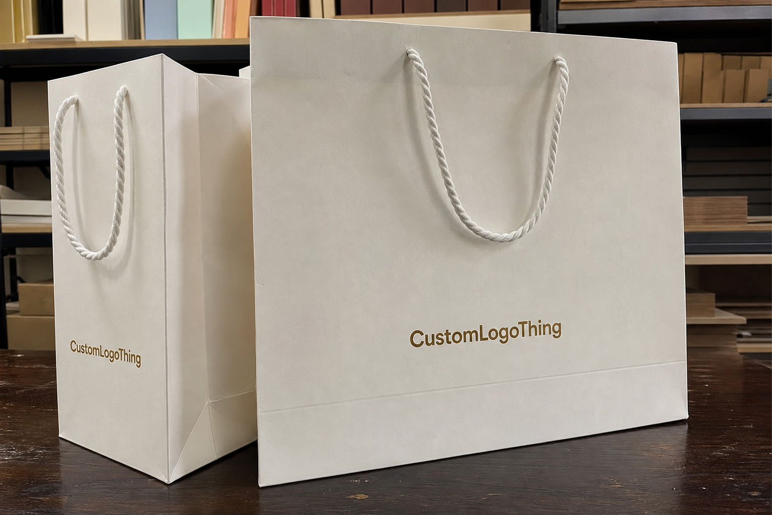
Most retail paper bags fall into a handful of useful placement patterns: centered front panel, slightly high front panel, low front panel, front and back, or a wraparound treatment that reaches into the gussets. Each one creates a different impression. A centered logo feels measured and calm. A slightly higher placement feels more active and can stay visible when the customer is holding the bag at their side. A low placement can look restrained, but it needs enough white space above it so the design does not feel pinned to the bottom seam.
For clothing stores, the most dependable choice is often the centered front panel. It gives the eye a clear focal point and usually works across a wider range of bag sizes. Higher placement is useful on tall bags, especially when the handles sit low enough to block part of the upper area. Front and back printing can be worthwhile when the bag will be seen from several directions in a busy retail environment, but it adds cost and requires tighter alignment during production.
A bag is not a flat sign. It moves, bends, and gets gripped in different places. The ideal layout keeps the logo readable at arm's length, still looks intentional in a photo, and leaves enough space for the printer to register the artwork cleanly. That basic discipline prevents a lot of avoidable revisions.
- Centered front panel: versatile, balanced, and easy to scale across product lines.
- High placement: useful on tall bags or when handle clearance matters.
- Low placement: works for minimal branding, but margin control has to be exact.
- Front and back: adds visibility in stores with heavy foot traffic.
- Wraparound: strongest presence, but more sensitive to alignment and cost.
For apparel packaging, the bag often carries the first physical impression of the store. A clean placement tells customers that the brand pays attention to the same details it expects them to notice in the merchandise. A crowded or awkward layout sends the opposite signal, even if the logo itself is strong.
“The right logo placement is the one that reads clearly on the actual bag, not just the one that looked balanced in the file preview.”
That difference matters more than many teams expect. The bag has handle attachments, folds, side gussets, and a bottom seam. Those features compress the usable area and change the visual balance. A solid custom clothing store Paper Bags Logo placement guide respects those constraints before it starts chasing a larger print size.
How the bag structure changes the print area
Paper Shopping Bags are packaging, not posters. Even before ink touches the stock, the bag structure creates zones that print well and zones that need caution. The front panel is usually the main field, but the top edge can become crowded quickly if the logo is pushed too high. The bottom area is less forgiving because seams and fold lines make that space feel visually compressed. Side gussets are usable, but only if the design is simple enough to remain legible when the bag bends.
Handle style changes the available space more than most buyers realize. Flat handles tend to sit closer to the top opening and can reduce vertical breathing room. Twisted paper handles are still practical, but they make the upper area feel busier. Rope handles and ribbon handles often read as more premium, yet they also draw the eye upward. If the logo sits too close to them, the composition starts to feel crowded even when the measurements technically fit.
Bag proportions matter just as much. A tall boutique bag behaves differently from a square shopping bag or a larger merch bag meant for jackets, denim, or multiple folded items. A centered logo that looks perfect on a square format may need to move upward on a tall format so it is visible when carried. A wider panel can usually tolerate a larger mark without looking stuffed.
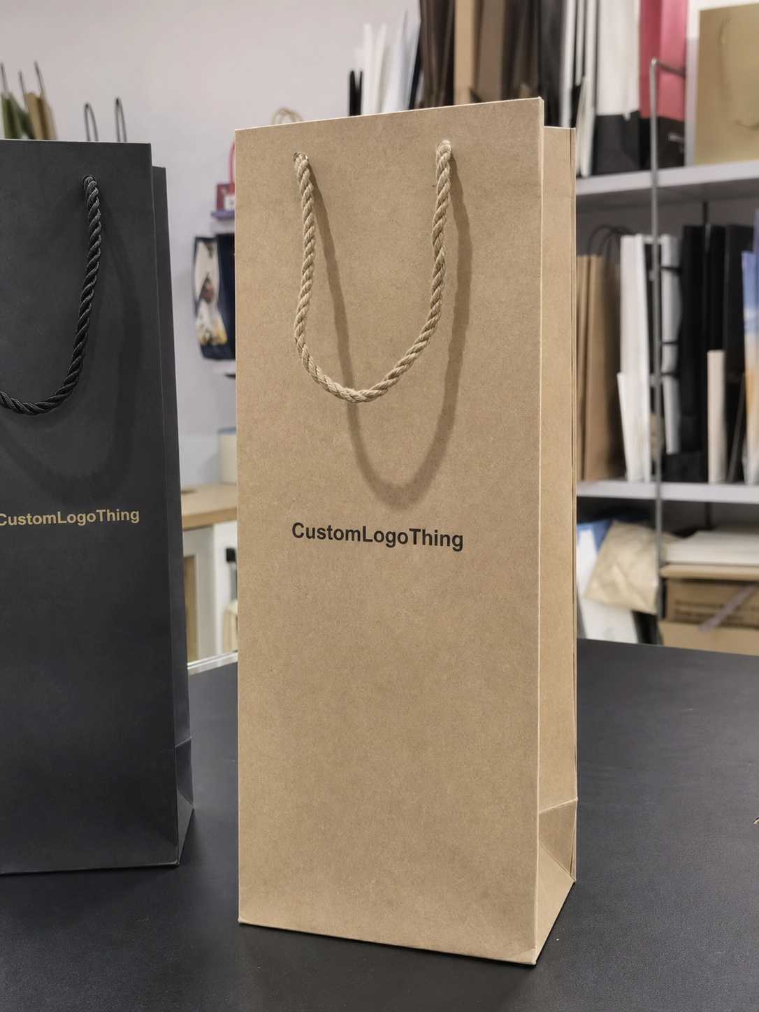
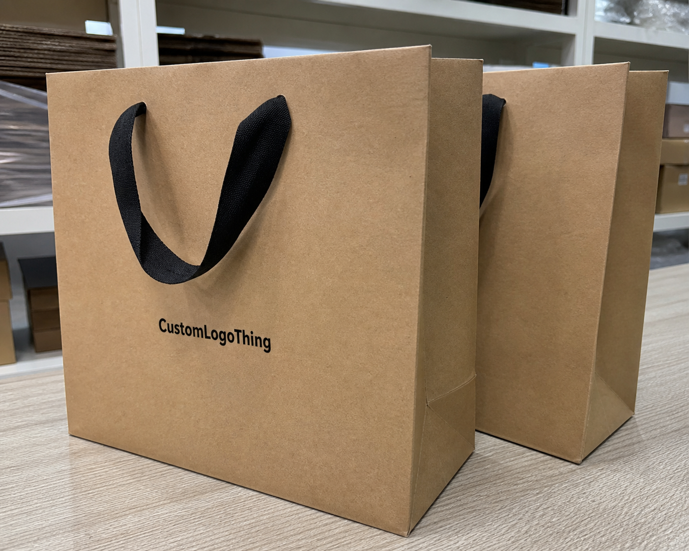
Paper color and finish also affect how the logo reads. White stock gives the sharpest contrast and is usually the easiest surface for small type. Kraft paper softens edges and changes the color temperature of dark inks. Matte black paper can look elegant, but only if the ink coverage is strong enough to avoid a dull or patchy finish. Foil stamping, spot color, soft-touch lamination, and matte varnish all change the visual result, so the print spec has to account for the surface before the layout is locked.
If the bag belongs to a broader packaging design system, the placement should feel related to the other pieces. Tissue, hang tags, and custom printed boxes do not need identical artwork, but they should share the same visual logic. That consistency is what turns a paper carrier into part of a recognizable package branding system.
In most approvals, the safest starting point is a centered front panel with a clean margin above and below the logo, followed by a second mockup placed slightly higher. Those two versions usually tell buyers more than a long discussion, because they show how the bag will behave in hand.
Key placement factors to check before you design
Before anyone drops a logo onto a dieline, a few details need to be confirmed. Start with the logo shape. A long horizontal wordmark behaves differently from a stacked mark, a circular badge, or an icon-plus-text arrangement. Wide logos need more left-to-right breathing room. Stacked logos usually fit narrower bags better because they use height more efficiently.
Then confirm the actual safe print area, not just the outside dimensions of the bag. Fold lines, handle anchors, and gusset folds can shrink the usable field faster than expected. A layout that looks roomy at full size may feel cramped once the dieline is accounted for. On many retail bags, leaving about 0.5 to 0.75 inches of clear space from the top fold is a sensible starting point, though the real margin depends on the handle style and the printer's process.
Brand hierarchy matters too. Some bags only need a logo. Others need a website, tagline, social handle, or store name. The more text you add, the more careful the placement has to be. Clothing stores often look better with one strong logo on the front and, if needed, a restrained secondary mark on the back panel instead of trying to squeeze everything into one face.
Color contrast is another production issue, not just a design preference. Black ink on white paper is straightforward. Black on kraft still works, but the brown stock changes the way the edges read. White ink on dark paper can look excellent, although opacity becomes a real concern. Foil and full-coverage ink each have their own limits. The logo placement should support the chosen print method instead of forcing the printer to compensate for a layout that is too tight.
Paper selection matters for sustainability and for quality control. FSC-certified paper can support a cleaner sourcing story, and buyers can verify chain-of-custody expectations through the Forest Stewardship Council. If the bags will be packed into shipping cartons before reaching stores, it also helps to think about transit stress. The packaging mindset behind the ISTA community is useful here because good print placement is only useful if the bags arrive clean, flat, and unscuffed.
A few practical checks catch most problems before proofing starts:
- Confirm the final bag dimensions, stock, and handle style.
- Check the safe print zone against the dieline, not the outer size alone.
- View the logo at real carrying distance, not zoomed in on a monitor.
- Decide whether the back panel should stay blank or carry a second mark.
- Confirm that any small type will still read after print and folding.
That last point is easy to miss. A logo that feels crisp on-screen can become soft once it is reduced for the bag, especially if the design includes thin lines or small lettering. Vector files solve most of that because they scale cleanly without losing edge quality. For a retailer that uses one logo across different bag widths or paper stocks, that flexibility matters.
Process and timeline for approving a paper bag proof
The approval process is simple when the inputs are organized. First, choose the bag size, paper stock, handle type, and finish. Next, the supplier applies the artwork to a dieline. After that, the proof should be reviewed as a production document, not as a mood board. That distinction keeps the conversation focused on what will actually print.
Vector files are the cleanest starting point. PDF, AI, or EPS artwork with outlines prepared properly gives the printer more room to fit the logo to the panel. Raster files can work for basic layouts, but they are less forgiving if the design needs to be scaled, mirrored, or shifted near a handle zone. For apparel packaging that needs to stay consistent across seasons, vector should be the default.
The proof should answer a few plain questions. Is the logo centered the way the brand intended? Is it high enough to avoid the fold but low enough to clear the handles? Are the colors correct? Is there any secondary text on the back panel, and if so, is it still readable? If any answer is unclear, the proof should be revised before production starts.
Lead times usually break into three parts: proof turnaround, sample approval, and production. A digital proof may return in one to three business days if the artwork is ready. A physical sample, if requested, can add several more days. Production for custom paper bags often falls in the 12 to 20 business day range after approval, though foil, embossing, specialty coatings, and heavy coverage can extend that schedule.
That is where proof discipline pays off. Catching an awkward low placement or a logo that crowds the top seam on day one is far cheaper than discovering it after the full order is boxed. For stores that run seasonal assortments, that kind of timing can make the difference between packaging that arrives with the collection and packaging that misses the sales window.
A digital proof also has limits. It can confirm proportion and placement, but it cannot fully show how ink absorbs into kraft stock, how a matte finish changes contrast, or how a foil treatment catches light in-store. If the artwork includes fine type, dark coverage, or a layout close to a seam, a sample or printed reference photo is worth requesting. That extra check often prevents the sort of issue that only shows up once the first stack is unwrapped.
Cost, pricing, and MOQ decisions that affect layout
Logo placement affects price because every extra print area adds setup, registration, and press time. A single-color front-panel print is usually the most economical option. Add a second panel, a gusset mark, or a wraparound treatment, and the job becomes more expensive because the printer has to hold alignment across more surfaces. Foil, embossing, and multiple colors add another layer of complexity.
Minimum order quantity changes the equation. At 1,000 pieces, a more involved layout may be hard to justify if the bag is only one part of the customer experience. At 5,000 or 10,000 pieces, the same treatment may make sense because the setup cost is spread over a larger run. This is why a layout that looks ideal in a mockup is not always the most practical choice in an actual quote.
Buyers usually compare placements more clearly when they see them side by side:
| Placement option | Typical print setup | Budget impact | Best use case |
|---|---|---|---|
| Front-only centered logo | One panel, one color, simple registration | Lowest | Boutiques, gift bags, clean branded packaging |
| Front and back logo | Two panels, matched placement | Moderate | Retail stores with steady foot traffic |
| Front plus gusset mark | Extra print location, tighter alignment | Moderate to higher | Stores that want subtle side visibility |
| Wraparound layout | Largest coverage, most registration control | Highest | Premium launches or strong visual merchandising |
Planning numbers vary by size, stock, print coverage, and quantity, but a simple single-color front-panel bag is often in the lower cost band, while multi-panel or foil-treated versions move higher. On a 5,000-piece run, a straightforward bag may land around $0.18-$0.32 per unit. More involved layouts can move into the $0.30-$0.60 range or higher, depending on finish and setup. Those numbers are useful for budgeting, not for locking a final quote.
The most accurate way to compare options is to ask for pricing based on the real placement plan. Keep the size, stock, handle, and print method the same, then compare the layout. That makes it much easier to see whether one supplier is genuinely less expensive or simply quoting a different build.
When clothing stores also need tissue, hang tags, or cartons, the bag layout should fit into the same family of materials. A consistent set of custom printed boxes and bags reduces the number of loose design choices and makes production easier to manage. That is one reason many buyers review the bag alongside Custom Packaging Products instead of treating it as a separate purchase.
Common logo placement mistakes on retail paper bags
The most common mistake is placing the logo too close to the top fold or handle anchors. It usually happens because the flat mockup looks fine on-screen, but the built bag is a different object. Once the handles are attached, the upper area becomes visually busy, and the logo can feel trapped. In some cases, part of the mark is hidden by the fold or by the way the customer grips the bag.
Another frequent issue is scale. Retail bags are seen from a distance and often while the customer is moving. If the logo only reads when someone is standing directly in front of it, it is not doing enough work. Clothing stores that depend on mall traffic, street visibility, or social photos usually need a mark with enough presence to read from several feet away without becoming heavy-handed.
Contrast causes problems as well. Thin logos can disappear on kraft. Fine serifs can soften on textured paper. Dark, saturated artwork on matte black stock may look elegant in concept but print unevenly if the ink coverage is not tuned correctly. The paper texture, finish, and print method all affect stroke weight. A proper proof should reflect that instead of pretending the bag will print like a brochure.
Blank space can also be mishandled. Some bags leave the back panel and gussets empty even when a small secondary mark, short brand line, or QR code would strengthen the package. That is not always a mistake. Sometimes blank is the right answer. But if the brand wants more visibility, leaving those areas unused can waste a useful surface.
The errors I see most often during approval are predictable:
- Logo placed too close to folds, handles, or seams.
- Artwork scaled for a screen instead of for a carried bag.
- Fine type that disappears on kraft or textured stock.
- Back panel left blank when the brand wanted stronger visibility.
- Placement approved without checking the actual bag height and handle clearance.
If the store is trying to build a refined retail experience, a careless bag layout can undermine that work quickly. A strong Custom Clothing Store Paper Bags logo placement guide should protect the brand from those avoidable errors before the order moves into production.
Next steps to lock in a cleaner bag layout
The easiest path forward is to treat the bag as a real retail object. Measure it, confirm the handle style, identify the printable panel, and collect the final vector files before asking for revisions. If the team is debating placement, request two or three mockups so everyone can compare balance, readability, and shelf appeal side by side.
Ask for a paper proof or a printed sample photo if the design uses dark ink, foil, fine lettering, or a layout that runs near a seam. Those are the details that most often change between a screen and the finished bag. Once the stock is folded, glued, and stacked, small shifts become much easier to notice.
It also helps to think about the bag as one piece of a larger material set: tissue, tags, cartons, and display materials. When those elements share the same visual language, the store feels more deliberate. Customers may not be able to describe why, but they do notice the consistency. That is the quiet value of careful retail packaging.
If you are comparing suppliers, ask three direct questions: What is the safe print area? What kind of proof will I approve? How does the layout change the unit price? Those answers reveal more than a polished mockup ever will. They also help prevent a common mistake where the brand falls in love with the look and forgets to check the production path.
A well-made Custom Clothing Store Paper Bags logo placement guide does not try to make the bag flashy. It keeps the artwork readable, keeps the print path simple, and fits the bag the customer actually carries. That is what makes the package feel like part of the brand instead of just a container with a logo on it.
Where should the logo go on custom clothing store paper bags?
The safest starting point is the center of the front panel, with enough space to stay clear of the top fold, handle attachments, and bottom seam. On taller bags, a slightly higher placement can improve visibility when the bag is carried at the side. If the bag is mainly for gift presentation, a centered front logo with a clean back panel usually feels the most polished.
Should a clothing store bag logo be centered or placed high?
Centered usually feels balanced and timeless, especially on medium-sized paper bags with a simple brand mark. A higher placement can work when the handles sit low or when the logo needs to remain visible above a shopper's arm. The right choice depends on bag height, handle style, and whether the logo needs to read from across a counter or from walking distance.
How does logo placement affect custom clothing store paper bags pricing?
A single-panel print is usually easier to price than multi-panel artwork, full-wrap coverage, or designs that need exact alignment. More colors, foil, and specialty finishes raise the quote because they add setup and production complexity. A focused layout often keeps costs under control while still looking intentional.
What is the best logo size for retail paper bags?
The best size is the largest one that fits the safe print area without crowding the folds, handles, or edges. Use the bag width and the viewing distance as the guide. A logo meant for walking traffic needs more presence than one used only at checkout. Vector files make it easier to test different sizes during proofing without losing sharpness.
What should I check before approving the artwork proof?
Confirm that the logo is centered or intentionally offset, depending on the design plan, and that all margins respect the dieline. Review color, handle clearance, and any secondary text so nothing gets clipped, hidden, or too small to read. Make sure the proof matches the actual print method and lead time so the schedule stays realistic.