Buyer Fit Snapshot
| Best fit | CMYK Printed Corrugated Boxes projects where brand print, material claims, artwork control, MOQ, and repeat-order consistency need to be specified before quoting. |
|---|---|
| Quote inputs | Share finished size, material target, print colors, finish, packing count, annual reorder estimate, ship-to region, and any compliance wording. |
| Proofing check | Approve dieline scale, logo placement, barcode or warning zones, color tolerance, closure strength, and carton packing before bulk production. |
| Main risk | Vague material claims, crowded artwork, missing packing details, or unclear freight terms can make a low unit price expensive after revisions. |
Fast answer: CMYK Printed Corrugated Boxes: What Actually Matters should be specified like a repeatable production item. The safest quote records material, print method, finish, artwork proof, packing count, and reorder notes in one written spec.
Production checks before approval
Compare the actual filled-product size with the drawing, then confirm tolerance on folds, seals, hang holes, label areas, and retail display edges. Reserve space for logos, QR codes, warning copy, and material claims before decorative graphics fill the panel.
Quote comparison points
Review material grade, print process, finish, sampling route, tooling charges, carton quantity, and freight assumptions side by side. A quote is only useful when the supplier can repeat the same color, closure quality, and packing count on the next order.
If you're shopping for cmyk Printed Corrugated Boxes, the first thing to understand is that the finished carton will not look exactly like a monitor mockup, and that is normal. Corrugated board absorbs ink differently than coated paper, the liner color changes the way tones read, and the texture of the board can soften detail in ways a screen never shows. I have seen plenty of buyers panic over a proof that looked "off" only to learn the box was actually printing within a normal range for the substrate. The goal is not perfect screen matching; it is getting a clean, branded carton that holds up in the real world.
For packaging teams, cmyk Printed Corrugated Boxes sit in a very practical middle ground. They can carry strong branding without pushing every job into the cost and setup of litho-laminated packaging. They Work for Shipping cartons, retail-ready cartons, subscription boxes, and e-commerce unboxing, which is part of why they have become so common. They also offer enough visual flexibility for brands that want more personality than plain kraft, while still keeping production realistic. That balance is useful, and it is also where expectations can get a little ahead of the materials.
A printed box is not just a graphic surface. It has to survive stacking, tape, handling, transit, and the occasional rough drop across a warehouse table. The image matters, but the structure is what keeps the product alive.
CMYK Printed Corrugated Boxes: What They Are and Why They Look Different
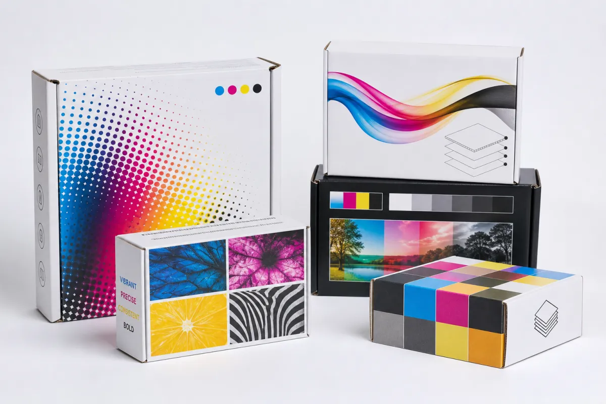
cmyk Printed Corrugated Boxes use the four-process-color model: cyan, magenta, yellow, and black. Those inks build photos, gradients, logos, and layered artwork through visual mixing rather than through a single premixed color. That is different from spot color, where a printer mixes one specific ink to hit a target tone, and different again from simple one-color flexographic printing, which is often a better fit for bold logos, shipping marks, and large runs with restrained artwork.
The screen-to-box gap is what surprises most people. A display is lit from behind, while corrugated board reflects light after the ink lands on it. That difference alone can make a brand blue look deeper, a gray feel warmer, or a photo lose a bit of pop. Then the board itself gets involved. Flutes, liner absorbency, and the base paper color all influence the final read. A crisp image on coated stock has to work harder on corrugated, especially when the design uses fine detail or small type.
These boxes tend to fit three jobs especially well. They work for shipping cartons that still need visible branding. They work for retail-ready packaging that has to stand up on a shelf or in a product photo. They also work for e-commerce unboxing, where the carton is part of the brand experience instead of just a container. If the package is going to be seen, photographed, or opened in front of a customer, cmyk printed corrugated boxes are often the right call.
People compare them with offset printing and digital printing for good reason. Offset printing gives the cleanest image on coated paper and is often used for litho wraps that are later mounted to corrugated. Digital printing can be fast and useful for short runs, samples, or frequent artwork changes. Direct cmyk printed corrugated boxes sit between those options: less polished than a coated paper wrap, more branding-friendly than a plain transit carton, and often the most sensible choice for products that actually ship.
Good results are absolutely possible, but the job has to be designed for the material. If the carton needs to survive parcel handling, choose a board and print method that can tolerate abrasion. If the goal is a brighter camera-friendly finish, start with a white-top liner. If the brand wants a natural kraft look, accept the color shift up front; the inks will usually read deeper, warmer, and a little less saturated. That is not a flaw. It is just how corrugated behaves.
How CMYK Printed Corrugated Boxes Are Made
To understand cmyk printed corrugated boxes, start with the structure. Corrugated board is typically made from a fluted medium sandwiched between linerboards. One liner is usually the printable face. The flute profile affects thickness, crush resistance, and how cleanly the board folds and cuts. E-flute is thinner and often better for sharper graphics. B-flute adds cushioning and is common for shipping. Single-wall board works for many custom projects. Double-wall adds strength, though it also increases weight, cost, and print complexity.
The printable surface matters just as much as the flute. White-top corrugated usually prints brighter than natural kraft because the white liner reflects more light back through the ink. Reds stay cleaner, blues read less dusty, and photos hold more detail. Natural kraft has a warmer, earthier tone that can suit rustic branding beautifully, but it can also mute artwork that depends on strong contrast. In practice, cmyk printed corrugated boxes on a white-top liner are easier to control, especially for logos, product photography, and layouts with fine type.
Prepress is where a lot of avoidable problems start. Artwork should be converted to CMYK, not left in RGB and hoped for the best. Images need enough resolution, usually around 300 dpi at final size for detailed work, although packaging viewed from a distance can sometimes tolerate less if the layout is not meant for close inspection. Bleed matters. Safe zones matter. Dielines matter. A design that crosses a fold line or sits too close to a cut edge can shift just enough to make text look off-center or crop a key element. A file that looks tidy on a laptop can still become a production headache once it reaches the board.
The transfer method changes the result too. Some cmyk printed corrugated boxes are printed directly on the sheet of corrugated board. Others use a printed liner that is mounted into the finished box structure. Direct print is often simpler and more economical for many runs. A litho-laminated structure, which starts with offset printing on paper before mounting to corrugated, can deliver a cleaner image but adds cost and more steps. Digital printing is useful for short runs and sample work. Flexographic printing can be efficient for simpler graphics and larger quantities. There is no universal winner, only the method that fits the job.
Proofs prevent expensive surprises. A press proof, a digital sample, or a properly color-managed comp gives you a reality check before the full run starts. Press profiles help the printer understand how your artwork will behave on a specific board and ink system. That matters because a deep navy on coated stock may turn into a softer blue on corrugated. If the approval process skips proofing, the first production run becomes a guessing exercise, and that is a bad place to leave a project.
For brands comparing packaging formats, it helps to browse Custom Packaging Products before settling on a shipper, mailer, sleeve, or retail carton. The box structure affects protection as much as appearance. For a straightforward starting point, Custom Shipping Boxes are often the most practical way to balance branding with transit performance.
Key Factors That Affect Color, Quality, and Cost
The board is the first major cost lever in cmyk printed corrugated boxes. E-flute supports finer graphics and a smoother-looking face, though it may not be the strongest choice for heavier loads. B-flute is more common for shipping and offers better cushioning, but the surface texture is less forgiving. Single-wall board is usually more affordable than double-wall. Double-wall is useful for heavier products or harsher transit conditions, yet the extra board and converting work raise the price. If the carton needs to look polished and survive rough treatment, that tradeoff needs to be decided early, not after the artwork is already approved.
Ink coverage affects both appearance and cost. Large solid areas, full-bleed backgrounds, and dense photo art require more press control and reveal imperfections more easily. cmyk printed corrugated boxes with generous open space are usually cheaper and easier to keep consistent than cartons covered edge to edge in dark ink. Heavy coverage can also increase the chance of banding, tint variation, and drying issues depending on the print method. A rich black background across every panel is possible, but it usually asks for more setup care and sometimes a higher price.
Finishing changes the look fast. Aqueous coating adds protection and helps reduce scuffing. Varnish can add a soft sheen or targeted resistance. Matte finish quiets the look and gives the box a more restrained, premium feel. Gloss finish lifts contrast and makes color pop, though it can also show fingerprints and handling marks more easily. Print finishing is not a decorative afterthought. It affects how the box performs in the real world. For cmyk printed corrugated boxes, the finish often decides whether a carton still looks clean after transit or arrives with rubbed edges and worn panels.
Order volume changes the economics sharply. The larger the run, the more fixed costs spread out. Setup, plates, die-cutting, and press calibration get diluted over more units, which is why 500 boxes can feel expensive while 5,000 boxes bring the unit price down fast. Size complexity matters too. Unusual dimensions, extra score lines, tuck features, and window cutouts all add tooling and labor. A standard RSC-style shipper is typically cheaper than a multi-panel display carton. Add inserts, partitions, special folds, or carry handles, and the machine time climbs.
There is also a real tension between exact brand appearance and rough transit durability. You can ask for deeper saturation, tighter registration, and cleaner photographic reproduction, but a box that moves through warehouses still has to survive scuffing, stacking, and moisture exposure. For products traveling through parcel networks, it is smart to think about transit testing under ISTA protocols or a similar method. The ISTA testing framework is a useful reference if you want to know whether the box protects the product as well as it presents it.
If sustainability matters, board sourcing matters too. FSC-certified paper and board can help with responsible sourcing documentation, and the Forest Stewardship Council is the place to verify what that label actually means. It is documentation, not a miracle cure. Still, for many brands, that paperwork matters just as much as the printed surface. Each of these decisions feeds into the final cost of cmyk printed corrugated boxes.
Here is a simple comparison of common options buyers ask about:
| Option | Typical Cost Impact | Print Quality | Best Use | Tradeoff |
|---|---|---|---|---|
| White-top E-flute direct print | Medium; often about $1.10-$2.40 per unit at moderate quantities | Bright, clean, and good for graphics | E-commerce and retail-facing shipping boxes | Not the strongest option for heavy abuse |
| Natural kraft direct print | Lower material cost; often about $0.95-$2.10 per unit | Muted and earthy, with less color pop | Simple branded shippers and eco-style packaging | Color accuracy is harder to control |
| Litho-laminated corrugated | Higher; often about $1.80-$3.50+ per unit | Best image fidelity and smooth detail | Retail displays and premium presentation | More steps, more lead time, more cost |
| Flexographic one- or two-color print | Lower setup for large runs | Fine for logos, text, and simple graphics | High-volume shipping cartons | Not ideal for photos or gradient-heavy art |
The cheapest option is not always the right one. If the product sells through an unboxing video, weak print can undercut the brand before the customer even reaches the product. If the carton is only meant for transit and gets destroyed on arrival, paying for premium finishing is just a costly detour. cmyk printed corrugated boxes work best when the print quality and the packaging job are treated as one decision instead of two unrelated ones.
Step-by-Step Process and Timeline for CMYK Printed Corrugated Boxes
Ordering cmyk printed corrugated boxes goes much more smoothly when the brief is complete before anyone starts quoting. Begin with the product size, filled weight, shipping method, storage conditions, and brand goal. A carton for local retail pickup is not the same as a carton moving through national parcel networks. A box for candles behaves differently from one for supplements or electronics. The more specific the brief, the less likely you are to get a pretty but useless estimate.
Step one is artwork and dieline alignment. The printer needs the box structure before design can be finalized. Panel widths, folds, glue areas, bleed zones, and safe margins all need to be set. If the dieline shifts after artwork approval, the design may need revision. That is where timelines slip and costs rise. Step two is color prep. Files should be converted correctly to CMYK, and any critical brand colors should be checked for how they reproduce on corrugated board. If a brand color has to hit a precise target, ask early whether a spot color strategy makes more sense than relying only on cmyk printed corrugated boxes.
Step three is proofing. A digital proof can confirm layout. A physical sample or press proof gives you a more honest read on color, board feel, and structure. This is the cheapest point in the process to catch mistakes. If you wait until full production to discover that the text is too small or the logo sits too close to a crease, the printer now has a problem and you now have a bill.
Step four is production. Simple cmyk printed corrugated boxes with a standard structure and clean artwork can sometimes move from proof approval to production in about 10-15 business days. More complex jobs, especially those with custom tooling, special coatings, or multiple rounds of revisions, often land in the 15-25 business day range. Add freight, customs, or a busy seasonal schedule and the calendar stretches further. Rush orders can shorten the schedule, but they usually cost more and leave less room for adjustment. That is not drama from the supplier. That is how production queues behave.
Step five is inspection and packing. Good suppliers check dimensions, print alignment, cut quality, and visual consistency before shipping. If the box supports a regulated or highly protected product line, this is also where you confirm any test reports or compliance documents you requested. For shipping-heavy applications, some buyers ask for performance testing aligned with ASTM D4169 or an ISTA profile. Those standards do not promise perfection, but they do reduce guesswork.
A workable order flow usually looks like this:
- Send dimensions, product weight, and target use case.
- Choose the board type and print style for the job.
- Approve the dieline before art finalization.
- Review a digital proof or printed sample.
- Confirm quantity, finish, and delivery timing.
- Release production only after everything matches the spec.
That sequence sounds plain, and that is exactly the point. Boring is what you want before a production run. cmyk printed corrugated boxes reward disciplined ordering because every skipped step tends to reappear later as a delay, a mismatch, or a reprint that nobody wants to pay for.
CMYK Printed Corrugated Boxes Cost and Pricing Breakdown
Pricing for cmyk printed corrugated boxes usually splits into several buckets: material, print setup, die-cutting, finishing, labor, and freight. Material is the board itself. Print setup covers plates, color calibration, and press prep for conventional print methods. Die-cutting applies when a custom shape or structure is required. Finishing can include aqueous coating, varnish, lamination, or a special treatment. Labor shows up in setup, converting, packing, and inspection. Freight is the part many buyers forget to model until the pallet is already on the road.
Quantity is the biggest pricing lever. A run of 250 boxes may carry a surprisingly high unit cost because setup charges are spread across very few pieces. A run of 5,000 or 10,000 boxes can pull the per-unit price down sharply, sometimes enough to make a better finish realistic. That does not mean bigger is always better. It means the curve is real, and cmyk printed corrugated boxes get cheaper per box as volume rises. Printing rarely likes tiny quantities unless digital production is part of the plan.
Artwork complexity also affects the number. Full-bleed panels, tiny type, gradients, and photographic imagery can increase the chance of press adjustments or visible inconsistency. Simplifying the layout often saves money without making the box dull. A clean logo, a strong side panel message, and one well-placed graphic can feel more intentional than a crowded carton trying to perform on every face at once.
Here is a practical way to think about pricing tiers:
- Budget-friendly: Standard sizes, limited ink coverage, natural kraft or simple white-top board, minimal finishing.
- Mid-range: White-top board, four-color graphics, one finish like aqueous coating, standard die-cutting.
- Premium: Higher-end board, more detailed artwork, special coatings, custom shapes, inserts, or litho-laminated construction.
Where can buyers save without weakening the box? Standardize dimensions wherever practical. Keep artwork coverage sensible. Use one well-chosen finish rather than stacking two or three effects just because the sample looked attractive. Match the box style to the shipping requirement instead of forcing a display carton to behave like a transit carton. If the brand does not need photographic detail, do not pay for it. That sounds obvious, yet it still gets overlooked.
The quote can shift after artwork approval if board grade, liner color, print coverage, or finish changes. A small switch from kraft to white-top board can change both appearance and cost. A last-minute request for gloss instead of matte changes the handling feel and the budget. Even a size change can reset the cutting plan. Once the structure changes, the run may need fresh setup work. That is why cmyk printed corrugated boxes should be priced against a locked specification, not a loose concept.
For buyers comparing suppliers, the cheapest quote only matters if it is built from the same spec. Same board. Same finish. Same print coverage. Same quantity. Without that, you are comparing apples to slightly different apples that happen to have different freight charges and a different shade of blue.
Common Mistakes With CMYK Printed Corrugated Boxes
The most common mistake with cmyk printed corrugated boxes is designing them as if they were coated paper. Corrugated is not a smooth brochure sheet. It has texture, absorbency, and structure, and those traits affect contrast, sharpness, and saturation. A layout that looks elegant on a glossy presentation board can turn muddy on a corrugated liner if the colors are too subtle or the text is too thin.
Flute direction creates another issue that people often ignore until the box folds awkwardly or the print shifts near a seam. Long folds can cause slight image distortion, especially around logos or repeating patterns. Crush risk matters too. Thin reverse type, tight registration marks, and delicate line art can all suffer near fold areas. If the graphic tries to do too much right at the crease, the board usually wins.
Small text is risky on cmyk printed corrugated boxes. Ultra-thin lines and tiny reversed type carry the same problem. The box may look perfectly readable in a mockup, then soften after printing because the board surface does not hold the detail the way a designer imagined. Dark full backgrounds can also show roller marks, drying variation, or edge wear more easily. That does not make dark cartons a bad choice. It means they need more planning and a more realistic expectation of transit wear.
Skipping a physical proof is the cheapest route to an expensive problem. A digital mockup has value, but it is still a screen. Once color accuracy, substrate texture, or retail presentation matters, a proof is the smarter move. For cmyk printed corrugated boxes, a proof can reveal whether the blue is too dull, the photo is too soft, or the logo needs more breathing room.
Last-minute file changes cause another familiar mess. A text edit after proof approval can push production out by days. A color switch can trigger rework. A new barcode position can collide with a die line. The worst version of this is the buyer who approves a loose draft and then tries to redesign the whole carton the night before press time. That is how schedules get broken and email threads get long.
Three mistakes show up over and over:
- Using RGB artwork instead of properly prepared CMYK files.
- Ignoring the board surface and expecting coated-paper brightness.
- Approving a job without testing the box under real shipping conditions.
Those mistakes are avoidable. They stay common because packaging often gets treated as a last-minute task until the last mile goes wrong.
Expert Tips and Next Steps for Ordering CMYK Printed Corrugated Boxes
If you want cmyk printed corrugated boxes to turn out well, start with the sample. A printed sample or a careful digital proof is not a luxury; it is insurance against bad assumptions. A supplier can promise beautiful color all day long, but the only thing that matters is how that color lands on the chosen board with the chosen finish. I have had jobs where a color looked a touch flat on the sample, then improved once the coating and fold geometry were factored in. I have also seen the opposite, which is why samples matter so much.
Confirm the exact build before you approve anything. Ask for the board type, flute profile, liner color, print method, coating, and any special finishing. If someone says "it will print nicely," that is not a specification. It is a hope. For cmyk printed corrugated boxes, the details shape the outcome far more than sales language does.
Test the box in real use. Put the product inside. Tape it. Stack it. Ship it. Handle it the way the warehouse team will, not the way a design presentation would like to imagine it. If the box scuffs after a short move across a table, it will not improve in transit. If the structure flexes too much under weight, the outer print will not rescue it. This part is kinda unglamorous, but it saves real money later.
Use this simple checklist before you request a quote:
- Final product dimensions and weight.
- Expected shipping environment and handling risk.
- Artwork files in the correct format.
- Quantity target and acceptable price range.
- Preferred board, finish, and print method.
- Timeline for proofing, production, and delivery.
Then compare quotes on the same specs. Not similar specs. The same specs. That matters more than most buyers want to admit. A cheaper quote might use a different liner, a simpler finish, or a lower-performing board. That can be a perfectly sensible choice if you know it up front. It becomes a bad choice only when the boxes arrive and look flatter or weaker than expected.
For many brands, the strongest path is a balanced one: white-top board for cleaner color, moderate coverage for cost control, one reliable finish for scuff resistance, and a proof before the run. That formula is not flashy, but it is the reason so many cmyk printed corrugated boxes work in real shipping and retail conditions. If the box needs to carry branding without turning fragile or fussy, that is usually the right place to begin.
When the box sits inside a broader packaging lineup, keep the system consistent. Use related structures, matching print rules, and repeatable specs across products where possible. That makes ordering easier and gives the brand a cleaner shelf and shipping presence. It also makes reordering less annoying, which is welcome for everyone involved.
The clearest next step is simple: lock the board choice, lock the print method, and get a physical proof before you approve production. If those three pieces are set, the odds of getting cmyk printed corrugated boxes that look right and ship well go up a lot.
FAQ
Are CMYK printed corrugated boxes good for shipping products that also need branding?
Yes. cmyk printed corrugated boxes are a strong fit when you want a shipping carton that still looks branded and polished. They work best with a printable white liner or another bright surface that holds color well, and they are less ideal if you need exact Pantone matching on every face.
How long do CMYK printed corrugated boxes usually take to produce?
Simple orders can move quickly, but proofing, sampling, and artwork revisions usually add the most time. For many cmyk printed corrugated boxes, production lands around 10-15 business days after approval for straightforward jobs, while more complex builds often need 15-25 business days or more depending on tooling, finish, and quantity.
What is the cheapest way to order CMYK printed corrugated boxes?
The cheapest path is usually a standard size, simple artwork, and a higher quantity so setup costs spread out. cmyk printed corrugated boxes get more affordable when you avoid unnecessary finishes and keep the design coverage sensible. Cheap does not have to mean flimsy, but it does mean disciplined.
Can CMYK printed corrugated boxes match my brand colors exactly?
They can get close, but exact color matching is harder on corrugated than on coated paper. Expect some variation based on board type, liner color, and ink absorption. If color precision is critical, ask for proofs and consider whether spot color is a better fit than pure cmyk printed corrugated boxes.
Do CMYK printed corrugated boxes need a white base?
Often yes, if you want bright, clean color and strong contrast. Printing directly on kraft usually makes colors look darker, flatter, and less accurate. Before approving the design, ask the printer which liner stock they recommend for cmyk printed corrugated boxes so the final result matches your intent.
Bottom line: cmyk printed corrugated boxes work best when the board, artwork, finish, and transit reality are planned together. Lock the spec, proof the color on the actual substrate, and test the carton with the product inside before you approve the run. That is how you get a box that does its job and still looks like your brand once it has done it.


