Why Coffee Shops Need a Jacquard Beanie Proof Checklist
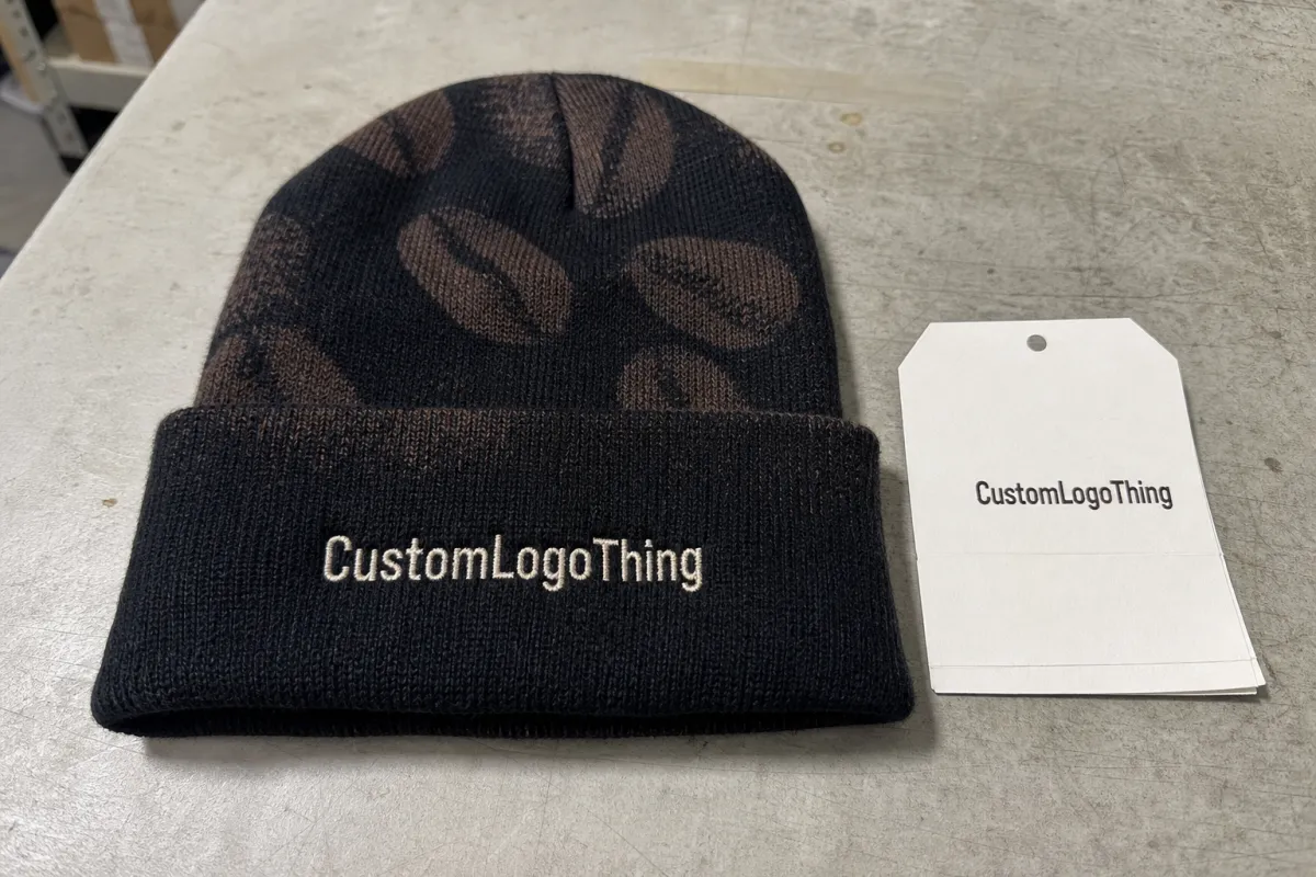
A paper cup may travel three blocks. A good beanie can travel for three winters. That difference is why a jacquard knit beanies Artwork Proof Checklist for coffee shops deserves more attention than most buyers give it.
An artwork proof is the pre-production document that shows what will be made before knitting begins. For custom jacquard beanies, it should confirm logo placement, knit colors, sizing, cuff height, label details, fold position, packaging notes, and any production limits that affect the finished piece. It is not a decorative mockup. It is the last practical checkpoint before money, yarn, and machine time are committed.
Coffee shops have a particular challenge because their brand systems tend to be compact, warm, and detail-heavy. A typical cafe identity may include a narrow wordmark, a cup icon, a bean illustration, a neighborhood name, a small establishment date, and a brown, cream, charcoal, green, or burgundy palette. Those elements can look beautiful on a menu, bag label, sticker, or ceramic mug. On a knitted cuff that may only have 2.5 to 4 inches of usable width, they need more discipline.
The common mistake is approving a beanie proof as if it were a flat sticker. Jacquard knitting does not print ink on top of fabric. It builds the design into the fabric with colored yarns, row by row. Fine typography, gradients, distressed textures, delicate steam lines, and tiny circular badge text all behave differently in stitches than they do in vector art.
Proof rule: if the proof does not show what will actually be knitted, it is asking for trust instead of giving evidence.
A buyer-friendly inspection system helps cafe owners, roasters, marketing managers, and merch leads catch problems while they are still inexpensive to fix: a logo that sits too high on the cuff, a yarn color too close to the background, a wordmark that collapses at knit scale, or a label placement that interferes with retail display. The goal is not to slow production. The goal is to keep a premium cafe item from becoming a box of almost-right beanies.
How Cafe Artwork Becomes Jacquard Knit Stitches
Jacquard knitting uses colored yarns to form the artwork inside the knit structure. The mark is not embroidered after the beanie is finished, and it is not transferred onto the surface. The design and the fabric are produced together, which is exactly why the proof needs to be read as a manufacturing document.
Digital artwork can be infinitely sharp. Yarn cannot. Yarn has thickness, stretch, tension, fuzz, and a visible row structure. A 0.3 mm line that looks elegant in Adobe Illustrator may disappear in a ribbed cuff. A thin steam curl above a coffee cup may need to become a broader shape. A circular seal with 24 letters around the edge may need fewer words, a larger field, or a different application such as a woven label.
That simplification is normal. It is not a downgrade when it is done with purpose. The strongest cafe beanies usually start with the most recognizable version of the brand: a wordmark, bean icon, mountain mark, cup silhouette, mascot shape, neighborhood name, or short phrase. Detail should be added only after the essential mark reads clearly at finished size.
A useful proof should show the front view, folded cuff view, flat dimensions, yarn color callouts, logo width, repeat pattern notes, and any patch, woven label, printed label, hang tag, or inner tag position. If the beanie has a pom-pom, contrast cuff, two-tone body, full-wrap pattern, reversible construction, or special packing requirement, those details should be visible or clearly described.
Pantone-to-yarn matching also needs sober expectations. A Pantone color on coated paper, a ceramic mug, screen-printed cotton, and acrylic yarn can look like related colors rather than exact matches. That is not automatically a supplier error; yarn absorbs and reflects light differently. For color-sensitive brands, ask for yarn references and judge contrast, not only color names.
The better question is not “does the PDF look nice?” It is “what evidence confirms the final knit result?” A proper jacquard knit beanies Artwork Proof Checklist for coffee shops pushes the review toward scale, contrast, placement, materials, and production notes instead of a quick approval based on a polished rendering.
Proof Details to Inspect Before Approval
Start with scale. A logo that looks bold on a 12-ounce cup sleeve can become weak when reduced to a knitted cuff. Ask for the logo width in inches or centimeters, not just a visual mockup. For many adult cuff beanies, a front logo field of roughly 2.5 to 4 inches wide is common, depending on the mark, knit gauge, and desired cuff height.
Then check the fold. Is the artwork centered on the folded cuff, or centered on the flat beanie before folding? That small distinction can create a very visible defect. A fold that shifts by half an inch may place the logo too high, too low, or partly under the roll.
- Logo scale: confirm actual width, height, and whether small text remains readable.
- Cuff height: check folded depth, often around 2.5 to 3.5 inches for retail beanies.
- Beanie body: confirm adult sizing, crown shape, slouch level, and stretch range.
- Yarn colors: verify brand color references, yarn callouts, and contrast under warm cafe lighting.
- Labels: confirm woven label, printed label, inner tag, UPC sticker, or hang tag placement.
- Packaging: note individual polybags, bundle packing, retail cartons, or no individual packaging.
Color control deserves extra suspicion for coffee brands. Espresso brown, cream, oatmeal, charcoal, copper, forest green, and muted burgundy make a beautiful palette, but some combinations lose visibility fast. A cream logo on oatmeal yarn can look refined on screen and nearly invisible under a pendant lamp at 6 p.m. Brown on charcoal may photograph even darker once the beanie curves around a head.
Typography is another trap. Small letters, tight spacing, script fonts, fine serifs, and weathered textures can blur in stitches. If the cafe name is long, a stacked arrangement may work better than a single narrow line. If the mark includes an establishment date, coordinates, or a tagline, ask whether those elements will be knitted, removed, enlarged, or moved to a label.
Structural specs matter because the beanie will not stay flat in real use. Ask whether it is single-layer or double-layer, what yarn composition is used, whether the cuff is fixed or rollable, and how much stretch is expected. Acrylic is common for promotional and retail beanies because it is warm, resilient, and usually more cost-stable than wool. Cotton blends can feel softer but may behave differently in stretch and recovery. Wool or wool blends can raise perceived value, but care instructions, price, and itch sensitivity need consideration.
If the beanies will be sold as merchandise, review them like retail products rather than giveaways. Hang tags, barcode stickers, size or care labels, and carton packing affect how quickly staff can stock a shelf beside coffee bags, mugs, and seasonal bundles. For broader packaging context, the Packaging Machinery Manufacturers Institute is a useful source for understanding how packaging choices affect handling and fulfillment systems.
Process and Timeline From Artwork to Finished Beanies
The production path is usually direct: quote request, artwork review, proof creation, revisions, approval, yarn setup, knitting, finishing, inspection, packing, and shipping. The risky part is not the number of steps. It is the assumption that each step can be compressed without changing the result.
The proof stage is the cheapest time to fix problems. Before knitting starts, a logo can be simplified, a cuff can be adjusted, and a yarn color can be changed with limited cost impact. After production begins, corrections may affect machine time, material use, labor, schedule, or all of those at once.
Before requesting a proof, gather the basics: vector logo file, brand color references, desired quantity, deadline, shipping address, beanie style, label requirements, and packaging notes. A clean vector file and a clear deadline usually produce a better first proof than a low-resolution menu screenshot and a vague request to “match the vibe.”
Timelines vary by supplier, season, quantity, and specification. A simple proof may be ready in 1 to 3 business days. Revisions can add another day or more per round, especially if a badge logo needs to be redrawn for knit. Production after final approval may run roughly 12 to 25 business days for many custom beanie orders, though rush work, imported materials, custom labels, and shipping method can move that range in either direction. Holiday demand can stretch schedules. Slow approvals can do the same.
A proof sitting in an inbox can delay production as much as a factory bottleneck. It sounds ordinary, but it is one of the most common causes of missed merch launch dates.
For a winter drop, the safer sequence is to approve the beanie proof before announcing the release date, building staff photo plans, or opening preorders. Announcing first creates pressure to approve quickly, and fast approvals are where cuff height, yarn substitutions, and typo-level artwork errors slip through.
Build the decision chain before the PDF arrives. One person owns brand accuracy. One person checks pricing and quantity. One person confirms operational needs such as staff wearability, retail packing, and shelf presentation. One person gives final written approval. Shared review is helpful; shared authority with no final owner is not.
Cost, MOQ, and Unit Cost Signals in the Proof
The artwork proof may not show pricing, but it often reveals the cost drivers. Count the yarn colors. Look at the pattern area. Check whether the logo appears once, repeats around the beanie, or becomes a full-body motif. Each choice affects setup, knitting complexity, inspection time, and sometimes waste.
Minimum order quantity, or MOQ, is where cafe buyers can be surprised. Many shops want to test 24 or 48 pieces before committing to a larger run. That instinct is reasonable. Jacquard setup, however, makes very small quantities less efficient than reorders or seasonal runs of 100, 250, or 500 pieces. Unit cost usually improves with volume because proofing, setup, yarn preparation, and machine programming are spread across more beanies.
| Proof Choice | Typical Cost Signal | Buyer Question to Ask |
|---|---|---|
| Two-color cuff logo | Often the most efficient custom jacquard option | Can the mark stay readable with one logo color and one ground color? |
| Three to five yarn colors | Higher complexity, especially in small details | Does every added color improve recognition or retail appeal? |
| Full-wrap pattern | More design and knitting review than a front-only mark | Will the repeat align cleanly around the head and near side joins? |
| Pom-pom plus custom label | Adds material, finishing, and inspection steps | Is this for retail margin, staff uniform impact, or a seasonal gift bundle? |
| Hang tag and retail packing | Adds print, attachment labor, and packing complexity | Does the merch shelf need barcode-ready or gift-ready presentation? |
Do not compare quotes by quantity alone. A two-color cuff logo and a multicolor full-wrap beanie are different products, even if both quotes say “100 custom beanies.” Ask for quote notes tied to proof choices: what changes if one yarn color is removed, the logo is simplified, the pom-pom is dropped, or a woven label changes to a printed label?
For margin planning, work backward from retail reality. If a cafe sells a beanie at $24 to $32, the landed cost has to leave room for card fees, staff handling, markdowns, damaged packaging, and unsold inventory. If the beanie is a loyalty gift, staff uniform piece, or coffee bundle premium, the calculation changes. The same proof can support different business goals, but only if the buyer knows which goal matters most.
Price ranges vary too much by yarn, quantity, label type, country of production, and freight to treat any single number as universal. Still, the pattern is consistent: lower quantities, more colors, more finishing steps, and tighter deadlines usually push unit cost up. A good proof makes those tradeoffs visible early enough to adjust.
Common Proof Mistakes That Make Cafe Beanies Look Off
The most common mistake is approving the proof as if the beanie will stay flat. It will stretch around a head, fold at the cuff, compress in a jacket pocket, and get photographed from awkward angles. Judge the proof with that physical life in mind.
Low contrast is especially damaging for cafe brands. Brown on charcoal, cream on oatmeal, forest green on black, and copper on burgundy can look sophisticated on a style board. In yarn, the same pairings may turn muddy. If customers cannot identify the cafe from several feet away, the beanie is not doing its brand job.
Over-detailed logos are the next culprit. Tiny coffee beans, steam wisps, coordinates, establishment dates, script taglines, and circular badge text may need to be removed, enlarged, or moved to a label. Emotional attachment to the full logo is understandable. The knit structure has limits, and ignoring them does not protect the brand.
Fold miscalculations create another preventable mess. If cuff height is not checked, the logo can disappear when a barista rolls the beanie differently than the mockup. A rollable cuff gives customers freedom, but it also means the design has to survive real human behavior.
Brand inconsistency shows up quickly on apparel. The beanie does not need to match cups, bags, aprons, signage, and retail packaging perfectly, but it should look intentional beside them. A quiet minimalist cafe may be better served by a restrained two-color beanie. A louder neighborhood espresso bar may need bigger type, higher contrast, or a more playful color break.
Approval ambiguity is the final quiet risk. After three revisions, “looks good” is not enough. Written approval should specify the exact proof version, quantity, colors, label choice, packing method, and ship-to details. A disciplined jacquard knit beanies Artwork Proof Checklist for coffee shops removes guesswork from the last email before production.
Practical Tips for Sharper Jacquard Beanie Proofs
Start with the simplest recognizable logo. Add detail only if the proof still reads at actual size. That may sound conservative, but it often produces the most premium result. Clean knit branding looks deliberate; overworked knit branding looks accidental.
Ask for a scaled view. A full-screen PDF can flatter almost anything. Print the proof or view it at actual dimensions: if the logo is supposed to be 3 inches wide, judge it at 3 inches wide. This habit catches more problems than long email threads about brand feel.
Use high-contrast yarn pairings for the main mark, especially if the beanie will be photographed indoors. Warm cafe lighting can lower contrast, and social images often compress detail. A cream mark on deep green may read better than tan on brown, even if the second option feels closer to the printed style guide.
Design for repeat wear. If the message says “Winter Roast Drop,” the beanie may feel dated after one campaign. That can be fine for a limited seasonal release. If the goal is staff use and retail sales over several months, a core logo, neighborhood name, or simple icon usually has more staying power.
Match the design to cafe operations. Staff uniforms may need neutral colors that hide lint, espresso splashes, and daily wear. Retail merch can take stronger risks: brighter pom-poms, oversized typography, contrast cuffs, or limited-run colorways tied to a roast release. Gifts and loyalty items should be easy to wear, because customers are less likely to promote a beanie that feels too loud for everyday use.
Keep a proof archive. Save the final PDF, vector artwork, yarn callouts, label notes, quantity, invoice, and reorder instructions. Reorders should not depend on someone remembering which “forest green” was used six months ago.
Ask what changed from the original logo during knit conversion. The answer tells you a lot. If the supplier can explain why a serif was thickened, why badge text was removed, or why a bean icon was widened by two stitch columns, you are seeing production judgment rather than simple file conversion.
Final Checks Before You Approve the Proof
Approval should feel almost boring. That is the point. Print the proof, view it at actual size, check colors against brand references, confirm dimensions, and read every note line by line. Five careful minutes before approval can prevent hundreds of identical problems.
- Confirm the logo is readable at actual size.
- Check that contrast is strong in both bright light and dim cafe lighting.
- Verify cuff position, fold height, body height, crown shape, and adult sizing.
- Confirm yarn references, material composition, label placement, quantity, unit cost, and packaging.
- Review the timeline, ship date, shipping address, and any rush assumptions.
- Approve the exact proof version in writing.
Assign review roles if more than one person is involved. The brand owner checks logo accuracy. Operations checks staff wearability. The buyer checks pricing and quantity. The merch lead checks retail presentation, hang tags, and display needs. One final approver then sends written approval.
Ask for clarification on anything vague: yarn substitutions, label placement, fold height, carton packing, revision limits, care instructions, or ship date. If sustainability claims or paper-based hang tags are part of the merch program, verify sourcing language carefully. The Forest Stewardship Council provides recognized guidance for responsibly sourced paper and forest-based materials, which can matter for tags, sleeves, and retail packaging.
After approval, save the final proof PDF, quote or invoice, artwork files, supplier notes, and reorder instructions. Future reorders become much easier when the approved version, yarn colors, and packing choices are documented instead of buried in old email threads.
A jacquard knit beanies Artwork Proof Checklist for Coffee shops is practical, not fussy. Use it to answer the operational question that matters: will this beanie look right on a barista, on a customer, and on the cafe merch shelf?
FAQ
What should be included in a jacquard knit beanies proof checklist for coffee shops?
Include logo placement, actual logo size, cuff height, yarn colors, material composition, beanie dimensions, knit style, label details, quantity, packaging notes, timeline, shipping details, and the exact proof version being approved. Coffee shops should also check retail use cases, including whether the beanie looks right on staff, on a merch display, and in gift bundles with coffee bags.
Can a detailed coffee shop logo work on jacquard knit beanies?
Yes, but it may need simplification because yarn cannot reproduce tiny details as sharply as print. Badge text, thin lines, steam shapes, small beans, coordinates, and distressed textures should be reviewed carefully at actual size before approval.
How many colors should a coffee shop use for custom jacquard beanies?
Most cafe designs work best with a limited palette that keeps strong contrast between the logo and background. Adding more yarn colors can increase complexity and may affect cost, so each color should have a clear branding or visibility purpose.
How long does the artwork proof process take for coffee shop beanies?
A simple proof may take 1 to 3 business days, with revisions adding time depending on artwork complexity and response speed. Full production after approval often takes several weeks, depending on quantity, yarn availability, labels, seasonality, packing requirements, and shipping method.
What raises the unit cost of jacquard knit beanies for coffee shops?
Cost can rise with extra yarn colors, complex knit patterns, low quantities, custom labels, hang tags, special packaging, rush timelines, and shipping requirements. Coffee shops should compare quotes by the full specification, not just the beanie quantity.


