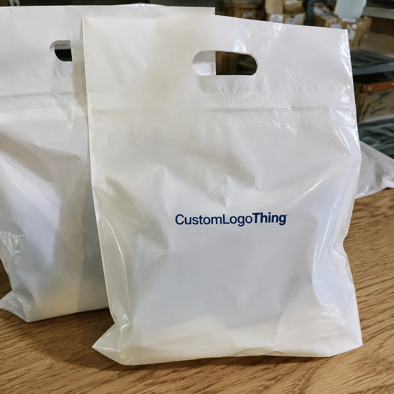
The corporate gifting Frosted Zipper Plastic Bags logo placement guide sounds narrow until you see how much it changes the finished presentation. The same bag can read as polished, budget, or awkward depending on where the logo sits, how large it is, and what is inside the pouch. Frosted film helps because it softens glare and gives the artwork a more deliberate backdrop than glossy clear plastic. That matters in meetings, onboarding kits, event handouts, and executive gifts, where packaging is part of the message rather than a disposable afterthought.
The placement decision has to survive three different views: the bag on a table, the bag in a hand, and the bag in motion as someone opens it. A mark that looks centered on a flat proof can drift once a zipper, side seam, or folded gusset comes into play. Add contents that change color and shape behind the print, and the margin for error gets smaller than many buyers expect. That is why the best placement is rarely the most obvious one.
Corporate gifting frosted zipper plastic bags logo placement guide
Frosted Zipper Bags sit between clear poly and fully opaque packaging. They let light through, but not in a shiny way, which is why the material often feels more premium than a standard clear sleeve. The matte haze hides fingerprints better, and that alone improves the first impression. More importantly, it gives logos a steadier field to read against, especially when the gift inside is colorful or irregularly shaped.
For corporate gifting, that visual control matters. A single logo on a frosted bag can feel restrained and expensive. The same logo repeated too often can push the package toward promotional swag. The balance depends on the item inside, the event context, and how much of the product you want visible. A notebook set, a tumbler kit, and a stack of sample cards do not need the same treatment.
In practice, the most successful layouts usually fall into three camps: front-center for fast recognition, lower-corner for a quieter branded look, and two-sided printing for bags that will be handled from multiple angles. Each one has tradeoffs. Center placement gives the strongest read but can compete with the contents. Corner placement feels more discreet, yet it can disappear if the bag is stacked or viewed from a distance. Two-sided print costs more, but it can solve orientation problems for retail counters or mailers.
Frosted film rewards restraint. A smaller, carefully placed logo often looks more premium than a large mark that has to fight the zipper line, seams, and the product inside.
There is one mistake that keeps showing up: judging the artwork on an empty bag. That is the wrong test. Empty bags hide contrast problems and make oversized logos look safer than they are. The real test is the filled bag under the lighting where recipients will actually see it. That means conference room light, ballroom light, retail light, or warehouse pickup light, depending on the use case.
Because the bag is translucent, placement should also account for the silhouette behind the print. A folded insert card can make a logo sharper. A dark pouch can flatten it. A white tissue bundle can brighten it. These shifts sound minor until you compare samples side by side. Then the difference is obvious.
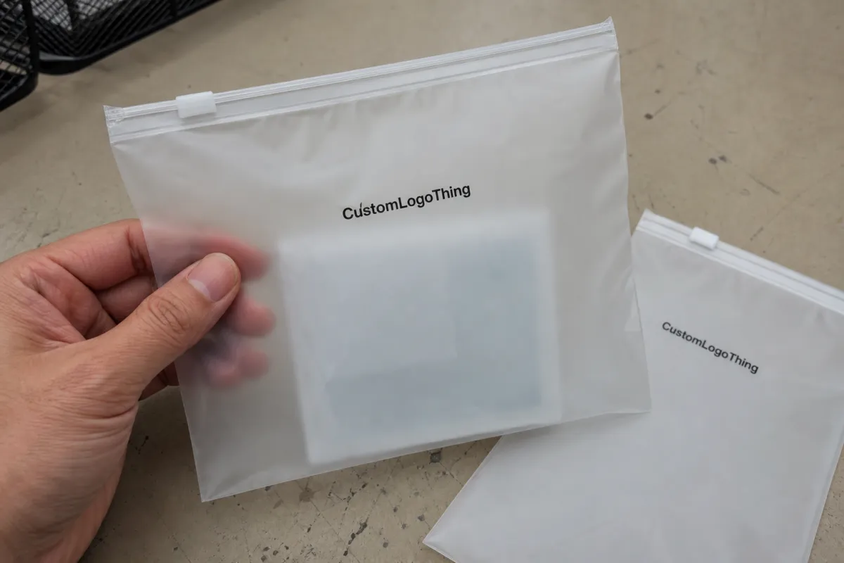
How logo placement works on frosted zip bags
Good placement begins with the usable print zone, not the full bag size on the spec sheet. Zipper seams, side gussets, heat seals, and fold lines all reduce the safe area where artwork can sit cleanly. On paper, a pouch may look generous. In production, the usable field can shrink fast once construction details are counted in. That is why suppliers ask for exact dimensions and why a quick sketch is often more valuable than a vague request for a “nice centered logo.”
Most frosted bags are printed with screen printing because the method gives solid opacity and crisp edges on plastic. For a simple one-color mark, that can be the cleanest and most durable route. Multi-color art, thin gradients, and delicate taglines are harder to hold on translucent film. They can print, but they do not always print well. A logo that relies on fine detail may need to be simplified before it reaches the bag.
Ink color matters almost as much as position. Dark inks usually create the strongest contrast. White can look excellent on frosted plastic too, but only when the ink is opaque enough and the supplier controls the laydown well. Light gray, pale blue, and delicate reversed-out details tend to disappear once the bag is filled or shifted under warm light. If a brand color looks perfect on a monitor but weak in a proof, trust the proof. The screen is not the material.
The bag contents affect legibility more than many buyers realize. A logo can read cleanly against a white insert and lose clarity against a dark pouch or a cluttered assortment of items. That is why proofs should be reviewed with a fill plan, not as blank packaging. A good production team will ask what goes inside for a reason. The object inside the bag is part of the background.
A practical rule works well across most programs: if the gift is premium and minimal, keep the mark smaller and centered with generous negative space. If the item is dense, colorful, or oddly shaped, give the logo more breathing room so the packaging does not compete with the contents. The bag should frame the gift, not wrestle it.
For programs that will travel by mail or move through a warehouse, handling matters too. Compression, scuffing, and stacking can shift the appearance of the print after approval. Test methods aligned with ISTA standards at ista.org can help teams think beyond the mockup and toward real transport conditions. That does not change the logo placement by itself, but it changes how cautious the placement needs to be.
- Front-center: best for quick recognition and a balanced presentation.
- Lower-corner: useful when the contents should stay visually dominant.
- Two-sided print: better for displays or kits seen from different angles.
Logo size, color, and artwork choices that read cleanly
The cleanest artwork starts with vector files. AI, EPS, or press-ready PDF files give the printer the edge sharpness they need, while raster files can soften or pixelate on output. That matters more on frosted plastic than it does on paper because the material already softens contrast. A crisp line in the file can become a fuzzy line in print if the source art is weak.
Simple shapes age better on this material. Bold letterforms, strong icons, and medium-weight lines are more reliable than thin serifs or intricate crests. Tiny taglines are also risky. If the logo has to be read at arm's length, it needs enough stroke weight to survive the haze of the film and the changing shadows inside the bag.
For many gift bags in the 6 to 10 inch range, a logo width around 2.5 to 4.5 inches is common, but the better answer depends on the available print zone and the amount of empty space around the mark. Larger bags can handle 5 to 6 inches if the artwork is simple. The mistake is not size alone. It is size without breathing room. A logo that touches the zipper line or squeezes against a seam feels cramped even if the artwork is technically correct.
Color choice should follow the material, not just the brand book. Dark inks read quickly on frosted plastic. White can look refined, but only when the ink deposit is opaque and the design leaves enough open area to hold its shape. Pale tones, especially those with low contrast, are where many proofs go sideways. The mockup may look elegant. The physical bag may not.
If a brand uses multiple elements, the bag is usually not the place for all of them. The logo should carry the load. Web addresses, slogans, and secondary marks are easy to add and hard to justify on a translucent pouch. In most cases, the bag needs one hero mark and little else. Any extra detail has to earn its space.
If the gifting program includes paper inserts, sleeves, or cards, materials with FSC certification can support the broader sustainability story. FSC is worth checking for paper-based components because it gives procurement teams a cleaner way to verify sourcing claims at fsc.org. The bag itself may be plastic, so the rest of the kit has to carry the environmental narrative with care instead of pretending the whole package is something it is not.
Cost and pricing factors that move the quote
Pricing is usually driven by five things: bag size, film thickness, number of print colors, number of print locations, and order quantity. A small run of 500 bags almost always carries a higher unit cost than 5,000 pieces because the setup work gets spread across fewer items. Screen creation, proofing, press alignment, and color checks happen whether the order is small or large. The math is simple, even if the quote is not.
Typical setup fees for one-color screen printing often land around $40-$90 per screen, while two-color work can move closer to $80-$180 depending on the supplier and complexity. At 5,000 pieces, one-color unit pricing commonly falls around $0.18-$0.35, and two-color work can sit closer to $0.28-$0.50. Double-sided printing often adds another $0.05-$0.12 per bag. These are not universal numbers, but they are realistic enough to help buyers spot quotes that are way out of range.
Rush orders, artwork cleanup, and custom sourcing can add another layer. A quote that looks low on unit price may end up expensive once the setup, revisions, and shipping are folded in. The useful comparison is landed cost, not the first line on the estimate. Ask whether the price includes art corrections, sample proofing, and delivery to the final destination. Some suppliers bundle those costs. Others leave them to surface later.
Film thickness also changes cost and performance. Thicker bags hold shape better and feel more substantial in hand, but they can cost more and may need different print handling. Thin bags are cheaper and lighter, yet they show wrinkles more easily and can make artwork look less stable. For executive gifting, the feel of the material is part of the impression. A flimsy pouch undercuts expensive contents fast.
| Option | Typical setup | Typical unit cost at 5,000 pcs | Best use |
|---|---|---|---|
| One-color screen print, one side | $40-$90 per screen | $0.18-$0.35 | Clean branding with a simple logo |
| Two-color screen print, one side | $80-$180 | $0.28-$0.50 | Marks that need a second color for clarity |
| Double-sided print | +$50-$120 | +$0.05-$0.12 | Events, displays, or mailers seen from multiple angles |
| Extra revision or rush request | Varies by supplier | Can add 5%-20% | Late approvals or shifting artwork |
For buyers under pressure to hit a date, the cheapest quote can become the most expensive one if it creates rework. A slightly higher supplier who returns cleaner proofs, fewer revision rounds, and more predictable shipping often saves more than the line-item difference suggests.
Process and turnaround for proofs, production, and shipping
The process is usually straightforward, but the proof stage deserves a slow read. The artwork is checked for size, contrast, and printability. A digital proof shows the placement on the bag template. After approval, production begins, the run is inspected, and the order ships. Each step sounds routine. Each step can create delay if the details are weak.
Simple one-color jobs often turn in roughly 10 to 15 business days after proof approval, though that window moves with order size and factory load. Multi-color art, double-sided printing, or custom bag sizes can extend the schedule. If the bag is not a stock item, sourcing may add time before printing even starts. Buyers often underestimate that part. The bag has to exist before the logo can.
The proof is where small errors become visible. A logo that sits too high may crowd the zipper. A mark that looks centered on a white template can drift once fold lines and side gussets are visible. A tagline that reads clearly in a PDF may vanish once the bag is filled. Those are not theoretical concerns. They show up constantly in production.
Internal review should include procurement, branding, and whoever owns the event or gift program. That sounds slow, but it prevents the classic mistake of approving a file that is technically accurate and visually wrong. If a campaign has a brand color standard, this is the moment to check whether the supplier is matching the right PMS value or making a best-fit approximation. In plastic printing, accuracy and ink behavior are not always the same thing.
Shipping deserves its own check. A good print run can be damaged by poor packing if the bags arrive scuffed, flattened, or warped. Outer cartons, mailers, and pallet layout matter when the bags are glossy enough to show wear. For a program that relies on a sharp first impression, transit conditions are part of the quality system, not a separate logistics problem.
- Approve the proof only after checking zipper position and safe margins.
- Keep the actual contents in mind when reviewing contrast.
- Confirm shipping destination early so the delivery window fits the event date.
- Save the approved placement note for reorders and future batches.
Common mistakes that make branded gift bags look off
The first mistake is placing artwork too close to the zipper, heat seal, or corner fold. Those areas are structurally busy, and print parked there can distort or disappear once the bag is filled. The second is oversizing the logo. A mark that works on a rigid box can look aggressive on a flexible pouch. Packaging materials do not scale emotionally. They change the tone of the artwork.
Low-contrast ink is another recurring problem. Pale ink on frosted plastic can look refined in a sample room and weak under event lighting. The issue is not always the supplier. Sometimes the chosen color simply does not have enough density for the material and the viewing conditions. Thin outlines and fine crests run into the same wall. They may look elegant in a brand deck and unreadable in hand.
There is also a sequencing problem. Teams often approve the logo before they know what goes inside the bag. That reverses the logic. Contents affect the background, and the background affects legibility. A white insert card can rescue a logo that would otherwise feel muddy. A dark pouch or dense assortment can do the opposite.
The simplest quality check is also the most useful: hold the filled bag under the same light where the recipient will see it. Then rotate it. Then stack it with a few others. If the print only looks good from one angle on a bright desk, it is not ready. Packaging gets judged in the real world, not in a file browser.
If the bag only behaves in the proof file, it is not finished. The filled, handled, lit version is the one that counts.
Expert tips for a more polished corporate gift presentation
Use one hero mark and let it breathe. That alone solves more packaging problems than any fancy finishing trick. A single logo with clear margins feels calmer, and calm usually reads as premium. The eye prefers one strong cue over three competing ones. That is true on a frosted pouch, and it is true on almost every other piece of branded packaging too.
Match the logo placement to the occasion. Executive gifts usually benefit from a centered, minimal layout that feels deliberate rather than promotional. Event giveaways can tolerate a slightly lower or side-leaning placement if the goal is to keep the contents visible. The bag should support the tone of the gift, not flatten every use case into the same template.
Think about the opening sequence. A Frosted Zipper Bag creates a partial reveal, which means the logo can either act as a frame or compete with the reveal. The better placements leave the most interesting part of the bag open so the contents do some of the storytelling. That contrast between hidden and visible is what gives the format its appeal.
One-color branding often beats a more complicated print. A restrained mark looks intentional, while a crowded bag can feel like a leftover from another medium. There is a reason so many polished corporate kits use minimal packaging: the packaging is not supposed to become the main event. It should make the contents look better.
If sustainability messaging is part of the program, the whole kit should speak the same visual language. Recycled paper inserts, FSC-certified cards, and durable outer mailers should feel like parts of a single decision, not stitched-together claims. Buyers notice when the packaging behaves consistently across materials. They also notice when it does not.
Ordering checklist and next steps before production
Before sending artwork, measure the bag and identify the zipper, side seams, and usable print window. That step saves time and cuts down on revision loops. If possible, mark the intended logo position directly on a sample image or template. A simple visual note prevents a lot of misinterpretation later.
Decide where the mark should sit before the proof is generated. Front-center, lower panel, and two-sided printing are not interchangeable choices. Each one changes how the package feels in hand and how it reads from a distance. The right answer depends on how the bag will be handed out and viewed. A meeting gift and a trade-show sample do not need the same visual strategy.
Prepare vector art, brand colors, and a short note on placement before the supplier starts proofing. That keeps the file clean and reduces the chance of a proof that is technically right but visually off. Confirm MOQ, turnaround, shipping destination, and approval deadline together so the order does not stall between departments. Packaging orders lose time in the handoff more often than in the press.
A practical checklist helps:
- Measure the bag and the usable print field.
- Confirm zipper position, seals, and safe margins.
- Prepare vector artwork and PMS references.
- Review a proof with the actual contents in mind.
- Save the approved placement note for reorders.
For a first order, leaving one extra day for approvals is usually smarter than rushing the file through. That small buffer can protect the entire schedule. It also gives room for the kind of correction that seems trivial until the order is already on a truck.
Where is the best logo placement on frosted zipper gift bags?
Front-center is usually the safest choice because it reads quickly and feels balanced. Lower-corner placement works better when the contents should stay visible. Avoid the zipper seam, heat seals, and corner folds because those areas can distort the print or hide it once the bag is filled.
How big should the logo be on frosted zipper plastic bags?
Make the logo large enough to read at arm's length, but not so large that it overwhelms the gift. Simple logos can often print smaller than detailed crests or multi-line marks. Always check the actual print size on a proof or blank sample before approval, because a good digital mockup can still feel too small or too busy in hand.
Can frosted zipper bags be printed on both sides?
Yes, if the supplier supports double-sided printing and the budget allows the added setup. Both sides make sense when the bag will be seen from different angles or handled during display. Keep the art aligned carefully so the result looks intentional rather than duplicated without a plan.
What affects MOQ and unit cost the most for logoed frosted bags?
Bag size, film thickness, number of colors, and number of print locations have the biggest effect on cost. MOQ is often tied to setup economics, especially for screen or plate-based printing. Higher quantities usually lower the unit cost, while rush orders and extra revisions push the price up.
How long does turnaround usually take for logo placement orders?
Proofs can often move quickly, but production starts only after approval. Simple one-color jobs usually move faster than multi-color or highly customized runs. Add buffer time for artwork review, shipping, and any last-minute brand changes so the order stays on track.
Used with care, the corporate gifting Frosted Zipper Plastic Bags logo placement guide is less about decoration than control: controlling what the eye sees first, how the bag feels in hand, and how the gift reads in the room. Get the placement, size, and print method right, and the pouch stops behaving like background packaging. It starts carrying part of the message.