Buyer Fit Snapshot
| Best fit | Custom Foil Stamped Pouches projects where brand print, material claims, artwork control, MOQ, and repeat-order consistency need to be specified before quoting. |
|---|---|
| Quote inputs | Share finished size, material target, print colors, finish, packing count, annual reorder estimate, ship-to region, and any compliance wording. |
| Proofing check | Approve dieline scale, logo placement, barcode or warning zones, color tolerance, closure strength, and carton packing before bulk production. |
| Main risk | Vague material claims, crowded artwork, missing packing details, or unclear freight terms can make a low unit price expensive after revisions. |
Fast answer: Custom Foil Stamped Pouches: Film, Print, MOQ, and Carton Packing should be specified like a repeatable production item. The safest quote records material, print method, finish, artwork proof, packing count, and reorder notes in one written spec.
Production checks before approval
Compare the actual filled-product size with the drawing, then confirm tolerance on folds, seals, hang holes, label areas, and retail display edges. Reserve space for logos, QR codes, warning copy, and material claims before decorative graphics fill the panel.
Quote comparison points
Review material grade, print process, finish, sampling route, tooling charges, carton quantity, and freight assumptions side by side. A quote is only useful when the supplier can repeat the same color, closure quality, and packing count on the next order.
Custom Foil Stamped pouches do one thing fast: they pull the eye. On a shelf crowded with bright claims, discount graphics, and a lot of noise, that matters. A metallic accent, a clean logo, a sharp seal. That is usually enough. Cover the whole pouch in shine and the design starts to feel theatrical. Use foil with restraint and it earns its place.
For brands comparing product packaging options, foil stamping sits in a useful middle zone. It gives you more presence than plain print and less sticker shock than a full premium finish stack. That balance is why buyers keep coming back to it when they want stronger retail packaging without turning every SKU into a budget problem. The real payoff comes from the right artwork and the right substrate, not from adding sparkle just because it looks expensive on a screen.
Good foil work should feel controlled. If the pouch only looks premium because every inch is metallic, the layout is doing too much. One strong mark that catches the light usually reads cleaner and sells harder than a front panel that shouts at everybody in the aisle.
What Custom Foil Stamped Pouches Actually Are
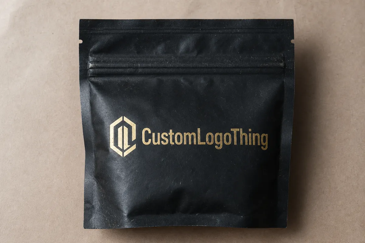
At the simplest level, Custom Foil Stamped pouches are flexible packages with a metallic or pigmented foil applied to selected areas. The foil can sit on top of printed artwork or on a bare panel, depending on the look and the pouch construction. That is not the same thing as regular ink. Ink lays down color. Foil throws light back at the shopper. Once the pouch sits under store lighting or gets photographed for a product page, that difference shows up immediately.
Most brands use foil on logos, award marks, premium seals, flavor names, limited-run graphics, and small decorative details. Those spots need clean edges and a strong read. Foil does real work there. It guides the eye to the brand first, then the product name, then the rest of the layout. That is basic package branding. Nothing flashy. Just structure that helps the shopper understand the pack in one glance.
Foil also has a practical edge in pouch packaging. A pouch does not have the wide storytelling surface of a carton, so every panel has to carry more weight. A foil stamp can turn a small front face into a strong shelf signal. On stand-up pouches, it can act like a beacon. On flat pouches, it helps separate one SKU from the next without forcing a complete redesign for every flavor or blend.
People often use foil stamping, hot stamping, and foil-like printing as if they mean the same thing. They do not. Hot stamping is the transfer method many foil applications use: heat and pressure push the foil onto the material through a die. Some printers use metallic inks or special print effects that mimic foil from a distance, but those are different animals. Metallic ink can work well, especially on shorter runs or tighter budgets, but it will not give you the same crisp reflection as a real foil transfer.
Set expectations early. Foil reads premium because the process demands more control. That does not mean the whole pouch needs to shine. The better question is simple: where does the foil create a cue that helps the product sell? If the answer is “everywhere,” the design probably needs another round. If the answer is “the logo and one supporting detail,” you are thinking like a packaging buyer, not a magician with a marker budget.
One more practical point: the pouch material matters as much as the artwork. Some films hold foil cleanly and keep the edges crisp. Others soften the effect or make fine detail look muddy. A supplier who understands flexible packaging should be able to explain the tradeoffs before anyone commits to tooling.
How the Foil Stamping Process Works on Pouches
The process starts with artwork prep. Foil areas need their own clean separation in the file, usually as a vector layer or spot color callout. The supplier then creates the die or plate that forms the foil image. Heat and pressure transfer the foil onto the pouch surface. Depending on the structure, that stamping can happen before the pouch is formed, after lamination, or during a later converting step.
That sounds tidy on paper. Flexible packaging is less obedient than paperboard. A carton stays put. A pouch shifts, stretches a little, curls, and reacts to heat in ways that make alignment more sensitive. Gloss film, matte film, and soft-touch finishes all change the way foil reads under pressure. Some materials grab the foil cleanly. Others produce softer edges that look fine on a proof and less dramatic once the press starts running.
These are the variables that usually matter most:
- Foil color: gold, silver, copper, holographic, black metallic, and custom tinted shades all behave differently in light.
- Die depth: better die control improves transfer consistency, especially on detailed logos and fine badge work.
- Registration tolerance: the foil has to align with the print and the pouch structure, or the package starts looking sloppy fast.
- Substrate compatibility: PET, BOPP, kraft laminates, matte films, and soft-touch coatings all react in their own way.
- Finish interaction: matte surfaces usually create stronger contrast, while gloss can flatten the effect if the layout is too busy.
Small type causes trouble. Thin lines cause trouble. Tiny icons that looked elegant in a mockup often get noisy on the actual pouch. A design that leans on hairline strokes is asking for production pain. Better to keep foil elements bold enough to survive normal variation, especially if the pouch will run at scale.
Foil also pairs with other finishes such as spot gloss, soft-touch lamination, and textured film. That combo can look sharp. It can also turn into a mess if the stack gets too clever. Every extra layer adds more registration risk and more chances for a dull patch, a shift, or a transfer miss. I like layered finishes when the brand actually needs that premium shelf story. I do not like them when the buyer is already sweating the quote. Fancy is fine. Waste is not.
If your product ships in cases or mailers before it ever hits the shelf, check the full package system, not just the pouch face. The pouch may carry the brand moment, but the outer carton or shipper shapes the unboxing. For teams building a broader system, our Custom Packaging Products page is a useful place to compare pouch, carton, and insert options.
For shipping stress tests, the ISTA test library is worth a look. If the package includes paper-based components and you need certified sourcing language, the FSC standards page is the right place to verify the claim before it lands in print.
Key Factors That Affect Foil Stamp Quality and Cost
Foil pricing is not one number. It is a stack of variables. Pouch size, film structure, foil coverage area, number of foil colors, order quantity, and custom tooling all shape the quote. A small logo in one foil color on a standard pouch is a different job from a full-panel metallic pattern on a specialty laminate. Same process family. Very different invoice.
MOQ matters because setup costs do not shrink just because the order is small. If the supplier has to build a die, prep the press, and dial in registration, those fixed steps get spread across the total quantity. That is why unit pricing usually falls as volume rises. Short runs carry heavier setup overhead. Larger runs spread the pain out more evenly.
Substrate choice affects both appearance and risk. Matte film often gives foil a cleaner read because the contrast is stronger. Gloss film can still look excellent, but the artwork has to carry more weight. Soft-touch finishes can feel rich, yet they sometimes dull the brightness of the foil or need tighter process control. Paper laminate pouches have their own appeal too. They can look natural and premium, which works well for branded packaging in food, coffee, wellness, and specialty retail. They are not always the best match for sharp metallic effects.
Typical Cost Ranges Buyers See
| Foil Approach | Best Use | Typical Setup Burden | Approx. Unit Impact at 5,000 Units | Risk Level |
|---|---|---|---|---|
| Small logo accent | Premium seal, brand mark, badge | Low to moderate | $0.03-$0.08 | Low if artwork is bold |
| Medium front-panel accent | Flavor name, hero graphic, limited edition | Moderate | $0.06-$0.15 | Moderate |
| Large foil coverage | Luxury look, seasonal launch, gift item | High | $0.15-$0.40+ | Higher, especially on complex film |
| Multiple foil colors | Multi-brand systems, premium campaigns | High | $0.20-$0.50+ | Higher because of alignment and setup |
Those numbers stay broad on purpose. A pouch supplier will price differently if you need a custom structure, a resealable zipper, a degassing valve, window cutouts, or a specialty finish. A simple 3.5 x 5 inch pouch with one foil accent is not priced like a 10 x 13 inch bag with multiple embellishments. Buyers who treat those two jobs like twins usually end up arguing with the quote instead of reading it.
Artwork complexity changes the bill too. Large solid foil blocks can look elegant, but they are more sensitive to surface variation. Tiny microtext is risky because foil does not forgive blur the way some printed effects do. Intricate linework can push the reject rate up. If the foil needs to read from three feet away on a retail shelf, it needs more breathing room than a designer’s first draft usually gives it.
There is also the tradeoff between premium appeal and actual spend. The smartest designs use foil as an accent, not a blanket. One strong brand cue usually does more than a field of metallic decoration. That holds true for Custom Printed Boxes too. Too much shine often looks louder, not better. Buyers pay for conversion, not for the factory to prove it can print glittery things.
Quality also depends on how much control the supplier has over the production line. If foil, printing, laminating, and pouch conversion all happen in separate places with weak communication, the risk of drift goes up. That is where good vendors earn their margin. They catch the problems before they become scrap.
Ordering Custom Foil Stamped Pouches Without Guesswork
Start with the product, not the decoration. What is going inside the pouch? How much does it weigh? Does it need a zipper, tear notch, barrier film, or reseal? Is it going to a retailer shelf program or direct to consumers? Those answers shape the structure, and the structure shapes what kind of foil finish is realistic. A snack pouch, a supplement pouch, and a coffee pouch all live in different worlds. Gas release and barrier performance alone can change the conversation fast.
Once the product needs are clear, prep the artwork properly. Use vector files wherever you can. Keep the foil layer separate from the print layer. Mark the safe zones clearly so seams, seals, zippers, and the bottom gusset do not cut through the design. This is where a good supplier earns their keep: not just by printing what you send, but by catching the things that would otherwise become a box of regrets.
Ask for the right proofs. A digital mockup helps, but it does not tell the whole story. Request substrate samples, foil swatches, and, if the order is large enough, a production sample or approved test proof on the actual film structure. Foil on white film and foil on matte black film can look like two different products. A screen proof rarely tells you that. Your hands and eyes do.
The timeline usually moves through five stages: design approval, tooling or die creation, production scheduling, stamping and pouch fabrication, quality checks, and shipping. For standard jobs, the full cycle often runs 12-20 business days after proof approval. Add time for sample rounds, revisions, or custom foil colors. Three to six weeks is common once the spec gets more complicated. Fast turnarounds happen, but only when the artwork is final early and the supplier already has the right materials on hand.
A practical order flow usually looks like this:
- Define the pouch size, product weight, barrier needs, and closure type.
- Confirm the foil area, foil color, and whether the finish should be matte, gloss, or soft-touch.
- Send vector artwork with a separate foil layer and clear safe-zone notes.
- Review digital mockups, substrate samples, and foil swatches.
- Approve a production sample or sign off on the final proof set.
- Lock the schedule and keep changes out of the run.
That last step matters more than most teams admit. Every late change ripples through the order. A shifted logo, a moved barcode, or a rewritten ingredient panel creates rework, and rework costs more than calm planning ever will. If the pouch has to fit into a larger family of branded packaging, build the family structure first. Then keep the variables under control. Our branded packaging options can help a team compare a pouch-led system with matching cartons and support items before the art gets locked.
One buyer described the best proof review like this:
“The mockup looked fine, but the physical sample told the truth. The logo was too close to the seam, and the foil made the seam look even busier. Once we moved it up and simplified the icon, the pouch finally looked expensive instead of crowded.”
That is useful feedback. It saves money. It also explains why proofing on the real substrate matters. The screen shows the idea. The sample shows the process risk.
There is a second benefit to sampling: it gives the sales team something concrete to show retailers, distributors, or internal leadership. A physical pouch answers questions a PDF never will. Is the shine too strong? Does the logo disappear under overhead lighting? Does the finish feel premium or just busy? Those are the decisions that shape the final order.
Common Mistakes When Designing Foil Stamped Pouches
The biggest mistake is overusing foil. A design with metallic everywhere usually loses hierarchy. The eye stops knowing where to land, and the pouch starts reading loud instead of premium. A little shine can signal quality. A lot of shine can signal panic. I know which one converts better.
Another common error is trying to stamp tiny text or very thin lines. On flexible packaging, those details are fragile. The pouch may be folded, sealed, or slightly curved by the time it reaches the buyer. That gives foil less tolerance than the artboard had. If the brand name is six-point type in foil and the supplier warns you about it, listen. A warning is cheaper than a remake.
Buyers also forget about the real front-panel dimensions. The artwork may be built for a flat rectangle, but the finished pouch has seams, gussets, zipper tracks, and cut allowances. Put foil too close to those edges and the result can look clipped, uneven, or awkwardly squeezed. Good packaging design starts with the real structure, not the presentation slide.
There is also the false confidence problem. A screen proof is not proof of foil behavior. It can show placement and color intent, but it cannot show how the foil will react to film, pressure, or pouch construction. A supplier may need to adjust line weight or move the foil after seeing the actual substrate. That is not failure. That is the process doing its job.
Budget mistakes happen too. Chasing the lowest quote without checking setup fees, lead times, and reject rates is how a brand pays twice. One supplier may quote a lower unit price but hide die charges or revision fees in the fine print. Another may look pricier and still be the better value because the sampling is better and the run is steadier. The cheapest quote is only cheap if the order is actually usable.
Watch for these warning signs:
- The quote does not specify foil area, foil color, or tooling charges.
- The supplier will not explain the safe-zone requirements around seams and seals.
- The artwork approval process is vague or rushed.
- No sample path is offered before the production run.
- The finish promise sounds too perfect for the substrate.
One more mistake shows up after approval: changing the file late because someone notices a typo, a shade shift, or a “small” layout tweak. On flexible packaging, small changes tend to be expensive changes. Lock the art before the run starts. That keeps the foil die, the print plates, and the pouch conversion in sync.
Expert Tips to Improve Results and Control Pricing
If the budget is tight, use foil on one high-impact brand element and let the rest of the pouch carry the message. A logo, seal, or short headline is usually enough. That keeps the premium cue clear without turning the pouch into a cost experiment. Simpler foil areas also make registration easier to hold and rework easier to avoid.
Contrast does a lot of the work. Dark film with bright foil reads well from a distance. Light film with a deep metallic tone can work too, especially for wellness, coffee, and specialty food. What usually fails is a low-contrast pairing where the foil and substrate fight each other. The eye should find the brand mark in one glance, not hunt for it like a missing receipt.
Simplify the artwork whenever you can. First-time foil orders are not the place to test ten effects at once. If the pouch needs to feel premium, keep the iconography clean and the typography strong. That improves print stability and makes the packaging easier to scale across a family of SKUs. It also gives you room to reuse the visual system for custom printed boxes, labels, and other packaging design assets later.
From a buying standpoint, ask very direct questions:
- What exactly is included in the quote?
- How many art revisions are allowed?
- Are die charges one-time or recurring?
- What is the expected reject range?
- What lead time applies after proof approval?
Those questions are not fussy. They are basic procurement discipline. A supplier that answers clearly is usually easier to work with than one that hides behind vague language and a glossy brochure. The goal is not to buy the prettiest deck. The goal is to buy a pouch that arrives on time, looks right, and supports the price point.
For brands with multiple flavors or formats, plan a pouch family instead of treating every SKU as a separate project. Shared structure, shared foil placement logic, and variable artwork can reduce setup overhead. That matters a lot once the line expands. A single hero pouch is easy. Ten variants with different foil logic is where sloppy planning gets expensive. Better to build the system once and keep the changes controlled.
If you are weighing foil against other print treatments, compare it against the full package system, not just the pouch face. Sometimes a stronger matte laminate, a better zipper, or a cleaner layout gives more sales lift than another layer of metallic detail. Pretty is not always persuasive. Clear is often better.
Experts also look at how the foil will age. Some finishes stay crisp through handling and shipping. Others scuff sooner than the buyer expects. If the pouch is going to sit in a display, get tossed into cases, or travel through fulfillment centers, ask for a finish that can survive real handling rather than only the showroom version of the product.
Actionable Next Steps for Custom Foil Stamped Pouches
If you are ready to source, start with a one-page spec sheet. Include pouch size, product type, fill weight, finish, foil area, expected quantity, and launch date. That single page cuts down the back-and-forth. It also forces internal teams to agree on the basics before asking for pricing, which is usually where messy projects start to get expensive.
Then ask each supplier for three things: production sample photos, a detailed cost breakdown, and a realistic lead time with setup milestones. If the supplier cannot explain the path from artwork approval to finished shipment, the job is not organized enough yet. Good vendors should describe the run in plain language, not bury it under sales talk.
Build a review checklist for your own team. Before approval, check foil line weight, seam clearance, barcode placement, regulatory text, and readability from a distance. If the pouch is headed for shelf retail, stand back three feet and see whether the brand still reads. If it is headed for e-commerce, look at how it photographs. A shiny pouch that washes out on camera is not a win.
For a new product, a new seal format, or a new foil color, order a small test run first. Yes, a test run costs money. So does fixing a bad launch. The test is not a luxury. It is a cheaper version of reality. That is usually where the extra dollars belong, especially if the pouch is part of a larger rollout across retail packaging, inserts, and display cartons.
Compare suppliers on three things only after the spec is set: quality, pricing transparency, and turnaround reliability. The prettiest sample is not always the most dependable option. The lowest quote is not always the smartest one. The best partner is the one whose process fits the brand and whose output can support the shelf price.
If the job is worth doing, Custom Foil Stamped pouches should be treated like a production decision, not a shiny afterthought. Used well, they improve shelf presence, support branded packaging, and make the product feel more deliberate. Used badly, they become a very expensive way to learn what not to do.
Frequently Asked Questions
Are custom foil stamped pouches more expensive than standard printed pouches?
Usually yes. Foil stamping adds setup, tooling, and press time, so the finished cost is higher than a standard printed pouch. The gap depends on foil coverage, pouch size, film type, and order quantity. A small foil accent often adds less cost than a full-surface metallic treatment, which is why smart placement usually delivers better value than broad coverage.
What artwork works best for custom foil stamped pouches?
Bold logos, simple icons, seals, short headlines, and strong shapes usually perform best. Thick strokes and open spacing help the foil transfer cleanly. Ultra-thin lines, tiny text, and crowded layouts are where problems start. If the design needs to read from a distance, keep the foil elements large enough to survive real production conditions, not just the mockup.
How long does the custom foil stamped pouch process usually take?
It depends on proof approval, tooling, pouch construction, and where the supplier sits in the production queue. A straightforward run often takes 12-20 business days after final approval. Add time for samples, revisions, or custom foil colors. Fast turnarounds are possible, but only when the spec is final early and the artwork does not trigger extra changes.
What is the minimum order quantity for foil stamped pouches?
MOQ varies by supplier and by pouch structure. Custom tooling, pouch size, and finish all affect the minimum. Lower quantities usually raise the unit cost because setup gets spread across fewer pieces. Ask for tiered pricing so you can compare a short run against a production run before you commit.
How do I make sure the foil finish looks premium, not cheap?
Use foil sparingly and let it highlight one clear brand element. Pair it with a substrate and finish that support clean contrast, and make sure the artwork is bold enough for the material. Physical samples are better than screen proofs for this decision. If the sample looks balanced and the logo reads instantly, the finish usually feels premium instead of overworked.
Can foil stamping work on eco-conscious packaging structures?
Sometimes, yes, but the structure has to be chosen carefully. Paper-based laminates and certain recyclable or compostable structures can accept foil-like effects or real foil transfer depending on the material stack and the supplier’s process. The honest answer is that the substrate drives the decision, not the other way around. Ask for material-specific samples before you assume the finish will hold up.
Before you approve custom foil stamped pouches, lock the spec, request a real substrate sample, and check the design at actual size. That is the cleanest way to avoid expensive surprises and end up with packaging that looks intentional instead of improvised.

