In a Custom Padded Mailers for apparel retailers print finish comparison, the finish often speaks before the package is opened. A shopper at a pickup counter, a fulfillment associate scanning a stack of mailers, or a customer posting an unboxing photo notices sheen, texture, and color depth first. That first read shapes how the brand feels, sometimes more than the artwork itself. For apparel retailers, where presentation and protection have to coexist, the finish is not a decoration layered on later; it is part of the packaging strategy.
The mailer is also a practical object. It sits in receiving bins, moves across conveyors, gets handled by multiple people, and may be photographed in poor lighting before it ever reaches a closet or dresser drawer. A finish that looks elegant in a render can still fail if it scuffs too easily, reflects badly under warehouse lights, or pushes the project over budget. That is why the best packaging decisions usually come from comparing finishes under real production constraints, not just from choosing the most attractive mockup.
What a print finish changes before the mailer is even opened
Before the seal is broken, the finish is already doing quiet work. Matte signals control and restraint. Gloss reads brighter and more energetic. Soft-touch adds a tactile layer that can make a simple mailer feel closer to a gift box than a shipping envelope. Those reactions happen fast, which is exactly why finish choice matters so much in fashion and retail packaging.
Technically, the finish sits on the printed face of the mailer as a coating, laminate, varnish, or film. That surface treatment changes how ink appears, how light bounces, how fingerprints show up, and how the pack survives handling. On padded mailers, those effects matter more than they do on many flat cartons because the item is folded, sealed, stacked, and dragged through distribution with more friction at the seams and corners.
From a buyer's point of view, the right finish has to answer four questions at once: does it match the brand, does it protect the printed surface, does it fit the budget, and can it be repeated consistently at reorder? That is the real test in a Custom Padded Mailers for apparel retailers print finish comparison. A finish that looks premium once but cannot be reproduced cleanly at scale is not a good packaging choice; it is a one-off expense.
There is also a merchandising angle. Apparel brands increasingly use the mailer as a visual extension of the collection inside it. A neutral matte surface can support a minimalist brand language. A glossy finish may suit louder seasonal drops or promotional campaigns. Soft-touch often lands well for premium basics and higher-margin lines because it gives the packaging a quieter, more deliberate feel. The finish becomes part of the brand's tone of voice, only in material form.
How print finishes are built into padded mailers
A typical padded mailer has three major components: the outer print surface, the cushioning layer, and the closure system. The finish sits on the outside, but it has to survive the whole manufacturing path, including folds, adhesive zones, trim lines, and compression during packing. That is why finish choice is tied to substrate and conversion method, not just to design preference.
Matte, gloss, and soft-touch are usually created through different build paths. A matte appearance may come from a low-sheen coating or film. Gloss often uses a higher-shine varnish or laminate. Soft-touch usually depends on a specialty coating or film that changes the tactile feel without making the surface look busy. The exact result depends on whether the mailer is paper-faced, film-faced, or built with a hybrid construction. Even within the same finish family, ink holdout and surface texture can shift the final look more than people expect.
Printing method matters too. Shorter runs often use digital printing because it reduces setup time and handles versioned artwork more easily. Larger programs may use offset printing, which can be more efficient once volume is high enough. Either way, the finish has to work with the print method, not against it. Deep blacks, saturated reds, and fine typography can look crisp on one surface and slightly softer on another.
There are practical tradeoffs that matter to production teams. A higher-gloss surface can show seam lines and pressure marks more readily. A matte surface can hide minor handling wear but may not deliver the same visual pop under retail lights. Soft-touch can feel more premium, yet some versions scuff on corners if the protective layer is too thin. Buyers often want the tactile effect without the maintenance risk, which means sample testing is not optional.
Brands that care about material sourcing also ask whether the finish fits a lower-plastic or FSC-sourced paper construction. That question is not just about sustainability language; it affects how the package behaves in production. A coating that improves abrasion resistance may also change recyclability, appearance, or cost. Suppliers should be able to explain the construction clearly, not hide the tradeoff behind a polished sample board.
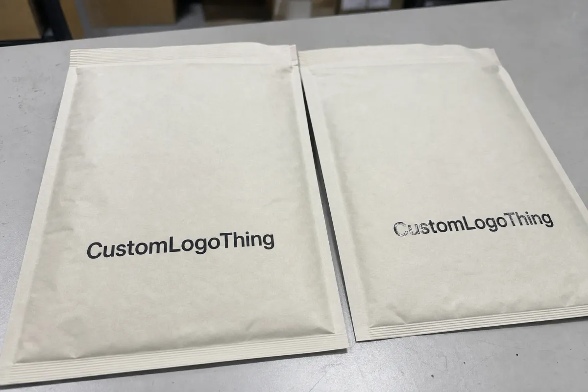
Matte, gloss, and soft-touch in the custom padded mailers for apparel retailers print finish comparison
The simplest way to compare the three is to look at what each finish does best and where it starts to struggle. Gloss is the loudest. It reflects more light, pushes color forward, and can make logos feel more immediate from a distance. Matte is calmer and more controlled. Soft-touch is the most tactile, which is why it often gets described as premium even when the print itself is minimal.
| Finish | Visual effect | Handling behavior | Typical cost impact | Best fit |
|---|---|---|---|---|
| Matte | Low sheen, restrained, modern | Hides fingerprints and light rub marks well | Usually baseline to slightly higher | Premium basics, boutique apparel, minimal branding |
| Gloss | Bright, vivid, high contrast | Shows scuffs sooner, especially on dark graphics | Often baseline to moderate | Promotional drops, colorful graphics, strong shelf impact |
| Soft-touch | Muted visually, rich tactile feel | Good at hiding minor handling wear, though corners can mark if the build is light | Usually the highest of the three | Premium fashion, subscription mailers, gift-like presentation |
For apparel mailers, matte and soft-touch usually hide fingerprints, warehouse rub, and shipping scuffs better than gloss. That does not make gloss a poor choice. It simply means gloss asks for cleaner handling and a brand voice that wants energy over understatement. A promotional capsule collection, for example, may benefit from a finish that looks louder and more immediate. A premium knitwear line may benefit from the opposite.
Color changes the equation. Black on gloss can look dramatic, but it also exposes every crease and pressure mark. White on matte feels clean and expensive when the layout has enough breathing room. Soft-touch often deepens muted palettes, which is one reason it shows up frequently in premium basics, beauty-adjacent fashion packaging, and higher-end subscription shipments. The same artwork can feel cheaper or more expensive depending on the surface beneath it. That is not theory; it is one of the few places where small material changes reliably alter perceived value.
The hand feel is a separate factor from the image. Some brands choose a soft-touch finish because they want the package to feel like part of the garment experience. Others choose matte because it keeps the package honest and legible. Gloss can still win in settings where shelf impact or campaign photography matters more than subtlety. The mistake is assuming one finish is universally better. The right answer usually depends on whether the customer is meant to notice the package as a fashion object or simply receive it as clean shipping protection.
Practical rule: if the mailer is meant to feel like part of the apparel experience, matte or soft-touch usually carries that message better than a high-shine surface.
Cost, pricing, and MOQ tradeoffs by finish
Cost rarely comes down to the finish alone. Pricing is shaped by the outer construction, print coverage, number of colors, size, coating method, and quantity. A one-color mailer at 10,000 units behaves very differently from a full-coverage soft-touch design at 1,000 units. The first is a manufacturing routine. The second is closer to a specialty job.
In many programs, a standard printed padded mailer lands somewhere around $0.18-$0.35 per unit at mid-to-larger quantities. Specialty finishes, heavier coverage, and more complex construction can move that into the $0.30-$0.60+ range. Smaller runs can cost more per unit because setup, coating, and converting overhead are spread across fewer pieces. If the project needs a soft-touch treatment or a very specific color match, it is common to see a meaningful jump in price, sometimes $0.03-$0.08 per mailer or more compared with a simpler coated build. That spread is not fixed; it depends on format, vendor process, and order size.
MOQ behavior matters as much as headline price. Matte and standard gloss often fit into more common production windows because those finishes are easier to run and more widely used. Soft-touch and specialty laminates can push minimums higher or make a small order less economical. A brand testing a new package direction may do better with a limited quantity and a lower-coverage design first, then scale once the visual direction has been proven in the market.
To compare quotes fairly, ask for the same package in the same format:
- Finished size and closure style
- Print method and number of colors
- Finish type and whether it is coated, laminated, or varnished
- Quantity breakpoints
- Packing format and freight assumptions
That list sounds basic, but it prevents one of the most common pricing errors: comparing a low unit price that excludes finish complexity against a more complete quote that includes all the real production steps. A slightly higher unit cost can still be the better decision if the package supports a higher-margin apparel line, a stronger gifting experience, or a more consistent reorder pattern.
Production steps and lead time for custom padded mailers
Most projects follow the same basic sequence: artwork approval, proofing, material sourcing, production, finishing, converting, packing, and shipment. The finish affects several of those steps because coatings and laminates need their own approval points, and some surfaces require tighter color control than others. If the art is not settled early, the finish can become the reason the job slips.
Typical lead time for Custom Padded Mailers often falls around 12-20 business days after proof approval for straightforward runs. Specialty finishes, custom sizing, or seasonal volume can push that longer, especially if the vendor needs a new sample round or a fresh color adjustment. Soft-touch, in particular, may require a little more patience because the surface needs to be checked for appearance, feel, and resistance to handling before the order is released to full production.
There are two common delay points. The first is color matching, especially on dark fashion palettes, precise brand reds, blush tones, and neutrals that need to sit consistently across reorders. The second is late artwork changes after proof approval. Even a small tweak can mean another round of setup and finish review. That is why packaging teams usually benefit from locking artwork earlier than they think they need to.
For planning purposes, it helps to think in three checkpoints:
- Proof approval and sample signoff
- Production and finishing window
- Freight transit and receiving time
For shipping tests, it is also smart to review transit guidance from organizations such as ISTA. Drop, vibration, and compression checks can reveal how a finish behaves when the mailer is stacked, moved, and shifted through the network. A surface that looks perfect on a tabletop may still show corner wear or adhesive stress after transit. That is not a design failure; it is a signal that the structure and finish need to be evaluated together.
Retailers sometimes compare padded mailers with other formats, including Custom Poly Mailers, before locking the spec. That comparison usually comes down to the product itself. Heavier apparel, layered garments, and premium presentation often justify a padded format. Lightweight basics or volume-driven promotions may not. Finish should support the format, not compensate for a structural mismatch.
Common finish mistakes that weaken apparel branding
The biggest mistake is choosing a finish because the mockup looked good on a screen. Screens flatter everything. Real mailers show seam lines, fold points, glare, and touch. Those details can change the entire read of the package. A gloss graphic that feels energetic in a render may look noisy in the hand. A matte design that seemed plain online may feel more expensive once printed.
Skipping a physical sample is another easy way to miss the real answer. Lighting changes everything. Warehouse light, retail light, and daylight all bounce off a finish differently. A surface that feels balanced in one environment can look too shiny or too dull in another. Apparel mailers usually pass through more than one of those settings, so the sample should be judged where the package will actually live.
Technical errors show up too. If the layout is crowded near folds or seam areas, the finish can look uneven after converting. Heavy ink coverage can make a mailer feel muddy if the substrate does not hold the color cleanly. Logos placed too close to adhesive strips or trim lines can distort when the mailer is sealed. These problems are avoidable, but only if the production file is built with the mailer's shape in mind.
There is also a business-side mistake that gets ignored. Brands sometimes choose the most premium finish available, then realize the reorder price is too high or the lead time is too slow for replenishment. The first shipment looks beautiful. The second one becomes a budget problem. Packaging has to work for the campaign and for the repeat order after the campaign is over.
Another issue is overestimating durability from appearance. Gloss can look tough because it is shiny, yet it may show scuffs sooner than a matte surface. Soft-touch can feel luxurious but still need an added protective layer if the mailer is going to be handled roughly. The finish should be tested for handling wear, not just for visual appeal.
Good packaging rule of thumb: if the finish improves the mockup but complicates production, ask whether it helps the customer experience or only the sample board.
Expert tips for choosing the right finish for your brand
For premium labels, matte and soft-touch usually signal more restraint and more value. For promotional drops, bright launches, and highly graphic streetwear packaging, gloss can give the artwork the punch it needs. That is the first filter I would use in any finish comparison: match the finish to the product tier, not just to the logo style.
Then test the sample in three places: under retail lighting, under warehouse lighting, and in natural daylight. The finish should hold up in all three, because that is how customers and staff will actually see it. If the package feels elegant only in one lighting condition, it may be too fragile for ongoing use. Packaging that depends on a single flattering environment tends to disappoint later.
It also helps to look at the entire packaging system. Inserts, tissue, labels, tape, and hang tags should reinforce the same visual language. If the mailer is soft-touch but the rest of the system is loud and glossy, the package loses coherence. The strongest apparel programs usually feel deliberate because every component points in the same direction, even if the individual parts are simple.
A simple decision matrix keeps the process practical:
- Visual impact: Which finish best matches the brand tier?
- Durability: Which surface hides the handling your shipments actually see?
- Cost: Which option works at the reorder quantity you expect?
- Speed: Which finish fits the launch calendar?
If those four answers do not agree, that usually means the packaging spec is still trying to do too much. The best finish is not always the most luxurious one. It is the one that survives production, protects the artwork, and still feels like the brand when it reaches the customer.
Next steps: sample, compare, and lock the spec
The cleanest process is straightforward: shortlist two finishes, request samples, and compare them under the same light with the same artwork. That gives a far better read than a screen render ever will. Small differences in sheen or texture are easy to miss digitally and hard to ignore in hand.
Then ask for a quote that separates unit price, setup cost, MOQ, finish type, and freight. A good quote should make the tradeoff obvious. If one finish looks cheaper but forces a larger run or slower turnaround, the true cost may be higher than the line item suggests. That is especially relevant for apparel teams balancing seasonal drops, replenishment, and cash flow.
Before approving production, confirm artwork file prep, finish placement, print tolerances, and any color targets that matter to the brand. It is easier to adjust a proof than to explain a mismatch after the order is already moving. If the supplier can show how the finish behaves around seams, folds, and sealed edges, even better. Those are the spots where quality problems show up first.
One more detail is worth building into the brief: specify the intended use case, not just the size and artwork. A mailer for premium knitwear, for example, does not need the same surface treatment as a mailer for a fast-moving seasonal basics program. Using the phrase Custom Padded Mailers for apparel retailers in the spec helps keep the conversation centered on retail presentation, transit durability, and reorder consistency, which is where the real decisions happen.
FAQ
Is matte or gloss better for custom padded mailers for apparel retailers?
Matte is usually better if the goal is a restrained, premium look and stronger resistance to visible scuffs. Gloss works well when the brand wants brighter color, more shine, and a stronger promotional feel. The right choice depends on how much handling the mailer will see and how loudly you want the artwork to speak.
Which finish hides shipping marks best on apparel mailers?
Matte and soft-touch usually hide fingerprints, rub marks, and light surface wear better than gloss. A coated or laminated surface can also improve abrasion resistance if the mailer will move through rough transit or repeated handoff points.
How does finish choice affect the unit cost of padded mailers?
Premium finishes usually raise unit cost because they add material, process steps, or tighter production control. The impact is larger on smaller runs because setup and finishing overhead are spread across fewer pieces.
What lead time should apparel retailers expect for custom padded mailers?
Lead time depends on artwork approval, finish selection, quantity, and whether samples are required before full production. Standard runs can be fairly quick after proof approval, while specialty finishes and seasonal volume usually add time.
What should I compare before approving a print finish?
Compare the sample under store lighting, warehouse lighting, and natural light so you can see how the surface reads in real conditions. Check color accuracy, scuff resistance, tactile feel, and how the finish affects your logo and product photography.

