Most poly mailers get judged in a couple of seconds: on the doorstep, in a warehouse stack, or in a customer photo where the package is only half in frame. That is why an ecommerce brand Custom Poly Mailer bags logo placement guide matters more than a clever print pattern that looks excellent on a monitor and weak on a real shipment. If the logo lands in the wrong place, the bag can read as generic even when the film and ink are perfectly decent.
Logo placement is not decoration. It affects whether the package is recognized quickly, whether a shipping label covers the mark, how much visual balance survives folding and handling, and whether the mailer feels intentional or improvised. Small choices on a bag can make a brand look more established than it is, or less polished than it should be. Packaging has a habit of exposing weak decisions faster than marketing decks do.
Why Logo Placement Matters on Poly Mailers
The job of logo placement is straightforward: make the brand visible fast. That usually means readable from a few feet away, still visible after a carrier label goes on, and balanced enough to survive crumpling, stacking, and the occasional awkward porch photo. Many ecommerce teams start with artwork style and treat placement as a last-minute detail. That sequence is backward. In packaging, position tends to register before detail.
A practical placement choice starts with use case, not with a mockup. A fashion mailer, a subscription shipment, and a return mailer do not face the same conditions. One may be opened on camera. Another may spend most of its life under a label and a barcode. The third may get reused, folded, and handled more than once. A good layout should answer the actual shipping flow instead of assuming the bag will always sit neatly under studio lighting.
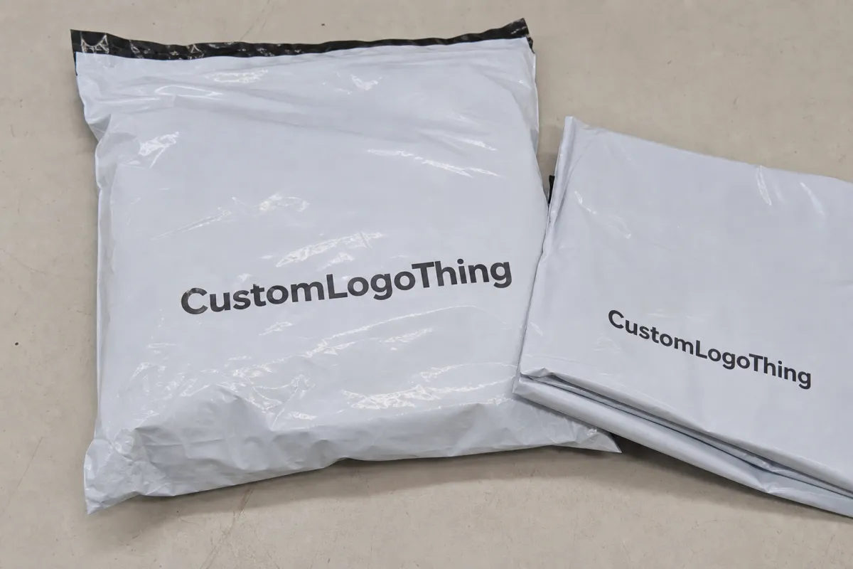
Bad placement has a predictable look. Put the logo too close to a seam and the print distorts. Put it too low and it gets covered. Shrink it too much and the bag starts to look like unbranded supply packaging rather than part of a product line. The surface does not need to be filled; it needs a clear focal point that survives transit.
A poly mailer does not need more decoration. It needs one job done cleanly: be identifiable, survive shipping, and look deliberate in a stack of other bags.
How Logo Printing Works on Poly Mailer Bags
Most poly mailers are printed with flexographic, gravure, or digital methods. Each process changes cost, sharpness, and the amount of artwork that can be covered. Flexo is common for larger runs because it handles solid shapes well and keeps unit cost sensible. Gravure can be very consistent on long runs, but setup is heavier and usually makes more sense at scale. Digital printing is friendlier for smaller orders and more complex artwork, although the per-unit cost often rises faster as volume drops.
The printer is not simply dropping a logo onto plastic. They are mapping the art to a dieline, checking the printable area, and protecting no-print zones around seals, folds, tear strips, and closure margins. That is where first-time buyers often misjudge the space. A front panel can look large in theory, then shrink fast once seam allowances and edge clearance are removed.
Film finish changes how the logo reads. Gloss film usually produces stronger contrast and deeper-looking color. Matte or recycled-style film softens the effect and can feel more premium in a quiet way, but it usually asks for thicker strokes and simpler shapes. Thin lines are unforgiving on plastic. If a logo depends on hairline details, expect some of that precision to disappear unless the supplier has very tight print control.
The right proof should show the actual panel, the safe zone, and the exact offset from the seams. If the supplier cannot point to where the print starts and stops, ask for a corrected proof before approving anything. One careful round of clarification is cheaper than opening a carton of bags and discovering the logo kisses the closure strip.
For brands comparing packaging performance and material claims, ISTA provides useful context on transit testing, and the EPA recycling guidance helps separate genuine recyclability claims from vague marketing language. Both are better references than a glossy product page with no technical detail.
Placement Factors That Change Visibility and Brand Impact
Five variables do most of the work: bag size, logo size, color count, contrast, and whether the artwork appears on one side or both. Everything else is secondary. A 10 x 13 inch mailer gives a different visual field than a 14.5 x 19 inch mailer, and that difference is not just about room. Larger bags can make weak layouts look emptier. Smaller bags expose bad spacing immediately.
Viewing distance matters more than people expect. A logo should read from a few feet away, not just at 100% zoom in a PDF. In a warehouse, people move quickly. On a porch, customers are distracted. If the mark disappears when a shipping label, fold, or crease crosses the bag, the brand loses the split-second recognition that makes branded packaging feel purposeful.
Brand style also changes the layout choice. Minimal logos often look strongest centered or slightly above center, where they stay clear of the label zone and avoid competing with folds. Detailed marks usually need more open space around them, otherwise the design feels cramped. Repeated patterns can work for brands that want louder visual identity, but repetition is not automatically smarter. Sometimes one strong mark is more effective than a busy bag that shouts at every surface.
Channel matters too. Subscription shipments benefit from a tidy reveal. Fashion orders usually gain from a cleaner hero mark because the bag becomes part of the visual brand language. Return mailers need practicality first because the package may be reused. That is why good packaging decisions should follow the operational path, not only the design mood board.
- Centered placement works well for broad recognition and a balanced front panel.
- Top-aligned placement helps keep the logo above label clutter and can feel more refined.
- Lower placement can work, but only if label coverage and fold lines are tested first.
- Double-sided printing increases visibility, yet it only pays off if both sides remain visible in real shipping.
Cost, Pricing, MOQ, and Unit Cost Tradeoffs
Custom Poly Mailer pricing is shaped by a few recurring variables: print colors, bag size, film thickness, finish, and whether the artwork appears on one side or two. A single-color logo on one panel is usually the least expensive route. Add more colors, more coverage, or a second side, and the price rises. That is not a mystery. It reflects plates, setup time, press time, and extra proofing.
MOQ changes the math quickly. Smaller runs spread setup costs across fewer bags, so unit price tends to be higher. Larger runs usually reduce per-bag cost and make a better print spec more affordable. A 1,000-unit order may look convenient, but when setup is added to the unit cost, the “cheap” choice often turns out to be the most expensive route on a per-impression basis.
| Logo Placement Option | Typical Unit Range | Best For | Tradeoff |
|---|---|---|---|
| Single-color front logo | $0.18-$0.35 at 5,000 pcs | Lean ecommerce launches | Lowest cost, simplest look |
| Two-color front logo | $0.24-$0.42 at 5,000 pcs | Brands needing stronger contrast | More setup and color control |
| Front and back logo | $0.30-$0.55 at 5,000 pcs | Orders seen from multiple angles | Better visibility, higher cost |
| Full-coverage or wrap print | $0.40-$0.85 at 5,000 pcs | Bold package branding | Most expensive, most to proof |
If you want a quote that actually helps decision-making, ask for two or three quantity breaks. A jump from 3,000 to 5,000 units, or from 5,000 to 10,000, can lower the unit price enough to matter. That said, more inventory is not always better. Storage space, sell-through speed, and cash flow still matter. Packaging that sits in a corner for 18 months is not inexpensive just because the quote looked tidy.
For brands ordering Custom Poly Mailers alongside inserts or cartons, it helps to compare the bag against Custom Packaging Products as one system rather than as separate purchases. The mailer should match the rest of the shipment, not compete with it.
Process and Timeline: From Art File to Production
The production workflow is usually simple in the best possible way. Send the artwork. Confirm the dieline. Review the proof. Approve color and placement. Start production. If any supplier skips over those steps too quickly, ask them to restate the final dimensions and the no-print zones. Guessing is how bags end up with awkward spacing and disappointed buyers.
Most delays come from familiar problems: low-resolution logos, missing bleed, late revisions, or a debate over seam clearance after the proof is already moving. Vector files are the safest starting point because they scale without losing edge quality. AI, EPS, and PDF files are generally preferred. If the logo only exists as a small PNG pulled from a website header, expect cleanup time and possibly extra charges.
Turnaround depends on complexity. A simple one-color mailer can move faster than a multi-color bag or a special finish. Custom sizes, metallic films, and additional inspection steps can add days. For straightforward orders, 12-15 business days after final proof approval is a reasonable working estimate, but that still depends on the plant queue and how clean the artwork is. If a supplier promises unusually fast production without asking about the print file, the schedule deserves a second look.
Material and performance references can help teams avoid vague assumptions. ISTA test methods are useful for transit and handling expectations, while ASTM references can support more precise conversations about materials and print behavior. Packaging that looks polished but tears early is not branded packaging. It is a return risk with a logo on it.
- Send a vector logo and the final bag size.
- Request the dieline and safe-zone measurements.
- Review the proof at actual size, not in a tiny preview window.
- Confirm color count, finish, and print side before approval.
- Lock the timeline, then avoid late revisions unless the error is real.
Step-by-Step Logo Placement Guide for Ecommerce Brands
Use the ecommerce brand Custom Poly Mailer Bags Logo placement guide as a working process, not as a slogan. The best order starts with the use case. A mailer for fashion may need a polished center mark. A value-driven brand may only need a simple front logo. A return bag should favor readability and durability over decorative ambition. Each of those choices leads to a different print spec.
Step 1: Define the shipping purpose. Decide whether the bag is meant to impress, protect, or do both. That choice changes how much visual space the logo deserves.
Step 2: Choose the primary panel. In most cases, the front side should carry the main logo because it remains visible longer and is less likely to be covered by shipping labels.
Step 3: Size the artwork against real dimensions. A logo that looks balanced on a screen may disappear on a larger mailer. At proof stage, check seam clearance, edge distance, and any fold or closure line that could interfere with the print.
Step 4: Review the art at actual scale. This is where thin typography, tiny sublines, and borders close to the edge tend to fail. Catching that before production is far cheaper than discovering it in a finished carton.
Step 5: Decide whether the back side earns its cost. If a label, slip, or handling process hides most of it, the added printing may not deliver real value. In that case, the money is often better spent on thicker film, cleaner ink coverage, or more reliable proofing.
Step 6: Keep the first run conservative. One strong hero placement usually tells you enough about readability and presentation. A second version can come later once the bag has been seen in actual shipping conditions.
Many brands over-spec the first order. They ask for three logo positions, a tagline, a QR code, and extra copy that no customer will read on a moving bag. The result is visual noise. On plastic, clarity usually wins more often than cleverness.
Common Mistakes That Make Poly Mailers Look Cheap
The quickest way to make a mailer look off is to place the logo too close to a seam, zipper, or tear strip. Those areas distort print, and distortion reads as poor quality even when the material itself is fine. If the bag has an edge seal or closure flap, give the artwork room to breathe. Crowding the edge makes the whole piece feel rushed.
Another common mistake is trying to fit too much on one panel. A logo, social handles, a tagline, a website, a legal line, and a pattern can all be printed on a bag, but that does not mean they should be. A poly mailer is not a billboard. It is a small moving surface that needs one clear message and enough white space to let that message register.
Weak contrast is especially hard to rescue. Thin lines that work on paper often disappear on glossy film or under warehouse lighting. Pale ink on pale film, or gray on clear plastic, usually looks softer than intended. If the logo depends on nuance, simplify the art. Packaging on plastic rewards bold shape, clean spacing, and controlled color more than subtle detail.
Proofing mistakes are the last major failure point. Approving a proof without checking orientation, scale, and bag color is how brands end up with sideways logos or muddy prints they have to live with until the inventory is gone. That is not a minor oversight. It is an avoidable stock problem.
Common errors worth avoiding:
- Do not print across seams unless the supplier explicitly approves it.
- Do not place critical text where shipping labels will cover it.
- Do not use hairline typography on a moving plastic surface.
- Do not approve a proof just because it looks good in a thumbnail.
Expert Tips and Next Steps for a Smarter Order
Start with one strong placement and test it in real shipping. That is the most reliable way to see whether the logo size, contrast, and panel choice work under actual handling. If the bag reaches customers without scuffs, label conflicts, or weak visibility, a second version can come later. Packaging tends to improve through testing, not through guesswork.
Ask for a blank sample or a realistic mockup before placing the order. Screen previews hide texture, sheen, and the way ink behaves on film. A physical sample makes logo size obvious quickly. It also gives operations, marketing, and fulfillment one object to review instead of a dozen opinions spread across messages.
It also helps to keep the mailer aligned with the rest of the packaging system. Inserts, stickers, labels, and any custom printed boxes used in the same shipment should feel related, not assembled from separate ideas. Cohesion matters more than over-branding. A strong mailer paired with a random insert card usually feels less deliberate than a simpler, better-matched set.
Good packaging decisions usually come from a short checklist: measure the bag, mark the safe zone, gather vector art, request more than one quote tier, and confirm the timeline before approval. That is not glamorous, but it is how brands avoid reprints, missed launches, and expensive inventory they do not want to use.
The best ecommerce brand Custom Poly Mailer Bags logo placement guide is the one that keeps artwork readable, production practical, and the customer experience consistent. Fancy is optional. Clear is not.
Where should an ecommerce brand place a logo on custom poly mailer bags?
Use the largest clean panel, usually centered or slightly top-aligned on the front side, so the logo stays visible after labels and handling. Keep the artwork clear of seams, tear strips, and fold lines, because those areas distort print and make the bag look uneven.
How big should the logo be on custom poly mailer bags?
Size it so it reads from a few feet away, not just on a mockup, and leave enough breathing room around the mark that it does not feel cramped. For most ecommerce bags, a single strong logo works better than a tiny repeated pattern unless the brand wants an all-over print by design.
Does front or back logo placement cost more on poly mailers?
Front-only printing is usually the lower-cost option, while printing on both sides can raise unit cost because it adds coverage and setup complexity. If the back side will be hidden by a shipping label or slip, paying for that space may not return much value.
What file type do I need for custom poly mailer bags logo placement?
A vector file is the safest choice, usually AI, EPS, or PDF, because it keeps edges sharp when the printer scales the artwork. Ask the supplier for the dieline and safe-zone rules first, then place the artwork to their spec instead of guessing and hoping the proof will fix it.
How do I check proof before ordering custom poly mailer bags?
Review the proof at actual size and check logo position, seam clearance, color contrast, and any text that could get too close to the edge. If the supplier offers a physical sample or realistic mockup, use it, because screen-only approvals miss the small details that often trigger reprints.

