custom promotional Hats Logo Placement does more than decide where a mark sits on a crown. It changes the decoration method, the proofing path, the unit price, and whether the finished cap reads as a useful brand asset or a rushed giveaway. Buyers often treat placement as a last-minute design detail. Production does not. The second a logo crosses a seam, shrinks below legible size, or moves onto a softer cap profile, the job changes.
A logo that looks clean on a structured snapback can turn clumsy on an unstructured dad hat. A wide wordmark may fit neatly front and center on a high-profile trucker cap, then fail on a low-crown blank because the panel area is shorter than expected. Those differences sound small on paper, but they affect every decision that follows: digitizing, stitch count, patch size, labor, and lead time.
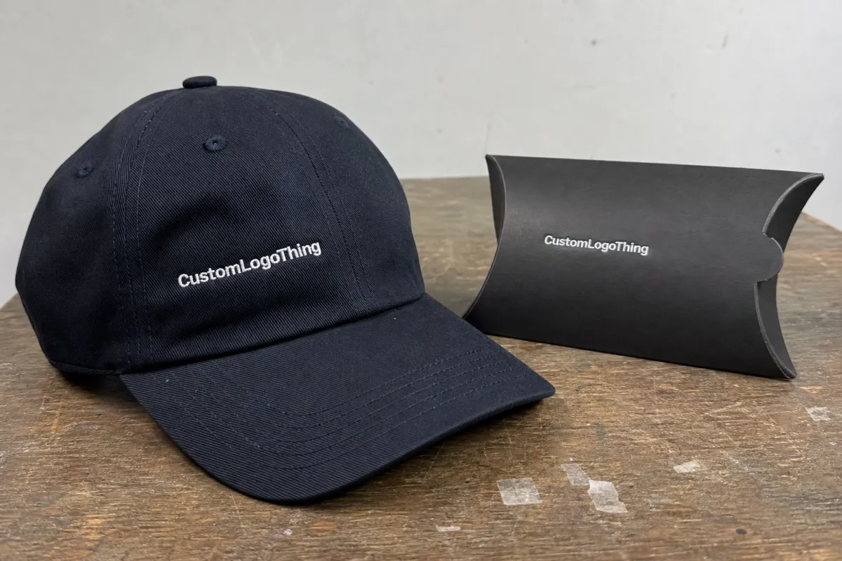
If you already think about branded boxes, inserts, and retail packaging as a system, hats should be handled the same way. The object matters. The surface matters. The placement has to match the structure that carries it.
Why logo placement changes the whole order
The usual placement zones are front center, front left, side panels, back, under brim, and strap area. Each one has a different visual purpose. Front center is the most readable from a distance and usually the easiest place to create strong brand recall. Side placements feel quieter and more premium. Back placements work well for secondary marks, sponsor IDs, or event-specific details. Under-brim graphics and strap tags are specialty choices, not default options.
custom promotional Hats Logo Placement influences three buyer priorities at once: visibility, comfort, and repeatability. A large logo may look strong in a mockup, but if it sits too close to the seam or wraps across a curved front panel, the result can warp. A smaller side mark may be less visible in photos, but it can make the cap feel more refined and less promotional. The placement choice is not cosmetic only. It determines how the hat will perform in real use.
Placement also controls the technical path. Front embroidery on a structured cap often moves quickly because the crown shape is predictable and the stitch field is straightforward. Shift the same logo to a low-profile front or a curved side panel, and the artwork may need to be simplified, re-digitized, or moved to a different decoration method altogether. That means more proof cycles and more chances for revisions.
There is also the question of consistency across reorders. A placement that barely clears a seam on one production run may not sit identically on another blank if the crown shape changes. Buyers who order hats as part of a larger uniform or packaging program usually feel this difference faster than first-time shoppers. Reproducibility matters as much as visual appeal.
Lock the placement before production starts. Changing the logo from front center to a side panel after proof approval is how small orders turn into slow orders.
Decoration methods and the placement limits they create
The decoration method should follow the hat, not the other way around. That sounds obvious, yet many quote problems start with a buyer selecting embroidery first and only later discovering that the artwork is too detailed, too wide, or too tall for the chosen cap. Hats have seams, vents, crown curves, and closure hardware. Those features reduce usable space far more quickly than most people expect.
Embroidery remains the most common option because it is durable, familiar, and usually cost-effective for standard promotional runs. It works best on structured caps with enough front depth to hold a clean logo. The limits show up fast: tiny text fills in, thin lines disappear, and art that crosses a seam can look uneven. In practical terms, logos with very fine serif text or tiny symbols usually need simplification before digitizing.
Woven patches and printed patches are useful when the artwork is too detailed for direct stitching. They preserve small text better and can hold sharper edges than embroidery. Leather patches give a rugged, premium feel, but they are not good for dense copy or intricate linework. Rubber patches add dimension and strong contrast, though they need enough flat surface area to sit properly. Direct print can work on some performance caps and soft crowns, but abrasion resistance and fabric texture become real concerns.
Hat structure changes the recommendation. A six-panel structured trucker cap usually allows a larger front mark than a low-profile five-panel hat. Unstructured Dad Hats, because of their softer front panel, often need smaller artwork and a simpler shape. Beanies typically work better with compact embroidery or a woven patch because the fabric surface does not support large rigid graphics. Performance caps can accept print or low-profile decoration, but the coating, stretch, and moisture management of the fabric limit the options.
| Method | Best placement | Typical limits | Common use case | Typical price impact |
|---|---|---|---|---|
| Embroidery | Front center, small side mark | Seams, fine text, dense detail | Team hats, promotions, uniforms | Lowest setup cost; price rises with stitch count |
| Woven patch | Front panel, side panel | Needs a reasonably flat surface | Detailed logos, sharp typography | Moderate setup; good for smaller text |
| Leather patch | Front center | Not ideal for tiny copy | Retail merch, premium giveaways | Tooling or laser prep can raise cost |
| Rubber patch | Front, side, low curve areas | Needs enough placement space | Outdoor brands, bold logos | Higher than embroidery; depends on mold or die use |
| Flat-ish panels, specialty blanks | Curve, abrasion, wash resistance | Performance caps, short-run graphics | Varies widely with method and artwork size |
For buyers comparing hat decoration with packaging programs, the lesson is the same: the cheaper-looking option is not always the cheaper invoice line. A simple front stitch may be more economical than forcing a complicated patch or oversized embroidery onto the wrong cap. The place where the logo sits can save money if it reduces setup and keeps the decoration method realistic.
Material specs matter too. Cotton twill behaves differently from polyester foam-front truckers, and acrylic knit behaves differently from brushed cotton dad hats. A cap with a stiffer front panel usually supports denser embroidery. A softer crown needs more restraint. When a supplier asks for the blank style before quoting, that is not an extra question. It is the question that determines whether the logo will actually fit.
Cost, pricing, and MOQ factors for decorated caps
Pricing for hats is driven by more than quantity. Stitch count, color count, setup labor, patch tooling, placement complexity, and sample approvals all affect the quote. If you are asking for multiple placement options on the same order, expect the unit price to rise because each additional location adds labor and inspection time. Even a small second mark can change the production schedule.
Basic front embroidery on a common blank usually lands in the lower price range because digitizing is straightforward and the run can move quickly once the proof is approved. Side placement, back placement, or multi-location decoration increases labor and makes alignment more important. Patch programs often require separate prep work, which can include cutting dies, laser work, adhesive backing, or mold setup. Those costs are easy to miss if you are only looking at the per-piece number.
Typical budget ranges for a standard promotional order often look like this, though volume and blank choice matter a great deal:
- Simple front embroidery: about $2.00-$5.00 per cap at moderate quantities, plus digitizing if needed.
- Woven or printed patch: about $3.00-$7.00 per cap, depending on patch size and attachment method.
- Leather or rubber patch: about $3.50-$8.50 per cap, especially if tooling or specialty finishing is involved.
- Extra placements: often $0.75-$2.50 more per cap, depending on the second location and production method.
Minimum order quantities move with the decoration method. A simple embroidery job may start at 24 or 48 pieces if the blank is stock and the artwork is clean. A custom patch order can start at 50 or 100 pieces if tooling, setup, or special materials are required. If you mix hat styles in the same order, the MOQ can climb again because the factory has to manage separate machine setups and proof paths. That is usually where a buyer thinks the quote is expensive, when the real issue is that the order contains multiple production problems.
Common budget leaks are easy to identify. Too much detail in the logo increases digitizing time. Extra placement zones add labor without adding much brand value. Rush timelines built on incomplete specs force everyone to work around missing information. The price does not rise because someone wants it to. It rises because each added complication takes time, and time is part of the manufacturing cost.
For larger programs, consistency is worth more than squeezing the lowest possible unit price. A cap that is repeated cleanly across a company rollout or event campaign is more valuable than a slightly cheaper version that shifts from batch to batch. That is true for packaging too, but hats expose the issue faster because the logo sits on a curved, visible surface that people notice immediately.
Workflow from artwork to approved proof
A solid workflow saves time and prevents placement mistakes. The usual sequence is straightforward: artwork cleanup, placement mockup, digitizing or tooling, proof approval, production, inspection, and packing. If one of those steps is rushed or skipped, the problem usually returns later as a delay, a rework, or a mismatch between the mockup and the finished cap.
Simple embroidery moves fast when the logo file is vector and the placement is obvious. Patch work takes longer because the supplier may need to confirm edge finishing, backing type, size, and attachment method. If the artwork is complex, expect at least one round of adjustments before approval. That is not a bad sign. It is what prevents a poorly scaled logo from being stitched or pressed into the wrong area.
Lead times are usually realistic in these bands:
- Simple embroidery: often 7-12 business days after proof approval if blanks are in stock.
- Patch orders: often 10-18 business days, depending on patch type and attachment method.
- Custom molded or specialty patch work: often 2-4 weeks, especially if tooling or sample approval is required.
Delays usually come from a small set of issues. The buyer changes placement after the proof stage. The hat color is backordered. The logo file is a low-resolution JPG instead of a vector file. The requested text is too small for the chosen method. Or the buyer asks for one more revision after approving the original layout. Each issue is understandable on its own. Together, they can easily add days to the order.
The fastest path is simple: pick the placement first, then request the proof on the exact blank style. If the hats are part of a broader branded kit, keep the cap art aligned with labels, inserts, or any packaging components that will travel with it. A mismatched system is easy to spot once the pieces are in hand.
A good proof answers one question clearly: does the logo sit where the buyer expects it to sit on the exact hat style being ordered?
How to choose the right placement by hat style and audience
Hat style changes the best placement. A trucker cap usually gives a visible front panel and enough crown height for a bold logo. A dad hat is softer and lower, so the artwork often needs to be smaller and more restrained. Snapbacks can handle a stronger front mark. Beanies usually work better with a compact front embroidery or a woven patch because there is less structure to hold larger graphics. Performance hats reward light decoration that does not interfere with the fabric.
The audience matters just as much. Giveaway hats need instant recognition, which usually means a more visible front placement. Staff hats may benefit from a smaller mark that feels cleaner and less promotional. Retail or resale programs often respond better to restraint because finish quality matters more than raw size. A side placement can make a cap feel more expensive than a large center logo if the rest of the execution is tight.
Think about how the hat will actually be seen. At events, people usually read the logo head-on and at a distance. In uniforms, the cap may be visible in profile while the wearer is moving. In social photos, contrast can matter more than absolute size. Outdoor use adds durability into the equation, which makes patch choice and thread choice more important than the mockup might suggest. A placement that works in a studio render can look tired quickly if the material was the wrong match.
A practical decision path helps keep the order grounded:
- Define the brand goal: loud promotion, subtle identity, or retail-ready polish.
- Set the budget range before you choose the decoration method.
- Choose the hat structure that can physically support the artwork.
- Match the artwork complexity to the decoration method.
- Finalize the placement only after those four decisions are settled.
That order prevents Custom Promotional Hats logo placement from becoming guesswork. The mistake buyers make most often is asking for a large logo first and solving the cap later. Once the hat style changes, the logo may need to shrink, move, or lose detail. Planning in the right sequence avoids that disappointment.
Mistakes that make branded hats look cheap
The most common mistake is placing artwork too close to seams, vents, or sharply curved crown edges. Distortion is almost guaranteed there. The logo may look fine in a flat file and still fail once it meets the cap’s actual geometry. A clean proof on the wrong area is still the wrong area.
Fine text causes another issue. Tiny taglines, stacked slogans, and thin icons often collapse once converted to embroidery or a small patch. Buyers like to fit everything into one decoration zone because they want maximum messaging. The cap usually punishes that approach. It has limited space and even less patience for overdesign.
Color contrast matters more than many people expect. Dark thread on a dark cap can disappear from a few feet away. Light-on-light can flatten the design until the logo reads as texture instead of branding. This is one reason good packaging design relies on hierarchy and contrast. Hats follow the same rules, just with more curvature.
Other mistakes worth avoiding:
- Using a generic hat preview instead of the exact cap style in the proof.
- Choosing a placement that disappears when the hat is worn normally.
- Adding a second placement just because there is empty space.
- Approving artwork before checking stitch count or minimum line thickness.
- Ignoring how cap color changes the visibility of the logo.
If a supplier does not show the logo on the exact blank, ask for that revision before approval. A generic mockup can hide issues with crown height, panel shape, seam alignment, and true size. One extra proof round is usually cheaper than redoing an order that looked better on screen than on fabric.
What to send before asking for a quote
Send one primary placement and one backup option. That makes quoting cleaner because the supplier does not have to guess what you mean by “a small logo on the side.” If you are open to either front center or left panel, say so clearly. If you only want one location, say that as well. Ambiguity slows down the estimate and often leads to a proof that reflects the wrong assumption.
To get a useful quote, include these details:
- Logo file: vector preferred, or the highest-resolution file available.
- Hat style: trucker, dad hat, snapback, beanie, performance cap, or a specific blank.
- Quantity: exact count, not a rough estimate.
- Deadline: the date the hats must arrive, not the date that sounds convenient.
- Decoration method: embroidery, patch, print, or open for recommendation.
- Color standards: Pantone references if brand accuracy matters.
If you want to compare options, ask for side-by-side mockups across embroidery, patch, and print. That makes the tradeoffs visible: texture, visibility, price, and fit. The difference is easier to judge when all three are shown on the exact cap style instead of in abstract terms. Buyers make better decisions when the mockup behaves like the real object.
Before approval, confirm proof timing, lead time, and re-order terms. Ask whether the same placement can be repeated on future runs without a new setup charge. If the order also includes labels, mailers, or event kits, keep the visual system consistent across the pieces. Good branding should read as one program, not as a collection of disconnected parts.
custom promotional hats logo placement works best when it is treated as a production decision first and a design preference second. The right placement fits the hat structure, matches the decoration method, and keeps the quote honest. That is how buyers end up with cleaner proofs, fewer surprises, and caps that actually support the brand instead of competing with it.
What is the best logo placement on custom promotional hats for visibility?
Front center is usually the most visible placement because people read it head-on. Side or back placement works better if the brand wants a cleaner, quieter look. The right answer depends on how the hat will be worn and where viewers will see it most.
Does custom promotional hats logo placement affect price?
Yes. Placement changes setup time, labor, stitch count, and proofing complexity. Smaller side or back placements may cost more per piece if they require extra precision, while a simple front decoration is often the easiest and most cost-effective starting point.
Which hat styles limit logo placement the most?
Low-profile, unstructured, and seam-heavy styles usually limit size and placement options the most. Structured trucker caps and snapbacks often give more room for front decoration, while beanies and soft crowns generally need smaller artwork or a more flexible decoration method.
How long does the logo placement process take?
If the artwork is ready, mockups and proofing can move quickly. Production time depends on the decoration method, quantity, and whether blanks are in stock. Rush orders are possible, but late placement changes can add time fast.
What should I send for a fast quote on custom promotional hats?
Send the logo file, hat style, quantity, deadline, and preferred placement. Include color references and specify whether you want embroidery, a patch, or print. Clear specs reduce back-and-forth and help the supplier quote accurately.
Good logo placement is not about making the logo the biggest thing on the cap. It is about making the logo fit the cap, the audience, and the budget without creating avoidable production problems.

