Buyer Fit Snapshot
| Best fit | Custom Stand Up Pouches Branding projects where brand print, material claims, artwork control, MOQ, and repeat-order consistency need to be specified before quoting. |
|---|---|
| Quote inputs | Share finished size, material target, print colors, finish, packing count, annual reorder estimate, ship-to region, and any compliance wording. |
| Proofing check | Approve dieline scale, logo placement, barcode or warning zones, color tolerance, closure strength, and carton packing before bulk production. |
| Main risk | Vague material claims, crowded artwork, missing packing details, or unclear freight terms can make a low unit price expensive after revisions. |
Fast answer: Custom Stand Up Pouches Branding: Film, Print, MOQ, and Carton Packing should be specified like a repeatable production item. The safest quote records material, print method, finish, artwork proof, packing count, and reorder notes in one written spec.
Production checks before approval
Compare the actual filled-product size with the drawing, then confirm tolerance on folds, seals, hang holes, label areas, and retail display edges. Reserve space for logos, QR codes, warning copy, and material claims before decorative graphics fill the panel.
Quote comparison points
Review material grade, print process, finish, sampling route, tooling charges, carton quantity, and freight assumptions side by side. A quote is only useful when the supplier can repeat the same color, closure quality, and packing count on the next order.
Custom Stand Up Pouches Branding: How to Win the Shelf
custom Stand Up Pouches branding can look simple on paper. One quote shows a clean pouch, a nice finish, and a price that is only a little higher than a plain stock option. The real test happens on shelf, in a product thumbnail, and in the customer’s hand. A plain pouch can protect the product. A branded pouch has to protect the product and earn attention at the same time.
That is why Custom Stand Up Pouches branding matters so much for retail, ecommerce, and subscription programs. The pouch is often the first physical touchpoint a shopper has with the brand, so it has to carry identity, product information, and enough visual clarity to make the purchase feel easy. If the artwork is muddy or the structure feels off, the product gets skipped before it gets understood.
For Custom Logo Things, the practical goal is straightforward: make custom Stand Up Pouches branding print cleanly, hold up in production, arrive on schedule, and stay inside budget without losing the purpose of the package. That takes a clear read on structure, print method, finish, minimum order quantity, and the details that shape the final build. It also takes discipline about where to spend money and where to keep the spec lean.
What Custom Stand Up Pouches Branding Actually Changes
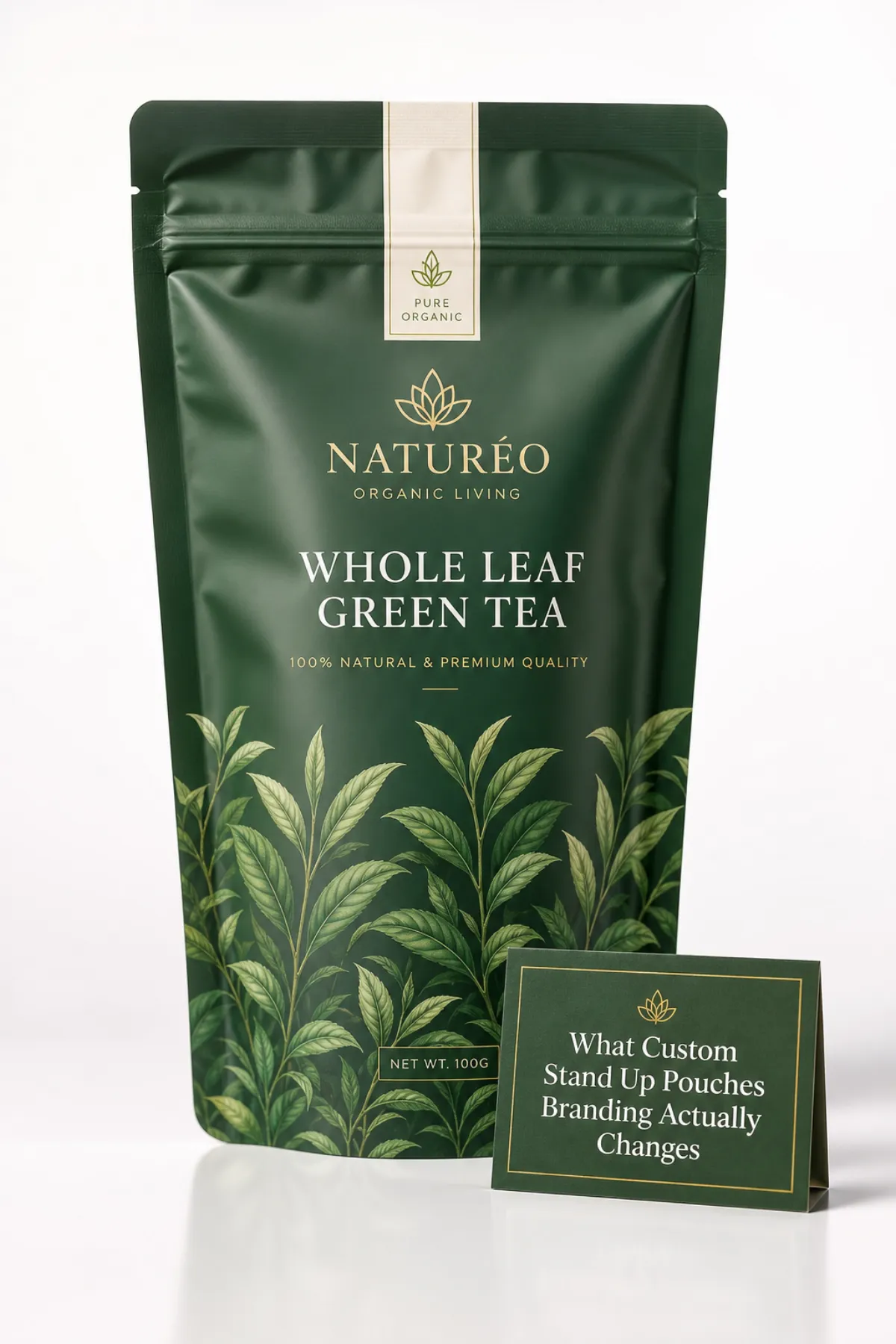
custom stand up pouches branding changes more than the front panel artwork. It changes the way the package feels, how quickly a shopper understands the product, and whether the pouch reads like a real brand asset or just another flexible bag in a crowded category. The pouch becomes part structure, part sales tool, and part memory cue, which is a lot to ask from one format.
Most customization starts with the basics: front and back panels, side gussets, zipper choice, tear notch placement, window size, surface finish, and special effects such as spot UV, metallic ink, or matte lamination. Those choices can build a strong packaging system without making the design noisy. For some brands, the graphics carry the story. For others, the structure itself does a lot of the heavy lifting.
A coffee pouch with a degassing valve signals a different set of expectations than a collagen pouch or a granola snack pouch. Shelf life, barrier performance, and category cues all live inside the structure before the shopper reads a word. That is why custom stand up pouches branding is not just about making something attractive. It is package design tied directly to product performance and brand perception.
Shoppers move quickly. On a crowded shelf, they notice color, product type, and brand name long before they study the details. The same behavior shows up online, where the pouch often appears as a small thumbnail among dozens of choices. Strong custom stand up pouches branding helps the product read clearly in both places. Weak branding blends into the background and leaves the sale to someone else.
From a packaging buyer’s point of view, the pouch often needs to do several jobs at once:
- Communicate the product type quickly
- Differentiate flavors or variants
- Support a premium price point
- Build trust and signal quality
- Improve the unboxing experience
That last point carries more weight than many teams expect. A crisp, well-made pouch inside a shipper can make a smaller brand feel more intentional than custom printed boxes with uneven artwork. I have seen pricey boxes underperform because the product packaging inside felt generic. The entire presentation matters, not just the outer carton.
Practical rule: if the pouch does not make sense from three feet away, the design is not finished. It is only decorated.
Brands comparing formats often benefit from reviewing pouches, labels, cartons, and hybrid options together. If you are building a broader line, it can help to review Custom Packaging Products alongside the pouch plan, and check Case Studies for examples of how package branding carries across multiple SKUs.
How Custom Stand Up Pouches Branding Is Produced
custom stand up pouches branding begins long before ink touches film. Production normally starts with a dieline, the flat layout that marks trim, seal areas, zipper placement, bottom gusset dimensions, and safe zones for copy. If the layout ignores the fold and seal areas, the finished pouch is gonna show it. That is not a printing flaw. It is a planning flaw in the artwork.
The typical production path looks like this:
- Project brief and sizing
- Dieline setup and artwork placement
- Quote and material selection
- Proof review and corrections
- Sample or preproduction approval
- Printing, laminating, and curing
- Conversion into finished pouches
- Inspection, packing, and freight
The sequence is easy to list and harder to execute without issues. File prep is usually where trouble begins. Fonts need to be outlined or embedded, image resolution needs to be high enough for production, and colors have to match the chosen print method. A file can look polished on a monitor and still fail once it reaches the press if the barcode sits too close to a fold or the layout crosses a seal line.
custom stand up pouches branding also depends on the material structure, and this is where specs get vague too often. They should not. The substrate affects feel, print quality, and barrier performance. A few common structures:
- Kraft laminate: warm, natural, and often chosen for organic, snack, or wellness products
- Clear film: useful when the product itself should remain visible
- Metalized film: offers strong shelf presence and solid barrier performance at a moderate cost
- Aluminum foil laminate: suited to products that need maximum barrier protection
- Recyclable mono-material: useful when sustainability claims need a more practical material story
Barrier performance matters more than many buyers realize. Oxygen and moisture barriers affect shelf life, aroma retention, and flavor stability. Coffee, powdered supplements, dried fruit, and pet treats do not all belong in the same construction. Some products do well with PET/PE or kraft/VMPET/PE. Others need a higher barrier spec. The right pouch is not the one that sounds premium in a meeting. It is the one that fits the product.
Print method changes the economics and the pace of the job. Digital printing works well for shorter runs, frequent design updates, and faster proof cycles. Flexographic printing is usually more cost-effective at higher volumes when the artwork stays stable. Gravure belongs in very large programs where the tooling and volume support the investment. Each method changes color consistency, lead time, and unit cost, and each one changes how custom stand up pouches branding reads on the final shelf.
Finish is where the brand tone becomes visible. Matte feels quieter and more refined. Gloss pushes color harder and usually looks louder under store lighting. Soft-touch lamination adds a tactile premium feel, while spot UV can create contrast without turning the entire pouch shiny. Used with restraint, those choices can make a modest product feel much more considered.
For buyers who want more technical grounding, the broader packaging industry has useful material references at packaging.org, and FSC guidance is helpful if paper-based components or certified fiber are part of the spec at fsc.org.
Design Factors That Make Custom Stand Up Pouches Branding Work
custom stand up pouches branding only works when the design fits the audience and the category. A coffee pouch should not borrow the visual language of a protein pouch unless the brand is intentionally breaking category expectations. A wellness pouch should not look like candy packaging unless the product truly belongs there. The best design starts with the shopper’s mental shelf, not the designer’s mood board.
Visual hierarchy comes first. The brand name should usually lead, followed by product type, then flavor, formula, or benefit claim. If every element tries to shout at once, the message falls apart. One of the oldest packaging problems is still the most common: too many messages and no clear order. Strong custom stand up pouches branding feels controlled, not crowded.
Color choices deserve more scrutiny than they often get. Bright contrast helps from a distance. Consistent brand colors build recognition across variants. Muddy palettes may look stylish on a laptop, yet they can disappear under store lighting or lose clarity when reduced to a thumbnail. A pouch can look premium on a PDF and still feel kinda flat once it is printed. For retail packaging, the right question is not whether the palette feels artistic. The real question is whether the shopper can recognize the product in a quick glance.
Physical constraints also shape the outcome, and no amount of creative enthusiasm can change them. Seal zones need space. Zippers have a real footprint. Bottom gussets can swallow artwork if they are ignored. Barcodes need contrast and quiet space. Legal text, ingredient statements, recycling notes, and compliance language cannot be treated like filler just because the front panel is running out of room. That is how brands end up paying for reprints.
Good custom stand up pouches branding also has a voice. Some brands should sound technical and precise. Others should feel natural, friendly, and grounded. A few can be playful. The important part is consistency. Typography, icon style, copy tone, ingredient story, and finish should all point in the same direction. If the pouch says clean and minimal, the copy says premium and clinical, and the color palette says budget snack, the shopper feels the mismatch immediately.
Here is a practical checklist I use for packaging review:
- Can the brand be read in two seconds?
- Does the product type stand out clearly?
- Are the variants easy to tell apart?
- Is the typography legible at thumbnail size?
- Do the materials fit the product category?
- Are the claims supportable and compliant?
That last point is not optional. Labels like organic, recyclable, compostable, or cruelty-free need documentation behind them. Brand trust is part of custom stand up pouches branding, and trust is easier to lose than to build.
If the pouch has to support a premium price, use white space deliberately. Space is not dead area. It gives the design room to breathe. Some of the strongest branded packaging looks expensive because it resists the urge to fill every inch. That restraint often says more than a wall of icons ever could.
Custom Stand Up Pouches Branding Process and Turnaround Timeline
custom stand up pouches branding follows a familiar schedule, but the timeline stays predictable only when the files and decisions are ready before production starts. The first 24 to 72 hours usually go into confirming pouch dimensions, material structure, zipper style, finish, and whether the artwork actually fits the dieline. If something is off, the proof gets revised. If many things are off, the launch date begins to slip.
The fastest projects are the ones where the buyer already knows the pouch size, quantity, and finish requirements. The slow ones are usually the jobs where the brief changes after the proof has already been sent. Delays tend to come from missing copy, low-resolution images, regulatory edits, or late size changes. Printing itself is often not the longest step. Revisions are.
custom stand up pouches branding timelines depend on print method and complexity. A short-run digital order may move from proof approval to shipment in roughly 7 to 12 business days, depending on the supplier and finishing steps. Larger flexo orders often need about 15 to 25 business days after approval. If the job includes special finishes, custom zippers, higher barrier layers, or overseas freight, the schedule stretches. The math is simple, even when it is inconvenient.
For ecommerce brands, transit testing matters just as much as print quality. If the pouches will be packed into shippers and moved through parcel networks, ask whether the packout has been considered against common transit stresses such as drop, vibration, and compression. ISTA testing standards are useful here, especially for shipped product presentations. More on that at ista.org.
Approvals should be treated like a gate, not a formality. The easiest way to miss a launch is to assume a sample is close enough, then discover a barcode issue, a copy correction, or a shade shift after production has started. A one-day delay at proof stage can turn into a week once print slots, lamination, and freight are in motion. custom stand up pouches branding rewards organized buyers and punishes the “we can fix it later” mindset.
Rule of thumb: approve the proof only after checking the dieline, copy, barcode, finish, and SKU naming together. Not one at a time. Together.
If a launch is tied to retail dates or subscription calendars, build in buffer time for sample review and revisions. Two to five extra business days is a realistic cushion for many mid-complexity projects. Highly regulated products need even more breathing room. Packaging has a way of ignoring the calendar.
Custom Stand Up Pouches Branding Cost, MOQ, and Quote Drivers
custom stand up pouches branding pricing depends on more variables than most buyers expect. Material type, pouch size, print method, number of colors, finish, zipper style, barrier level, and special effects all influence the final quote. Two pouches that look nearly identical from across a conference table can land at very different unit costs once the spec sheet gets opened. Packaging likes hidden variables. It is an expensive habit.
MOQ, or minimum order quantity, matters because setup costs are spread across the run. Small runs usually carry a higher unit price. Larger runs usually bring the cost down. That is not a trick. That is production math. Digital printing often starts around 1,000 to 3,000 units for many projects. Flexo usually becomes more cost-effective around 5,000 to 10,000 units and up. Gravure sits higher still. Exact thresholds depend on the supplier and the construction.
For a practical sense of pricing, a short-run digitally printed pouch might land around $0.35 to $0.90 per unit for a standard size, depending on coverage, finish, and barrier structure. A larger flexo run can often come in closer to $0.18 to $0.40 per unit. Add soft-touch lamination, foil effects, unusual zippers, or more demanding materials, and the number rises. custom stand up pouches branding is not cheap or expensive in the abstract. It is spec-dependent.
Below is a simple comparison that helps buyers separate method from myth.
| Print Method | Typical MOQ | Best For | Typical Lead Time After Approval | Watch-Out |
|---|---|---|---|---|
| Digital | 1,000-3,000 units | Short runs, fast launches, frequent artwork changes | 7-12 business days | Unit cost usually stays higher at lower volumes |
| Flexographic | 5,000-10,000 units | Stable SKUs and better volume economics | 15-25 business days | Setup takes longer and revisions cost more time |
| Gravure | 10,000+ units | Very high-volume programs | Often longer than flexo | Higher tooling commitment and less flexibility |
Where people overspend is usually clear once the project is finished. They choose a premium structure for a commodity product, add several special finishes where one would have done the job, or revise the layout after quote approval and trigger a new production path. Some teams also design a barcode-friendly panel and then decide to cover it with a large decorative block. That one never gets less frustrating.
To quote accurately, a supplier needs enough information to avoid guesswork. Send the pouch dimensions, product weight, quantity, material preference, finish preference, zipper style, window requirements, barrier needs, artwork status, barcode needs, shipping destination, and launch date. Without those details, the quote is little more than a placeholder with a logo.
Here is the budgeting rule I recommend: decide which part of the pouch sells the product best, then spend there first. If the brand sells through color, protect color. If tactile feel drives the premium perception, invest in finish. If shelf differentiation depends on the structure, pay for the right material. Do not scatter the budget across hidden details that nobody will notice.
custom stand up pouches branding should be planned with commercial reality in mind. If the forecast says 4,000 units and the MOQ sits at 10,000, that mismatch needs attention early. Either the run size changes, the spec changes, or the launch plan changes. One of those has to move. Packaging does not respond to optimism.
Common Custom Stand Up Pouches Branding Mistakes to Avoid
custom stand up pouches branding fails most often because the design tries to say too much. Too many claims. Too many icons. Too many adjectives. The result is a pouch that asks the shopper to do homework in the aisle. They will not. They will move on to something easier to understand.
Another common problem is ignoring the technical side of the layout. Artwork that crosses a seal line can distort or disappear. Tiny copy may look acceptable in a file and vanish in print. Colors can shift once matte or gloss finish enters the picture. Barcodes placed too close to a curve may scan poorly. These are not rare edge cases. They show up constantly when design and production are not talking to each other.
Usability matters too. A beautiful pouch that is hard to open, hard to reseal, or awkward to store creates frustration after the sale. That frustration does not stay private. It shows up in reviews, returns, and customer service messages. In branded packaging, the post-purchase experience matters just as much as shelf appeal. The unboxing experience starts before the box opens and continues through first use.
custom stand up pouches branding also suffers when production planning gets left until after approval. That delay can force rushed reprints, expensive freight, or compromised specs. If the launch window is fixed, the production calendar needs respect from day one. There is no reward for improvising under pressure.
Credibility mistakes can damage trust the fastest. If the pouch says premium, organic, recyclable, or cruelty-free, the supporting documentation should already exist. Not later. Now. Buyers and retailers are more careful than they used to be, and consumer scrutiny is not getting lighter. If a claim cannot survive a quick audit, it should not be on the pouch.
It also helps to think about the brand system rather than a single SKU. If the first pouch looks strong but the flavor extensions do not follow the same rules, the shelf turns messy fast. Product packaging works best when the whole series feels related. Variant planning belongs inside package branding, not as an afterthought.
For teams comparing pouch decisions against other formats, reviewing Custom Packaging Products and Custom Labels & Tags can help keep the visual system consistent across the range. Pouches do not live alone in the aisle. They have neighbors.
Expert Tips and Next Steps for Better Custom Stand Up Pouches Branding
custom stand up pouches branding gets stronger when the design is checked three ways: zoomed out to shelf distance, reduced to thumbnail size, and reviewed at actual print size. If the pouch works in all three views, the design is on solid ground. If it only works on a large monitor, the shelf will expose it quickly.
A variant system should be built early, not patched together after launch. Flavor, scent, formula, and size changes need a clear visual logic so the line can grow without turning into a mess. A controlled color family, a stable type hierarchy, and a few repeatable layout rules keep the system readable as SKUs expand. That is how strong branded packaging scales without becoming a design argument every quarter.
I also recommend asking for a sample pack or printed proof before committing to full production, especially when finish or color accuracy matters. Matte and gloss do not behave the same way. Metallic films can shift nearby ink. Soft-touch changes the feel in a way that is hard to judge from a PDF. A sample costs far less than a warehouse full of pouches that look wrong in daylight.
For the handoff, keep the checklist blunt:
- Final copy approved
- Dieline confirmed
- Barcode file tested
- Required claims documented
- Approved colors or references shared
- Quantity and ship date locked
That checklist sounds basic because it is basic. Basic is good. Basic is how custom stand up pouches branding avoids expensive confusion. The more polished the product needs to feel, the more disciplined the setup has to be. Fancy finishes do not fix sloppy coordination.
The practical takeaway is simple: lock the pouch structure before you polish the artwork. Size, barrier, closure, finish, and claim language should be settled together, because custom stand up pouches branding only works cleanly when production, compliance, and design are speaking the same language. If those decisions are made early, the pouch has a real shot at doing its job instead of just looking busy.
If you are comparing launch paths, compare at least two or three quotes, inspect one physical sample, and make sure the MOQ fits the forecast instead of the fantasy. That is the cleanest way to move custom stand up pouches branding from concept to production without drama. The pouch should help sell the product, not create a small administrative disaster. And that sort of trouble happens more often than most teams admit.
How does custom stand up pouches branding help a product stand out?
custom stand up pouches branding gives the product a fast, recognizable shelf identity, which matters when shoppers are scanning rows instead of reading long copy. The strongest designs improve clarity first and decoration second, so the buyer can tell what the product is, why it matters, and whether it deserves a closer look.
What should I include in a custom stand up pouch branding quote?
Send pouch size, product weight, quantity, material preference, finish, zipper style, and whether you need a window or a high-barrier film. Include artwork status, required claims, barcode needs, shipping destination, and your target launch date so the quote has real value. That is how custom stand up pouches branding stops being a guessing game.
How long does custom stand up pouches branding usually take?
Simple digital jobs can move quickly after artwork approval, while larger or more complex runs need more time for setup, production, and shipping. The real delay usually comes from revisions and approvals rather than printing itself, so finalize copy and dieline details early. custom stand up pouches branding moves fastest when the buyer stays organized.
Which finish works best for custom stand up pouches branding?
Matte usually feels more premium and calm, while gloss pushes color harder and tends to look louder on shelf. If you want a high-end look without overdoing it, combine a soft base finish with a small accent treatment instead of covering the whole pouch in effects. That balance often works better for custom stand up pouches branding than trying to make every square inch shout.
What are the biggest mistakes in custom stand up pouches branding?
The biggest misses are overcrowded layouts, weak contrast, unreadable text, and artwork that ignores seal zones or barcode placement. Another expensive mistake is approving a design before checking a real sample, because what looks great on screen can still print poorly. In practice, custom stand up pouches branding fails more from poor planning than from bad printing.

