Custom Wine Paper Bags Logo Placement Guide for Buyers
A custom wine Paper Bags Logo Placement guide sounds straightforward until the first proof comes back and the mark is sitting half a centimeter too high, almost kissing the handle cutout. On a screen, the bag looks generous. In production, the top fold, seams, gussets, and handle reinforcement start claiming space that the mockup never warned you about.
That gap between concept and construction is where most problems happen. Wine bags are carried upright, held at arm's length, set on counters, and photographed in motion. Placement changes what people notice first. It also changes whether the bag reads as premium packaging or a rushed print job.
Buyers often focus on paper stock or foil color before they settle the placement. That order is backward. The right position gives the logo room to breathe, protects legibility, and keeps the design from fighting the bag's structure. Once that is right, the print method and finish become much easier to choose.
This article is built for practical buying decisions: where the logo should go, how bag structure limits the usable space, what the print method does to the artwork, and where pricing starts to move. It is also built around the small checks that prevent expensive mistakes. That is usually where the savings are.
Where the Logo Sits: Front, Back, Side Gusset, and Bottom
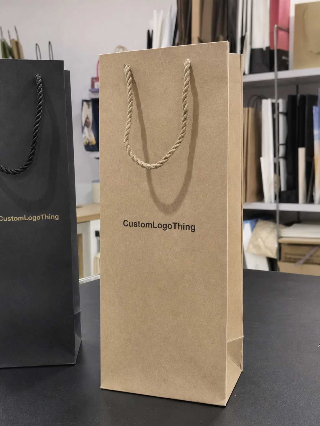
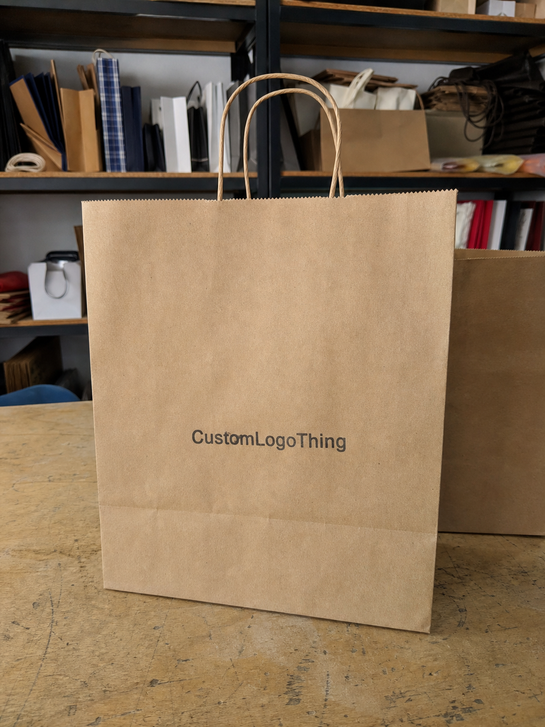
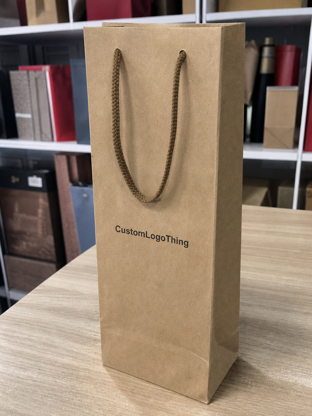
For most wine bags, the front panel is the main branding surface. It is the first thing visible when the bag is carried and the strongest place for brand recognition in retail, tasting-room, and gift settings. On a single-bottle carrier, the printable area often feels smaller than expected once you remove the safe zones around the top fold and handles. On two-bottle bags, the front panel is wider, but the extra width does not mean the logo should simply grow without restraint. A stretched mark can feel clumsy fast.
The back panel is useful when the front needs to stay clean. It can hold a website, short tagline, event name, or a secondary mark. That works especially well when the bag already carries a strong front logo and the buyer wants a quieter, more polished look. The back can also carry compliance text or a simple supporting message, but only if it does not crowd the structure.
Side gussets are often overlooked, yet they can carry a narrow logo, monogram, vertical wordmark, or repeating icon with good visibility. In real use, gussets can be seen more often than the back panel because the bag shifts while it is being carried. For brands that want their packaging to read from several angles, gussets are worth considering early.
The bottom panel is usually a poor branding location. Most shoppers never see it, and the panel also takes the most stress from weight and handling. Detailed art there tends to be wasted. If the only place a logo fits is the bottom, the layout is not ready.
If the logo sits too close to the handle die-cut or folds into a seam, the bag stops feeling designed and starts looking accidental. That is usually the first sign the artwork needs a true dieline check.
A workable order of priority is simple: front panel first, back panel second, gusset third, bottom last. That hierarchy keeps the design honest and gives you a cleaner proof conversation with the supplier.
Bag Specs That Control Placement: Size, Structure, and Print Method
A custom wine paper Bags Logo Placement guide only works if it matches the actual bag spec. Size matters more than buyers expect. A one-bottle bag and a two-bottle bag do not share the same safe zone, even if the front panels look similar at a glance. Handle span, gusset depth, and the fold geometry all reduce printable room. As a rough planning range, a single-bottle carrier often leaves about 90-120 mm of comfortable width for a centered mark, while a larger carrier may allow 140-180 mm or more. The dieline decides the final answer.
Structure changes the usable area too. Top folds, reinforcement cards, glued seams, and handle anchors all eat into artwork space. A logo can look balanced on a flat mockup and still drift once the bag is assembled. That is why the proof should always sit on the real template, not on a free-floating rectangle.
Paper choice is part of placement, not just aesthetics. Kraft paper gives a warm, natural look, but it lowers contrast and can make delicate details harder to read. White or coated stocks hold sharp edges better. Matte finishes reduce glare and make the printed shape feel calmer. Gloss can look crisp under bright retail lighting, but it is less forgiving if the artwork is thin or crowded near the edge.
Print method is the other major constraint. Flexo works well for bold, repeatable artwork and larger runs. Screen print gives strong coverage on darker paper but prefers simple shapes. Foil stamping brings a premium feel, though it needs enough stroke width to avoid broken edges. Embossing and debossing add depth, yet tiny type tends to flatten or disappear. Digital print is helpful for shorter runs and more complex art, but the unit price can climb on larger quantities.
Typical artwork tolerances are small. A shift of 3-5 mm can change how the logo sits against a fold or handle opening. That is why file preparation matters so much. Vector art in PDF, AI, or EPS format is usually the safest starting point, and any fine line work should be checked at actual size before approval.
If sustainability claims are part of the pitch, ask about FSC-certified stock. It does not change placement, but it can affect how the packaging is positioned in retail. The certification basics are explained at fsc.org.
Cost, MOQ, and Unit Price: What Changes the Quote
Placement affects cost more than many buyers expect. Larger print areas, multiple logo positions, extra ink colors, and special finishes all raise the production load. That means more setup, more checking, and in some cases more waste during calibration. The quote changes because the process changes.
MOQ changes the math again. When the minimum order quantity is low, the setup cost gets divided across fewer bags, so unit price rises. At higher volumes, the same print setup spreads more efficiently. For rough planning, small runs may land around $0.60-$1.20 per bag, depending on paper, finish, and print method, while larger runs can fall closer to $0.20-$0.45 per bag. Foil, embossing, and heavier paper can push those figures higher.
Special finishes are the usual budget trap. A foil mark can look excellent on a sample card, but it adds a separate setup step and needs careful registration. Embossing and debossing also require precise tooling. Soft-touch coatings, multiple print sides, and heavy paper stock all increase cost. None of those features are wrong; they just need to earn their place.
| Print option | Typical use | Relative cost | Placement impact | Buyer watch-out |
|---|---|---|---|---|
| Flexo print | Bold logos, repeat orders, larger runs | Low to moderate | Best for simple front-panel placement | Fine lines and tiny text can drop out |
| Digital print | Short runs, multi-color art, quick testing | Moderate to high | Good for detailed artwork across one or more panels | Can raise the unit price on bigger quantities |
| Foil stamping | Premium branding, gift packaging, high-contrast marks | Moderate to high | Needs wider strokes and clean spacing | Small text and thin borders can fail fast |
| Emboss / deboss | Texture-driven branding, understated luxury | Moderate | Works best on centered marks with breathing room | Not ideal for detailed logos or tiny copy |
If a supplier asks for bag size, bottle count, paper stock, finish, print sides, artwork complexity, quantity, and delivery destination, that is a serious quote process. If they only ask for a logo file and quantity, expect a rough estimate at best. Buyers who are coordinating multiple items can also compare matching Custom Packaging Products so the wine bag, inserts, and custom printed boxes keep the same visual logic.
Process and Turnaround: Proofs, Sampling, and Lead Time
Production should start with the dieline, not the logo. A good custom wine paper Bags Logo Placement guide begins by locking the print-safe area, bleed, fold lines, handle openings, and seam allowances. Artwork comes after that. If the logo is placed first and the template second, the design will get pushed around later, usually at the most inconvenient moment.
The digital proof is where mistakes are cheapest to catch. Check scale against the actual bag size. Check whether the logo clears the top fold and handle cutout. Check both sides, not only the front panel. A surprising number of approvals go wrong because the buyer looked at one face and assumed the rest matched.
Sampling is worth the time when the bags are used for gifting, launches, tasting events, or premium retail displays. A pre-production sample can reveal a color shift, a stroke that is too thin, or a placement that needs to move 5-10 mm for better balance. That is a small correction on paper and a large savings in reprint costs.
Lead time depends on the print method, quantity, and how quickly proofs are approved. A straightforward run may take around 12-15 business days after approval. Foil stamping, embossing, or custom tooling can extend that. If the artwork goes through multiple revisions, build in extra days. Shipping adds another buffer, especially when the bags are tied to an event date that cannot move.
For shipping durability and secondary-packaging handling, ISTA is a useful reference point. Their testing standards matter most when packaging needs to survive transfer, stacking, and transit before it ever reaches a counter.
Step-by-Step Placement Workflow for a Clean Order
If you want the finished bag to look intentional, treat placement like a production workflow instead of a design preference. This sequence keeps the artwork, price, and timeline in sync.
- Measure the bag - Confirm the exact dimensions, bottle count, print-safe area, and any limits caused by the handle or fold structure.
- Choose the primary face - Decide where the main logo belongs before adding any secondary elements.
- Set the secondary content - Add a URL, tagline, monogram, or event detail only if it earns its space and does not crowd the panel.
- Build vector artwork - Use clean outlines and test the logo at full size. Thin strokes and tight counters often fail in print.
- Mock it up on the actual bag - Review the design at arm's length, because that is the distance most people will see it at.
- Approve the proof only after checking both sides - A clean front panel does not rescue a bad gusset or a logo clipped by the back seam.
For brands that already use consistent branding packaging across tissue, labels, and custom printed boxes, keep the logo treatment aligned. The wine bag does not need to copy every item exactly, but the visual rules should match. That is what makes the package line feel planned rather than assembled from separate orders.
Ask for a proof that shows exact placement coordinates or at least a marked safe zone. If the supplier cannot show where the logo sits relative to the handles and folds, the artwork is still too vague to approve.
Common Mistakes That Make Wine Bags Look Cheap
A custom wine Paper Bags Logo Placement guide is often just a list of traps to avoid. That may sound negative, but it is the fastest way to protect the budget. The same few mistakes keep showing up.
1. Centering by eye. A bag can be technically centered and still look wrong once the fold and handle are in view. Measure from the dieline, not from the mockup viewer.
2. Trying to print too much. Logo, slogan, website, social handle, decorative border, and a small flourish in one layout usually creates clutter. A single strong mark is easier to read and often looks more expensive.
3. Ignoring contrast. Dark ink on dark kraft, or pale ink on textured stock, can disappear quickly. If the brand color is delicate, use thicker strokes, a different stock color, or a stronger print method.
4. Forgetting how the bag moves. A design that looks fine flat may become awkward once the bag is upright and carried. The logo has to read in motion, not only in a still proof.
5. Skipping the back and gusset checks. Seams and fold lines can split artwork or make the logo feel off-center. Both sides should be checked before production is approved.
The logo does not need to shout. It does need to read clearly from a few feet away under ordinary store lighting. Strong placement matters more than decorative excess.
Paper finish also changes perception. Gloss can sharpen the printed edge, but it can throw glare across small details. Kraft has a natural, premium feel, but it asks for bolder art. There is no universal best choice. The right one depends on how the bag will be seen, handled, and printed.
Next Steps: Build a Print-Ready Brief and Final Proof
If you are asking for pricing, send a brief with the bag size, bottle count, paper color, finish, quantity, artwork file, and delivery deadline. Leave out the deadline and the production schedule gets distorted later. Clear input gets a cleaner quote and a more accurate proof.
Vector artwork is still the safest format. Add Pantone or CMYK references if color accuracy matters. If you already have an approved placement style, share that too. Good suppliers can usually show two or three placement options, which makes it easier to compare visibility, cost, and production complexity before you commit.
- Ask for a placement proof with safe zones and handle clearance marked clearly.
- Request a sample if the bags are for a launch, holiday program, tasting event, or retail display.
- Confirm the finish before approval, since foil, embossing, and coating affect how the logo reads.
- Match the look with any other Custom Packaging Products in the order so the packaging system stays consistent.
Once the sample looks right, stop making tiny changes for the sake of motion. That is how deadlines slip and files drift out of alignment. A useful proof should answer three questions cleanly: does the logo read clearly, does it sit in the right place, and does the finish justify the price?
Use this custom wine paper bags logo placement guide as a pre-press checklist before you sign off. That one pass can prevent a bad layout, protect the budget, and keep the bag looking like a deliberate brand choice instead of a rushed add-on.
Where should a logo go on wine paper bags for the best visibility?
The front panel is usually the strongest location because it is the first surface people see when the bag is carried. Keep the logo away from the handle cutout, folds, and seams so it reads clearly from a few feet away.
How do I choose logo placement for a two-bottle wine paper bag?
Start with the full dieline and look for the widest printable front area. Two-bottle carriers usually need a broader balance than single-bottle bags, so test the logo at full size before approving the layout.
Does kraft paper change custom wine bag logo placement?
Yes. Kraft paper lowers contrast and can make fine details harder to read, so the logo often needs stronger strokes and simpler spacing. Thin lines and small text are more likely to fail on textured stock.
What affects the price of logo printing on wine paper bags?
Print size, number of colors, finish, quantity, and whether the design prints on one side or multiple sides all affect the quote. Foil stamping, embossing, and heavier paper stock usually add cost and can extend lead time.
What should I send before requesting a custom wine paper bag quote?
Send the bag size, bottle count, artwork file, quantity, paper color, finish, and delivery deadline. Ask for a proof that shows the exact placement and the safe zones around handles and folds.