Private label buyer OPP Header Bags Logo Placement guide decisions often look easy on a screen and then wobble in production. The header fold steals a little space, the seal band shifts the visual center, the hang hole creates another interruption, and clear OPP makes every small offset more visible than buyers expect. A logo that feels perfectly balanced in a PDF can land slightly high, slightly cramped, or simply too busy once the bag is filled and hanging under store lighting. That matters because the package has a few seconds to sell the product before the shopper moves on.
For a buyer, logo placement is not decoration. It is a production spec that affects proof approval, remake risk, shelf readability, and the consistency of every reorder. The goal is not to make the bag loud. It is to make the brand read cleanly from a short distance, without fighting the product inside or the mechanics of the bag itself.
The best private label orders usually begin with three things: a measured bag spec, a clear front-panel target, and a proof that shows the artwork relative to the real structure, not a floating mockup. If you already manage Custom Labels & Tags for the same line, the same discipline applies here. The file should answer a simple question before production starts: what is fixed, what can move, and what absolutely cannot touch the seal zone?
If the proof does not show distances from the top seal, fold line, and hang hole, the approval is incomplete. A centered-looking mockup is not the same thing as a production-ready placement.
Professional packaging groups such as packaging industry associations can also help internal teams align on terminology before the order is released. That sounds minor. It saves time later.
Private Label Buyer OPP Header Bags Logo Placement Guide Basics
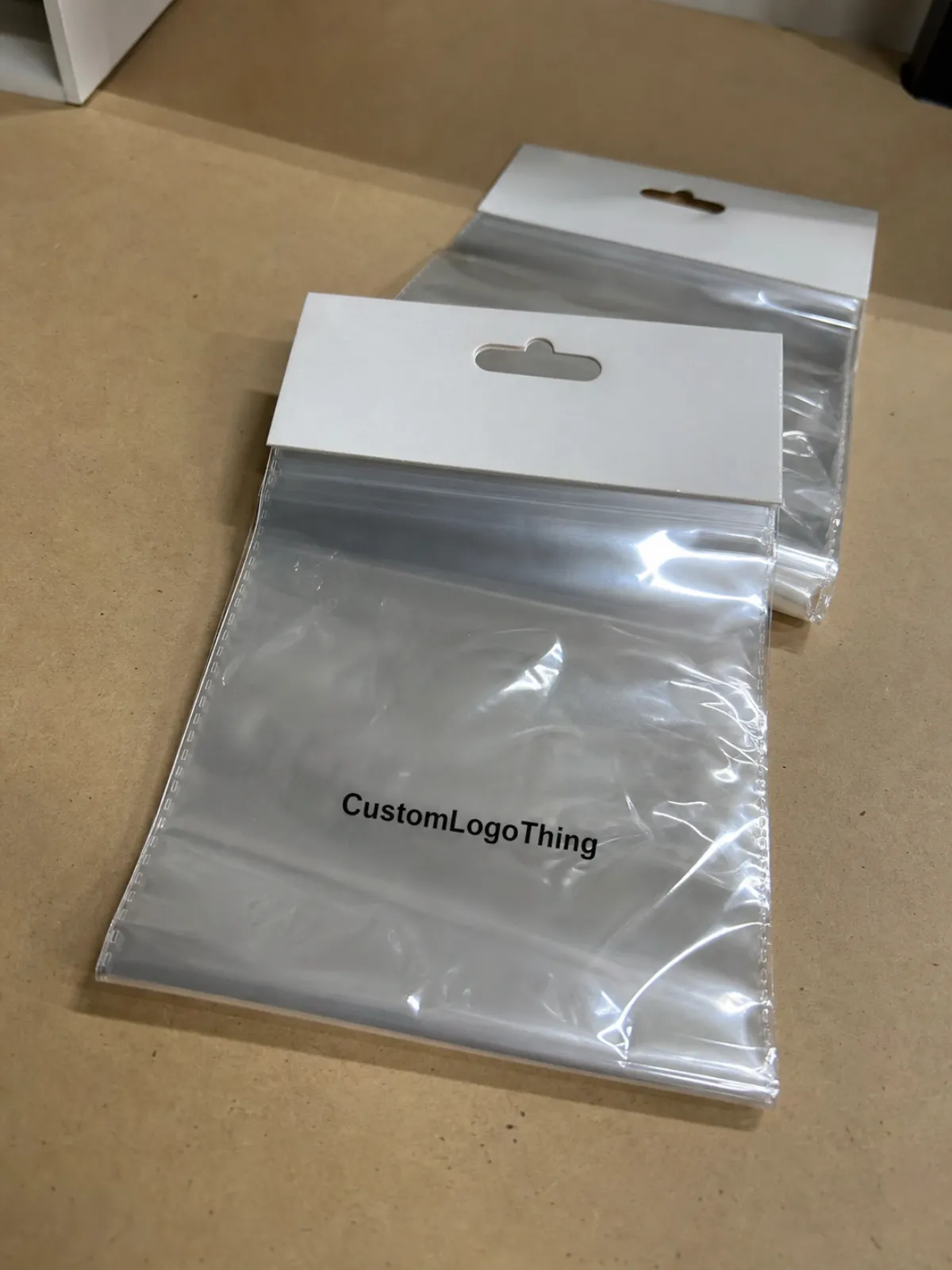
On an OPP header bag, the logo lives inside a structure with hard boundaries. The front panel, header strip, top seal, hang hole, and any side or bottom seal all change how the artwork reads once the bag is manufactured. A mark can appear centered in the art file and still sit too close to the product after filling. It can also look small in isolation and then feel crowded once the header is folded and the bag is hung on a peg.
Clear OPP has one advantage that changes everything: the product remains visible. That visibility helps a brand, but it also leaves no room for sloppy placement. The shopper sees the product, the seal, the hole, and the logo at the same time. If one element is off, the whole pack feels less deliberate. On transparent film, even a few millimeters matter because the eye compares the print to the edges and hardware above it.
That is why the most reliable private label programs treat placement like a manufacturing decision. A buyer who defines a safe zone early gets cleaner proofs, faster approvals, and fewer surprises on press. A buyer who says “center it nicely” usually ends up revisiting the artwork after the first sample.
There is also a practical reason to keep the logo restrained. Most header bags are viewed from a distance of one to three feet on a peg or shelf hook. Fine details disappear quickly. Small type, thin outlines, and stacked copy can look tidy on a monitor but turn weak in retail conditions. A stronger logo block, with more breathing room, often sells better than a busy layout trying to say too much.
Artwork Window, Safe Zone, and Print Registration
The easiest way to plan artwork is to divide the bag into usable and unusable space. The usable area is the part of the front panel that will remain visible after folding, sealing, and filling. The unusable area includes the top seal band, header fold, punch area, heat-seal margins, and any edges likely to shift during manufacture. That usable area is often smaller than buyers expect, especially on compact bags where the header competes with the product for space.
Safe zone rules are practical, not decorative. Keep the logo away from the top edge so a slight press shift does not clip it. Keep small text away from the fold line because folded film can distort letters. Keep thin rules and delicate type out of the seal margin, where heat and pressure can blur edges or flatten detail. If the design depends on exact symmetry, do not place it where the hole punch or header edge will make even a small error obvious.
Registration tolerance matters more on clear film than on opaque packaging. On a carton, a tiny shift can disappear. On OPP, especially with dark ink or narrow lettering, that same shift can look careless. This is why vector artwork is the right starting point and why a proof should show exact offsets, not only a centered icon in a rectangle. The buyer needs to see the logo distance from the top edge, side edges, and any structural interruption before approving the run.
Production teams also need to know how the bag will be used. A lightly filled bag reads differently than a full one. A product with irregular shape pushes against the front panel and changes the visual center. A tall header can make a bag feel more premium, but it also gives the impression of more empty space if the logo is too low. These are small shifts in inches, but on a hook display they change the entire look.
- Use vector files such as AI, EPS, or press-ready PDF so edges stay crisp.
- Request a dieline that shows the front panel, header, seal bands, and hang hole.
- Approve measured placement instead of relying on a visual mockup alone.
- Keep fine copy out of risk zones near folds, seals, and punch areas.
If your package includes a paper insert, hang tag, or carton component, confirm whether the supplier can support an FSC claim on that piece only where it is actually applicable. Mixing film packaging with printed paper elements is common, but the claims need to match the material, not the intent. That distinction gets overlooked more often than it should.
Bag Specs That Change Shelf Readability
Film thickness, clarity, and finish all shape how the logo lands in retail. A 25 to 30 micron OPP bag feels lighter and may show more movement in handling. A 35 to 40 micron structure usually feels steadier and can hold its shape better, though the exact result depends on bag size and seal construction. Gloss surface tends to give stronger contrast and a sharper read. A lower-haze film keeps the product visible and makes the print look cleaner, but only if the artwork is built for it.
Header size matters too. A narrow header limits vertical placement and leaves less room for a logo plus any supporting line of copy. A wide header gives more breathing room, but it can make the top of the bag feel heavy if the design is not balanced. Hole style changes the visual field as well. Round holes, slot holes, and euro holes all affect how much empty space sits above the brand mark. Add a gusset or a fuller fill, and the printed panel may appear lower or tighter than the flat proof suggested.
In practice, simpler artwork often performs better. A one-color logo with a strong outline usually outperforms a dense, multi-color mark with fine type, especially on smaller bags. The printer gets better registration, the shelf view stays clearer, and the brand avoids the cramped look that appears when too much information is forced into too little space. Buyers sometimes try to make the header bag do the work of the carton, label, and insert all at once. That rarely ends well.
The distribution path matters as much as the display path. Carton pack count, bundle orientation, and compression during shipping can affect wrinkles and edge curl. For teams that want a baseline on handling and transit discipline, the ISTA testing standards are useful when outer cartons need to survive a longer route before the retail shelf.
| Print Option | Typical Use | Indicative MOQ | Ballpark Unit Cost at 5,000 pcs | Notes |
|---|---|---|---|---|
| 1-color spot logo | Simple retail branding | 3,000-5,000 pcs | $0.14-$0.22 | Best for bold marks and clean placement |
| 2-color logo | Brand color separation | 5,000 pcs+ | $0.20-$0.32 | Needs tighter registration and more proofing |
| Full-color process | More detailed identity work | 10,000 pcs+ | $0.30-$0.48 | Higher setup effort and greater reject risk |
| No print / plain header | Low-cost test or stock use | Lower MOQ possible | $0.08-$0.15 | Good for speed, not for brand presence |
Pricing, MOQ, and Unit Cost Drivers
Price depends on more than the print itself. Bag size, film gauge, header construction, print colors, artwork complexity, and run length all push cost up or down. Larger bags use more material. More colors add setup and registration checks. Thin rules, small type, and tight spacing usually mean more scrutiny in prepress and on press. That does not always show up in the quote line by line, but it shows up in the time and effort required to get the order right.
MOQ is where Private Label Buyers make the first real tradeoff. A smaller test run protects launch risk, but the unit cost will usually be higher than on a larger production order. That is not a penalty so much as a reflection of machine efficiency. A line set up for 20,000 bags spreads its setup cost far better than one that stops after 3,000. If the brand is new or the package design has not been run before, a test MOQ is sensible. If the placement is already approved and the SKU will repeat, a larger reorder usually delivers better value.
Quoted pricing should always be read as landed cost, not just factory cost. Freight, carton pack configuration, possible repacking labor, proof revisions, and the chance of remake all sit in the background. A lower quote can become expensive if the supplier is loose on proofing or vague on dimensions. A slightly higher quote can be the better buy if it keeps the artwork consistent and the production file organized.
Buyers comparing suppliers should request the same information each time: exact bag size, film spec, print colors, one-sided or two-sided printing, packaging format, and target lead time. That is a basic control step, but it prevents misleading comparisons. Two quotes may look close until one includes a larger header, a heavier film, or a different color count.
Production Steps and Lead Time
A typical order moves through quote approval, artwork review, digital proof, sample or preproduction sign-off, production, inspection, packing, and shipment. Each step has its own failure point. Missing dimensions slow the first review. Unclear placement notes slow the proof. Color changes stretch the schedule. Delayed approval is usually the biggest reason a job slips.
For a simple single-color logo on standard Opp Header Bags, 12 to 15 business days after final proof approval is a realistic range if the spec is clean and the film is available. More colors, tighter registration, custom sizing, or special finishing often moves the timeline to 15 to 20 business days or longer. Rush work can happen, but rushed work and messy art are a bad combination. The factory may still run the job, yet the risk of an avoidable problem rises quickly.
Buyers often fixate on the press date and ignore the approval package. That is the wrong place to save time. The fastest jobs arrive with clean vector art, written placement dimensions, named Pantone references if color matters, and a final decision on which copy is fixed. Good preparation shortens turnaround more effectively than last-minute pressure ever will.
Lead time also depends on whether the supplier is treating the project as a one-off or as a repeatable SKU. If the file is documented properly, reorders become much easier. If each order starts from a new email chain, the process slows down and the risk of drift increases.
Proof Review and Prepress Checks
The proof is the cheapest place to catch a mistake. Once the film is printed, sealed, and packed, a placement problem becomes a supply problem. So the review needs to be specific and a little suspicious in the best possible way. Check the logo size. Check the distance from the top edge. Check the space between the mark and the fold. Check orientation. Check spelling. Check whether the colors match the brand target, even if the supplier is using the closest production equivalent rather than a perfect swatch match.
The most common errors are predictable. Low-resolution artwork gets enlarged and softens on press. A buyer approves a proof without measuring the placement and later discovers that the logo sits too high. Someone assumes the screen mockup equals the physical bag, but the mockup did not account for the fold, the punch, or the real fill level. None of those mistakes are unusual. All of them are avoidable.
A good prepress checklist stays short and direct:
- Confirm the dieline and front-panel dimensions.
- Write the exact logo placement in millimeters or inches.
- Verify Pantone targets or approve the closest print standard.
- Confirm which copy is fixed and which copy can move.
- Ask for a revised proof if any distance looks off.
Physical samples are worth the delay. A sample or preproduction unit shows spacing, gloss, and visual weight in a way that a screen never can. That matters most on transparent film, where the product behind the print changes the whole read. A package can look balanced in isolation and then feel awkward once the actual product is inside.
Text weight deserves attention too. Very light type often disappears first. If the logo has fine lettering, the buyer should ask how the printer will hold the detail at the intended size. A design that relies on hairline strokes is vulnerable to both registration loss and ordinary handling.
Compliance, Reorders, and Supplier Controls
Good suppliers protect the approved spec. That means keeping the artwork, dieline, placement notes, and sign-off file on record so the next run matches the first one. It also means documenting carton counts, film spec, and any pack configuration tied to the SKU. If the project has food-contact requirements, ask for the exact declaration rather than assuming a generic film description covers it. If the package will move through retail distribution, ask what batch consistency checks are used before cartons are released.
Reorders are where supplier discipline becomes visible. A careful partner can open the previous job, repeat the placement, and flag any spec change that will affect the finished look. If every reorder starts with rebuilding the artwork from scratch, that is hidden risk disguised as admin work. A better system is a locked specification sheet that production can follow without guessing.
Brand drift is real, and it usually starts small. One run may print slightly cooler. Another may move the logo a few millimeters. Another may fold tighter or looser than the last. Each difference sounds minor until the SKUs are hanging side by side. That is why sample retention, approval records, and batch notes deserve a place in the file, even for lower-cost private label programs.
There is also a quiet quality check that buyers sometimes forget: compare the live package against the approved photo or marked proof, not against memory. Memory is slippery. The stored file is not.
Next Steps for a Retail-Ready Private Label Order
Start with the facts. Gather the bag dimensions, choose the header style, decide where the logo should sit on the front panel, and send clean artwork with any brand color references that actually matter. Then request a quote that states MOQ, film spec, print colors, and lead time in the same format from every supplier. That makes it possible to compare real options instead of comparing vague promises.
If the project is new, ask for a marked proof and a sample or preproduction approval before releasing the full run. If the line repeats, save the approved spec and use it as the baseline for every reorder. That one habit prevents a surprising amount of drift and keeps the visual standard stable.
This Private Label Buyer opp header Bags Logo Placement guide works best as an ordering checklist, not a marketing slogan. Keep the final proof with the production file, keep the dimensions written down, and keep the placement decision tied to the actual bag geometry. That is how a clear OPP package stays readable from the first order to the next one.
Where should the logo go on private label OPP header bags?
Place it inside the front-panel safe zone and keep it away from the top seal, header fold, and hang hole so the finished bag still reads centered after sealing. On clear film, measured placement matters more than a rough mockup because small shifts show up quickly.
What affects pricing for custom OPP header bag logo placement?
Price changes with bag size, film thickness, print colors, artwork complexity, and run length. MOQ and setup effort also matter, since smaller orders usually carry more per-unit cost than larger production runs.
How long does production usually take for printed header bags?
Simple jobs often move through production in about 12 to 15 business days after final proof approval. More complex artwork, additional colors, or special sizing can extend that to 15 to 20 business days or more.
What artwork file is best for logo placement on OPP header bags?
Vector files such as AI, EPS, or a press-ready PDF are best because they keep edges sharp and scale cleanly. Outline fonts, include brand colors where possible, and note the exact placement you want in writing.
Can I order a small MOQ for private label buyer opp header bags logo placement projects?
Yes. Many buyers start with a smaller MOQ for a test run, but unit cost is usually higher than on a larger order. A short run is useful for launch testing, while a bigger reorder usually becomes the better value once the placement is approved.


