Printed Bakery Paper Bags Logo Placement Buyer's Guide
If you are planning printed bakery paper Bags Logo Placement for bakery brands, start with visibility, not decoration. A logo can look perfectly centered on a screen and still disappear once the bag is folded, overfilled, or carried under an arm. That gap between artwork and reality is where packaging budgets quietly get wasted.
Most shoppers do not inspect a bakery bag like a designer reviewing proofs. They glance at the counter, take the bag, and form an impression in seconds. That impression is shaped less by the logo itself than by where the logo sits, how much breathing room it has, and whether it survives the real-world abuse of handling, folding, and product weight.
A bakery that sells a croissant for $4 and a sourdough loaf for $9 is also selling a feeling: care, consistency, and freshness. Packaging should support that feeling, not fight it. A misplaced mark, especially on a folded edge or too close to the top seal, makes the bag look like an afterthought. A clean, readable placement does the opposite. It suggests the brand understands how its own packaging behaves.
Printed bakery paper bags logo placement for bakery brands: what shoppers notice first
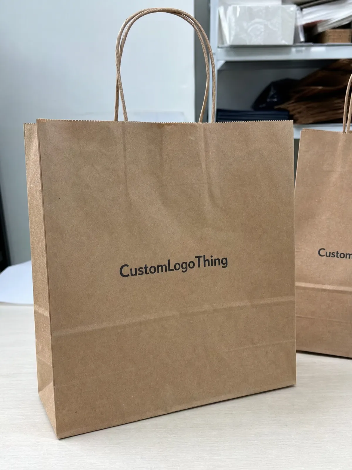
The first thing shoppers notice is usually not the logo artwork. It is the position of the logo in relation to the bag shape. A logo in the upper third reads fast and stays visible after the bag is filled. A logo drifting too low often gets swallowed by pastries, boxes, or the way a hand naturally grips the bag.
That matters because takeaway packaging works in motion. A bag on a counter is one moment. A bag in a car, on a bike rack, or tucked under a coat is another. The best printed bakery Paper Bags Logo Placement for bakery brands survives all of those moments without needing perfect lighting or a flat surface. That is why placement usually has more impact than adding another color or enlarging the artwork by a few millimeters.
Low placement causes two predictable problems. First, the logo disappears behind the product load. Second, the bag starts to look like the branding was squeezed into leftover space rather than designed intentionally. For a bakery that wants to signal quality, that is a bad trade. A plain bag with good placement often looks more premium than a decorative bag with careless positioning.
"If the logo sits on a fold, it is not branding. It is a production problem."
That blunt rule is useful because bakery bags are unforgiving in a very ordinary way. The bag is not a poster. It bends, creases, and changes shape as soon as it is filled. Buyers who approve artwork only from a flat mockup often find out too late that the final result looks skewed, cropped, or too close to the handle reinforcement.
How logo placement works across bag panels and folds
Think of a bakery bag as a set of printable zones, not one open canvas. The front panel is the most obvious area, but side gussets, seams, and the top fold all affect what stays visible after production. A logo that looks balanced on a computer file can become lopsided once the bag is assembled.
Square-bottom paper bags usually give the cleanest front-panel presentation because the face stays readable when the bag stands upright. Pinch-bottom bags have less usable area and tend to distort more near the closure. Handled carry bags add another constraint: the reinforced handle area can eat into top margin faster than buyers expect, especially if the logo is tall or the artwork relies on fine type.
That is why the dieline matters more than the mockup. The dieline shows where the folds, glue areas, seams, and handles actually sit. A flat screenshot does not. As a practical rule, keep critical artwork at least 6-10 mm away from fold lines and glue zones, unless the supplier gives a tighter or looser production spec. If the factory sends a different safe-area guide, use that guide. It is built around the real machinery and the real paper behavior.
Side gussets deserve attention too. They are often treated as secondary space, but they can do a lot of work for a bakery that sells across a counter, from a display shelf, or through delivery. A smaller repeated mark or short brand line on the gusset can help with visibility when the front panel is turned away from the customer. The key is restraint. Overfilling every panel with graphics turns a simple carrier into visual noise.
There is also a paper behavior issue that gets ignored too often. Kraft stock, especially uncoated kraft, can soften small details and mute light colors. White paper holds crisp edges better. Coated stock can sharpen color but may shift the feel away from rustic or handmade. The placement decision and the stock choice should be made together, because the same logo may read very differently across those surfaces.
Cost, pricing, MOQ, and unit cost tradeoffs
Placement affects cost more than many buyers expect. A simple one-color logo on the front panel is usually the least expensive option because it uses fewer setup steps and carries less risk of registration issues. Add side gusset branding, multiple colors, larger coverage, or a full-wrap design, and the price climbs. Not always dramatically, but enough to matter when the order moves from concept to purchase order.
For standard bakery orders, a straightforward front-panel print on medium-size paper bags often lands around $0.10-$0.22 per unit at 5,000 pieces, depending on bag size, paper weight, print method, and freight. Two-panel branding commonly pushes that to $0.14-$0.30 per unit. Full-wrap or premium finish work can sit higher, especially on shorter runs. These ranges are useful for planning, not promises. Paper grade, color count, plate setup, and shipping lane all shift the final number.
MOQ changes the economics quickly. Lower minimum orders usually carry higher per-unit pricing because the setup cost is spread across fewer bags. Larger orders lower unit cost, but only if the bags will actually be used before storage becomes a problem. A buyer who over-orders to save a few cents per piece can easily lose more money in storage, obsolescence, or revised branding later.
| Placement option | Typical MOQ | Relative cost impact | Best use case |
|---|---|---|---|
| Front-panel one-color logo | 3,000-10,000 | Lowest | Counter pickup, quick brand recall |
| Front + side gusset branding | 5,000-15,000 | Moderate | Delivery bags, walk-out traffic, social photos |
| Full-wrap or multi-color layout | 10,000+ | Highest | Flagship locations, premium programs, launches |
The pattern is predictable: the more surfaces you claim, the more the supplier must control registration, waste, and consistency. That is one reason buyers should decide placement alongside budget, not after it. If the design only works at a price point your order cannot support, the artwork needs to be simplified before production starts.
There is another hidden cost: revisions. Every late change to logo placement can trigger new proofs, new sampling, and a fresh round of sign-off. That is manageable on a short run. On a large order, it can add days and create disputes about who approved what. Clear placement decisions reduce those delays.
Production steps and turnaround from proof to delivery
The process is simple on paper and less simple in real life. It starts with a brief that includes bag style, dimensions, paper weight, print colors, quantity, finish, and target delivery date. The supplier then applies the correct dieline so the logo lands on the actual panel instead of a guessed rectangle.
Proof review is the main checkpoint. This is where mistakes can still be fixed cheaply. If the logo sits too low, gets too close to the handle, or crosses a seam, adjust it before the order goes to press. Once printing begins, the cost of correction rises fast. Sample approval adds another layer of protection, especially for larger orders or launch packaging. It takes extra time, yes, but it usually costs less than reprinting a run of bags that look fine in a file and awkward in hand.
Typical turnaround after proof approval is often 12-15 business days for standard printed bags, with packing and freight added on top. More complex jobs, such as special finishes, unusual sizes, or multiple print colors, can stretch to 15-25 business days. Rush schedules are possible when the artwork is final and the spec is simple. They are much less possible when the placement is still being negotiated after the proof arrives.
Quality control should happen at more than one stage. Good buyers check:
- Logo distance from folds, handles, and glue seams.
- Registration alignment on front and side panels.
- Ink coverage on kraft stock, where color can look softer than expected.
- Bag strength after printing, especially around the handle area.
- Pack-out appearance with the actual product inside the bag.
A bag that looks right empty but fails when filled is not a finished design. It is a draft. That is why many experienced buyers ask for one physical sample before production, particularly when the bag will carry heavier items like boxed pastries or multiple loaves.
Common logo placement mistakes that hurt bakery branding
The most common mistake is also the easiest to avoid: approving artwork based on how it looks on a flat screen. A centered logo on the dieline may end up clipped by folds or visually buried once the bag is packed. Bakery bags change shape immediately after filling, so the placement needs to survive movement, pressure, and handling.
Too-low placement is another regular problem. It delays recognition, and on a crowded counter it can disappear entirely. Too-small artwork creates a similar issue, especially on kraft paper, where texture softens the edges of fine type and thin strokes. Light colors can also get lost on brown stock. Beige, pale gray, and delicate linework often look tasteful in a presentation file and weak in production.
Overdesign causes its own damage. Some teams want the logo, a slogan, a badge, a pattern, and a social handle all competing for space. The result is not premium. It looks crowded and under-edited. A bakery bag has a limited job: identify the brand quickly and look credible while doing it. A single strong mark with enough quiet space around it usually does that better than a busy layout.
Another mistake is ignoring repeatability. The first order may look acceptable, but if the placement is not documented carefully, the next reorder can drift. A few millimeters may not sound like much, but on a small bag with a top fold and handle reinforcement, those millimeters matter. Keeping the final proof on file is not bureaucracy. It is how brands avoid slowly changing their own packaging without meaning to.
Expert rules for front, side, and gusset placement
For storefront pickup bags, the front panel should carry the main logo. That is the area most likely to be photographed, carried past other customers, and seen from eye level. Keep the logo high enough that the top edge does not get lost in the fold or handle area. On many handled bags, that means the mark belongs in the upper-middle zone, not pressed against the lip.
Side panels and gussets help when the bag moves through multiple hands. Delivery drivers tilt bags, stack them, and place them in cars. A front-facing logo is not always visible in those moments, but a side mark often is. If the bakery needs additional recognition without making the artwork feel crowded, a smaller repeated logo on the gusset is usually more useful than trying to fill every surface with a different graphic element.
Printed Bakery Paper Bags logo placement for bakery brands works best when the layout follows the customer path. A counter pickup bag needs immediate front-facing clarity. A delivery bag needs visibility from more than one angle. A retail bag used for loaves and pastries may need stronger contrast and a taller safe area because the contents can push the paper outward and alter the visible window.
There is no universal formula that fits every bakery. A small neighborhood shop selling a handful of items all day may only need a simple front logo. A multi-location brand with seasonal runs, delivery volume, and mixed product weights may need a more structured system: one primary front mark, a shorter side-panel version, and a carefully measured top margin that never changes between orders. Consistency matters more than decorative variety.
If the bakery wants a practical shorthand, use this rule: the front panel carries the identity, the gusset supports recognition, and the fold lines are off-limits unless the printer confirms otherwise. That keeps the package readable without turning it into a billboard.
Material and print choices that change the final look
Material changes the final read more than most people expect. Kraft paper gives a natural, earthy appearance, but it absorbs color differently and can mute delicate details. White paper offers stronger contrast and usually makes logos sharper. Coated stock can lift color intensity, though it may feel less aligned with an artisanal bakery identity if the visual direction leans rustic.
Paper weight matters too. Typical bakery bags may use roughly 60-80 gsm for lighter paper applications, while heavier carry bags often move into stronger stock depending on structure and handle requirements. A thicker paper can hold print better and reduce see-through issues, but it may also affect folding behavior and cost. The right choice depends on what the bag carries and how long it needs to stay presentable.
Printing method changes both appearance and price. Flexographic printing is efficient for larger runs and simple layouts. Offset printing tends to deliver tighter detail and stronger color control for more complex artwork. Digital printing helps on short runs or when speed matters more than economy at scale. The method should match the artwork and the order size, not the other way around.
Finishes can help, but only when they support the design. Matte usually feels right for bakery packaging because it looks calm and tactile. Gloss can make a logo stand out, but too much shine can feel out of step with an artisan brand. Spot varnish, embossing, or foil can add distinction, though they also add cost, complexity, and more opportunities for a mismatch between visual promise and daily use. If the brand is not ready to pay for that level of detail across the full run, simpler is safer.
For sourcing and sustainability checks, ask suppliers to explain any FSC chain-of-custody claims at fsc.org. For shipping resistance, ISTA testing references are useful when bags must survive compression, box stacking, and long transit. These standards are not decoration for the spec sheet. They help confirm the bag can do its job after it leaves the factory.
Ink behavior deserves one more mention. On kraft, deep black, dark green, or warm red often hold up better than pastel tones. On white stock, almost anything can work if the margins are clean. The design challenge is not just choosing colors that look nice in a digital file. It is choosing colors that still read after they hit fiber, glue, and folding machinery.
Next steps before you approve artwork and order
Before approving production, ask for the exact bag size, paper weight, print method, and safe-area spec. Place the logo on the real dieline, not on a guessed rectangle or a flattened screenshot. Then check all fold lines, seams, gussets, and handle clearances at full scale. If the logo is supposed to sit on the front panel, make sure it still reads once the bag is filled to normal capacity.
- Confirm the exact bag dimensions and paper stock.
- Review the proof on the dieline, not just on a mockup image.
- Check logo distance from folds, handles, and seams.
- Request a sample for launches, premium lines, or higher-volume orders.
- Lock the quantity, finish, and shipping window before production begins.
Document the final version. That sounds dull, but it prevents one of the most common packaging problems: the first order is approved carefully, then the reorder loses the original placement details. If the brand wants consistency, the proof and the notes need to survive the handoff from marketing to purchasing to production.
Once the placement is settled, the bag becomes easier to trust. That is the real value of printed bakery paper Bags Logo Placement for bakery brands: not just visibility, but reliability. The package reads well on the counter, survives the walk to the car, and still looks like the same brand by the time the pastry is gone.
Where is the best logo position on printed bakery paper bags?
Front-panel center or upper-center is usually the safest choice because it reads quickly and survives normal handling. If the bag will be tied, folded, or filled high, move the logo slightly upward so it stays visible. Side panels and gussets work best as supporting placements, not the main identity on most bags.
How big should a logo be on bakery paper bags?
Large enough to read from arm's length, but not so large that folds or handles cut into it. The right size depends on the bag dimensions and the amount of blank space around the mark. Always size from the dieline and proof the artwork in full scale before approval.
Does bag material change logo placement results?
Yes. Kraft, white, and coated papers each show contrast differently. A logo that looks crisp on white stock may need stronger color or bolder type on kraft. Paper texture also affects how sharp fine lines and small text appear.
What affects the price of printed bakery paper bags with logos?
Main cost drivers include bag size, paper weight, print colors, finish, quantity, and the number of printed panels. A simple front-only one-color layout is usually cheaper than multi-panel branding or special effects. Lower MOQ orders cost more per bag because the setup cost is spread across fewer units.
How long does it take to produce custom bakery paper bags?
Proofing can be quick if the artwork is final and the dieline is correct. Production often takes 12-15 business days after approval for standard bags, and complex jobs can take 15-25 business days or more. Freight, sampling, and late revisions can extend the schedule.

