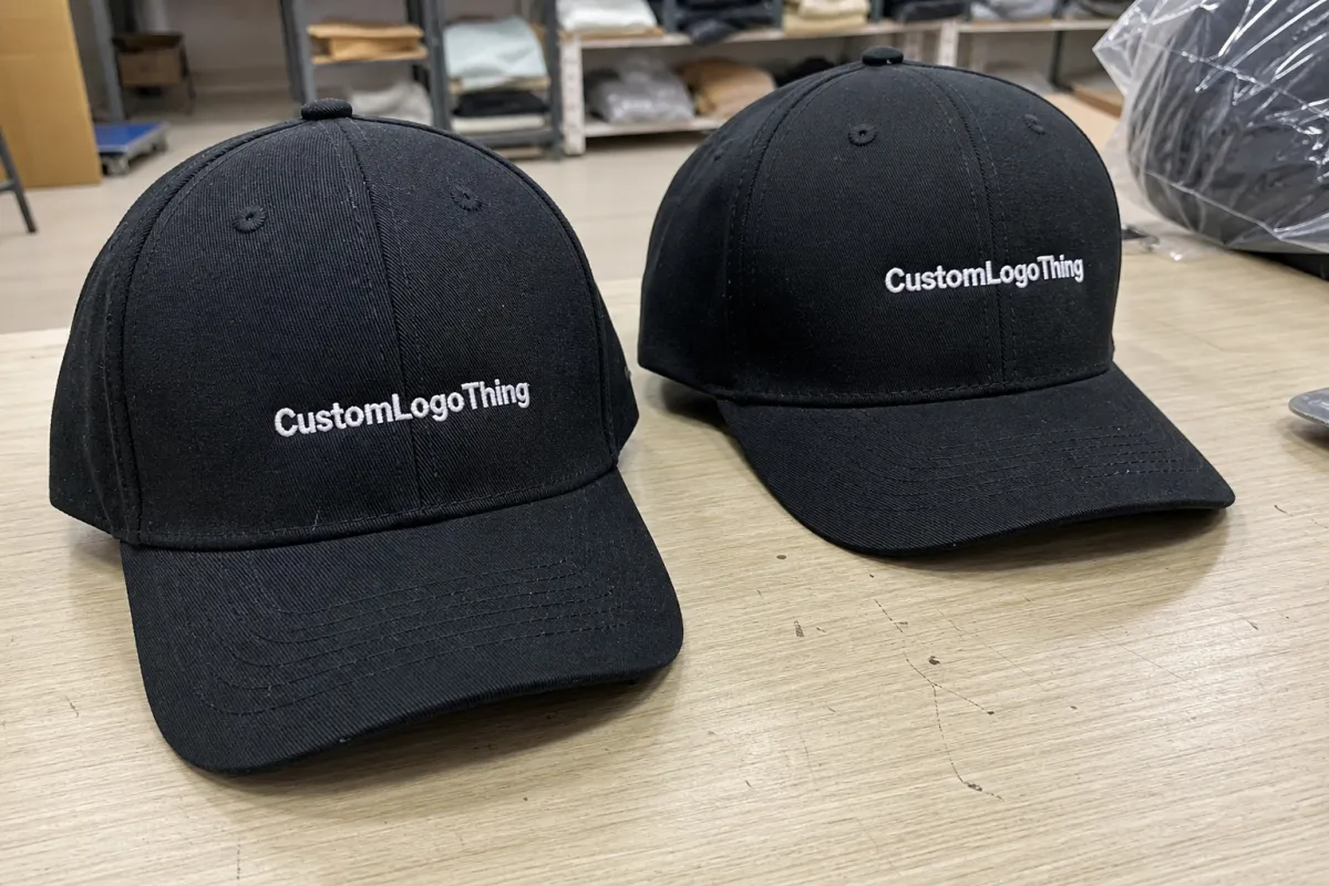
ecommerce Embroidered Baseball Caps digital proof checklist is the point where a flattering mockup stops being a sales tool and starts becoming a production instruction. That shift matters. A logo can look balanced on a screen and still fail once it meets a curved crown, a center seam, or stitches that have to pull around tiny details.
Buyers often treat the proof as a formality because it arrives after the artwork is already chosen. That is usually a mistake. The proof is the first place the shop has to translate the design into thread, and thread is less forgiving than pixels. Thread has thickness. It has direction. It catches light. It also exposes weak artwork fast, especially on low-profile caps, structured fronts, and logos with small type.
A digital proof is not a cosmetic preview. It is the first production document that says whether the cap can actually be made the way the brand expects.
What a digital proof catches before stitching starts
A good digital proof catches more than spelling mistakes. It should show whether the logo fits the available embroidery space, whether the thread colors are close enough to the brand standard, and whether the design needs to be simplified before the first run. On Embroidered Baseball Caps, that last point is often the one that saves the most time and money.
Cap embroidery has physical limits that flat artwork hides. The front panel may be structured or unstructured. It may have a center seam or no seam at all. The crown may sit low, high, or somewhere in between. A design that looks generous in a browser window can become crowded once it is measured against those constraints. A proof should make those limits visible before anyone approves production.
That is why a marketing mockup and a production proof are different documents. One sells the idea. The other has to survive the needle. A mockup can exaggerate scale, smooth out curves, and ignore stitch direction. A real proof should include placement, width, height, and any note about how the logo will be digitized for the cap style being ordered.
The details that fail most often are usually the smallest ones: thin lines, tight letter spacing, narrow counters inside letters, and symbols with too much interior detail. If the logo includes a six-point font, a hairline stroke, or a tiny registration mark, the proof should say whether that element will be thickened, removed, or redrawn. If it does not, the risk shifts downstream to production, where corrections are slower and more expensive.
Thread color is another trap. Screen color and thread color are related only in the broadest sense. A navy on a monitor can look flatter than the actual thread, while a bright red can appear more saturated on a matte cap than it did in the proof. A careful proof names the closest available thread match and flags any expected variation. That protects buyers who need their caps to align with uniforms, retail packaging, event kits, or other branded items.
How the proofing process and timeline usually work
The process usually starts with artwork intake and digitizing. The digitizer converts the logo into stitch paths, adjusts density, and decides how the machine will travel through the design. After that, the supplier builds a digital proof around the exact cap style. A six-panel structured trucker cap and a low-profile cotton twill cap do not accept the same placement rules, even if the logo itself stays the same.
Clean inputs shorten the cycle. Vector artwork is best because it gives the shop a clean base to work from. If the logo only exists as a raster image, resolution matters. Blurry edges, jagged curves, and low-resolution files tend to force extra cleanup, which adds review time. Clear instructions on cap color, thread preferences, placement, and quantity help even more. When those details are missing, the proof becomes a guessing game.
Typical first-proof turnaround is often 1-3 business days. Revisions may add another 1-2 days, depending on how much needs to change and how quickly the buyer responds. Production usually begins only after final approval, and lead time after that can run 7-15 business days for many orders. Larger quantities, multi-location decoration, complicated digitizing, and seasonal demand can stretch that window.
Rush timelines usually create tradeoffs. A faster proof can mean less time for discussion. A faster production slot can mean less flexibility if the artwork needs a correction. That does not make rush orders bad, but it does mean the proof needs more attention, not less. A buyer who approves too quickly to save one day can lose several days if the first sewn sample misses the mark.
There is also a practical reason cap proofs take longer than a basic screen mockup. The shop is not simply placing a logo on a hat image. It is planning stitch direction, density, trims, color sequence, and how the design will behave across a curved surface. Those choices influence not only appearance, but also how cleanly the machine will sew and how the cap will wear over time.
Cap details that change the proof and final stitch quality
Cap construction changes the result more than many online buyers expect. Structured fronts hold shape and usually give embroidery a steadier base. Unstructured caps collapse more easily, so the same logo may need to be slightly smaller or positioned with more care. Low-profile caps sit differently on the head than high-profile caps, which changes how the logo reads from the front.
The panel layout matters too. A five-panel cap usually offers a cleaner front field because it avoids the center seam that runs through many six-panel caps. If a logo crosses a seam, the stitches may distort or split in ways that are visible from a few feet away. That is not a defect in the machine; it is a constraint of the cap itself. A good proof should flag that before approval.
Bill shape can alter the appearance as well. A curved bill often makes the front logo feel a little taller and more upright, while a flat bill can make the same mark feel broader and more fashion-forward. Those differences are subtle on paper and obvious in real life. For that reason, placement should be measured, not guessed. Buyers should ask where the logo is measured from, how far it sits above the bill, and whether it is centered to the crown or adjusted slightly for visual balance.
Embroidery limits are especially visible with tiny type. Small lettering can fill in once stitch density increases. Fine rules can disappear. Tight internal spaces in letters like A, O, P, and R may close more than expected. Many suppliers will recommend a minimum letter height for clean cap embroidery, often around 0.20-0.25 inch for very simple text and larger for detailed marks, though the exact threshold depends on the font and stitch count. The proof should make those limits plain.
Thread also behaves differently from ink. It reflects light and has a little texture. That means the same color can look richer, duller, darker, or brighter depending on the fabric, lighting, and stitch direction. A buyer ordering navy caps with white embroidery may find the contrast looks sharper on a monitor than on the actual hat. That is normal. The proof should explain the closest thread match rather than promising an exact screen match.
Material choice matters beyond the cap blank itself. Cotton twill, performance polyester, and foam-front trucker caps each handle stitching differently. Heavier fabrics usually hold crisp embroidery better, while lighter or more elastic materials may show more puckering if the design is dense. If the order includes retail packaging or gift boxes, carton size and transit handling should be reviewed too. A crushed cap front can undo a perfect sewout.
Cost, pricing, and unit cost drivers to review
Proofing is often folded into setup, but setup is rarely free in practice. Digitizing complexity, thread count, stitch density, cap style, and the number of placements all affect the amount of time needed before production starts. A one-color logo on a standard six-panel cap is quicker to prepare than a multicolor badge with tiny text, a side mark, and a back hit.
For planning purposes, digitizing or setup often falls in the rough range of $25-$75 per logo, with more complicated artwork going higher. Unit pricing for embroidered caps commonly lands around $6-$14 per cap at lower quantities, while larger runs may drop into the $3-$6 range depending on the blank, the stitch count, and the number of decoration locations. Those are broad ranges, not fixed rules, but they are useful for comparison shopping.
| Proof or order type | What it usually includes | Typical cost impact | Best fit |
|---|---|---|---|
| Simple front logo proof | One placement, standard thread colors, basic cap style | Lowest setup friction; usually fastest approval | Clean logos, uniforms, simple merch drops |
| Complex embroidered proof | Multiple colors, fine detail, stitch simplification notes | Higher digitizing and revision time | Detailed brand marks, retail merch, event giveaways |
| Multi-location cap order | Front plus side or back embroidery, more approvals | More machine time and more review steps | Teamwear, premium branded caps, resale programs |
Lower quantities almost always carry a higher unit price because the setup work is spread across fewer pieces. That is not a penalty so much as a reflection of labor. On a 25-piece order, digitizing and setup can represent a meaningful share of the total. On a 500-piece order, the same setup cost gets diluted. The proof still matters at both sizes, because the financial hit from a mistake can be larger on the high-volume run.
Buyers should ask what the quote really includes. Does it cover digitizing, revisions, shipping, and rush handling? Are custom labels, polybags, or specialty threads extra? Is there a charge for a second revision if the first proof comes back with changes? These are not small questions. They are the difference between a usable quote and a quote that only looks low on paper.
Step-by-step approval checklist for buying embroidered caps online
Start before the proof arrives. Send the final logo file, not an old presentation version or a web image with compressed edges. Vector artwork is best. If vector is unavailable, ask whether the raster file has enough resolution to digitize cleanly. A blurry source file tends to produce a blurry embroidery conversation, and that slows everything down.
Then check the proof against the order, line by line. Cap style, cap color, logo dimensions, thread colors, and quantity should all match what was requested. If the proof includes notes about stitch density, underlay, or simplification, read them. Those notes explain how the design will actually run, which is more useful than the mockup image itself.
It helps to review the cap as a whole, not the logo in isolation. The artwork may be centered in the preview and still sit too low once the curved front panel is considered. A cap proof should be judged in context: crown shape, bill shape, logo size, and where the eye lands first when the hat is worn. Good embroidery feels natural because those proportions were reviewed early.
Use this order of checks:
- Logo spelling and file version
- Cap style, color, and size
- Thread colors and closest matches
- Logo size and placement measurements
- Any stitch simplification or detail notes
- Quantity, packaging, and delivery details
Save the approved proof, the quote, and the revision history together. That record matters if there is a dispute later, but it is just as useful for reorders. A clean file trail cuts down on repeat questions and keeps future runs aligned with the first approved version. For ecommerce teams, that matters because a reorder should behave like a repeat, not a new project.
If the caps will be shipped to multiple destinations, check carton counts and label logic before approving. A finished embroidery job can still create fulfillment headaches if the pack-out is unclear. The same goes for retail programs that require individual polybags, barcode stickers, or insert cards. Those details should be confirmed while the proof is open, not after the run is complete.
Common mistakes that cause delays or disappointing results
The biggest mistake is approving too fast. A logo that looks crisp on a monitor can still break down in thread if the shapes are too tight. Small type, thin lines, and delicate borders are the usual culprits. Once the design is converted into stitch paths, the shop may need to thicken or remove those elements. Buyers who expect a pixel-perfect copy of the original art are usually the ones most disappointed.
Another common error is treating thread as if it were print ink. It is not. Thread has sheen, texture, and directional light reflection. A dark thread can look lighter under warehouse lighting. A saturated thread can look deeper on a matte cap than on the proof. That variation is normal and should be framed as such from the start.
Placement mistakes show up often on curved crowns. A design can be technically centered but still look visually high or low depending on the cap style. If the proof does not define the measurement point, the shop has to make a judgment call. Sometimes that call works well. Sometimes it misses the brand team's preference by just enough to matter.
Low-resolution artwork creates another round of back-and-forth. Raster files often force cleanup, and cleanup often means lost detail. If the logo has internal cutouts, fine borders, or layered elements, ask whether those features are likely to survive embroidery. The answer may be no, and it is better to hear that early than after the caps are in motion.
Skipping the final review after revisions is a quiet but expensive mistake. Even a one-line change can shift the stitch balance or alter placement notes. If a revision only touched thread color, the whole proof still deserves a fresh read. On a 200-piece order, one overlooked change can turn into a costly remake. The proof stage exists precisely to catch that kind of error.
There is also a packaging mistake that gets ignored too often: assuming the cap itself is the entire deliverable. In ecommerce, the carton, label, fold, and shipping method are part of the product experience. A great embroidered cap can arrive wrinkled, crushed, or mislabeled if the packing plan was never checked. Buyers who think beyond decoration usually get better results.
Expert tips before you approve production
Build a short internal checklist before the first proof request goes out. Include the final logo file, exact cap style, quantity, target delivery date, placement notes, preferred thread colors, and any packaging requirement. That one page keeps marketing, purchasing, and operations from sending mixed signals that slow the proof cycle down.
If the artwork is detailed, ask for a proof process that allows one focused round of cleanup. That does not mean endless edits. It means the digitizer has room to simplify the design for embroidery without changing the brand identity. In practice, the best outcomes usually come from a conversation about what must stay and what can be adjusted for stitch quality.
Think about use case before approving scale. A cap for retail resale often needs stronger shelf presence than a cap for internal staff uniforms. A giveaway at a packed event may need the logo larger than the same mark used on a premium apparel line. The right size depends on how far away the cap will be seen, how it will be worn, and how much visual competition is around it.
One person should own the final sign-off. That sounds administrative, but it prevents the familiar slowdown where three teams all believe someone else is approving the proof. A single approver, a clear deadline, and a saved approval record reduce the odds of a last-minute change that throws the order off schedule.
The best ecommerce Embroidered Baseball Caps Digital Proof Checklist is not long. It is disciplined. It checks the art, the cap, the thread, the placement, the timeline, and the pack-out before production starts. That kind of review is what keeps a small proof from turning into a large problem.
What should I check first in a digital proof for embroidered baseball caps?
Start with logo spelling, cap style, placement, and thread colors. Those are the quickest places to catch an expensive mismatch before production begins.
How long does a cap proof usually take?
Simple orders often receive a first proof in 1-3 business days. Detailed artwork, multiple revisions, or rush scheduling can extend that timeline.
Can a digital proof show the exact thread color?
Not exactly. A proof can show the intended thread match, but thread always looks different from a monitor because light reflects off stitched surfaces in a way screens cannot copy.
What if my logo is too detailed for embroidery?
The design may need thicker lines, larger text, or fewer tiny elements so it can sew cleanly on a curved cap. A useful proof should show those adjustments before you approve the order.
How do I keep proof-related costs under control?
Send final artwork, confirm cap style early, and respond to revisions quickly. It also helps to ask what the quote includes, because digitizing, revisions, shipping, and rush handling are often priced separately.