Fitness snapback Caps Logo Placement looks straightforward on a screen and complicated on a hat. A flat file turns into a curved crown, a front seam, stitching tension, and a brim that changes how the eye reads the mark. That gap between artwork and finished cap is where many projects slip from sharp to slightly wrong.
The fix is rarely more design. It is usually a clearer spec, a better understanding of the cap body, and a willingness to simplify the mark before production starts. The best-looking cap branding is not always the biggest logo. Often it is the one that respects the structure of the cap and survives real wear.
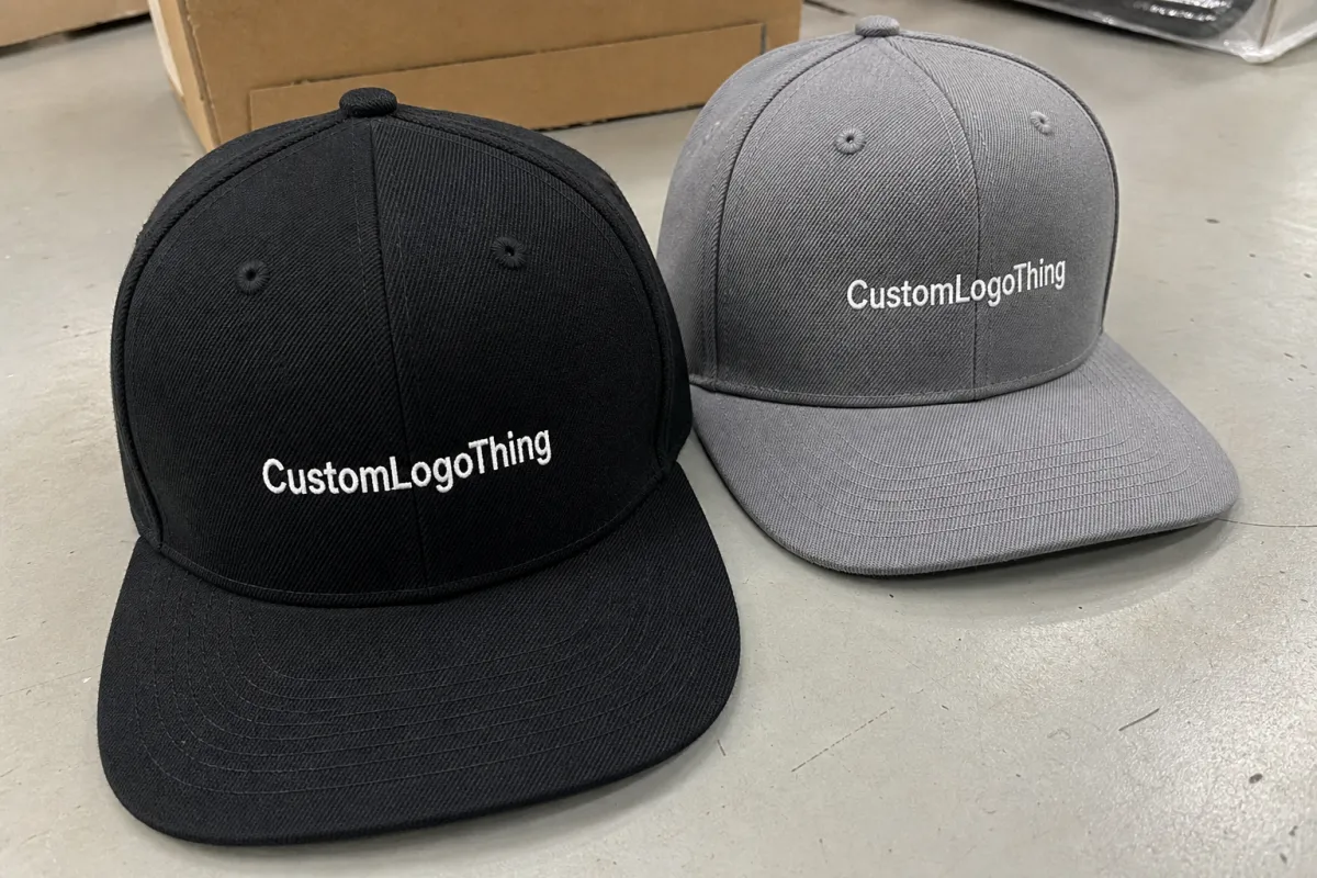
Why fitness snapback caps logo placement gets tricky fast
A logo can look centered in a mockup and still land awkwardly once it is stitched, patched, or heat-applied. That is not a software problem. It is geometry. A snapback is built from panels that rise and curve, and the front panel is not a blank billboard. It has seams, a crown shape, and usually a brim curve that steals a little of the apparent space.
That matters because most buyers judge placement from an artboard, while the factory has to decorate an object that bends under pressure. If the front panel is tall and structured, the mark can sit higher and still read cleanly. If the crown is shorter or softer, the same logo can feel cramped, low, or visually heavy. The difference between those two caps is enough to change the whole layout.
For fitness brands, the stakes are practical. These hats are worn while lifting, walking, training, and moving from one light source to another. A placement that feels balanced in a studio render may disappear in a dim gym or tilt off-axis once the cap is on a head. That is why fitness snapback Caps Logo Placement should be treated as a production decision, not a styling afterthought.
Good cap branding starts with the cap body. If seam layout, crown depth, and decoration method are not considered together, the logo ends up competing with the structure instead of fitting it.
There is another trap buyers fall into: assuming the largest possible logo is the best one. Sometimes a slightly smaller mark placed higher on the crown looks more premium, reads faster, and leaves enough breathing room for the cap to look intentional rather than crowded. That sort of restraint usually saves sample rounds and avoids the familiar complaint that the logo feels “off” even when it is technically centered.
Where the logo actually lands on the crown
Most placements fall into a few familiar zones, and each one sends a different signal. Front center is the default because it gives the strongest visibility. High front works better on many structured snapbacks because it clears the brim curve. Slightly offset front placement reads more lifestyle-oriented and less promotional. Side panel placement is subtler. Back placement above the closure is usually secondary branding, not the hero mark.
Structured caps are more forgiving because the front panel holds its shape. Softer or less rigid caps show more distortion once they are worn, which means the same logo size can appear larger, smaller, or more compressed depending on the body. A 2.25-inch mark on one cap can look perfectly balanced, while the same size on another cap feels squeezed or too low. The cap body decides more than most design decks admit.
Placement should be measured against the real crown, not a flat square canvas. The seam can split lettering, the brim curve can swallow the lower edge, and the top of the decoration zone is often narrower than it looks. If the logo crosses the center seam, it may need to move upward, widen slightly, or lose thin interior detail so it survives the panel break cleanly.
- Front center: best for visibility, team wear, and event merch.
- High front: usually cleaner on structured caps and keeps clear of the brim curve.
- Offset front: quieter, more retail-friendly, and less promotional in tone.
- Side panel: useful for icons, secondary marks, or smaller wordmarks.
- Back above closure: works as a secondary brand hit, not a main placement.
For gym merch, the first decision should be what the cap needs to do. If it must be seen from across a studio, keep the mark forward and readable. If the goal is a more premium retail feel, lift it higher or reduce the visual weight. The placement should follow the job, not a generic template.
Materials, stitch count, and contrast that make or break readability
Material choice changes what can actually be placed on the cap. Flat embroidery is the most familiar option and works well for simple logos, but it still has limits. Fine lines, tiny text, and delicate internal cuts often blur once thread density is added. 3D puff embroidery creates a bolder, sportier look, but it needs thicker letterforms and wider spacing or it collapses into itself. Woven patches keep line work cleaner. PVC patches give crisp edges and a more molded appearance. Heat-applied graphics can work for simple designs, though they still need enough shape and contrast to read on a curved surface.
Stitch count changes the result more than many buyers expect. A tidy wordmark might sit comfortably in a lower-stitch build, while a more detailed logo can push the decoration into a denser, stiffer feel that looks crowded on the crown. Once the design gets too detailed, the sample usually starts giving clues: thread fills become heavy, counters close up, and the edges lose sharpness. At that point, the artwork should be simplified rather than forced through production.
Seams cut down the usable area. A center seam, side joins, and topstitching all eat into the space the logo can occupy cleanly. A mark that measures 2.5 inches across on paper may only have about 2.1 inches of practical room once the crown is accounted for. That difference is enough to change spacing, kerning, and even whether the design should be an embroidered logo or a patch.
Contrast is the other silent variable. Dark-on-dark branding looks restrained in a presentation deck and nearly disappears under gym lighting. Thin gray thread on charcoal fabric can seem premium on a mockup and vanish in real use. If the goal is visibility from a distance, the safest route is usually a clear contrast between cap color and logo color, plus a shape that can survive motion and mixed lighting.
For buyers comparing decoration methods, the tradeoffs are practical:
| Decoration method | Best for | Typical strengths | Common tradeoff |
|---|---|---|---|
| Flat embroidery | Simple logos, clean wordmarks | Lower cost, familiar look, faster setup | Fine detail can blur at small sizes |
| 3D puff embroidery | Bold front marks | Strong shelf presence, athletic feel | Needs thicker artwork and wider spacing |
| Woven patch | Detailed logos, small type | Sharper edges, cleaner line work | Adds an extra construction step |
| PVC patch | Modern, premium branding | Durable, dimensional, easy to read | Usually costs more than simple embroidery |
If a logo uses gradients, hairline copy, or too many interior cuts, it should be simplified before production starts. That is especially true for fitness snapback Caps Logo Placement, because the art has to survive distance, sweat, motion, and curve at the same time.
Process and turnaround: from artwork to approved sample
The cleanest workflow starts with art review, then a placement proof, then digitizing or patch prep, then sample approval, then bulk production, and finally final inspection. That sequence sounds ordinary because it is. The weak link is usually the step where the artwork should be adapted to the cap body but instead gets approved as-is because the mockup looked polished.
Simple embroidered orders often move in about 10 to 15 business days after proof approval if the production queue is manageable. Patch-heavy builds, mixed materials, or more complex cap constructions take longer. If the order also needs a custom body, special label work, or precise color matching, the schedule stretches again. More steps mean more time, and there is no shortcut that removes that reality.
Revision rounds affect lead time. Change the logo size after the proof is approved and the stitch file may need to be rebuilt. Move the mark higher and the placement guide changes. Swap cap colors midway through sampling and the timeline can shift again. That is why the front-panel placement should be locked early instead of treated like a styling detail that can be sorted out at the end.
Buyers should ask for a few things before they approve anything:
- Exact placement dimensions from seam to seam and from brim curve to the logo base.
- Decoration method stated clearly, including embroidery type or patch type.
- Digitized proof or patch artwork before sample approval.
- Photo or video of the decorated sample on an actual cap, not just a flat sketch.
- Final QC standard for thread tension, patch alignment, and color match.
If the order includes retail packaging or shipper cartons, it is worth checking those details alongside the hat. Packaging and transit performance are often validated through standards such as ISTA, and paper components can be specified with FSC-certified material if the project includes hangtags, inserts, or cartons. That does not change the cap itself, but it does matter when the whole order has to arrive intact and presentable.
Cost, MOQ, and unit pricing for custom snapbacks
Pricing usually breaks into five parts: base cap cost, decoration method, setup or digitizing fees, sample charges, and freight. The base cap can be modest or premium depending on fabric weight, structure, closure style, and sweatband details. Decoration is where the price starts to diverge. A simple embroidered logo costs less than a shaped patch or a multi-step construction. That is not a hidden fee structure. It is just production math.
For rough planning, simple embroidered snapbacks may land around $3.50 to $6.50 per unit at higher quantities, depending on cap quality and stitch count. Woven or PVC patch versions often move into the $4.50 to $8.50 range, sometimes higher if the logo is intricate or the cap body is upgraded. At 5,000 pieces, even a small shift in decoration complexity can move the total by thousands, which is why placement should be decided before the quote is locked.
MOQ usually rises as complexity increases. A standard cap body with one decoration method and a straightforward logo is easier to source and easier to run. Add custom color matching, multiple thread colors, special patch construction, or unusual labeling, and the minimum order often goes up. That is not a tactic. It is the cost of setting up a more complicated run.
Clear placement improves quote accuracy. If the logo stays inside a standard decoration zone and does not cross seams, the vendor can price it more cleanly. If the art might move, grow, shrink, or straddle the crown break, the quote tends to include extra margin for risk. Buyers sometimes call that price inflation. Most of the time, it is just uncertainty getting priced in.
Here is a practical way to compare the common buying paths:
| Spec choice | Approx. unit cost | MOQ tendency | Best use case |
|---|---|---|---|
| Standard embroidery | $3.50-$6.50 | Lower | Gym staff hats, giveaways, event merch |
| Woven patch | $4.50-$7.50 | Medium | Sharper logos, retail-ready branding |
| PVC patch | $5.50-$8.50+ | Medium to higher | Premium look, crisp edges, durable finish |
| 3D puff embroidery | $4.00-$7.00 | Medium | Bold front branding, sport-first positioning |
There is no universal best price. There is only the right cap body, decoration method, and volume for the job. If the logo must read from six feet away, a patch may be worth the extra cost. If the order is a large staff run and the mark is simple, embroidery usually makes more sense. Fitness snapback Caps Logo Placement influences that decision more than most teams expect because the placement determines how hard the decoration has to work.
A step-by-step placement checklist before you approve
Measure the front panel space on the actual cap before anyone signs off. Not the mockup. The cap. Check seam-to-seam width, vertical height, and the distance from the brim curve to the usable top edge. A ruler and a sample beat a polished render every time. Once the real dimensions are known, compare them to the production-size logo, not the idealized artwork size on your screen.
Then test the logo three ways: full size, slightly reduced, and in the real decoration method. A mark that looks fine on paper can fall apart once embroidery density is added or once a patch mold has to be cut around it. If the design includes thin lettering, reduce it until the smallest stroke still survives the chosen production method. That is the test that matters.
After that, place the cap on a head form or a person. A curved surface changes the read immediately. The brim bend, the angle of the front panel, and the way the wearer’s head fills the cap all affect balance. If the logo sits too low, the brim takes over. If it sits too high, it can feel detached from the crown. Either problem makes the hat look less finished than it should.
Finally, leave enough breathing room around seams and detail-heavy elements. A logo needs margin so the eye can read it without fighting the construction. The best placements usually feel calm rather than crowded. That is especially true for fitness snapback caps logo placement, where the cap is seen in motion and from multiple angles instead of one neat front-facing view.
- Measure the usable front panel on the actual cap.
- Check seam clearance and brim curve clearance.
- Reduce the logo to production size and inspect small details.
- View the sample on a head or curved form.
- Approve only after the placement still reads cleanly in motion.
Common mistakes that make gym hats look cheap
The first mistake is the obvious one: a centered logo that gets cut by the seam or pushed too close to the brim curve. The second is more common than it should be: too much detail in too little space. Small text, layered effects, gradients, and hairline outlines look impressive in a design file and muddy on a cap. The hat is not the place for a graphic that needs a full paragraph to explain itself.
Weak contrast is another easy way to flatten the result. If the cap is charcoal and the logo is dark gray, the mark may disappear under overhead lights or outdoors. Many brands choose muted tones because they look premium on screen, then are surprised when the branding all but vanishes in real use. Premium and invisible are not the same thing.
It also helps to remember how the cap is worn. A snapback sits on the forehead, shifts slightly with movement, and can tilt during training or travel. That changes the logo’s relationship to the eyes. Front-heavy designs need enough balance to hold up when the wearer moves, not just when the hat is lying flat on a table.
The last mistake is approving a size because it is technically possible to make, not because it looks right. If the mark needs too many thread colors, tiny counters, or ultra-thin borders, simplify it. If the patch needs hairline edges, thicken them. A clean cap usually comes from editing out the weak parts, not cramming every line of the original artwork onto the front panel.
Next steps for a clean fit-and-logo spec
The cleanest brief is one page, not a stack of vague messages. Include the cap style, fabric, closure, logo dimensions, exact placement, decoration method, and preferred colorway. If there is a backup version of the logo for smaller space, include that too. It reduces back-and-forth and keeps the decoration team from guessing what matters most.
Ask for a digital proof or decorated sample before the full run is approved. If the logo has fine detail, that is not optional. The proof should show where the mark sits relative to the seam and brim, not just floating in a blank box. If a revision is needed, this is the moment to make it. Once the full order is moving, small changes are expensive in time and money.
Decide what the cap is supposed to communicate. Maximum visibility. A cleaner retail look. A quieter premium signal. A louder front logo usually works better for events and staff wear. A smaller, more controlled placement tends to suit lifestyle retail. Neither is right in every case, and there is no need to force one approach into the other.
If the cap needs to look sharp in the real world, test it under normal lighting, check it while worn, and lock in fitness snapback caps logo placement before production starts. That one decision does more to protect the budget than any last-minute tweak ever will.
Where should the logo sit on fitness snapback caps?
Front-center is the default if visibility matters most, but it should sit high enough to clear the brim curve. If the logo crosses a seam, move it slightly up or simplify the artwork so it reads cleanly on the crown.
How big should a snapback logo be for gym merch?
Most front logos work best when they are large enough to read at arm's length without taking over the whole cap. Tiny text is risky unless the decoration area is large enough to hold it after embroidery or patch conversion.
Is embroidery or a patch better for fitness snapback caps?
Embroidery is usually cheaper and faster for simple marks with solid shapes. Patches are better when the design needs sharper detail, a more premium look, or a cleaner edge than stitches can deliver.
What affects turnaround time for custom snapback logo production?
Decoration method, sample revisions, and factory queue all affect speed. Simple embroidery usually turns faster than patch-heavy builds or more complicated mixed-material specs.
How much do custom logo snapbacks usually cost?
Price depends on MOQ, cap quality, decoration method, and whether setup or digitizing fees are required. More colors, more detail, and premium finishes push the unit cost up.


