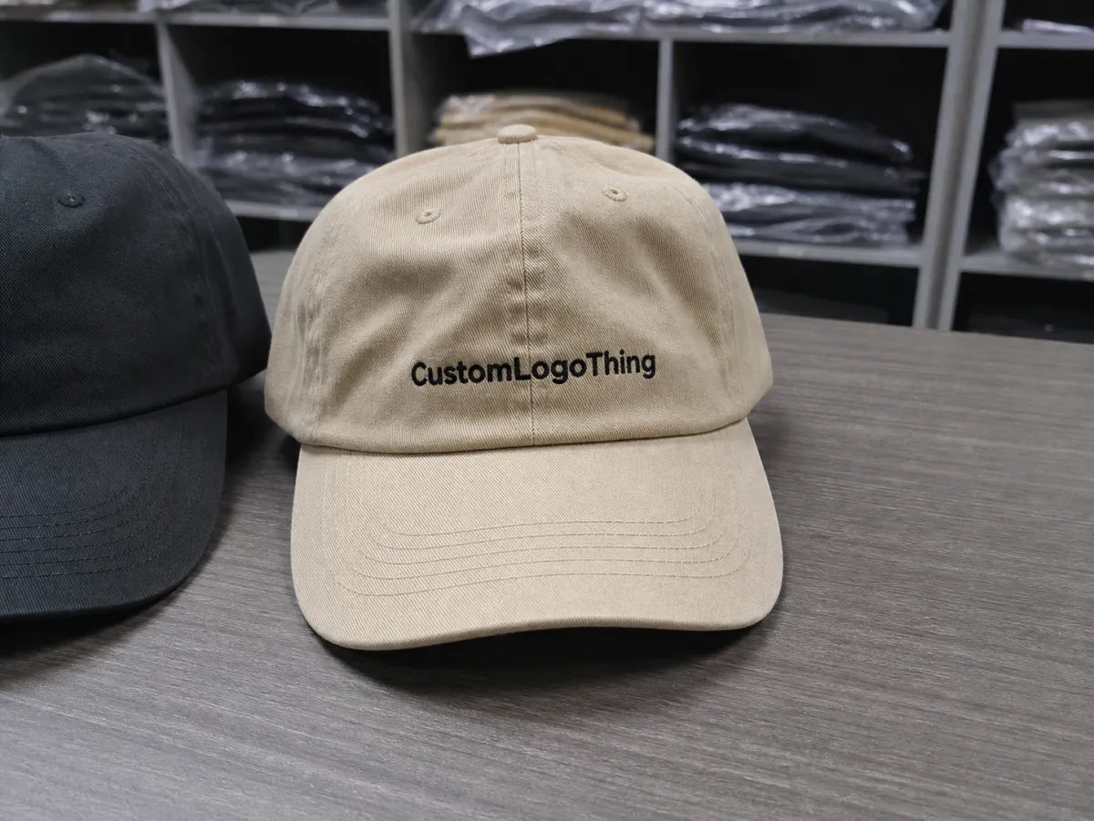
Unstructured Dad Hats Logo Placement for Bulk Orders
On an unstructured dad hat, moving a logo by 4 mm can be the difference between “intentional” and “why is it sitting there?” That is the part buyers often underestimate. The crown is soft, the front panel relaxes, and the cap changes shape once it leaves the table and lands on a head. A mark that looks centered in a mockup can drift high, sink into the crown curve, or feel cramped above the brim.
That is why Unstructured Dad Hats logo placement is not a finishing detail. It affects how the cap reads in person, how it photographs, and how consistent the whole run looks when stacked in a warehouse. The same artwork can feel premium on one blank and clumsy on another.
For bulk orders, the real question is not whether a logo can fit. It is whether it will still look balanced after the fabric gives, the brim bends, and the wearer’s head changes the hat’s profile.
What Placement Changes On A Soft Crown
Unstructured hats behave differently from structured caps because there is no stiff front panel holding the shape. The fabric collapses a little. The crown height shifts from batch to batch. A logo placed dead center on paper can look visually high once the hat is worn, or too low if the front panel slouches forward. That is not a flaw in the mockup. It is the nature of the blank.
For buyers, this matters because the eye reacts to proportion before it reacts to measurement. A 3-inch mark can feel oversized on a shallow crown and understated on a taller one. In a retail setting, the cap is usually viewed from a distance of three to six feet, not under a bright monitor. The human eye notices balance faster than it notices exact centering.
A placement decision is really a visibility decision. The logo is not just on the hat; it is competing with the hat’s shape.
That is why the best Unstructured Dad Hats logo placement decisions start with the worn view, not the flat view. If the design has to read cleanly in real life, the factory needs to know how the hat should sit on the head, where the eye should land first, and how much visual space should remain between the mark and the brim.
How Placement Works On Unstructured Caps
Once you map the crown, the usable area is smaller than most first-time buyers expect. Seams pull the fabric inward. The front panel curves instead of staying flat. Even inside one production run, hats can vary slightly in crown height and softness. That means the placement spec should be based on the cap in use, not a generic blank template pulled from a catalog.
Placement zones that actually matter
- Center front: Best for simple marks that need the widest visibility, but it can read high if the crown is tall and relaxed.
- Slightly lowered front: Often the safest option for wordmarks because it gives the logo more breathing room above the brim.
- Off-center front: Useful for smaller icons, lifestyle branding, or art that should feel less rigid.
- Side placement: Works for secondary branding, initials, or a small retail detail that should not compete with the front.
- Back or above the strap: Practical for event giveaways, sponsor marks, or secondary copy that should stay quiet.
That list is simple, but the edge cases are where projects go sideways. A seam running through the front panel can break thin lettering. A lower crown can make a logo appear closer to the brim than the proof suggested. A design that looks composed on a screen can shift once the hat is bent, packed, and worn.
Decoration methods do not tolerate placement the same way
Direct embroidery works well for clean, compact logos, but it does not forgive weak spacing or artwork that lands on a seam. Woven patches preserve detail better when the logo has small type or sharp internal lines. Leather patches and screen-printed appliques can give more flexibility when the crown is too soft for dense stitching.
That choice changes the logic of Unstructured Dad Hats logo placement. A 3-inch embroidered wordmark might look right on one blank and cramped on another, while the same artwork in patch form feels more balanced because the patch creates its own visual boundary. If the logo has tight letter spacing, multiple lines, or thin corners, ask how much the decoration method will simplify the art before the placement is approved.
Why mockups can mislead
Digital mockups flatten the cap. Real hats do not. This is where buyers get caught: the proof looks centered, but the actual hat bends forward and changes the relationship between logo and brim. A useful proof should show the logo width, the distance from the brim, and whether the design is measured from the visual center or the lowest edge.
Sample photos matter more than polished renders on soft crowns. A front view can hide left-right drift. A slight angle can reveal that the logo is too close to the brim or that one side of the crown is pulling differently from the other. On dark fabric, a patch edge may disappear in a way that changes the perceived size. On light fabric, every millimeter shift becomes obvious.
For multi-colorway orders, that difference gets sharper. The same placement can read clean on black, busy on khaki, and slightly too low on washed olive. Lock the placement before production starts. Changing it after the first sample is not just a design adjustment; it is often a production reset.
Cost Drivers, MOQ, and Unit Pricing
Pricing usually begins with decoration method, but it does not end there. Stitch count, patch construction, thread count, artwork cleanup, and placement revisions all affect the final unit price. A clean one-color icon is easier to produce than a detailed wordmark with tiny negative spaces, and the difference becomes obvious at 500, 1,000, or 5,000 pieces.
Unstructured Dad Hats logo placement can influence cost in quieter ways too. A simple center-front embroidery field is usually efficient. A design that has to move to avoid a seam, or a patch that needs a custom shape cut, can add setup time and sometimes a small sampling fee.
| Decoration method | Typical use case | Approx. pricing at 5,000 pcs | Placement tolerance |
|---|---|---|---|
| Direct embroidery | Simple icons, short wordmarks, clean front branding | $0.45-$1.10 per hat plus digitizing | Moderate; needs careful seam and height control |
| Woven patch | Fine detail, small type, sharper edges | $0.70-$1.60 per hat depending on patch size | High; patch can hide minor crown irregularity |
| Leather patch | Outdoor brands, premium casual look | $0.80-$1.80 per hat | Good; best when kept slightly above the brim |
| Screen-printed applique | Flat graphics, low-detail promotional runs | $0.35-$0.95 per hat | Moderate to high, depending on film and laydown |
MOQ changes how those numbers feel. A $65 digitizing fee is easy to absorb across 2,500 hats. On 150 hats, it is visible. The same goes for patch tooling, extra color changes, and additional proof cycles. For smaller orders, a cleaner placement decision can save more than a cheaper decoration method because it reduces corrections and re-approvals.
Ask three things before approving a quote: what is included in setup, whether artwork revisions cost extra, and how reorders are priced. A reliable quote should also say whether the same placement can be repeated across every colorway or whether each variation will be treated as a separate run.
Shipping and packaging matter less than decoration, but they still affect the final experience. If the hats are going through distribution centers, packaging standards modeled on ISTA testing are a useful reference. If paper inserts or hang tags are part of the order, FSC-certified stock can support a cleaner sourcing story without changing the cap itself.
Production Steps, Proofing, and Turnaround
The production path is usually straightforward. Artwork intake comes first. Then digitizing or patch prep. Then the placement proof. After approval, production starts, finishing happens, and the hats are packed. Each step is simple on its own. The friction shows up when the placement is vague.
Where delays usually happen
- Unclear logo size: If the width is not defined, the factory has to guess the visual balance.
- Seam conflict: A logo that crosses a front seam often needs a second proof.
- Approval loops: Small revisions can turn a same-day review into a multi-day exchange.
- Late placement changes: Moving the design after proof approval often triggers a new sample or file update.
For bulk orders, a simple embroidered run can move quickly once the proof is approved, often in about 10-15 business days depending on quantity and factory load. Patch-based orders usually take longer because the patch itself has its own production step. If a sample is required first, add time for that approval before the bulk run starts.
Unstructured dad hats logo placement speeds up when the buyer gives the factory fewer questions to answer. A short spec sheet should include the logo width in inches or millimeters, the preferred distance from the brim, the decoration method, and whether the mark should sit perfectly centered or slightly low. That sounds small. It is not. On a soft crown, one vague instruction can create a chain of rework.
The fastest orders are not the ones with the fewest decisions. They are the ones with the clearest decisions.
A good proof should show front view, worn view, and a measurement callout. If the vendor only sends a pretty flat rendering, ask for another round. The proof needs to answer practical questions: does the artwork clear the seam, does it sit low enough to feel intentional, and will the mark still read cleanly once the brim bends and the crown settles?
Common Placement Mistakes That Make Hats Look Off
The biggest mistake is treating an unstructured crown like a flat panel. It is not flat, and the fabric will not stay exactly where the proof put it. Centering a logo without checking how the hat sits on a head often creates a mark that feels too high or too cramped once the brim bends forward.
Oversized artwork is the second trap. A large logo can pull the front panel into a shape that feels top-heavy, and it may catch a seam or fold the crown in a way that makes the cap look cheaper in person. In practice, a smaller mark often looks more premium because it leaves breathing room.
Another common miss is relying only on sample photos. A front-on image can hide left-right drift, angle distortion, or a logo that sits too close to the brim. The same placement rule should not be forced onto every design either. A compact icon, a two-line wordmark, and a long slogan each need different visual balance.
If the art includes tiny type or thin strokes, unstructured dad hats logo placement becomes less forgiving. Fine detail can blur into the crown curve or lose contrast at a distance. That is usually the point where buyers simplify the artwork or switch to a decoration method that holds detail better.
One more problem shows up in reorder work. If the first order was approved from a blurry mockup and nobody saved the actual measurement callout, the second run can drift. It may still be “centered,” but it will not match the first batch. That kind of inconsistency is subtle, and customers notice it faster than most production teams expect.
Rules For Cleaner, More Balanced Placement
The cleanest placements usually follow a few simple rules, and none of them are mysterious.
- Test at multiple heights: Move the logo up and down in small increments before locking the proof.
- Leave space near the brim: A little breathing room keeps the logo from feeling crowded.
- Check the worn view: A hat that looks perfect flat can read differently on a head.
- Match method to logo type: Bold marks often work well as patches; fine detail usually needs more careful embroidery planning.
- Review three angles: Front, three-quarter, and side views each reveal different problems.
That last point matters more than most buyers expect. A front view tells you whether the logo is centered. A three-quarter view shows whether the crown is pulling the design to one side. A side view reveals whether the mark sits too high above the brim line. Taken together, those views catch problems that a single mockup misses.
Consistency matters too. If you plan to reorder later, lock one measurement standard now and keep it in the spec file. The same unstructured dad hats logo placement should be repeatable across runs, or the first batch and the reorder will start looking like different products. That creates a quiet brand problem, and apparel shows it early.
For teams managing multiple SKUs, a stable placement spec also makes quoting easier. Sales can compare apples to apples. Production can reuse the same digitized file. And the final cap looks familiar whether it ships to retail, gets handed out at an event, or goes direct to consumer.
There is a reason experienced buyers usually care more about measurement discipline than “creative flexibility.” Soft crowns reward restraint. The cap already has enough shape; the logo does not need to fight it.
How do you choose the best unstructured dad hats logo placement for a small logo?
Start with the wearer view. Small logos usually look best slightly lower and centered so they do not disappear into the crown curve. Ask for a proof at actual size so you can judge readability, not just artwork balance.
What logo placement works best on an unstructured dad hat with a seam down the front?
Avoid putting fine detail directly on the seam unless the decoration method can handle the break cleanly. Shift the logo slightly left or right, or reduce the size so it sits on the flattest area possible. A worn sample is the best test.
Does unstructured dad hats logo placement affect pricing?
Yes. Tighter placement requirements can add setup, sampling, or correction work. More complex decoration methods and higher stitch counts usually raise unit cost more than a simple front placement. A clear spec keeps the quote more accurate.
How long does production usually take after logo placement is approved?
It depends on decoration method, quantity, and whether a sample is needed. Simple embroidered orders typically move faster than patch-based or highly detailed placements. Quick proof approval helps keep the overall timeline shorter.
What should I send when asking for a quote on unstructured dad hats logo placement?
Send vector artwork, color references, quantity, hat style, and the decoration method you want. Include a rough placement idea or reference image so the vendor can recommend the most realistic option. Ask whether setup, digitizing, revisions, and shipping are included.
What is the main quality-control check before bulk production?
Compare the proof against an actual cap, not just a screen mockup. Confirm logo width, distance from the brim, seam clearance, and how the design reads at arm’s length. That one check catches most placement errors before they become expensive.
Good unstructured dad hats logo placement is usually the result of small, disciplined decisions: the right width, the right height, the right decoration method, and a proof that reflects how the cap will actually be worn.