Hotel Flat Handle Paper Bags Logo Placement for Orders
Hotel flat handle Paper Bags Logo Placement looks straightforward on paper, then the first proof arrives and the logo is too close to a fold, too low on the face panel, or crushed by the handle reinforcement. That is not a rare problem. The printable area on a paper bag is smaller than it appears once the base seam, gussets, handle glue points, and top fold are all accounted for.
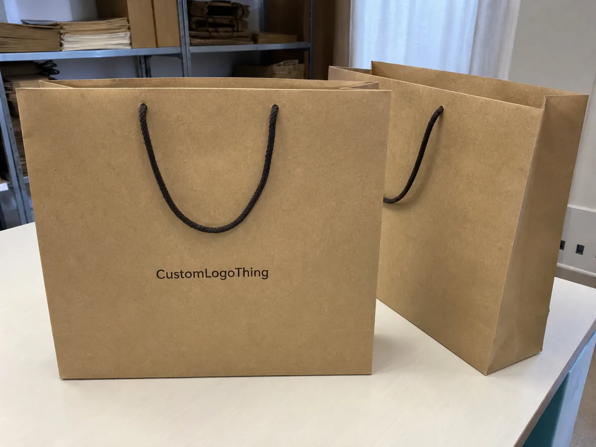
For a hotel buyer, the bag has one job: carry something cleanly while reinforcing the property’s image without shouting. It may be handed across a front desk, picked up at a concierge station, dropped into a car trunk, or carried through a lobby where the guest gives it only a quick glance. That makes readability a more valuable metric than decorative balance. If the logo reads clearly from a few feet away, the bag is doing its work. If it only looks good on a mockup, the design is not finished yet.
A centered logo in a PDF can look perfectly balanced and still end up awkward once the bag is folded, glued, and stacked.
Hotel Flat Handle Paper Bags Logo Placement: What Buyers Miss First
The first mistake is trusting the mockup too much. Mockups are useful for approval, but they flatten reality. In production, the top fold consumes space, the handle reinforcement steals a strip of usable height, and the gussets can pull the eye away from the main panel. A logo that seems generous on screen often ends up smaller, lower, or more crowded once the dieline is applied.
The second mistake is judging placement from the designer’s perspective instead of the guest’s. The person carrying the bag sees it in motion. The person receiving it may see it from above. Someone standing near a lobby desk sees it at an angle. Those are different reading conditions, and they matter. A mark that feels elegant in a layout review can read weak if it is too thin, too low, or too close to the side seam.
The third mistake is treating the bag like a brochure. It is not a brochure. A paper bag has to survive handling, movement, storage, and transport. That means the placement has to work visually and mechanically. If the artwork crosses a fold or sits in a zone that gets compressed during stacking, the print can look uneven or worn before the bag even leaves the property.
The cleanest hotel bag branding usually follows one principle: put the most important mark where the eye naturally lands first, then leave enough white space or kraft space for the design to breathe. That restraint often looks more expensive than adding another line of copy or forcing the logo to fill every available inch.
How Placement Works on the Front Panel and Side Gussets
The front panel is the safest place for the primary logo. It gives the clearest read, the strongest symmetry, and the least risk of visual interruption. For most hotel programs, especially the first run, that is the panel to prioritize. Side gussets can support the design, but they should not carry the full weight of the brand identity unless the bag is unusually large or the visual system has been built for that purpose.
Safe zones matter more than many buyers expect. Keep clear of the top fold, the handle attachment strip, the lower seam, and any glue or reinforcement areas specified by the manufacturer. A logo too close to the top can vanish under the fold. One too close to the bottom can feel heavy and unbalanced. If the artwork sits across a seam, it may break visually once the bag is assembled or filled.
Most suppliers will send a dieline showing the exact printable area. That file should drive the artwork, not the other way around. It sounds obvious, but it is one of the most common reasons a bag needs a second proof. A logo placed by eye on a generic bag template often needs to be moved once the real dimensions are known.
Placement usually falls into three working patterns:
- Centered placement - the default for most hotel bags, easy to approve and easy to reproduce consistently.
- Upper placement - useful on taller bags when the brand should sit closer to the guest’s line of sight.
- Lower placement - sometimes necessary when the handle reinforcement takes up the upper area, though it can feel dense on narrow bags.
Orientation changes the feel too. A horizontal wordmark is usually the easiest to read while the bag is being carried. A vertical lockup can feel more editorial, but it needs enough height to work. If the bag will be photographed, shared in amenity content, or used in a branded gift setting, side gusset printing can add a quieter layer of recognition without turning the bag into a billboard.
One practical detail buyers overlook: handles cast visual weight. Even flat handles draw the eye upward. If the logo is already high on the panel, the top area can get crowded fast. In that case, shifting the mark down slightly or reducing the height of the lockup often improves the final result more than increasing ink coverage.
Artwork Size, Color Count, and Material Choices That Change Results
Logo size should be set by viewing distance, not by how much empty space appears on the artwork file. For hotel use, the primary mark should read cleanly from about four to eight feet. That is the range that matters at a front desk, in a corridor, or beside a valet stand. If the lockup includes a fine script, a tagline, or a small website address, those secondary elements are often the first to go. Less copy usually improves the bag.
There is also a practical printing limit. Fine lines can disappear on textured paper. Small type can fill in on kraft stock. If the logo has delicate strokes, a thick outline, or low-contrast details, ask for a proof on the exact paper being used. Some printers can hold detail down to surprisingly small sizes, but there is always a point where sharpness gives way to softness. On paper bags, the line between refined and muddy can be thin.
Color count affects both appearance and cost. One-color printing is often the strongest option for kraft bags because it looks disciplined and avoids registration problems. Two-color work adds brand fidelity without making the production too complicated. Full-color printing has its place, but it should be reserved for brands that genuinely need tonal detail or photographic imagery. Otherwise, the result can feel busier than the hotel environment needs.
Paper choice changes the visual outcome as much as the artwork does. Brown kraft softens dark inks and can mute small details. White paper gives better contrast and usually makes small lettering easier to read. Recycled stocks can look excellent, but they are not always perfectly uniform, so slight variation in tone is normal. Coated stocks produce sharper edges, although they may feel less tactile if the brand is aiming for a warmer hospitality look.
Typical paper weights for hotel flat handle bags often sit in the 100-180 gsm range, depending on bag size and contents. Smaller amenity bags can work in the lower end of that range. Larger retail-style bags usually need more structure. If the bag is meant to hold heavier items such as boxed toiletries, slippers, or multiple brochures, the handle attachment and base construction deserve as much attention as the print itself.
If sustainability claims matter, verify them directly. FSC certification, recycled content, and compostability are not interchangeable, and a sales sheet alone is not enough to confirm chain-of-custody status. Ask for documentation tied to the actual material, not a generic claim. That step takes minutes and can prevent awkward questions later.
Here is the useful shorthand: paper tone, ink density, and font weight often matter more than a few millimeters of logo movement. A slightly off-center design on the right stock can still feel premium. A perfectly centered logo on the wrong stock can look surprisingly flat.
Pricing, MOQ, and Unit Cost for Printed Hotel Bags
Quotes for printed paper bags are easy to compare badly. Two suppliers can offer a bag with the same dimensions and same logo placement, but if one uses lighter paper, a narrower handle, or a smaller printable field, the lower price is not really the better deal. The useful comparison starts with the same bag size, paper weight, handle style, color count, and print method.
The main cost drivers are straightforward: bag dimensions, paper weight, handle type, number of print colors, and whether the artwork requires one side or both. MOQ affects unit cost heavily. The higher the order, the lower the per-piece price usually falls, but higher quantity also means more inventory risk. A large resort with predictable occupancy can absorb a bigger run. A boutique hotel with seasonal demand may be better served by a smaller order and a quicker reorder cycle.
| Print Option | Typical MOQ | Indicative Unit Cost | What Drives the Price |
|---|---|---|---|
| One-color kraft print | 3,000-5,000 units | $0.18-$0.28 each | Lower setup, fewer plates, simpler registration |
| Two-color white paper print | 5,000-10,000 units | $0.24-$0.40 each | Extra ink station, tighter alignment, stronger contrast |
| Full-color premium bag | 10,000+ units | $0.35-$0.65 each | More setup time, more reject risk, higher visual impact |
These are working ranges, not fixed market prices. Setup charges, sample fees, carton quality, freight, and destination duties can move the final landed cost more than the unit price does. Some suppliers hide those charges inside the per-piece rate. Others list them separately. Ask for both numbers if you want a real comparison.
Plate-based printing can be cheaper on large runs when the artwork is stable. Digital printing may cost more per unit in volume, but it can save time for short runs or seasonal hotel programs that change often. The right choice depends less on ideology and more on repetition. If you print the same bag every quarter, plates often make sense. If the property refreshes design details frequently, flexibility can be worth more than the lowest quote.
One more cost point that gets ignored: overly complex logos can be expensive to print well. Thin reversals, tiny type, metallic inks, and edge-to-edge coverage increase the chance of error. That does not mean they are impossible. It just means the budget should include a cushion for proofing and waste.
Production Process and Lead Time: From Proof to Shipment
The production sequence is usually stable: brief, dieline review, artwork placement, digital proof, sample approval if needed, production, packing, and shipment. That is a good thing. Stability gives buyers a chance to catch mistakes before they become expensive. Hotel Flat Handle Paper Bags logo placement should be locked early in that sequence, because each revision after proofing adds time and increases the chance of a new error.
Lead time is usually lost in three places: incomplete files, delayed approval, and last-minute spec changes. A logo shift of just a few millimeters may seem minor, but it can trigger a new proof, a new sign-off, and a delay in the print queue. If the brand uses a specific PMS color, confirm that the supplier understands whether it will be matched visually, by formula, or by a close printed approximation. Paper absorbs ink differently from coated stock, so the same color can look slightly softer on kraft than it does on screen.
For a stable spec, production often takes about 12-15 business days after final proof approval. If the bag has multiple colors, specialty paper, custom handles, foil, or unusual finishing, 18-25 business days is more realistic. Rush production is possible when the artwork is clean and the order details are settled, but rush jobs leave little room for error correction.
A practical timeline usually looks like this:
- Confirm dimensions, paper weight, and logo placement before design work starts.
- Review the dieline and check that safe margins are visible on every panel.
- Approve the proof only after checking spelling, contrast, and fold behavior.
- Request a physical sample if the paper texture, color, or print sharpness is critical.
- Allow extra time for freight if the bags are tied to a launch date or peak travel period.
Quality control should include more than a glance at the final proof. Check handle adhesion, base strength, print registration, and the consistency of the logo across a carton sample. A bag can look perfect on a single proof sheet and still have minor variation when a full production batch is stacked, folded, and boxed. That variation is normal within limits, but the supplier should know where the limit is.
If the bags will carry heavier items or move through multiple handling points, carton packing matters. Weak outer cartons and tight stacking can crease the bags or distort the handles before they ever reach a guest. For that reason, transit should be considered part of the spec, not an afterthought.
Common Mistakes That Hurt Brand Readability
The first mistake is crowding the top edge. A logo placed too close to the fold or reinforcement strip can disappear when the bag is compressed. The second is adding too much information. Website, phone number, tagline, department name, and a second logo might fit in theory, but the result often feels like a flyer clipped to a handle. On a hotel bag, that amount of copy usually reduces impact.
Thin fonts are another weak point. A decorative script may look polished on a presentation slide and fragile on textured kraft. Very light-weight fonts can also break up in print, especially at smaller sizes. If the brand identity depends on a delicate wordmark, ask the printer for a sample on the real stock before approving a full run.
Poor contrast causes more damage than most buyers expect. Dark brown ink on brown kraft, pale gold on off-white paper, or gray on recycled stock can look quiet in the wrong way. Quiet is fine. Unreadable is not. The logo should still hold up in lobby light, airport light, and in the shadow cast by the handles.
Another recurring problem is relying on a digital crop instead of the full dieline. A logo may look centered in an image file and still sit too far left once the actual bag width is measured. That happens when the mockup is built from a generic template instead of the supplier’s real dimensions. If the bag is part of a larger hotel program, that small error can repeat across thousands of units.
Finally, avoid crossing important marks over seams or fold lines. A seam can interrupt a wordmark, distort a symbol, or make a circular logo look slightly oval once the bag is assembled. It is a small technical detail with a visible consequence.
Expert Tips for Cleaner, More Premium Branding
If the logo lockup is complicated, simplify it for the bag. The strongest element should lead. On narrow or mid-size hotel bags, that often means the symbol first, then the wordmark, with any tagline removed unless there is ample room. A cleaner layout usually looks more intentional than a crowded one.
Negative space is not wasted space. In premium hospitality packaging, room around the logo creates calm. It also makes the bag easier to read at a glance. Buyers sometimes try to use every available millimeter because they feel they are getting more value. In practice, the opposite is often true. A controlled, restrained layout can make a modest bag look more expensive than a fully occupied panel.
Test the layout at arm’s length and again from several feet away. That is the distance a guest experiences in real use. If the logo vanishes, the scale is off. If it dominates the panel so aggressively that the bag starts to feel promotional, the balance needs work. The ideal sits between those extremes: visible, composed, and easy to understand in motion.
A few checks are worth insisting on before approval:
- Match the bag color to the hotel palette instead of forcing a generic white or brown default.
- Ask for both a flat mockup and a folded mockup, because each exposes different placement issues.
- Request a physical sample if the stock is textured, recycled, or unusually light.
- Verify the logo at the exact print size, not just in the original vector file.
There is a reason the best hotel bags often look simple. Simplicity is not laziness. It is the result of removing the extra copy, the awkward alignment, and the decorative element that did not earn its place.
Next Steps: Build a Print-Ready Bag Spec Sheet
Before requesting quotes, gather the bag size, paper weight, handle style, preferred print method, color references, and the final artwork files in vector format, usually AI, EPS, or PDF. Include notes on clear space around the logo, and specify whether branding should live on one face, both faces, or the gussets as well. The more precise the brief, the fewer revisions you will need.
A useful internal approval checklist should cover mockup review, proof sign-off, sample check, and reorder instructions. That is not glamorous, but it prevents the expensive mistake of approving artwork before the real bag dimensions are confirmed. Once the bag is measured properly, the logo placement can be judged on real terms instead of guesswork.
Keep the placement decision tied to the physical product. If the stock changes, the handle changes, or the brand refresh alters the proportions of the mark, revisit the layout. Small production changes can have a bigger visual effect than expected. That is especially true for hotel flat handle paper Bags Logo Placement, where a few millimeters can determine whether the design looks polished or merely printed.
In short: approve the dieline before the art, judge the logo from guest distance, and let the material do part of the work. The best hotel bag programs do not chase decoration. They use disciplined placement, sensible materials, and a print spec that holds up under real handling.
Where should the logo go on hotel flat handle paper bags?
Place the primary logo on the main front panel unless the brand system specifically calls for gusset branding. Keep the artwork clear of the top fold, handle reinforcement, and bottom seam. Center placement is the safest starting point, while a slightly higher position can work on taller bags if the safe zone allows it.
How big should a logo be for flat handle paper bags?
Size the logo so it reads clearly from a few feet away. Use the actual printable width from the dieline, not a generic template, to set the maximum size. If the mark includes small type or fine lines, simplify the lockup and enlarge the main symbol or wordmark so the print stays legible on paper.
Does logo placement change the bag price?
Placement alone usually does not change the price much, but larger print areas, extra colors, and multiple print zones often do. The bigger cost swings come from paper weight, handle type, quantity, print method, and finishing. Always compare quotes using the same bag specification.
What is the usual turnaround for printed hotel bags?
Lead time depends on proof approval, print method, quantity, and shipping distance. A stable one-color order may move in about 12-15 business days after approval, while more complex bags can take 18-25 business days or longer. Rush orders are possible, but only when the spec is already locked.
What should I check before approving artwork for hotel bags?
Confirm the final dimensions, print area, logo placement, and safe margins on the dieline. Review contrast, spelling, and color matching, and request a sample if the stock or finish is unusual. Most errors come from approving the layout before the real bag geometry is checked.

