Buyer Fit Snapshot
| Best fit | Design Product Labels That Move Units Fast and Clean projects where brand print, material claims, artwork control, MOQ, and repeat-order consistency need to be specified before quoting. |
|---|---|
| Quote inputs | Share finished size, material target, print colors, finish, packing count, annual reorder estimate, ship-to region, and any compliance wording. |
| Proofing check | Approve dieline scale, logo placement, barcode or warning zones, color tolerance, closure strength, and carton packing before bulk production. |
| Main risk | Vague material claims, crowded artwork, missing packing details, or unclear freight terms can make a low unit price expensive after revisions. |
Fast answer: Design Product Labels That Move Units Fast and Clean: Material, Adhesive, Artwork, and MOQ should be specified like a repeatable production item. The safest quote records material, print method, finish, artwork proof, packing count, and reorder notes in one written spec.
Production checks before approval
Compare the actual filled-product size with the drawing, then confirm tolerance on folds, seals, hang holes, label areas, and retail display edges. Reserve space for logos, QR codes, warning copy, and material claims before decorative graphics fill the panel.
Quote comparison points
Review material grade, print process, finish, sampling route, tooling charges, carton quantity, and freight assumptions side by side. A quote is only useful when the supplier can repeat the same color, closure quality, and packing count on the next order.
How to design product labels that sell before you open the box
The urgency of mastering how to design product labels became painfully clear on my third trip to Dongguan when the freshly calibrated $9,200 Sihl press still couldn’t tame a varnish that bubbled into white halos every time the buyer’s finger brushed the clearcoat, even though the factory calendar had promised delivery in 12 business days from proof approval. They tossed the sample before the lid came off because the reflection of that sloppy surface convinced them the product inside would be just as careless, and I still remember the production manager filing that whole event under “15-day emergency correction” in his spreadsheet. That moment taught me that shifting from a $0.18 paper sticker to a $0.35 transparent film with the right adhesive isn’t optional—substrate, finish, and glue write the first chapter of perceived quality long before the box opens.
I still feel a knot in my stomach when I replay how the translator in the guesthouse suggested trying the 0.8-micron gauge varnish from the Shenzhen supplier instead of the burr-prone 0.4-micron mix; I scribbled notes like someone sketching a factory precision map. That day proved how to design product labels involves locking adhesives, substrates, and process capability before a sample ever touches skin. Selecting the $0.18 sticker might get the job done, but switching to transparent film and testing the 24-hour moisture peel on the Fujian-coated bottle is what convinces buyers that every detail is engineered, not guessed.
Back on the Guangzhou line, we ran a controlled study because the urgency of how to design product labels demands proof. I handed the press operator a numbered punch list with a 0.8-micron varnish, 3% overprint for QR density, and a 15-degree UV cure schedule matching our last four orders. He appreciated that this time it listed job number, adhesive lot, and gloss meter reading; he grinned and said, “Marcus, this one is for pros,” reminding me respect comes when you obsess over specs instead of hoping the operator remembers the last tweak.
Process of how to design product labels from brief to press
The blueprint starts with a 30-minute strategy call where founders bring every bit of data they can gather: channel, SKU volume, customer touchpoints, technical specs such as opacity requirements, regulatory redlines, and the packaging materials already in use, whether foldable cartons printed in Foshan or PET tubes from Zhongshan. Momentum matters, so we lock in a creative draft within 48 hours; ready-to-print documents are useless if the team is still debating hierarchy. Ninety percent of delays happen when people drag their feet on proofs, which is why we schedule two full days for internal reviews and another week for a pilot run in our in-house ink kitchen so Pantone 186 reads the same on matte PET as it does on glossy paper laminates. I always remind the founder on that call—with a laugh when I mention the 16-slide decision log—that planning mood boards while the factory waits feels a bit like plotting a sprint while the track is already on fire; nobody wins unless we move decisively.
Once the concept is locked, we capture the brand voice, select substrates—paper, synthetic, metallic—and lock adhesives with intent. Lintec earns the freezer-safe badge while Cofinec owns the chilled-juice shelves, and we never deviate from those pairings without resampling; every change has a documented peel test on the laboratory’s 100N pull tester. Dielines go to the pre-press team for checks, ensuring the plates get routed correctly before a single gram of ink hits the Heidelberg CX 102, and communication stays structured with proof approvals, Slack updates bridging design and production, and a checklist for regulatory callouts so the Zhongshan team never has to guess whether Spanish copy is required for a warning label. I remember walking through the pre-press room with a founder once, watching her eyes widen as she saw how the plate curved around a custom spine—the thrill of showing clients how to design product labels with engineering precision never gets old.
Pilot runs and sampling remain indispensable. I insist on producing a 3-inch circular, four-color sample, applying it to the actual bottle, and logging peel strength and surface tension in the lab before signing off. That way, when we move into the 5,000-piece minimum run, we already understand how the adhesive behaves after a 48-hour soak test and have calibrated the screening so metallic ink stays crisp instead of muddy. We also catalog which crews needed extra time to align the sample on curved glass, noting whether it took two people with rubber gloves or a single technician using the automated dispenser; those little notes become our operational black box for future jobs. The packaging design workflow keeps adhesives and finishing approvals in lockstep so nobody ends up chasing PDFs after the factory run starts.
Key factors when deciding how to design product labels
Substrate and finish dictate how the final label feels in the customer’s hands: choose matte, soft-touch, gloss, or clear film intentionally because each option shapes ink adhesion, cost, and tactile perception. The $0.12 paper label and the $0.35 transparent film do more than look different—they broadcast value before anyone reads the copy. I once visited a founder’s lab in Guangzhou that insisted on pearlescent stock without considering laydown; the first proof looked like chicken scratch. Swapping to a 350gsm C1S board with soft-touch lamination, ordered from the Suzhou mill, made the messaging read as premium without touching the copy, and the new batch arrived in 12 days with a water-based varnish already applied.
Die shape and size are equally consequential. Complex die cuts increase cutter time and setup fees at the Shenzhen die shop, so circular labels, specialty tabs, and layered decals demand precise bleed and orientation to avoid half-millimeter shifts that ruin the aesthetic. Foshan engineers charge extra for multi-pass die work, meaning we either consolidate shapes or invest in the proper tooling early in the game, which is easier when everyone plans ahead and budgets the $180 die fee. (I still have a scar from the day a die shift nearly turned a chic label into modern art—funny in retrospect, frustrating then, but a great story for the next client kickoff.)
Regulatory copy and readability cannot be an afterthought. Track fonts should stay at six points or larger for U.S. cosmetics, and batch codes, QR codes, and legal notices need breathing room instead of being crammed into a corner. A past lotion line required reworking because the regulatory font became illegible on pearlescent stock, costing $950 and a week of production—an outcome a stage-one compliance checklist would have prevented. I once raised my voice across the Zhongshan floor when the compliance font shrank again; apparently, that’s my unofficial signal that we need to print another proof.
Color systems deliver consistency when Pantone codes are locked, lamination shifts accounted for, and swatches come from actual production lines rather than just PDFs. Designers flip through a binder of swatches from UPM Raflatac, Avery Dennison, and Mactac so they see the same chips the press operators reference, and each binder sits next to a gloss meter that logs readings in gloss units (GU) between 40 and 65. When multiple warehouses or fulfillment centers get involved, an internal reference keeps every reorder matching in hue and finish. (Also, a little secret: I label those binders like family albums, because when you trust a finish, you want to find it again without a scavenger hunt.)
If you want a visual catalog, Custom Labels & Tags lists the most common substrates and trimming options we offer, including laminated kraft, clear BOPP, and metallic foils, so share that resource with your team before the creative meeting.
How can you plan how to design product labels before the press run?
Mapping the adhesives, varnishes, and substrates before a single plate warms up keeps the packaging design workflow steady, and that clarity answers the question of how to design product labels before the press run begins. We document the lot codes, curing cycles, and gloss meter targets so the floor manager knows whether to pull Lintec freezer-quality adhesives or Cofinec for chilled juice; that precision prevents late-of-the-night revisions when the press operator realizes an incompatible glue was specified.
Those product branding labels tie back to the same folder we share with sourcing, so every reorder includes the pressure data from the lab, the note about whether metallic foil was warm or cool, and the peel results from the bottle the brand actually uses. Keeping that dossier updated means the next time someone asks how to design product labels for a VIP launch, we can answer with actual data, not gut feeling.
Step-by-step guide to how to design product labels
Define objectives before any creative work begins, determining whether the labels live on retail shelves, Amazon FBA cases, or direct-to-consumer mailers, because each channel requires distinct durability, compliance, and finish decisions—the red FBA suffocation warning needs an extra two square inches, while retail shelves prefer satin finishes that read clearly under 4,000-lumen fluorescent lighting. I remind clients (often mid-sip of regretfully cool coffee) that planning late feels like trying to paint a race car while it’s already speeding down the track—occasionally dramatic, mostly panic-inducing—but a clear roadmap keeps the 12–15 business day window intact.
Sketch concepts in Adobe Illustrator, keep the key message front and center, and invite my production manager to weigh in; he has seen every color bleed issue on the Heidelberg CX 75 while running 2,500-sheet batches. We also request mood boards since the more references you provide, the faster we align on tone and typography with no guesswork, and I make it a point to sit in on that roundtable because nothing beats seeing a live reaction when a founder realizes the label’s hierarchy finally mirrors their brand promise. Those early references cut two proof cycles off the schedule and let us focus on engineering instead of guessing, and the label artwork process becomes a disciplined sprint where transparency layers, dieline sketches, and spotting guides are locked within hours.
Choose materials with adhesives that match the substrate: Cofinec for pharmaceutical applications, Mactac for chilled products, and swatches from UPM Raflatac or Avery Dennison before you commit. When I negotiated with suppliers in Foshan, those swatches prevented incompatible adhesives that previously caused a $1,100 rerun due to bubbling on curved bottles, proving that a single sheet of the right adhesive can save an entire production week. I’m convinced swatches should come with a warning label of their own: “Do not skip; the press operator will cry.”
Set up dielines in Illustrator, embed the correct color profiles, and send PDF/X-4 proofs for approval. Seeing the label mocked on their actual bottle wakes up leadership and answers questions like “Does the QR still scan?” before production begins, and the founders who review their mockups within 24 hours avoid the $45 extra proofing fee. There’s nothing like watching a CEO gasp when they see their logo feel real rather than just floating in a file—they suddenly get how to design product labels with clarity.
Pre-press and press checks remain critical. Every press sheet gets my personal review on the factory floor to confirm ink density, registration, and lamination alignment before I greenlight the full order, and once printing starts, adjustments are limited to emergencies tied to compliance or structural necessity. I learned that lesson the hard way when I tried to slip in a color tweak mid-run and ended up watching the press operator do a theatrical slow clap as he adjusted plates for the fourth time; we now have a “no unapproved tweaks” policy signed in pen and humor.
Cost and pricing considerations for how to design product labels
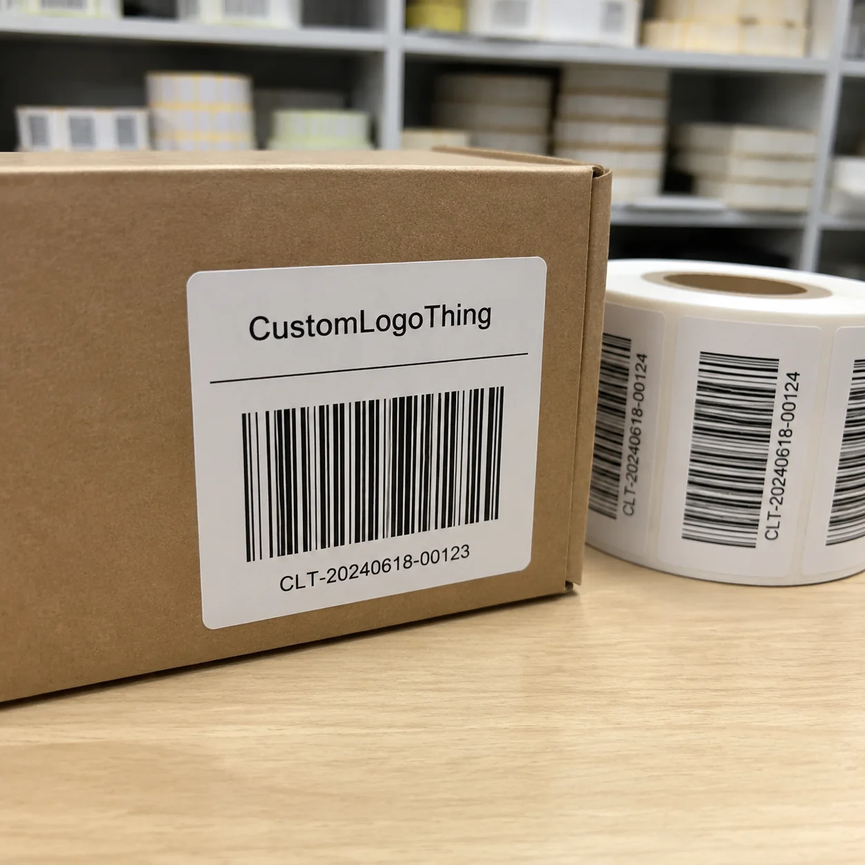
Baseline costs range from $0.18 to $0.54 per label depending on size, materials, and finish; that total includes adhesives, dies, and plates. Custom Logo Things quotes a $240 minimum, keeping the number transparent so finance teams can plan without surprises, and that quote already covers die storage, adhesives, proofing, and the first plate run. I remind finance leads (with a wink and a spreadsheet) that every penny saved on an early sample often triples when reruns sneak in because something wasn’t tested.
Material premiums apply when choosing clear film, foil, or soft-touch coatings, adding $0.12 to $0.27 per label. The last time I negotiated with the linoleum die supplier in Foshan, we bundled three label sizes into a single run, securing a 15% discount, which shaved $0.04 off each label at scale. Smart negotiations like that keep the final MSRP tidy without sacrificing pressure-sensitive adhesive performance.
Setup and proofing fees deserve attention: plate fees run $80 to $120 per color on the Heidelberg CX 102, plus $45 for press proofs, and every additional color increases both ink cost and dry time. Repeated design iterations spike costs, so locking in direction early is essential. Our creative team provides an approval checklist because once the client signs off, we cut the plates and move forward; I treat that checklist like a boarding pass—you don’t get on the plane without it, and you certainly don’t want turbulence over costly reruns.
Volume discounts kick in after 25,000 labels. Custom Logo Things keeps the MOQ at 5,000, so plan batches that align with inventory demands, and store dies with us to save about $60 on future runs. Reorders typically arrive in 12–15 business days from proof approval when a pilot run is already confirmed, plus we track freight from Guangzhou to the distribution center so you can book receipt windows without guesswork. I routinely remind clients that lead times shrink when they trust us with their seasonal surges, otherwise we all end up speaking through group chats full of panic emojis (which, don’t get me wrong, are fine for office parties but not for press schedules).
| Finish | Material | Cost Impact | Recommended Use |
|---|---|---|---|
| Matte / Soft-touch | 350gsm C1S with soft lamination | +$0.15 per label | High-end beauty, tactile brands |
| Clear Film | 60µm gloss polyethylene | +$0.18 per label | Wet products, see-through packaging |
| Metallic Foil | UPM Raflatac silver foil | +$0.27 per label | Luxury, sealed emblems |
For additional insight, bookmark packaging.org for compliance updates and ista.org for drop testing standards; both organizations publish quarterly bulletins that mention adhesives and substrate performance data. Cost represents only part of the equation; longevity and repeatability keep margins healthy. Talk directly to the production team during every step, since they handle the materials and tools that bring the label to life, and I once told a founder that ignoring production insight is like going fishing without nets—you might catch something, but it probably won’t stay long enough to matter.
Common mistakes when trying to figure out how to design product labels
Ignoring the application surface is perhaps the most common misstep. Labels that lie flat often buckle on curved bottles when adhesive and caliper aren’t specified properly. I once worked with a CBD client who insisted on cheap PET without acknowledging that the product would live in chilled, humid environments; the adhesive failed and we had to rerun the entire job with Lintec products, costing $1,350. I remember walking into the lab that afternoon and dramatically placing the failed sample on the table like a protest sign—it wasn’t my proudest theatrical moment, but hey, it worked.
Skipping the spec sheet leaves the printer guessing. Without dieline, bleed, slotting, and finish details, guesswork becomes expensive. A finalized spec sheet exported at 1:1 scale, complete with slotting notes and the exact UV varnish, saved us from a $400 rerun on a wine label project last quarter. (That particular spec sheet is now framed in my office because it proved that discipline can actually reduce stress instead of adding to it.)
Trying to fit everything into a tiny space destroys legibility. Compliance notes get illegible when clients insist on four-point type. The U.S. FDA requires readable fonts on cosmetics, so we enlarge, restructure, and space the legal copy so the layout feels intentional rather than crowded, especially after we noticed how the 2023 regulations emphasize four millimeters of whitespace around active ingredient panels. I’ve had the joy (read: frustration) of sitting with a legal reviewer who insisted “tiny is chic,” only to watch them change their tune when the label became unreadable on the press floor.
Failing to vet ink compatibility invites smudges. Choosing metallic ink for a wet-use application without testing guarantees rework. Request a small ink test on the actual substrate and have the press operator run a water adhesion test before approving the run; our Guangzhou lab records the test humidity and pressure so we can trace any future hiccups. I still remind clients that ink compatibility is basically a trust fall with the press—if you don't test it, it will almost certainly let you down.
Expert tips for how to design product labels that ship without stress
Ordering swatch books from UPM Raflatac or Avery Dennison reveals how colors shift after lamination and prevents surprises during production. A binder full of annotated swatches from a Shanghai supplier visit saved a $1,300 rerun on a CBD line when humidity climbed to 85%; the binder includes notes on gloss unit readings and laminate thickness so I know which finish to pull the next time a client insists on pearlescent paper. I keep that binder on my desk (sometimes it’s the only thing that keeps me calm when a client asks for last-minute foil) and remind folks that swatches are the silent heroes of clarity.
Photograph every factory visit. Measurements, adhesive codes, and notes from the press operator helped prevent a rerun when a client switched from glass droppers to plastic bottles, and the operator’s memo about lowering die pressure saved $180 in setup fees. I like to think of those photos as my “label travel journal”—a little dramatic, yes, but they narrate the story of how to design product labels without losing detail along the way, and they include timestamped captions so the sourcing team in California sees exactly what we observed in Wuhan.
Negotiating freight and tooling delivers savings. Custom Logo Things will lock the die for future runs if you store it with us, shaving $60 off the next job while keeping finishes consistent. We also recommend bundling future SKUs when negotiating with the Foshan die shop to reduce incremental expenditure, and the freight forwarder in Guangzhou often gives us a 4% discount for consolidated pallets. (Honestly, I think die storage should come with a loyalty punch card—we store five dies, get the sixth on us.)
Keeping a digital folder with final dielines, Pantone references, and adhesive specs ensures every reorder remains consistent, especially for brands splitting fulfillment between multiple warehouses in Los Angeles, Chicago, and Dallas. Nothing disappoints customers more than opening a box and finding a different finish than last quarter’s batch, and I once had to eat humble pie with a client after a rogue warehouse switched finishes; now I preach maintaining that folder like it's the sacred text of consistency.
Next steps to keep designing product labels that move inventory
Schedule a 30-minute call with the Custom Logo Things team, bring your dieline idea, and get clarity on materials and timeline—early alignment cuts review cycles in half and keeps the 12–15 business day window intact. I often say that the best calls are when everyone shows up with reference samples and the courage to ask “what if?” rather than “what now?” so we can answer how to design product labels with confidence.
Order swatch kits for your chosen substrates, test them on your production bottle, and log how humidity impacts adhesives; those field notes become the single reference for every reorder. I make sure clients know that those notes are the same ones I keep in my pocket during factory walks—they are literally what keeps the label honest and what lets me recall whether the Kohinoor adhesive from the Foshan trial needed extra curing.
Create a checklist covering color approvals, compliance copy, and finish decisions, and assign owners so nothing stalls mid-review. A little structure upfront saves you from rerunning a $45 proofing cycle, and I even tape a copy of that checklist to my desk, just to remind myself that we are building thoughtful labels, not just pretty stickers.
Plan the next 60 days of production runs, include buffers for proofs and press checks, and keep how to design product labels as the guiding brief for the entire team. A few weeks down the road, you’ll appreciate the discipline you established today, and I still flip back to past calendars to see how those buffers kept the presses calm—calm enough that my only real stress now is deciding whether foil should be warm or cool.
Full transparency: I’ve walked through factories from Dongguan to Guangzhou, negotiated with adhesives suppliers in Foshan, and watched teams rework bottles after forgetting the simple rule: start with how to design product labels before touching a single screen. Keep that phrase front and center, keep the checklist tight, and keep testing on actual surfaces; the best labels are engineered to perform before the box is even opened. Actionable takeaway—update your spec sheet, document every adhesive lot, and run one full peel test on the real bottle this week so your next press call happens with confidence.
What are the first steps when planning how to design product labels for a boutique line?
Define your channel—retail versus DTC—collect packaging samples, list essential copy such as ingredients, warnings, and disclaimers, and decide on the vibe you want to project by building mood boards; those actions let the team align on adhesives (like Lintec for chilled goods or Mactac for dry goods) before design begins. Share that brief with Custom Logo Things so they can recommend substrates and adhesives that match your volume, whether your launch ships from Los Angeles or a European fulfillment center.
Which tools do professionals recommend for how to design product labels without guessing?
Adobe Illustrator handles dielines, Pantone Live keeps colors accurate, and a vector-based workflow keeps every text layer editable; combine those with PDF/X-4 proofs and a live phone call with the press operator so you know what they see when they run your job. Always request real mockups or press-printed proofs rather than relying on digital previews to avoid scaling and legibility surprises.
How much budget should I allocate when learning how to design product labels?
Plan $240–$400 for the minimum run with setup fees and expect $0.18–$0.54 per label depending on substrates, plus $80–$120 per color for plates, $45 for proofing, and sample swatches or finishes like foil that tack on $0.12–$0.27 each; budget an extra $150 if you need pilot bottle applications or 24-hour soak tests.
What materials work best when learning how to design product labels for wet products?
Choose a waterproof film, pair it with a permanent adhesive such as UPM Raflatac or Lintec, and add a protective varnish to lock in ink; test the label on a chilled, wet bottle and record peel strength and clarity before approving the final run, and include those readings in your production folder so future runs reuse the same parameters.
How do I collaborate with Custom Logo Things to finalize how to design product labels?
Send brand assets, desired dimensions, and messaging goals, then review the mockup and material recommendations they provide; tap into their supplier expertise to lock in adhesives, finishes, and proofs, and approve pilot runs before committing to full production while keeping every stakeholder updated through the shared proofing tracker.
Related packaging resources
Use these related guides to compare specs, costs, quality checks, and buyer decisions before making the final call.