Buyer Fit Snapshot
| Best fit | Printed Kraft Cartons for Retail projects where brand print, material claims, artwork control, MOQ, and repeat-order consistency need to be specified before quoting. |
|---|---|
| Quote inputs | Share finished size, material target, print colors, finish, packing count, annual reorder estimate, ship-to region, and any compliance wording. |
| Proofing check | Approve dieline scale, logo placement, barcode or warning zones, color tolerance, closure strength, and carton packing before bulk production. |
| Main risk | Vague material claims, crowded artwork, missing packing details, or unclear freight terms can make a low unit price expensive after revisions. |
Fast answer: Printed Kraft Cartons for Retail: What Brands Need should be specified like a repeatable production item. The safest quote records material, print method, finish, artwork proof, packing count, and reorder notes in one written spec.
Production checks before approval
Compare the actual filled-product size with the drawing, then confirm tolerance on folds, seals, hang holes, label areas, and retail display edges. Reserve space for logos, QR codes, warning copy, and material claims before decorative graphics fill the panel.
Quote comparison points
Review material grade, print process, finish, sampling route, tooling charges, carton quantity, and freight assumptions side by side. A quote is only useful when the supplier can repeat the same color, closure quality, and packing count on the next order.
Printed Kraft Cartons for retail do a nice little trick that glossy packaging often fails at: they make a product feel grounded before anyone even opens the box. That matters more than brands like to admit. People scan shelves fast, and kraft packaging signals something immediate - natural, honest, not trying too hard. The good versions look effortless. They are anything but. Behind that understated look is a pile of decisions about board, print, finish, fit, and how much abuse the carton needs to survive on the way to store shelves. The bad versions are easy to spot. Thin. Crooked. Warped at the edges. The kind of carton that makes a product look cheaper than it really is.
From a buyer's point of view, printed kraft cartons for retail sit in a practical middle lane. They ship flat, usually cost less than rigid boxes, and give a brand a natural feel without turning the package into a brown rectangle with a logo slapped on top. The catch is that "kraft" is not one fixed material. Board type, coating, print process, and carton structure all change the result. Ignore those details and you end up comparing packaging that only looks similar from across the room.
The promise is pretty straightforward. Get the structure, stock, print method, and timeline right, and printed kraft cartons for retail can look premium, hold up in transit, and stay inside a sane budget. Miss those basics, and the carton will announce the mistake for you.
What Printed Kraft Cartons for Retail Actually Are
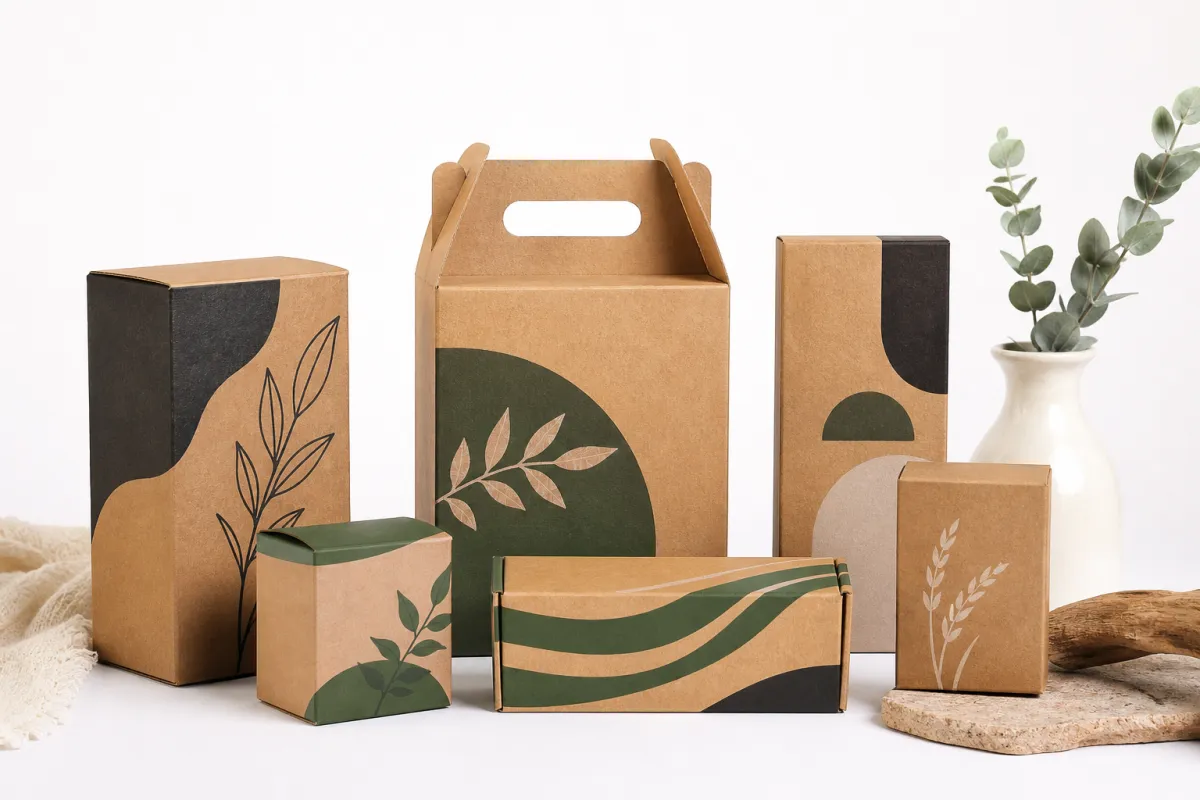
Printed kraft cartons for retail are folded paperboard cartons made with kraft-style stock and printed with brand graphics, product details, and compliance information. They sit on a shelf, secure the product, and still give shoppers enough information to make a decision quickly. So the carton has to do three jobs at once: protect, communicate, and sell. It gets no medals for looking pretty if it fails the other two.
The format is usually a folding carton with top and bottom flaps, a tuck-end closure, or a lock-bottom structure for heavier items. A soap bar, lip balm, tea tin, supplement bottle, and candle jar all need different carton behavior. That is why printed kraft cartons for retail should start with product dimensions and weight, not artwork. I have seen brands approve a gorgeous design first, then discover the product rattles around inside like loose change in a car cup holder. Not premium. Not even close.
There is also a difference between a carton that looks kraft and a carton built entirely from kraft board. Some stocks use recycled kraft liners, some use a kraft-finished outer sheet over a whiter board, and some use unbleached kraft through the full structure. That difference matters. Fully unbleached board usually gives a more natural tone and a rougher fiber story. A kraft-finish board can deliver sharper print detail and cleaner edges. Neither one wins automatically. Printed kraft cartons for retail should match the signal the brand wants to send: rustic, clinical, minimal, earthy, or premium with restraint.
These cartons work especially well in categories where buyers expect a grounded, credible feel. Cosmetics and skincare use them to soften an overly polished look. Food brands use them to signal simplicity and ingredient transparency. Supplements use them to stay readable and compliant without shouting. Accessories and gifts use them because the carton feels considered instead of overdesigned. That is the real value of printed kraft cartons for retail: they make a product look intentional without pretending the packaging is the main character.
A plain kraft carton can beat a shiny one if it gets the point across faster. Shoppers do not reward effort. They reward clarity.
There is one thing buyers still get wrong: not every "kraft" carton is environmentally equal. A brown surface does not magically make a box sustainable. Ask for FSC certification, recycled content percentages, or other proof if sustainability claims matter. The paper industry has standards for a reason. The [FSC](https://fsc.org) system is a useful place to start if sourcing matters, and [ISTA](https://ista.org) testing guidance helps you think about shipping stress, not just shelf appeal.
Printed kraft cartons for retail are not magic. They are paperboard systems with design choices layered on top. Get the base right, and the branding does a lot more work. Get the base wrong, and no amount of typography will rescue it.
How Printed Kraft Cartons for Retail Get Made
The first step in printed kraft cartons for retail is the dieline. That is the flat template showing every panel, fold, tuck, glue seam, and cut line. If the dieline is sloppy, everything downstream gets messy. Good carton vendors ask for product dimensions, product weight, opening direction, and any retail requirements before they print a single sheet. They should. Guessing here is amateur hour dressed up as enthusiasm.
Once the layout is fixed, the team selects stock. Common options include virgin kraft board, recycled kraft board, and SBS or C1S board with a kraft finish. Virgin kraft usually feels stronger and cleaner. Recycled kraft often has a more textured, muted surface but can vary more from batch to batch. SBS with a kraft look can deliver sharper graphics and better color consistency, especially if the artwork uses small type or barcode areas. For printed kraft cartons for retail, the stock choice changes stiffness, print clarity, edge appearance, and how much the carton feels like a natural package versus a designed object.
Then comes printing. Digital printing is often the best answer for short runs, frequent revisions, or multiple SKU launches. Offset printing is usually better for cleaner color and tighter detail at larger quantities. Flexographic printing can be cost-effective for simpler graphics, but it is not the first choice for every brand look. If the design depends on subtle gradients, fine lines, or small legal text, offset or high-resolution digital usually gives a better result. The wrong print method does not just look a little off; it can make the whole carton feel cheap.
Finishing is where printed kraft cartons for retail either stay grounded or wander into overdone territory. Matte aqueous coating keeps the paper feel. Soft-touch lamination gives a smoother hand feel, though it can mute some of the raw kraft character. Spot varnish can pull attention to a logo, product name, or icon. Embossing adds depth. Foil adds contrast, but use it carefully; too much foil on kraft starts to look like the brand lost an argument with the design team. Window cutouts are useful if the product itself matters visually, like soap, tea, snacks, or cosmetic items.
After printing and finishing, the cartons are cut, scored, glued, packed flat, and shipped. That part sounds simple until a glue seam opens, a fold cracks, or the barcode scans poorly under retail lighting. Quality control should include color checks, fold testing, glue-seam inspection, and a quick look at barcode readability. For printed kraft cartons for retail, the final check is not the PDF. It is the folded sample sitting under real light, with a real product inside.
Here is a useful way to think about the build:
- Dieline first: product fit, closure style, and shelf orientation.
- Board second: stiffness, texture, and print response.
- Print method third: detail, color consistency, and run size.
- Finish last: touch, glare control, and brand tone.
If you want a formal reference point for packaging performance, the [Packaging School](https://www.packaging.org) and ISTA resources are useful starting points for thinking beyond visuals. Packaging is not just graphic design with a glue flap. That is how people end up with retail packaging that looks good in a mockup and falls apart in the first shipping carton.
Key Factors That Change Strength, Finish, and Shelf Appeal
Board caliper is the first decision that matters in printed kraft cartons for retail. Too light, and the carton feels flimsy before the shopper even touches it. Too heavy, and you get a box that feels overbuilt, costs more than it should, and slows down folding or packing. For lightweight items, around 14pt to 16pt can work. For many retail products, 18pt to 24pt is the more practical range. Heavier or more fragile items may need inserts or thicker board, especially if the carton ships in bulk. Point caliper is not the whole story, but it is usually where the pain starts if the spec is wrong.
Print coverage changes the look more than a lot of brands expect. A light design with open space lets the kraft texture show through, which can be great if the brand wants an earthy feel. Full-bleed graphics, dark solids, and heavy ink coverage reduce that texture and move the carton toward a more polished look. Printed kraft cartons for retail live on that line all the time. Use too little print, and the carton can look unfinished. Use too much, and the kraft story disappears.
There is also a real tradeoff between natural feel and retail clarity. Uncoated kraft feels authentic and tactile, but small type can soften on the surface. Coated or treated kraft gives cleaner edges, better color density, and more predictable print results. That does not mean coating is always better. For some brands, the slight softness of uncoated kraft is the whole point. For others, especially supplements and beauty products with a lot of legal copy, coated or semi-coated printed kraft cartons for retail can keep the label panel from turning muddy and unreadable.
Product weight and shipping distance should shape the structure. A candle in a thin tuck-end carton might survive on a local boutique shelf and fail after a few days in a warehouse and a cross-country freight run. A soap bar with a snug fit can get by with a looser pack-out. A glass bottle usually needs a tighter fit, maybe an insert, maybe both. The carton is not standing alone. It is part of the shipping system, and retail buyers notice failures quickly because the damage often shows up before the product gets scanned into inventory.
Retail channel matters too. Boutique stores often accept softer natural textures and lower pack volumes. Chain stores tend to punish weak board, inconsistent sizing, and loose closures. Subscription boxes can create stack pressure and impact problems. E-commerce adds parcel shock, compression, and abrasion. Printed kraft cartons for retail should be tested for the channel they will actually live in, not just the place where the marketing team wants a nice photo.
Here is a simple comparison that helps brands make a better board choice:
| Stock Option | Look | Strength | Print Quality | Typical Use | Cost Impact |
|---|---|---|---|---|---|
| Virgin kraft board | Clean, warm, natural | Good to very good | Good, slightly textured | Beauty, wellness, premium food | Medium |
| Recycled kraft board | Earthy, less uniform | Moderate to good | Variable, depends on batch | Eco-focused brands, value retail | Lower to medium |
| SBS with kraft finish | Controlled, branded, cleaner edge | Good | Very good | Cosmetics, supplements, high-detail graphics | Medium to higher |
| Heavy kraft board with insert | Structured, premium, protective | Very good | Good | Glass, candles, fragile or heavier goods | Higher |
Printed kraft cartons for retail also have to survive handling, not just display. If you want a standard to think against, ISTA transit testing and ASTM-style compression thinking are useful references. Not every project needs formal lab testing, but if your product is fragile or high-value, skipping sample testing is how you pay for the same mistake twice. I have watched more than one launch get delayed because a box looked fine on the render and then crushed after a day in the warehouse. Kind of a bummer when that happens after production.
One practical tip: ask for a sample using the actual product weight, not a placeholder. A carton can look fine empty and misbehave the moment a filled bottle slides into it. That is the kind of mistake that only gets expensive after production starts.
Printed Kraft Cartons for Retail Cost: What Drives Pricing
The cost of printed kraft cartons for retail is driven by a small set of variables that matter more than most brands expect: size, board grade, print coverage, number of colors, finishing, structural complexity, and total quantity. Bigger cartons use more board. More colors take more setup. Complex folds need more setup and more room for error. Extra finishes are pleasant right up until you see the quote. Then they are "pleasant" in the same way a dental bill is pleasant.
Short runs cost more per unit because setup time gets spread across fewer cartons. If you are ordering 250 to 1,000 pieces, the unit price can feel irritatingly high. That is normal. Once you move into 2,500 to 5,000 pieces, the per-unit cost usually improves. At 10,000 and above, the setup cost is diluted even more, as long as the design stays stable and the print method supports that volume. For printed kraft cartons for retail, quantity often matters as much as artwork.
Finishes can change the bill fast. Foil stamping adds tooling and labor. Embossing or debossing needs a custom die. Window cutouts require extra die-cutting and sometimes a film patch. A soft-touch finish can raise the unit price if the carton needs additional handling. If you are trying to keep printed kraft cartons for retail inside a budget, the cleanest move is often to use one smart finish instead of three average ones.
Hidden costs are where projects quietly go sideways. Proofs cost money. Custom dielines cost money. Freight can cost more than expected if cartons are bulky but lightweight, because you are paying for space. Storage can matter if you are building inventory for several SKUs. And if your carton ships flat but needs hand assembly or kitting, labor becomes part of the packaging budget whether you planned for it or not.
Here is a practical pricing view for typical printed kraft cartons for retail orders. These are ballpark ranges, not promises, because board grade, print coverage, and finishes move the numbers quickly:
| Quantity | Basic Print, No Special Finish | Mid-Level Finish | Complex Finish or Structure |
|---|---|---|---|
| 250-1,000 units | $1.10-$2.40 each | $1.60-$3.25 each | $2.50-$5.00+ each |
| 2,500 units | $0.55-$1.10 each | $0.80-$1.60 each | $1.40-$3.25 each |
| 5,000 units | $0.28-$0.85 each | $0.45-$1.20 each | $0.95-$2.40 each |
| 10,000+ units | $0.18-$0.48 each | $0.32-$0.80 each | $0.70-$1.80 each |
For most brands, that table explains the real pattern behind printed kraft cartons for retail: the more stable the design, the lower the per-unit price gets. The more changes you make after proofing, the more you pay for the privilege of indecision. Packaging does not enjoy indecision. It invoices it.
If you want a cleaner buying process, ask for one quote that clearly lists stock, dimensions, print method, finish, carton count, freight assumptions, and proof terms. That one page can prevent three days of back-and-forth and a surprise line item at the end.
Step-by-Step Timeline for Printed Kraft Cartons for Retail
A good production timeline for printed kraft cartons for retail starts with the brief, not the artwork. The brief should include product size, product weight, closure preference, retail channel, finish goals, and any compliance copy that must fit on the carton. If the product spec is still moving, the timeline is still fiction. I have seen more packaging delays come from "we thought the bottle was 120 ml" than from machine problems. That kind of mistake sounds tiny right up until it pushes a launch by two weeks.
Once the brief is locked, the dieline gets built or selected. That can take a day or a week depending on whether the structure is standard or custom. Artwork follows, then proofing. Simple printed kraft cartons for retail can move from approved proof to production in about 2 to 4 weeks. More complex jobs, especially those with specialty finishes, inserts, or multiple approval rounds, often need 4 to 6 weeks or longer. If you are launching a seasonal item, the calendar will not care that the print shop was "almost done."
Delays usually happen in the same places. Missing dimensions force a redraw. Late legal copy forces a new proof. Color changes after approval mean another round. Structural revisions after samples can add a week or more. The fastest way to slow printed kraft cartons for retail is to keep changing your mind after the sample stage. That habit is expensive and weirdly common.
You can shorten the timeline with a few simple moves. Lock the product weight early. Use a ready dieline if the structure is standard. Approve proofs quickly, but not carelessly. Send high-resolution artwork with correct bleed and safe zones. Keep the number of stakeholders reasonable, because every extra "just one more opinion" can create another round of revisions. For printed kraft cartons for retail, clarity saves days. Sometimes it saves weeks.
Timeline and cost move together. Rush jobs often force faster freight, fewer sample rounds, and less flexibility on finishing. If you compress the schedule, you are usually paying in at least one of these ways: higher shipping, reduced material options, or less room for correction. That does not mean rush work is impossible. It means it should be a deliberate choice, not a panic move.
A practical timeline might look like this:
- Days 1-3: brief, dimensions, structure selection.
- Days 4-7: dieline setup and artwork placement.
- Days 8-12: proofing, corrections, and final approval.
- Days 13-20: print production, finishing, cutting, and folding.
- Days 21-30: packing, freight, and receiving.
That is a realistic shape for many printed kraft cartons for retail orders, though some projects move faster and some need more room. If your cartons must pass transit testing or internal quality checks, budget a little more time. A rushed carton that fails on arrival is not a schedule win. It is a future problem wearing a shipping label.
Common Mistakes With Printed Kraft Cartons for Retail
The first mistake with printed kraft cartons for retail is choosing stock by appearance alone. A carton can look good in a mockup and still collapse under product weight or show ugly cracking on the folds. Paperboard has behavior. It is not just a surface. If the carton feels too light in a sample, believe the sample. It is warning you before production punishes you.
Overdesign is another common problem. Kraft board already has a strong visual personality. Add too many inks, too many gradients, too much foil, and the result starts to feel confused. Brands often think more decoration equals more premium. Not always. For printed kraft cartons for retail, restraint usually looks smarter. One sharp logo, clean typography, and one accent finish can beat a crowded design full of decorative noise.
Bad sizing causes endless irritation. If the carton is loose, the product moves and rattles. If it is too tight, packing slows down and product edges can scuff. A good sample should close without force and hold the item firmly without crushing it. The fit of printed kraft cartons for retail should feel deliberate, not guessed at in a spreadsheet by someone who has never packed a box.
Skipping a sample is risky. Real folding lines behave differently from PDFs. Real glue seams can shift. Real retail lighting reveals color issues that your monitor hid. Real shipping stacks create pressure points. If you are ordering printed kraft cartons for retail for a launch, a sample with the actual product inside is not optional. It is the cheapest insurance you can buy.
Compliance mistakes can kill a project late. Barcode space has to be clear. Ingredient or warning copy needs room. Some retailers have panel placement rules. Some distributors want batch information or carton coding. None of that is glamorous, which is probably why people forget it until the final round. With printed kraft cartons for retail, a beautiful box that fails a retail checklist is just expensive stationery.
Here are the mistakes I see most often:
- Picking a board that is too light for the product weight.
- Using heavy ink coverage that hides the kraft character completely.
- Leaving no room for required copy or barcode placement.
- Skipping fit testing with the actual product.
- Adding finishes that look nice but make the carton expensive without improving shelf performance.
One more practical warning: if you are launching several SKUs, do not treat them all like the same box with different artwork. A tea carton, a candle carton, and a supplement carton may all use printed kraft cartons for retail, but they do not all need the same structure, thickness, or finish. That shortcut usually creates one great-looking carton and two annoying ones.
Expert Tips and Next Steps for Printed Kraft Cartons for Retail
Start with the shelf story, not the artwork. Ask what the carton needs to communicate in three seconds: premium, earthy, clinical, value-driven, or giftable. That decision shapes the structure, finish, and print density for printed kraft cartons for retail. If you try to solve the shelf story later, the design usually gets layered on top of the wrong base.
Ask for a sample built with the actual product weight. This sounds basic because it is basic. Yet people still approve empty cartons and then act surprised when the filled version bows, slides, or resists closure. A real sample lets you test fit, closure strength, and shipping behavior. For printed kraft cartons for retail, that is where the useful answers live.
Request one clean spec sheet before quoting. It should list stock, dimensions, print method, finish, carton count, and target timeline. If you are comparing suppliers, force the apples-to-apples comparison early. Otherwise you will spend half a day comparing a 16pt digital carton to a 24pt offset carton with foil and wondering why one looks cheap and the other looks expensive. Because they are not the same thing.
If the carton will be sold nationally or across multiple retail channels, do a pilot run. A small production mistake is annoying. A large one is inventory dead weight. Pilot runs are especially useful for printed kraft cartons for retail because they reveal how the carton behaves in transit, on shelf, and in the hands of the people who actually pack it. That is the point. Packaging exists in the real world, not just in the branding deck.
Here is the simplest action plan:
- Approve the dieline with the real product dimensions.
- Confirm board grade and thickness before artwork locks.
- Keep the print layout clean and readable.
- Test one sample under real handling conditions.
- Schedule the first run only after the fit and finish check pass.
If you are choosing printed kraft cartons for retail for a new launch, the smartest move is usually the least flashy one: choose a board that fits the product, keep the graphics disciplined, and budget enough time for a sample review. That gives you a carton that sells the product without pretending the packaging itself is the product.
For brands that want natural-looking retail packaging with a clear message, printed kraft cartons for retail are still one of the best options on the table. They can look premium, keep costs manageable, and move through production fast enough for real launch schedules. Get the structure right, and printed kraft cartons for retail will do their job quietly. Which is exactly what good packaging should do.
FAQ
What are printed kraft cartons for retail used for?
They are used for shelf-ready product packaging when a brand wants a natural look with branded graphics. Printed kraft cartons for retail work especially well for lightweight to medium-weight items like cosmetics, snacks, candles, and supplements. They are also useful when the carton needs to signal value without looking overly glossy or expensive.
How much do printed kraft cartons for retail usually cost?
Cost depends on quantity, board thickness, print coverage, and finishing. Small runs of printed kraft cartons for retail usually have higher per-unit pricing because setup costs are spread across fewer cartons. Add foil, embossing, windows, or complex structures, and the price climbs quickly. That is the part people never love, but it is the part the quote will definitely remember.
Are printed kraft cartons for retail strong enough for shipping?
Yes, if the board grade and structure match the product weight and shipping conditions. Heavier items may need inserts, tighter sizing, or thicker board to prevent crushing and movement. The safest move is to test a sample of printed kraft cartons for retail with the actual product before production starts.
How long does it take to produce printed kraft cartons for retail?
Simple jobs can often move through in 2 to 4 weeks once artwork is approved. Custom structural work, specialty finishes, or multiple proof rounds can push printed kraft cartons for retail to 4 to 6 weeks or more. Late design changes are the fastest way to blow the schedule. Packaging teams see that happen all the time, usually right before a launch.
Can printed kraft cartons for retail still look premium?
Yes. Premium usually comes from restraint: strong typography, clean layout, and one or two smart finishes. Natural kraft texture, matte coating, embossing, and precise printing often look better than trying to cover everything. The best printed kraft cartons for retail feel intentional, not crowded. That is the difference between "designed" and "decorated until the budget ran out."
Related packaging resources
Use these related guides to compare specs, costs, quality checks, and buyer decisions before making the final call.


