Buyer Fit Snapshot
| Best fit | Printed Kraft Stickers with Logo projects where brand print, material claims, artwork control, MOQ, and repeat-order consistency need to be specified before quoting. |
|---|---|
| Quote inputs | Share finished size, material target, print colors, finish, packing count, annual reorder estimate, ship-to region, and any compliance wording. |
| Proofing check | Approve dieline scale, logo placement, barcode or warning zones, color tolerance, closure strength, and carton packing before bulk production. |
| Main risk | Vague material claims, crowded artwork, missing packing details, or unclear freight terms can make a low unit price expensive after revisions. |
Fast answer: Printed Kraft Stickers with Logo: Material, Adhesive, Artwork, and MOQ should be specified like a repeatable production item. The safest quote records material, print method, finish, artwork proof, packing count, and reorder notes in one written spec.
Production checks before approval
Compare the actual filled-product size with the drawing, then confirm tolerance on folds, seals, hang holes, label areas, and retail display edges. Reserve space for logos, QR codes, warning copy, and material claims before decorative graphics fill the panel.
Quote comparison points
Review material grade, print process, finish, sampling route, tooling charges, carton quantity, and freight assumptions side by side. A quote is only useful when the supplier can repeat the same color, closure quality, and packing count on the next order.
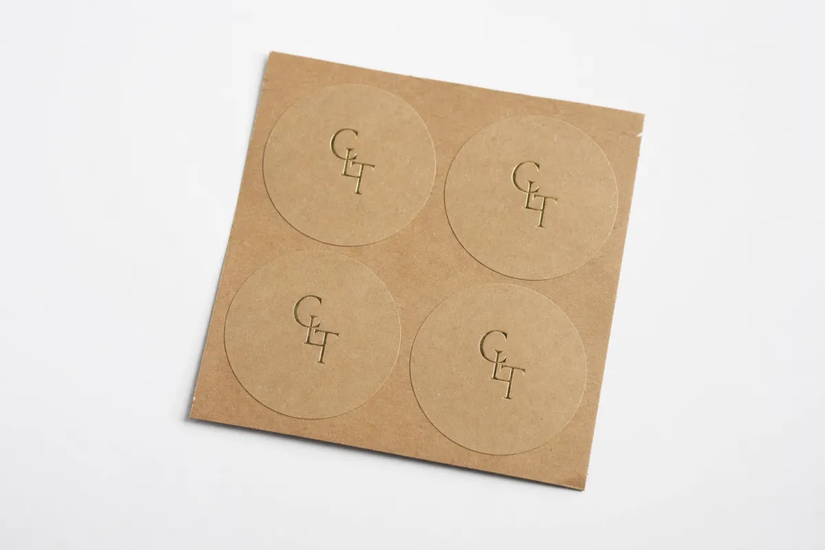
Printed Kraft Stickers With Logo: Design, Cost, and Practical Tips
Printed kraft stickers with logo can change the feel of a plain mailer, carton, pouch, or tissue wrap faster than almost any other low-cost packaging move. One clean seal turns a generic shipper into something that looks considered, which matters when a customer is opening the box on a kitchen counter, not in a warehouse. That first impression is doing a lot of work.
The appeal is straightforward. A single sticker can cover part of what a hang tag, a branded insert, and a printed box would normally handle, without forcing a full custom carton run. For many small brands, printed kraft stickers with logo are the first packaging upgrade that pays for itself in visibility and speed. They are simple, but not simplistic.
The format usually means brown kraft paper or a kraft-look stock printed with a brand mark, short message, seal, or QR code, then cut into rolls or sheets. The look works because it combines texture, contrast, and restraint. On a natural base, a logo often reads more premium than it does on bright white stock, especially if the brand is aiming for earthy, handmade, recycled, or pantry-friendly cues.
Design for the packing line, not just the mockup. A sticker that looks beautiful on screen but fights the carton texture in real life is expensive in the most ordinary way possible: it slows fulfillment.
From a packaging buyer's point of view, printed kraft stickers with logo sit in a useful middle ground. They are inexpensive compared with Printed Folding Cartons, flexible enough for small runs, and fast to deploy when a brand needs to ship this week rather than next quarter. If the logo, message, and adhesive are chosen well, the result feels deliberate instead of improvised.
Printed kraft stickers with logo: why they stand out
Printed kraft stickers with logo stand out because they look grounded. The brown base softens the graphic edge of a brand mark, and that can make a product feel more artisanal, more sustainable, or simply more human. For brands selling food, wellness goods, candles, handmade goods, or subscription kits, that visual language often fits the product before a customer even reads the label.
There is a practical side to the appeal as well. A sticker can close a box, seal tissue, brand a jar lid, or add a message to a mailer without extra assembly. If you are running a small team, that matters. A 2-inch round seal takes seconds to apply. A larger front-panel sticker takes a little longer, but it still avoids the setup burden of a full print package. In that sense, printed kraft stickers with logo are not just decoration; they are part of the packaging system.
Designers like them for another reason: the base does some of the work. Kraft naturally pushes artwork toward a limited palette, and limits can improve the final result. Deep black, dark green, navy, rust, and warm burgundy tend to print well. Fine-line line art, fragile scripts, and washed-out pastels are harder to read on the fiber texture. That is why many strong printed kraft stickers with logo designs use one bold mark, a short descriptor, and plenty of breathing room.
There is a perception advantage too. Natural-looking packaging often signals care, even when the economics behind it are practical. A buyer does not need to know that the sticker cost a fraction of a printed box. They only see that the box feels branded, consistent, and finished. That is a useful impression, and a legitimate one, as long as the sticker actually survives handling and shipping.
I have seen plenty of packing tables where a simple kraft seal was the thing that made the whole setup feel finished. It is a small detail, but it changes how the brand reads. If the packaging system also needs hang tags, product seals, or coordinated labels, Custom Labels & Tags can extend the same visual language across the rest of the line. A kraft sticker on the outside and a matching tag inside often do more than a single hero print job.
Why the look works so well
Three design forces do most of the work: texture, color, and scale. Kraft texture signals warmth and utility. The brown tone quietly supports earthy, recycled, or handmade positioning. The scale of the sticker can be matched to the pack, so a small seal feels subtle while a larger label reads like a deliberate brand panel.
- Texture: The surface creates a tactile, unpolished feel that buyers often associate with authenticity.
- Color: Brown stock naturally boosts contrast for dark inks and helps logos feel grounded.
- Scale: Small seals and larger format labels create very different brand cues, even with the same logo.
That is why printed kraft stickers with logo often feel more convincing than plain white stickers for certain categories. White can look clinical. Kraft can look purposeful. The difference is subtle on paper, but it becomes obvious once the box is in someone's hands.
Printed kraft stickers with logo: production process and timeline
The production path for printed kraft stickers with logo is pretty straightforward, yet each step affects timing. It usually starts with artwork review, then moves to material selection, proofing, printing, cutting, finishing, and final packing. If any one of those steps is vague, the schedule stretches. Clear files move faster. Guesswork adds days.
Artwork review is where many delays begin. A supplier needs the logo in vector format, the cut line defined, and any copy checked for spelling and line breaks. If the design uses gradients, tiny type, or a complicated emblem, a prepress team may need an extra proof to confirm that details survive the kraft background. That is especially true for printed kraft stickers with logo that include QR codes or legal text, where readability matters more than the mockup.
Printing method matters too. Digital print is usually the most flexible for short runs because setup is lighter and design changes are easier to absorb. Flexographic printing becomes more attractive as volume rises, but it has higher setup requirements, which means the economics improve after you get past the smallest orders. There are also specialty options such as white ink or spot varnish, though those can add another round of approval. For many printed kraft stickers with logo orders, the cleanest path is the simplest one that still meets the brand brief.
Typical turnaround depends on the press and the approval speed. Small digital jobs can often ship in about 5-10 business days after proof approval if the artwork is clean and the material is standard. Mid-size custom die-cut runs may take 10-15 business days. Complex shapes, unusual adhesives, or multiple proof revisions can push it longer. That is normal. Packaging projects rarely run late because of the printer alone; they run late because of missing files, changing copy, or color questions that were left too long.
For buyers comparing suppliers, the fastest job is rarely the cheapest one, and the cheapest quote is rarely the fastest. With printed kraft stickers with logo, speed comes from preparation. If the logo is vectorized, the dimensions are settled, and the destination address is confirmed early, the order can move through production without drama.
Where delays usually happen
- Missing vector files: Raster art slows prepress and can create jagged edges at print size.
- Unclear cut lines: Custom shapes need a defined die or kiss-cut path before approval.
- Color questions: Brown stock shifts color perception, so screen mockups are not enough.
- Late copy edits: Even one line change can trigger a new proof and reset the schedule.
- Surface uncertainty: If the adhesive target is not clear, testing may be needed before production.
For shipping-heavy brands, this is where standards can help. If packaging needs to survive distribution shocks, some teams use ISTA procedures as a benchmark for broader pack testing; see the test resources at ista.org. For paper sourcing, FSC certification remains a common reference point, and the standards hub at fsc.org explains the system well.
Cost and pricing for printed kraft stickers with logo
Pricing for printed kraft stickers with logo usually comes down to five things: size, shape, quantity, print colors, and finish. A simple 2-inch round seal in one dark color will cost less than a custom-shaped label with white ink, a laminated face, and a specialty adhesive. That sounds obvious, yet buyers still get surprised by the spread because they compare quotes without normalizing the specs.
MOQ, or minimum order quantity, is the next concept to understand. In plain language, the setup cost has to be spread across enough pieces to make the run efficient. If you order a few hundred stickers, the per-piece price is higher because the die, proofing, and press setup are shared across fewer units. If you order 5,000 or 10,000, the unit cost usually falls sharply. That is why printed kraft stickers with logo can look inexpensive in total value but still carry a noticeable per-unit difference between small and medium runs.
Good quotes should show the structure clearly. A proper estimate usually includes the substrate, adhesive type, print method, cut style, finish, and freight assumptions. If the supplier lists one attractive number but hides die charges, white-ink setup, or delivery costs, the quote is incomplete. Honest pricing is less flashy, but it is much easier to compare.
| Option | Typical setup | Typical unit cost | Best for | Notes |
|---|---|---|---|---|
| Digital short run | $40-$120 | $0.12-$0.45 at 500-2,000 pcs | Small launches, seasonal packs, fast proof cycles | Flexible artwork changes; best when speed matters more than extreme volume savings |
| Flexographic mid-to-long run | $150-$600+ | $0.03-$0.12 at 5,000-20,000 pcs | Repeat orders, higher volume fulfillment, consistent SKUs | Better unit economics at scale; setup is harder to absorb on tiny runs |
| Custom shape with specialty finish | $100-$350 | $0.08-$0.30 depending on coverage | Premium branding, retail packs, gift sets | Die complexity and finishing steps can move pricing more than ink coverage alone |
| Sheeted hand-apply format | $30-$100 | $0.10-$0.40 at lower quantities | Small-batch packing teams, artisan products, light assembly lines | Convenient for manual use; usually slower than rolls for high-throughput packing |
Those numbers are directional, not fixed. A 3 x 4 inch label with heavy ink coverage, a Custom Die Cut, and a premium adhesive will not price like a simple 1.5 inch round seal. The curve still behaves the same. Larger runs lower the unit price. Simpler specs lower the unit price. Standard sizes lower the unit price. That pattern holds across printed kraft stickers with logo more often than buyers expect.
There are a few hidden costs worth watching:
- Die charges: Custom shapes often need a new cutting die.
- Proof iterations: Extra color matching or layout changes can add time and labor.
- Freight: Heavy rolls or urgent shipping can change the landed cost materially.
- Special inks: White ink, metallics, or strong opacity requirements can increase production complexity.
- Packaging format: Rolls are often more efficient for applicators; sheets may cost more for convenience.
From a buyer's point of view, the smartest way to compare suppliers is to ask every one of them for the same spec sheet. If the size, quantity, adhesive, shape, and delivery address are identical, the quotes will tell you something useful. If not, you are comparing apples to a basket of oranges. That sounds obvious. It still gets missed all the time.
Key factors that shape printed kraft stickers with logo
The material choice drives much of the visual outcome. True kraft paper has a natural fiber appearance, while kraft-look facestocks may simulate the color and texture but behave differently in print and adhesion. Recycled stocks can add a stronger sustainability story, but they may also vary more in tone and stiffness. For printed kraft stickers with logo, that variation is not just technical trivia. It changes how the logo reads, how the edge cuts, and how the sticker feels in hand.
Color is the next major variable. Brown stock is not a blank canvas. It is a strong background with its own warmth and darkness, so pale colors often vanish faster than expected. Dark artwork usually performs better. If a brand needs a light logo, white ink can help, either as an underprint or as part of the design itself. On some runs, spot white is the difference between "nice idea" and "actually legible." That is why proofing matters so much for printed kraft stickers with logo—screen color and paper color rarely match the way people imagine.
Adhesive choice matters just as much as ink choice. A sticker for a corrugated shipping carton does not need the same adhesive as one for a refrigerated jar, a coated pouch, or a glossy bottle. Texture, moisture, temperature, and curvature all affect performance. A high-tack permanent adhesive can help on rough cartons. A freezer-grade or cold-chain adhesive may be needed if the label has to hold under chilled conditions. A removable adhesive may suit temporary campaigns or event packaging. The wrong choice does not always fail immediately. Sometimes it just peels a little, lifts at the corners, or creates packing-line annoyance that costs more than the sticker itself.
Size and shape are branding decisions, not mere specifications. A 1.5 inch seal says something different from a 4 x 6 inch front-panel label. A round cut feels more casual. A square or rectangle can feel more structured and informational. A custom die cut can support a premium story, but it also adds tooling and layout complexity. Good printed kraft stickers with logo begin with a clear job: seal, label, promote, or identify.
There is also a broader sustainability question. Not every kraft-looking sticker is recycled, recyclable, or responsibly sourced in the same way. The EPA's recycling resources at epa.gov are a useful reminder that end-of-life claims should be specific, not vague. If a brand wants to say more than "kraft-like," the supplier should be able to describe the facestock, liner, adhesive, and any certification with precision. Otherwise, the claim is just marketing fog.
Practical design rules that hold up on press
- Keep body text legible: On kraft, 6.5-7 pt is usually safer than very fine microtype.
- Use strong contrast: Dark inks, spot white, and simplified marks read better than pastel builds.
- Allow enough quiet space: Crowded layouts get muddy on textured stock.
- Match the shape to the message: Seals, labels, and branding badges should not all look identical.
If a brand already uses Custom Labels & Tags for some product lines, printed kraft stickers with logo can serve as the lower-friction version for cartons and mailers. That combination is common in practice: labels for product-facing information, kraft stickers for outer-pack branding and closure.
Step-by-step: ordering printed kraft stickers with logo
The simplest way to order printed kraft stickers with logo is to treat the job like a small spec project rather than a casual print request. The difference is usually visible in the proofing stage. A complete brief leads to a cleaner quote, fewer revisions, and better control over the final result.
-
Define the use case.
Start with the physical job. Is the sticker sealing a box, branding tissue, labeling jars, or decorating a mailer? A closure sticker sees different wear than a shelf label. The surface, handling, and expected life of the sticker should be clear before artwork begins.
-
Choose the size and format.
Pick dimensions based on the package, not the artwork. A logo that looks elegant at 2 inches may disappear on a 6-inch panel, while a bold message can feel crowded if you downsize too much. If you are still deciding, request two size options. For printed kraft stickers with logo, size changes often affect legibility more than color does.
-
Prepare the file properly.
Send vector art if possible: AI, EPS, or PDF with outlined fonts. Include a clear die line if the shape is custom. Keep any critical text away from the edge, and add bleed where needed. If the artwork has a white underprint, mark that layer clearly so prepress does not guess. That kind of housekeeping sounds boring, but it saves headaches.
-
Request proofing that reflects reality.
Do not approve a design from a flat mockup alone. Ask for a digital proof or a sample if the run is important. Test readability, color contrast, and adhesive behavior on the real packaging surface. A label can look clean on screen and still fail on a recycled carton or coated pouch. That is one of the most common lessons with printed kraft stickers with logo.
-
Confirm production details before the run.
Lock the quantity, shipping address, packaging format, and deadline. If the stickers will be stored before use, ask how they should be packed to reduce curl, dust exposure, or liner damage. A few extra minutes here usually prevent a much bigger headache later.
A good spec sheet can be surprisingly short. It just needs the essentials: size, shape, quantity, surface type, adhesive preference, print colors, finish, and required delivery date. Once those items are fixed, suppliers can quote apples-to-apples and you can compare them with less noise.
What to ask for in a proof
Ask whether the proof shows final color intent, whether the cut line is accurate, and whether the adhesive is suitable for the intended surface. If you are ordering printed kraft stickers with logo for a food, cosmetic, or wellness product, also ask how the material behaves under humidity or light handling. A proof that answers those questions saves more money than a discount ever will.
Common mistakes with printed kraft stickers with logo
The most common mistake is visual: using artwork that is too light, too thin, or too detailed for brown stock. On a monitor, delicate linework can look refined. On kraft, it can disappear into the fibers. Thin serif fonts, pale beige inks, and tiny decorative marks are especially risky. The safest path for printed kraft stickers with logo is usually a more assertive logo mark, stronger contrast, and less decorative clutter.
The second mistake is choosing the wrong adhesive for the job. A sticker that works beautifully on a smooth carton might struggle on a rough, textured, or dusty recycled box. Curved surfaces add another layer of difficulty because the sticker has to conform without lifting. If the pack will face cold storage or moisture, the adhesive must be selected for that environment, not for a generic shelf test. That is where many good designs fail in practice.
Skipping proofing is another expensive habit. Sizing issues, cut-line errors, and color shifts are hard to see until a sample is in hand. With printed kraft stickers with logo, the proof stage is where the paper tone, print opacity, and edge quality become obvious. On screen, people often judge the logo. In hand, they judge the whole package.
Over-ordering is a quieter mistake, but it happens often. A brand refresh, seasonal shift, ingredient change, or new compliance line can make older stock feel dated before it is fully used. That is especially true for companies testing a new look or a new SKU. For the first order of printed kraft stickers with logo, a smaller run with a second reorder planned is usually smarter than printing a warehouse full of a design that has not been tested in real fulfillment.
There is also a workflow mistake that gets overlooked: failing to align the sticker size with the packing process. If the label is too large, it slows application and can wrinkle on curved surfaces. If it is too small, the brand message disappears. Good packaging design lives at the intersection of the printer's file and the team's hands on the packing table.
- Do not assume kraft means forgiving.
- Do not approve color from a screen alone.
- Do not ignore the actual packaging surface.
- Do not buy more than you can realistically use before the design changes.
Expert tips and next steps for printed kraft stickers with logo
If you are approaching printed kraft stickers with logo for the first time, start with one job, not five. Pick the most visible use case first: box sealing, tissue branding, jar labeling, or mailer closure. Once the first version works, the design language can expand to other pack formats. That order matters because packaging systems are easier to refine when one application is already proven.
Test more than one option if the order is meaningful. Two sizes can reveal more than a spreadsheet. Two adhesives can tell you which one grips better on recycled cartons. Two finishes, even if both are matte, can feel surprisingly different in hand. For printed kraft stickers with logo, the best choice often becomes obvious once the sticker is applied to the real package under real lighting.
Keep a simple internal spec sheet. It should list the size, shape, quantity, surface type, expected storage conditions, and deadline. That sheet makes quotes easier to compare and reduces back-and-forth with the supplier. It also helps if you reorder later, because the exact spec is already written down. Small teams save a lot of time that way, and nobody has to dig through old email threads when a reprint is needed.
For brands that need a broader packaging system, Custom Labels & Tags can complement printed kraft stickers with logo on secondary products or inserts. The strongest packaging programs usually do not rely on one format alone. They use one consistent visual grammar across labels, seals, tags, and cartons.
My practical advice is simple: request a proof, test it on the real packaging, and compare the result under the same conditions the customer will see. If the sticker holds, reads clearly, and feels like part of the brand, scale it. If not, adjust before you place the larger run. That is the difference between a small packaging experiment and a repeatable system.
Done well, printed kraft stickers with logo are not just decorative. They are a compact branding tool, a production aid, and a cost-controlled way to make packaging feel finished. The brands that get the most out of them do not chase novelty. They Choose the Right size, the right adhesive, and the right print method, then let the material do its quiet work.
Are printed kraft stickers with logo good for small business packaging?
Yes. Printed kraft stickers with logo are a strong fit for small brands because they add identity without forcing a full custom box run. They work especially well for subscriptions, handmade goods, and seasonal packaging where a natural look supports the brand story. They are also quick to apply during fulfillment, which matters when labor time is part of the real cost.
Do printed kraft stickers with logo need white ink to look good?
Not always, but white ink helps lighter logos and fine details stand out on brown kraft stock. If the logo uses dark, high-contrast colors, many designs print well without it. A proof is the safest way to judge readability because the same artwork can look very different on screen and on kraft material.
How much do printed kraft stickers with logo usually cost?
Pricing usually depends on quantity, sticker size, print colors, shape complexity, and finish. Smaller orders often have a higher unit cost because setup and production overhead are spread across fewer pieces. The best way to estimate cost is to ask for a quote with exact specs, including substrate, adhesive, and delivery needs.
What file should I send for printed kraft stickers with logo?
A vector file such as AI, EPS, or PDF is usually best because it keeps edges clean at any size. Include outlined fonts, linked images, and a clear die line if the sticker shape is custom. If you are unsure, send the editable file and ask for a prepress check before printing starts.
How fast can printed kraft stickers with logo be produced?
Turnaround depends on the print method, quantity, and whether the artwork is approved on the first round. Simple jobs with standard sizes often move faster than custom shapes or specialty finishes. The fastest path is to have final artwork ready, confirm specs early, and respond quickly to proof questions.

