On a curved performance cap, logo size is only half the story. Placement changes what people can read, how quickly they read it, and whether the mark still feels intentional once the cap is worn. That is why printed Performance Golf Caps logo placement for bakery brands is less about decoration and more about visibility under real conditions: point-of-sale lighting, outdoor markets, delivery runs, and social photos taken on the move.
Treat the cap like a small branded sign. If the logo cannot be recognized in a couple of seconds, the placement is not doing its job.
Bakery teams often underestimate how hard a cap works. A pastry box gets a glance at the counter. A cap gets seen while someone is turning, walking, loading trays, or leaning over a display case. The front panel has to read fast, and it has to read at odd angles. That makes the placement decision more important than the artwork file alone. If you compare different decoration categories, the same logic shows up again and again: the surface dictates the best message.
Printed performance golf caps logo placement for bakery brands
With printed Performance Golf Caps logo placement for bakery brands, the first question is not “How big can the logo be?” It is “Who needs to recognize the brand, and from how far away?” A walk-in bakery serving counter traffic needs a different read than a catering crew, an event team, or a staff uniform that only appears in the background of a few photos. One version calls for instant recognition. Another works better with a quieter front and a small secondary mark elsewhere.
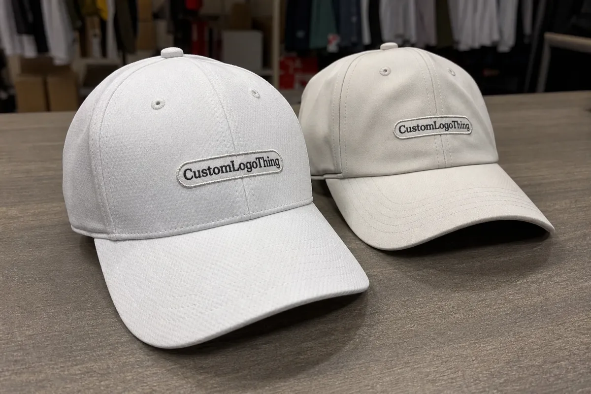
For bakery brands, the cap behaves like mobile packaging. It needs to reinforce the same cues that make the product line feel trustworthy: clear identity, clean presentation, and enough contrast to survive imperfect lighting. The front panel usually carries the primary logo because it gives the best uninterrupted field. Side or back placement tends to work better for a wordmark, web address, or small icon. That is not a style preference. It is a reading-order decision.
Most buyers get the best result when they decide the use case first. Staff caps can be restrained. Retail giveaway caps can be more assertive. Market caps need stronger contrast because they are viewed outdoors and in motion. If the logo is meant to support shelf-ready visibility, the cap should behave the same way a strong carton panel does: identify the brand quickly, remove doubt, and feel deliberate rather than improvised.
- Front panel: strongest brand read, best for the main logo.
- Side panel: subtle and premium, better for a secondary mark.
- Back strap area: useful for a website, short line, or small detail.
One detail that gets missed often: the same artwork can look larger on a flat mockup and smaller on a worn cap. Curvature changes the read. A mark that looks generous on screen may feel compressed once the crown follows the shape of the head. Printed performance golf Caps Logo Placement for bakery brands should always be checked on a worn mockup or sample, not just a digital proof.
What cap structure does to logo visibility
Performance Golf Caps are not built like soft promotional caps. Structured front panels hold shape, which helps a printed logo stay readable, but seams and crown shape can still distort the art if placement is careless. Pre-curved brims also pull the eye downward, so a logo placed too low can disappear into the overall shape of the cap instead of standing out from it.
The front panel is usually the safest home for the hero mark because it gives the largest uninterrupted space. Side placement works well for smaller brand cues and can feel polished on artisan bakery uniforms. Back placement is better reserved for supporting information. If a supplier suggests squeezing the main mark across a seam, ask for a physical sample or a curved mockup before signing off. Digital proofs rarely show how much a seam will change the read.
Crown depth matters too. A shallow crown can compress the logo and make type feel crowded. A taller crown gives the decoration more breathing room. Fabric stretch is another constraint. Mesh backs and stretch panels may improve comfort, but they also change how the front panel sits once the cap is worn. That is one reason buyers should think in measurements, not just in “large” or “small” placement language.
A practical way to sort placements is to separate them into three groups:
- High-read placement: centered front, medium-to-large logo, strong contrast.
- Quiet placement: side or small offset front mark, useful for premium positioning.
- Utility placement: back or secondary location, often used on staff wear.
For teams that are translating packaging thinking into apparel, that distinction will feel familiar. The cap front works like a main label panel. Everything else is support information.
Cost, pricing, MOQ, and quote drivers
Pricing usually moves with three variables: decoration method, artwork complexity, and quantity. A simple one-color logo in a clean placement is easy to quote. Add fine type, multiple colors, gradients, or a long tagline, and the labor cost rises quickly. The blank cap itself is often not the expensive part. Setup and decoration are where the quote changes.
For many bakery orders, a blank performance golf cap may land in the low single digits per unit depending on fabric, closure type, and panel construction. Decoration commonly adds about $0.60 to $3.50 per cap, with the lower end usually tied to straightforward print or embroidery and the higher end tied to specialty patches or more involved setup. At smaller volumes, that spread matters. A run of 150 caps can cost materially more per unit than a run of 500 because the setup charge is being divided across fewer pieces.
| Decoration option | Best for | Typical cost impact | What to watch |
|---|---|---|---|
| Flat embroidery | Bold wordmarks and simple icons | Often adds about $0.90-$2.25 per cap | Fine text can fill in or lose sharpness |
| Heat transfer print | Small text, detail, and tighter color control | Often adds about $1.10-$3.00 per cap | Durability depends on fabric, heat, and wash cycle |
| Silicone or woven patch | Premium finish with a tactile look | Often adds about $1.50-$3.50 per cap | Can increase MOQ or add approval time |
Ask every supplier for the same four line items: blank cap cost, decoration cost, setup or digitizing, and freight. If those are bundled together, it becomes hard to tell whether a quote is actually competitive or just rearranged. Freight matters more than buyers expect, especially if caps ship inside larger promo kits. A dented crown or crushed front panel can make the cap unusable even if the apparel technically arrived.
MOQ should be checked before art is finalized. Some vendors will accept smaller runs, but the per-unit cost climbs fast. That is not always a problem for a local bakery ordering staff caps and a few extras. It becomes a bigger issue for a seasonal launch, a retail rollout, or a chain-wide refresh. In those cases, it is usually smarter to keep the placement and decoration method consistent from the start than to mix a few different versions just to satisfy separate budgets.
Process and turnaround from mockup to shipment
The normal sequence is simple: choose the cap, review placement mockups, clean the artwork, approve the proof, and then move into production. The order matters because a strong logo can still fail if the decoration method and crown shape are not aligned before the first sample is made. Once the supplier has started production on the wrong placement, every correction gets slower and more expensive.
Fast turnaround usually comes from stocked cap inventory, simple artwork, and quick approval. If one of those slows down, the schedule stretches. A bakery promo tied to an opening week, farmers market season, or trade show should always include buffer time for at least one revision. Even a small change in logo width or placement can add several business days if the sample has to be rebuilt.
Lead time is not just a manufacturing issue. It also depends on how quickly the buyer responds. If the proof sits in someone’s inbox for three days, the production clock has not even started yet. Add in holiday demand, color matching questions, or packaging inserts, and the timeline gets longer. For that reason, the fastest orders are usually the ones where the buyer makes the decisions early and documents them clearly.
A workflow that avoids most delays looks like this:
- Choose the cap based on fit, crown height, and fabric behavior.
- Test placement on both a flat mockup and a worn mockup.
- Clean the artwork so tiny details do not disappear.
- Approve the proof in writing with size and color notes.
- Lock the production file so future reorders match the first run.
If the order includes packaging materials, it can also help to specify carton counts and outer packaging expectations at the same time. That keeps the cap from arriving as a loose item when it is meant to land inside a store kit or event pack. Small details like that are often the difference between a tidy rollout and a messy one.
Choosing the right decoration method and materials
Embroidery offers texture and durability. Print is usually better for small text, thin lines, gradients, and exact color behavior. On bakery logos that include script lettering or a detailed emblem, that difference becomes obvious very quickly. What looks clean on a carton panel can become crowded on a cap front if the decoration method is fighting the art.
Performance fabrics change the equation again. Polyester blends, stretch panels, and moisture-wicking finishes behave differently from cotton twill. They resist sweat and dry quickly, but they can also reveal weak artwork faster because the fabric flexes more in wear. If the cap will be used in warm kitchens or outdoor events, ask how the decoration holds up after repeated wear, not just on day one.
There is no universal winner. The best method depends on the logo and the job.
- Use print when the logo includes small text, gradient work, or thin stroke detail.
- Use embroidery when the logo is bold, simplified, and meant to feel classic.
- Use a patch when the brand wants a more tactile, premium finish.
For bakery brands, the visual tone matters as much as the material choice. A fast-service concept may want a cleaner athletic look with sharp contrast and little else. An artisan bakery may prefer a softer, more crafted feel that aligns with hand-finished packaging and a warmer store environment. The cap should extend the same visual language, not invent a new one.
A good performance cap should still do the basics well: breathe, keep its shape, and stay readable under mixed light. If the decoration is beautiful but the cap becomes hard to read after the first few wears, the project has missed the point. That is one reason printed Performance Golf Caps logo placement for bakery brands deserves the same discipline buyers already use for cartons, labels, and sleeves.
Step-by-step artwork and approval checklist
When the brief is tight, approvals move faster and the end result is usually better. For printed performance golf caps logo placement for bakery brands, the production file should be plain, precise, and easy to reread six months later. Fancy formatting is not the goal. Consistency is.
- Audit the logo file. Remove tiny text, hairline strokes, and effects that will vanish at cap scale. Vector artwork is best. If you only have a raster file, it should be high resolution and cleaned up before it reaches production.
- Test placement twice. Review a flat mockup and a worn mockup. The curved version tells you far more than the screen version.
- Lock the colors. Use Pantone references or thread codes, and record the cap color beside the logo file.
- Write the measurements. Do not leave the supplier with “center front” alone. Use width, height, and distance from the crown seam where possible.
- Confirm the pack-out. Carton counts, polybag notes, and spare units should all be captured before production begins.
One good rule saves a lot of frustration: if the logo needs an explanation, it is probably too complicated for the cap. Cap front panels reward clarity more than narrative. The same artwork that works on a large pastry box may need to be simplified before it can live in a 2.5-inch decoration zone. That is not a downgrade. It is a translation.
Keep a backup option ready. If the first decoration method cannot hold the detail, move to a simpler wordmark or switch methods before the order is released. Teams that prepare a fallback usually approve faster because they are not restarting the design discussion every time a proof comes back with a problem.
For larger teams, the most useful output is a compact cap spec sheet: approved artwork, placement diagram, cap color, decoration method, and reorder notes. That one document turns a one-time purchase into something that can be repeated without guesswork.
Common mistakes that hurt bakery brand impact
The biggest mistake is trusting the flat digital proof too much. A logo can look centered and balanced on a screen, then sit too low, too high, or slightly warped on the actual cap. The crown curves, the wearer moves, and the artwork changes with the angle. The proof is a starting point, not the final verdict.
Another common miss is using a logo built for packaging or signage and assuming it will behave the same way on a cap. It often will not. Text that reads well on a pastry bag or shipping box can collapse on the cap front if the letters are tight. Thin outlines are another risk. They can vanish in sunlight, kitchen lighting, or any quick movement of the wearer.
Color contrast causes a third set of problems. A tone-on-tone look may feel polished in a presentation deck, but it can disappear in a bright market stall or a warm production space. That does not mean subtle branding is wrong. It means subtle branding needs to be tested in the lighting where the cap will actually live.
- Too much detail: micro text, scripts, and tiny icons disappear fast.
- Wrong placement: seams and crown curves can distort the mark.
- Low contrast: a tasteful concept can become invisible from a few feet away.
If the cap will appear in customer photos, the stakes rise quickly. Bakery brands live across counters, delivery boxes, staff uniforms, and social feeds. A cap that photographs poorly can make the whole presentation feel less deliberate, even when the product quality is strong. That is a branding problem, not just an apparel one.
Expert tips and next steps for bakery teams
Shortlist two cap colors, two logo placements, and one backup decoration method before asking for quotes. That keeps vendors pricing the same decision set instead of three different versions of the project. It also makes internal approval faster, which is usually the hidden bottleneck.
If the caps will appear in retail counters, event wear, or customer-facing photos, ask for both a digital proof and a physical sample. A sample costs more time up front, but it is far cheaper than discovering that the logo is too small, too low, or too washed out after the full order is already finished.
A practical reorder file should include the approved placement, cap style and color code, artwork in vector format, decoration method, and pack-out notes. That is the kind of record that helps a marketing manager, purchasing lead, or decorator stay aligned without reopening the whole discussion every season. It also protects the brand when different people handle the next order.
The strongest bakery cap orders are rarely the flashiest. They are the ones where the logo reads cleanly, the cap shape supports the artwork, the cost is clear, and the approval file is disciplined. If you document the approved version of printed performance golf caps logo placement for bakery brands once, you give yourself a cleaner path for the next refill, seasonal color update, or staff uniform refresh.
Where should a bakery logo sit on performance golf caps for the best read?
Center front usually gives the fastest read and works best for most bakery teams. Side placement is better when the brand wants a quieter, more premium look. Avoid straddling seams unless the supplier confirms the logo will stay flat and legible on the worn cap.
Is print or embroidery better for printed performance golf caps logo placement for bakery brands?
Print is better for small text, gradients, and fine detail. Embroidery is better for durability and a textured finish. The right choice depends on logo size, fabric stretch, and how often the caps will be worn and washed.
What MOQ is typical for custom bakery golf caps?
MOQ depends on the supplier, decoration method, and whether the cap is stocked or made to order. Lower quantities usually carry a higher unit cost because setup is spread across fewer pieces. Ask whether the MOQ changes for sample runs versus full production.
How long does production usually take after approval?
Simple stock-cap runs can move quickly once the proof is approved. Complex artwork, custom colors, or sample revisions can extend the timeline. A good supplier should separate proof time, production time, and shipping time in the estimate.
Can a small bakery logo still look clear on a golf cap?
Yes, if the logo is simplified before decoration and placed on the flattest part of the front panel. Tiny text and thin outlines should be removed or enlarged before production. A physical sample is the safest way to confirm readability before a larger order is released.


