The restaurant Printed Poly Mailers Digital Proof checklist saves money because most bad jobs do not fail on press; they fail during approval. A proof can look polished on a monitor and still miss the actual bag size, the seal zone, or the contrast needed for a logo that has to survive a fast handoff at the door. If the mailer carries takeout, delivery, or shipping items, the proof is not decoration. It is the last useful checkpoint before material, ink, and labor become expensive.
That is why the review has to be practical rather than cosmetic. A restaurant mailer has a short job: protect the package, carry the brand, and give drivers or customers the information they need without squinting. If you are comparing options on Custom Poly Mailers, the proof should be judged against the actual film, seal, and flap dimensions, not a clean mockup that only exists to make everyone feel organized.
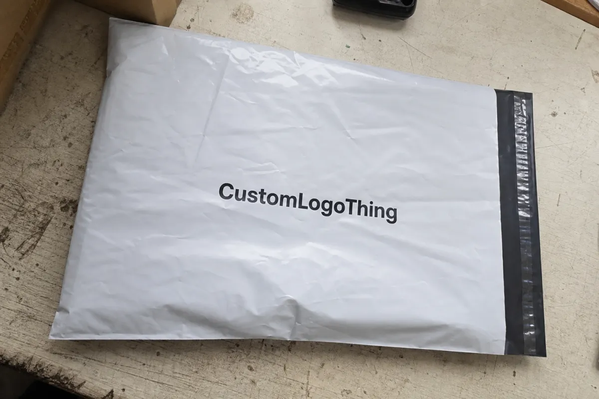
Restaurant Printed Poly Mailers Digital Proof Checklist: what to catch first
Start with size. A proof built for a 14 x 20 inch mailer is useless if the order is actually a 12 x 15.5 inch bag with a 2 inch flap and a different seal line. That sounds obvious until someone approves a layout that looked centered in the template and then gets clipped by the finished construction. Film mailers are unforgiving in a way paper proofs are not. The bag bends, folds, seals, and shifts. Artwork that seems generous on a screen can become crowded once the pouch is formed.
Then move to the restaurant-specific details that tend to fail in real use. The logo matters, but so do the phone number, website, QR code, and any promo text that must still read at arm's length. If the bag includes allergy language, order notes, or a legal line, that copy deserves the same attention as the logo. Tiny text on glossy film is where weak layouts go to die. Thin type, reversed-out copy, and low-contrast lines are all risky if the bag will be handled in dim light or moved quickly through a kitchen and delivery flow.
Color is the other common trap. A screen can make a design look clean and balanced while the printed film shifts the tone, deepens the shadows, or lowers contrast. White ink on clear or colored poly behaves differently from black on white film. Dark reds, navy blues, and delicate serif fonts often need stricter handling than people expect. If the brand depends on a specific color, ask for a proof note that names the ink system and the substrate. Without that, you are reviewing a guess dressed up as a sample.
A useful way to review the proof is to separate issues into two buckets:
- Layout issues: wrong size, off-center logo, text too close to a seam, artwork crossing the flap, or copy sitting where a fold will distort it.
- Print-quality issues: muddy colors, weak contrast, broken thin lines, oversized solid fills, missing white underlay, or gradients that may band on film.
That split matters because it tells the team what can be corrected in a revision and what will become a press problem later. A bad address or misplaced disclaimer is a proof problem. A font that falls apart on film is a file problem. Catching the difference early keeps the job moving instead of turning the approval thread into a second production meeting.
A proof should be judged like a shipping tool. If it is only being judged like a brand mockup, somebody is missing the point.
Before approving, ask one blunt question: would this bag still work if a customer only glanced at it for two seconds? If the answer is no, the design needs another pass.
How digital proofs move from artwork to approval
The workflow is usually simple enough to explain in one line: artwork arrives, the supplier places it on a bag template, prepress checks the file, and a digital proof goes out for review. Then comes revision, then sign-off. The process gets messy only when the buyer side treats the proof like a casual visual rather than a production document. A clean approval depends on clean input. If the art file is inconsistent, incomplete, or pulled from three different versions of the brand folder, the proof stage starts on uneven ground.
Prepress teams usually check bleed, safe zone, image resolution, fonts, vector paths, and missing links. If a file is built well, those checks are fast. If it is not, the proof can still look acceptable while hiding problems that show up on press. Missing fonts, rasterized logos, overflattened files, and stray transparency issues are common culprits. A good proof does more than ask whether the layout looks nice. It asks whether the artwork will print cleanly on a poly film that bends, seals, ships, and gets handled more than once.
The buyer side should also stay small. Ideally, one person owns brand accuracy, one person owns operations, and one final approver has the authority to say yes without sending the file into committee purgatory. Three people can catch more mistakes than one. Ten people can turn a straightforward job into a week of delay because everyone has thoughts about spacing, and none of those thoughts are connected to the actual production method.
Watch the places where errors hide:
- Seal and closure areas: artwork too close to the flap can disappear or distort after fabrication.
- Gussets and folds: side panels can shift logos or break alignment in a way a flat mockup will not show.
- Barcodes and QR codes: low contrast or tiny sizing can make them hard to scan in real use.
- Back-side copy: brands often review the front carefully and forget the reverse panel entirely.
If you want broader packaging terminology or context around shipping abuse, the industry resources at packaging.org and the transit-testing references at ista.org are useful starting points. They will not replace a proof review, but they help teams speak the same language about structure, handling, and damage tolerance. If your order spans more than one format, the details on Manufacturing Capabilities should explain what can be printed, how it is printed, and which film types are actually available.
Cost, pricing, MOQ, and quote variables that change the number
Price on custom Printed Poly Mailers is never just price. It is bag size, film gauge, print count, ink coverage, and how much file cleanup the art needs before anyone starts a machine. For a simple one-color job at a common size, unit pricing usually improves once the order moves into the 5,000 to 10,000 piece range. Smaller runs cost more per bag because setup gets spread across fewer units. That is not a sales trick. It is manufacturing math, and manufacturing math has no interest in being flattering.
For restaurant buyers, the practical range usually comes down to how much of the order is standard and how much has to be managed by hand. A straightforward design on a familiar bag size can stay relatively efficient. A custom size, dense ink coverage, white ink on tinted film, or multiple proof revisions will push the number upward. The price is not only buying bags. It is buying attention from prepress, machine setup, and quality control.
Here are the cost drivers that tend to move a quote fastest:
- Bag size: larger bags use more film, which raises material cost immediately.
- Film thickness: 1.5 mil to 2.5 mil is common; thicker film usually costs more and feels sturdier in hand.
- Print colors: one-color art is usually easier than multi-color work or full coverage.
- White ink: needed on clear or colored film, and it adds a separate production layer.
- Revisions: more proof rounds mean more labor before the order ships.
- Special finishes: matte effects, extra opacity, or upgraded adhesives often add cost.
MOQ logic is simple. A vendor may quote 3,000 pieces, but the unit price will usually be higher than 10,000 pieces because the setup does not shrink just because the order is small. If you need to reduce cost without damaging the design, start with the print complexity. Keep the bag size standard if you can. Avoid four-color art if a one-color logo still works. If the layout allows it, remove unnecessary gradients, extra promo panels, or second-side printing that does not change the customer experience.
The fastest way to compare quotes is to line up the specs exactly. Same bag size. Same thickness. Same print sides. Same pack count. Same shipping terms. Same revision allowance. If one quote includes one proof round and another includes three, those are not the same offers. They only look similar until the back-and-forth starts.
| Option | Typical Use | What It Includes | Usual Cost Impact |
|---|---|---|---|
| Basic digital proof | Simple logo and contact info | Flat mockup, placement check, text review | Often included or low fee |
| Annotated proof | Orders with detailed review needs | Markup notes for size, safe zone, and print areas | Small added fee in some programs |
| Physical sample | Fine type, brand color, or compliance copy | Real film or preproduction sample | Higher cost plus shipping |
| Rush proof and production | Deadline-driven launches | Faster proof cycle and queue priority | Rush charge is common |
If you are evaluating several packaging formats at once, review Custom Packaging Products alongside the mailer quote. That keeps a bare-bones estimate from being compared against a more complete package with different materials, more review support, or a different fulfillment path.
Production steps, lead time, and turnaround after approval
Once the proof is approved, the job usually moves into prepress, color prep, printing, curing, conversion, packing, and shipment. The exact order depends on the film and print method, but the logic stays the same. Approval unlocks the order. Before that, everything is just a file with a deadline attached.
Lead time is often shaped more by approval speed than machine speed. A supplier can have a clean slot open and still sit on the job because nobody signed off on the final proof, the deposit is missing, or someone is waiting for a manager who is unavailable. Standard jobs move faster when the art is final and the specs are clear. Custom sizes, multi-color work, or heavy ink coverage usually take longer because the setup and color checks are fussier and less forgiving.
For many custom poly mailer orders, a practical planning range is about 12 to 15 business days after proof approval for standard production, with longer windows for complex art, special materials, or freight coordination. That is a working estimate, not a promise. If a vendor claims every job is instant, they are either guessing or selling optimism with a print head attached.
Ask one direct question before you approve: what starts the clock? Some suppliers count from proof approval. Others count from deposit receipt, artwork receipt, or final file lock. If that trigger is unclear, the schedule is unclear too. And if you are coordinating a launch, store opening, or seasonal delivery push, unclear timing becomes a real operational problem.
After approval, the production team may also confirm pack style, carton count, and whether the bags will be bundled or loose-packed. That matters if the receiving team wants a specific carton weight or if the order is shipping to multiple restaurant locations. The detail looks small until the freight arrives and nobody agrees on how it should be received, stored, or distributed.
If sustainability specifications matter, ask for recycled-content documentation or chain-of-custody information only where it truly applies. The Forest Stewardship Council site at fsc.org is a helpful reference for paper-based materials and certification concepts, but poly mailers are a different material category. Those details get mixed up often enough that they deserve a clear line in the spec sheet.
Common proof mistakes that trigger reprints or delays
The most expensive proof mistakes are rarely dramatic. They are usually dull. Wrong dimensions. Stretched logos. A closure area nobody noticed. Missing disclaimers. A phone number that is one digit off. Those are the kinds of errors that should have been caught in the first review and instead show up after someone has already approved the proof and moved on to the next task.
Color mistakes happen because people trust screens too much. RGB on a monitor is not the same as CMYK or spot ink on poly film. Gloss, opacity, and ink density all change the final look. Dark colors can read heavier than expected. Light colors can disappear. Fine gradients may band. If the brand depends on exact color consistency, ask for a proof note that describes the ink method and the substrate instead of hoping the screen version will hold up. Hope is not a spec.
File quality is another quiet failure point. Low-resolution artwork may look acceptable at thumbnail size and fall apart when scaled. Raster text is especially annoying because it often slips past a quick review. Flattened files can hide layer issues, and if nobody checks the back side, the problem can survive right into production. That is how a clean-looking proof becomes a reprint order with a very awkward email chain attached.
Three review gaps cause more delays than they should:
- No one checked the reverse panel.
- No one compared the proof to the order spec sheet.
- No one read the production notes line by line.
There is also a human factor. If the proof feels rushed, it probably is. Rushed proofs often carry contradictions: a note that says one size, a template that shows another, or a copy block that was updated but never checked again. Sloppy proof review is how a small packaging order becomes a week-long cleanup project.
Expert proofing tips for stronger artwork and cleaner print
Use vector logos whenever possible. Outline the type. Keep the artwork high contrast. Those three habits solve a lot of pain before it starts. Poly film is not forgiving in the way a coated paper stock can be. If the design is thin, pale, and over-detailed, the finished bag will show it quickly.
Build a brand spec sheet and stop reinventing the wheel on every order. Include the approved logo files, exact color codes, minimum type size, disclaimer language, and any no-go layouts. That sheet becomes the reference point for future orders, which saves time and reduces the odds that a new reviewer "improves" the design into something worse. Packaging work has enough variation already. The repeatable part should be repeatable.
Check the proof in context. A restaurant delivery bag is not being viewed on a giant monitor in a bright office. It is seen in a parking lot, on a counter, in a kitchen pass, or under poor light while somebody is trying to hand off food quickly. So ask whether the logo is still obvious at a glance, whether the phone number can be read fast, and whether any promo code has enough contrast to survive real use. Good packaging design behaves well under stress. Bad design only behaves well in a presentation.
Here are the upgrades worth prioritizing first:
- One solid revision cycle: cheaper than stopping a production run.
- Physical sample: worth it for tiny type, dense coverage, or critical brand color.
- Annotated proof: useful when multiple people touch the approval process.
- Clear file handoff: one folder, one final version, one owner.
From a buyer's point of view, the smartest orders are usually the boring ones. Clear file, standard size, simple print, clean proof, fast approval. That is the path most likely to hit budget and timing without drama. If the job includes fine lines, dense art, or compliance text that has to stay legible, request a sample instead of relying on a screen image to predict everything. A digital proof is good for layout. It cannot tell you how the bag will feel, how opaque the ink will read under real light, or whether the finish will make small copy harder to scan.
That is the real value of a disciplined review. It cuts out the assumptions before they harden into production.
Next steps before you approve the final mailer proof
Gather the final vector logo, exact copy, bag size, and any special notes in one folder before the proof goes out. If the proof team has to chase files, delays start early and tend to multiply. Then assign one person with actual sign-off authority and one backup who can catch obvious mistakes quickly. That alone prevents a surprising amount of approval chaos.
Ask for the proof format you actually need. Sometimes a flat art proof is enough. Other times you need an annotated revision sheet or a production proof that shows seal areas, back panel copy, and safe zones more clearly. Do not assume the default format answers the real question. A pretty proof can still be incomplete.
Before you approve, compare the quote to the spec sheet line by line. Check MOQ, lead time, print sides, material thickness, shipping terms, and revision count. If anything is fuzzy, fix the wording now. Fuzzy terms become expensive later, and in packaging work they usually become expensive in the least convenient part of the calendar.
Use the Restaurant Printed Poly Mailers Digital Proof Checklist one more time before you sign off. If the layout is clean, the text is correct, the size is right, and the proof matches the actual bag structure, approve it. If not, take one more revision. A single extra round on a proof is cheap. Reprinting a bad run is not.
What should a restaurant printed poly mailers digital proof checklist include?
Check size, print area, bleed, safe zone, and closure placement first. Confirm the logo, contact information, promo text, and any compliance copy are spelled exactly right. Verify the proof type so you know whether you are reviewing layout only or also judging color expectations.
Is a digital proof enough for custom restaurant poly mailers?
It is usually enough to approve layout and copy if the file is clean. It is not enough to judge exact color, shine, or print feel on finished film. Request a physical sample when the design has fine details, critical brand color, or dense coverage.
How can I lower unit cost on printed poly mailers without hurting quality?
Keep the bag size standard, reduce print complexity, and avoid unnecessary special finishes. Order enough quantity to spread setup cost across more bags. Cut revision cycles by sending final art and a clear spec sheet the first time.
What usually delays turnaround after proof approval?
Missing deposit, missing artwork files, and late approval are the most common delays. Color corrections or a second round of revisions can push the job back quickly. Material backorders or rush freight requirements can add more time than expected.
When should I request a sample instead of relying on the digital proof?
Ask for a sample when the artwork uses tiny text, fine lines, or brand-critical colors. Use a sample if the mailer will carry compliance text, legal information, or a high-stakes promo. A sample is smart when you want to judge finish, opacity, and real-world readability.


