Retail Launch Slider Lock Clothing Bags: Logo Placement Tips
A bag can look premium or painfully generic in one glance. The retail launch slider lock clothing Bags Logo Placement guide matters because the closure, fold line, and hanger hole all compete for the same visual real estate before the shopper ever handles the package.
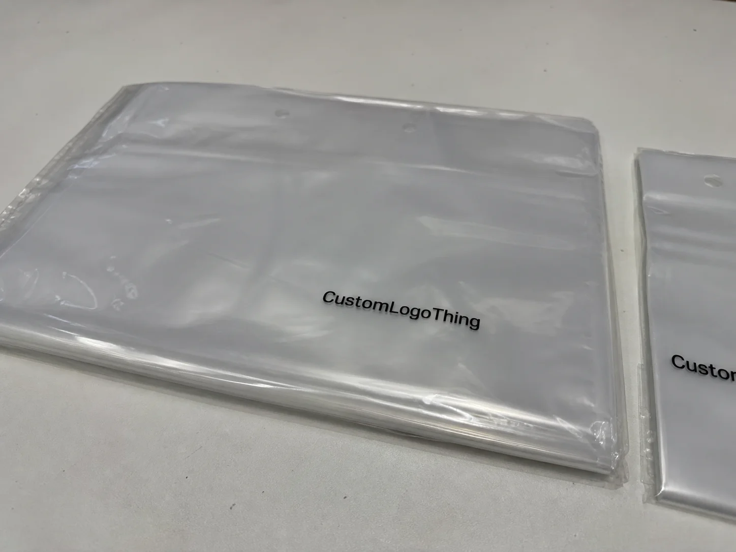
Slider lock clothing bags are resealable plastic packages used to protect folded garments while still letting staff and buyers reopen the pack without destroying the presentation. That sounds simple until you start mapping the print area. The top rail, slider track, side seals, and garment fold all change what is actually visible on shelf, so logo placement affects brand impact, readability, unit cost, and whether the pack feels planned or improvised.
Retail launch slider lock clothing bags logo placement guide: what matters first
The first mistake buyers make is treating the bag like a flat flyer. It is not. A retail-ready slider lock bag has a closure rail, a lock tab, side seals, and a garment inside that changes the visible print zone once the pack is filled. If the logo sits where the hardware lands, the brand mark loses a fight it was never going to win.
For a launch, the logo needs to do three jobs at once: identify the brand, preserve product visibility, and hold up under fast scanning on a shelf or rack. That is why the retail launch slider lock clothing Bags Logo Placement guide is less about decoration and more about visibility planning. You are designing for a three-second read, not for someone to stand there and admire the composition.
A useful rule: print for the retail view, not the artwork file. If the bag will sit folded on a shelf, the safest zone is usually the upper front third, below the slider rail and above the fold line created by the garment. If the bag hangs on a peg, the logo may need to ride slightly higher so it stays visible at eye level. Either way, the closure should look intentional, not like a graphic squeezed around a problem.
There is also a hierarchy issue. The logo should lead, but it should not bully the practical information into illegibility. Size callouts, barcode space, and care or SKU text still have to fit somewhere. Packaging that tries to say everything at once usually ends up saying nothing clearly.
How the slider lock closure changes print placement
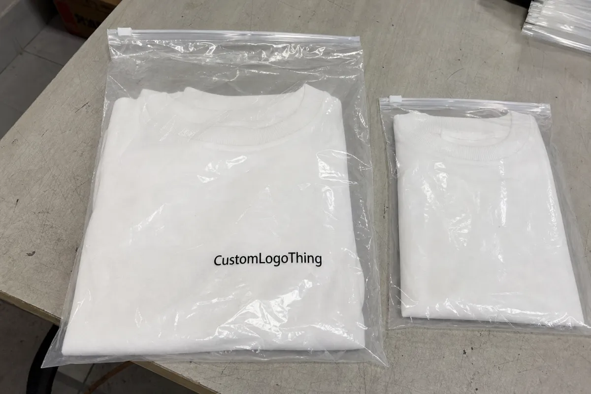
The closure is the feature that makes slider lock packaging useful, and also the feature that causes the most layout damage when it is ignored. The top rail, slider track, and lock tab create a dead zone that is smaller than first-time buyers expect. On a dieline, that area can look generous. Once the garment is folded, packed, and sealed, it shrinks quickly.
That is why front-panel placement usually wins. It gives the brand mark the best chance of being seen before the shopper notices the hardware. The catch is clearance. Keep the logo below the slider mechanism and leave enough room above the garment fold so the print does not look clipped or crowded. If the mark is too close to the top edge, the whole package starts to feel cramped. Cramped packaging reads cheap, even when the film and print quality are good.
Back-panel branding can work when the front needs to stay cleaner for product visibility, size data, or a windowed presentation. That approach is common for apparel packaging that needs to show color or texture through clear film. On frosted or tinted film, though, the back mark may need stronger contrast or a white underprint to avoid disappearing into the material.
Material choice changes everything more than most quotes admit:
- Clear film gives the strongest product visibility but exposes every spacing flaw and can make light logos vanish.
- Frosted film softens glare and usually hides minor print imperfections better.
- Tinted film can feel more premium in some categories, but it often flattens color and weakens readability.
For most apparel launches, 50 to 100 micron film is a common working range, though actual spec depends on product weight, shipping method, and how much stiffness the brand wants. Thinner film looks lighter and costs less. Heavier film usually prints more cleanly and resists wrinkling, but it can feel less flexible in the hand.
The same logo can look sharp on one bag and muddy on another because closure hardware, film finish, and viewing distance all change how the eye reads the package. That is why mockups matter, but physical samples matter more.
Key factors that decide the best logo position
There is no universal template because garments do not fold the same way. A tee, a sweater, a pair of shorts, and a layered outfit all create different occupied zones inside the bag. The printable area on paper is not the same thing as the visible area after packing, and that difference drives most placement errors.
Start with the physical constraints, not the logo idea.
- Garment type: bulkier items push the visible logo zone lower or wider.
- Bag size: a small pack may leave only one clean branding lane.
- Closure style: larger slider hardware eats into the top margin faster than expected.
- Retail channel: shelf stacks, hang-rail displays, and e-commerce prep expose different parts of the pack.
- Film finish: gloss, matte, frosted, and tinted surfaces all change contrast and glare.
Brand hierarchy matters just as much as hardware. If the front needs a logo, product name, size, barcode, and legal copy, the mark cannot occupy the whole panel. That is a common early-stage mistake. Buyers often want to make the logo large enough to announce the brand, then discover there is no room left for the actual operational information that retail needs.
For apparel brands running multiple sizes in one style, lock the logo position against the finished pack size, not the garment alone. That keeps the line visually consistent across S, M, L, and oversized items. If the artwork drifts from one size to the next, the system looks improvised even when each bag is technically acceptable.
Contrast deserves a separate check. A logo that looks bold on a desktop render can fade under store lighting once the film picks up glare. Thin strokes, script fonts, and pale inks are often the first casualties. If the brand identity depends on a delicate logo, ask the supplier for a real substrate proof instead of judging it on a glowing screen.
Registration tolerance matters too. Many converters hold a few millimeters of variation from print to cut or seal, and that is enough to clip thin borders or push type too close to the rail. A good layout assumes slight movement and still looks deliberate after production drift.
Cost, pricing, MOQ, and unit-cost tradeoffs
Placement is not only a design choice. It changes the quote. The more ink coverage, print colors, and panel usage you ask for, the more the price climbs. A one-color logo on the front panel is usually the cheapest route. Add a second side, a larger coverage area, or special effects, and the bag starts behaving like a custom packaging project instead of a straightforward launch item.
MOQ changes the math as well. Smaller runs are easier to approve, but the per-unit cost usually rises because setup is spread across fewer bags. A buyer ordering 500 pieces will almost always pay more per unit than a buyer ordering 5,000, even if the bag design looks identical. The factory still has to prep plates, align print, and check quality either way.
Typical pricing ranges vary by region, print method, and film spec, but a rough planning view helps. Simple one-color front logo bags may land around $0.18 to $0.30 at mid-volume. Two-color front print with a small back mark often moves into the $0.24 to $0.38 range. Full-panel print, heavier film, or extra finishing pushes the number higher. Pilot runs are usually the most expensive per bag because setup costs do not have enough units to dilute them.
| Option | Typical MOQ | Typical unit cost | Best use | Main tradeoff |
|---|---|---|---|---|
| One-color front logo | 1,000-3,000 | $0.18-$0.30 | Clean retail launch | Lowest visual coverage |
| Two-color front + small back mark | 3,000-5,000 | $0.24-$0.38 | Stronger brand presence | More setup and proof time |
| Full-panel print | 5,000+ | $0.32-$0.55 | Premium shelf impact | Higher setup cost |
| Pilot sample run | 300-1,000 | $0.35-$0.70 | Testing a new style | Expensive per bag |
Ask each supplier to quote the same dimensions, same closure, same film gauge, same print area, and same carton count. Otherwise you are comparing different products while pretending they are the same. Also ask whether proofing, plates, samples, and rush fees are separate. Those charges have a habit of surfacing late, right when the launch date becomes real.
One more cost trap: a low price per bag can hide a weak tolerance on color, seal strength, or slider fit. Those defects are expensive in a retail launch because they show up after the cartons are already packed. The right comparison is not the cheapest line on the quote; it is the lowest-risk package that still fits the margin.
Process and turnaround: from artwork to production steps
The fastest way to slow a packaging launch is to approve artwork before the dieline is locked. Do it the other way around. Confirm the bag size, closure style, and safe zones first, then build the artwork around them. Otherwise the printer keeps nudging your logo away from the rail, the fold, or a barcode that should have been placed elsewhere from the start.
A clean artwork package should include:
- Vector logo files in AI, EPS, or press-ready PDF format.
- Pantone references if color accuracy matters.
- Exact copy for size, SKU, care notes, and legal lines.
- Barcode requirements with readable quiet space around them.
- No-print zones around the slider rail, seals, and fold lines.
The normal approval flow is proof, revision, sample, and sign-off. The delay is usually on the buyer side, not the factory side. Someone wants to move the logo 8 mm. Someone else wants the brand name slightly larger. Then the barcode shifts and the whole layout needs another pass. Small changes are not small once they affect the safety margins around the closure.
After final approval, a realistic production window is often 10 to 15 business days, though that changes with print method, color count, and available capacity. If the order needs transit durability checks, refer to ISTA test methods for packaging abuse and handling. That is not overkill if the bags will ship in master cartons and then be opened, restacked, and handled again before they reach a store.
Sampling adds time, but it is cheap insurance. A one-off sample can reveal if the logo sits too close to the closure or if the film finish makes the brand mark hard to read under store lights. It can also expose color drift, seal waviness, and the kind of slight registration shift that only becomes obvious when the package is in your hand.
Step-by-step logo placement guide for a retail launch
Here is the process buyers actually use when the deadline is close. The retail launch slider lock clothing Bags Logo Placement guide works best when it behaves like a checklist, not a creative brainstorm.
- Measure the finished pack. Use the exact bag size and the way the garment will fold inside it.
- Mark the hardware clearance. Leave room around the slider rail, lock tab, side seals, and bottom seal.
- Set the retail view. Decide whether the bag will be seen on a shelf, a hanger, or in a shipping carton first.
- Place the logo against that view. Center it where shoppers will actually look, not where the dieline feels symmetrical on screen.
- Check the crease line. Keep important type away from the fold that forms once the garment is packed.
- Test with a mockup. A paper mockup or a short-run sample costs far less than fixing a production mistake.
If the launch includes multiple garment categories, standardize the top logo margin and the side margin, then allow the lower content block to flex. That keeps the line visually consistent while still letting size and compliance copy move where needed. The result is not flashy. It is disciplined, which is usually what retail packaging needs most.
For a few product families, the safest placement is not the most glamorous one. A centered logo in the upper third can outperform a larger mark pushed too high or too low. The eye reads balance faster than novelty when a shopper is moving down a rack. That is one reason restrained layouts often age better than busy ones.
If the pack includes paper inserts, header cards, or shipper cartons, check the packaging system around the bag too. Choosing responsibly sourced paper and confirming FSC chain-of-custody options can keep the whole presentation coherent. It is a small detail, but buyers notice when the packaging story looks assembled from unrelated parts.
Common logo-placement mistakes that make bags look cheap
Some packaging mistakes are subtle. These are not. The worst offenders are usually the easiest to avoid, which is part of why they keep showing up.
Shoppers do not read the bag the way designers do. They see the closure first, then the logo, then the garment inside. If that order feels wrong, the package feels off.
- Crowding the slider: placing the mark too close to the closure makes the whole bag look squeezed.
- Centering for the mockup, not the shelf: a logo can look mathematically correct and retail-wrong at the same time.
- Using thin strokes or low contrast: elegant on screen, weak under fluorescent lighting.
- Ignoring the fold: the visible lower edge often clips text or shrinks the mark after packing.
- Overloading the front: logo, product name, barcode, and claims all trying to lead creates visual noise.
Another mistake is assuming a clear bag needs less planning. It usually needs more. Clear film exposes every spacing problem, every bad crop, and every sloppy font choice. If the brand mark sits even slightly too high or too low, the eye catches it immediately because there is nowhere for the design to hide.
Gloss can also wreck a strong design. Store lighting throws reflections across smooth film, and those reflections can cut through fine lines or pale ink. If you are choosing between a delicate logo and one with stronger weights, pick the version that survives normal retail lighting. Pretty on a monitor is not the job. Readable on a shelf is the job.
One last issue: print that is too ambitious for the bag size. Buyers sometimes ask for a large logo, a tagline, a QR code, a barcode, and size data on a small closure bag. The result is compression everywhere. In those cases, removing one decorative element usually improves the entire package more than adding another layer ever could.
Expert tips and next steps for your packaging launch
The smartest launch plans are boring in the best way. They use a real dieline, a clear proof cycle, and a physical sample before anyone signs off on a full run. That is how you avoid paying for 5,000 bags that are technically correct and visually awkward.
My short approval checklist is simple:
- Confirm the dieline and safe zones.
- Choose the print method before finalizing the artwork.
- Compare at least two quotes with identical specs.
- Review a sample under store-like lighting.
- Write down the approved placement in millimeters, not “about here.”
If the project feels complicated, that is usually because it is. Apparel packaging has a lot of moving parts: garment fold, closure clearance, shelf view, barcode location, film finish, and print contrast. A one-page spec sheet saves more time than another round of vague email feedback. It also keeps the supplier from making assumptions that look harmless in prepress and expensive in production.
For retail launches, the best bag is rarely the one with the most graphics. It is the one that protects the garment, scans properly, and reads clearly from a few feet away. If that means a modest logo in a cleaner zone, that is not a compromise. It is packaging discipline. The retail launch slider lock clothing Bags Logo Placement guide works because it starts with visibility, not decoration.
FAQs
Where should the logo go on retail launch slider lock clothing bags?
Usually in the upper front third, just below the slider hardware and above the fold line. That keeps the mark visible without crowding the closure. For hang-display retail, I would bias it slightly higher so the logo still reads from about three feet away, which is closer to how shoppers actually see it.
How does logo placement affect the unit price of slider lock clothing bags?
Simple one-color front placement is usually the lowest-cost option. Larger coverage, multiple colors, or print on both sides pushes the unit cost up, often into the $0.24 to $0.38 range at mid-volume and higher for smaller runs. A tighter MOQ can also raise the per-bag price because setup gets spread across fewer units.
What turnaround should I expect after artwork approval?
A normal production window is often about 10 to 15 business days after final approval, depending on the factory and print method. Sampling or proof revisions add time, so do not treat the first proof as the finish line. Rush jobs are possible sometimes, but they depend on capacity and available materials.
Can I print a logo and barcode on the same clothing bag?
Yes, if the layout leaves enough quiet space around the barcode for scanning. Put the brand mark on the main visual panel and move barcode or SKU information to a lower or back panel. Avoid placing critical text near glossy edges or folds that can distort readability.
What file format works best for clothing bag logo artwork?
Vector files like AI, EPS, or press-ready PDF are the safest starting point. Outline your fonts and include Pantone colors if color accuracy matters. If the printer asks for pixel art, that is a sign someone is already making this harder than it needs to be.
What print method is best for slider lock clothing bags?
That depends on run size and coverage. Flexographic printing is common for larger orders because the unit cost drops once setup is absorbed. Digital can make sense for short runs, color tests, or launches that need faster changes. The important part is not the method name; it is whether the method can hold fine logo detail on the selected film without excessive glare or color shift.
How much margin should I leave around the logo?
Enough that small registration shifts do not make the logo feel crowded. Many teams start with a few millimeters of buffer and then increase it once the sample is checked in hand. If a border or tagline touches the rail in proof form, it will usually look worse after production, not better.
What should I check on the final sample before approving?
Check logo contrast, placement relative to the closure, fold interference, barcode scan space, seal straightness, and whether the bag still looks balanced when filled. A sample that looks fine flat on a table can behave differently once the garment is inside it, and that is the condition that matters.