Retail Merch Caps Logo Placement Guide: Why a Half Inch Can Change the Whole Cap
Two caps can use the same embroidery file, the same thread colors, and the same cotton twill body, yet one looks retail-ready because the logo sits a half inch higher, reads cleanly across the crown, and holds its shape on a display. That is the practical reason to use a retail merch Caps Logo Placement guide: cap branding is not just a design decision, but a buying decision that affects sampling, production cost, product photos, and sell-through.
A cap is not a flat canvas. The crown curves forward and sideways. A front seam may run directly through the artwork. The bill throws a shadow over low placement. A structured cap stands proud because of buckram behind the front panels, while an Unstructured Dad Hat softens and collapses slightly on the head. Even the viewing angle changes the result, because shoppers usually see a cap from eye level, slightly above, or in a three-quarter product photo rather than as a straight-on digital mockup.
For Retail Merch Caps, logo placement means the planned position, size, method, and orientation of branding across front panels, side panels, back closure areas, brims, underbrims, woven labels, patches, and small trim details. The strongest cap programs usually separate the primary mark from the supporting details instead of giving every logo equal weight.
Promotional caps can be forgiving. They often need visibility at an event table, trade show, or staff handout. Retail caps are judged against lifestyle brands, outdoor labels, sportswear, and boutique headwear in the same search results or on the same rack. If the logo is too low, too wide, too busy, or fighting the seam, the cap starts to feel like merchandise that was decorated after the fact instead of a product designed from the beginning.
Before requesting a quote, it helps to know where logos work best, what construction limits the decoration area, how production moves, and which placement choices tend to create delays. A half inch sounds minor on a spec sheet; on a cap crown, it can change the whole read.
How Cap Construction Controls Logo Position and Decoration Method
The cap body sets the boundaries for decoration. A structured six-panel cap usually has firm buckram behind the front panels, which gives embroidery and patches a stable surface. An unstructured dad hat has a softer crown, so dense stitching can pull the fabric or make the front feel stiff if the artwork is too heavy. A five-panel cap gives one uninterrupted front panel, useful for rectangular patches, wide wordmarks, screen-printed transfers, and designs that do not want a center seam.
Trucker caps add another layer of decision-making. The front foam or cotton panel may decorate well, but mesh side and back panels are not suited for standard embroidery. Flat-brim snapbacks can carry larger streetwear-style marks, while performance caps made from polyester, nylon, or stretch fabrics often need lighter stitch density, heat-applied decoration, or specialty backing to reduce puckering. Bucket silhouettes can work with small front embroidery or woven labels, although the sloped shape changes the normal viewing angle and often makes oversized front marks feel awkward.
Panel seams deserve more attention than they usually get during early mockups. On a six-panel cap, the center seam can interrupt thin lettering, small icons, circles, shields, and fine outlines. A skilled digitizer can plan stitch direction, underlay, and pull compensation around that seam, but not every logo should be forced through it. If the mark depends on perfect symmetry or tiny detail, a five-panel crown, woven patch, or simplified embroidery file may be the cleaner route.
Decoration methods behave differently across cap styles. Direct embroidery gives a familiar retail look and works well for clean shapes, short type, and simple icons. 3D puff embroidery adds height, but it needs thicker strokes, open spacing, and enough surface area for foam to sit under the top stitches. Woven patches hold small lettering and fine detail better than thread. Leather and faux leather patches suit outdoor, hospitality, resort, and lifestyle merchandise where texture matters. PVC patches lean rugged and dimensional. Heat transfers can reproduce smooth multicolor artwork, but the cap fabric, crown curve, and heat tolerance must be compatible.
| Decoration method | Best placement zones | Typical use | Cost behavior |
|---|---|---|---|
| Direct embroidery | Front center, offset front, side, back | Clean logos, short text, classic merch | Efficient on many stock caps; stitch count affects price |
| 3D puff embroidery | Front center, flat-brim styles | Bold initials, block lettering, streetwear marks | Requires more setup care and slower running than flat embroidery |
| Woven patch | Front center, five-panel front, side panel | Detailed logos, small lettering, badge artwork | Patch MOQ, shape, edge finish, and application time affect unit cost |
| Leather or faux leather patch | Front center, offset front | Premium lifestyle, outdoor, hospitality merch | Material, debossing, laser detail, shape, and sewing add cost |
| Heat transfer | Front panels, underbrim on compatible materials | Smooth gradients, multicolor graphics, fine edges | Art prep, transfer size, and application testing drive pricing |
Think in terms of live decoration area, not total cap surface. The machine hoop, crown curve, sweatband, closure hardware, brim angle, and panel seams all reduce usable space. Good placement starts with construction before it starts with logo size.
Best Logo Placement Zones for Front, Side, Back, and Brim Areas
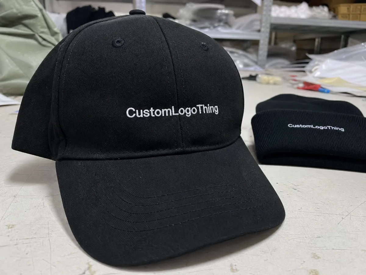
Center front is the strongest placement for most retail caps. It gives the logo the fastest read, photographs well, and works on retail walls where caps are stacked, pegged, or shown in rows. Many front logos land around 2 to 4 inches wide, though crown height, structure, and artwork shape matter more than any single measurement.
Front-center placement works best when the artwork is sized to the panel rather than stretched to fill every available inch. Leave breathing room above the bill. Avoid crowding the top crown seam. A tall badge may feel large at 2.25 inches high, while a horizontal wordmark at 3.25 inches wide may look balanced on one cap and cramped on another. The same measurement can read differently on a low-profile dad hat and a high-crown snapback.
Offset front placement gives a quieter, more fashion-focused result. It works well for small icons, minimalist initials, location shorthand, tone-on-tone embroidery, or small woven patches. For retail, offset branding often makes a cap feel less like a giveaway and more like an accessory someone would choose because the design has restraint.
Side placement can add polish, but it needs discipline. A side icon, event year, collection code, or short secondary mark can support the main logo without competing with it. Tiny side type usually disappears once the cap is worn, especially at normal viewing distance. If side text is part of the brief, keep it short, avoid delicate fonts, and expect the readable width to be smaller than the front.
Back placement depends heavily on the closure. A plastic snapback leaves different decoration space than a fabric strap with metal buckle, hook-and-loop closure, elastic back, or fitted cap. Back embroidery is usually short, centered, and either straight, gently arched, or stacked. Long website addresses are rarely elegant on a cap; they also become difficult to read at small letter heights.
Brim decoration is more specific. A top-brim mark can feel bold on streetwear and sports-inspired silhouettes. Underbrim printing creates a discovery detail when the cap is handled, hung, or photographed from below. Both need to be judged against rubbing, heat, adhesive performance, and price point. A cap planned for a $18 retail tag does not need the same amount of finishing as one meant to sit near $45.
Plan the cap like a small retail package: one clear primary mark, one supporting detail if needed, and enough blank space for the material and shape to do their work.
Key Factors That Decide Logo Size, Thread Detail, and Readability
A logo that looks sharp on a screen may not translate cleanly to a curved cap. Tiny type, thin strokes, gradients, distressed textures, tight registration marks, and narrow spacing all become harder to control once the artwork is stitched, woven, printed, or applied over the crown.
For many retail caps, front logos sit around 2 to 4 inches wide. Side marks may be closer to 1 to 2 inches wide, depending on the shape and placement angle. Back text often needs to be reduced to a short word, initials, or a small line of copy. These are working ranges, not fixed rules, but they help prevent the most common scale errors.
Stitch count matters because thread has mass. A large filled logo with 12,000 stitches behaves differently than a small outline mark with 3,000 stitches. Dense embroidery can make a soft cap ripple, pull, or feel rigid. On structured caps, heavy stitching may still look clean, but it can create a stiff front if the logo covers too much area. With 3D puff, foam sits under the top stitches, so thin scripts, sharp points, tiny counters, and small negative spaces may not survive production cleanly.
Thread color changes the read as much as size does. High contrast, such as white on black or navy on stone, improves shelf visibility and product-photo clarity. Tonal embroidery, such as charcoal on black or cream on khaki, can feel more premium but may photograph softly online. Metallic thread can work in small accents, although it is less forgiving than standard polyester or rayon thread and should be tested before it becomes a key feature of a retail run.
Artwork simplification is normal in cap production. A tagline may need to come off the front and move to a hangtag. A gradient may need to become two flat color steps. A photographic element may be better suited to a printed patch than direct embroidery. Legal marks, distressed texture, hairline rules, and thin script can look good in a brand deck and still be poor candidates for thread.
Quality control should include more than checking whether the right logo was used. Review the first decorated piece for placement height, level alignment, loose threads, puckering, stitch coverage, thread color, patch edge quality, and whether the cap still sits naturally after decoration. On multi-location caps, check consistency from piece to piece; a side logo that shifts even a quarter inch can look sloppy when caps are stacked together.
Brand hierarchy is the quiet discipline behind good cap design. One strong mark usually outperforms several competing logos. Caps are small products, and every extra element has to earn its space.
Process and Timeline: From Artwork Proof to Finished Retail Caps
The process usually starts with choosing the cap blank or custom cap style. After that, confirm placement zones, review artwork, select the decoration method, approve a digital proof, and decide whether a physical sample or pre-production confirmation is needed before bulk production. Simple stock-cap embroidery moves faster than a custom cap with patches, labels, retail packaging, and multiple decoration locations.
Embroidery requires digitizing. The logo is not simply uploaded to a machine. It is converted into stitch instructions that control direction, density, underlay, thread changes, trims, and how the design sits on the crown. Good digitizing can make a medium-complex logo look clean. Poor digitizing can make an expensive cap look cheap, even if the blank itself is solid.
Proofing deserves a slow read. Check spelling, placement, relative size, and orientation. Confirm whether the logo is centered to the front panel, centered to the cap as worn, or intentionally offset. Review thread colors or patch materials against the cap color. A digital proof is useful, but it cannot fully show thread sheen, patch thickness, crown tension, or how a raised seam changes the surface.
Sampling is most useful for first-time retail runs, higher quantities, premium patch materials, unfamiliar silhouettes, detailed artwork, or complex placements. Repeat orders with approved files may not need the same level of sampling, as long as the cap body, thread colors, decoration supplier, and material specs have not changed. If any of those inputs shift, treat the reorder with fresh caution.
Timeline depends on blank availability, artwork readiness, digitizing time, proof approvals, sample revisions, order quantity, decoration method, seasonality, packaging requirements, and shipping destination. As a broad planning range, straightforward embroidered stock-cap orders often move in a couple of production weeks after proof approval. Custom caps with specialty trims, private labels, patches, hangtags, or retail finishing can take longer. That is not a guarantee; it is a useful planning range for buyers who need to work backward from a launch date.
If the caps support a merch drop, wholesale delivery, paid event, or photo shoot, build in time for revisions. The cost of rushing is rarely just freight. It can be a compromised logo size, skipped sample, limited blank choice, or artwork decision that no one loves once the cartons arrive.
Cost, MOQ, and Pricing Factors for Logo Placement Choices
Cap pricing is shaped by the cap body, decoration method, number of placements, stitch count, patch type, color count, sampling needs, packaging, and quantity. A single front embroidery on a stock cap is usually the most efficient path. Add side embroidery, back embroidery, woven labels, underbrim printing, custom hangtags, or individual polybags, and the handling increases.
Stitch count is production time expressed in thread. More filled area, larger logos, and dense 3D puff work generally take longer to run, even when the artwork uses only one or two colors. A 4-inch filled logo may cost more to produce than a 2.5-inch outlined mark with four colors because the machine stays on the cap longer and the risk of distortion increases.
MOQs vary by build. Direct embroidery on stock caps can often support lower quantities than fully custom caps, custom-dyed fabrics, specialty patches, private-label sweatbands, or retail packaging sets. Exact minimums depend on the decoration and supply path, so do not assume a cap with three placements carries the same minimum as a basic front-logo order.
Realistic price ranges depend on quantity and specs, but buyers tend to see clear jumps between a basic stock cap with one front embroidery and a structured cap with a sewn woven patch, back embroidery, custom inside label, and polybag. A low-cost blank can save money on the quote, yet weak structure, poor closure hardware, uneven stitching, or loose fabric can make the finished cap feel less valuable than the logo deserves.
For cleaner pricing, send the cap style, quantity, logo file, desired placement, preferred decoration method, thread or patch colors, deadline, packaging needs, and shipping location. If there is a target retail price, include it. A cap intended to sell for $22 has different finishing logic than one planned for $45, and the decoration plan should respect that margin.
Buyers using sustainability claims should be specific about materials and documentation. If FSC-certified paper hangtags or packaging are part of the retail set, check current guidance from the Forest Stewardship Council. For distribution testing and shipping durability, the International Safe Transit Association offers standards that help packaging teams think beyond the cap itself, especially for wholesale shipments or e-commerce fulfillment.
Common Logo Placement Mistakes That Make Caps Look Unfinished
The most common mistake is scaling the logo too large for the crown. Big can work, especially on flat-brim or streetwear caps, but oversized artwork can crash into seams, distort around the curve, or turn the cap into a billboard. Retail customers notice that faster than many buyers expect.
The opposite problem is a mark that is too small or placed too low. The bill shadow can hide the lower edge of the design, and the crown curve can make low placement feel droopy when worn. A logo can be technically centered on a proof and still look visually low on the actual cap.
Ignoring the center seam is another quality trap. Six-panel caps split the front area. Symmetrical icons, circles, shields, small typography, and fine outlines can look uneven if the artwork is not planned around that seam. If the mark must be perfectly clean, consider a five-panel cap, a patch, or a simplified version of the logo.
Too many placements can make a cap feel cluttered rather than premium. Front, side, back, brim, underbrim, and label branding can work for certain streetwear concepts, but most retail merch needs clear hierarchy. One primary mark and one supporting detail are often enough.
Poor artwork preparation slows production and weakens the final result. Low-resolution files, unconverted fonts, thin lines, gradients, tiny dates, and fuzzy screenshots all create extra proofing work. Vector files such as AI, EPS, or clean PDF artwork usually give the production team more control. High-resolution PNG files can help as references, but they are not always production-ready.
Color mismatch can also undercut an otherwise strong cap. Navy-on-black may look subtle in hand but disappear in online photos. Cream-on-khaki can feel refined, yet it may not read from six feet away. A practical retail merch Caps Logo Placement guide should treat contrast as both a design choice and a selling tool.
Build a Cap Placement Brief Before You Request a Quote
Start with the silhouette. Decide whether the cap should feel classic, athletic, outdoor, streetwear, uniform-ready, or premium lifestyle. Then choose one primary placement before adding secondary marks. That single decision keeps the project grounded and prevents the decoration plan from becoming a list of every possible branding opportunity.
Prepare artwork in vector format when possible, and include notes about which details can be simplified. If the brand mark has required clear space, minimum size, exact Pantone color, or protected proportions, share that early. If some elements are flexible, say so. Production teams can usually find better solutions when they know what must stay exact and what can be adjusted for the cap surface.
Measure a favorite retail cap as a reference. Write down the approximate logo width, height, distance from the bill, and whether the mark is centered, offset, patched, embroidered, or printed. Photos help as well. Front-on, side, back, and angled shots give useful clues about the look you want, especially when the cap shape is difficult to describe in words.
A useful placement brief does not need to be elaborate. It should include:
- Cap silhouette, color, structure, fabric, and closure preference
- Primary logo placement, target width, and decoration method
- Secondary placement notes for side, back, brim, label, or patch details
- Thread, patch, or print color preferences with any brand color rules
- Quantity, target selling price, launch date, packaging needs, and shipping location
Request a sample for first-time retail runs, premium price points, unfamiliar cap shapes, detailed logos, multi-location decoration, or any order where customer perception carries real weight. A sample adds time and cost, but it can prevent a full run of caps that feel almost right and still miss the mark.
The strongest cap placements look obvious after they are finished, but they usually come from careful decisions made early: the right silhouette, the right decoration method, a controlled logo size, and enough restraint to let the cap feel like a finished product. Use this Retail Merch Caps logo placement guide as shared language for front, side, back, brim, patch, and label decisions before production starts.
FAQs
What is the best logo placement for retail merch caps?
Center front is usually the safest and most visible placement for a primary retail logo, especially for embroidery or patches. Offset front placement works well for a quieter fashion look, while side and back placements are better for secondary marks, short text, or collection details. The best choice depends on cap structure, logo shape, decoration method, and how the cap will be displayed or photographed.
How large should a logo be on a retail cap?
Many front logos fall around 2 to 4 inches wide, but the right size depends on crown height, panel seams, artwork detail, and whether the logo is embroidered, patched, or printed. Small text, thin strokes, and complex icons often need to be enlarged, simplified, or moved to a patch to stay readable. A production proof or sample is the best way to confirm scale before a full retail run.
Does logo placement affect the cost of custom retail caps?
Yes. Each decoration location can add machine time, handling, setup, and quality checks. A single front embroidery is usually more efficient than front plus side plus back decoration. Cost also changes with stitch count, patch material, cap style, order quantity, sampling, private labeling, and packaging.
What files are needed for a retail merch caps logo placement proof?
Vector artwork such as AI, EPS, or PDF is preferred because it allows cleaner resizing and better preparation for embroidery or patch production. High-resolution PNG files may help with visual reference, but they are not always enough for production-ready decoration. Include placement notes, cap color, desired logo size, thread or patch colors, and any brand rules that must be followed.
How long does the custom cap logo placement process take?
Timing depends on cap availability, artwork readiness, digitizing, proof approval, sampling, production quantity, decoration method, and shipping. Simple stock-cap embroidery can move faster than custom caps with specialty patches, multiple placements, or retail packaging. Build in extra time for proof revisions and samples when the caps are part of a merch launch, event, or paid retail program.


