A Slider Lock Clothing bag looks straightforward until the proof comes back with the logo trapped under the closure, squeezed into the seam allowance, or placed where the folded garment hides half of it. That is why a Slider Lock Clothing Bags logo placement guide matters before artwork gets approved or price discussions start. The closure changes the printable field, and that changes the decisions that matter most: where the mark sits, how large it should be, and how much room it needs to stay readable after packing.
These bags show up in apparel programs because they keep product neat, protect garments from dust, and present better than a plain poly sleeve. They also appear in enough sizes and film finishes that “standard placement” is only a rough starting point. A bag that works for a tee may fail for a hoodie. A bag that looks clean in a flat mockup may look crowded once the slider rail, garment fold, and hanger hook are all in view.
The practical rule is simple: design for visibility first, decoration second. If the logo reads clearly on the bag, the package feels intentional. If the closure competes with the artwork, the bag feels compromised even when the print itself is technically sharp.
Slider Lock Clothing Bags Logo Placement Guide Basics
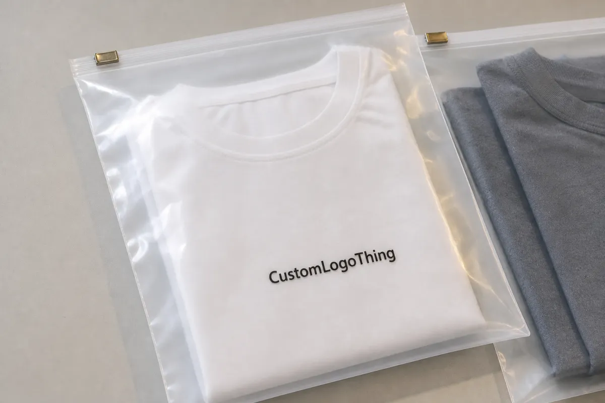
Slider Lock Clothing Bags are usually made from clear, frosted, or gloss poly film with a track-and-slider closure across the top. The closure is convenient for retail and repeat use, but it reduces the usable print area near the top edge. That is where most placement problems start. Buyers often assume the top third of the bag is prime branding space, then discover the slider track runs through the same zone and narrows the visible field more than expected.
Good placement depends on how the bag will actually be used. A folded tee sits differently from a bulky sweatshirt. A hanging garment exposes more of the front panel than a stacked garment on a shelf. Even the insert card, tissue, or hang tag can shift how the logo reads. None of those details sound dramatic, yet they are usually the reason a proof looks fine on screen and wrong on the sample.
For most apparel programs, three placement approaches appear again and again: center front, upper-middle front, and lower-third front. Center front is the easiest to read from a distance and usually the safest for first orders. Upper-middle front can feel more refined if the garment occupies the lower part of the bag. Lower-third placement works better on taller bags or when the product itself fills the upper section. The right answer depends on the bag dimensions, garment thickness, and the closure zone shown on the dieline.
“A proof can look perfect until the folded hoodie lands behind the slider rail. Then the logo is technically printed, but visually lost. That is the reprint no one wants.”
Packaging buyers usually care about three things at once: brand visibility, production consistency, and cost control. Placement affects all three. A well-positioned logo improves shelf appeal and product photos. It also reduces the chance of a rejected proof or a reorder that no longer matches the first run. Small changes in placement can save larger costs later.
How the Slider Lock Changes Print Visibility
The slider mechanism sits on the top edge, so the upper strip of the bag is the first place where readability starts to suffer. A logo that reaches too high may be hidden partly by the closure, especially if the design includes a tagline or a tall icon. The art may still be inside the printable area, but the visible area is smaller than the printable one. That distinction matters more than people expect.
Front-panel printing usually gives the best read at arm’s length. It also photographs better for ecommerce, provided the garment does not crowd the logo. Back-panel printing can work for care information, compliance details, or secondary branding, but it is rarely the first read in a store. If the brand depends on quick recognition, front placement usually performs better than back placement.
Orientation matters too. A centered logo can drift visually once the apparel is inserted and compressed. The bag may look slightly different when it hangs on a peg versus when it lies flat in a shipping carton. Retail lighting adds another layer. Gloss film reflects more, clear film shows more of what is behind it, and frosted film softens the look but can reduce contrast. None of these finishes is inherently better. Each one changes the way the logo reads.
For buyer teams that photograph products before launch, the smartest test is the simple one: place the sample under the same lighting used for product photography or retail display. Thin strokes, low-contrast colors, and delicate details often disappear on film long before anyone notices them on a monitor. If the mark has to survive logistics, handling, and shelf lighting, it should be reviewed in those conditions, not just on a digital proof.
Materials also affect the result. Clear film usually shows the garment well and gives the most straightforward brand view, but the logo competes with whatever is inside the bag. Frosted film reduces that visual noise and can look higher end. Gloss film gives stronger shine and a cleaner pop on the shelf, though glare can wash out dark artwork. The best choice depends on the product line and the retail setting, not on what looks attractive in isolation.
Logo Size, Safe Zones, and Artwork Rules
Logo size should be based on the real printable window, not the full bag width. That is one of the most common mistakes in custom packaging. A blank mockup makes the film look spacious, but the slider track, seal margins, and side allowances all reduce the usable area. If the artwork stretches too far, it can run into problem zones or look crowded once the bag is filled.
Safe zones are not optional. A practical starting point is to leave at least 6-10 mm from the closure, side seams, and bottom fold, though the exact margin depends on the bag size and the supplier’s tooling. Smaller bags often need more careful spacing because even a few millimeters can change how the art reads. If a supplier cannot mark the safe zone on the dieline, the artwork is not ready for approval.
Contrast matters as much as placement. On clear or frosted film, thin hairlines and tiny taglines tend to disappear first. Simple one-color logos often print better than complex marks because they stay legible at smaller sizes and survive the slight softness that can appear on plastic. A highly detailed logo may still be usable, but it should be simplified for the bag if the details do not hold at production size.
Production artwork should usually be vector-based: AI, EPS, or a clean PDF. Fonts should be outlined. Gradients, transparency effects, and tiny text deserve extra scrutiny because they may reproduce differently depending on the print method. If the art depends on crisp fine lines, ask for a prepress check before approval. It is much easier to simplify a logo than to fix a run after the film is printed.
Here is a practical comparison of common placement choices:
| Placement Option | Typical Use | Visual Effect | Risk Level |
|---|---|---|---|
| Center front, below closure zone | Core brand mark | Strong shelf read | Low |
| Upper-middle front | Premium look, smaller garment folds | Balanced and clean | Medium |
| Lower-third front | Tall bags, folded apparel stacks | Visible under product | Medium |
| Back-panel print | Secondary branding, care or compliance copy | Less visible in store | Low to medium |
For most brands, the safest option is still a centered front logo with enough breathing room around it. That is where the Slider Lock Clothing Bags logo placement guide becomes practical instead of theoretical. Restraint usually improves the result. Bigger artwork is not automatically stronger artwork.
Cost, Pricing, and MOQ for Custom Logo Bags
Pricing depends on size, film thickness, color count, print coverage, and whether the bag is printed on one side or both. A one-color logo on a stock-size bag will generally cost less than a larger, fuller print area with multiple colors. The biggest cost jump often comes from setup and quantity, not from the ink itself.
At smaller volumes, the per-unit price can feel stubborn. Typical budget ranges for a custom run might land around $0.22-$0.45 per bag at 500 pieces, $0.15-$0.32 at 1,000 pieces, and $0.08-$0.18 at 5,000 pieces, depending on the spec. Those are broad ranges, not promises. They are useful as a reality check when a quote looks unusually high or surprisingly low.
Several extra charges often appear during quoting:
- Setup fees: often $35-$120 for artwork handling or press setup.
- Plate charges: often $25-$80 per color if the print method requires them.
- Proofing: sometimes included, sometimes $15-$50 for a mockup.
- Physical samples: often $20-$60 before freight, depending on the spec.
MOQ matters because those setup costs spread across every unit in the order. A 500-piece run may look expensive on paper, but the same setup over 5,000 units drops the cost much faster. That is why buyers who expect repeat orders should ask for quotes at a few volumes, not just one. The breakpoints usually show up quickly.
A useful quote comparison should include:
- Bag size and film thickness.
- One-side or two-side print.
- Number of ink colors.
- Artwork coverage area.
- Setup, sample, and freight charges.
If a quote seems too cheap, check the details. A lower price may assume a smaller logo, thinner film, or a generic stock bag with minimal customization. That may be acceptable for some use cases, but it is not the same product. Buyers sometimes compare only the headline unit cost and miss the real difference in print area or closure spec.
Material choice can move price as well. Thicker film generally costs more but resists tearing and feels more substantial in hand. Frosted material sometimes carries a premium because it changes the visual finish. If the package is part of a premium apparel line, the extra cost may be justified. If the bags are for internal packing only, that premium might not be worth paying.
Production Steps, Timeline, and Lead Time
The normal workflow is predictable: artwork review, digital proof, sample or sample image, production, then shipping. The delays usually happen at the handoff points. A missing vector file, unclear placement note, or proof that gets revised several times can add days without changing the actual design.
Typical timing looks like this. Artwork review may take 1-2 business days. Proofing often adds another 1-3 business days. A physical sample can take 3-7 business days if it is needed before approval. Production commonly runs 10-18 business days after final sign-off, with shipping added on top. Simple stock-size orders move faster. Custom sizing, extra print colors, and specialty films slow the schedule.
Rush orders are possible in some cases, but only if the specification is simple and the line has open capacity. A one-color bag with clear artwork can sometimes move faster than expected. A custom-size order with two-sided print and multiple revision rounds usually cannot. Honest lead time is more useful than optimistic lead time. Buyers who build the schedule around best-case timing often end up paying for avoidable air freight.
Clear communication saves time. The proof should show the closure zone, the printable area, and the logo position in a way that can be verified without guessing. If the bag is going to be reordered later, the approved file should keep the same placement notes, artwork version, and size references. That kind of documentation sounds mundane. It prevents expensive confusion later.
For brands that move through distribution, transit behavior matters as well. Not every apparel bag needs formal lab testing, but the packaging should survive handling and still look aligned when it reaches the shelf. If the bag is part of a larger supply chain, checking the packaging against common transport standards such as ISTA test methods can help catch weak points early. That is less about theory than about avoiding a pile of bags that arrive wrinkled, scuffed, or visually off-center.
Step-by-Step Logo Placement Workflow
Start with the actual bag template. Not a screenshot, not a sketch, and not a memory of the last order. Use the supplier’s dieline or a marked layout that shows the closure zone, fold line, and side margins. Measure the printable area first. Only then decide where the logo should sit.
Next, match the placement to the product. A slim tee folds differently from a sweatshirt or a folded knit. A tag insert can cover part of the panel. A hoodie can push artwork downward. The logo should be positioned for the final packed state, not just for an empty bag lying flat on a desk.
Then check readability. A customer should be able to identify the brand in a couple of seconds from a short distance. If the mark is too high, the slider can crowd it. If it is too low, the garment can hide it. If it is too detailed, the film can soften the edges. Each of those problems is small on its own. Together they make the package look unfinished.
A clean approval process usually looks like this:
- Confirm the bag size and closure spec.
- Mark the printable zone on the dieline.
- Position the logo with safe margins.
- Check color contrast on clear or frosted film.
- Approve a digital mockup or physical sample.
- Lock the placement specs for reorders.
The final step matters more than many buyers realize. Reorders fail when the first approval is undocumented. “Same as last time” is not enough if the bag size, printer, or film finish changes. Good packaging teams keep the placement notes with the artwork files so the next run mirrors the first one.
If there is any doubt, request a sample with a simulated insert. Empty-bag proofs can be misleading because they do not reveal how the garment shifts the design. A filled sample makes the spacing problem obvious fast. That is usually cheaper than discovering the issue after a full production run.
Common Mistakes That Hurt the Finish
The most common mistake is placing the logo too high. The slider track eats into the top edge visually, so even a technically correct placement can feel cramped. Right behind that is using thin strokes or too much detail. What looks precise on a screen often prints soft on plastic. Film is unforgiving in a way paper is not.
Ignoring bag distortion is another frequent error. Once the product is inserted, the bag can pull slightly along the seams or bow around the garment bulk. If the logo sits too close to the edge, it can appear crooked after filling. That is why a filled proof is worth more than a perfect empty mockup.
Lighting also changes the result. Gloss film under bright retail LEDs can wash out dark artwork or create reflections that hide light elements. Clear bags can behave like mirrors. If the bag will be sold in a showroom, on a peg, or in a photo-driven storefront, test the sample under the same type of light before approving the final artwork.
The last mistake is forgetting that the package is viewed in motion. A customer sees the bag from the front, then from an angle, then while it swings on a hanger or slides in a box. A logo that reads well only in one static position is weaker than a simpler mark that holds up from a few viewpoints.
Practical rule: if the brand name is hard to read from two to three feet away on the proof, the layout probably needs to be adjusted.
In many cases, less art produces a better bag. Fewer colors, cleaner spacing, and a stronger mark usually create a better impression than a crowded design that tries to use every inch of film. That is especially true on slider bags, where the closure already competes for attention.
Next Steps: Review, Approve, and Order
Before requesting a final quote, confirm the bag size, identify the logo panel, and ask for the dieline with the printable area clearly marked. Then compare pricing at a few order quantities so you can see where the unit cost actually changes. If the brand has a retail presentation standard, send it with the artwork. That makes placement decisions easier before production starts.
Prepare vector artwork, note any Pantone references if color matching matters, and include examples of preferred placement if they already exist. For products that will be reordered, store the approved version with the size, placement, and print notes together. That reduces the chance of inconsistency later, especially when the team changes or the order moves between buyers.
The most reliable approach is to treat the proof as a production document, not as decoration. The bag is protecting apparel, presenting the brand, and surviving handling at the same time. A good Slider Lock Clothing Bags logo placement guide keeps those functions in balance: readable branding, practical safe zones, and enough clarity in the artwork that the next run matches the first.
Where should the logo go on slider lock clothing bags for best visibility?
Center front or upper-middle front usually works best, as long as the mark stays below the closure zone. The slider should never cut into the logo or tagline. Always verify the visible area on the actual dieline before approving the layout.
How big should a logo be on slider lock clothing bags?
Large enough to read at arm’s length, but not so large that it enters the seal, side margin, or closure area. Simple logos can usually be printed larger than detailed marks because they remain legible on clear or frosted film. Bag size and printable area matter more than any fixed rule.
What file format is best for slider lock clothing bags logo placement?
Vector files such as AI, EPS, or PDF are the safest choice for clean edges and scaling. Fonts should be outlined, and tiny details should be removed if they will not survive at production size. If only a raster file is available, send the highest-resolution version and ask for a prepress check.
How do cost and MOQ change with logo placement on these bags?
Placement alone usually does not move price very much, but larger artwork, more colors, and two-sided printing do. MOQ affects unit cost because setup charges are spread over more bags. Ask for quotes at several quantities so the breakpoints are easy to compare.
How long does production take after the slider lock clothing bags proof is approved?
Simple orders often move from approval to production in about 10-18 business days, with shipping added after that. Artwork revisions, custom sizing, specialty film, and sample rounds add time. If the timeline is tight, confirm the realistic lead time before final approval.

