Snapback caps logo placement guide for brand launch kits
A practical snapback caps logo placement guide for Brand Launch Kits starts with the cap itself, not the mockup. A structured crown has seams, buckram, and a curved surface that can make a logo look smaller, higher, or tighter than it did on screen. What seems centered in a flat file may land too close to a seam or read awkwardly once it is stitched or patched onto the actual cap.
That matters in launch kits because the cap is often one of the first items a recipient handles. If the placement is off, the box can feel rushed. If the logo sits cleanly and the decoration method fits the art, the cap adds polish without needing extra graphics or heavy branding.
Snapbacks behave differently from unstructured hats. The front panel gives branding a defined stage, but it also limits how large or detailed the artwork can be. Front-center placement usually carries the most visual weight, side placement is useful for secondary marks, and rear placement works best when the goal is subtlety.
If a cap reads clearly from a few steps away, looks balanced in a phone photo, and still feels clean when worn, the placement and method are probably right.
This guide focuses on the decisions that affect buying and production: where the logo should sit, how large it should be, which decoration method fits the art, what the timeline looks like, and where cost changes. The goal is a cap that supports the launch kit instead of competing with it.
How front, side, and back placements work on structured caps
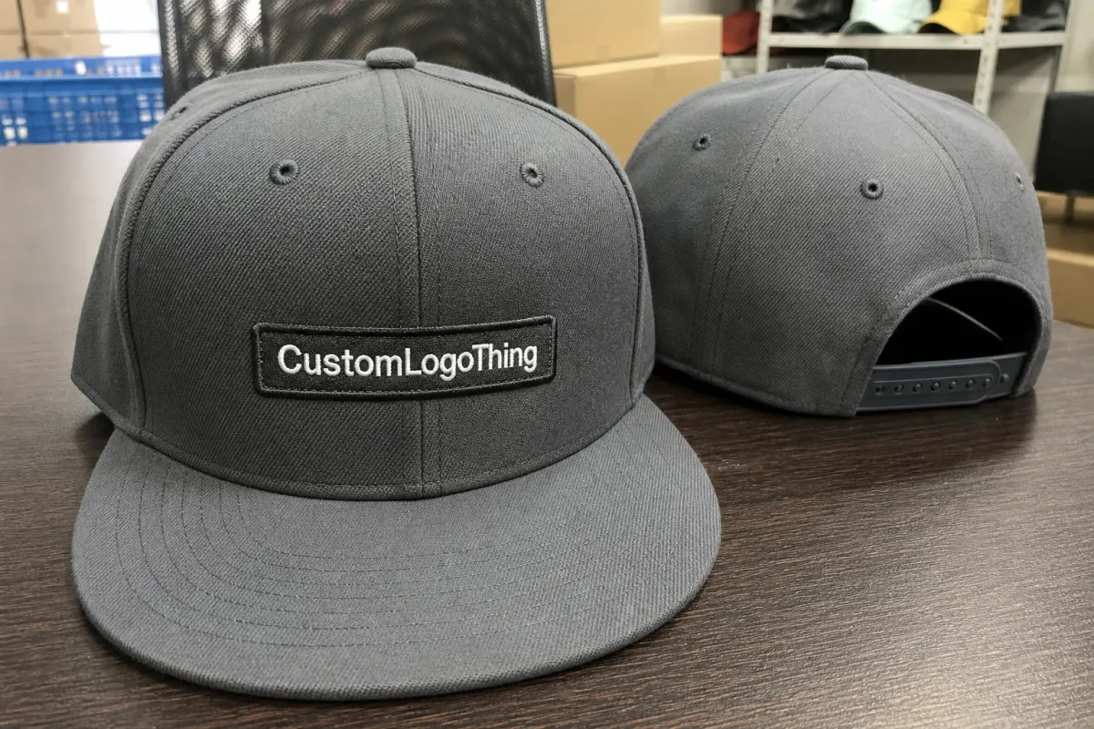
The front panel is usually the best place for the main logo on a structured snapback. It gives the strongest first impression and the clearest viewing angle, especially in press photos, kit photography, or event handouts. For a wordmark, icon, or emblem that needs to be recognized quickly, front-center placement usually does the most work.
Size matters as much as location. Tall letters, wide emblems, and bold icons often fit the front panel well because they can use the space without fighting the crown shape. Very complex marks need more room, and a logo that is too large can wrap awkwardly across seams. A logo that is too small can disappear into the structure of the hat.
Side placements are better for supporting details than for primary branding. They can hold a short campaign phrase, a small secondary mark, or a co-brand element that should not compete with the front. That makes side placement a useful option when the buyer wants a little more branding without crowding the cap.
Rear placement is the quietest choice. A small icon near the closure or a compact wordmark above the strap adds finish without taking attention away from the front. That approach works well for internal launches, premium mailers, and gift kits where the cap should feel complete but not overdesigned.
Structure changes the layout more than many buyers expect. Seams create visual breaks, and those breaks affect embroidery registration, patch placement, and usable imprint area. A logo placed too close to a seam can look pinched or uneven. Patches are a little more forgiving than direct embroidery, but they still need to sit within the crown rather than against it.
- Front-center is best for hero branding, product launches, and press kits.
- Side placement works well for secondary marks, taglines, or low-profile co-branding.
- Rear placement fits subtle identifiers and details meant to be discovered after the cap is worn.
Design factors that affect size, stitch quality, and visibility
Good placement still fails if the artwork is not sized for the cap. On a structured snapback, front logos often land around 3.25 to 4.75 inches wide, but that is only a starting point. The final size should follow the artwork and the specific crown shape. A wide logo on a narrow front panel can look stretched, while a small mark on a tall front panel can look lost.
Detail is where first-time orders often run into trouble. Thin strokes, small type, tight spacing, and delicate outlines can look fine in a digital proof and then become weak once they are digitized for embroidery or reduced for a patch. Thread has thickness, stitch direction adds texture, and that changes the way fine art reads. Text below about 6 to 7 mm can become fragile on a textured cap or across a seam.
Color contrast matters just as much. A dark cap with dark thread may look good in a studio image and then disappear in ordinary light. High-contrast combinations usually read faster and safer. Tonal pairings can work, but only when the logo shape is strong enough to carry its outline. Thread sheen also changes the result: satin thread reflects more light, while matte thread keeps the mark quieter.
The decoration method should fit the art. Direct embroidery gives a durable, classic finish and suits bold logos with clean edges and limited color changes. Woven patches can hold finer detail, but they still need enough open area to sit well on the crown. Leather and silicone patches add texture and a premium feel, though they work best with simplified artwork. Print can work on some structured caps, but only when the cap body, ink system, and intended wear are aligned.
Material affects the final look too. Cotton twill shows texture more clearly, wool blends keep a classic snapback feel, and polyester or recycled-poly bodies usually hold color consistently across larger runs. That matters because launch kits are judged as sets. The cap should sit naturally beside cards, inserts, and packaging, not overpower them or fade into the background.
Strong vendors usually suggest small edits before approval, and those changes often improve the final cap. That can mean opening letter spacing, thickening a line, dropping a tagline, or shifting the mark a fraction of an inch. Those are production adjustments, not brand changes. The goal is to keep the logo recognizable while making it work on a stitched or patched surface.
If you want to compare how different decoration decisions affect presentation across other products, our Case Studies page shows how finish, placement, and packaging interact in real projects.
Production steps and timeline for launch-ready snapbacks
The process is predictable, but each step affects the result. It starts with artwork review. Vector files are best, with outlined fonts and clean edges. Placement is confirmed next because the logo location needs to be locked before digitizing, patch prep, or print setup begins. A proof follows, and for some orders a sewout or sample is worth the extra time because it catches issues that a flat proof cannot show.
A digital proof helps, but it does not show how the front panel rises or how stitches sit against the grain of the fabric. A proof on the exact snapback style is more reliable than a generic silhouette. If the crown is taller, the logo may need to move slightly lower or use a different height. If the closure area is tight, the rear mark may need to be smaller than expected.
Timeline depends on the method and the amount of revision. A simple embroidered snapback with final artwork can often move through production in about 12 to 15 business days after approval. Patch systems, extra locations, special materials, and repeated proof rounds add time. If a sample is required first, that adds another step. Launch kits also need assembly, including folding, polybagging, labeling, carton packing, and freight planning.
For mixed kits, the cap should usually be approved early. That keeps box sizing, insert layout, and shipping plans from drifting around a moving target. It also protects the launch date. If the cap slips, the rest of the kit often slips with it.
Rush production is possible, but only when the art is final, the placement is settled, and the decoration method already fits the cap body. Speed is mostly a result of decision quality at the front end. When the logo is still being edited, the schedule gets harder to protect.
Packaging and transport matter as well. A cap can leave production looking crisp and still arrive bent if the packout is weak. Compression and drop risk are real, especially when launch kits move through fulfillment centers or distribution networks. Packaging test organizations such as ISTA publish methods that help teams think through those hazards before cartons are sealed.
Cost, MOQ, and unit cost trade-offs to expect
Pricing in a Snapback Caps Logo Placement guide for brand launch kits usually comes down to five things: the cap body, the decoration method, the logo size, the number of locations, and the order quantity. Buyers often focus on the blank cap first, but decoration and setup usually drive the final cost more than they expect.
A quality blank structured snapback often falls in the $4.00 to $8.00 range depending on material, closure style, and finish. With decoration, the project can move into roughly $6.50 to $14.00 per cap before assembly and freight. Premium patch systems, multi-location branding, or small runs can push the price higher. Digitizing, patch tooling, and similar one-time setup charges matter most on the first order, then usually soften on reorders.
MOQ changes the math. Many programs start in the 48 to 72 piece range, while others may need 100 or more for certain patch styles or body colors. At lower quantities, simple front embroidery often makes the most sense because it keeps setup and stitch time in check. At 250 pieces and up, there is usually more room for layered decoration or a second placement without pushing the unit cost too far.
| Placement / method | Typical setup impact | Indicative unit price range | Best fit |
|---|---|---|---|
| Front embroidery | Low to moderate digitizing cost | $2.50-$5.50 decoration add-on | Hero branding, clean wordmarks, event kits |
| Front woven or patch application | Moderate tooling or patch prep | $3.50-$7.50 decoration add-on | Sharper detail, premium presentation, launch boxes |
| Side or rear secondary mark | Additional placement setup | $1.00-$3.00 decoration add-on | Subtle branding, internal teams, co-branding |
| Dual placement | Higher stitch or application time | $4.50-$9.00 decoration add-on | Retail launches, media sends, premium kits |
Extra branding locations raise cost, but they do not always raise value in the same way. A single clean front hit can look stronger than three small marks competing for space. That is why the cheapest-looking solution is not always the best value. A cap that supports brand consistency across the kit can do more for presentation than a busier design that spends money without adding clarity.
Assembly and freight belong in the budget from the start. Polybagging, insert cards, labels, carton packing, and kit bundling can change the landed cost more than buyers expect. If printed inserts or paper sleeves are part of the plan, FSC-certified paper sourcing can be a useful reference point for the packaging side of the project; the FSC system is a practical benchmark for paper-based materials in branded kits.
Common mistakes, expert checks, and next steps before ordering
The most common mistake is choosing artwork that is too detailed for the space. Thin fonts, tiny icons, and long taglines can look acceptable on a screen and then turn muddy once they are stitched or patched onto a crown. A good snapback Caps Logo Placement guide for brand launch kits should keep asking one hard question: will this still read clearly when the cap is worn, photographed, and handled under normal lighting?
Another problem is trusting a centered mockup without checking the actual cap template. The eye assumes the crown is symmetrical, but seam structure and panel shaping can shift the visual center more than people realize. If the main mark rides too high, cuts into a seam, or drifts too close to the closure area, the cap can feel slightly off even if the logo itself is strong.
Before approving a run, a few checks save time and money:
- Request a placement proof on the exact snapback style, not a generic cap silhouette.
- Check thread color against the cap body in daylight and indoor light.
- Confirm that the logo still reads from a short distance and in a phone photo.
- Ask for a sample photo or sewout if the kit depends on a polished presentation.
- Review the full kit layout so the cap supports the package instead of competing with it.
- Verify seam clearance around the front panel and closure clearance at the back.
It also helps to think through the cap from the wearer’s point of view. A logo that looks strong on a table can sit differently once the visor angles down and the crown flexes. If the cap will be worn at an event, in shipping photos, or in press images, those shifts matter. Small changes in height, width, and placement can make the difference between a cap that feels branded and one that feels forced.
The cleanest path is usually the simplest one: finalize vector art, choose one primary placement and one backup option, confirm the decoration method, lock the budget with line-item pricing, and approve the timeline before the rest of the launch kit moves into print or packout. That keeps the cap decision grounded in the package as a whole instead of isolated inside one product spec.
Used well, this Snapback Caps Logo Placement guide for brand launch kits keeps the process practical and the presentation sharp. The right cap reads clearly, fits the budget, and gives the launch kit a more finished feel without adding noise.
What is the best logo placement for snapback caps in brand launch kits?
Front-center placement usually gives the strongest first impression and works best for hero branding. Side placements fit secondary marks, co-branding, or a quieter look. The best option depends on the crown shape, artwork size, and how the cap should sit inside the full kit.
How large should a snapback cap logo be for clean embroidery?
Keep the logo large enough for legibility, but not so large that it wraps awkwardly over the crown. Simple shapes and thicker letterforms usually hold up better than fine details or tiny text. A proof on the actual cap style matters more than a generic flat-art size rule.
Does snapback cap logo placement change the price of launch kits?
Yes. Extra locations, complex decoration methods, and higher stitch counts all raise production cost. Setup work such as digitizing or tooling can also affect the first order more than repeat runs. Packaging and assembly should be included when comparing quotes.
How long does production usually take for custom snapback caps?
Timeline depends on artwork readiness, proof approval, and whether the cap needs a sample before production. Simple embroidered orders often move faster than patch-based projects or multi-location runs. Add extra time if the caps must be packed with other branded items in a launch kit.
Should I choose embroidery, patch, or print for snapback cap logos?
Embroidery is durable and works well for bold logos with clean shapes. Patches can add texture and a more premium feel, especially when the artwork carries more detail. Print can work for some designs, but the final method should match the cap material and the look you want in the kit.


