Soap Cuffed Knit Beanies Digital Proof Checklist for Buyers
A soap cuffed knit beanies Digital Proof Checklist sounds technical because the underlying risk is technical. Knitwear is not a flat canvas. The cuff folds, the yarn stretches, the gauge opens and closes under tension, and a logo that looked balanced on screen can land a little too high, too low, or too cramped once it is translated into stitches.
That is why proofing matters so much on cuffed beanies. The screen is only the first filter. The actual product adds texture, seam placement, thread limitations, and color behavior that a mockup cannot fully reproduce. Buyers who know that usually avoid the expensive mistakes: misread logos, off-center placement, unreadable small text, and approval notes that turn into rework after the run has already been scheduled.
“A proof is not a decoration stage. It is the point where artwork meets manufacturing constraints.”
Soap Cuffed Knit Beanies Digital Proof Checklist: What It Prevents
The most common beanie problems are small, not dramatic. A logo shifts a quarter inch from the fold line. A red thread looks right on a laptop and dull in production. Thin letters that were crisp in vector form get swallowed by ribbing. None of those issues looks catastrophic in a proof email, yet each one can turn a clean order into a round of corrections.
A digital proof should answer practical questions before a factory commits yarn, machine time, and labor. Is the cuff folded or flattened in the artwork? Is the logo width measured on the beanie as worn, or on the blank before folding? Is the decoration centered on the visual front or the physical center seam? Those distinctions sound minor until the finished pieces arrive and the whole run feels just a little off.
For buyers, the proof is the cheapest place to catch a mistake. Once the order is approved, the costs are no longer theoretical. Setup has started, materials have been allocated, and a small change can ripple through the entire production plan. Even a modest run becomes hard to unwind if the proof was approved too quickly.
That is especially true with knit goods. A design that works on a jersey tee may fail on a 3-gauge beanie because the stitch structure is larger and more irregular. A 5-gauge knit holds detail better, but it still has limits. The proof should reveal those limits early, not after the carton is sealed.
How the Proof Process Works From Artwork Upload to Approval
The workflow is usually simple on paper. The buyer submits artwork, color references, and order details. The vendor confirms the beanie style, cuff configuration, yarn color, and decoration method. A digital mockup follows, showing where the art should sit and how it is expected to appear on the finished product. Then the buyer reviews the file, requests revisions if needed, and signs off.
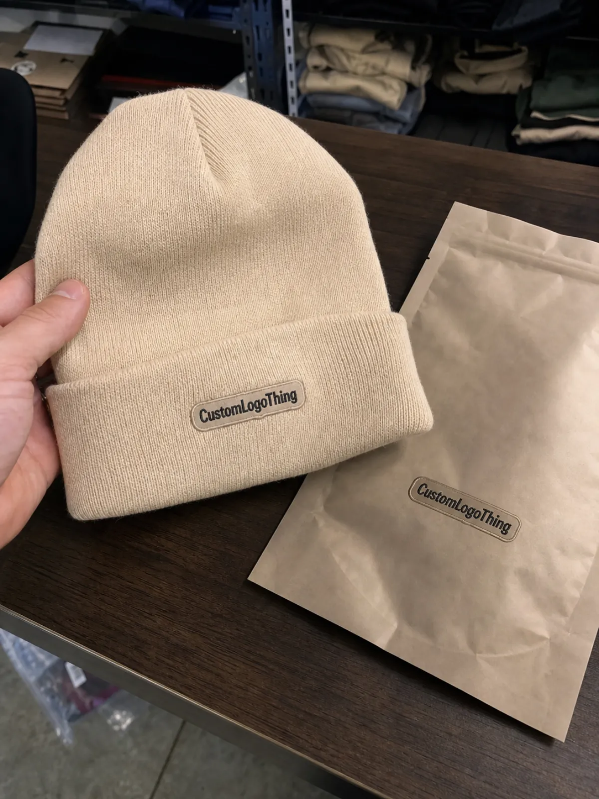
What should a strong proof include? At minimum: style code, body color, cuff style, approximate artwork dimensions, placement reference, decoration method, quantity, and ship target. If the piece uses embroidery, the proof should also flag stitch density, minimum line thickness, and whether small type needs to be simplified. If the decoration is a woven patch or label, the proof should show the patch size relative to the cuff so the buyer can judge whether it looks intentional or overcrowded.
Lead time depends on complexity. A clean one-color logo on a common cuff can come back in 1 to 2 business days. Add multiple thread colors, special placement, or artwork cleanup, and the process usually takes longer. A physical sample, if requested, adds more time again because it needs actual production attention instead of a screen-based layout. That delay is normal, not a sign of trouble.
The fastest proof is not always the best one. A file that comes back too quickly can miss the exact details that decide whether the order succeeds. The goal is not speed for its own sake; the goal is a proof accurate enough to approve without guessing.
Sizing, Placement, and Knit-Texture Checks That Change the Outcome
This is where most buyers either protect the order or create avoidable trouble. Size, placement, and texture interact in ways that flat-product approvals rarely reveal. A logo that looks perfectly sized at 2.5 inches across can feel small once the cuff is folded and the stitches pull the art inward. On the opposite side, an oversized mark can dominate the hat and make the piece look promotional instead of retail-ready.
Placement should be measured from a fixed point. Ask what the factory is using: seam, fold line, edge of cuff, or a center guide. If the art is meant to sit slightly off-center for a slouchier look, that should be called out in the proof notes. Buyers often assume the vendor will interpret the same center point they use internally. That assumption causes more problems than it should.
Knit texture changes readability. Ribbing can eat fine lines, especially on darker yarns. Small serif fonts, thin icon outlines, and delicate monograms are the first things to disappear. In practical terms, very small lettering often looks better simplified than enlarged. A cleaner mark at the right size usually performs better than a crowded layout that tries to preserve too much detail.
Color contrast matters just as much. White or bright thread on charcoal acrylic usually reads well. Mid-tone thread on heather yarn may vanish in some lighting, especially once the hat is worn and the cuff is curved. Screen color is only a reference; it is not the final material. If the order depends on precision, ask for a thread chart, Pantone callout, or production photo instead of relying on the monitor.
Material choice affects what the proof can honestly promise. Acrylic is common because it is affordable and holds shape well. Wool blends can feel better and look richer, but they may cost more and react differently to stitch density. Polyester can be useful for certain performance looks, though it does not always have the same hand feel as natural or blended yarns. A good proof should reflect the actual substrate, not an idealized version of it.
Cost, Pricing, and MOQ Factors Behind Each Proof Revision
Proofing is often included in the quote, but the structure varies. Some vendors include the first digital proof and one revision at no charge. Others add fees when the artwork needs redrawing, the placement changes, or the revision requires a fresh layout from scratch. A physical pre-production sample is a different category entirely because it consumes labor and material before the main run begins.
For planning purposes, the range is usually modest for digital changes and noticeably higher for a physical sample. A basic proof may be built into the unit price. Additional digital revisions are often free or priced in the low tens of dollars when the changes are minor. A sample can land in the $25 to $100+ range before shipping, especially if real yarn, embroidery, or a custom patch is involved. Those numbers vary by vendor and complexity, but they are useful enough to keep budgets honest.
MOQ changes the math. A 48-piece order spreads setup across fewer units, so every revision feels heavier. A 500-piece order can absorb the same proof labor with less pain, though the approval standards should not drop. Large or seasonal programs are where proof discipline pays off most, because a small error multiplies across inventory, packaging, and delivery timing.
Before approving any revised proof, buyers should ask three direct questions:
- Are revisions included, or does a second round trigger a charge?
- Does a physical sample add cost, and how much time does it add?
- Will any post-approval change reset pricing, lead time, or MOQ?
| Proof Option | Typical Cost | Best For | Tradeoff |
|---|---|---|---|
| Basic digital proof | Often included | Standard artwork and common cuff placement | Fast, but limited to what the screen can show |
| Revised digital proof | Usually included or low-cost for small edits | Placement changes, spelling fixes, thread adjustments | Extra review time before approval |
| Pre-production sample | Often a separate charge | Complex art, color-sensitive brands, larger orders | Best real-world check, but adds cost and time |
Packaging can also affect the approval strategy. If cartons, inserts, or retail-ready packing are part of the order, the buyer should understand how the hats will ship and how much compression the packaging introduces. Organizations such as the ISTA publish shipping test standards that help teams think beyond the hat itself. That does not change the proof, but it does change how the finished product should be protected on the way out.
Step-by-Step Digital Proof Review Before You Sign Off
Good proof reviews follow a predictable order. Start with the order data, because admin errors are easier to catch before anyone starts debating artwork. Confirm style code, yarn color, cuff configuration, decoration method, quantity, and ship date. A proof can look polished and still be attached to the wrong spec sheet. That happens more often than teams like to admit.
Then move to the artwork itself. Check spelling, logo orientation, proportion, and the relationship between the mark and the seam or fold line. If the beanie is meant for retail, the proof should look retail-ready. If it is for a stadium giveaway, a larger mark may be appropriate. Context matters. A design that feels too bold in one setting may be exactly right in another.
Measurements deserve slower attention than they usually get. Ask whether the width is shown on the folded cuff or on the flat blank. Ask whether the visual center is aligned to the physical center or to the wearer’s point of view. Those are not interchangeable. Knitwear punishes assumptions with visible drift.
A second set of eyes helps more than most teams expect. One person can check brand accuracy while another verifies production details. That split takes only a few minutes and catches errors that a single reviewer often misses, especially when quantity, color, and packaging notes are buried in the same email thread. The time spent here is small compared with the time needed to fix a full run.
If the vendor offers a thread card or Pantone note, compare it with the brand guide instead of the screen image. Monitors drift. Lighting drift matters too. A thread that looks warm in daylight can look cooler under warehouse lights. Keep the final proof, approved artwork, and purchase order together so repeat orders start from the same reference point instead of from memory.
Common Approval Mistakes That Create Reprints and Delays
Most proof problems come from predictable habits. Approving on a phone is one of the easiest mistakes to make. A small screen hides spacing issues, type size problems, and color shifts that would be obvious on a desktop or printed copy. For a simple reorder, that may be acceptable. For a new run, it usually is not.
Color is another trap. Screen color is not production color. A deep red logo can look muddy on one device and clean on another, while the thread itself may be correct all along. Buyers who need exact color matching should ask for a Pantone reference, thread chart, or sample before signing off. Guessing from a screen usually ends with surprise, not accuracy.
Vague revision notes slow the process. Comments like “make it stronger” or “tighten it up” force the vendor to interpret intent. Specific notes move faster: enlarge the logo by 15 percent, lift it 0.25 inch above the fold, reduce the text line weight, or swap to a higher-contrast thread. The better the note, the cleaner the next proof.
Approving the wrong file is another common failure point. Multiple versions, forwarded email chains, and attachment names like “final_v7_new2” make confusion almost guaranteed. If a proof is updated, confirm everyone is reviewing the same version. Many reprints begin with a simple mismatch between what one stakeholder thought was final and what production actually received.
Keep the approval trail. Save the annotated proof, the final signoff, and the revision history together with the order record. That record matters later, especially when someone asks why the logo was sized a certain way or why a repeat order needs to match a previous run exactly.
Expert Next Steps After the Final Proof Is Approved
Once the proof is approved, the work is not finished. Archive the approved file, source art, and PO in the same folder. That sounds administrative because it is administrative, and administrative discipline is what keeps repeat orders from drifting. If a different buyer picks up the program next season, the file should tell the whole story without relying on memory.
For larger or color-critical orders, a mid-production checkpoint can be worth asking for. It is especially useful on textured cuff placements where the mockup only tells part of the story. The checkpoint does not mean the proof was weak; it means the order carries enough value to justify one more verification before the full quantity is completed.
Reorders deserve special care because knitwear changes slightly from one batch to the next. Yarn lot, dye lot, and machine setting can all affect how the piece reads. Even when the original proof was approved perfectly, a later order can drift if the approved reference is missing or poorly stored. Keep the proof close to the spec sheet so the next run starts from a known baseline.
That is the real value of a soap cuffed knit beanies Digital Proof Checklist: it turns a visual approval into a repeatable production control. A buyer can use the same checklist across seasons, vendors, and quantities to catch changes in cuff size, artwork scale, thread color, and placement before they become warehouse problems. In a category where texture changes the way art reads, consistency is not a luxury. It is the margin between a clean receipt and a costly correction.
Frequently Asked Questions
What should a soap cuffed knit beanies digital proof checklist include?
It should cover style code, body color, cuff style, decoration method, quantity, and ship target, plus artwork size, placement, and spelling checks. The most useful checklists also record the revision history and the final approval contact so there is no confusion later.
How many proof revisions are normal for custom knit beanies?
One or two rounds is common when the artwork is clean and the placement is clear. More than that usually means the size, color direction, or cuff placement still needs alignment. Specific feedback shortens the cycle more reliably than broad comments.
Can I approve a beanie proof if the logo color looks slightly off on screen?
Only if the vendor has given you a clear color reference or Pantone note. Screens can shift color enough to mislead experienced buyers, so confirm the specification rather than trusting the display. If color accuracy matters, request a revised proof or a sample.
What usually delays the proof process for cuffed knit beanies?
Missing artwork files, low-resolution logos, unclear placement instructions, and too many decision-makers are the usual culprits. Late changes to size, color, or quantity after the first proof also slow things down because they force the vendor to rebuild the mockup and sometimes the production plan.
Should I ask for a pre-production sample before final approval?
Yes when the design is complex, color-sensitive, or the order volume is high. A sample shows texture, scale, and cuff placement in real life, which a mockup cannot fully capture. It costs more up front, but it can prevent a much costlier mistake on the full run.