Buyer Fit Snapshot
| Best fit | Designing Branded Poly Mailers projects where brand print, material claims, artwork control, MOQ, and repeat-order consistency need to be specified before quoting. |
|---|---|
| Quote inputs | Share finished size, material target, print colors, finish, packing count, annual reorder estimate, ship-to region, and any compliance wording. |
| Proofing check | Approve dieline scale, logo placement, barcode or warning zones, color tolerance, closure strength, and carton packing before bulk production. |
| Main risk | Vague material claims, crowded artwork, missing packing details, or unclear freight terms can make a low unit price expensive after revisions. |
Fast answer: Designing Branded Poly Mailers: Material Claims, Seal Quality, and Freight Cost should be specified like a repeatable production item. The safest quote records material, print method, finish, artwork proof, packing count, and reorder notes in one written spec.
Production checks before approval
Compare the actual filled-product size with the drawing, then confirm tolerance on folds, seals, hang holes, label areas, and retail display edges. Reserve space for logos, QR codes, warning copy, and material claims before decorative graphics fill the panel.
Quote comparison points
Review material grade, print process, finish, sampling route, tooling charges, carton quantity, and freight assumptions side by side. A quote is only useful when the supplier can repeat the same color, closure quality, and packing count on the next order.
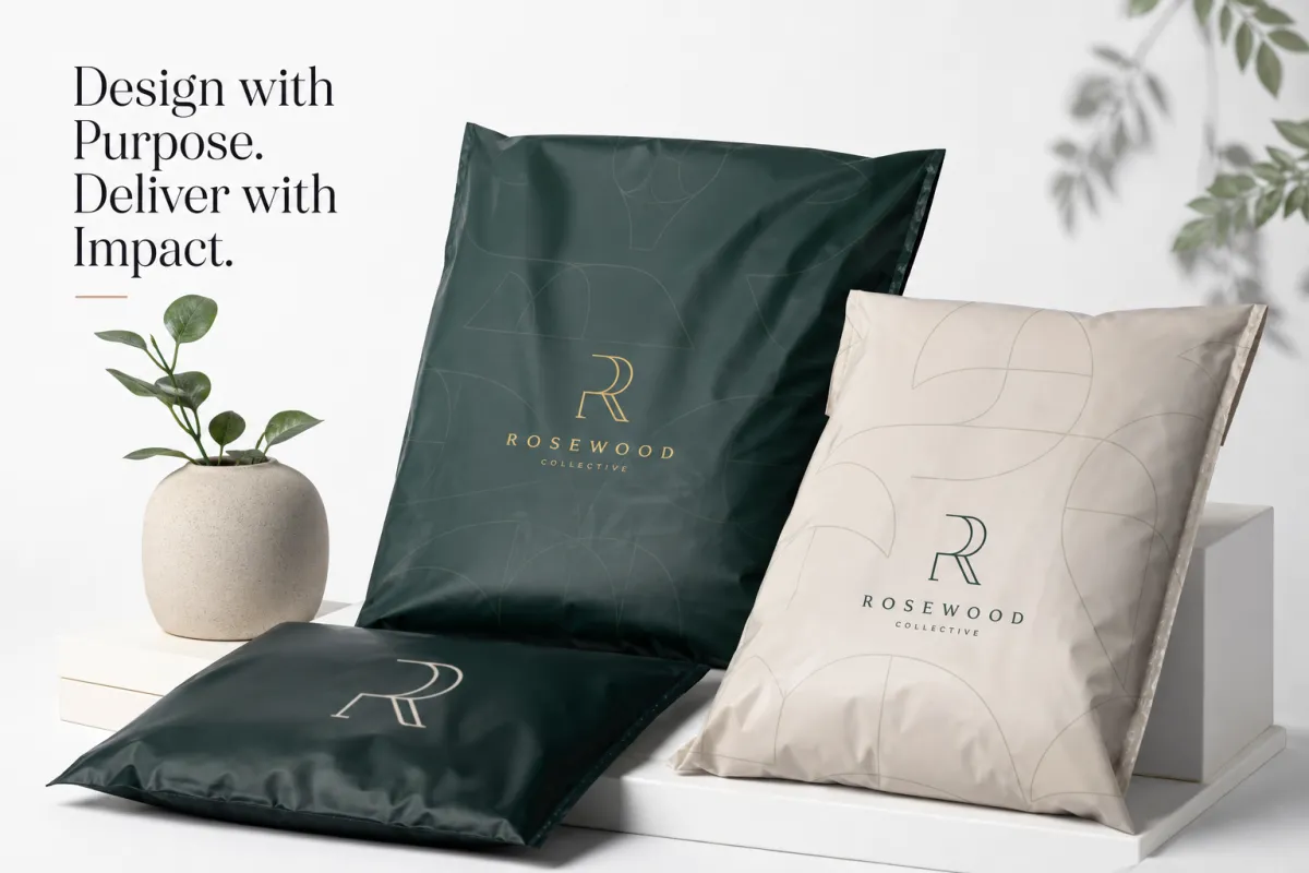
A shipment sets the tone before the customer even opens it. That outer bag has a job to do, and it has to do it fast. That is why tips for designing Branded Poly Mailers matter so much. A solid mailer does more than move a product from point A to point B. It frames the brand, protects the contents, and tells the customer they bought from someone who pays attention.
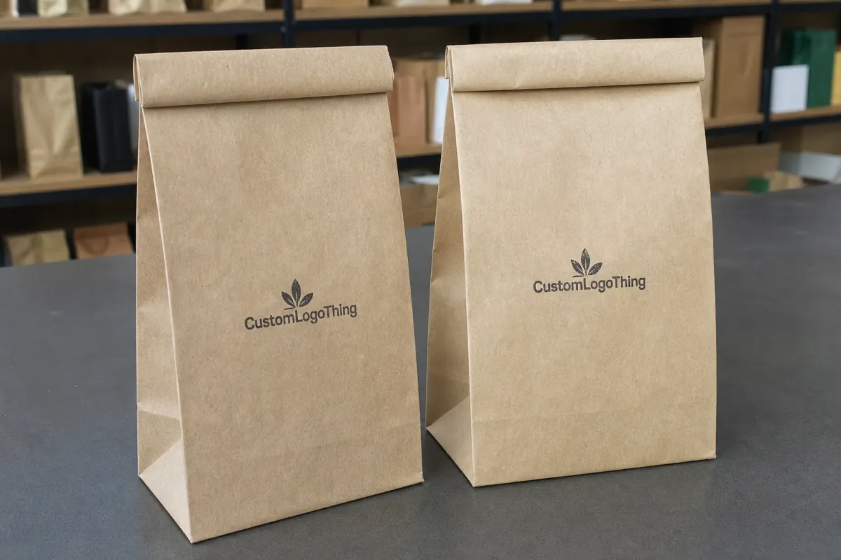
Branded Poly Mailers are lightweight shipping pouches made from polyethylene film and printed with a logo, pattern, tagline, or full-bleed artwork. They show up everywhere for apparel, accessories, subscription kits, cosmetics, and small hard goods. For a lot of orders, the mailer is the first branded surface anyone sees. I have watched the bag do more brand work than the insert card inside, which is a little rude, but also true. That is why tips for designing branded poly mailers need to balance appearance with production reality, not decoration alone.
At Custom Logo Things, the best packaging choices usually come from treating the outer mailer as part of the whole system. If you are comparing formats, take a look at Custom Packaging Products and our Custom Poly Mailers. It is easier to design the right bag when you are looking at the full setup instead of one piece in a vacuum.
Tips for Designing Branded Poly Mailers: Why They Matter
A branded mailer often acts like a storefront window. The customer may never see a box. They may not touch the product insert until after the package is open. So the outside has to say a few things right away: this brand is organized, the order was intentional, and the product inside was worth waiting for.
That matters most for eCommerce brands shipping soft goods, compact accessories, and subscription items in volume. Poly mailers also help when a brand wants a lower freight profile than corrugated boxes without giving up a clean presentation. One of the better tips for designing Branded Poly Mailers is to think about the route the package takes after it leaves your hands. Sorting hubs. Conveyor belts. Parcel bins. Delivery trucks. Porch drops. The design has to survive all of that and still look like it belongs to the brand.
From the buyer's side, the mailer should fit the rest of the brand system. If the site uses sharp black-and-cream visuals, the shipment should not arrive screaming in rainbow chaos. If the brand is loud and playful, the mailer can carry that energy with stronger contrast or a repeated pattern. The best tips for designing Branded Poly Mailers usually start with a simple question: what do you want the customer to feel in the first three seconds?
Efficiency matters too. These bags are quick to pack, light to store, and easier to handle than boxes stuffed with void fill. That is a real advantage in busy fulfillment spaces where every second on the pack line counts. A design that looks great but slows sealing, scanning, or stacking is not a good design. Real tips for designing branded poly mailers respect the pack line as much as the artboard.
"A mailer has two jobs: protect the product and make the customer feel like the brand paid attention."
If sustainability claims are part of the pitch, keep them honest. Film type, recyclability claims, and local collection rules should all be checked before they land on the printed surface. The FSC site helps with paper-based packaging claims, while EPA guidance is useful when you are evaluating end-of-life messaging and waste reduction language. Neither one replaces legal review. Both keep the conversation grounded.
Put simply, tips for designing branded poly mailers are about making a small piece of packaging work harder than its size suggests. That is exactly why brands use them for apparel drops, loyalty shipments, limited promotions, and recurring subscriptions. The format is simple. The brand impact does not have to be.
How Branded Poly Mailers Work in Production
Good tips for designing branded poly mailers start before anyone approves artwork, because production choices shape what is possible on press. The usual path starts with file setup, moves to proofing, and then goes through printing, converting, sealing, packing, and freight. Each stage hides a few design consequences. Catch them early, and the project gets a lot less annoying later.
Artwork prep comes first. Vector logos, clean line work, and clearly labeled Pantone references give the printer a much better shot at matching color and keeping edges sharp. If the design uses a repeat pattern, the repeat length and direction should be spelled out before proofing begins. One of the most practical tips for designing branded poly mailers is to assume the printer will follow exactly what you send, not what you meant in your head. The file needs to be plain about the details.
Flexographic printing is often used for larger runs because it handles repeated artwork efficiently and keeps unit cost under control when the design uses a limited number of colors. Digital printing can make more sense for shorter runs, artwork changes, or graphics that need more variation from one order to the next. Neither method wins every time. Quantity, color count, and finish all matter. If you are comparing options, tips for designing branded poly mailers should include the print method in the design brief, not as an afterthought.
Registration matters more than people want to admit. The artwork has to line up properly as the film moves through the press and later through cutting and sealing. Logos placed too close to edges, folds, seams, or adhesive zones can look slightly off once the bag is formed and packed. A strong design leaves room for that shift. That is one of those tips for designing branded poly mailers that sounds small on paper and saves a lot of grief in the finished run.
Proofing and sampling are where the project gets safer or more expensive. A PDF proof is useful, but a screen cannot show how a metallic ink behaves under warehouse lighting or how a dark background looks once the bag is filled and stretched. Ask for a physical sample or a short pilot run whenever the project has special colors, a new size, or a finish you have not used before. Good tips for designing branded poly mailers always leave room for correction.
Timeline is where planning becomes real. Standard production windows often sit around 12 to 15 business days after proof approval, though that can shift with quantity, tooling, and material availability. Rush schedules are possible, but they usually leave less room for custom detail or careful color matching. From a packaging buyer's point of view, the smartest tips for designing branded poly mailers include room for internal review, because the biggest delays usually happen before production starts.
For brands that care about testing performance, it helps to align the design conversation with shipping standards. Groups like ISTA publish transport test resources that help teams think about distribution hazards more clearly. You do not need to turn a mailer project into a laboratory project. A little testing mindset goes a long way.
The production lesson is blunt: tips for designing branded poly mailers are not just about making the artwork attractive. They are about making sure the artwork can be printed, sealed, packed, and shipped without drifting away from the intended look.
Key Design Factors for Branded Poly Mailers
Once the production path makes sense, the design choices get easier to judge. Strong tips for designing branded poly mailers start with visual hierarchy. Decide what should be seen first, second, and third. For many brands, that order is logo, brand message, and then pattern or social handle. If the design tries to do everything at once, the eye has nowhere to land. The package stops feeling premium and starts feeling noisy.
Logo placement matters more than most teams expect. Centered logos feel formal and balanced. Off-center placement can feel fashion-forward or editorial when it is deliberate. Repeated logos can create a strong retail rhythm, but they can also turn cluttered fast if the scale is wrong. One of the most useful tips for designing branded poly mailers is to think in distance. The package will be seen across a room, then at arm's length, then up close when the customer opens it. The design should hold up at all three distances.
Material thickness and opacity shape both durability and presentation. A 2.5 mil film can work for lighter apparel and softer goods, while 3 mil or 4 mil films usually feel sturdier for heavier shipments or items with sharper edges. Opacity matters too, especially if the product should not show through the film. Matte finishes tend to feel more understated and modern, while gloss can make colors look brighter and more saturated. Those choices are not just aesthetic. They affect scuffing, shelf appeal, and how the print reads under different light. The best tips for designing branded poly mailers connect finish choice to the actual shipping use case.
Color is where many brands overdo it or underthink it. In flexographic printing, fewer spot colors usually simplify setup and help control the project cost. High contrast helps logos read faster, especially on moving parcels or in busy receiving areas. Dark-on-dark palettes can feel expensive, but they are risky if the contrast is weak. Full-bleed coverage can look dramatic, but it usually raises ink coverage and sometimes raises cost too. A good rule holds up here: the mailer should feel branded, not busy. That is one of the most dependable tips for designing branded poly mailers I can give.
Size and structure should never be guessed. If the mailer is too large, the product shifts and the package loses its clean silhouette. If it is too tight, seams strain and the print can distort around the seals. Measure the packed product, not just the empty item. Add room for tissue, inserts, or a return card if those are part of the presentation. Strong tips for designing branded poly mailers always start with the actual folded dimensions, not the wishful ones.
Brand consistency matters as well. The mailer should support the box, tape, tissue, and label language rather than fighting them. A strong packaging system usually uses one central visual cue across the whole set, such as a logo repeat, a line pattern, or a specific color pair. When that cue shows up in the mailer and the other components, the shipment feels thought through. That kind of consistency is one of the quieter tips for designing branded poly mailers, but it is often what makes the experience feel polished.
Practical design checks before you approve the art
- Confirm the logo is readable at both arm's length and close viewing distance.
- Keep critical artwork away from seams, adhesive closures, and fold zones.
- Limit tiny copy, because small type tends to lose clarity on flexible film.
- Use strong contrast if the package needs to stand out in retail or parcel handling.
- Match the design style to the rest of the packaging family.
A good package system makes the mailer feel like a quiet extension of the brand instead of a loud interruption. That is why tips for designing branded poly mailers should always include the bigger visual context, not just the pouch itself.
Step-by-Step Tips for Designing Branded Poly Mailers
If you want a clean launch, move through the work in sequence. The best tips for designing branded poly mailers are easier to use when the project is broken into clear steps instead of one giant revision pile.
Start with the job of the mailer. Is it mainly protective, mainly promotional, or a mix of both? A subscription shipper may want a stronger brand reveal, while a replenishment order may only need a logo and a restrained repeat pattern. If the mailer is for a campaign or product drop, the graphics can be more expressive. If it is a daily fulfillment item, simple usually wins. This is one of the most practical tips for designing branded poly mailers because the purpose drives everything else.
Build the layout from the logo outward. Place the strongest brand mark first, then add secondary text only if it earns its spot. A website URL, hashtag, or social handle can help, but not every mailer needs all three. The more elements you cram in, the harder it gets for the eye to settle. Good tips for designing branded poly mailers tend to sound a little conservative here, because restraint keeps the package clean.
Set technical specs early. Ask for vector artwork, bleed requirements, safe zones, and preferred file formats before the designer starts final art. If a printer wants Pantone references, supply them. If a repeat pattern needs to line up on the seam, note that clearly. The cleaner the handoff, the fewer surprises later. This is one of those tips for designing branded poly mailers that saves time even after the creative work is done.
Check the artwork at actual size. A design that looks balanced on a monitor can fall apart when it is scaled to a mailer. Tiny text may become unreadable, a border may feel too tight, or a pattern may turn visually noisy once it is printed full size. Printing a proof at scale or using a mockup template catches those issues early. If the brand team has never done packaging before, this is one of the most useful tips for designing branded poly mailers to push internally.
Review the back side and closure zone. A lot of teams focus on the front face and forget that the sealed edge changes what the customer sees. If the opening flap, adhesive strip, or back panel carries important text, make sure it stays legible after folding and sealing. A package can look great flat and awkward once it is formed. Good tips for designing branded poly mailers respect the finished shape, not just the artwork file.
Get feedback from fulfillment. The packing team will catch things creative people miss: where the mailer is hard to load, which side feels natural to grab, whether the artwork distracts from barcodes or labels, and whether the chosen finish is too slippery on the line. That feedback is worth listening to. It turns tips for designing branded poly mailers into something operational, not just visual.
Approve a sample or pilot batch. If you are changing size, switching finish, or launching a design that uses more than one color, a short validation run is worth it. A sample can reveal issues with opacity, color density, seal behavior, or scuffing that a proof will never show. I have seen more than one project saved by a single physical sample. That is why real tips for designing branded poly mailers always leave room for testing.
Before the order moves into production, use a launch checklist like this:
- Confirm final size and material thickness.
- Verify artwork file format, bleed, and safe zones.
- Approve logo placement and color references.
- Check sample fit with the actual product.
- Align the delivery date with fulfillment capacity and storage space.
The list looks basic because it is basic. That is the point. In packaging work, the small checks usually protect the budget and the timeline. That is why tips for designing branded poly mailers reward discipline more than flair.
Cost and Pricing for Branded Poly Mailers
Pricing is where design choices stop being abstract. The best tips for designing branded poly mailers always include a real budget conversation, because the creative decision and unit cost are tied together. Order quantity, film thickness, number of print colors, coverage area, custom sizing, and finish all affect what you pay.
As a planning range, smaller short-run orders often land much higher per piece than larger volume runs because setup costs are spread across fewer units. A simple two-color flexo mailer in a larger run might sit around $0.18-$0.28 per unit at 5,000 pieces, while a more detailed design or shorter run can climb higher. Digital options can be useful for very small orders or frequent artwork changes, but they often cost more per unit. Those differences matter, and they are exactly why tips for designing branded poly mailers should sit next to the quote sheet, not apart from it.
Here is a useful way to think about the tradeoffs:
| Option | Typical Use | Approx. Unit Price | Main Benefit | Main Tradeoff |
|---|---|---|---|---|
| Two-color flexographic print | Larger runs with simple brand marks | $0.18-$0.28 | Efficient, clean, cost-controlled | Limited color complexity |
| Three- to four-color flexographic print | More detailed brand systems | $0.22-$0.36 | Stronger visual depth | Higher setup and ink complexity |
| Digital print | Short runs or variable artwork | $0.40-$0.95 | Flexible graphics, quicker design changes | Higher per-unit cost on larger volumes |
| Heavy film with full-bleed coverage | Premium presentation and more protection | $0.24-$0.42 | Better opacity and stronger presence | More material and print coverage cost |
The biggest cost lever is usually quantity. Setup, plates, sampling, and proofing costs do not disappear because the design looks simple, so larger runs usually bring down unit cost. That is a strong reason to plan artwork around the likely order size. A project that keeps changing from one campaign to the next can get expensive fast if the setup gets repeated too often. Smart tips for designing branded poly mailers think one or two orders ahead.
There is also a hidden cost conversation around shipping economics. A slightly higher mailer price may still be the right call if it cuts damage, shortens pack time, or improves repeat purchase behavior. Too many brands compare packaging only as a line item. That is a lazy way to do it. Practical tips for designing branded poly mailers ask whether the mailer helps the business, not just whether it looks nice on a spreadsheet.
Freight and storage matter too. Poly mailers store flat, which helps, but large custom runs still need space. If the design uses special inks or a heavier film, freight can creep up as well. A real budgeting conversation includes the whole landed cost: unit price, freight, storage, and the cost of any damage reduction or efficiency gain. That broader view is one of the clearest tips for designing branded poly mailers because it keeps the decision tied to business reality.
Common Mistakes When Designing Branded Poly Mailers
Most mistakes are not dramatic. They are little problems that get bigger after the bag is printed, packed, and shipped. The first error is treating the mailer like a poster. A poster sits flat on a wall. A mailer has seams, seals, tension points, and handling wear. That difference changes everything. One of the most useful tips for designing branded poly mailers is to design for movement, not just for display.
Another common issue is tiny text. Small copy may look elegant on screen, but it often disappears once the film is printed and folded into a real package. If you need to include a slogan, website, or social handle, make sure the type is large enough to read quickly. Thin typefaces can also get lost, especially on glossy surfaces or dark backgrounds. That is why tips for designing branded poly mailers usually favor clarity over cleverness.
Low contrast shows up a lot too. A pale gray logo on a silver or white pouch might feel refined in a proof, but under warehouse lighting it can flatten out. Dark text on a medium-toned background can do the same thing. Strong contrast helps the brand survive the actual shipping environment. In a pile of parcels, legibility is part of brand value. Good tips for designing branded poly mailers recognize that a package has to read quickly.
Structural mistakes are just as common as visual ones. Important elements too close to the edge can get clipped. Artwork that ignores the gusset area may look distorted after filling. A design that looks balanced on the front may become awkward once the adhesive flap is sealed. Those problems are avoidable if the artwork gets reviewed in the actual bag format. That is one of the most practical tips for designing branded poly mailers for teams that only work from flat mockups.
Budget mistakes are another trap. A design can look excellent and still be bad for the business if it needs too many print colors, a special finish with no real need, or custom sizing that does not materially improve pack-out. I have seen brands approve the premium look first and then realize the volume does not justify the setup. Balanced tips for designing branded poly mailers take both the brand and the budget seriously.
Skipping samples is probably the costliest mistake of all. A proof can hide a surprising amount: color drift, unexpected sheen, logo distortion, and seam behavior. A physical sample shows those things earlier. If you want fewer reprints and less frustration, make room for review. In real production, that is one of the strongest tips for designing branded poly mailers you can follow.
Watch for these warning signs before you approve the order:
- The mockup looks beautiful but the logo is tiny.
- The design depends on subtle color differences with low contrast.
- No one has checked where the seal line falls.
- The budget assumes premium effects without a business reason.
- The team has not seen a physical sample.
Those problems show up because they are easy to miss during the creative phase. The best tips for designing branded poly mailers catch them early, before the order is locked in.
Expert Tips and Next Steps for a Better Mailer Launch
Once the basics are handled, the more advanced tips for designing branded poly mailers focus on flexibility. A strong mailer system should not need a rebuild every time a new campaign shows up. It should use a core design language that can support seasonal art, limited drops, event mailings, or subscription variations without losing the brand thread. That approach saves time and keeps the packaging recognizable.
One smart move is to leave some negative space alone. Clean space gives the logo room to breathe and makes the package feel more expensive, even when the artwork is simple. It also leaves room for future campaign text or a small promotional note if the brand wants to update the layout later. Good tips for designing branded poly mailers often sound understated because the quiet packages age better across multiple launches.
Coordinate with fulfillment before final approval. Ask how the bags will be loaded, stacked, sealed, and labeled. Ask whether the pack line favors top-loading or side-loading. Ask where barcodes or shipping labels will sit. Those operational details can change how much artwork area is actually available. In my experience, the best tips for designing branded poly mailers come from getting production, creative, and fulfillment into the same conversation early enough to matter.
If you are launching a new size, finish, or color, order a short run first when possible. That small test can show whether the bag feels too slippery, whether the color reads too dark, or whether the material thickness suits the product weight. A pilot run is not wasted money if it prevents a larger mistake later. It is one of the most practical tips for designing branded poly mailers for brands that are growing fast and cannot afford surprises.
Here is a simple final checklist before you approve production:
- Confirm the final mailer size and film thickness.
- Verify print method and color count.
- Check safe zones, bleed, and seam placement.
- Approve a physical sample if the project is new or complex.
- Align the launch quantity with storage and fulfillment capacity.
- Review freight timing so the mailers arrive before the pack schedule needs them.
That process keeps the project grounded. It is easy to get excited about a mockup, but the real win is a mailer that looks good, ships well, and does not create extra work on the line. That is the outcome the best tips for designing branded poly mailers are meant to deliver.
If you want a stronger packaging program overall, compare your mailer plan with other formats and examples in our Case Studies. Seeing how other brands handle packaging hierarchy, material selection, and print simplicity usually makes the next decision easier.
The best tips for designing branded poly mailers are the ones that improve the brand impression while keeping the process realistic, efficient, and repeatable. If the design protects the product, prints cleanly, and feels intentional in the customer’s hands, the mailer has done its job.
FAQ
How do I choose the right material for branded poly mailers?
Match film thickness to the product weight, shipping route, and presentation goal. A lighter apparel shipment may work well in a 2.5 mil bag, while heavier or sharper items often benefit from 3 mil or 4 mil film. Ask for samples if the product has edges, zippers, hard corners, or anything that could stress the pouch during transit. Opacity and finish matter too, because they affect both protection and appearance.
What print method works best for custom branded poly mailers?
Flexographic printing is often a strong fit for larger runs and simpler color builds, while digital printing can be useful for short runs, frequent artwork changes, or more detailed graphics. The right choice depends on order quantity, color complexity, and the level of precision your brand needs. If you are unsure, ask the printer to compare both methods on the same design so you can see the tradeoff in cost and appearance.
How many colors should I use on branded poly mailers?
Use only as many colors as you need to communicate the brand clearly. Fewer colors usually simplify production and help control pricing, especially on larger orders. A bold two-color design can often feel more intentional than a crowded full-color layout. If you need full-color artwork, confirm that the print method and budget support it before you approve the final proof.
How long does it take to produce branded poly mailers?
Lead time depends on artwork approval, sampling, quantity, and the chosen print method. A common production window is about 12 to 15 business days after proof approval, but that can change if the order needs custom sizing, special finishes, or color matching. If the launch date is fixed, build in extra time for internal revisions so the schedule does not get squeezed at the end.
What should I check before approving branded poly mailer proofs?
Check logo placement, safe zones, bleed, seam locations, and any text that sits close to an edge or closure line. Review the design at actual size, not only on a screen, and make sure the colors still read clearly once the film is printed. Confirm quantities, material specs, and shipping details as well, because small paperwork errors can cause unnecessary delays.