Trade show giveaway OPP Header Bags print method comparison sounds like procurement jargon, but the choice usually comes down to a few plain realities: how much detail the artwork needs, how many bags you need, and how much time you have before the show floor opens. The bag is small. The consequences are not. A weak print method can flatten a logo, blur fine type, or make a premium giveaway look like a last-minute replenishment order.
Clear Opp Header Bags are a particular kind of problem because the film is glossy, transparent, and unforgiving. There is nowhere for a bad line to hide. If the logo is too thin, the ink too pale, or the artwork too close to the seal, the bag looks tired before it leaves the carton. That is why the method should follow the use case, not the other way around.
A bag for a brochure packet, a bag for a small sample kit, and a bag meant to hang in a booth for three days do not need the same print strategy. The difference is not theoretical. It shows up in visibility, cost, and how often the design survives handling.
Trade show giveaway opp header bags print method comparison: what changes first
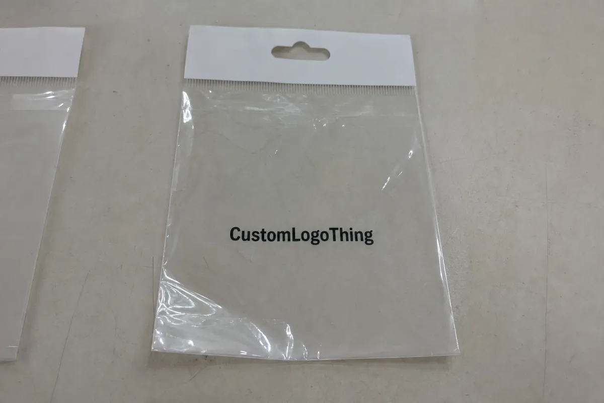
The first change is not color. It is legibility. On clear film, the artwork has to work against reflections, folds, and whatever the show lighting happens to be doing that day. A logo that looks crisp on a monitor can lose its edges on glossy OPP. Small text can vanish. QR codes can become unreliable if they sit in the wrong place or use weak contrast.
For trade show handouts, I usually think in three buckets. The first is simple branding: one logo, a short line of copy, maybe a website. The second adds practical content such as a QR code, a product claim, or a repeat pattern. The third turns the bag into part of the presentation itself, which is where print quality starts to matter almost as much as the giveaway inside. Each bucket points toward a different method.
Flexographic printing tends to fit straightforward artwork and repeat orders. Digital printing fits smaller runs and frequent changes. Gravure makes sense when volume is high enough to absorb tooling and consistency matters over a long program. That is the whole decision tree in plain English. Fancy is not the point. Fit is.
If the bag has to carry the brand before anyone reaches the booth, the artwork should read instantly, not reward close inspection.
Clear film also punishes the habits people bring from paper packaging. On paper, soft gradients, thin type, and subtle color changes can still work because the substrate gives you a little forgiveness. OPP gives you less. A design that depends on delicate tone shifts or hairline strokes can look elegant in concept and weak in production. That mismatch is one of the fastest ways to waste a promotional budget.
The best starting question is not “Which method is best?” It is “Which method can reproduce this artwork cleanly at the quantity and speed we actually need?” That framing saves money and usually saves a revision cycle too.
How flexo, digital, and gravure differ on clear bags
Flexographic printing is the practical middle ground for many promotional bag runs. It uses plates, so setup takes effort, but the economics improve as quantity rises. Flexo works especially well for bold logos, spot colors, clean typography, and artwork that does not depend on delicate gradients. If the design is simple and the order is respectable, flexo is often the quiet winner.
Digital printing is the easiest path when speed and flexibility matter more than the lowest possible unit cost. It avoids plate charges, so short runs are easier to justify. It is also the cleanest route for variable information, such as different QR codes for different show locations or quick proofing changes late in the process. The tradeoff is straightforward: cost per bag is usually higher, and transparent film demands strong contrast and careful file prep.
Gravure is the long-run specialist. It can deliver very consistent results and handle fine detail well, but the tooling is expensive. That makes it hard to justify for a modest trade show order unless the program is large enough to spread the setup cost across many units. For one event, gravure can be overbuilt. For a recurring national campaign, it can be exactly right.
Here is the practical comparison most buyers actually need:
| Method | Best quantity | Typical unit cost | Setup or tooling | Turnaround | Best fit |
|---|---|---|---|---|---|
| Flexo | 3,000-20,000+ | $0.08-$0.22 | Moderate plate setup | Often 12-18 business days | Simple logos, spot color, repeat orders |
| Digital | 250-3,000 | $0.20-$0.55 | Low setup | Often 7-12 business days | Short runs, fast edits, variable art |
| Gravure | 25,000+ | $0.05-$0.15 | High tooling cost | Often 20-30 business days | Large programs, tight repeat consistency |
The numbers above are typical planning ranges, not promises. A small layout with one color and no special underprint can land near the low end. Full coverage, white ink, special registration, or custom sizing push the quote upward fast. Packaging jobs rarely fail because a buyer asked the wrong question. They usually fail because someone asked only for the cheapest number and skipped the variables that actually drive cost.
For broad packaging education, the Packaging Machinery Manufacturers Institute has useful resources at packaging.org. If the bags need to survive shipping and handling as well as the booth, ISTA's testing references at ista.org are also worth a look.
Cost, pricing, MOQ, and what drives your quote
People often ask for a price per bag, but the real answer lives in the setup. Quantity matters, of course, yet the biggest swings usually come from artwork complexity, number of colors, bag thickness, white ink, custom sizing, and freight. A simple one-color logo is a very different job from a full-coverage transparent bag that has to read under bright convention center lighting.
MOQ is where the economics become visible. Flexo usually needs enough quantity to justify plate work. Digital can accept much smaller orders, sometimes only a few hundred pieces, but the unit cost stays higher. Gravure only starts making sense once the run is large enough to absorb tooling. That is why requesting quotes for more than one print method is useful. It shows the breakpoints instead of hiding them.
Ask for itemized pricing. A quote worth reading should separate:
- Film and construction - thickness, header type, seal style, and custom dimensions.
- Print setup - plates, screens, file prep, or cylinder/tooling charges.
- Ink and coverage - spot color, CMYK, white underprint, or full-bleed graphics.
- Packaging and freight - cartons, palletizing, shipping ZIP, and rush delivery.
That breakdown matters because a quote can look attractive until freight, tooling, or an art correction gets added back in. A lower sticker price is not the same as a lower total cost. Suppliers who show their math are usually easier to work with because the job does not have to be rediscovered three days before production.
There is also a material-side question that buyers overlook: how much print coverage the bag actually needs. More ink means more production complexity, especially on clear film. Leaving negative space can cut cost and improve visibility. That is a useful tradeoff, not a compromise.
Print finishing matters too, even on a simple bag. On OPP Header Bags, finishing is less about decorative coating and more about useful details: header width, hang hole placement, tear notch behavior, and whether the print sits cleanly away from folds and seals. Those details change both price and presentation. They also change how the bag feels in hand, which is not a small thing when someone is deciding whether to keep it or toss it.
Production steps, proofing, and turnaround timing
The production sequence is usually predictable: artwork review, proofing, approval, print, converting, packing, and shipping. The surprises come from the files. Low-resolution logos, misplaced QR codes, poor separations, and text sitting too close to the header seal all force revisions. That is not resistance. It is basic quality control.
Proof approval deserves more attention than it gets. Check the final dimensions, not just the artboard. Confirm whether the bag is front-only or printed on both sides. Verify barcode and QR placement at the real size. Look carefully at anything close to the header, because that area often shifts once the bag is sealed and hung. On transparent film, a few millimeters can separate a clean result from a mess.
Timing depends on the method. Short digital runs can often turn in 7-12 business days after approval. Flexo usually takes 12-18 business days, depending on plate work and quantity. Gravure is slower because tooling and press scheduling add steps before the press even starts running. Freight then adds its own variable. If a show date is fixed, the smart move is to freeze artwork earlier than feels comfortable. Waiting for the final week is how teams end up paying more to feel nervous in transit.
Good suppliers will often recommend a sample or pre-production proof if the design is tight, the run is large, or the artwork uses white ink. Take that advice seriously. A sample costs less than a reprint, and a reprint costs less than a booth full of bags that nobody wants to hand out.
There is one more practical detail: if the bag will be stuffed with catalogs, product pieces, or a boxed giveaway, ask whether the carton count and packing method fit your receiving plan. Trade show shipping is full of small failures. A perfect bag that arrives late is still a failure.
Choose the right bag specs for booth handouts
Start with the contents. A flat brochure packet and a heavy sample kit do not need the same film. For booth handouts, OPP thickness often sits in the 30-50 micron range, while bulkier or sharper contents may need a heavier spec. Saving a small amount by going too thin is rarely worth it if the bag has to survive a day of grabbing, stacking, and transport.
Header style matters more than buyers expect. A standard hang hole suits most displays. A euro slot can look cleaner in retail-style booths. Seal width influences both durability and presentation. Wider headers can create more room for branding, but they also reduce the usable print area. That tradeoff is common enough that it should be planned, not discovered during proof review.
Visibility is the next decision. If the contents are the draw, the artwork should frame them rather than cover them. Transparent film gives the bag a lighter feel, but only if the print respects the clear window. Heavy coverage can make the package look more like a retail wrapper than a promotion. Sometimes that is the right move. Often it is not.
Carton strength and transit protection matter too. Trade show orders are frequently shipped, unpacked, moved again, and stacked under something heavier than they should be. If the job includes paper inserts or outer packaging, sourcing claims may enter the conversation as well. FSC certification is worth checking for paperboard components, and fsc.org is a useful reference point for that side of the supply chain.
A good spec sheet answers three questions cleanly: what goes inside, how the bag will be displayed, and how much handling it must survive before the event ends. If the sheet cannot answer those, the quote is only an estimate with better grammar.
Common mistakes that make trade show bags look cheap
The fastest way to make a nice bag look careless is to crowd the header with small text. Clear OPP film does not forgive clutter. Fine type near a fold can disappear under glare. Tiny disclaimers shoved against a seal can look like they were added in a panic. The bag may still function, but it will not look planned.
Another common error is locking the print method too early. A design that seems fine in CMYK on a screen may need a spot-color version to stay readable on transparent film. Some designs need white ink under the logo so the mark does not float into the background. If the method is chosen before the artwork settles, the buyer can end up paying for one process and then paying again to fix the design to fit it.
Lighting changes everything. Trade show floors use bright overhead systems, reflective finishes, and stacks of neighboring booths that can flatten contrast. A low-contrast bag can disappear when someone walks by carrying three other items. A cleaner, simpler design with stronger shapes often outperforms a crowded layout that tries to tell the whole brand story in four square inches.
Common failures show up again and again:
- Thin strokes that break apart on glossy film.
- QR codes placed too close to the seal or edge.
- Too many colors for a job that only needs one strong spot color.
- Ignoring how the bag looks once it is filled and hanging at eye level.
There is no prize for overcomplication. The most expensive-looking bag is often the one with fewer weak details, stronger contrast, and a layout that knows where to stop.
Expert tips for stronger color, cleaner art, and better handouts
Begin with contrast. On clear OPP header bags, solid shapes and bold type usually outperform fragile artwork. If the brand mark relies on very thin lines, consider a heavier print version. If the logo uses subtle color shifts, ask whether a spot-color adaptation would read better than a full CMYK build. On transparent film, clarity almost always matters more than decoration.
Ask for a proof at final size with measurements visible. Not a casual mockup. Not a pretty PDF with no scale reference. Final size. That is how you catch the problems that matter: a QR code that scans poorly because it is too small, a slogan that sits too close to the header, or a logo that floats awkwardly in the seal area. A printed or digital production proof with dimensions marked is worth the extra step.
If the budget is tight, simplify before you shrink the order. Remove the extra color, cut the decorative clutter, and keep the message direct. A clean one-color flexo job can look more expensive than a messy full-color piece because the layout has discipline. Fancy is not a strategy. A restrained design with one strong brand mark often does more for a booth than a crowded bag trying to prove a point nobody asked for.
There is also a simple field check that catches problems early. Fill one bag with the actual contents, hold it at the distance people will see it on the show floor, and check whether the brand still reads under bright light. If the design only works on a file preview, keep refining it. That small test prevents awkward booth conversations later.
For packaging handling and transit context, the resources at packaging.org and ista.org are useful reminders that a promotional bag has two jobs: it has to look right, and it has to arrive ready to use.
Next steps: build a quote-ready spec sheet and compare samples
If you want an accurate quote, send the details that actually affect production: bag size, film thickness, quantity, print colors, artwork files, shipping ZIP code, deadline, and whether samples are needed before full production. Add notes about the contents and display setup. A flat brochure handout is not the same job as a bag holding a catalog, a product sample, and a small premium item.
Then ask for two or three versions of the same job using different print methods. That is the easiest way to see the tradeoffs in plain numbers. Flexo may win on a simple design and a medium run. Digital may be the fastest route for a small order with late artwork changes. Gravure may only make sense once volume is high enough to dilute the tooling. That is the real trade show giveaway opp header Bags Print Method Comparison, minus the sales gloss and the fake drama.
The cleanest outcome is usually simple: choose the method that fits the artwork, the quantity, and the schedule, then approve the proof early. If the bag reads quickly, looks intentional, and lands on time, it does its job. If not, it becomes another stack of materials people carry once and forget.
Which print method is best for short-run trade show giveaway opp header bags?
Digital printing usually makes the most sense for low quantities and fast artwork changes. Flexo can still be cheaper if the layout is simple and the setup cost stays controlled. Gravure is rarely practical unless the order is large enough to justify tooling.
How much does print coverage change opp header bag pricing?
More coverage usually raises cost because it increases production complexity and material use. Full-bleed art typically costs more than a simple logo treatment. Leaving clear space can lower price and improve visibility at the same time.
What lead time should I plan for before a trade show?
Digital jobs can move quickly, but proof approval and revisions still control the schedule. Flexo usually needs a longer window, and gravure needs the most time because tooling comes first. Build in buffer for sampling, production, and freight instead of cutting it close.
Can I print barcodes or QR codes on opp header bags?
Yes, but keep them away from folds, seals, and glare-heavy areas. Test scan quality at the final print size, not only on a screen. Use enough contrast so the code still scans through clear film and booth lighting.
What should I send for an accurate quote on custom opp header bags?
Send the size, thickness, quantity, print colors, artwork files, and delivery ZIP code. Include deadline and sample needs so the quote reflects the real job. Notes about product weight and presentation goals help too, especially if the bag has to do more than simply hold items.


